How to Add Labels in Matplotlib
Matplotlib is a powerful plotting library in Python that allows users to create various types of graphs and charts. Adding labels to plots is an essential feature as it helps to provide context to the data being visualized. In this article, we will explore how to add labels to different parts of a plot in Matplotlib.
Adding Title to Plot
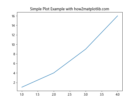
Adding a title to a plot is important to provide a clear description of what the plot represents. The title() function in Matplotlib is used to add a title to the plot.
import matplotlib.pyplot as plt

plt.plot([1, 2, 3, 4], [1, 4, 9, 16])
plt.title('Simple Plot Example with how2matplotlib.com')
plt.show()
Output:
Adding X and Y Labels
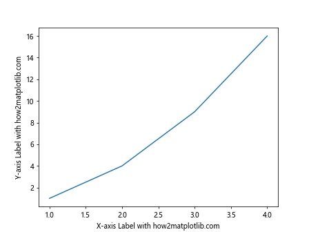
X and Y labels are used to provide information about the data being plotted on the respective axes. The xlabel() and ylabel() functions in Matplotlib are used to add labels to the X and Y axes, respectively.
import matplotlib.pyplot as plt

plt.plot([1, 2, 3, 4], [1, 4, 9, 16])
plt.xlabel('X-axis Label with how2matplotlib.com')
plt.ylabel('Y-axis Label with how2matplotlib.com')
plt.show()
Output:
Adding Legends to Plot
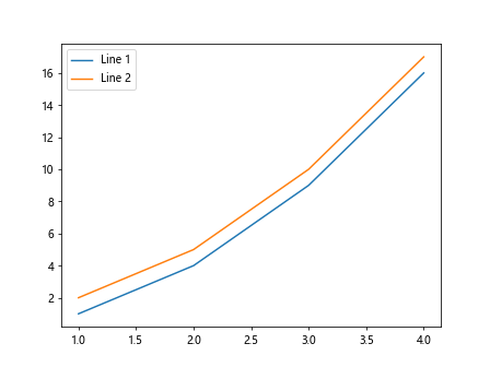
Legends are used to distinguish between multiple lines or datasets in a plot. The legend() function in Matplotlib is used to add a legend to the plot.
import matplotlib.pyplot as plt

plt.plot([1, 2, 3, 4], [1, 4, 9, 16], label='Line 1')
plt.plot([1, 2, 3, 4], [2, 5, 10, 17], label='Line 2')
plt.legend()
plt.show()
Output:
Adding Text Annotations
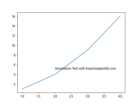
Text annotations are used to add additional information or highlight specific data points on a plot. The text() function in Matplotlib is used to add text annotations to a plot.
import matplotlib.pyplot as plt

plt.plot([1, 2, 3, 4], [1, 4, 9, 16])
plt.text(2, 5, 'Annotation Text with how2matplotlib.com')
plt.show()
Output:
Adding Grid Lines
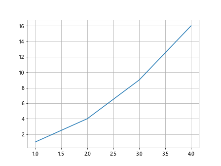
Grid lines can help in better understanding the data points on a plot. The grid() function in Matplotlib is used to add grid lines to the plot.
import matplotlib.pyplot as plt

plt.plot([1, 2, 3, 4], [1, 4, 9, 16])
plt.grid(True)
plt.show()
Output:
Adding Ticks and Tick Labels
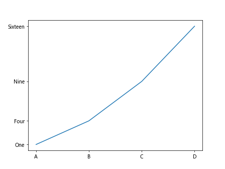
Ticks and tick labels are used to indicate specific values on the axes of a plot. The xticks() and yticks() functions in Matplotlib are used to set custom ticks and tick labels on the X and Y axes, respectively.
import matplotlib.pyplot as plt

plt.plot([1, 2, 3, 4], [1, 4, 9, 16])
plt.xticks([1, 2, 3, 4], ['A', 'B', 'C', 'D'])
plt.yticks([1, 4, 9, 16], ['One', 'Four', 'Nine', 'Sixteen'])
plt.show()
Output:
Adding Colorbar to Plot
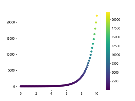
A colorbar can be added to a plot to represent variations in data using colors. The colorbar() function in Matplotlib is used to add a colorbar to the plot.
import numpy as np
import matplotlib.pyplot as plt

x = np.linspace(0, 10, 100)
y = np.exp(x)
plt.scatter(x, y, c=y, cmap='viridis')
plt.colorbar()
plt.show()
Output:
Adding Annotations with Arrows
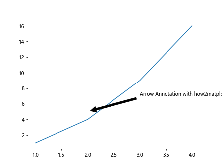
Annotations with arrows can be used to highlight specific data points on a plot. The annotate() function in Matplotlib is used to add annotations with arrows to a plot.
import numpy as np
import matplotlib.pyplot as plt

plt.plot([1, 2, 3, 4], [1, 4, 9, 16])
plt.annotate('Arrow Annotation with how2matplotlib.com', xy=(2, 5), xytext=(3, 7),
             arrowprops=dict(facecolor='black', shrink=0.05))
plt.show()
Output:
Adding Shapes and Text Boxes to Plot
Shapes and text boxes can be added to a plot to provide additional information or emphasize certain data points. The Rectangle and TextBox classes in Matplotlib are used to add shapes and text boxes to a plot, respectively.
import matplotlib.patches as patches
import numpy as np
import matplotlib.pyplot as plt

fig, ax = plt.subplots()
rect = patches.Rectangle((0.1, 0.1), 0.4, 0.5, linewidth=1, edgecolor='r', facecolor='none')
ax.add_patch(rect)
plt.text(0.3, 0.3, 'Text Box with how2matplotlib.com', fontsize=12,
         bbox=dict(facecolor='yellow', alpha=0.5))
plt.show()
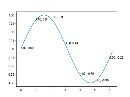
Adding Annotations to Specific Data Points
Annotations can be added to specific data points on a plot to provide additional information. The annotate() function in Matplotlib is used to add annotations to specific data points on a plot.
import numpy as np
import matplotlib.pyplot as plt

x = np.arange(0, 2*np.pi, 0.1)
y = np.sin(x)
plt.plot(x, y)
for i in range(len(x)):
    if i % 10 == 0:
        plt.annotate(f'{x[i]:.2f}, {y[i]:.2f}', (x[i], y[i]))
plt.show()
Output:
Adding Multiple Axes and Labels
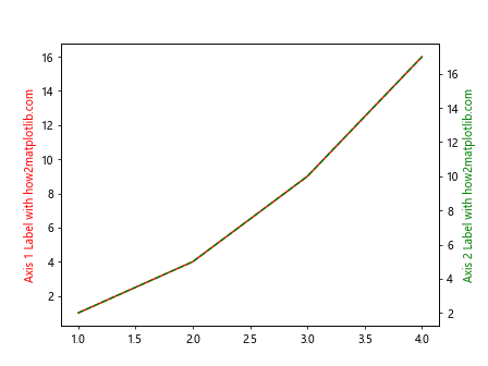
Multiple axes and labels can be added to a single plot to compare different datasets. The twinx() and twiny() functions in Matplotlib are used to create additional axes on a plot.
import numpy as np
import matplotlib.pyplot as plt

fig, ax1 = plt.subplots()

ax2 = ax1.twinx()
ax1.plot([1, 2, 3, 4], [1, 4, 9, 16], 'r-')
ax2.plot([1, 2, 3, 4], [2, 5, 10, 17], 'g--')

ax1.set_ylabel('Axis 1 Label with how2matplotlib.com', color='r')
ax2.set_ylabel('Axis 2 Label with how2matplotlib.com', color='g')

plt.show()
Output:
Adding Annotations to Axes
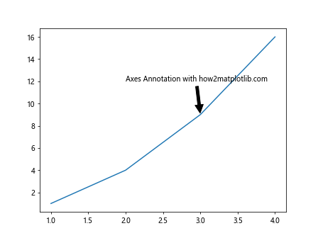
Annotations can be added to axes to provide context or additional information about the data being plotted. The annotate() function in Matplotlib can be used to add annotations to axes.
import numpy as np
import matplotlib.pyplot as plt

fig, ax = plt.subplots()
ax.plot([1, 2, 3, 4], [1, 4, 9, 16])
ax.annotate('Axes Annotation with how2matplotlib.com', xy=(3, 9), xytext=(2, 12),
             arrowprops=dict(facecolor='black', shrink=0.05))
plt.show()
Output:
Adding Arrows to Plot
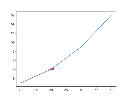
Arrows can be added to a plot to highlight trends or relationships between data points. The arrow() function in Matplotlib is used to add arrows to a plot.
import numpy as np
import matplotlib.pyplot as plt

plt.plot([1, 2, 3, 4], [1, 4, 9, 16])
plt.arrow(1, 1, 1, 3, head_width=0.2, head_length=0.3, fc='r', ec='r')
plt.show()
Output:
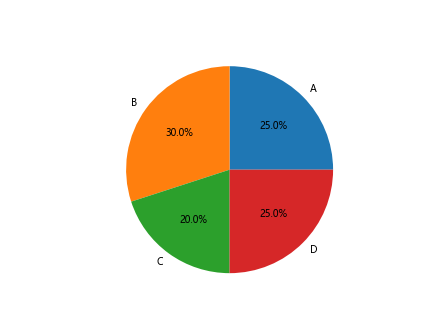
Adding Labels to Pie Chart
Labels can be added to a pie chart to indicate the percentage or value of each slice. The pie() function in Matplotlib is used to create a pie chart with labels.
import numpy as np
import matplotlib.pyplot as plt

labels = ['A', 'B', 'C', 'D']
sizes = [25, 30, 20, 25]
plt.pie(sizes, labels=labels, autopct='%1.1f%%')
plt.show()
Output:
Adding Annotations to Pie Chart
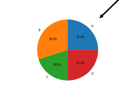
Annotations can be added to a pie chart to provide additional information about each slice. The annotate() function in Matplotlib can be used to add annotations to a pie chart.
import numpy as np
import matplotlib.pyplot as plt

labels = ['A', 'B', 'C', 'D']
sizes = [25, 30, 20, 25]
plt.pie(sizes, labels=labels, autopct='%1.1f%%')

explode = (0.1, 0, 0, 0)
plt.annotate('Exploded Slice', xy=(1, 1), xytext=(2, 2),
             arrowprops=dict(facecolor='black', shrink=0.05))

plt.show()
Output:
Adding Annotations to Bar Chart
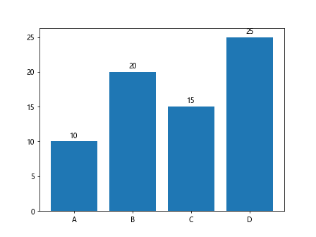
Annotations can be added to a bar chart to provide additional information about each bar. The annotate() function in Matplotlib can be used to add annotations to a bar chart.
import numpy as np
import matplotlib.pyplot as plt

x = ['A', 'B', 'C', 'D']
y = [10, 20, 15, 25]
plt.bar(x, y)
for i, v in enumerate(y):
    plt.text(i, v + 0.5, str(v), color='black', ha='center')
plt.show()
Output:
Conclusion
In this article, we have explored various ways to add labels to different parts of a plot in Matplotlib. Labels such as titles, axis labels, legends, annotations, grid lines, color bars, and more play a crucial role in providing context and understanding to the plotted data. By utilizing the functions and techniques discussed in this article, users can enhance the visual presentation of their plots and effectively communicate insights derived from the data.
Remember to refer to the Matplotlib documentation for more advanced customization options and features. Experiment with different label styles, positions, and formatting to create visually appealing and informative plots using Matplotlib.