Comprehensive Guide to Matplotlib.axis.Axis.set_data_interval() Function in Python
Matplotlib.axis.Axis.set_data_interval() function in Python is a powerful tool for customizing the data range of an axis in Matplotlib plots. This function allows you to manually set the data limits for an axis, providing fine-grained control over how your data is displayed. In this comprehensive guide, we’ll explore the Matplotlib.axis.Axis.set_data_interval() function in depth, covering its usage, parameters, and various applications in data visualization.
Understanding the Matplotlib.axis.Axis.set_data_interval() Function
The Matplotlib.axis.Axis.set_data_interval() function is a method of the Axis class in Matplotlib. It is used to set the data limits for an axis, which determines the range of data that will be displayed on that axis. This function is particularly useful when you want to override the automatically calculated data range or when you need to focus on a specific portion of your data.
Let’s start with a simple example to illustrate the basic usage of the Matplotlib.axis.Axis.set_data_interval() function:
import matplotlib.pyplot as plt
import numpy as np

# Create sample data
x = np.linspace(0, 10, 100)
y = np.sin(x)

# Create a plot
fig, ax = plt.subplots()
ax.plot(x, y, label='Sine wave')

# Set the data interval for the x-axis
ax.xaxis.set_data_interval(2, 8)

plt.title('Using Matplotlib.axis.Axis.set_data_interval() - how2matplotlib.com')
plt.legend()
plt.show()
Output:
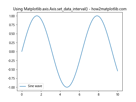
In this example, we create a simple sine wave plot and then use the Matplotlib.axis.Axis.set_data_interval() function to set the x-axis data range from 2 to 8. This effectively zooms in on a portion of the sine wave.
Parameters of Matplotlib.axis.Axis.set_data_interval()
The Matplotlib.axis.Axis.set_data_interval() function takes two main parameters:
- vmin: The minimum value of the data interval.
- vmax: The maximum value of the data interval.
Both vmin and vmax should be floating-point numbers representing the desired data range for the axis.
Let’s look at an example that demonstrates how to use these parameters:
import matplotlib.pyplot as plt
import numpy as np

# Create sample data
x = np.linspace(0, 10, 100)
y = np.exp(x)

# Create a plot
fig, ax = plt.subplots()
ax.plot(x, y, label='Exponential function')

# Set the data interval for the y-axis
ax.yaxis.set_data_interval(0, 1000)

plt.title('Matplotlib.axis.Axis.set_data_interval() Parameters - how2matplotlib.com')
plt.legend()
plt.show()
Output:
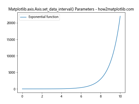
In this example, we plot an exponential function and use the Matplotlib.axis.Axis.set_data_interval() function to set the y-axis range from 0 to 1000. This allows us to focus on a specific portion of the exponential curve.
Applying Matplotlib.axis.Axis.set_data_interval() to Different Axis Types
The Matplotlib.axis.Axis.set_data_interval() function can be applied to both x and y axes, as well as to secondary axes. Let’s explore how to use this function with different axis types.
X-Axis Application
We’ve already seen an example of applying Matplotlib.axis.Axis.set_data_interval() to the x-axis. Here’s another example that demonstrates its use in a bar plot:
import matplotlib.pyplot as plt
import numpy as np

# Create sample data
categories = ['A', 'B', 'C', 'D', 'E']
values = [3, 7, 2, 5, 8]

# Create a bar plot
fig, ax = plt.subplots()
ax.bar(categories, values)

# Set the data interval for the x-axis
ax.xaxis.set_data_interval(-0.5, 3.5)

plt.title('Matplotlib.axis.Axis.set_data_interval() on X-axis - how2matplotlib.com')
plt.show()
Output:
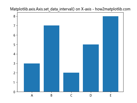
In this example, we create a bar plot and use Matplotlib.axis.Axis.set_data_interval() to focus on the first four categories by setting the x-axis range from -0.5 to 3.5.
Y-Axis Application
Applying Matplotlib.axis.Axis.set_data_interval() to the y-axis is just as straightforward. Here’s an example using a scatter plot:
import matplotlib.pyplot as plt
import numpy as np

# Create sample data
x = np.random.rand(50)
y = np.random.rand(50)

# Create a scatter plot
fig, ax = plt.subplots()
ax.scatter(x, y)

# Set the data interval for the y-axis
ax.yaxis.set_data_interval(0.2, 0.8)

plt.title('Matplotlib.axis.Axis.set_data_interval() on Y-axis - how2matplotlib.com')
plt.show()
Output:
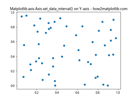
In this scatter plot example, we use Matplotlib.axis.Axis.set_data_interval() to focus on the middle range of y-values by setting the y-axis range from 0.2 to 0.8.
Secondary Axis Application
Matplotlib.axis.Axis.set_data_interval() can also be applied to secondary axes. Here’s an example that demonstrates this:
import matplotlib.pyplot as plt
import numpy as np

# Create sample data
x = np.linspace(0, 10, 100)
y1 = np.sin(x)
y2 = np.cos(x)

# Create a plot with two y-axes
fig, ax1 = plt.subplots()
ax2 = ax1.twinx()

ax1.plot(x, y1, 'b-', label='Sine')
ax2.plot(x, y2, 'r-', label='Cosine')

# Set the data interval for the primary y-axis
ax1.yaxis.set_data_interval(-0.5, 0.5)

# Set the data interval for the secondary y-axis
ax2.yaxis.set_data_interval(-1, 1)

plt.title('Matplotlib.axis.Axis.set_data_interval() on Secondary Axis - how2matplotlib.com')
ax1.legend(loc='upper left')
ax2.legend(loc='upper right')
plt.show()
Output:
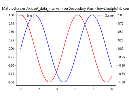
In this example, we create a plot with two y-axes and apply Matplotlib.axis.Axis.set_data_interval() to both the primary and secondary y-axes to customize their ranges independently.
Combining Matplotlib.axis.Axis.set_data_interval() with Other Axis Methods
The Matplotlib.axis.Axis.set_data_interval() function can be used in conjunction with other axis methods to achieve more complex customizations. Let’s explore some common combinations.
Using set_data_interval() with set_view_interval()
The set_view_interval() method is used to set the view limits of an axis. When used together with Matplotlib.axis.Axis.set_data_interval(), you can control both the data range and the displayed range of an axis.
import matplotlib.pyplot as plt
import numpy as np

# Create sample data
x = np.linspace(0, 10, 100)
y = np.sin(x)

# Create a plot
fig, ax = plt.subplots()
ax.plot(x, y)

# Set the data interval for the x-axis
ax.xaxis.set_data_interval(0, 10)

# Set the view interval for the x-axis
ax.xaxis.set_view_interval(2, 8)

plt.title('Combining set_data_interval() and set_view_interval() - how2matplotlib.com')
plt.show()
Output:
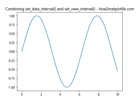
In this example, we set the data interval for the entire range of x (0 to 10), but we set the view interval to display only a portion of that range (2 to 8).
Using set_data_interval() with set_ticks()
You can combine Matplotlib.axis.Axis.set_data_interval() with set_ticks() to customize both the data range and the tick locations on an axis.
import matplotlib.pyplot as plt
import numpy as np

# Create sample data
x = np.linspace(0, 10, 100)
y = np.exp(x)

# Create a plot
fig, ax = plt.subplots()
ax.plot(x, y)

# Set the data interval for the y-axis
ax.yaxis.set_data_interval(0, 20000)

# Set custom ticks for the y-axis
ax.yaxis.set_ticks([0, 5000, 10000, 15000, 20000])

plt.title('Combining set_data_interval() and set_ticks() - how2matplotlib.com')
plt.show()
Output:
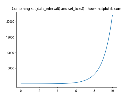
In this example, we set the y-axis data interval from 0 to 20000 and then use set_ticks() to specify custom tick locations within that range.
Advanced Applications of Matplotlib.axis.Axis.set_data_interval()
Now that we’ve covered the basics, let’s explore some more advanced applications of the Matplotlib.axis.Axis.set_data_interval() function.
Dynamic Data Range Adjustment
You can use Matplotlib.axis.Axis.set_data_interval() to dynamically adjust the data range based on certain conditions or user input. Here’s an example that demonstrates this:
import matplotlib.pyplot as plt
import numpy as np

# Create sample data
x = np.linspace(0, 10, 100)
y = np.sin(x)

# Create a plot
fig, ax = plt.subplots()
line, = ax.plot(x, y)

# Function to update the plot
def update_plot(event):
    if event.key == 'up':
        current_ymin, current_ymax = ax.yaxis.get_data_interval()
        ax.yaxis.set_data_interval(current_ymin - 0.1, current_ymax + 0.1)
    elif event.key == 'down':
        current_ymin, current_ymax = ax.yaxis.get_data_interval()
        ax.yaxis.set_data_interval(current_ymin + 0.1, current_ymax - 0.1)
    fig.canvas.draw()

# Connect the key press event to the update function
fig.canvas.mpl_connect('key_press_event', update_plot)

plt.title('Dynamic Data Range Adjustment - how2matplotlib.com')
plt.show()
Output:
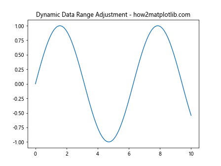
In this interactive example, pressing the up arrow key expands the y-axis range, while pressing the down arrow key contracts it. This demonstrates how Matplotlib.axis.Axis.set_data_interval() can be used for dynamic plot adjustments.
Handling Logarithmic Scales
The Matplotlib.axis.Axis.set_data_interval() function can also be used with logarithmic scales. Here’s an example:
import matplotlib.pyplot as plt
import numpy as np

# Create sample data
x = np.logspace(0, 5, 100)
y = x**2

# Create a plot with logarithmic scales
fig, ax = plt.subplots()
ax.loglog(x, y)

# Set the data interval for both axes
ax.xaxis.set_data_interval(10, 10000)
ax.yaxis.set_data_interval(100, 100000000)

plt.title('Matplotlib.axis.Axis.set_data_interval() with Log Scales - how2matplotlib.com')
plt.show()
Output:
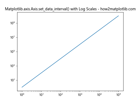
In this example, we create a log-log plot and use Matplotlib.axis.Axis.set_data_interval() to set appropriate ranges for both the x and y axes.
Multiple Subplots with Different Data Intervals
You can use Matplotlib.axis.Axis.set_data_interval() to set different data ranges for multiple subplots. Here’s an example:
import matplotlib.pyplot as plt
import numpy as np

# Create sample data
x = np.linspace(0, 10, 100)
y1 = np.sin(x)
y2 = np.cos(x)
y3 = np.tan(x)

# Create a figure with three subplots
fig, (ax1, ax2, ax3) = plt.subplots(3, 1, figsize=(8, 12))

# Plot data and set data intervals for each subplot
ax1.plot(x, y1)
ax1.yaxis.set_data_interval(-1, 1)
ax1.set_title('Sine - how2matplotlib.com')

ax2.plot(x, y2)
ax2.yaxis.set_data_interval(-0.5, 0.5)
ax2.set_title('Cosine - how2matplotlib.com')

ax3.plot(x, y3)
ax3.yaxis.set_data_interval(-5, 5)
ax3.set_title('Tangent - how2matplotlib.com')

plt.tight_layout()
plt.show()
Output:
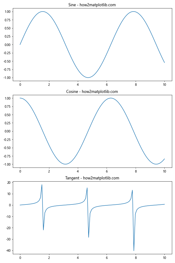
In this example, we create three subplots with different trigonometric functions and use Matplotlib.axis.Axis.set_data_interval() to set appropriate y-axis ranges for each subplot.
Best Practices and Considerations
When using the Matplotlib.axis.Axis.set_data_interval() function, there are several best practices and considerations to keep in mind:
- Data Visibility: Ensure that your chosen data interval doesn’t hide important features of your data. It’s often a good idea to start with the full data range and then adjust as needed.
Consistency: If you’re creating multiple plots for comparison, try to use consistent data intervals across plots to avoid misleading visual comparisons.
Axis Labels: After setting a custom data interval, make sure your axis labels and tick marks are still appropriate and readable.
Combining with Other Methods: Remember that Matplotlib.axis.Axis.set_data_interval() can be combined with other axis methods for more complex customizations.
Performance: For large datasets, setting appropriate data intervals can improve rendering performance by limiting the amount of data that needs to be displayed.
Here’s an example that demonstrates some of these best practices: