How to Add Colorbar to Subplot in Matplotlib
Matplotlib is a popular Python library used for creating static, animated, and interactive visualizations in Python. One common task when creating plots using Matplotlib is adding a colorbar to subplots. In this tutorial, we will explore how to add a colorbar to a subplot in Matplotlib.
Example 1: Creating Subplots
First, let’s start by creating multiple subplots using Matplotlib.
import matplotlib.pyplot as plt

fig, axs = plt.subplots(2, 2)
plt.show()
Output:
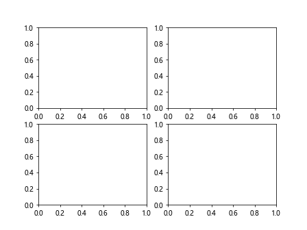
In this example, we create a 2×2 grid of subplots. We will add colorbars to these subplots in the subsequent examples.
Example 2: Adding Colorbar to a Single Subplot
Next, let’s add a colorbar to a single subplot in the plot grid.
import numpy as np
import matplotlib.pyplot as plt

fig, axs = plt.subplots(2, 2)
data = np.random.rand(10,10)
img = axs[0, 0].imshow(data)
fig.colorbar(img, ax=axs[0, 0])
plt.show()
Output:
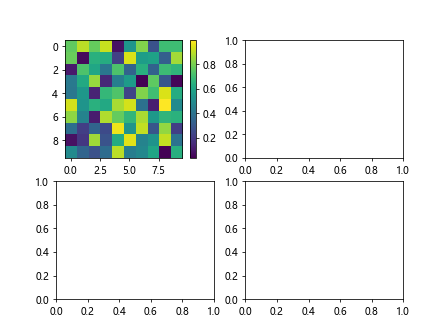
In this example, we generate random data and display it as an image on the first subplot. We then add a colorbar to that subplot.
Example 3: Adding Colorbars to Multiple Subplots
Now, let’s add colorbars to all the subplots in the grid.
import numpy as np
import matplotlib.pyplot as plt

fig, axs = plt.subplots(2, 2)
for ax in axs.flat:
    data = np.random.rand(10,10)
    img = ax.imshow(data)
    fig.colorbar(img, ax=ax)
plt.show()
Output:
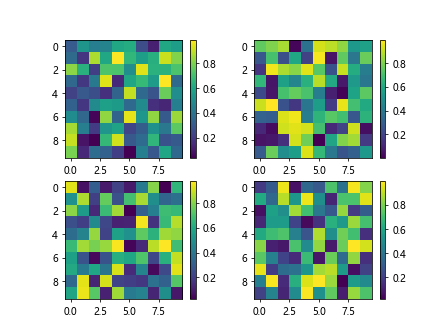
In this example, we iterate over each subplot in the grid, generate random data, display it as an image, and add a colorbar to each subplot.
Example 4: Customizing Colorbars
You can customize the appearance and properties of colorbars in Matplotlib. Let’s create a colorbar with a specific colormap and orientation.
import numpy as np
import matplotlib.pyplot as plt

fig, axs = plt.subplots(2, 2)

data = np.random.rand(10,10)
img = axs[1, 0].imshow(data, cmap='viridis')
cbar = fig.colorbar(img, ax=axs[1, 0], orientation='horizontal')
plt.show()
Output:
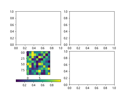
In this example, we set the colormap to ‘viridis’ and change the orientation of the colorbar to horizontal.
Example 5: Setting Colorbar Label
You can also set a label for the colorbar to provide additional information about the data being displayed.
import numpy as np
import matplotlib.pyplot as plt

fig, axs = plt.subplots(2, 2)

data = np.random.rand(10,10)
img = axs[1, 1].imshow(data)
cbar = fig.colorbar(img, ax=axs[1, 1])
cbar.set_label('Value Range')
plt.show()
Output:
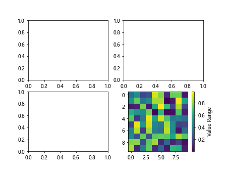
In this example, we add a label ‘Value Range’ to the colorbar to indicate the range of values represented by the colors in the plot.
Example 6: Changing Colorbar Ticks
You can customize the tick positions and labels on the colorbar to better represent the data.
import numpy as np
import matplotlib.pyplot as plt

fig, axs = plt.subplots(2, 2)

data = np.random.rand(10,10)
img = axs[0, 1].imshow(data)
cbar = fig.colorbar(img, ax=axs[0, 1])
cbar.set_ticks([0.2, 0.4, 0.6, 0.8])
cbar.set_ticklabels(['Low', 'Mid', 'High', 'Very High'])
plt.show()
Output:
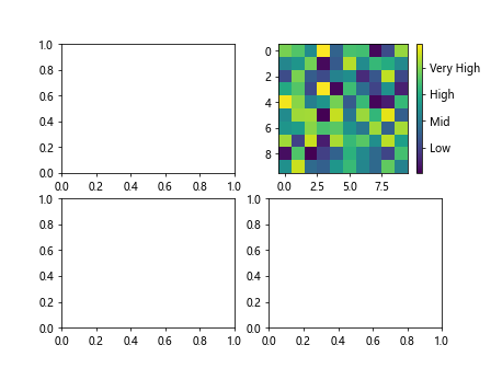
In this example, we set custom tick positions and labels on the colorbar to indicate specific data ranges.
Example 7: Colorbar Range Adjustment
You can adjust the range of values displayed on the colorbar to focus on a specific range of values.
import numpy as np
import matplotlib.pyplot as plt

fig, axs = plt.subplots(2, 2)

data = np.random.rand(10,10) * 100
img = axs[0, 0].imshow(data, vmin=20, vmax=80)
cbar = fig.colorbar(img, ax=axs[0, 0])
plt.show()
Output:
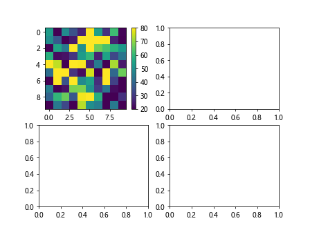
In this example, we limit the range of values displayed on the colorbar between 20 and 80 by setting vmin and vmax parameters.
Example 8: Discrete Colorbar
You can create a discrete colorbar that maps specific values to distinct colors.
import numpy as np
import matplotlib.pyplot as plt

fig, axs = plt.subplots(2, 2)

data = np.random.randint(0, 5, (10,10))
img = axs[1, 1].imshow(data, cmap='tab10')
cbar = fig.colorbar(img, ax=axs[1, 1], ticks=[0, 1, 2, 3, 4])
plt.show()
Output:
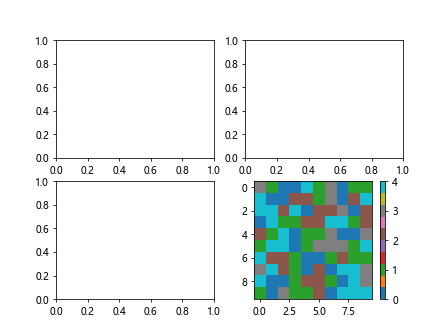
In this example, we generate random integer data and display it with a discrete colormap (tab10) and specify the unique color for each value.
Example 9: Changing Colorbar Size
You can adjust the size of the colorbar to fit the subplot layout better.
import numpy as np
import matplotlib.pyplot as plt

fig, axs = plt.subplots(2, 2)

data = np.random.rand(10, 10)
img = axs[0, 0].imshow(data)
cbar = fig.colorbar(img, ax=axs[0, 0], orientation='vertical', fraction=0.05)
plt.show()
Output:
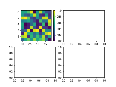
In this example, we set the fraction parameter to 0.05 to make the colorbar smaller and fit better within the subplot.
Example 10: Colorbar Placement
You can specify the position of the colorbar relative to the subplot.
import numpy as np
import matplotlib.pyplot as plt

fig, axs = plt.subplots(2, 2)

data = np.random.rand(10, 10)
img = axs[1, 0].imshow(data)
cbar = fig.colorbar(img, ax=axs[1, 0], location='right')
plt.show()
Output:
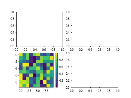
In this example, we position the colorbar to the right of the subplot by setting the location parameter to ‘right’.
Conclusion
In this tutorial, we learned how to add a colorbar to subplots in Matplotlib. We explored various customization options such as setting colormaps, labels, ticks, range adjustment, creating discrete colorbars, changing colorbar size, and placement. By utilizing these techniques, you can enhance the visual representation of your data in Matplotlib plots. Experiment with different settings to create informative and visually appealing colorbars in your subplots.