How to Add Legend in Matplotlib
In this article, we will discuss how to add legends to plots using the popular Python library Matplotlib. Legends are an important component of a plot as they help in identifying the various elements that are being displayed. Matplotlib provides a simple way to add legends to your plots, making them more informative and visually appealing.
1. Basic Legend
You can add a basic legend to a plot in Matplotlib by using the legend function. Here is an example:
import matplotlib.pyplot as plt

x = [1, 2, 3, 4, 5]
y1 = [2, 3, 5, 7, 11]
plt.plot(x, y1, label='Prime Numbers')

plt.legend()
plt.show()
Output:
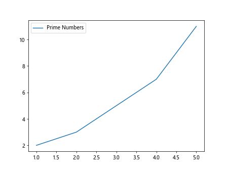
In this example, we plot the y1 values with respect to the x values and assign a label ‘Prime Numbers’ to the line. The legend function is then used to display the legend on the plot.
2. Positioning the Legend
You can specify the position of the legend on the plot by using the loc parameter. Here is an example:
import matplotlib.pyplot as plt

x = [1, 2, 3, 4, 5]
y1 = [2, 3, 5, 7, 11]
plt.plot(x, y1, label='Prime Numbers')

plt.legend(loc='upper right')
plt.show()
Output:
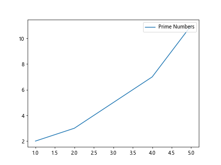
In this example, we use the loc='upper right' parameter to place the legend in the upper right corner of the plot. You can also use other values such as upper left, lower left, lower right, center, etc. to position the legend accordingly.
3. Customizing the Legend
You can customize the appearance of the legend in Matplotlib by specifying various parameters such as font size, background color, border width, etc. Here is an example:
import matplotlib.pyplot as plt

x = [1, 2, 3, 4, 5]
y1 = [2, 3, 5, 7, 11]
plt.plot(x, y1, label='Prime Numbers')

plt.legend(title='Legend', title_fontsize='large', shadow=True)
plt.show()
Output:
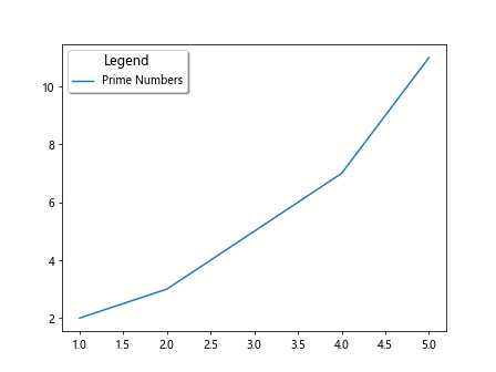
In this example, we add a title to the legend with title='Legend', set the font size of the title to large with title_fontsize='large', and add a shadow effect to the legend with shadow=True.
4. Adding Multiple Legends
You can add multiple legends to a single plot in Matplotlib by calling the legend function multiple times. Here is an example:
import matplotlib.pyplot as plt

x = [1, 2, 3, 4, 5]
y1 = [2, 3, 5, 7, 11]
y2 = [4, 5, 6, 7, 8]

plt.plot(x, y1, label='Prime Numbers')
plt.plot(x, y2, label='Even Numbers')

plt.legend(title='Numbers')
plt.legend(title='Categories')
plt.show()
Output:
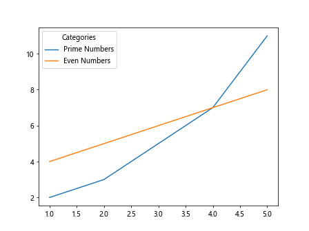
In this example, we add two legends to the plot, one for ‘Prime Numbers’ and another for ‘Even Numbers’. Each call to the legend function adds a new legend to the plot.
5. Customizing the Legend Labels
You can customize the labels of the legend in Matplotlib by specifying them manually using the label parameter. Here is an example:
import matplotlib.pyplot as plt

x = [1, 2, 3, 4, 5]
y1 = [2, 3, 5, 7, 11]
plt.plot(x, y1, label='P\u03C0me Numbers')

plt.legend()
plt.show()
Output:

In this example, we use the \u03C0 Unicode character to represent the Greek letter Pi in the legend label ‘P\u03C0me Numbers’. You can use Unicode characters or LaTeX expressions to customize the labels of the legend.
6. Adding Legends to Subplots
You can add legends to subplots in Matplotlib by iterating over each subplot and adding a legend to it. Here is an example:
import matplotlib.pyplot as plt

fig, axs = plt.subplots(2, 1)

x = [1, 2, 3, 4, 5]
y1 = [2, 3, 5, 7, 11]
y2 = [4, 5, 6, 7, 8]

axs[0].plot(x, y1, label='Prime Numbers')
axs[1].plot(x, y2, label='Even Numbers')

for ax in axs:
    ax.legend()

plt.show()
Output:
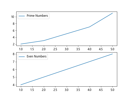
In this example, we create a figure with two subplots using subplots(2, 1) and plot the ‘Prime Numbers’ on the first subplot and ‘Even Numbers’ on the second subplot. We then iterate over each subplot and add a legend to it using the legend function.
7. Styling the Legend
You can style the appearance of the legend in Matplotlib by changing the font, color, size, and other properties. Here is an example:
import matplotlib.pyplot as plt

x = [1, 2, 3, 4, 5]
y1 = [2, 3, 5, 7, 11]
plt.plot(x, y1, label='Prime Numbers')

legend = plt.legend()
for text in legend.get_texts():
    text.set_color('red')

plt.show()
Output:
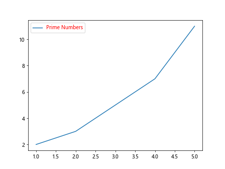
In this example, we change the color of the legend text to red by iterating over each text element in the legend and setting its color property using text.set_color('red'). You can customize various properties of the legend in a similar manner.
8. Adding Legend for Scatter Plots
You can add legends to scatter plots in Matplotlib by setting the label parameter while creating the scatter plot. Here is an example:
import matplotlib.pyplot as plt

x = [1, 2, 3, 4, 5]
y = [2, 3, 5, 7, 11]
sizes = [50, 100, 150, 200, 250]

plt.scatter(x, y, s=sizes, label='Sizes')
plt.legend()

plt.show()
Output:
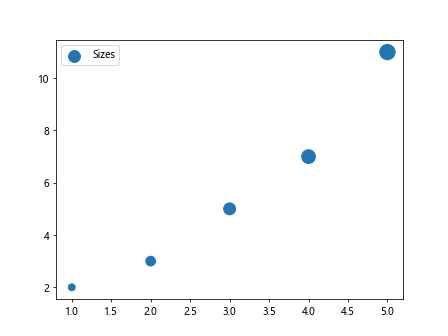
In this example, we create a scatter plot with different sizes for each point and add a legend with the label ‘Sizes’ to the plot. The legend will display the label along with the marker size present in the scatter plot.
9. Adding Legend for Bar Plots
You can add legends to bar plots in Matplotlib by setting the label parameter while creating the bar plot. Here is an example:
import matplotlib.pyplot as plt

x = [1, 2, 3, 4, 5]
y = [2, 3, 5, 7, 11]

plt.bar(x, y, label='Bars')
plt.legend()

plt.show()
Output:
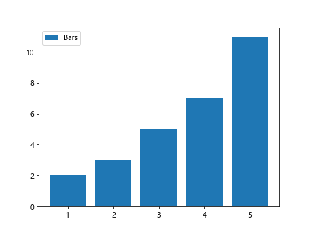
In this example, we create a bar plot with bars representing the values in the y list and add a legend with the label ‘Bars’ to the plot. The legend will display the label associated with the bars in the bar plot.
10. Adding Legend for Pie Charts
You can add legends to pie charts in Matplotlib by setting the label parameter while creating the pie chart. Here is an example:
import matplotlib.pyplot as plt

sizes = [20, 30, 40, 10]
labels = ['A', 'B', 'C', 'D']

plt.pie(sizes, labels=labels)
plt.legend()

plt.show()
Output:
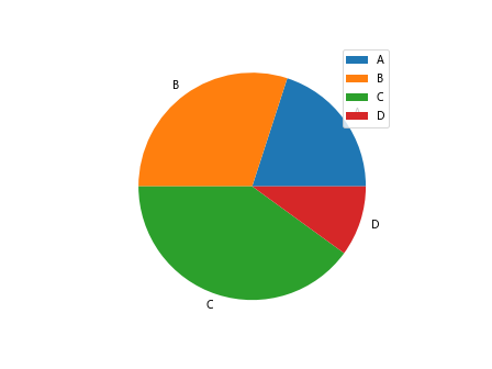
In this example, we create a pie chart with sizes representing the percentage distribution of each category and labels ‘A’, ‘B’, ‘C’, ‘D’ associated with each category. We then add a legend to display the labels along with their corresponding colors in the pie chart.
11. Handling Multiple Legends with Handles
If you have multiple elements in your plot that you want to include in the legend, you can use handles to specify which elements should be included. Here is an example:
import matplotlib.pyplot as plt

x = [1, 2, 3, 4, 5]
y1 = [2, 3, 5, 7, 11]
y2 = [4, 5, 6, 7, 8]

line1, = plt.plot(x, y1, label='Prime Numbers')
line2, = plt.plot(x, y2, label='Even Numbers')

plt.legend(handles=[line1, line2])
plt.show()
Output:
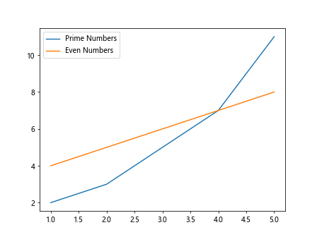
In this example, we assign the return values of the plot function to variables line1 and line2 and then use these handles to specify which elements to include in the legend using the handles parameter of the legend function.
12. Hiding Legend for Specific Elements
You can hide the legend for specific elements in your plot by passing None for their handle in the handles parameter. Here is an example:
import matplotlib.pyplot as plt

x = [1, 2, 3, 4, 5]
y1 = [2, 3, 5, 7, 11]
y2 = [4, 5, 6, 7, 8]

line1, = plt.plot(x, y1, label='Prime Numbers')
line2, = plt.plot(x, y2)

plt.legend(handles=[line1, None])
plt.show()
In this example, we hide the legend for the second line by passing None as its handle in the handles parameter of the legend function.
13. Customizing Legend Labels with LaTeX Expressions
You can use LaTeX expressions to customize the appearance of the legend labels in Matplotlib. Here is an example:
import matplotlib.pyplot as plt

x = [1, 2, 3, 4, 5]
y1 = [2, 3, 5, 7, 11]
plt.plot(x, y1, label='$y = x^2$')

plt.legend()
plt.show()
Output:
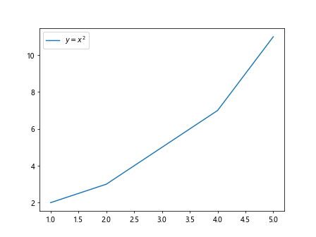
In this example, we use the LaTeX expression $y = x^2$ as the legend label, which will render the equation y = x² in the legend text. You can use LaTeX expressions to include mathematical symbols and equations in the legend labels.
14. Adding Legend Outside the Plot
You can add the legend outside the plot area in Matplotlib by setting the bbox_to_anchor parameter with the desired position. Here is an example:
import matplotlib.pyplot as plt

x = [1, 2, 3, 4, 5]
y1 = [2, 3, 5, 7, 11]
plt.plot(x, y1, label='Prime Numbers')

plt.legend(loc='upper left', bbox_to_anchor=(1, 1))
plt.show()
Output:
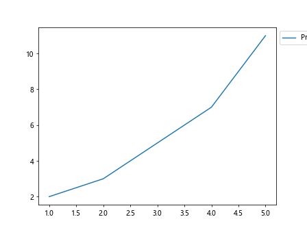
In this example, we add the legend to the upper left corner of the plot but outside the plot area by setting bbox_to_anchor=(1, 1). This will position the legend outside the plot area at the specified location.
15. Adding Legend with Multiple Columns
If you have a large number of legend entries, you can split them into multiple columns for better organization. Here is an example:
import matplotlib.pyplot as plt

x = [1, 2, 3, 4, 5]
y1 = [2, 3, 5, 7, 11]
y2 = [4, 5, 6, 7, 8]

plt.plot(x, y1, label='Prime Numbers')
plt.plot(x, y2, label='Even Numbers')

plt.legend(ncol=2)
plt.show()
Output:
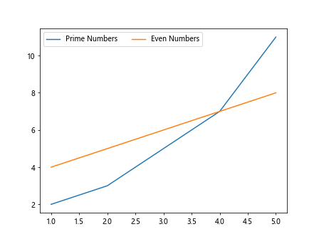
In this example, we create a legend with two columns using the ncol=2 parameter. This will arrange the legend entries in two columns for better readability.
16. Adding Legend with Grid Alignment
You can align the legend entries in a grid layout for a more organized presentation in Matplotlib. Here is an example:
import matplotlib.pyplot as plt

x = [1, 2, 3, 4, 5]
y1 = [2, 3, 5, 7, 11]
y2 = [4, 5, 6, 7, 8]

plt.plot(x, y1, label='Prime Numbers')
plt.plot(x, y2, label='Even Numbers')

plt.legend(ncol=2, mode='expand', bbox_to_anchor=(0.5, -0.15))
plt.show()
Output:
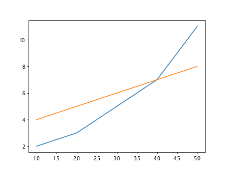
In this example, we align the legend entries in a grid layout with two columns using ncol=2 and mode='expand' parameters. The bbox_to_anchor=(0.5, -0.15) positions the legend below the plot but centered.
17. Using Legend Handlers
You can customize the appearance of the legend items by using different legend handlers in Matplotlib. Here is an example:
import matplotlib.pyplot as plt

x = [1, 2, 3, 4, 5]
y = [2, 3, 5, 7, 11]

plt.plot(x, y, label='Prime Numbers')

plt.legend(handler_map={plt.Line2D: plt.legend.Legend})
plt.show()
In this example, we use the plt.Line2D handler to specify the style of the legend items in the plot. You can use different handlers to customize the appearance of the legend items according to your requirements.
18. Adding Legend with Title
You can add a title to the legend in Matplotlib to provide additional information about the legend entries. Here is an example:
import matplotlib.pyplot as plt

x = [1, 2, 3, 4, 5]
y1 = [2, 3, 5, 7, 11]
y2 = [4, 5, 6, 7, 8]

plt.plot(x, y1, label='Prime Numbers')
plt.plot(x, y2, label='Even Numbers')

plt.legend(title='Categories')
plt.show()
Output:

In this example, we add a title ‘Categories’ to the legend using the title='Categories' parameter. The title provides additional information about the legend entries in the plot.
19. Creating Custom Legends with Patch
You can create custom legends with patches to represent different elements in the plot in Matplotlib. Here is an example:
import matplotlib.pyplot as plt
import matplotlib.patches as mpatches

x = [1, 2, 3, 4, 5]
y = [2, 3, 5, 7, 11]

plt.scatter(x, y, color='blue')
circle_patch = mpatches.Patch(color='blue', label='Data Points')

plt.legend(handles=[circle_patch])
plt.show()
Output:
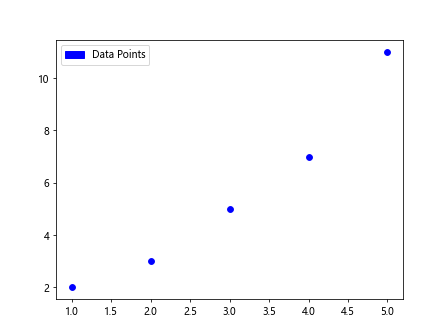
In this example, we create a custom legend with a circle patch representing the data points in the plot. We use the mpatches.Patch class to create a patch object and include it in the legend using the handles parameter of the legend function.
20. Removing Legend from Plot
If you want to remove the legend from your plot in Matplotlib, you can simply omit the label parameter in the plotting functions or call the legend function with no arguments. Here is an example:
import matplotlib.pyplot as plt

x = [1, 2, 3, 4, 5]
y = [2, 3, 5, 7, 11]

plt.plot(x, y)

plt.legend().remove()
plt.show()
In this example, we plot the y values against the x values without specifying a label, which will not include the plot in the legend. We then call the remove method on the legend function to remove the legend from the plot.