Matplotlib fill_between transparency
In Matplotlib, the fill_between function is commonly used to fill the area between two lines on a plot. One useful feature of fill_between is the ability to adjust the transparency of the filled area. This can be helpful for emphasizing certain regions of the plot or creating visually appealing visualizations. In this article, we will explore how to adjust the transparency of the filled area when using fill_between.
Setting Transparency with Alpha Parameter
One way to adjust the transparency of the filled area created by fill_between is by using the alpha parameter. The alpha parameter accepts a value between 0 and 1, where 0 corresponds to completely transparent and 1 corresponds to completely opaque. Let’s take a look at an example:
import matplotlib.pyplot as plt
import numpy as np

x = np.linspace(0, 10, 100)
y1 = np.sin(x)
y2 = np.cos(x)

plt.fill_between(x, y1, y2, alpha=0.5)
plt.show()
Output:
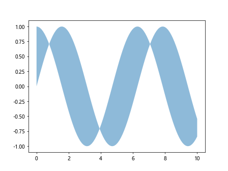
In this example, the alpha=0.5 sets the transparency of the filled area to 50%. You can adjust the value of alpha to control the level of transparency.
Overlaying Multiple Filled Areas
You can also overlay multiple filled areas with different transparencies to create complex visualizations. Let’s demonstrate this with an example:
import matplotlib.pyplot as plt
import numpy as np

x = np.linspace(0, 10, 100)
y1 = np.sin(x)
y2 = np.cos(x)

plt.fill_between(x, y1, y2, alpha=0.3)
plt.fill_between(x, y2, y2-1, alpha=0.7)
plt.show()
Output:
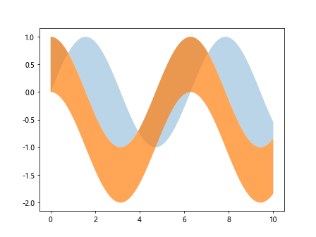
In this example, we are creating two separate filled areas with different transparencies (30% and 70% respectively). This technique can be useful for highlighting specific regions of the plot.
Transitioning Transparency with Colormap
Another approach to adjust the transparency of the filled area is by using a colormap. By specifying a colormap to the fill_between function, you can create a smooth transition of transparency across the filled area. Here’s an example to illustrate this concept:
import matplotlib.pyplot as plt
import numpy as np

x = np.linspace(0, 10, 100)
y1 = np.sin(x)
y2 = np.cos(x)

cmap = plt.get_cmap('Blues')
colors = cmap(np.linspace(0, 1, 100))

plt.fill_between(x, y1, y2, color=colors)
plt.show()
Output:
In this example, we are using a colormap to create a smooth transition of transparency from the start to the end of the filled area. You can experiment with different colormaps to achieve various visual effects.
Customizing Transparency with RGB Values
For more fine-grained control over the transparency of the filled area, you can specify the RGB values along with an alpha value. This allows you to customize the color and transparency of the filled area. Let’s see this in action:
import matplotlib.pyplot as plt
import numpy as np

x = np.linspace(0, 10, 100)
y1 = np.sin(x)
y2 = np.cos(x)

color = (0.2, 0.4, 0.6)  # RGB tuple
plt.fill_between(x, y1, y2, color=color, alpha=0.5)
plt.show()
Output:
In this example, we are setting the RGB color values to (0.2, 0.4, 0.6) and the alpha value to 0.5, resulting in a customized color with 50% transparency.
Creating Non-Rectangular Filled Areas
Sometimes you may want to create non-rectangular filled areas with a specific shape or pattern. Matplotlib allows you to achieve this by defining custom polygons. Let’s create a triangular filled area using the fill_between function:
import matplotlib.pyplot as plt
import numpy as np

x = np.linspace(0, 10, 100)
y1 = np.sin(x)
y2 = np.cos(x)

x_tri = np.array([1, 2, 3])
y_tri = np.array([1, 3, 2])

plt.fill_between(x_tri, y_tri, alpha=0.7)
plt.show()
Output:
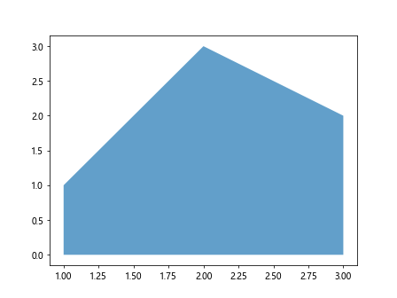
In this example, we are creating a triangular filled area by specifying the x and y coordinates of the vertices. The alpha=0.7 sets the transparency of the filled area to 70%.
Combining Transparency with Other Plot Elements
You can combine transparency with other plot elements, such as lines and markers, to create visually appealing plots. Let’s integrate transparency with a line plot and markers in this example:
import matplotlib.pyplot as plt
import numpy as np

x = np.linspace(0, 10, 100)
y1 = np.sin(x)
y2 = np.cos(x)

plt.plot(x, y1, color='blue', label='sin(x)')
plt.plot(x, y2, color='red', label='cos(x)')
plt.fill_between(x, y1, y2, alpha=0.5, color='gray')
plt.scatter(x[::10], y1[::10], color='blue', alpha=0.7)
plt.show()
Output:
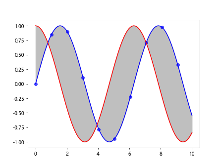
In this example, we have a line plot of sin(x) and cos(x) along with markers at specific points. The fill_between function is used to create a filled area between the two lines with 50% transparency. The markers are also set with 70% transparency to blend in with the plot.
Highlighting Specific Regions
Adjusting the transparency of filled areas can help highlight specific regions of interest in your plot. Let’s demonstrate by highlighting the region where sin(x) is greater than cos(x):
import matplotlib.pyplot as plt
import numpy as np

x = np.linspace(0, 10, 100)
y1 = np.sin(x)
y2 = np.cos(x)

mask = y1 > y2
plt.fill_between(x, y1, y2, where=mask, alpha=0.5, color='green')
plt.show()
Output:
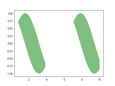
In this example, we use a boolean mask to specify the region where sin(x) is greater than cos(x). The fill_between function is then applied with a green color and 50% transparency to highlight this specific region.
Using Transparency with Subplots
When working with subplots in Matplotlib, you can apply transparency to filled areas in individual subplots. Let’s create a figure with two subplots, each showing a different filled area with transparency:
import matplotlib.pyplot as plt
import numpy as np

x = np.linspace(0, 10, 100)
y1 = np.sin(x)
y2 = np.cos(x)

fig, axs = plt.subplots(2, 1, figsize=(8, 6))

axs[0].fill_between(x, y1, y2, alpha=0.3, color='blue')
axs[1].fill_between(x, y2, y2-1, alpha=0.7, color='red')

plt.show()
Output:
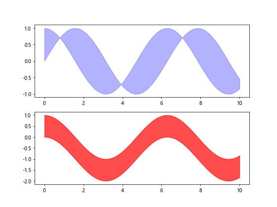
In this example, we are creating a figure with two subplots arranged vertically. Each subplot contains a filled area with a different transparency level and color. This allows for a clear visualization of multiple filled areas with varying opacities.
Handling Transparency in Legend
When using transparency in filled areas, it’s essential to handle the transparency of the legend appropriately. By default, the legend may not display the correct transparency level. Let’s demonstrate how to adjust the legend transparency:
import matplotlib.pyplot as plt
import numpy as np

x = np.linspace(0, 10, 100)
y1 = np.sin(x)
y2 = np.cos(x)

splt.fill_between(x, y1, y2, alpha=0.5, label='Filled Area')
plt.legend(framealpha=0.7)
plt.show()
In this example, we set the transparency of the legend frame to 70% using the framealpha parameter. This ensures that the legend is consistent with the transparency level of the filled area in the plot.
Conclusion
Adjusting the transparency of filled areas in Matplotlib can enhance the visual appeal of your plots and help emphasize specific regions. By utilizing the alpha parameter, colormaps, RGB values, and custom polygons, you can create eye-catching visualizations with varying levels of transparency. Experiment with different techniques and explore the diverse possibilities of using transparency in filled areas to elevate your data visualizations.