Programming with fig, ax = plt.subplots()
When working with Matplotlib in Python, a common way to create a figure and its associated axes is by using the plt.subplots() function. This function creates a new figure and adds a set of subplots in a single call, which is convenient for creating multiple plots in the same figure. In this article, we will explore how to use the plt.subplots() function in various scenarios.
Basic Usage
The most basic way to use plt.subplots() is to create a single subplot in a figure. Here’s an example:
import matplotlib.pyplot as plt

fig, ax = plt.subplots()
ax.plot([1, 2, 3, 4], [1, 4, 9, 16])
plt.show()
Output:
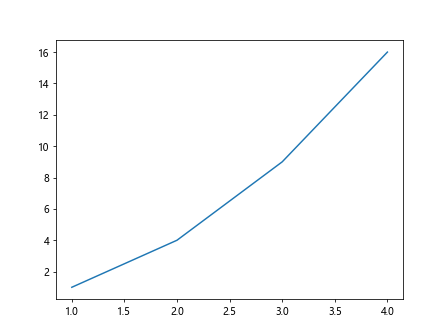
In this example, we create a single subplot and plot a simple line graph with the plot() method of the axes object.
Multiple Subplots
You can also create multiple subplots in a single figure by specifying the number of rows and columns when calling plt.subplots(). Here’s an example:
import matplotlib.pyplot as plt
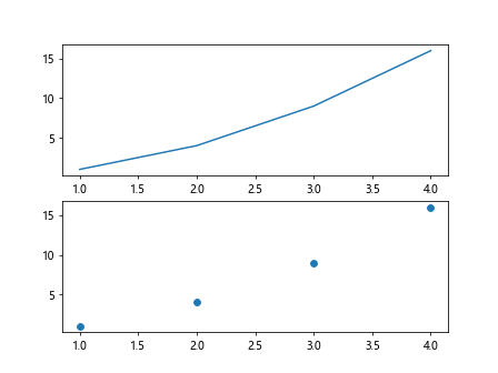
fig, axs = plt.subplots(2, 2)
axs[0, 0].plot([1, 2, 3, 4], [1, 4, 9, 16])
axs[0, 1].scatter([1, 2, 3, 4], [1, 4, 9, 16])
axs[1, 0].bar([1, 2, 3, 4], [1, 4, 9, 16])
axs[1, 1].hist([1, 2, 3, 4, 4, 4, 3, 2, 1])
plt.show()
Output:
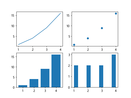
In this example, we create a 2×2 grid of subplots and plot a line graph, scatter plot, bar plot, and histogram on each subplot.
Specifying Figure Size
You can also specify the size of the figure by providing the figsize parameter to plt.subplots(). This parameter takes a tuple of width and height in inches. Here’s an example:
import matplotlib.pyplot as plt

fig, ax = plt.subplots(figsize=(8, 4))
ax.plot([1, 2, 3, 4], [1, 4, 9, 16])
plt.show()
Output:
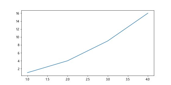
In this example, we create a figure with a size of 8×4 inches.
Sharing Axes
By default, each subplot created with plt.subplots() has its own set of axes. However, you can share the axes between subplots by specifying the sharex or sharey parameters when calling plt.subplots(). Here’s an example:
import matplotlib.pyplot as plt
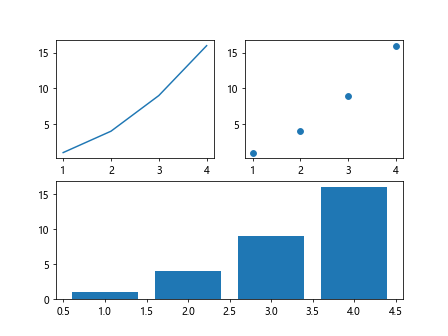
fig, axs = plt.subplots(2, 2, sharex=True, sharey=True)
axs[0, 0].plot([1, 2, 3, 4], [1, 4, 9, 16])
axs[0, 1].scatter([1, 2, 3, 4], [1, 4, 9, 16])
axs[1, 0].bar([1, 2, 3, 4], [1, 4, 9, 16])
axs[1, 1].hist([1, 2, 3, 4, 4, 4, 3, 2, 1])
plt.show()
Output:
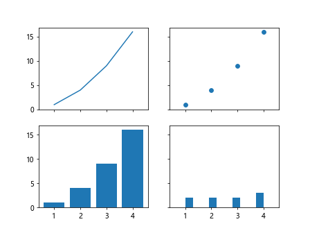
In this example, we create a 2×2 grid of subplots with shared x and y axes.
Subplot Spacing
You can adjust the spacing between subplots by providing the hspace and wspace parameters to plt.subplots(). These parameters control the height and width space between subplots, respectively. Here’s an example:
import matplotlib.pyplot as plt

fig, axs = plt.subplots(2, 2, figsize=(8, 6), hspace=0.5, wspace=0.2)
axs[0, 0].plot([1, 2, 3, 4], [1, 4, 9, 16])
axs[0, 1].scatter([1, 2, 3, 4], [1, 4, 9, 16])
axs[1, 0].bar([1, 2, 3, 4], [1, 4, 9, 16])
axs[1, 1].hist([1, 2, 3, 4, 4, 4, 3, 2, 1])
plt.show()
In this example, we create a 2×2 grid of subplots with adjusted horizontal and vertical spacing.
Customizing Subplots
You can further customize each subplot by accessing and modifying the properties of the axes objects. Here’s an example:
import matplotlib.pyplot as plt

fig, ax = plt.subplots()
ax.plot([1, 2, 3, 4], [1, 4, 9, 16])
ax.set_title('Example Plot')
ax.set_xlabel('X-axis')
ax.set_ylabel('Y-axis')
plt.show()
Output:
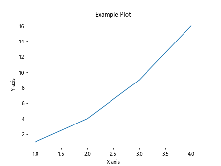
In this example, we add a title to the subplot and label the x and y axes.
Saving Figures
You can save the figures created with plt.subplots() to a file by calling the savefig() method on the figure object. Here’s an example:
import matplotlib.pyplot as plt

fig, ax = plt.subplots()
ax.plot([1, 2, 3, 4], [1, 4, 9, 16])
fig.savefig('example_plot.png')
In this example, we save the figure as a PNG file named example_plot.png.
Removing Spines
You can remove the spines (borders) of the plot by accessing the spines of the axes object and setting their visibility to False. Here’s an example:
import matplotlib.pyplot as plt

fig, ax = plt.subplots()
ax.plot([1, 2, 3, 4], [1, 4, 9, 16])
ax.spines['top'].set_visible(False)
ax.spines['right'].set_visible(False)
plt.show()
Output:
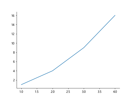
In this example, we remove the top and right spines of the plot.
Setting Axis Limits
You can set the limits of the x and y axes by calling the set_xlim() and set_ylim() methods on the axes object. Here’s an example:
import matplotlib.pyplot as plt

fig, ax = plt.subplots()
ax.plot([1, 2, 3, 4], [1, 4, 9, 16])
ax.set_xlim(0, 5)
ax.set_ylim(0, 20)
plt.show()
Output:
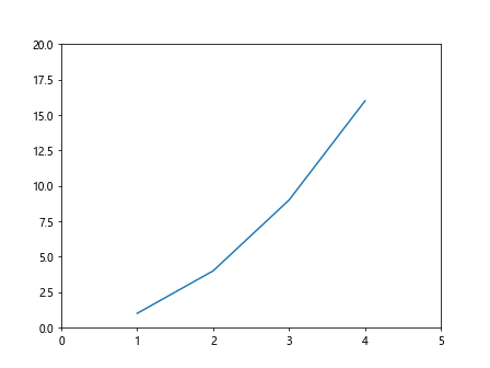
In this example, we set the x-axis limits to 0-5 and the y-axis limits to 0-20.
Annotations
You can add annotations to the plot by calling the annotate() method on the axes object. Here’s an example:
import matplotlib.pyplot as plt

fig, ax = plt.subplots()
ax.plot([1, 2, 3, 4], [1, 4, 9, 16])
ax.annotate('Max Value', xy=(3, 9), xytext=(3.5, 10),
            arrowprops=dict(facecolor='black', shrink=0.05))
plt.show()
Output:
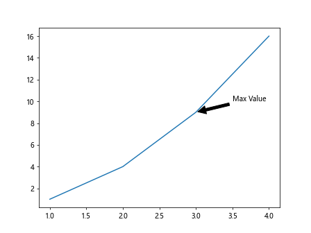
In this example, we add an annotation to the plot at the point (3, 9) with an arrow pointing to (3.5, 10).
Subplot Grid
You can also create subplots in a grid layout using the subplot() function. Here’s an example:
import matplotlib.pyplot as plt

plt.subplot(2, 1, 1)
plt.plot([1, 2, 3, 4], [1, 4, 9, 16])

plt.subplot(2, 1, 2)
plt.scatter([1, 2, 3, 4], [1, 4, 9, 16])

plt.show()
Output:
In this example, we create a grid layout with 2 rows and 1 column of subplots using the subplot()function and plot a line graph and scatter plot in each subplot.
GridSpec
You can also create subplots with a more complex layout using the GridSpec class from the matplotlib.gridspec module. Here’s an example:
import matplotlib.pyplot as plt
import matplotlib.gridspec as gridspec

fig = plt.figure()
gs = gridspec.GridSpec(2, 2)

ax1 = fig.add_subplot(gs[0, 0])
ax1.plot([1, 2, 3, 4], [1, 4, 9, 16])

ax2 = fig.add_subplot(gs[0, 1])
ax2.scatter([1, 2, 3, 4], [1, 4, 9, 16])

ax3 = fig.add_subplot(gs[1, :])
ax3.bar([1, 2, 3, 4], [1, 4, 9, 16])

plt.show()
Output:
In this example, we create a figure with subplots arranged in a 2×2 grid using the GridSpec class.
Twin Axes
You can create plots with dual y-axes by using the twinx() or twiny() methods on the axes object. Here’s an example:
import matplotlib.pyplot as plt

fig, ax1 = plt.subplots()
ax1.plot([1, 2, 3, 4], [1, 4, 9, 16], color='r')
ax1.set_ylabel('Primary Y-axis')

ax2 = ax1.twinx()
ax2.plot([1, 2, 3, 4], [2, 4, 6, 8], color='b')
ax2.set_ylabel('Secondary Y-axis')

plt.show()
Output:
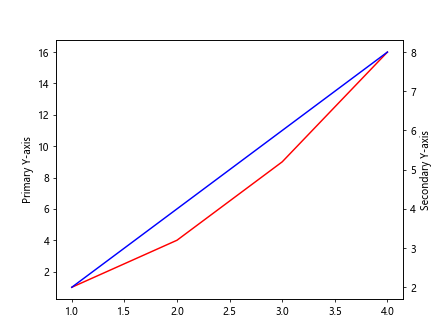
In this example, we create a plot with two y-axes, where one plot is in red and the other in blue.
Adding Legends
You can add legends to the plot by calling the legend() method on the axes object and passing the labels as a list. Here’s an example:
import matplotlib.pyplot as plt

fig, ax = plt.subplots()
ax.plot([1, 2, 3, 4], [1, 4, 9, 16], label='Line 1')
ax.scatter([1, 2, 3, 4], [1, 4, 9, 16], label='Points')
ax.legend()

plt.show()
Output:
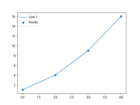
In this example, we add a legend to the plot with labels ‘Line 1’ and ‘Points’.
Color Maps
You can use color maps to specify the color scheme of your plots. Matplotlib provides a range of built-in color maps that you can use. Here’s an example:
import matplotlib.pyplot as plt
import numpy as np

x = np.linspace(0, 10, 100)
y = np.sin(x)

fig, ax = plt.subplots()
sc = ax.scatter(x, y, c=y, cmap='viridis')
plt.colorbar(sc)

plt.show()
Output:
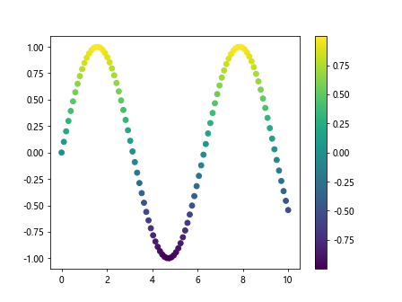
In this example, we use the ‘viridis’ color map to color the scatter plot based on the y-values.
Subplotting with Pandas DataFrames
You can create subplots directly from Pandas DataFrames by using the plot() method on the DataFrame object. Here’s an example:
import matplotlib.pyplot as plt
import pandas as pd

data = {'x': [1, 2, 3, 4, 5],
        'y1': [2, 4, 6, 8, 10],
        'y2': [1, 3, 5, 7, 9]}

df = pd.DataFrame(data)

fig, axs = plt.subplots(2)
df.plot(x='x', y='y1', ax=axs[0])
df.plot(x='x', y='y2', ax=axs[1])

plt.show()
Output:
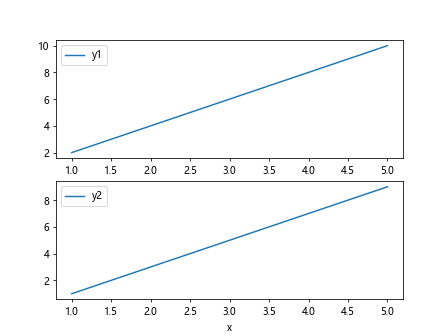
In this example, we create subplots from a Pandas DataFrame and plot two columns against the x-axis on separate subplots.
Conclusion
In this article, we have explored how to use the fig, ax = plt.subplots() function in Matplotlib to create figures and subplots for visualizing data. By following the examples provided, you can create complex layouts and customize your plots to suit your needs. Experiment with different parameters and settings to create visually appealing and informative plots for your data analysis and visualization tasks.