How to plot multiple lines in Matplotlib
Matplotlib is a popular plotting library in Python that is widely used for creating static, animated, and interactive visualizations. In this article, we will explore how to plot multiple lines in Matplotlib to create line charts with multiple series.
1. Basic Line Plot
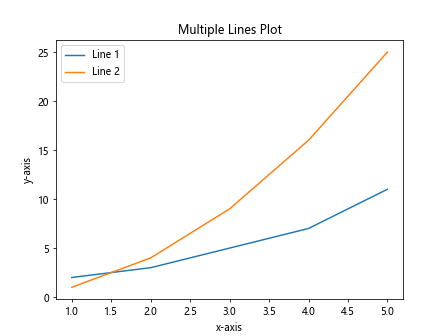
The simplest way to plot multiple lines in Matplotlib is by using the plot function. You can pass multiple arrays of data as arguments to plot multiple lines on the same plot.
import matplotlib.pyplot as plt

x = [1, 2, 3, 4, 5]
y1 = [2, 3, 5, 7, 11]
y2 = [1, 4, 9, 16, 25]

plt.plot(x, y1)
plt.plot(x, y2)

plt.xlabel('x-axis')
plt.ylabel('y-axis')
plt.title('Multiple Lines Plot')
plt.legend(['Line 1', 'Line 2'])

plt.show()
Output:
2. Customizing Line Styles
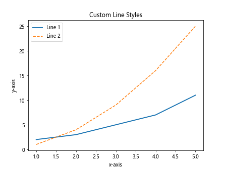
You can customize the line styles of each line by specifying the linestyle and linewidth parameters in the plot function.
import matplotlib.pyplot as plt

x = [1, 2, 3, 4, 5]
y1 = [2, 3, 5, 7, 11]
y2 = [1, 4, 9, 16, 25]

plt.plot(x, y1, linestyle='-', linewidth=2) # solid line with width 2
plt.plot(x, y2, linestyle='--', linewidth=1.5) # dashed line with width 1.5

plt.xlabel('x-axis')
plt.ylabel('y-axis')
plt.title('Custom Line Styles')
plt.legend(['Line 1', 'Line 2'])

plt.show()
Output:
3. Changing Line Colors
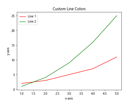
You can also change the line colors of each line by specifying the color parameter in the plot function. Matplotlib supports a wide range of colors including named colors, hexadecimal colors, and RGB tuples.
import matplotlib.pyplot as plt

x = [1, 2, 3, 4, 5]
y1 = [2, 3, 5, 7, 11]
y2 = [1, 4, 9, 16, 25]

plt.plot(x, y1, color='red') # red line
plt.plot(x, y2, color='#008000') # green line

plt.xlabel('x-axis')
plt.ylabel('y-axis')
plt.title('Custom Line Colors')
plt.legend(['Line 1', 'Line 2'])

plt.show()
Output:
4. Adding Markers to Data Points
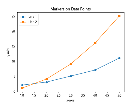
You can add markers to data points on each line by specifying the marker parameter in the plot function. This can help in visualizing individual data points on the plot.
import matplotlib.pyplot as plt

x = [1, 2, 3, 4, 5]
y1 = [2, 3, 5, 7, 11]
y2 = [1, 4, 9, 16, 25]

plt.plot(x, y1, marker='o') # circle markers
plt.plot(x, y2, marker='s') # square markers

plt.xlabel('x-axis')
plt.ylabel('y-axis')
plt.title('Markers on Data Points')
plt.legend(['Line 1', 'Line 2'])

plt.show()
Output:
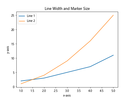
5. Specifying Line Width and Marker Size
You can control the line width and marker size for each line by specifying the linewidth and markersize parameters in the plot function.
import matplotlib.pyplot as plt

x = [1, 2, 3, 4, 5]
y1 = [2, 3, 5, 7, 11]
y2 = [1, 4, 9, 16, 25]

plt.plot(x, y1, linewidth=2, markersize=8) # line width 2, marker size 8
plt.plot(x, y2, linewidth=1.5, markersize=6) # line width 1.5, marker size 6

plt.xlabel('x-axis')
plt.ylabel('y-axis')
plt.title('Line Width and Marker Size')
plt.legend(['Line 1', 'Line 2'])

plt.show()
Output:
6. Using Different Line Styles and Markers
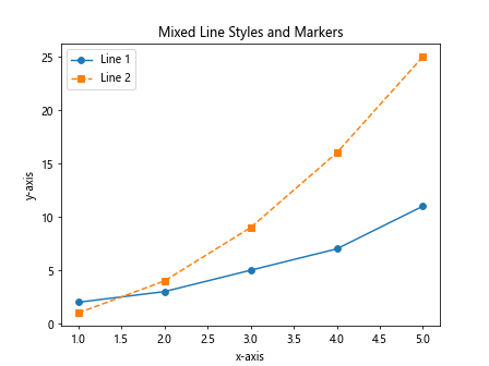
You can combine different line styles and markers on each line by specifying the linestyle and marker parameters in the plot function.
import matplotlib.pyplot as plt

x = [1, 2, 3, 4, 5]
y1 = [2, 3, 5, 7, 11]
y2 = [1, 4, 9, 16, 25]

plt.plot(x, y1, linestyle='-', marker='o') # solid line with circle markers
plt.plot(x, y2, linestyle='--', marker='s') # dashed line with square markers

plt.xlabel('x-axis')
plt.ylabel('y-axis')
plt.title('Mixed Line Styles and Markers')
plt.legend(['Line 1', 'Line 2'])

plt.show()
Output:
7. Changing Line Width and Marker Size for Each Line
You can specify different line widths and marker sizes for each line by passing a list of values to thelinewidth and markersize parameters in the plot function.
import matplotlib.pyplot as plt

x = [1, 2, 3, 4, 5]
y1 = [2, 3, 5, 7, 11]
y2 = [1, 4, 9, 16, 25]

plt.plot(x, y1, linewidth=[2, 3, 4, 1, 2], markersize=[6, 8, 10, 4, 6]) # varying line widths and marker sizes
plt.plot(x, y2, linewidth=[1.5, 2.5, 3.5, 1, 1], markersize=[4, 6, 8, 3, 4]) # varying line widths and marker sizes

plt.xlabel('x-axis')
plt.ylabel('y-axis')
plt.title('Variable Line Width and Marker Size')
plt.legend(['Line 1', 'Line 2'])

plt.show()
8. Creating Subplots with Multiple Lines
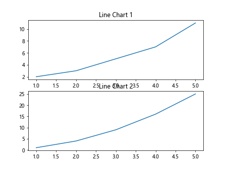
You can create subplots with multiple lines using the subplots function in Matplotlib. This allows you to plot multiple line charts in separate axes within a single figure.
import matplotlib.pyplot as plt

x = [1, 2, 3, 4, 5]
y1 = [2, 3, 5, 7, 11]
y2 = [1, 4, 9, 16, 25]

fig, axs = plt.subplots(2)

axs[0].plot(x, y1)
axs[0].set_title('Line Chart 1')

axs[1].plot(x, y2)
axs[1].set_title('Line Chart 2')

plt.show()
Output:
9. Adding Annotations to Plot
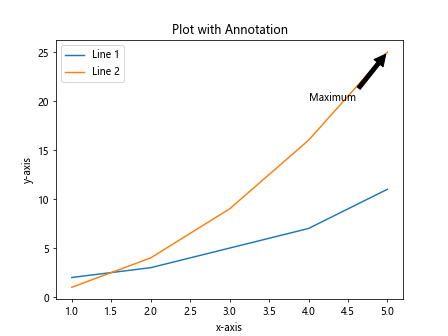
You can add annotations to your plot to provide additional information about the data points or lines. Annotations can include text, arrows, and shapes.
import matplotlib.pyplot as plt

x = [1, 2, 3, 4, 5]
y1 = [2, 3, 5, 7, 11]
y2 = [1, 4, 9, 16, 25]

plt.plot(x, y1)
plt.plot(x, y2)

plt.annotate('Maximum', xy=(5, 25), xytext=(4, 20),
             arrowprops=dict(facecolor='black', shrink=0.05))

plt.xlabel('x-axis')
plt.ylabel('y-axis')
plt.title('Plot with Annotation')
plt.legend(['Line 1', 'Line 2'])

plt.show()
Output:
10. Using Legends to Identify Lines
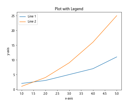
Legends help in identifying different lines on a plot. You can add legends to your plot by passing labels to the legend function after plotting the lines.
import matplotlib.pyplot as plt

x = [1, 2, 3, 4, 5]
y1 = [2, 3, 5, 7, 11]
y2 = [1, 4, 9, 16, 25]

plt.plot(x, y1)
plt.plot(x, y2)

plt.xlabel('x-axis')
plt.ylabel('y-axis')
plt.title('Plot with Legend')
plt.legend(['Line 1', 'Line 2'])

plt.show()
Output:
11. Changing Legend Location
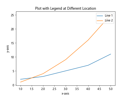
You can change the location of the legend on the plot by specifying the loc parameter in the legend function. This allows you to place the legend at different positions on the plot.
import matplotlib.pyplot as plt

x = [1, 2, 3, 4, 5]
y1 = [2, 3, 5, 7, 11]
y2 = [1, 4, 9, 16, 25]

plt.plot(x, y1)
plt.plot(x, y2)

plt.xlabel('x-axis')
plt.ylabel('y-axis')
plt.title('Plot with Legend at Different Location')
plt.legend(['Line 1', 'Line 2'], loc='upper right')

plt.show()
Output:
12. Adding Grid to the Plot
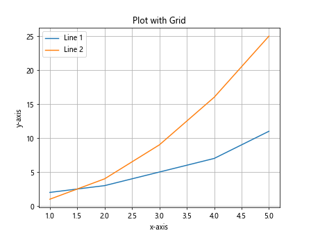
You can add a grid to your plot to help in visually aligning the data points and lines. This can be done by calling the grid function with the desired parameters.
import matplotlib.pyplot as plt

x = [1, 2, 3, 4, 5]
y1 = [2, 3, 5, 7, 11]
y2 = [1, 4, 9, 16, 25]

plt.plot(x, y1)
plt.plot(x, y2)

plt.xlabel('x-axis')
plt.ylabel('y-axis')
plt.title('Plot with Grid')
plt.legend(['Line 1', 'Line 2'])

plt.grid(True)

plt.show()
Output:
13. Changing Plot Style
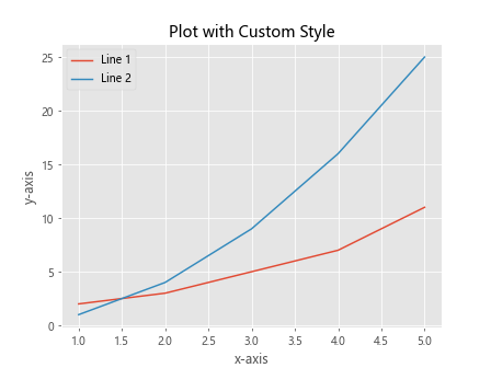
Matplotlib provides various plot styles that can be used to customize the appearance of the plot. You can change the plot style by calling the style function with the desired style name.
import matplotlib.pyplot as plt

plt.style.use('ggplot')

x = [1, 2, 3, 4, 5]
y1 = [2, 3, 5, 7, 11]
y2 = [1, 4, 9, 16, 25]

plt.plot(x, y1)
plt.plot(x, y2)

plt.xlabel('x-axis')
plt.ylabel('y-axis')
plt.title('Plot with Custom Style')
plt.legend(['Line 1', 'Line 2'])

plt.show()
Output:
14. Saving Plot to File
You can save the plot with multiple lines to a file in various formats such as PNG, JPEG, PDF, or SVG. This can be done by calling the savefig function with the desired file name and format.
import matplotlib.pyplot as plt

x = [1, 2, 3, 4, 5]
y1 = [2, 3, 5, 7, 11]
y2 = [1, 4, 9, 16, 25]

plt.plot(x, y1)
plt.plot(x, y2)

plt.xlabel('x-axis')
plt.ylabel('y-axis')
plt.title('Save Plot to File')
plt.legend(['Line 1', 'Line 2'])

plt.savefig('multiple_lines_plot.png')
15. Plotting Logarithmic Scale
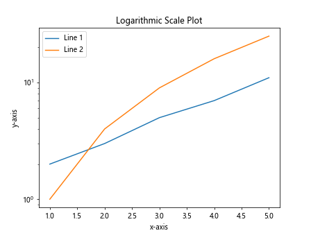
You can plot multiple lines on a logarithmic scale by changing the scale of the axes using the semilogy or semilogx functions.
import matplotlib.pyplot as plt

x = [1, 2, 3, 4, 5]
y1 = [2, 3, 5, 7, 11]
y2 = [1, 4, 9, 16, 25]

plt.semilogy(x, y1) # plot line 1 on logarithmic scale
plt.semilogy(x, y2) # plot line 2 on logarithmic scale

plt.xlabel('x-axis')
plt.ylabel('y-axis')
plt.title('Logarithmic Scale Plot')
plt.legend(['Line 1', 'Line 2'])

plt.show()
Output:
16. Plotting on a Secondary Y-Axis
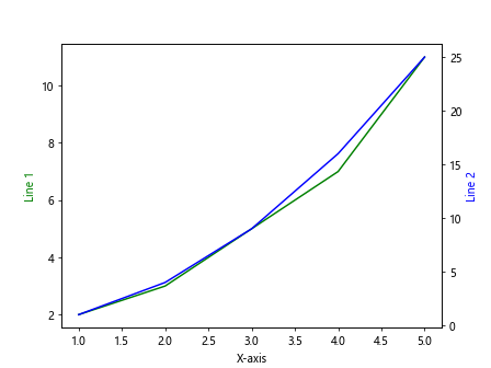
You can plot multiple lines with different scales on a secondary y-axis by using the twinx function to create a secondary axes instance.
import matplotlib.pyplot as plt

x = [1, 2, 3, 4, 5]
y1 = [2, 3, 5, 7, 11]
y2 = [1, 4, 9, 16, 25]

fig, ax1 = plt.subplots()

ax2 = ax1.twinx()
ax1.plot(x, y1, 'g-')
ax2.plot(x, y2, 'b-')

ax1.set_xlabel('X-axis')
ax1.set_ylabel('Line 1', color='g')
ax2.set_ylabel('Line 2', color='b')

plt.show()
Output:
17. Plotting Error Bars
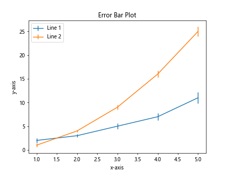
You can plot multiple lines with error bars to visualize the variability or uncertainty of the data points by using the errorbar function.
import matplotlib.pyplot as plt
import numpy as np

x = np.array([1, 2, 3, 4, 5])
y1 = np.array([2, 3, 5, 7, 11])
y2 = np.array([1, 4, 9, 16, 25])
yerr1 = np.array([0.5, 0.3, 0.6, 0.8, 1.2])
yerr2 = np.array([0.4, 0.2, 0.5, 0.7, 1.0])

plt.errorbar(x, y1, yerr=yerr1)
plt.errorbar(x, y2, yerr=yerr2)

plt.xlabel('x-axis')
plt.ylabel('y-axis')
plt.title('Error Bar Plot')
plt.legend(['Line 1', 'Line 2'])

plt.show()
Output:
18. Plotting Shaded Error Bands
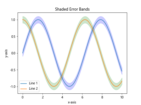
You can plot multiple lines with shaded error bands to show the range of uncertainty around the data points by using the fill_between function.
import matplotlib.pyplot as plt
import numpy as np

x = np.linspace(0, 10, 100)
y1 = np.sin(x)
y2 = np.cos(x)
error = 0.1

plt.plot(x, y1)
plt.plot(x, y2)

plt.fill_between(x, y1-error, y1+error, color='blue', alpha=0.2)
plt.fill_between(x, y2-error, y2+error, color='green', alpha=0.2)

plt.xlabel('x-axis')
plt.ylabel('y-axis')
plt.title('Shaded Error Bands')
plt.legend(['Line 1', 'Line 2'])

plt.show()
Output:
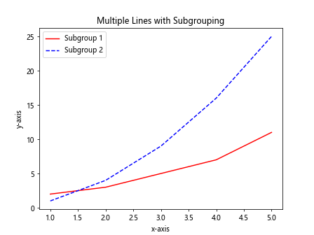
19. Plotting Multiple Lines with Subgrouping
You can plot multiple lines with subgrouping by using different colors or markers for each subgroup within the lines. This can help in identifying different categories within the data.
import matplotlib.pyplot as plt

x = [1, 2, 3, 4, 5]
y1 = [2, 3, 5, 7, 11]
y2 = [1, 4, 9, 16, 25]

plt.plot(x, y1, color='red') # subgroup 1 with red color
plt.plot(x, y2, color='blue', linestyle='--') # subgroup 2 with blue color and dashed line

plt.xlabel('x-axis')
plt.ylabel('y-axis')
plt.title('Multiple Lines with Subgrouping')
plt.legend(['Subgroup 1', 'Subgroup 2'])

plt.show()
Output:
20. Plotting Multiple Lines with Interactive Legends
You can plot multiple lines with interactive legends that allow users to toggle the visibility of each line by clicking on the legend. This can be done by using the legend
import matplotlib.pyplot as plt
from matplotlib.lines import Line2D

x = [1, 2, 3, 4, 5]
y1 = [2, 3, 5, 7, 11]
y2 = [1, 4, 9, 16, 25]

line1, = plt.plot(x, y1)
line2, = plt.plot(x, y2)

plt.xlabel('x-axis')
plt.ylabel('y-axis')
plt.title('Interactive Legends')
plt.legend([line1, line2], ['Line 1', 'Line 2'], handler_map={Line2D: HighlightLegendHandler()})

plt.show()