Grid Behind Plot in Matplotlib
When creating plots using Matplotlib, it is common to add grid lines for better visualization of the data. By default, these grid lines are plotted in front of the data points, which can sometimes obscure the data. In this tutorial, we will learn how to plot the grid lines behind the data in Matplotlib.
Adding Grid Behind Plot
To plot the grid lines behind the data in Matplotlib, we can use the zorder parameter when adding the grid lines. The zorder parameter controls the order in which the elements are drawn on the plot. By setting a lower zorder value for the grid lines, we can ensure that they are plotted behind the data.
Here is an example code snippet that demonstrates adding grid lines behind the plot:
import matplotlib.pyplot as plt

# Generate some data
x = [1, 2, 3, 4, 5]
y = [2, 3, 5, 7, 11]

# Plot the data
plt.plot(x, y)

# Add grid lines behind the plot
plt.grid(zorder=0)

plt.show()
Output:
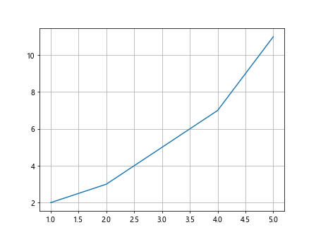
In the code above, we first generate some sample data points x and y. We then plot the data using plt.plot() and add grid lines behind the plot by setting zorder=0 in plt.grid().
Customizing Grid Lines
We can further customize the appearance of the grid lines in Matplotlib. For example, we can change the color, linestyle, and transparency of the grid lines.
Here is an example code snippet that demonstrates customizing the grid lines:
import matplotlib.pyplot as plt

# Generate some data
x = [1, 2, 3, 4, 5]
y = [2, 3, 5, 7, 11]

# Plot the data
plt.plot(x, y)

# Add custom grid lines
plt.grid(color='gray', linestyle='--', alpha=0.5)

plt.show()
Output:
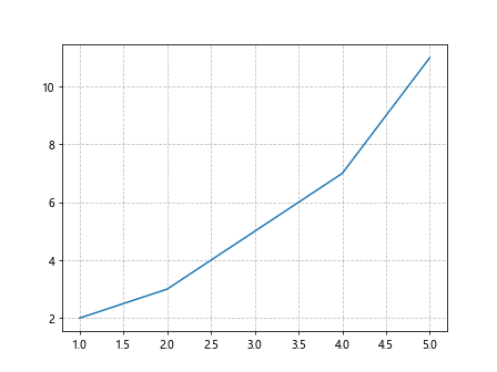
In the code above, we have customized the grid lines to be gray in color, dashed linestyle, and 50% transparency by using the color, linestyle, and alpha parameters in plt.grid().
Multiple Plot Windows
When working with multiple subplots in Matplotlib, we may want to have grid lines behind all the plots. We can achieve this by adding grid lines to the entire figure instead of individual subplots.
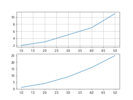
Here is an example code snippet that demonstrates adding grid lines to the entire figure:
import matplotlib.pyplot as plt

# Generate some data
x = [1, 2, 3, 4, 5]
y1 = [2, 3, 5, 7, 11]
y2 = [1, 4, 9, 16, 25]

# Create a figure with two subplots
fig, axs = plt.subplots(2)

# Plot data on the first subplot
axs[0].plot(x, y1)

# Plot data on the second subplot
axs[1].plot(x, y2)

# Add grid lines to the entire figure
plt.grid(zorder=0)

plt.show()
Output:
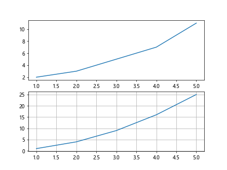
In the code above, we first create a figure with two subplots using plt.subplots(). We then plot data on each subplot and add grid lines to the entire figure by setting zorder=0 in plt.grid().
Changing Grid Line Properties
We can also change the properties of the grid lines, such as the line width and spacing. These properties can help us better visualize the data on the plot.
Here is an example code snippet that demonstrates changing the grid line properties:
import matplotlib.pyplot as plt

# Generate some data
x = [1, 2, 3, 4, 5]
y = [2, 3, 5, 7, 11]

# Plot the data
plt.plot(x, y)

# Change grid line properties
plt.grid(zorder=0, linewidth=1, linestyle=':', alpha=0.8)

plt.show()
Output:
In the code above, we have changed the grid line properties to have a line width of 1, dotted linestyle, and 80% transparency by using the linewidth, linestyle, and alpha parameters in plt.grid().
Grid Lines for Specific Axes
When working with plots that have multiple axes, we may want to add grid lines only to specific axes. We can achieve this by specifying the axis or axes on which to add the grid lines.
Here is an example code snippet that demonstrates adding grid lines to specific axes:
import matplotlib.pyplot as plt

# Generate some data
x = [1, 2, 3, 4, 5]
y1 = [2, 3, 5, 7, 11]
y2 = [1, 4, 9, 16, 25]

# Create a figure with two subplots
fig, axs = plt.subplots(2)

# Plot data on the first subplot
axs[0].plot(x, y1)
axs[0].grid(zorder=0)

# Plot data on the second subplot
axs[1].plot(x, y2)

plt.show()
Output:
In the code above, we first create a figure with two subplots using plt.subplots(). We then plot data on each subplot and add grid lines only to the first subplot by setting zorder=0 in axs[0].grid().
Grid Line Styles
Matplotlib provides various grid line styles that we can use to make our plots visually appealing. Some of the common grid line styles include solid, dashed, and dotted lines.
Here is an example code snippet that demonstrates using different grid line styles:
import matplotlib.pyplot as plt

# Generate some data
x = [1, 2, 3, 4, 5]
y = [2, 3, 5, 7, 11]

# Plot the data
plt.plot(x, y)

# Add grid lines with different styles
plt.grid(zorder=0, linestyle='-', linewidth=1)  # solid lines
plt.grid(zorder=0, linestyle='--', linewidth=1)  # dashed lines
plt.grid(zorder=0, linestyle=':', linewidth=1)  # dotted lines

plt.show()
Output:

In the code above, we have added grid lines with solid, dashed, and dotted line styles by using the linestyle parameter in plt.grid().
Customizing Grid Line Spacing
We can also customize the spacing of the grid lines in Matplotlib. By changing the grid line spacing, we can control the density of the grid lines on the plot.
Here is an example code snippet that demonstrates customizing the spacing of the grid lines:
import matplotlib.pyplot as plt

# Generate some data
x = [1, 2, 3, 4, 5]
y = [2, 3, 5, 7, 11]

# Plot the data
plt.plot(x, y)

# Add grid lines with custom spacing
plt.grid(zorder=0, linestyle='-', linewidth=1)  # default spacing
plt.grid(zorder=0, linestyle='-', linewidth=1, spacing=0.5)  # half spacing
plt.grid(zorder=0, linestyle='-', linewidth=1, spacing=2)  # double spacing

plt.show()
In the code above, we have added grid lines with default spacing, half the spacing, and double the spacing by using the spacing parameter in plt.grid().
Plotting Annotations with Grid Lines
Grid lines can be useful when plotting annotations or highlighting specific points on the plot. By adding grid lines behind the annotations, we can make them stand out more clearly.
Here is an example code snippet that demonstrates plotting annotations with grid lines:
import matplotlib.pyplot as plt
# Generate some data
x = [1, 2, 3, 4, 5]
y = [2, 3, 5, 7, 11]
# Plot the data
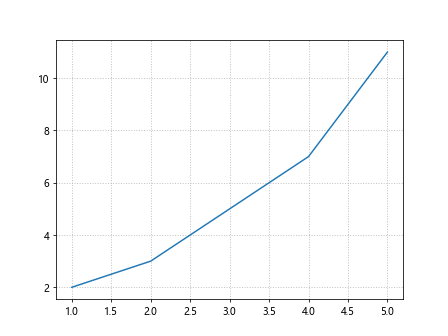
plt.plot(x, y)
# Add annotations
plt.annotate('Max value', xy=(5, 11), xytext=(4, 12),
arrowprops=dict(facecolor='black', shrink=0.05))
# Add grid lines behind the annotations
plt.grid(zorder=0)
plt.show()
Output:
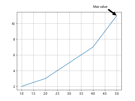
In the code above, we first plot the data points x and y using plt.plot(). We then add an annotation at the point (5, 11) on the plot, indicating the maximum value. Finally, we add grid lines behind the annotations to make them more visible by setting zorder=0 in plt.grid().
Conclusion
In this tutorial, we have learned how to plot grid lines behind the data in Matplotlib. By customizing the appearance and properties of the grid lines, we can improve the visualization of our plots and make them more informative. Grid lines play an important role in guiding the eyes and understanding the data, and knowing how to control their placement in relation to the plot elements can help us create more effective visualizations.
We explored various techniques for adding grid lines behind the plot, customizing their appearance, handling multiple plot windows, changing grid line properties, and adding grid lines to specific axes. We also discussed grid line styles, customizing grid line spacing, and plotting annotations with grid lines.
By mastering these techniques, we can create more visually appealing and informative plots using Matplotlib. Experiment with different settings and styles to find the best combination for your specific data visualization needs. Grid lines are a powerful tool for enhancing the clarity and readability of your plots.