Comprehensive Guide to Matplotlib.axis.Axis.get_pickradius() Function in Python

Comprehensive Guide to Matplotlib.axis.Axis.get_pickradius() Function in Python

Matplotlib.axis.Axis.get_pickradius() function in Python is an essential tool for customizing the interactive behavior of plots in Matplotlib. This function allows you to retrieve the pick radius used for mouse-click events on axis lines. In this comprehensive guide, we’ll explore the Matplotlib.axis.Axis.get_pickradius() function in depth, covering its usage, parameters, return values, and practical applications. We’ll also provide numerous examples to illustrate how this function can be utilized effectively in various scenarios.

Understanding the Matplotlib.axis.Axis.get_pickradius() Function

The Matplotlib.axis.Axis.get_pickradius() function is a method of the Axis class in Matplotlib. It is used to get the pick radius for mouse-click events on axis lines. The pick radius determines the distance from the axis line within which a mouse click will be considered as a pick event. This function is particularly useful when you want to create interactive plots where users can select or interact with specific parts of the axis.

Let’s start with a simple example to demonstrate how to use the Matplotlib.axis.Axis.get_pickradius() function:

import matplotlib.pyplot as plt

# Create a simple plot
fig, ax = plt.subplots()
ax.plot([1, 2, 3, 4], [1, 4, 2, 3], label='how2matplotlib.com')

# Get the pick radius for the x-axis
x_pick_radius = ax.xaxis.get_pickradius()
print(f"X-axis pick radius: {x_pick_radius}")

# Get the pick radius for the y-axis
y_pick_radius = ax.yaxis.get_pickradius()
print(f"Y-axis pick radius: {y_pick_radius}")

plt.legend()
plt.show()

Output:
Comprehensive Guide to Matplotlib.axis.Axis.get_pickradius() Function in Python

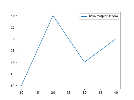
In this example, we create a simple line plot and then use the Matplotlib.axis.Axis.get_pickradius() function to retrieve the pick radius for both the x-axis and y-axis. The function is called on the xaxis and yaxis attributes of the Axes object.

Parameters of Matplotlib.axis.Axis.get_pickradius()

The Matplotlib.axis.Axis.get_pickradius() function doesn’t take any parameters. It’s a simple getter method that returns the current pick radius value for the axis.

Return Value of Matplotlib.axis.Axis.get_pickradius()

The Matplotlib.axis.Axis.get_pickradius() function returns a float value representing the pick radius in points. This value determines the distance from the axis line within which a mouse click will be considered as a pick event.

Let’s look at another example to illustrate how we can use the returned value:

import matplotlib.pyplot as plt

# Create a plot with multiple subplots
fig, (ax1, ax2) = plt.subplots(2, 1, figsize=(8, 8))

# Plot data in both subplots
ax1.plot([1, 2, 3, 4], [1, 4, 2, 3], label='how2matplotlib.com')
ax2.plot([1, 2, 3, 4], [3, 1, 4, 2], label='how2matplotlib.com')

# Get and print pick radius for all axes
axes = [ax1.xaxis, ax1.yaxis, ax2.xaxis, ax2.yaxis]
for i, axis in enumerate(axes):
    pick_radius = axis.get_pickradius()
    print(f"Subplot {i//2 + 1}, {'X' if i%2 == 0 else 'Y'}-axis pick radius: {pick_radius}")

plt.tight_layout()
plt.show()

Output:
Comprehensive Guide to Matplotlib.axis.Axis.get_pickradius() Function in Python

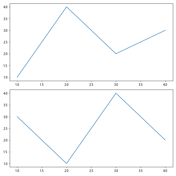
In this example, we create a figure with two subplots and use Matplotlib.axis.Axis.get_pickradius() to retrieve the pick radius for all axes. This demonstrates how the function can be used across multiple subplots and axes.

Practical Applications of Matplotlib.axis.Axis.get_pickradius()

The Matplotlib.axis.Axis.get_pickradius() function is particularly useful in scenarios where you need to create interactive plots or customize the behavior of mouse events near axis lines. Here are some practical applications:

  1. Interactive Data Selection: You can use the pick radius to allow users to select data points near the axis lines.

  2. Custom Tooltips: Create custom tooltips that appear when the user hovers near axis tick marks.

  3. Axis Line Highlighting: Implement highlighting of axis lines when the mouse is within the pick radius.

  4. Event Handling: Use the pick radius in combination with event handlers to create responsive plots.

Let’s explore these applications with some examples:

1. Interactive Data Selection

import matplotlib.pyplot as plt
import numpy as np

def on_pick(event):
    thisline = event.artist
    xdata = thisline.get_xdata()
    ydata = thisline.get_ydata()
    ind = event.ind
    print(f'Selected point: x={xdata[ind][0]:.2f}, y={ydata[ind][0]:.2f}')

fig, ax = plt.subplots()
x = np.linspace(0, 10, 100)
y = np.sin(x)
line, = ax.plot(x, y, 'o', picker=True, pickradius=5, label='how2matplotlib.com')

ax.set_title('Click near points to select')
pick_radius = ax.xaxis.get_pickradius()
print(f"X-axis pick radius: {pick_radius}")

fig.canvas.mpl_connect('pick_event', on_pick)
plt.legend()
plt.show()

Output:

Comprehensive Guide to Matplotlib.axis.Axis.get_pickradius() Function in Python

In this example, we create an interactive plot where users can click near data points to select them. We use the Matplotlib.axis.Axis.get_pickradius() function to print the current pick radius for the x-axis.

2. Custom Tooltips

import matplotlib.pyplot as plt
import numpy as np

def update_tooltip(event):
    if event.inaxes == ax:
        x, y = event.xdata, event.ydata
        if abs(x - round(x)) < ax.xaxis.get_pickradius() / ax.figure.dpi * 72:
            tooltip.set_text(f'X: {round(x)}')
            tooltip.set_visible(True)
        elif abs(y - round(y)) < ax.yaxis.get_pickradius() / ax.figure.dpi * 72:
            tooltip.set_text(f'Y: {round(y)}')
            tooltip.set_visible(True)
        else:
            tooltip.set_visible(False)
        fig.canvas.draw_idle()

fig, ax = plt.subplots()
x = np.linspace(0, 10, 100)
y = np.sin(x)
ax.plot(x, y, label='how2matplotlib.com')

tooltip = ax.text(0, 0, '', bbox=dict(boxstyle='round', fc='w', ec='0.5', alpha=0.9))
tooltip.set_visible(False)

fig.canvas.mpl_connect('motion_notify_event', update_tooltip)
plt.legend()
plt.show()

Output:

Comprehensive Guide to Matplotlib.axis.Axis.get_pickradius() Function in Python

This example demonstrates how to create custom tooltips that appear when the mouse hovers near axis tick marks. We use the Matplotlib.axis.Axis.get_pickradius() function to determine when the mouse is close enough to a tick mark.

3. Axis Line Highlighting

import matplotlib.pyplot as plt
import numpy as np

def highlight_axis(event):
    if event.inaxes == ax:
        x, y = event.xdata, event.ydata
        x_pick_radius = ax.xaxis.get_pickradius() / ax.figure.dpi * 72
        y_pick_radius = ax.yaxis.get_pickradius() / ax.figure.dpi * 72

        if abs(y) < y_pick_radius:
            ax.spines['bottom'].set_color('red')
        else:
            ax.spines['bottom'].set_color('black')

        if abs(x) < x_pick_radius:
            ax.spines['left'].set_color('red')
        else:
            ax.spines['left'].set_color('black')

        fig.canvas.draw_idle()

fig, ax = plt.subplots()
x = np.linspace(-5, 5, 100)
y = x**2
ax.plot(x, y, label='how2matplotlib.com')

ax.set_title('Move mouse near axes to highlight')
fig.canvas.mpl_connect('motion_notify_event', highlight_axis)
plt.legend()
plt.show()

Output:

Comprehensive Guide to Matplotlib.axis.Axis.get_pickradius() Function in Python

In this example, we use the Matplotlib.axis.Axis.get_pickradius() function to implement axis line highlighting when the mouse moves near the x or y axis.

4. Event Handling

import matplotlib.pyplot as plt
import numpy as np

def on_click(event):
    if event.inaxes == ax:
        x, y = event.xdata, event.ydata
        x_pick_radius = ax.xaxis.get_pickradius() / ax.figure.dpi * 72
        y_pick_radius = ax.yaxis.get_pickradius() / ax.figure.dpi * 72

        if abs(y) < y_pick_radius:
            print(f"Clicked near x-axis at x={x:.2f}")
        elif abs(x) < x_pick_radius:
            print(f"Clicked near y-axis at y={y:.2f}")
        else:
            print(f"Clicked at (x={x:.2f}, y={y:.2f})")

fig, ax = plt.subplots()
x = np.linspace(0, 10, 100)
y = np.sin(x)
ax.plot(x, y, label='how2matplotlib.com')

ax.set_title('Click near axes for events')
fig.canvas.mpl_connect('button_press_event', on_click)
plt.legend()
plt.show()

Output:

Comprehensive Guide to Matplotlib.axis.Axis.get_pickradius() Function in Python

This example demonstrates how to use the Matplotlib.axis.Axis.get_pickradius() function in combination with event handlers to create a responsive plot that detects clicks near the axes.

Advanced Usage of Matplotlib.axis.Axis.get_pickradius()

While the Matplotlib.axis.Axis.get_pickradius() function is primarily used to retrieve the pick radius, it can be combined with other Matplotlib functions and techniques to create more advanced visualizations and interactions. Let’s explore some advanced usage scenarios:

Combining with set_pickradius()

The Matplotlib.axis.Axis.get_pickradius() function is often used in conjunction with its counterpart, set_pickradius(). This allows you to dynamically adjust the pick radius based on certain conditions or user interactions.

import matplotlib.pyplot as plt
import numpy as np

def toggle_pick_radius(event):
    current_radius = ax.xaxis.get_pickradius()
    new_radius = 20 if current_radius == 5 else 5
    ax.xaxis.set_pickradius(new_radius)
    ax.yaxis.set_pickradius(new_radius)
    print(f"Pick radius changed to: {new_radius}")
    fig.canvas.draw_idle()

fig, ax = plt.subplots()
x = np.linspace(0, 10, 100)
y = np.sin(x)
ax.plot(x, y, label='how2matplotlib.com')

ax.xaxis.set_pickradius(5)
ax.yaxis.set_pickradius(5)

ax.set_title('Click to toggle pick radius (5 <-> 20)')
fig.canvas.mpl_connect('button_press_event', toggle_pick_radius)
plt.legend()
plt.show()

Output:

Comprehensive Guide to Matplotlib.axis.Axis.get_pickradius() Function in Python

In this example, we create a plot where clicking anywhere toggles the pick radius between 5 and 20 points. The Matplotlib.axis.Axis.get_pickradius() function is used to check the current radius, and set_pickradius() is used to update it.

Custom Axis Selector

We can use the Matplotlib.axis.Axis.get_pickradius() function to create a custom axis selector that allows users to interactively choose which axis to modify:

import matplotlib.pyplot as plt
import numpy as np

class AxisSelector:
    def __init__(self, ax):
        self.ax = ax
        self.selected_axis = None

    def on_move(self, event):
        if event.inaxes == self.ax:
            x, y = event.xdata, event.ydata
            x_pick_radius = self.ax.xaxis.get_pickradius() / self.ax.figure.dpi * 72
            y_pick_radius = self.ax.yaxis.get_pickradius() / self.ax.figure.dpi * 72

            if abs(y) < y_pick_radius:
                self.selected_axis = self.ax.xaxis
                self.ax.set_title('X-axis selected')
            elif abs(x) < x_pick_radius:
                self.selected_axis = self.ax.yaxis
                self.ax.set_title('Y-axis selected')
            else:
                self.selected_axis = None
                self.ax.set_title('No axis selected')

            self.ax.figure.canvas.draw_idle()

    def on_scroll(self, event):
        if self.selected_axis:
            current_radius = self.selected_axis.get_pickradius()
            new_radius = max(1, current_radius + event.step)
            self.selected_axis.set_pickradius(new_radius)
            print(f"New pick radius for {self.selected_axis.axis_name}-axis: {new_radius}")
            self.ax.figure.canvas.draw_idle()

fig, ax = plt.subplots()
x = np.linspace(0, 10, 100)
y = np.sin(x)
ax.plot(x, y, label='how2matplotlib.com')

selector = AxisSelector(ax)
fig.canvas.mpl_connect('motion_notify_event', selector.on_move)
fig.canvas.mpl_connect('scroll_event', selector.on_scroll)

plt.legend()
plt.show()

Output:

Comprehensive Guide to Matplotlib.axis.Axis.get_pickradius() Function in Python

This example creates an AxisSelector class that uses Matplotlib.axis.Axis.get_pickradius() to determine which axis the mouse is near. Users can then scroll to adjust the pick radius of the selected axis.

Dynamic Tick Selection

We can use the Matplotlib.axis.Axis.get_pickradius() function to create a dynamic tick selection system:

import matplotlib.pyplot as plt
import numpy as np

def on_move(event):
    if event.inaxes == ax:
        x, y = event.xdata, event.ydata
        x_pick_radius = ax.xaxis.get_pickradius() / ax.figure.dpi * 72
        y_pick_radius = ax.yaxis.get_pickradius() / ax.figure.dpi * 72

        for tick in ax.xaxis.get_major_ticks():
            if abs(tick.get_loc() - x) < x_pick_radius and abs(y) < y_pick_radius:
                tick.label1.set_color('red')
            else:
                tick.label1.set_color('black')

        for tick in ax.yaxis.get_major_ticks():
            if abs(tick.get_loc() - y) < y_pick_radius and abs(x) < x_pick_radius:
                tick.label1.set_color('red')
            else:
                tick.label1.set_color('black')

        fig.canvas.draw_idle()

fig, ax = plt.subplots()
x = np.linspace(0, 10, 100)
y = np.sin(x)
ax.plot(x, y, label='how2matplotlib.com')

ax.set_title('Move mouse near ticks to highlight')
fig.canvas.mpl_connect('motion_notify_event', on_move)
plt.legend()
plt.show()

Output:

Comprehensive Guide to Matplotlib.axis.Axis.get_pickradius() Function in Python

In this example, we use Matplotlib.axis.Axis.get_pickradius() to create a dynamic tick selection system where tick labels are highlighted when the mouse moves near them.

Best Practices for Using Matplotlib.axis.Axis.get_pickradius()

When working with the Matplotlib.axis.Axis.get_pickradius() function, it’s important to follow some best practices to ensure optimal performance and user experience:

  1. Combine with set_pickradius(): Always consider using get_pickradius() in conjunction with set_pickradius() to create dynamic and responsive plots.

  2. Consider DPI scaling: Remember that the pick radius is in points, so you may need to scale it based on the figure’s DPI for pixel-perfect interactions.

  3. Use with event handlers: Combine get_pickradius() with appropriate event handlers (e.g., ‘motion_notify_event’, ‘button_press_event’) for interactive features.

  4. Optimize performance: For complex plots or large datasets, be mindful of performance when using get_pickradius() in event loops.

  5. Provide visual feedback: When using get_pickradius() for interactive features, always provide clear visual feedback to the user.

Let’s look at an example that incorporates these best practices:

import matplotlib.pyplot as plt
import numpy as np

class InteractiveAxisPlot:
    def __init__(self, fig, ax):
        self.fig = fig
        self.ax = ax
        self.highlight_color = 'red'
        self.default_color = 'black'
        self.dpi_scale = 72 / self.fig.dpi

        self.connect_events()

    def connect_events(self):
        self.fig.canvas.mpl_connect('motion_notify_event', self.on_move)
        self.fig.canvas.mpl_connect('button_press_event', self.on_click)

    def on_move(self, event):
        if event.inaxes == self.ax:
            self.highlight_nearest_axis(event.xdata, event.ydata)

    def on_click(self, event):
        if event.inaxes == self.ax:
            self.toggle_pick_radius(event.xdata, event.ydata)

    def highlight_nearest_axis(self, x, y):
        x_pick_radius = self.ax.xaxis.get_pickradius() * self.dpi_scale
        y_pick_radius = self.ax.yaxis.get_pickradius() * self.dpi_scale

        if abs(y) < y_pick_radius:
            self.ax.spines['bottom'].set_color(self.highlight_color)
            self.ax.spines['left'].set_color(self.default_color)
        elif abs(x) < x_pick_radius:
            self.ax.spines['left'].set_color(self.highlight_color)
            self.ax.spines['bottom'].set_color(self.default_color)
        else:
            self.ax.spines['bottom'].set_color(self.default_color)
            self.ax.spines['left'].set_color(self.default_color)

        self.fig.canvas.draw_idle()

    def toggle_pick_radius(self, x, y):
        x_pick_radius = self.ax.xaxis.get_pickradius() * self.dpi_scale
        y_pick_radius = self.ax.yaxis.get_pickradius() * self.dpi_scale

        if abs(y) < y_pick_radius:
            new_radius = 20 if self.ax.xaxis.get_pickradius() == 5 else 5
            self.ax.xaxis.set_pickradius(new_radius)
            print(f"X-axis pick radius changed to: {new_radius}")
        elif abs(x) < x_pick_radius:
            new_radius = 20 if self.ax.yaxis.get_pickradius() == 5 else 5
            self.ax.yaxis.set_pickradius(new_radius)
            print(f"Y-axis pick radius changed to: {new_radius}")

        self.fig.canvas.draw_idle()

fig, ax = plt.subplots()
x = np.linspace(0, 10, 100)
y = np.sin(x)
ax.plot(x, y, label='how2matplotlib.com')

ax.set_title('Move near axes to highlight, click to toggle pick radius')
interactive_plot = InteractiveAxisPlot(fig, ax)

plt.legend()
plt.show()

Output:

Comprehensive Guide to Matplotlib.axis.Axis.get_pickradius() Function in Python

This example demonstrates a class-based approach to creating an interactive plot that incorporates all the best practices mentioned above. It uses Matplotlib.axis.Axis.get_pickradius() to create axis highlighting and allows users to toggle the pick radius by clicking near the axes.

Common Pitfalls and How to Avoid Them

When working with the Matplotlib.axis.Axis.get_pickradius() function, there are some common pitfalls that developers might encounter. Here are a few of them and how to avoid them:

  1. Ignoring DPI scaling: The pick radius is in points, which can lead to inconsistent behavior across different display resolutions.

    Solution: Always scale the pick radius by the figure’s DPI when performing pixel-based calculations.

  2. Overusing in event loops: Constantly calling get_pickradius() in tight loops can impact performance.

    Solution: Cache the pick radius value and only update it when necessary.

  3. Neglecting to provide visual feedback: Using get_pickradius() for interactions without clear visual cues can confuse users.

    Solution: Always provide clear visual feedback when the pick radius is relevant to user interactions.

  4. Forgetting to update related elements: When changing the pick radius, forgetting to update related visual elements or interaction zones.

    Solution: Implement a centralized method to update all relevant elements when the pick radius changes.

Let’s look at an example that addresses these pitfalls:

import matplotlib.pyplot as plt
import numpy as np

class ImprovedInteractivePlot:
    def __init__(self, fig, ax):
        self.fig = fig
        self.ax = ax
        self.highlight_color = 'red'
        self.default_color = 'black'
        self.dpi_scale = 72 / self.fig.dpi
        self.x_pick_radius = self.ax.xaxis.get_pickradius() * self.dpi_scale
        self.y_pick_radius = self.ax.yaxis.get_pickradius() * self.dpi_scale
        self.highlight_element = None

        self.connect_events()

    def connect_events(self):
        self.fig.canvas.mpl_connect('motion_notify_event', self.on_move)
        self.fig.canvas.mpl_connect('button_press_event', self.on_click)

    def on_move(self, event):
        if event.inaxes == self.ax:
            self.highlight_nearest_element(event.xdata, event.ydata)

    def on_click(self, event):
        if event.inaxes == self.ax:
            self.toggle_pick_radius(event.xdata, event.ydata)

    def highlight_nearest_element(self, x, y):
        if abs(y) < self.y_pick_radius:
            self.highlight_element = self.ax.spines['bottom']
        elif abs(x) < self.x_pick_radius:
            self.highlight_element = self.ax.spines['left']
        else:
            self.highlight_element = None

        self.update_highlight()

    def update_highlight(self):
        for spine in self.ax.spines.values():
            spine.set_color(self.highlight_color if spine == self.highlight_element else self.default_color)
        self.fig.canvas.draw_idle()

    def toggle_pick_radius(self, x, y):
        if abs(y) < self.y_pick_radius:
            new_radius = 20 if self.ax.xaxis.get_pickradius() == 5 else 5
            self.ax.xaxis.set_pickradius(new_radius)
            self.x_pick_radius = new_radius * self.dpi_scale
            print(f"X-axis pick radius changed to: {new_radius}")
        elif abs(x) < self.x_pick_radius:
            new_radius = 20 if self.ax.yaxis.get_pickradius() == 5 else 5
            self.ax.yaxis.set_pickradius(new_radius)
            self.y_pick_radius = new_radius * self.dpi_scale
            print(f"Y-axis pick radius changed to: {new_radius}")

        self.update_interaction_zones()

    def update_interaction_zones(self):
        self.x_pick_radius = self.ax.xaxis.get_pickradius() * self.dpi_scale
        self.y_pick_radius = self.ax.yaxis.get_pickradius() * self.dpi_scale
        self.highlight_nearest_element(self.ax.transData.inverted().transform(self.fig.canvas.get_width_height()))
        self.fig.canvas.draw_idle()

fig, ax = plt.subplots()
x = np.linspace(0, 10, 100)
y = np.sin(x)
ax.plot(x, y, label='how2matplotlib.com')

ax.set_title('Move near axes to highlight, click to toggle pick radius')
interactive_plot = ImprovedInteractivePlot(fig, ax)

plt.legend()
plt.show()

Output:

Comprehensive Guide to Matplotlib.axis.Axis.get_pickradius() Function in Python

This improved example addresses the common pitfalls by:

  1. Scaling the pick radius based on DPI.
  2. Caching the pick radius values and only updating them when necessary.
  3. Providing clear visual feedback through axis highlighting.
  4. Implementing a centralized method (update_interaction_zones) to update all relevant elements when the pick radius changes.

Conclusion

The Matplotlib.axis.Axis.get_pickradius() function is a powerful tool for creating interactive and responsive plots in Matplotlib. By understanding its usage, best practices, and potential pitfalls, you can leverage this function to create more engaging and user-friendly visualizations.

Throughout this article, we’ve explored various aspects of the Matplotlib.axis.Axis.get_pickradius() function, including:

  1. Basic usage and syntax
  2. Practical applications in interactive data visualization
  3. Advanced usage scenarios
  4. Best practices for optimal implementation
  5. Common pitfalls and how to avoid them

By incorporating the Matplotlib.axis.Axis.get_pickradius() function into your Matplotlib workflows, you can enhance the interactivity of your plots and provide users with more intuitive ways to explore and interact with data visualizations.

Like(0)