Comprehensive Guide to Matplotlib.axis.Tick.set_sketch_params() Function in Python
Matplotlib.axis.Tick.set_sketch_params() function in Python is a powerful tool for customizing the appearance of tick marks in Matplotlib plots. This function allows you to add a sketch-like effect to your tick marks, giving your visualizations a unique and artistic touch. In this comprehensive guide, we’ll explore the Matplotlib.axis.Tick.set_sketch_params() function in depth, covering its usage, parameters, and various applications in data visualization.
Understanding the Basics of Matplotlib.axis.Tick.set_sketch_params()
The Matplotlib.axis.Tick.set_sketch_params() function is part of the Matplotlib library, which is widely used for creating static, animated, and interactive visualizations in Python. This particular function is specifically designed to modify the appearance of tick marks on plot axes.
Let’s start with a simple example to demonstrate how to use the Matplotlib.axis.Tick.set_sketch_params() function:
import matplotlib.pyplot as plt
import numpy as np

# Create sample data
x = np.linspace(0, 10, 100)
y = np.sin(x)

# Create the plot
fig, ax = plt.subplots()
ax.plot(x, y)

# Apply sketch params to x-axis ticks
for tick in ax.xaxis.get_major_ticks():
    tick.set_sketch_params(scale=5, length=100, randomness=0.1)

plt.title("Matplotlib.axis.Tick.set_sketch_params() Example - how2matplotlib.com")
plt.show()
Output:
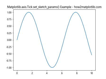
In this example, we create a simple sine wave plot and apply the set_sketch_params() function to the x-axis ticks. The function takes three parameters: scale, length, and randomness. These parameters control the appearance of the sketch effect on the tick marks.
Parameters of Matplotlib.axis.Tick.set_sketch_params()
The Matplotlib.axis.Tick.set_sketch_params() function accepts the following parameters:
- scale: Controls the overall size of the sketch effect.
- length: Determines the length of the sketch lines.
- randomness: Adds a random factor to the sketch effect, making it appear more hand-drawn.
Let’s explore each of these parameters in more detail with examples.
Scale Parameter in Matplotlib.axis.Tick.set_sketch_params()
The scale parameter in Matplotlib.axis.Tick.set_sketch_params() function determines the overall size of the sketch effect. A larger scale value will result in a more pronounced sketch effect.
Here’s an example demonstrating different scale values:
import matplotlib.pyplot as plt
import numpy as np

fig, (ax1, ax2, ax3) = plt.subplots(1, 3, figsize=(15, 5))

x = np.linspace(0, 10, 100)
y = np.cos(x)

for ax, scale in zip([ax1, ax2, ax3], [1, 5, 10]):
    ax.plot(x, y)
    for tick in ax.xaxis.get_major_ticks():
        tick.set_sketch_params(scale=scale, length=100, randomness=0.1)
    ax.set_title(f"Scale = {scale}")

plt.suptitle("Matplotlib.axis.Tick.set_sketch_params() Scale Examples - how2matplotlib.com")
plt.tight_layout()
plt.show()
Output:
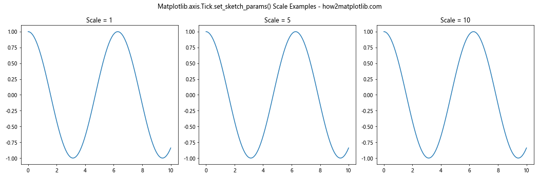
In this example, we create three subplots with different scale values (1, 5, and 10) to showcase how the scale parameter affects the appearance of the tick marks.
Length Parameter in Matplotlib.axis.Tick.set_sketch_params()
The length parameter in Matplotlib.axis.Tick.set_sketch_params() function controls the length of the sketch lines. A larger length value will result in longer sketch lines.
Let’s see an example with different length values:
import matplotlib.pyplot as plt
import numpy as np

fig, (ax1, ax2, ax3) = plt.subplots(1, 3, figsize=(15, 5))

x = np.linspace(0, 10, 100)
y = np.sin(x) * np.exp(-0.1 * x)

for ax, length in zip([ax1, ax2, ax3], [50, 100, 200]):
    ax.plot(x, y)
    for tick in ax.xaxis.get_major_ticks():
        tick.set_sketch_params(scale=5, length=length, randomness=0.1)
    ax.set_title(f"Length = {length}")

plt.suptitle("Matplotlib.axis.Tick.set_sketch_params() Length Examples - how2matplotlib.com")
plt.tight_layout()
plt.show()
Output:
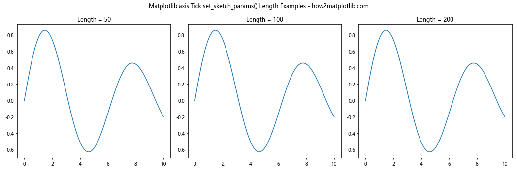
This example demonstrates the effect of different length values (50, 100, and 200) on the appearance of the tick marks.
Randomness Parameter in Matplotlib.axis.Tick.set_sketch_params()
The randomness parameter in Matplotlib.axis.Tick.set_sketch_params() function adds a random factor to the sketch effect, making it appear more hand-drawn. A higher randomness value will result in a more irregular and sketchy appearance.
Here’s an example showcasing different randomness values:
import matplotlib.pyplot as plt
import numpy as np

fig, (ax1, ax2, ax3) = plt.subplots(1, 3, figsize=(15, 5))

x = np.linspace(0, 10, 100)
y = np.tan(x)

for ax, randomness in zip([ax1, ax2, ax3], [0.1, 0.5, 1.0]):
    ax.plot(x, y)
    for tick in ax.xaxis.get_major_ticks():
        tick.set_sketch_params(scale=5, length=100, randomness=randomness)
    ax.set_title(f"Randomness = {randomness}")

plt.suptitle("Matplotlib.axis.Tick.set_sketch_params() Randomness Examples - how2matplotlib.com")
plt.tight_layout()
plt.show()
Output:
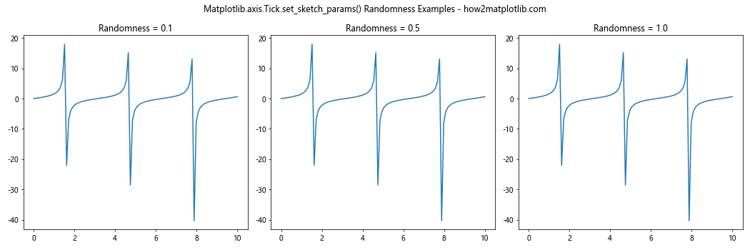
This example illustrates the effect of different randomness values (0.1, 0.5, and 1.0) on the appearance of the tick marks.
Applying Matplotlib.axis.Tick.set_sketch_params() to Different Axis Types
The Matplotlib.axis.Tick.set_sketch_params() function can be applied to various types of axes in Matplotlib plots. Let’s explore how to use this function with different axis types.
X-Axis Ticks with Matplotlib.axis.Tick.set_sketch_params()
We’ve already seen examples of applying the set_sketch_params() function to x-axis ticks. Here’s another example with a bar plot:
import matplotlib.pyplot as plt
import numpy as np

categories = ['A', 'B', 'C', 'D', 'E']
values = np.random.rand(5) * 10

fig, ax = plt.subplots()
ax.bar(categories, values)

for tick in ax.xaxis.get_major_ticks():
    tick.set_sketch_params(scale=3, length=50, randomness=0.2)

plt.title("Matplotlib.axis.Tick.set_sketch_params() on X-Axis - how2matplotlib.com")
plt.show()
Output:
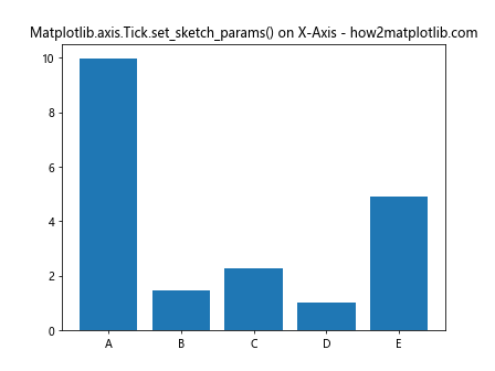
This example demonstrates how to apply the sketch effect to x-axis ticks in a bar plot.
Y-Axis Ticks with Matplotlib.axis.Tick.set_sketch_params()
The set_sketch_params() function can also be applied to y-axis ticks. Here’s an example:
import matplotlib.pyplot as plt
import numpy as np

x = np.linspace(0, 10, 100)
y = np.exp(-0.5 * x) * np.sin(2 * np.pi * x)

fig, ax = plt.subplots()
ax.plot(x, y)

for tick in ax.yaxis.get_major_ticks():
    tick.set_sketch_params(scale=4, length=75, randomness=0.3)

plt.title("Matplotlib.axis.Tick.set_sketch_params() on Y-Axis - how2matplotlib.com")
plt.show()
Output:
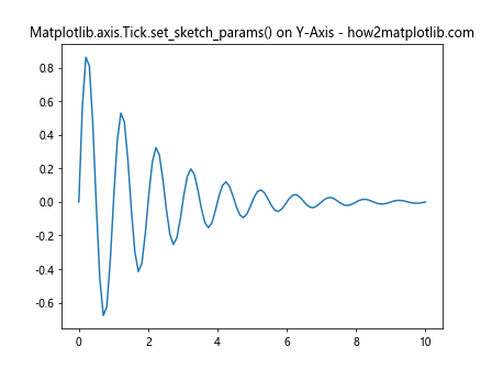
This example shows how to apply the sketch effect to y-axis ticks in a line plot.
Both X and Y Axis Ticks with Matplotlib.axis.Tick.set_sketch_params()
You can apply the set_sketch_params() function to both x and y axis ticks simultaneously. Here’s an example:
import matplotlib.pyplot as plt
import numpy as np

x = np.linspace(0, 5, 50)
y = np.sin(x) * np.exp(-0.2 * x)

fig, ax = plt.subplots()
ax.scatter(x, y, alpha=0.7)

for axis in [ax.xaxis, ax.yaxis]:
    for tick in axis.get_major_ticks():
        tick.set_sketch_params(scale=3, length=60, randomness=0.2)

plt.title("Matplotlib.axis.Tick.set_sketch_params() on Both Axes - how2matplotlib.com")
plt.show()
Output:
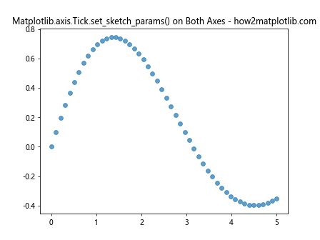
This example demonstrates how to apply the sketch effect to both x and y axis ticks in a scatter plot.
Using Matplotlib.axis.Tick.set_sketch_params() in Subplots
The set_sketch_params() function can be applied to individual subplots, allowing you to create diverse visualizations within a single figure. Here’s an example:
import matplotlib.pyplot as plt
import numpy as np

fig, ((ax1, ax2), (ax3, ax4)) = plt.subplots(2, 2, figsize=(12, 10))

x = np.linspace(0, 10, 100)
y1 = np.sin(x)
y2 = np.cos(x)
y3 = np.tan(x)
y4 = np.exp(-0.1 * x) * np.sin(x)

ax1.plot(x, y1)
ax2.plot(x, y2)
ax3.plot(x, y3)
ax4.plot(x, y4)

for ax, title in zip([ax1, ax2, ax3, ax4], ['Sin', 'Cos', 'Tan', 'Damped Sin']):
    for axis in [ax.xaxis, ax.yaxis]:
        for tick in axis.get_major_ticks():
            tick.set_sketch_params(scale=np.random.randint(2, 6),
                                   length=np.random.randint(50, 100),
                                   randomness=np.random.uniform(0.1, 0.5))
    ax.set_title(title)

plt.suptitle("Matplotlib.axis.Tick.set_sketch_params() in Subplots - how2matplotlib.com")
plt.tight_layout()
plt.show()
Output:
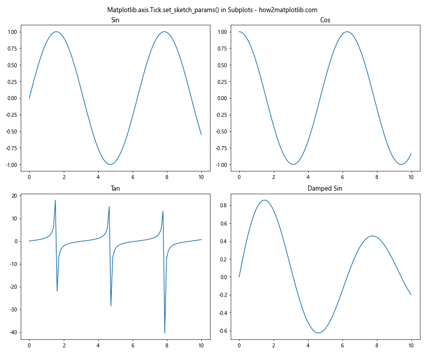
This example demonstrates how to apply different sketch effects to ticks in multiple subplots.
Animating Matplotlib.axis.Tick.set_sketch_params()
You can create animated plots by dynamically changing the sketch parameters. Here’s an example of a simple animation:
import matplotlib.pyplot as plt
import numpy as np
from matplotlib.animation import FuncAnimation

fig, ax = plt.subplots()
x = np.linspace(0, 10, 100)
line, = ax.plot(x, np.sin(x))

def update(frame):
    line.set_ydata(np.sin(x + frame / 10))
    for tick in ax.xaxis.get_major_ticks():
        tick.set_sketch_params(scale=3 + np.sin(frame / 10),
                               length=80 + 20 * np.sin(frame / 5),
                               randomness=0.1 + 0.1 * np.sin(frame / 15))
    return line,

ani = FuncAnimation(fig, update, frames=100, interval=50, blit=True)
plt.title("Animated Matplotlib.axis.Tick.set_sketch_params() - how2matplotlib.com")
plt.show()
Output:
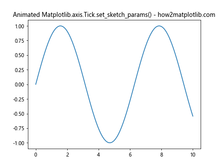
This example creates an animated plot where both the sine wave and the tick sketch parameters change over time.
Best Practices for Using Matplotlib.axis.Tick.set_sketch_params()
When using the Matplotlib.axis.Tick.set_sketch_params() function, it’s important to follow some best practices to ensure your visualizations are effective and visually appealing.
- Use appropriate scale values: Choose scale values that complement your plot size and overall design. Extremely large or small scale values may distort your visualization.
Balance length and randomness: Find the right balance between length and randomness to create a natural-looking sketch effect without overwhelming the plot.
Consider the plot type: Different types of plots may benefit from different sketch parameter settings. Experiment with various combinations to find what works best for your specific visualization.
Maintain readability: While the sketch effect can add visual interest, ensure that it doesn’t compromise the readability of your plot or its labels.
Combine with other styling options: Use the set_sketch_params() function in conjunction with other Matplotlib styling options to create cohesive and visually appealing plots.
Here’s an example that demonstrates these best practices: