Comprehensive Guide to Matplotlib.axis.Tick.set_rasterized() Function in Python
Matplotlib.axis.Tick.set_rasterized() function in Python is a powerful tool for optimizing plot rendering in Matplotlib. This function allows you to control whether individual tick marks are rasterized or not, which can significantly impact the performance and appearance of your plots. In this comprehensive guide, we’ll explore the Matplotlib.axis.Tick.set_rasterized() function in depth, covering its usage, benefits, and various applications in data visualization.
Understanding the Matplotlib.axis.Tick.set_rasterized() Function
The Matplotlib.axis.Tick.set_rasterized() function is a method of the Tick class in Matplotlib’s axis module. It is used to set the rasterization state of a tick mark. Rasterization is the process of converting vector graphics into a bitmap image. When applied to tick marks, it can help reduce file size and improve rendering performance, especially for plots with a large number of ticks.
Basic Syntax
The basic syntax of the Matplotlib.axis.Tick.set_rasterized() function is as follows:
import matplotlib.pyplot as plt
fig, ax = plt.subplots()
tick = ax.xaxis.get_major_ticks()[0]
tick.set_rasterized(True)
plt.title("How to use set_rasterized() - how2matplotlib.com")
plt.show()
Output:
In this example, we set the rasterization state of the first major tick on the x-axis to True. This means that the tick will be rasterized when the plot is rendered.
Benefits of Using Matplotlib.axis.Tick.set_rasterized()
The Matplotlib.axis.Tick.set_rasterized() function offers several benefits:
- Improved performance: Rasterizing tick marks can significantly reduce rendering time for plots with many ticks.
- Reduced file size: Rasterized ticks take up less space in saved files, especially in vector formats like PDF or SVG.
- Better appearance: In some cases, rasterized ticks can look better when zoomed in or printed at high resolutions.
Let’s explore these benefits with some examples.
Example: Improving Performance with Rasterized Ticks
import matplotlib.pyplot as plt
import numpy as np
fig, (ax1, ax2) = plt.subplots(1, 2, figsize=(12, 5))
# Plot with non-rasterized ticks
x = np.linspace(0, 10, 1000)
y = np.sin(x)
ax1.plot(x, y)
ax1.set_title("Non-rasterized Ticks - how2matplotlib.com")
# Plot with rasterized ticks
ax2.plot(x, y)
ax2.set_title("Rasterized Ticks - how2matplotlib.com")
for tick in ax2.xaxis.get_major_ticks() + ax2.yaxis.get_major_ticks():
tick.set_rasterized(True)
plt.tight_layout()
plt.show()
Output:
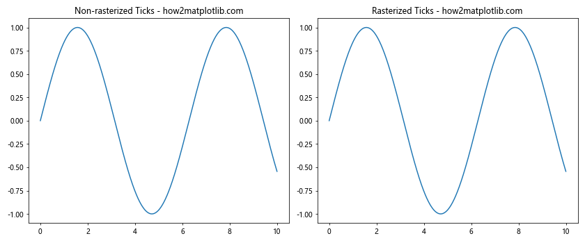
In this example, we create two plots side by side. The left plot has non-rasterized ticks, while the right plot has rasterized ticks. You may notice that the right plot renders faster, especially if you have a large number of ticks.
When to Use Matplotlib.axis.Tick.set_rasterized()
The Matplotlib.axis.Tick.set_rasterized() function is particularly useful in certain scenarios:
- Plots with Many Ticks: If your plot has a large number of ticks, rasterizing them can significantly improve rendering performance and reduce file size.
-
High-Resolution Outputs: When creating plots for high-resolution prints or displays, rasterized ticks can sometimes look better than vector ticks.
-
Reducing File Size: If you need to create many plots or embed plots in documents, using rasterized ticks can help keep file sizes manageable.
Let’s look at an example where rasterized ticks are beneficial:
import matplotlib.pyplot as plt
import numpy as np
fig, ax = plt.subplots(figsize=(10, 6))
# Create a plot with many ticks
x = np.linspace(0, 100, 10000)
y = np.sin(x) * np.exp(-x/100)
ax.plot(x, y)
# Set a large number of ticks
ax.set_xticks(np.arange(0, 101, 0.5))
ax.set_yticks(np.arange(-1, 1.1, 0.01))
# Rasterize all ticks
for tick in ax.xaxis.get_major_ticks() + ax.yaxis.get_major_ticks():
tick.set_rasterized(True)
ax.set_title("Plot with Many Rasterized Ticks - how2matplotlib.com")
plt.tight_layout()
plt.show()
Output:
In this example, we create a plot with a large number of ticks on both axes. By rasterizing these ticks, we can significantly improve the rendering performance and reduce the file size of the resulting plot.
Advanced Usage of Matplotlib.axis.Tick.set_rasterized()
While the basic usage of Matplotlib.axis.Tick.set_rasterized() is straightforward, there are several advanced techniques and considerations to keep in mind:
Selective Rasterization
You don’t have to rasterize all ticks. You can choose to rasterize only certain ticks based on your specific requirements. Here’s an example:
import matplotlib.pyplot as plt
import numpy as np
fig, ax = plt.subplots(figsize=(10, 6))
x = np.linspace(0, 10, 1000)
y = np.sin(x)
ax.plot(x, y)
# Rasterize every other tick
for i, tick in enumerate(ax.xaxis.get_major_ticks()):
if i % 2 == 0:
tick.set_rasterized(True)
ax.set_title("Selective Tick Rasterization - how2matplotlib.com")
plt.show()
Output:
In this example, we rasterize every other tick on the x-axis, demonstrating how you can selectively apply rasterization.
Combining Rasterized and Vector Elements
You can combine rasterized ticks with vector plot elements to optimize both performance and quality. Here’s an example:
import matplotlib.pyplot as plt
import numpy as np
fig, ax = plt.subplots(figsize=(10, 6))
x = np.linspace(0, 10, 1000)
y = np.sin(x)
line, = ax.plot(x, y, rasterized=False) # Vector line
ax.fill_between(x, 0, y, alpha=0.3, rasterized=True) # Rasterized fill
# Rasterize ticks
for tick in ax.xaxis.get_major_ticks() + ax.yaxis.get_major_ticks():
tick.set_rasterized(True)
ax.set_title("Combining Rasterized and Vector Elements - how2matplotlib.com")
plt.show()
Output:
In this example, we keep the main plot line as a vector element for crisp rendering, while rasterizing the fill area and ticks for better performance.
Matplotlib.axis.Tick.set_rasterized() in Different Plot Types
The Matplotlib.axis.Tick.set_rasterized() function can be applied to various types of plots. Let’s explore how it works with different plot types:
Bar Plots
import matplotlib.pyplot as plt
import numpy as np
fig, ax = plt.subplots(figsize=(10, 6))
categories = ['A', 'B', 'C', 'D', 'E']
values = np.random.rand(5)
ax.bar(categories, values)
for tick in ax.xaxis.get_major_ticks() + ax.yaxis.get_major_ticks():
tick.set_rasterized(True)
ax.set_title("Bar Plot with Rasterized Ticks - how2matplotlib.com")
plt.show()
Output:
In this example, we create a bar plot and rasterize all the ticks. This can be particularly useful for bar plots with many categories.
Scatter Plots
import matplotlib.pyplot as plt
import numpy as np
fig, ax = plt.subplots(figsize=(10, 6))
x = np.random.rand(100)
y = np.random.rand(100)
ax.scatter(x, y, alpha=0.5)
for tick in ax.xaxis.get_major_ticks() + ax.yaxis.get_major_ticks():
tick.set_rasterized(True)
ax.set_title("Scatter Plot with Rasterized Ticks - how2matplotlib.com")
plt.show()
Output:
Here, we apply tick rasterization to a scatter plot. This can be beneficial when dealing with a large number of data points.
3D Plots
import matplotlib.pyplot as plt
import numpy as np
from mpl_toolkits.mplot3d import Axes3D
fig = plt.figure(figsize=(10, 8))
ax = fig.add_subplot(111, projection='3d')
x = np.linspace(-5, 5, 100)
y = np.linspace(-5, 5, 100)
X, Y = np.meshgrid(x, y)
Z = np.sin(np.sqrt(X**2 + Y**2))
surf = ax.plot_surface(X, Y, Z, cmap='viridis')
for axis in [ax.xaxis, ax.yaxis, ax.zaxis]:
for tick in axis.get_major_ticks():
tick.set_rasterized(True)
ax.set_title("3D Plot with Rasterized Ticks - how2matplotlib.com")
plt.show()
Output:
In this 3D plot example, we rasterize the ticks on all three axes. This can help improve the rendering performance of complex 3D visualizations.
Troubleshooting Matplotlib.axis.Tick.set_rasterized()
While using the Matplotlib.axis.Tick.set_rasterized() function, you might encounter some issues. Here are some common problems and their solutions:
Issue 1: Poor Quality Rasterized Ticks
If your rasterized ticks appear pixelated or of poor quality, you can increase the DPI:
import matplotlib.pyplot as plt
import numpy as np
fig, ax = plt.subplots(figsize=(10, 6), dpi=300) # Increase DPI
x = np.linspace(0, 10, 1000)
y = np.sin(x)
ax.plot(x, y)
for tick in ax.xaxis.get_major_ticks() + ax.yaxis.get_major_ticks():
tick.set_rasterized(True)
ax.set_title("High-Quality Rasterized Ticks - how2matplotlib.com")
plt.savefig("high_quality_rasterized_ticks.png", dpi=300)
plt.show()
Output:
In this example, we increase the DPI to 300, which results in higher-quality rasterized ticks.
Best Practices for Using Matplotlib.axis.Tick.set_rasterized()
To get the most out of the Matplotlib.axis.Tick.set_rasterized() function, consider the following best practices:
- Selective Rasterization: Only rasterize ticks when necessary, such as when dealing with a large number of ticks or when file size is a concern.
-
Balance Quality and Performance: Choose an appropriate DPI that balances image quality and file size/rendering performance.
-
Combine with Other Techniques: Use tick rasterization in combination with other Matplotlib optimization techniques for best results.
-
Test Different Scenarios: Experiment with rasterized and non-rasterized ticks in different plot types and output formats to find the best approach for your specific use case.
Let’s look at an example that incorporates these best practices:
import matplotlib.pyplot as plt
import numpy as np
def optimized_plot(x, y, rasterize_ticks=True, rasterize_fill=True, dpi=150):
fig, ax = plt.subplots(figsize=(10, 6), dpi=dpi)
# Plot line (vector)
line, = ax.plot(x, y, linewidth=2)
# Fill (rasterized or vector)
ax.fill_between(x, 0, y, alpha=0.3, rasterized=rasterize_fill)
# Rasterize ticks if specified
if rasterize_ticks:
for tick in ax.xaxis.get_major_ticks() + ax.yaxis.get_major_ticks():
tick.set_rasterized(True)
ax.set_title("Optimized Plot - how2matplotlib.com")
return fig
# Generate data
x = np.linspace(0, 10, 1000)
y = np.sin(x) * np.exp(-x/10)
# Create optimized plot
fig = optimized_plot(x, y)
# Save in different formats
fig.savefig("optimized_plot.png")
fig.savefig("optimized_plot.pdf")
fig.savefig("optimized_plot.svg")
plt.show()
Output:
This example demonstrates an optimized plotting function that incorporates selective rasterization and allows for easy experimentation with different settings.
Matplotlib.axis.Tick.set_rasterized() in Real-World Applications
Let’s explore some real-world scenarios where the Matplotlib.axis.Tick.set_rasterized() function can be particularly useful:
Data Dashboards
For interactive data dashboards where rendering speed is crucial, tick rasterization can help improve performance:
import matplotlib.pyplot as plt
import numpy as np
def create_dashboard_plot(data, title):
fig, ax = plt.subplots(figsize=(10, 6))
ax.plot(data, linewidth=2)
ax.set_title(title)
# Rasterize ticks for faster rendering
for tick in ax.xaxis.get_major_ticks() + ax.yaxis.get_major_ticks():
tick.set_rasterized(True)
return fig
# Simulate real-time data
data = np.cumsum(np.random.randn(1000))
fig = create_dashboard_plot(data, "Real-time Data Dashboard - how2matplotlib.com")
plt.show()
Output:
This example demonstrates how tick rasterization can be used in a data dashboard scenario to improve rendering performance.
Conclusion
The Matplotlib.axis.Tick.set_rasterized() function is a powerful tool in the Matplotlib library that allows for fine-grained control over tick rendering. By selectively rasterizing ticks, you can optimize plot rendering, reduce file sizes, and improve overall performance, especially for complex visualizations with many ticks.
Throughout this comprehensive guide, we’ve explored the various aspects of the Matplotlib.axis.Tick.set_rasterized() function, including its basic usage, advanced techniques, troubleshooting, and real-world applications. We’ve seen how this function can be applied to different plot types and how it interacts with other Matplotlib features.