Comprehensive Guide to Matplotlib.axis.Tick.set_transform() Function in Python

Comprehensive Guide to Matplotlib.axis.Tick.set_transform() Function in Python

Matplotlib.axis.Tick.set_transform() function in Python is a powerful tool for customizing the appearance and behavior of tick marks in Matplotlib plots. This function allows you to apply transformations to individual tick marks, giving you fine-grained control over their positioning and orientation. In this comprehensive guide, we’ll explore the Matplotlib.axis.Tick.set_transform() function in depth, covering its usage, parameters, and various applications in data visualization.

Understanding the Matplotlib.axis.Tick.set_transform() Function

The Matplotlib.axis.Tick.set_transform() function is a method of the Tick class in Matplotlib’s axis module. It is used to set the transform for a specific tick mark. This function is particularly useful when you need to apply custom transformations to individual ticks, which can be helpful in creating specialized plots or adjusting the appearance of your visualizations.

Let’s start with a simple example to demonstrate the basic usage of Matplotlib.axis.Tick.set_transform():

import matplotlib.pyplot as plt
import numpy as np
from matplotlib.transforms import Affine2D

# Create a simple plot
fig, ax = plt.subplots()
ax.plot([1, 2, 3, 4], [1, 4, 2, 3], label='Data from how2matplotlib.com')

# Get the first x-axis tick
tick = ax.xaxis.get_major_ticks()[0]

# Create a custom transform
transform = Affine2D().rotate_deg(45) + ax.transAxes

# Apply the transform to the tick
tick.set_transform(transform)

plt.legend()
plt.title('Using Matplotlib.axis.Tick.set_transform()')
plt.show()

Output:

Comprehensive Guide to Matplotlib.axis.Tick.set_transform() Function in Python

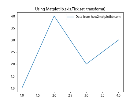
In this example, we create a simple line plot and then apply a 45-degree rotation transform to the first x-axis tick using the Matplotlib.axis.Tick.set_transform() function. This demonstrates how you can manipulate individual ticks to achieve custom effects.

Parameters of Matplotlib.axis.Tick.set_transform()

The Matplotlib.axis.Tick.set_transform() function takes a single parameter:

  • transform: This parameter is a matplotlib.transforms.Transform object that defines the transformation to be applied to the tick.

Understanding the transform parameter is crucial for effectively using the Matplotlib.axis.Tick.set_transform() function. Let’s explore some common types of transformations you can use:

1. Affine Transformations

Affine transformations are the most common type of transformations used with Matplotlib.axis.Tick.set_transform(). These include rotations, translations, scaling, and shearing. Here’s an example that demonstrates scaling a tick:

import matplotlib.pyplot as plt
import numpy as np
from matplotlib.transforms import Affine2D

fig, ax = plt.subplots()
ax.plot([1, 2, 3, 4], [1, 4, 2, 3], label='Data from how2matplotlib.com')

tick = ax.xaxis.get_major_ticks()[1]
transform = Affine2D().scale(2, 1) + ax.transAxes
tick.set_transform(transform)

plt.legend()
plt.title('Scaling a Tick with Matplotlib.axis.Tick.set_transform()')
plt.show()

Output:

Comprehensive Guide to Matplotlib.axis.Tick.set_transform() Function in Python

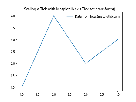
In this example, we scale the second x-axis tick horizontally by a factor of 2 using an Affine2D transformation.

2. Composite Transformations

You can combine multiple transformations to create more complex effects. Here’s an example that rotates and translates a tick:

import matplotlib.pyplot as plt
import numpy as np
from matplotlib.transforms import Affine2D

fig, ax = plt.subplots()
ax.plot([1, 2, 3, 4], [1, 4, 2, 3], label='Data from how2matplotlib.com')

tick = ax.yaxis.get_major_ticks()[2]
transform = Affine2D().rotate_deg(30).translate(0, 0.1) + ax.transAxes
tick.set_transform(transform)

plt.legend()
plt.title('Composite Transform with Matplotlib.axis.Tick.set_transform()')
plt.show()

Output:

Comprehensive Guide to Matplotlib.axis.Tick.set_transform() Function in Python

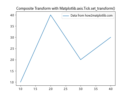
This example applies a 30-degree rotation followed by a vertical translation to the third y-axis tick.

Applications of Matplotlib.axis.Tick.set_transform()

Now that we understand the basics of the Matplotlib.axis.Tick.set_transform() function, let’s explore some practical applications and advanced techniques.

1. Creating Radial Tick Labels

One interesting application of Matplotlib.axis.Tick.set_transform() is creating radial tick labels for polar plots. Here’s an example:

import matplotlib.pyplot as plt
import numpy as np
from matplotlib.transforms import Affine2D

fig, ax = plt.subplots(subplot_kw=dict(projection='polar'))
ax.set_ylim(0, 10)
ax.set_yticks(np.arange(1, 11))

for tick in ax.yaxis.get_major_ticks():
    angle = tick.get_loc() * np.pi / 180
    transform = Affine2D().rotate(-angle) + ax.transAxes
    tick.set_transform(transform)
    tick.label1.set_rotation(0)

ax.set_title('Radial Ticks with Matplotlib.axis.Tick.set_transform()')
plt.text(0, 0, 'how2matplotlib.com', ha='center', va='center')
plt.show()

Output:

Comprehensive Guide to Matplotlib.axis.Tick.set_transform() Function in Python

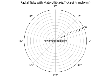
In this example, we create a polar plot and use Matplotlib.axis.Tick.set_transform() to rotate each tick label so that it’s aligned radially.

2. Custom Tick Positioning

You can use Matplotlib.axis.Tick.set_transform() to position ticks in unconventional ways. Here’s an example that places ticks along a sine curve:

import matplotlib.pyplot as plt
import numpy as np
from matplotlib.transforms import Affine2D

fig, ax = plt.subplots(figsize=(10, 6))
x = np.linspace(0, 2*np.pi, 100)
y = np.sin(x)
ax.plot(x, y, label='Sine curve from how2matplotlib.com')

for i, tick in enumerate(ax.xaxis.get_major_ticks()):
    x_pos = i * 2*np.pi / 5
    y_pos = np.sin(x_pos)
    transform = Affine2D().translate(x_pos, y_pos) + ax.transData
    tick.set_transform(transform)

plt.legend()
plt.title('Custom Tick Positioning with Matplotlib.axis.Tick.set_transform()')
plt.show()

Output:

Comprehensive Guide to Matplotlib.axis.Tick.set_transform() Function in Python

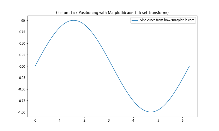
This example positions the x-axis ticks along the sine curve, demonstrating how Matplotlib.axis.Tick.set_transform() can be used for creative tick placement.

3. Emphasizing Specific Ticks

You can use Matplotlib.axis.Tick.set_transform() to emphasize certain ticks by scaling them. Here’s an example:

import matplotlib.pyplot as plt
import numpy as np
from matplotlib.transforms import Affine2D

fig, ax = plt.subplots()
ax.plot([1, 2, 3, 4, 5], [2, 4, 1, 3, 5], label='Data from how2matplotlib.com')

for i, tick in enumerate(ax.xaxis.get_major_ticks()):
    if i % 2 == 0:  # Emphasize every other tick
        transform = Affine2D().scale(1.5, 1.5) + ax.transAxes
        tick.set_transform(transform)

plt.legend()
plt.title('Emphasizing Ticks with Matplotlib.axis.Tick.set_transform()')
plt.show()

Output:

Comprehensive Guide to Matplotlib.axis.Tick.set_transform() Function in Python

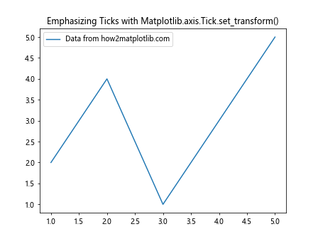
In this example, we scale up every other x-axis tick to make them stand out.

Advanced Techniques with Matplotlib.axis.Tick.set_transform()

Let’s explore some more advanced techniques using the Matplotlib.axis.Tick.set_transform() function.

1. Animated Tick Transformations

You can create animated plots where tick transformations change over time. Here’s an example:

import matplotlib.pyplot as plt
import numpy as np
from matplotlib.animation import FuncAnimation
from matplotlib.transforms import Affine2D

fig, ax = plt.subplots()
ax.set_xlim(0, 2*np.pi)
ax.set_ylim(-1, 1)
line, = ax.plot([], [], label='Sine wave from how2matplotlib.com')

def init():
    line.set_data([], [])
    return line,

def animate(frame):
    x = np.linspace(0, 2*np.pi, 100)
    y = np.sin(x - frame/10)
    line.set_data(x, y)

    for i, tick in enumerate(ax.xaxis.get_major_ticks()):
        angle = frame * np.pi / 180
        transform = Affine2D().rotate(angle) + ax.transAxes
        tick.set_transform(transform)

    return line,

anim = FuncAnimation(fig, animate, init_func=init, frames=360, interval=20, blit=True)
plt.legend()
plt.title('Animated Ticks with Matplotlib.axis.Tick.set_transform()')
plt.show()

Output:

Comprehensive Guide to Matplotlib.axis.Tick.set_transform() Function in Python

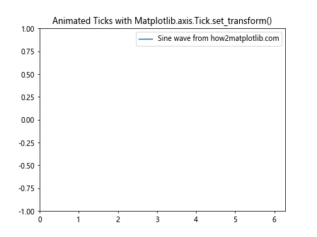
This example creates an animation where the x-axis ticks rotate as a sine wave moves across the plot.

2. Custom Tick Shapes

You can combine Matplotlib.axis.Tick.set_transform() with custom tick markers to create unique tick styles:

import matplotlib.pyplot as plt
import numpy as np
from matplotlib.transforms import Affine2D
from matplotlib.patches import RegularPolygon

fig, ax = plt.subplots()
ax.plot([1, 2, 3, 4], [1, 4, 2, 3], label='Data from how2matplotlib.com')

for i, tick in enumerate(ax.xaxis.get_major_ticks()):
    marker = RegularPolygon((0, 0), numVertices=3, radius=0.1, orientation=np.pi/2)
    transform = Affine2D().rotate_deg(i*30) + ax.transAxes
    tick.tick1line.set_marker(marker)
    tick.tick1line.set_markersize(10)
    tick.tick1line.set_transform(transform)

plt.legend()
plt.title('Custom Tick Shapes with Matplotlib.axis.Tick.set_transform()')
plt.show()

This example creates triangular tick marks and rotates each one using Matplotlib.axis.Tick.set_transform().

3. Non-linear Tick Spacing

You can use Matplotlib.axis.Tick.set_transform() to create non-linear tick spacing:

import matplotlib.pyplot as plt
import numpy as np
from matplotlib.transforms import Affine2D

fig, ax = plt.subplots()
x = np.linspace(0, 10, 100)
y = np.exp(x)
ax.plot(x, y, label='Exponential curve from how2matplotlib.com')

for i, tick in enumerate(ax.xaxis.get_major_ticks()):
    x_pos = i**2
    transform = Affine2D().translate(x_pos, 0) + ax.transData
    tick.set_transform(transform)

plt.legend()
plt.title('Non-linear Tick Spacing with Matplotlib.axis.Tick.set_transform()')
plt.show()

Output:

Comprehensive Guide to Matplotlib.axis.Tick.set_transform() Function in Python

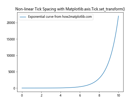
This example spaces the x-axis ticks according to a quadratic function, resulting in non-linear tick spacing.

Best Practices for Using Matplotlib.axis.Tick.set_transform()

When working with the Matplotlib.axis.Tick.set_transform() function, it’s important to keep some best practices in mind:

  1. Consistency: When applying transformations to ticks, try to maintain consistency across your plot. Inconsistent transformations can lead to confusing or misleading visualizations.

  2. Readability: While creative tick transformations can be visually interesting, always prioritize the readability of your plot. Ensure that transformed ticks don’t obscure data or make it difficult to interpret the plot.

  3. Performance: Applying complex transformations to many ticks can impact performance, especially in interactive or animated plots. Use transformations judiciously and consider simplifying them if performance becomes an issue.

  4. Documentation: If you’re using unusual tick transformations, it’s a good idea to document them in your plot’s legend or caption. This helps viewers understand what they’re seeing.

  5. Coordinate Systems: Be mindful of the coordinate system you’re working in. Transformations applied in data coordinates will behave differently from those applied in axes or figure coordinates.

Here’s an example that demonstrates these best practices:

import matplotlib.pyplot as plt
import numpy as np
from matplotlib.transforms import Affine2D

fig, ax = plt.subplots(figsize=(10, 6))
x = np.linspace(0, 10, 100)
y = np.sin(x)
ax.plot(x, y, label='Sine wave from how2matplotlib.com')

for i, tick in enumerate(ax.xaxis.get_major_ticks()):
    if i % 2 == 0:
        transform = Affine2D().scale(1.2, 1.2) + ax.transAxes
        tick.set_transform(transform)
        tick.label1.set_fontweight('bold')

ax.set_title('Best Practices for Matplotlib.axis.Tick.set_transform()')
ax.text(5, -0.5, 'Note: Every other x-tick is enlarged for emphasis', 
        ha='center', va='center', fontsize=10, style='italic')
plt.legend()
plt.show()

Output:

Comprehensive Guide to Matplotlib.axis.Tick.set_transform() Function in Python

This example demonstrates consistent tick transformations (every other tick is enlarged), maintains readability, and includes a note explaining the unusual tick appearance.

Troubleshooting Common Issues with Matplotlib.axis.Tick.set_transform()

When working with the Matplotlib.axis.Tick.set_transform() function, you might encounter some common issues. Let’s address these and provide solutions:

1. Ticks Disappearing

Sometimes, after applying a transformation, ticks might seem to disappear. This often happens when the transformation moves the tick outside the visible area of the plot.

import matplotlib.pyplot as plt
import numpy as np
from matplotlib.transforms import Affine2D

fig, ax = plt.subplots()
ax.plot([1, 2, 3, 4], [1, 4, 2, 3], label='Data from how2matplotlib.com')

for tick in ax.xaxis.get_major_ticks():
    transform = Affine2D().translate(0, 1) + ax.transAxes  # This will move ticks out of view
    tick.set_transform(transform)

plt.legend()
plt.title('Issue: Disappearing Ticks')
plt.show()

Output:

Comprehensive Guide to Matplotlib.axis.Tick.set_transform() Function in Python

To fix this, ensure your transformations keep the ticks within the plot area:

import matplotlib.pyplot as plt
import numpy as np
from matplotlib.transforms import Affine2D

fig, ax = plt.subplots()
ax.plot([1, 2, 3, 4], [1, 4, 2, 3], label='Data from how2matplotlib.com')

for tick in ax.xaxis.get_major_ticks():
    transform = Affine2D().translate(0, 0.1) + ax.transAxes  # Smaller translation
    tick.set_transform(transform)

plt.legend()
plt.title('Fixed: Visible Ticks')
plt.show()

Output:

Comprehensive Guide to Matplotlib.axis.Tick.set_transform() Function in Python

2. Inconsistent Tick Sizes

If you’re scaling ticks, you might notice that the tick labels don’t scale with the tick marks:

import matplotlib.pyplot as plt
import numpy as np
frommatplotlib.transforms import Affine2D

fig, ax = plt.subplots()
ax.plot([1, 2, 3, 4], [1, 4, 2, 3], label='Data from how2matplotlib.com')

for tick in ax.xaxis.get_major_ticks():
    transform = Affine2D().scale(2, 2) + ax.transAxes
    tick.set_transform(transform)

plt.legend()
plt.title('Issue: Inconsistent Tick Sizes')
plt.show()

To fix this, you can manually adjust the font size of the tick labels:

import matplotlib.pyplot as plt
import numpy as np
from matplotlib.transforms import Affine2D

fig, ax = plt.subplots()
ax.plot([1, 2, 3, 4], [1, 4, 2, 3], label='Data from how2matplotlib.com')

for tick in ax.xaxis.get_major_ticks():
    transform = Affine2D().scale(2, 2) + ax.transAxes
    tick.set_transform(transform)
    tick.label1.set_fontsize(16)  # Adjust font size to match tick size

plt.legend()
plt.title('Fixed: Consistent Tick Sizes')
plt.show()

Output:

Comprehensive Guide to Matplotlib.axis.Tick.set_transform() Function in Python

3. Unexpected Tick Behavior in Different Projections

The Matplotlib.axis.Tick.set_transform() function might behave unexpectedly in different plot projections. For example, in polar plots:

import matplotlib.pyplot as plt
import numpy as np
from matplotlib.transforms import Affine2D

fig, ax = plt.subplots(subplot_kw=dict(projection='polar'))
ax.plot(np.linspace(0, 2*np.pi, 100), np.random.rand(100), label='Data from how2matplotlib.com')

for tick in ax.xaxis.get_major_ticks():
    transform = Affine2D().rotate_deg(45) + ax.transAxes
    tick.set_transform(transform)

plt.legend()
plt.title('Issue: Unexpected Tick Behavior in Polar Plot')
plt.show()

Output:

Comprehensive Guide to Matplotlib.axis.Tick.set_transform() Function in Python

To address this, you may need to use a different transformation approach:

import matplotlib.pyplot as plt
import numpy as np
from matplotlib.transforms import Affine2D

fig, ax = plt.subplots(subplot_kw=dict(projection='polar'))
ax.plot(np.linspace(0, 2*np.pi, 100), np.random.rand(100), label='Data from how2matplotlib.com')

for tick in ax.xaxis.get_major_ticks():
    angle = tick.get_loc()
    transform = Affine2D().rotate(-angle) + ax.transAxes
    tick.set_transform(transform)
    tick.label1.set_rotation(angle * 180 / np.pi - 90)

plt.legend()
plt.title('Fixed: Proper Tick Behavior in Polar Plot')
plt.show()

Output:

Comprehensive Guide to Matplotlib.axis.Tick.set_transform() Function in Python

Advanced Applications of Matplotlib.axis.Tick.set_transform()

Let’s explore some more advanced applications of the Matplotlib.axis.Tick.set_transform() function.

1. Creating a Circular Bar Plot

We can use Matplotlib.axis.Tick.set_transform() to create a circular bar plot with radially aligned tick labels:

import matplotlib.pyplot as plt
import numpy as np
from matplotlib.transforms import Affine2D

fig, ax = plt.subplots(figsize=(10, 10), subplot_kw=dict(projection='polar'))

categories = ['A', 'B', 'C', 'D', 'E', 'F', 'G', 'H']
values = np.random.randint(1, 10, len(categories))

theta = np.linspace(0, 2*np.pi, len(categories), endpoint=False)
width = 2*np.pi / len(categories)

ax.bar(theta, values, width=width, bottom=2, alpha=0.5)

ax.set_xticks(theta)
ax.set_xticklabels(categories)

for tick in ax.xaxis.get_major_ticks():
    angle = tick.get_loc()
    transform = Affine2D().rotate(-angle) + ax.transAxes
    tick.set_transform(transform)
    tick.label1.set_rotation(0)

ax.set_ylim(0, 12)
ax.set_title('Circular Bar Plot with Radial Labels\nData from how2matplotlib.com')
plt.show()

Output:

Comprehensive Guide to Matplotlib.axis.Tick.set_transform() Function in Python

This example creates a circular bar plot with categories around the circumference. The Matplotlib.axis.Tick.set_transform() function is used to align the tick labels radially.

2. Creating a Spiral Plot

We can use Matplotlib.axis.Tick.set_transform() to create a spiral plot with custom tick positions:

import matplotlib.pyplot as plt
import numpy as np
from matplotlib.transforms import Affine2D

fig, ax = plt.subplots(figsize=(10, 10))

t = np.linspace(0, 10*np.pi, 1000)
r = t
x = r * np.cos(t)
y = r * np.sin(t)

ax.plot(x, y, label='Spiral from how2matplotlib.com')

for i in range(10):
    angle = i * 2 * np.pi
    r = i * np.pi
    x = r * np.cos(angle)
    y = r * np.sin(angle)

    transform = Affine2D().translate(x, y) + ax.transData
    tick = ax.xaxis.get_major_ticks()[i]
    tick.set_transform(transform)
    tick.set_visible(True)
    tick.label1.set_text(f'{i+1}')
    tick.label1.set_rotation(angle * 180 / np.pi)

ax.set_xlim(-35, 35)
ax.set_ylim(-35, 35)
ax.set_aspect('equal')
ax.set_title('Spiral Plot with Custom Tick Positions')
plt.legend()
plt.show()

In this example, we create a spiral plot and use Matplotlib.axis.Tick.set_transform() to position tick labels along the spiral.

3. Creating a Logarithmic Color Bar

We can use Matplotlib.axis.Tick.set_transform() to create a logarithmic color bar:

import matplotlib.pyplot as plt
import numpy as np
from matplotlib.transforms import Affine2D
from matplotlib.colors import LogNorm

fig, ax = plt.subplots(figsize=(10, 6))

data = np.random.lognormal(mean=0, sigma=1, size=(20, 20))
im = ax.imshow(data, norm=LogNorm(vmin=data.min(), vmax=data.max()))

cbar = fig.colorbar(im)

for tick in cbar.ax.yaxis.get_major_ticks():
    tick_val = tick.get_loc()
    y_val = np.log10(tick_val)
    transform = Affine2D().translate(0, y_val) + cbar.ax.transAxes
    tick.set_transform(transform)

cbar.set_ticks([0.1, 1, 10])
cbar.set_ticklabels(['0.1', '1', '10'])

ax.set_title('Logarithmic Color Bar\nData from how2matplotlib.com')
plt.show()

Output:

Comprehensive Guide to Matplotlib.axis.Tick.set_transform() Function in Python

In this example, we create a logarithmic color bar and use Matplotlib.axis.Tick.set_transform() to position the tick marks logarithmically.

Conclusion

The Matplotlib.axis.Tick.set_transform() function is a powerful tool in the Matplotlib library that allows for fine-grained control over tick positioning and appearance. Throughout this comprehensive guide, we’ve explored its basic usage, parameters, and a wide range of applications, from simple tick rotations to complex visualizations like circular bar plots and spiral plots.

We’ve seen how Matplotlib.axis.Tick.set_transform() can be used to:
– Rotate and scale individual ticks
– Create radial tick labels in polar plots
– Position ticks along custom paths
– Emphasize specific ticks
– Create animated tick transformations
– Design custom tick shapes
– Implement non-linear tick spacing

We’ve also addressed common issues that may arise when using this function and provided solutions and best practices to ensure your plots remain clear and informative.

The versatility of Matplotlib.axis.Tick.set_transform() makes it an invaluable tool for data scientists, researchers, and anyone working with data visualization in Python. By mastering this function, you can create unique, informative, and visually appealing plots that effectively communicate your data.

Like(0)