How to Create Overlapping Histograms with Matplotlib
Overlapping histograms with Matplotlib are a powerful visualization technique that allows you to compare multiple distributions in a single plot. This article will explore various aspects of creating overlapping histograms using Matplotlib, providing detailed explanations and code examples to help you master this essential data visualization skill.
Understanding Overlapping Histograms
Overlapping histograms are a type of data visualization where two or more histograms are plotted on the same axes, allowing for easy comparison of different distributions. This technique is particularly useful when you want to compare the frequency distributions of multiple datasets or categories within a single variable.
When creating overlapping histograms with Matplotlib, it’s important to consider factors such as transparency, color choice, and bin alignment to ensure that the resulting visualization is clear and informative.
Let’s start with a simple example of creating overlapping histograms with Matplotlib:
import matplotlib.pyplot as plt
import numpy as np

# Generate sample data
data1 = np.random.normal(0, 1, 1000)
data2 = np.random.normal(2, 1, 1000)

# Create overlapping histograms
plt.hist(data1, bins=30, alpha=0.5, label='Data 1')
plt.hist(data2, bins=30, alpha=0.5, label='Data 2')

plt.xlabel('Values')
plt.ylabel('Frequency')
plt.title('Overlapping Histograms with Matplotlib - how2matplotlib.com')
plt.legend()
plt.show()
Output:
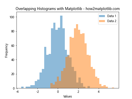
In this example, we generate two sets of random data using NumPy’s normal distribution. We then use Matplotlib’s hist() function to create overlapping histograms. The alpha parameter is set to 0.5 to make the histograms semi-transparent, allowing both distributions to be visible.
Customizing Overlapping Histograms
Matplotlib offers a wide range of customization options for overlapping histograms. Let’s explore some of these options to create more informative and visually appealing plots.
Adjusting Bin Width and Alignment
The bin width and alignment of overlapping histograms can significantly impact the visualization’s clarity. Here’s an example of how to adjust these parameters:
import matplotlib.pyplot as plt
import numpy as np

# Generate sample data
data1 = np.random.normal(0, 1, 1000)
data2 = np.random.normal(2, 1, 1000)

# Create overlapping histograms with custom bin width and alignment
bins = np.linspace(-4, 6, 40)
plt.hist(data1, bins=bins, alpha=0.5, label='Data 1')
plt.hist(data2, bins=bins, alpha=0.5, label='Data 2')

plt.xlabel('Values')
plt.ylabel('Frequency')
plt.title('Overlapping Histograms with Custom Bins - how2matplotlib.com')
plt.legend()
plt.show()
Output:
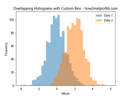
In this example, we use np.linspace() to create a custom set of bins that span the range of both datasets. This ensures that the histograms are aligned and use the same bin width, making it easier to compare the distributions.
Using Different Colors and Styles
To make overlapping histograms more visually distinct, you can use different colors and styles for each histogram:
import matplotlib.pyplot as plt
import numpy as np

# Generate sample data
data1 = np.random.normal(0, 1, 1000)
data2 = np.random.normal(2, 1, 1000)

# Create overlapping histograms with custom colors and styles
plt.hist(data1, bins=30, alpha=0.7, color='skyblue', edgecolor='black', linewidth=1.2, label='Data 1')
plt.hist(data2, bins=30, alpha=0.7, color='lightgreen', edgecolor='black', linewidth=1.2, label='Data 2')

plt.xlabel('Values')
plt.ylabel('Frequency')
plt.title('Stylized Overlapping Histograms - how2matplotlib.com')
plt.legend()
plt.show()
Output:
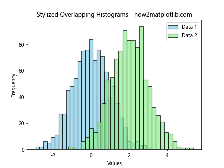
In this example, we use different colors for each histogram and add black edges to make them more distinct. The alpha value is increased to 0.7 to make the colors more vibrant while still allowing overlap visibility.
Adding Density Curves
To enhance the comparison between distributions, you can add density curves to your overlapping histograms:
import matplotlib.pyplot as plt
import numpy as np
from scipy import stats

# Generate sample data
data1 = np.random.normal(0, 1, 1000)
data2 = np.random.normal(2, 1, 1000)

# Create overlapping histograms with density curves
plt.hist(data1, bins=30, alpha=0.5, density=True, label='Data 1')
plt.hist(data2, bins=30, alpha=0.5, density=True, label='Data 2')

# Add density curves
x = np.linspace(-4, 6, 100)
plt.plot(x, stats.norm.pdf(x, 0, 1), 'r-', lw=2, label='Data 1 Density')
plt.plot(x, stats.norm.pdf(x, 2, 1), 'g-', lw=2, label='Data 2 Density')

plt.xlabel('Values')
plt.ylabel('Density')
plt.title('Overlapping Histograms with Density Curves - how2matplotlib.com')
plt.legend()
plt.show()
Output:
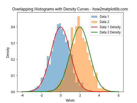
In this example, we set density=True in the hist() function to normalize the histogram data. We then use SciPy’s stats.norm.pdf() function to generate density curves for each distribution and plot them on top of the histograms.
Advanced Techniques for Overlapping Histograms
Now that we’ve covered the basics, let’s explore some advanced techniques for creating overlapping histograms with Matplotlib.
Stacked Overlapping Histograms
Stacked overlapping histograms can be useful when you want to show both the individual distributions and their combined effect:
import matplotlib.pyplot as plt
import numpy as np

# Generate sample data
data1 = np.random.normal(0, 1, 1000)
data2 = np.random.normal(2, 1, 1000)

# Create stacked overlapping histograms
plt.hist([data1, data2], bins=30, stacked=True, alpha=0.7, label=['Data 1', 'Data 2'])

plt.xlabel('Values')
plt.ylabel('Frequency')
plt.title('Stacked Overlapping Histograms - how2matplotlib.com')
plt.legend()
plt.show()
Output:
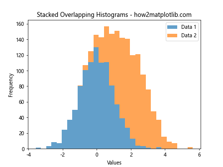
In this example, we pass both datasets as a list to the hist() function and set stacked=True to create a stacked histogram. This allows us to see both the individual distributions and their combined frequency.
Overlapping Histograms with Different Scales
Sometimes, you may need to plot overlapping histograms with different scales. Here’s how you can achieve this using two y-axes:
import matplotlib.pyplot as plt
import numpy as np

# Generate sample data
data1 = np.random.normal(0, 1, 1000)
data2 = np.random.exponential(2, 1000)

# Create figure and axes
fig, ax1 = plt.subplots()

# Plot first histogram
n1, bins1, patches1 = ax1.hist(data1, bins=30, alpha=0.7, color='skyblue', label='Data 1')
ax1.set_xlabel('Values')
ax1.set_ylabel('Frequency (Data 1)', color='skyblue')
ax1.tick_params(axis='y', labelcolor='skyblue')

# Create second y-axis and plot second histogram
ax2 = ax1.twinx()
n2, bins2, patches2 = ax2.hist(data2, bins=30, alpha=0.7, color='lightgreen', label='Data 2')
ax2.set_ylabel('Frequency (Data 2)', color='lightgreen')
ax2.tick_params(axis='y', labelcolor='lightgreen')

plt.title('Overlapping Histograms with Different Scales - how2matplotlib.com')
fig.legend(loc='upper right', bbox_to_anchor=(1, 1), bbox_transform=ax1.transAxes)
plt.show()
Output:
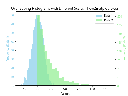
In this example, we create two y-axes using ax1.twinx(). This allows us to plot two histograms with different scales on the same plot, making it easier to compare distributions with different ranges or units.
Overlapping Histograms with Subplots
For more complex comparisons, you might want to create multiple sets of overlapping histograms using subplots:
import matplotlib.pyplot as plt
import numpy as np

# Generate sample data
data1 = np.random.normal(0, 1, 1000)
data2 = np.random.normal(2, 1, 1000)
data3 = np.random.normal(-1, 1.5, 1000)
data4 = np.random.normal(3, 0.5, 1000)

# Create figure and subplots
fig, (ax1, ax2) = plt.subplots(2, 1, figsize=(10, 8))

# Plot first set of overlapping histograms
ax1.hist(data1, bins=30, alpha=0.5, label='Data 1')
ax1.hist(data2, bins=30, alpha=0.5, label='Data 2')
ax1.set_xlabel('Values')
ax1.set_ylabel('Frequency')
ax1.set_title('Overlapping Histograms Set 1 - how2matplotlib.com')
ax1.legend()

# Plot second set of overlapping histograms
ax2.hist(data3, bins=30, alpha=0.5, label='Data 3')
ax2.hist(data4, bins=30, alpha=0.5, label='Data 4')
ax2.set_xlabel('Values')
ax2.set_ylabel('Frequency')
ax2.set_title('Overlapping Histograms Set 2 - how2matplotlib.com')
ax2.legend()

plt.tight_layout()
plt.show()
Output:
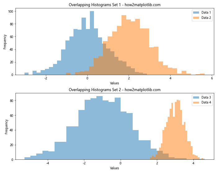
In this example, we create two subplots, each containing a set of overlapping histograms. This allows for easy comparison between multiple pairs of distributions.
Enhancing Overlapping Histograms with Statistical Information
To make overlapping histograms more informative, you can add statistical information directly to the plot. Let’s explore some techniques for incorporating statistical data into your visualizations.
Adding Mean and Standard Deviation Lines
Adding vertical lines to represent the mean and standard deviation of each distribution can provide valuable insights:
import matplotlib.pyplot as plt
import numpy as np

# Generate sample data
data1 = np.random.normal(0, 1, 1000)
data2 = np.random.normal(2, 1, 1000)

# Calculate means and standard deviations
mean1, std1 = np.mean(data1), np.std(data1)
mean2, std2 = np.mean(data2), np.std(data2)

# Create overlapping histograms
plt.hist(data1, bins=30, alpha=0.5, label='Data 1')
plt.hist(data2, bins=30, alpha=0.5, label='Data 2')

# Add mean and standard deviation lines
plt.axvline(mean1, color='r', linestyle='dashed', linewidth=2, label='Mean (Data 1)')
plt.axvline(mean1 - std1, color='r', linestyle='dotted', linewidth=2)
plt.axvline(mean1 + std1, color='r', linestyle='dotted', linewidth=2)

plt.axvline(mean2, color='g', linestyle='dashed', linewidth=2, label='Mean (Data 2)')
plt.axvline(mean2 - std2, color='g', linestyle='dotted', linewidth=2)
plt.axvline(mean2 + std2, color='g', linestyle='dotted', linewidth=2)

plt.xlabel('Values')
plt.ylabel('Frequency')
plt.title('Overlapping Histograms with Statistical Information - how2matplotlib.com')
plt.legend()
plt.show()
Output:
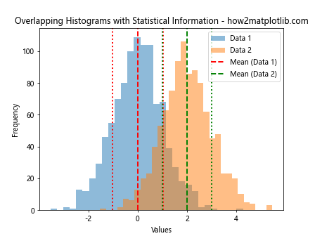
In this example, we calculate the mean and standard deviation for each dataset and add vertical lines to represent these values. Dashed lines represent the means, while dotted lines show one standard deviation above and below the mean.
Incorporating Box Plots
Combining overlapping histograms with box plots can provide a comprehensive view of the data distributions:
import matplotlib.pyplot as plt
import numpy as np

# Generate sample data
data1 = np.random.normal(0, 1, 1000)
data2 = np.random.normal(2, 1, 1000)

# Create figure and axes
fig, (ax1, ax2) = plt.subplots(2, 1, figsize=(10, 8), sharex=True, gridspec_kw={'height_ratios': [3, 1]})

# Plot overlapping histograms
ax1.hist(data1, bins=30, alpha=0.5, label='Data 1')
ax1.hist(data2, bins=30, alpha=0.5, label='Data 2')
ax1.set_ylabel('Frequency')
ax1.set_title('Overlapping Histograms with Box Plots - how2matplotlib.com')
ax1.legend()

# Plot box plots
ax2.boxplot([data1, data2], labels=['Data 1', 'Data 2'])
ax2.set_xlabel('Datasets')

plt.tight_layout()
plt.show()
Output:
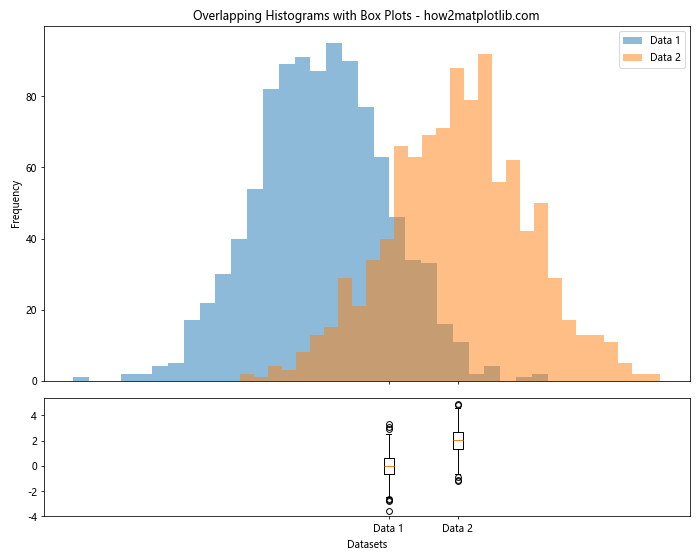
In this example, we create two subplots: one for the overlapping histograms and another for the box plots. This combination allows for a detailed comparison of the distributions, including their central tendencies, spread, and potential outliers.
Customizing Overlapping Histograms for Specific Use Cases
Overlapping histograms can be adapted to various specific use cases. Let’s explore some examples of how to customize overlapping histograms for different scenarios.
Comparing Before and After Data
When comparing data from before and after an intervention or treatment, overlapping histograms can be particularly useful:
import matplotlib.pyplot as plt
import numpy as np

# Generate sample data
before = np.random.normal(50, 10, 1000)
after = np.random.normal(60, 8, 1000)

# Create overlapping histograms
plt.hist(before, bins=30, alpha=0.5, label='Before', color='skyblue')
plt.hist(after, bins=30, alpha=0.5, label='After', color='lightgreen')

plt.xlabel('Score')
plt.ylabel('Frequency')
plt.title('Before vs. After Treatment Comparison - how2matplotlib.com')
plt.legend()

# Add annotations
plt.annotate('Improvement', xy=(55, 50), xytext=(40, 80),
             arrowprops=dict(facecolor='black', shrink=0.05))

plt.show()
Output:
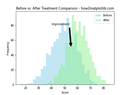
In this example, we create overlapping histograms to compare data before and after a hypothetical treatment. We use different colors for each distribution and add an annotation to highlight the improvement.
Visualizing Gender Differences
Overlapping histograms can be used to visualize differences between demographic groups, such as gender:
import matplotlib.pyplot as plt
import numpy as np

# Generate sample data
male_heights = np.random.normal(175, 7, 1000)
female_heights = np.random.normal(162, 6, 1000)

# Create overlapping histograms
plt.hist(male_heights, bins=30, alpha=0.5, label='Male', color='blue')
plt.hist(female_heights, bins=30, alpha=0.5, label='Female', color='pink')

plt.xlabel('Height (cm)')
plt.ylabel('Frequency')
plt.title('Height Distribution by Gender - how2matplotlib.com')
plt.legend()

# Add vertical lines for mean heights
plt.axvline(np.mean(male_heights), color='blue', linestyle='dashed', linewidth=2)
plt.axvline(np.mean(female_heights), color='pink', linestyle='dashed', linewidth=2)

plt.show()
Output:
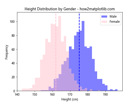
In this example, we create overlapping histograms to compare height distributions between males and females. We use gender-stereotypical colors and add vertical lines to represent the mean height for each group.
Comparing Multiple Product Versions
Overlapping histograms can be useful for comparing performance metrics across different product versions:
import matplotlib.pyplot as plt
import numpy as np

# Generate sample data
version1 = np.random.normal(50, 10, 1000)
version2 = np.random.normal(55, 8, 1000)
version3 = np.random.normal(60, 9, 1000)

# Create overlapping histograms
plt.hist(version1, bins=30, alpha=0.5, label='Version 1', color='red')
plt.hist(version2, bins=30, alpha=0.5, label='Version 2', color='green')
plt.hist(version3, bins=30, alpha=0.5, label='Version 3', color='blue')

plt.xlabel('Performance Score')
plt.ylabel('Frequency')
plt.title('Product Performance Comparison - how2matplotlib.com')
plt.legend()

# Add text annotations for mean scores
plt.text(40, 80, f'Mean V1: {np.mean(version1):.2f}', color='red')
plt.text(40, 70, f'Mean V2: {np.mean(version2):.2f}', color='green')
plt.text(40, 60, f'Mean V3: {np.mean(version3):.2f}', color='blue')

plt.show()
Output:
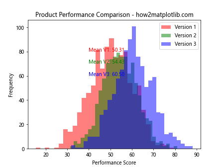
In this example, we create overlapping histograms to compare performance scores across three product versions. We use different colors for each version and add text annotations to display the mean scores.
Advanced Styling Techniques for Overlapping Histograms
To make your overlapping histograms stand out, you can apply advanced styling techniques. Let’s explore some ways to enhance the visual appeal of your plots.
Using Custom Color Palettes
You can use custom color palettes to create visually striking overlapping histograms:
import matplotlib.pyplot as plt
import numpy as np
import seaborn as sns

# Set a custom color palette
sns.set_palette("husl")

# Generate sample data
data1 = np.random.normal(0, 1, 1000)
data2 = np.random.normal(2, 1, 1000)
data3 = np.random.normal(-1, 1.5, 1000)

# Create overlapping histograms with custom colors
plt.hist(data1, bins=30, alpha=0.6, label='Data 1')
plt.hist(data2, bins=30, alpha=0.6, label='Data 2')
plt.hist(data3, bins=30, alpha=0.6, label='Data 3')

plt.xlabel('Values')
plt.ylabel('Frequency')
plt.title('Overlapping Histograms with Custom Colors - how2matplotlib.com')
plt.legend()

plt.show()
Output:
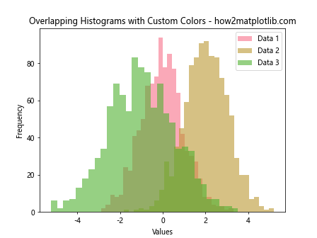
In this example, we use Seaborn’s set_palette() function to set a custom color palette for our overlapping histograms. This creates a visually appealing and harmonious color scheme.
Adding a Background Grid
Adding a background grid can improve the readability of your overlapping histograms:
import matplotlib.pyplot as plt
import numpy as np

# Generate sample data
data1 = np.random.normal(0, 1, 1000)
data2 = np.random.normal(2, 1, 1000)

# Create figure and axes
fig, ax = plt.subplots(figsize=(10, 6))

# Create overlapping histograms
ax.hist(data1, bins=30, alpha=0.5, label='Data 1')
ax.hist(data2, bins=30, alpha=0.5, label='Data 2')

ax.set_xlabel('Values')
ax.set_ylabel('Frequency')
ax.set_title('Overlapping Histograms with Grid - how2matplotlib.com')
ax.legend()

# Add grid
ax.grid(True, linestyle='--', alpha=0.7)

plt.show()
Output:
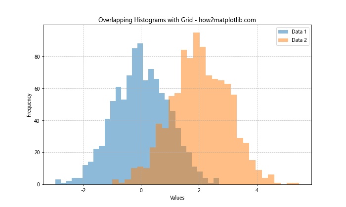
In this example, we add a background grid using the grid() function. The grid lines are styled with dashes and reduced opacity to avoid overwhelming the histogram data.
Using a Dark Theme
A dark theme can make your overlapping histograms more visually striking:
import matplotlib.pyplot as plt
import numpy as np

# Set dark theme
plt.style.use('dark_background')

# Generate sample data
data1 = np.random.normal(0, 1, 1000)
data2 = np.random.normal(2, 1, 1000)

# Create overlapping histograms
plt.hist(data1, bins=30, alpha=0.7, label='Data 1', color='skyblue')
plt.hist(data2, bins=30, alpha=0.7, label='Data 2', color='lightgreen')

plt.xlabel('Values')
plt.ylabel('Frequency')
plt.title('Overlapping Histograms with Dark Theme - how2matplotlib.com')
plt.legend()

plt.show()
Output:
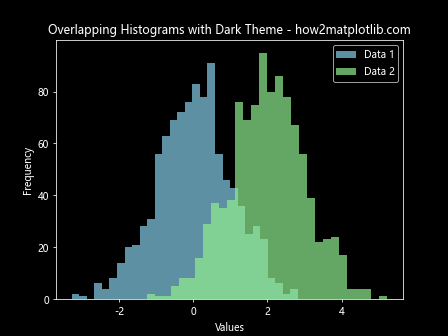
In this example, we use plt.style.use('dark_background') to set a dark theme for our plot. We then choose light colors for the histograms to create a strong contrast against the dark background.
Handling Large Datasets in Overlapping Histograms
When working with large datasets, creating overlapping histograms can be challenging. Here are some techniques to effectively visualize large datasets using overlapping histograms.
Using Log Scale
For datasets with a wide range of values, using a logarithmic scale can help visualize the distribution more effectively:
import matplotlib.pyplot as plt
import numpy as np

# Generate sample data
data1 = np.random.lognormal(0, 1, 10000)
data2 = np.random.lognormal(0.5, 1.2, 10000)

# Create overlapping histograms with log scale
plt.hist(data1, bins=50, alpha=0.5, label='Data 1')
plt.hist(data2, bins=50, alpha=0.5, label='Data 2')

plt.xscale('log')
plt.yscale('log')

plt.xlabel('Values (log scale)')
plt.ylabel('Frequency (log scale)')
plt.title('Overlapping Histograms with Log Scale - how2matplotlib.com')
plt.legend()

plt.show()
Output:
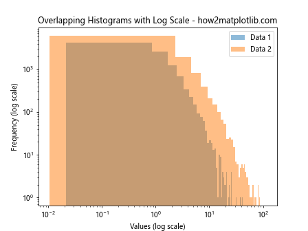
In this example, we use plt.xscale('log') and plt.yscale('log') to set both axes to a logarithmic scale. This helps to visualize the distribution of data that spans several orders of magnitude.
Using Kernel Density Estimation
For very large datasets, using kernel density estimation (KDE) instead of histograms can provide a smoother representation of the distribution:
import matplotlib.pyplot as plt
import numpy as np
from scipy import stats

# Generate sample data
data1 = np.random.normal(0, 1, 100000)
data2 = np.random.normal(2, 1, 100000)

# Calculate KDE
x = np.linspace(-4, 6, 1000)
kde1 = stats.gaussian_kde(data1)
kde2 = stats.gaussian_kde(data2)

# Plot KDE
plt.plot(x, kde1(x), label='Data 1')
plt.plot(x, kde2(x), label='Data 2')

plt.fill_between(x, kde1(x), alpha=0.3)
plt.fill_between(x, kde2(x), alpha=0.3)

plt.xlabel('Values')
plt.ylabel('Density')
plt.title('Overlapping KDE Plots - how2matplotlib.com')
plt.legend()

plt.show()
Output:
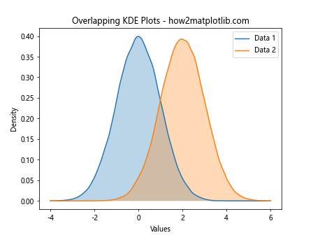
In this example, we use SciPy’s gaussian_kde() function to calculate the kernel density estimation for each dataset. We then plot the KDE curves and fill the area under each curve with a semi-transparent color.
Best Practices for Creating Overlapping Histograms
When creating overlapping histograms with Matplotlib, it’s important to follow some best practices to ensure your visualizations are clear, informative, and easy to interpret. Here are some key guidelines:
- Use appropriate transparency: Set the
alphavalue to allow visibility of overlapping areas while maintaining the distinctness of each histogram. Choose contrasting colors: Select colors that are easily distinguishable from each other to help viewers differentiate between distributions.
Align bin edges: Ensure that the bin edges of all histograms are aligned to facilitate accurate comparisons.
Normalize data when necessary: If comparing datasets of different sizes, consider normalizing the data or using density plots instead of raw counts.
Add clear labels and legends: Provide informative labels for axes, titles, and legends to help viewers understand the data being presented.
Consider using density curves: Adding density curves can provide a smoother representation of the distribution and facilitate comparisons.
Use appropriate scales: Choose linear or logarithmic scales based on the nature of your data and the range of values.
Avoid overcrowding: Limit the number of overlapping histograms to maintain clarity. If you need to compare many distributions, consider using small multiples or other visualization techniques.
Provide context: Add statistical information, such as mean and standard deviation lines, to give viewers more insight into the data.
Test for colorblindness: Ensure that your color choices are accessible to colorblind viewers by using colorblind-friendly palettes or patterns.
Conclusion
Overlapping histograms with Matplotlib are a powerful tool for comparing multiple distributions in a single plot. Throughout this article, we’ve explored various techniques for creating, customizing, and enhancing overlapping histograms to suit different data visualization needs. We’ve covered basic creation of overlapping histograms, advanced styling techniques, handling large datasets, and even touched on interactive visualizations. By following the best practices and examples provided, you’ll be well-equipped to create informative and visually appealing overlapping histograms for your data analysis projects.