How to Plot Multiple Lines in Matplotlib
Plot Multiple lines in Matplotlib is a powerful technique for visualizing and comparing multiple data sets or trends simultaneously. This article will provide an in-depth exploration of various methods and techniques to plot multiple lines using Matplotlib, one of the most popular data visualization libraries in Python. We’ll cover everything from basic line plots to advanced customization options, ensuring you have a thorough understanding of how to create informative and visually appealing multi-line plots.
Introduction to Plotting Multiple Lines in Matplotlib
Matplotlib is a versatile library that allows you to plot multiple lines on a single graph with ease. This capability is particularly useful when you need to compare different data sets, show trends over time, or visualize relationships between various variables. To plot multiple lines in Matplotlib, you typically create a figure and axis object, then use the plot() function multiple times or pass multiple data sets to a single plot() call.
Let’s start with a basic example of how to plot multiple lines in Matplotlib:
import matplotlib.pyplot as plt
import numpy as np

x = np.linspace(0, 10, 100)
y1 = np.sin(x)
y2 = np.cos(x)

plt.figure(figsize=(10, 6))
plt.plot(x, y1, label='Sine')
plt.plot(x, y2, label='Cosine')
plt.title('Plot Multiple Lines in Matplotlib - how2matplotlib.com')
plt.xlabel('X-axis')
plt.ylabel('Y-axis')
plt.legend()
plt.grid(True)
plt.show()
Output:
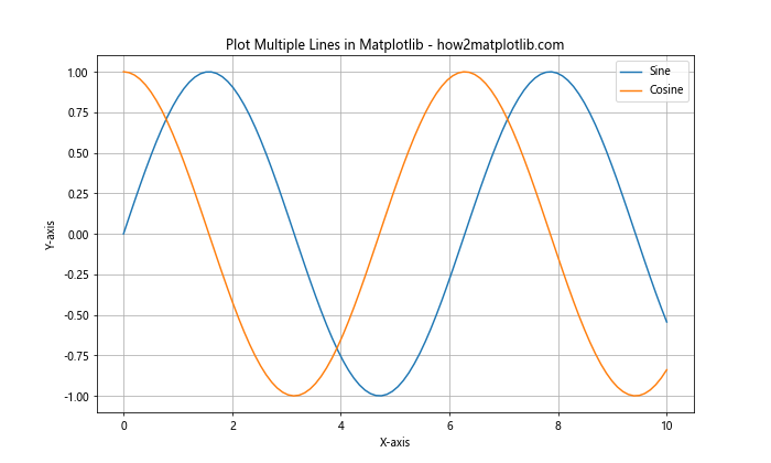
In this example, we create two lines representing sine and cosine functions. We use separate plot() calls for each line, which allows us to customize their appearance individually. The label parameter is used to create a legend, making it easy to identify each line.
Different Methods to Plot Multiple Lines in Matplotlib
There are several ways to plot multiple lines in Matplotlib. Let’s explore some of the most common methods:
1. Multiple plot() Calls
As shown in the previous example, you can use multiple plot() calls to add lines to your graph. This method gives you the most control over individual line properties:
import matplotlib.pyplot as plt
import numpy as np

x = np.linspace(0, 5, 100)
y1 = x
y2 = x**2
y3 = x**3

plt.figure(figsize=(10, 6))
plt.plot(x, y1, label='Linear')
plt.plot(x, y2, label='Quadratic')
plt.plot(x, y3, label='Cubic')
plt.title('Plot Multiple Lines in Matplotlib - how2matplotlib.com')
plt.xlabel('X-axis')
plt.ylabel('Y-axis')
plt.legend()
plt.show()
Output:

This method allows you to set different colors, line styles, and other properties for each line individually.
2. Single plot() Call with Multiple Data Sets
You can also plot multiple lines using a single plot() call by passing multiple x-y pairs:
import matplotlib.pyplot as plt
import numpy as np

x = np.linspace(0, 2*np.pi, 100)
y1 = np.sin(x)
y2 = np.cos(x)
y3 = np.tan(x)

plt.figure(figsize=(10, 6))
plt.plot(x, y1, x, y2, x, y3)
plt.title('Plot Multiple Lines in Matplotlib - how2matplotlib.com')
plt.xlabel('X-axis')
plt.ylabel('Y-axis')
plt.legend(['Sine', 'Cosine', 'Tangent'])
plt.ylim(-2, 2)
plt.show()
Output:
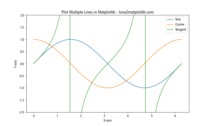
This method is more concise but offers less control over individual line properties.
3. Using plt.subplots()
For more complex plots, you can use plt.subplots() to create a figure and axis object, which gives you more control over the plot:
import matplotlib.pyplot as plt
import numpy as np

x = np.linspace(0, 10, 100)
y1 = np.sin(x)
y2 = np.cos(x)
y3 = np.tan(x)

fig, ax = plt.subplots(figsize=(10, 6))
ax.plot(x, y1, label='Sine')
ax.plot(x, y2, label='Cosine')
ax.plot(x, y3, label='Tangent')
ax.set_title('Plot Multiple Lines in Matplotlib - how2matplotlib.com')
ax.set_xlabel('X-axis')
ax.set_ylabel('Y-axis')
ax.legend()
ax.set_ylim(-2, 2)
plt.show()
Output:
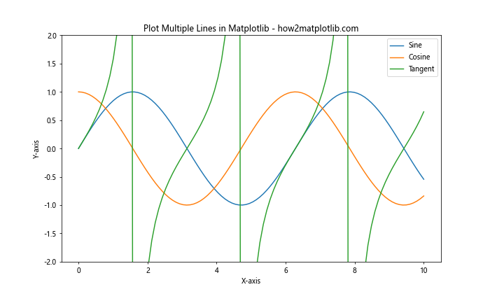
This method is particularly useful when you need to create multiple subplots or want to have more fine-grained control over plot elements.
Customizing Line Styles and Colors
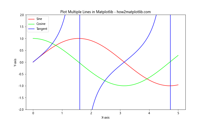
When you plot multiple lines in Matplotlib, it’s important to make each line distinguishable. Matplotlib offers various ways to customize line styles and colors:
Line Colors
You can specify line colors using color names, hex codes, or RGB values:
import matplotlib.pyplot as plt
import numpy as np

x = np.linspace(0, 5, 100)
y1 = np.sin(x)
y2 = np.cos(x)
y3 = np.tan(x)

plt.figure(figsize=(10, 6))
plt.plot(x, y1, color='red', label='Sine')
plt.plot(x, y2, color='#00FF00', label='Cosine')
plt.plot(x, y3, color=(0, 0, 1), label='Tangent')
plt.title('Plot Multiple Lines in Matplotlib - how2matplotlib.com')
plt.xlabel('X-axis')
plt.ylabel('Y-axis')
plt.legend()
plt.ylim(-2, 2)
plt.show()
Output:
Line Styles
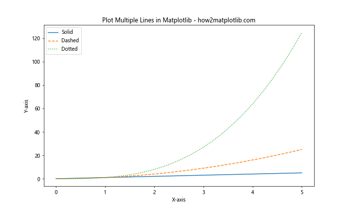
Matplotlib provides various line styles such as solid, dashed, dotted, and dash-dot:
import matplotlib.pyplot as plt
import numpy as np

x = np.linspace(0, 5, 100)
y1 = x
y2 = x**2
y3 = x**3

plt.figure(figsize=(10, 6))
plt.plot(x, y1, linestyle='-', label='Solid')
plt.plot(x, y2, linestyle='--', label='Dashed')
plt.plot(x, y3, linestyle=':', label='Dotted')
plt.title('Plot Multiple Lines in Matplotlib - how2matplotlib.com')
plt.xlabel('X-axis')
plt.ylabel('Y-axis')
plt.legend()
plt.show()
Output:
Line Width
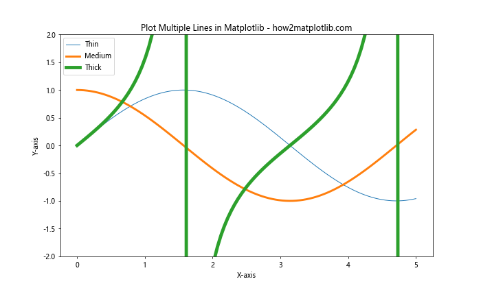
You can adjust the thickness of lines using the linewidth or lw parameter:
import matplotlib.pyplot as plt
import numpy as np

x = np.linspace(0, 5, 100)
y1 = np.sin(x)
y2 = np.cos(x)
y3 = np.tan(x)

plt.figure(figsize=(10, 6))
plt.plot(x, y1, linewidth=1, label='Thin')
plt.plot(x, y2, linewidth=3, label='Medium')
plt.plot(x, y3, linewidth=5, label='Thick')
plt.title('Plot Multiple Lines in Matplotlib - how2matplotlib.com')
plt.xlabel('X-axis')
plt.ylabel('Y-axis')
plt.legend()
plt.ylim(-2, 2)
plt.show()
Output:
Adding Markers to Lines
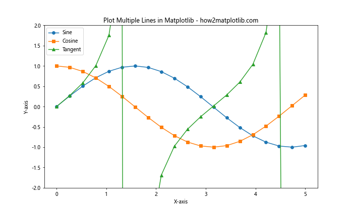
When you plot multiple lines in Matplotlib, adding markers can help distinguish data points and make the plot more informative:
import matplotlib.pyplot as plt
import numpy as np

x = np.linspace(0, 5, 20)
y1 = np.sin(x)
y2 = np.cos(x)
y3 = np.tan(x)

plt.figure(figsize=(10, 6))
plt.plot(x, y1, marker='o', label='Sine')
plt.plot(x, y2, marker='s', label='Cosine')
plt.plot(x, y3, marker='^', label='Tangent')
plt.title('Plot Multiple Lines in Matplotlib - how2matplotlib.com')
plt.xlabel('X-axis')
plt.ylabel('Y-axis')
plt.legend()
plt.ylim(-2, 2)
plt.show()
Output:
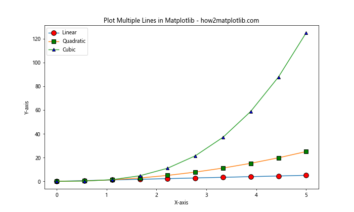
You can customize marker size, color, and edge color:
import matplotlib.pyplot as plt
import numpy as np

x = np.linspace(0, 5, 10)
y1 = x
y2 = x**2
y3 = x**3

plt.figure(figsize=(10, 6))
plt.plot(x, y1, marker='o', markersize=10, markerfacecolor='red', markeredgecolor='black', label='Linear')
plt.plot(x, y2, marker='s', markersize=8, markerfacecolor='green', markeredgecolor='black', label='Quadratic')
plt.plot(x, y3, marker='^', markersize=6, markerfacecolor='blue', markeredgecolor='black', label='Cubic')
plt.title('Plot Multiple Lines in Matplotlib - how2matplotlib.com')
plt.xlabel('X-axis')
plt.ylabel('Y-axis')
plt.legend()
plt.show()
Output:
Customizing Legends
When you plot multiple lines in Matplotlib, a well-designed legend is crucial for understanding the graph. Here are some ways to customize legends:
Legend Position
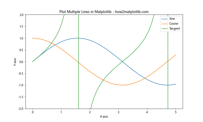
You can specify the legend position using the loc parameter:
import matplotlib.pyplot as plt
import numpy as np

x = np.linspace(0, 5, 100)
y1 = np.sin(x)
y2 = np.cos(x)
y3 = np.tan(x)

plt.figure(figsize=(10, 6))
plt.plot(x, y1, label='Sine')
plt.plot(x, y2, label='Cosine')
plt.plot(x, y3, label='Tangent')
plt.title('Plot Multiple Lines in Matplotlib - how2matplotlib.com')
plt.xlabel('X-axis')
plt.ylabel('Y-axis')
plt.legend(loc='upper right')
plt.ylim(-2, 2)
plt.show()
Output:
Legend Outside the Plot
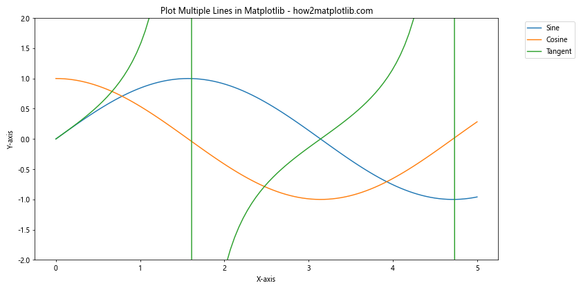
You can place the legend outside the plot area:
import matplotlib.pyplot as plt
import numpy as np

x = np.linspace(0, 5, 100)
y1 = np.sin(x)
y2 = np.cos(x)
y3 = np.tan(x)

plt.figure(figsize=(12, 6))
plt.plot(x, y1, label='Sine')
plt.plot(x, y2, label='Cosine')
plt.plot(x, y3, label='Tangent')
plt.title('Plot Multiple Lines in Matplotlib - how2matplotlib.com')
plt.xlabel('X-axis')
plt.ylabel('Y-axis')
plt.legend(bbox_to_anchor=(1.05, 1), loc='upper left')
plt.ylim(-2, 2)
plt.tight_layout()
plt.show()
Output:
Customizing Legend Appearance
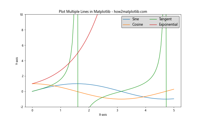
You can customize the legend’s appearance, including font size, number of columns, and background color:
import matplotlib.pyplot as plt
import numpy as np

x = np.linspace(0, 5, 100)
y1 = np.sin(x)
y2 = np.cos(x)
y3 = np.tan(x)
y4 = np.exp(x)

plt.figure(figsize=(10, 6))
plt.plot(x, y1, label='Sine')
plt.plot(x, y2, label='Cosine')
plt.plot(x, y3, label='Tangent')
plt.plot(x, y4, label='Exponential')
plt.title('Plot Multiple Lines in Matplotlib - how2matplotlib.com')
plt.xlabel('X-axis')
plt.ylabel('Y-axis')
plt.legend(fontsize=12, ncol=2, facecolor='lightgray', edgecolor='black')
plt.ylim(-2, 10)
plt.show()
Output:
Adding Grid Lines
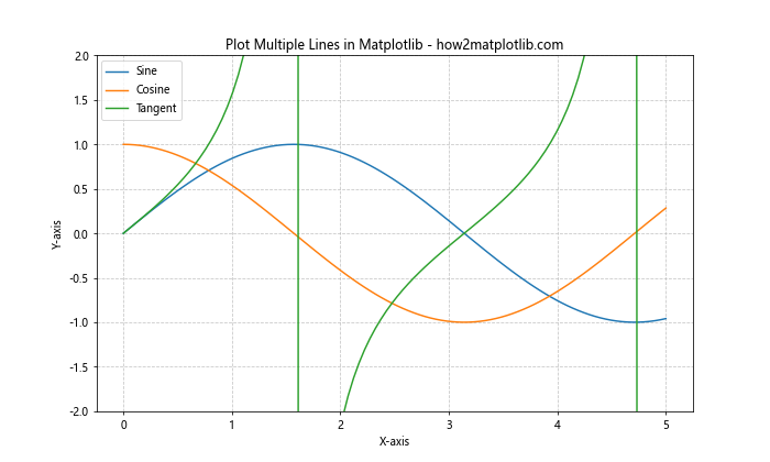
Grid lines can make it easier to read values from your plot. When you plot multiple lines in Matplotlib, adding a grid can enhance the readability of your graph:
import matplotlib.pyplot as plt
import numpy as np

x = np.linspace(0, 5, 100)
y1 = np.sin(x)
y2 = np.cos(x)
y3 = np.tan(x)

plt.figure(figsize=(10, 6))
plt.plot(x, y1, label='Sine')
plt.plot(x, y2, label='Cosine')
plt.plot(x, y3, label='Tangent')
plt.title('Plot Multiple Lines in Matplotlib - how2matplotlib.com')
plt.xlabel('X-axis')
plt.ylabel('Y-axis')
plt.legend()
plt.grid(True, linestyle='--', alpha=0.7)
plt.ylim(-2, 2)
plt.show()
Output:
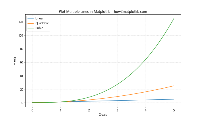
You can customize the grid appearance:
import matplotlib.pyplot as plt
import numpy as np

x = np.linspace(0, 5, 100)
y1 = x
y2 = x**2
y3 = x**3

plt.figure(figsize=(10, 6))
plt.plot(x, y1, label='Linear')
plt.plot(x, y2, label='Quadratic')
plt.plot(x, y3, label='Cubic')
plt.title('Plot Multiple Lines in Matplotlib - how2matplotlib.com')
plt.xlabel('X-axis')
plt.ylabel('Y-axis')
plt.legend()
plt.grid(True, which='both', linestyle=':', color='gray', alpha=0.5)
plt.show()
Output:
Using Different Scales for Multiple Lines
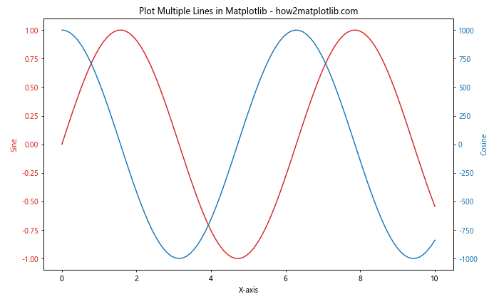
When you plot multiple lines in Matplotlib that have significantly different scales, you can use secondary y-axes:
import matplotlib.pyplot as plt
import numpy as np

x = np.linspace(0, 10, 100)
y1 = np.sin(x)
y2 = 1000 * np.cos(x)

fig, ax1 = plt.subplots(figsize=(10, 6))

color = 'tab:red'
ax1.set_xlabel('X-axis')
ax1.set_ylabel('Sine', color=color)
ax1.plot(x, y1, color=color, label='Sine')
ax1.tick_params(axis='y', labelcolor=color)

ax2 = ax1.twinx()
color = 'tab:blue'
ax2.set_ylabel('Cosine', color=color)
ax2.plot(x, y2, color=color, label='Cosine')
ax2.tick_params(axis='y', labelcolor=color)

plt.title('Plot Multiple Lines in Matplotlib - how2matplotlib.com')
fig.tight_layout()
plt.show()
Output:
Handling Time Series Data
When you plot multiple lines in Matplotlib with time series data, you may need to handle date formatting:
import matplotlib.pyplot as plt
import pandas as pd
import numpy as np

dates = pd.date_range(start='2023-01-01', end='2023-12-31', freq='D')
y1 = np.random.randn(len(dates)).cumsum()
y2 = np.random.randn(len(dates)).cumsum()
y3 = np.random.randn(len(dates)).cumsum()

plt.figure(figsize=(12, 6))
plt.plot(dates, y1, label='Series 1')
plt.plot(dates, y2, label='Series 2')
plt.plot(dates, y3, label='Series 3')
plt.title('Plot Multiple Lines in Matplotlib - Time Series - how2matplotlib.com')
plt.xlabel('Date')
plt.ylabel('Value')
plt.legend()
plt.gcf().autofmt_xdate()  # Rotate and align the tick labels
plt.show()
Output:
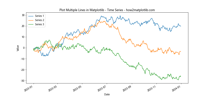
This example shows how to plot multiple lines in Matplotlib using time series data, with proper date formatting on the x-axis.
Adding Annotations to Multiple Lines
When you plot multiple lines in Matplotlib, adding annotations can help highlight specific points or provide additional information:
import matplotlib.pyplot as plt
import numpy as np

x = np.linspace(0, 10, 100)
y1 = np.sin(x)
y2 = np.cos(x)

plt.figure(figsize=(12, 6))
plt.plot(x, y1, label='Sine')
plt.plot(x, y2, label='Cosine')

plt.annotate('Sine Peak', xy=(np.pi/2, 1), xytext=(np.pi/2 + 1, 1.2),
             arrowprops=dict(facecolor='black', shrink=0.05))
plt.annotate('Cosine Valley', xy=(np.pi, -1), xytext=(np.pi + 1, -1.2),
             arrowprops=dict(facecolor='black', shrink=0.05))

plt.title('Plot Multiple Lines in Matplotlib with Annotations - how2matplotlib.com')
plt.xlabel('X-axis')
plt.ylabel('Y-axis')
plt.legend()
plt.grid(True)
plt.show()
Output:
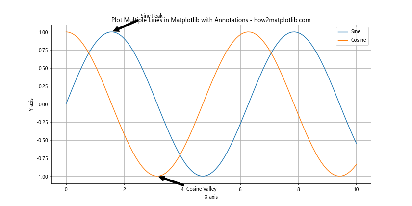
This example demonstrates how to add annotations to specific points on multiple lines, enhancing the information conveyed by the plot.
Using Different Line Styles for Clarity
When you plot multiple lines in Matplotlib, using different line styles can help distinguish between lines, especially when printing in black and white:
import matplotlib.pyplot as plt
import numpy as np

x = np.linspace(0, 10, 100)
y1 = np.sin(x)
y2 = np.cos(x)
y3 = np.tan(x)
y4 = x

plt.figure(figsize=(12, 6))
plt.plot(x, y1, linestyle='-', label='Solid')
plt.plot(x, y2, linestyle='--', label='Dashed')
plt.plot(x, y3, linestyle=':', label='Dotted')
plt.plot(x, y4, linestyle='-.', label='Dash-dot')

plt.title('Plot Multiple Lines in Matplotlib with Different Styles - how2matplotlib.com')
plt.xlabel('X-axis')
plt.ylabel('Y-axis')
plt.legend()
plt.ylim(-5, 5)
plt.show()
Output:
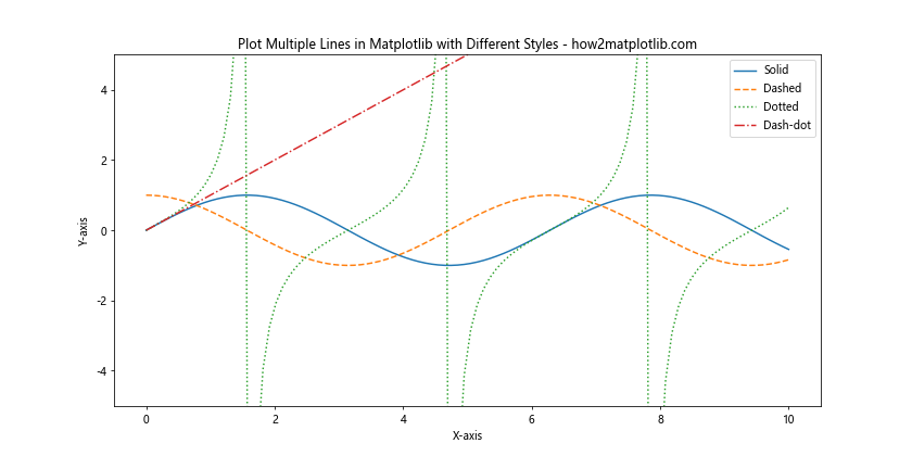
This example shows how to use different line styles when you plot multiple lines in Matplotlib, improving the readability of your graph.
Creating a Stacked Line Plot
A stacked line plot can be useful when you want to show how different components contribute to a total:
import matplotlib.pyplot as plt
import numpy as np

x = np.linspace(0, 10, 100)
y1 = np.random.rand(100)
y2 = np.random.rand(100)
y3 = np.random.rand(100)

plt.figure(figsize=(12, 6))
plt.fill_between(x, y1, label='Series 1')
plt.fill_between(x, y1, y1+y2, label='Series 2')
plt.fill_between(x, y1+y2, y1+y2+y3, label='Series 3')

plt.title('Stacked Line Plot - how2matplotlib.com')
plt.xlabel('X-axis')
plt.ylabel('Y-axis')
plt.legend()
plt.show()
Output:
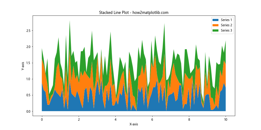
This example demonstrates how to create a stacked line plot, which is a variation of plotting multiple lines in Matplotlib.
Handling Missing Data
When you plot multiple lines in Matplotlib, you may encounter missing data. Here’s how to handle it:
import matplotlib.pyplot as plt
import numpy as np
import pandas as pd

dates = pd.date_range(start='2023-01-01', end='2023-12-31', freq='D')
y1 = np.random.randn(len(dates)).cumsum()
y2 = np.random.randn(len(dates)).cumsum()

# Introduce some missing data
y1[50:100] = np.nan
y2[150:200] = np.nan

plt.figure(figsize=(12, 6))
plt.plot(dates, y1, label='Series 1')
plt.plot(dates, y2, label='Series 2')

plt.title('Plot Multiple Lines in Matplotlib with Missing Data - how2matplotlib.com')
plt.xlabel('Date')
plt.ylabel('Value')
plt.legend()
plt.gcf().autofmt_xdate()
plt.show()
Output:
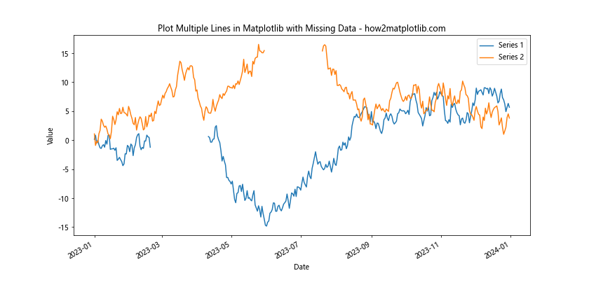
This example shows how Matplotlib handles missing data when plotting multiple lines, which is important for real-world data analysis scenarios.
Creating a Multi-Line Plot with Shared X-axis but Different Y-axes
Sometimes, when you plot multiple lines in Matplotlib, you may want to use a shared x-axis but different y-axes for each line:
import matplotlib.pyplot as plt
import numpy as np

x = np.linspace(0, 10, 100)
y1 = np.sin(x)
y2 = np.exp(x)

fig, ax1 = plt.subplots(figsize=(12, 6))

color = 'tab:blue'
ax1.set_xlabel('X-axis')
ax1.set_ylabel('Sine', color=color)
ax1.plot(x, y1, color=color)
ax1.tick_params(axis='y', labelcolor=color)

ax2 = ax1.twinx()
color = 'tab:orange'
ax2.set_ylabel('Exponential', color=color)
ax2.plot(x, y2, color=color)
ax2.tick_params(axis='y', labelcolor=color)

plt.title('Multi-Line Plot with Different Y-axes - how2matplotlib.com')
fig.tight_layout()
plt.show()
Output:
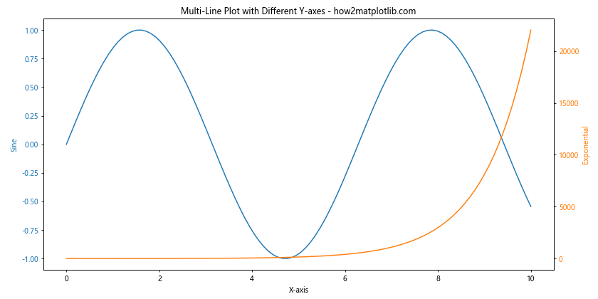
This example demonstrates how to create a plot with multiple lines that share an x-axis but have different y-axes, which is useful for comparing data with different scales.
Adding a Colorbar to Multi-Line Plots
When you plot multiple lines in Matplotlib, adding a colorbar can provide an additional dimension of information:
import matplotlib.pyplot as plt
import numpy as np

x = np.linspace(0, 10, 100)
y = np.random.rand(5, 100)

plt.figure(figsize=(12, 6))
for i in range(5):
    plt.plot(x, y[i], label=f'Line {i+1}')

plt.colorbar(plt.cm.ScalarMappable(cmap='viridis'), label='Line Number')
plt.title('Multi-Line Plot with Colorbar - how2matplotlib.com')
plt.xlabel('X-axis')
plt.ylabel('Y-axis')
plt.legend()
plt.show()
This example shows how to add a colorbar to a plot with multiple lines, providing an additional way to distinguish between different lines.
Conclusion
Plotting multiple lines in Matplotlib is a powerful technique for visualizing and comparing different data sets or functions. Throughout this article, we’ve explored various methods and customization options for creating multi-line plots, including:
- Basic line plotting techniques
- Customizing line styles, colors, and markers
- Adding and customizing legends
- Working with grid lines
- Handling different scales and time series data
- Creating subplots and stacked line plots
- Dealing with missing data
- Using different y-axes for multiple lines
- Adding colorbars to multi-line plots
By mastering these techniques, you’ll be able to create informative and visually appealing multi-line plots that effectively communicate your data and insights. Remember to experiment with different combinations of these methods to find the best way to represent your specific data and tell your story through visualization.
When you plot multiple lines in Matplotlib, always consider the following best practices:
- Use clear and distinguishable colors or line styles for each line
- Provide a legend to identify each line
- Label your axes and provide a descriptive title
- Use appropriate scales and axis limits
- Add grid lines or annotations when they enhance readability
- Consider using subplots for complex comparisons
- Handle missing data appropriately
By following these guidelines and utilizing the techniques discussed in this article, you’ll be well-equipped to create effective and professional-looking multi-line plots using Matplotlib. Whether you’re working on data analysis, scientific visualization, or any other field that requires graphical representation of data, the ability to plot multiple lines in Matplotlib is an invaluable skill that will serve you well in your data visualization journey.