How to Plot a Square Wave Using Matplotlib, Numpy, and Scipy
Plotting a square wave using Matplotlib, Numpy, and Scipy is a common task in signal processing and data visualization. This article will provide a detailed exploration of the techniques and methods for creating square wave plots using these powerful Python libraries. We’ll cover everything from basic concepts to advanced techniques, ensuring you have a thorough understanding of how to plot square waves effectively.
Understanding Square Waves and Their Importance
Before diving into the plotting techniques, it’s essential to understand what a square wave is and why it’s important in various fields. A square wave is a non-sinusoidal periodic waveform that alternates between two fixed voltage levels. It’s characterized by its sharp transitions between these levels, creating a rectangular shape when plotted.
Square waves are widely used in digital systems, signal processing, and electronics. They serve as ideal representations of binary data, clock signals, and pulse-width modulation (PWM) signals. Understanding how to plot square waves using Matplotlib, Numpy, and Scipy is crucial for engineers, data scientists, and researchers working with digital signals or time-series data.
Setting Up the Environment
To get started with plotting square waves using Matplotlib, Numpy, and Scipy, you’ll need to ensure you have these libraries installed in your Python environment. If you haven’t already, you can install them using pip:
pip install matplotlib numpy scipy
Once installed, you can import the necessary modules in your Python script:
import matplotlib.pyplot as plt
import numpy as np
from scipy import signal
Basic Square Wave Plotting with Matplotlib and Numpy
Let’s start with a simple example of plotting a square wave using Matplotlib and Numpy. We’ll create a basic square wave function and plot it using Matplotlib’s plot function.
import matplotlib.pyplot as plt
import numpy as np

# Generate time points
t = np.linspace(0, 1, 1000, endpoint=False)

# Create a square wave
square_wave = np.where(t < 0.5, 1, -1)

# Plot the square wave
plt.figure(figsize=(10, 6))
plt.plot(t, square_wave)
plt.title('Square Wave Plot - how2matplotlib.com')
plt.xlabel('Time')
plt.ylabel('Amplitude')
plt.grid(True)
plt.show()
Output:
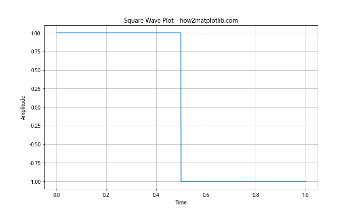
In this example, we use np.linspace to create an array of time points from 0 to 1. The np.where function is used to generate the square wave, assigning a value of 1 for the first half of the cycle and -1 for the second half. We then use Matplotlib's plot function to create the graph.
Using Scipy's Signal Module for Square Wave Generation
While the previous method works, Scipy's signal module provides a more convenient way to generate square waves. Let's explore how to use the scipy.signal.square function to create and plot a square wave.
import matplotlib.pyplot as plt
import numpy as np
from scipy import signal

# Generate time points
t = np.linspace(0, 1, 1000, endpoint=False)

# Create a square wave using scipy.signal.square
square_wave = signal.square(2 * np.pi * 5 * t)

# Plot the square wave
plt.figure(figsize=(10, 6))
plt.plot(t, square_wave)
plt.title('Square Wave using scipy.signal.square - how2matplotlib.com')
plt.xlabel('Time')
plt.ylabel('Amplitude')
plt.grid(True)
plt.show()
Output:
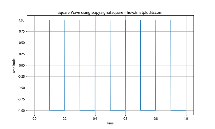
In this example, we use signal.square to generate the square wave. The function takes the argument 2 np.pi 5 * t, where 5 represents the frequency of the square wave. This method provides more control over the frequency and allows for easier manipulation of the waveform.
Adjusting Square Wave Duty Cycle
The duty cycle of a square wave represents the proportion of time the signal spends in its high state compared to its total period. By default, scipy.signal.square produces a square wave with a 50% duty cycle. However, we can adjust this using the duty parameter.
import matplotlib.pyplot as plt
import numpy as np
from scipy import signal

# Generate time points
t = np.linspace(0, 1, 1000, endpoint=False)

# Create square waves with different duty cycles
square_wave_25 = signal.square(2 * np.pi * 5 * t, duty=0.25)
square_wave_50 = signal.square(2 * np.pi * 5 * t, duty=0.50)
square_wave_75 = signal.square(2 * np.pi * 5 * t, duty=0.75)

# Plot the square waves
plt.figure(figsize=(12, 8))
plt.plot(t, square_wave_25, label='25% Duty Cycle')
plt.plot(t, square_wave_50, label='50% Duty Cycle')
plt.plot(t, square_wave_75, label='75% Duty Cycle')
plt.title('Square Waves with Different Duty Cycles - how2matplotlib.com')
plt.xlabel('Time')
plt.ylabel('Amplitude')
plt.legend()
plt.grid(True)
plt.show()
Output:
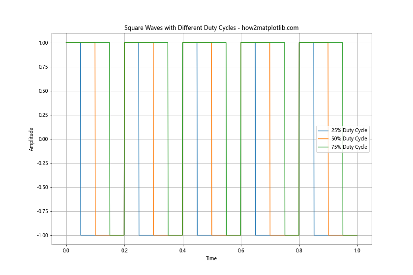
This example demonstrates how to create and plot square waves with different duty cycles. The duty parameter in signal.square allows us to specify the fraction of the cycle that the signal is positive.
Creating a Multi-Frequency Square Wave Plot
Sometimes, it's useful to visualize square waves of different frequencies on the same plot. This can help in understanding how frequency affects the waveform. Let's create a plot with square waves of three different frequencies.
import matplotlib.pyplot as plt
import numpy as np
from scipy import signal

# Generate time points
t = np.linspace(0, 1, 1000, endpoint=False)

# Create square waves with different frequencies
square_wave_1 = signal.square(2 * np.pi * 1 * t)
square_wave_3 = signal.square(2 * np.pi * 3 * t)
square_wave_5 = signal.square(2 * np.pi * 5 * t)

# Plot the square waves
plt.figure(figsize=(12, 8))
plt.plot(t, square_wave_1, label='1 Hz')
plt.plot(t, square_wave_3, label='3 Hz')
plt.plot(t, square_wave_5, label='5 Hz')
plt.title('Multi-Frequency Square Waves - how2matplotlib.com')
plt.xlabel('Time')
plt.ylabel('Amplitude')
plt.legend()
plt.grid(True)
plt.show()
Output:
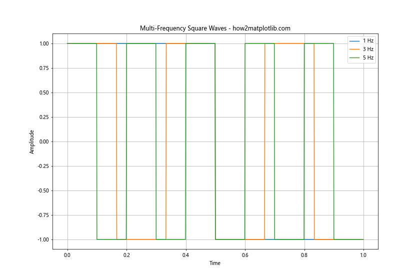
This example shows how to create and plot square waves with frequencies of 1 Hz, 3 Hz, and 5 Hz on the same graph. This visualization helps in understanding how frequency affects the number of cycles within a given time period.
Adding Noise to a Square Wave
In real-world applications, signals often contain noise. We can simulate this by adding random noise to our square wave. Let's create a plot that shows both a clean square wave and a noisy square wave.
import matplotlib.pyplot as plt
import numpy as np
from scipy import signal

# Generate time points
t = np.linspace(0, 1, 1000, endpoint=False)

# Create a clean square wave
clean_square = signal.square(2 * np.pi * 5 * t)

# Add noise to the square wave
noise = np.random.normal(0, 0.1, len(t))
noisy_square = clean_square + noise

# Plot the clean and noisy square waves
plt.figure(figsize=(12, 8))
plt.plot(t, clean_square, label='Clean Square Wave')
plt.plot(t, noisy_square, label='Noisy Square Wave')
plt.title('Clean vs Noisy Square Wave - how2matplotlib.com')
plt.xlabel('Time')
plt.ylabel('Amplitude')
plt.legend()
plt.grid(True)
plt.show()
Output:
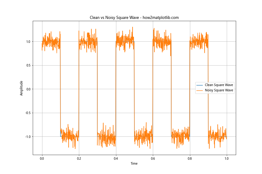
In this example, we create a clean square wave using signal.square and then add Gaussian noise using np.random.normal. The resulting plot shows both the clean and noisy square waves, illustrating how noise can affect the signal.
Creating a Square Wave with Varying Amplitude
In some applications, you might need to create a square wave with varying amplitude. This can be achieved by multiplying the square wave with an amplitude function. Let's create an example where the amplitude of the square wave increases linearly over time.
import matplotlib.pyplot as plt
import numpy as np
from scipy import signal

# Generate time points
t = np.linspace(0, 1, 1000, endpoint=False)

# Create a square wave
square_wave = signal.square(2 * np.pi * 5 * t)

# Create a linearly increasing amplitude function
amplitude = np.linspace(0.5, 2, len(t))

# Multiply the square wave by the amplitude function
varying_amplitude_square = square_wave * amplitude

# Plot the square wave with varying amplitude
plt.figure(figsize=(12, 8))
plt.plot(t, varying_amplitude_square)
plt.title('Square Wave with Varying Amplitude - how2matplotlib.com')
plt.xlabel('Time')
plt.ylabel('Amplitude')
plt.grid(True)
plt.show()
Output:
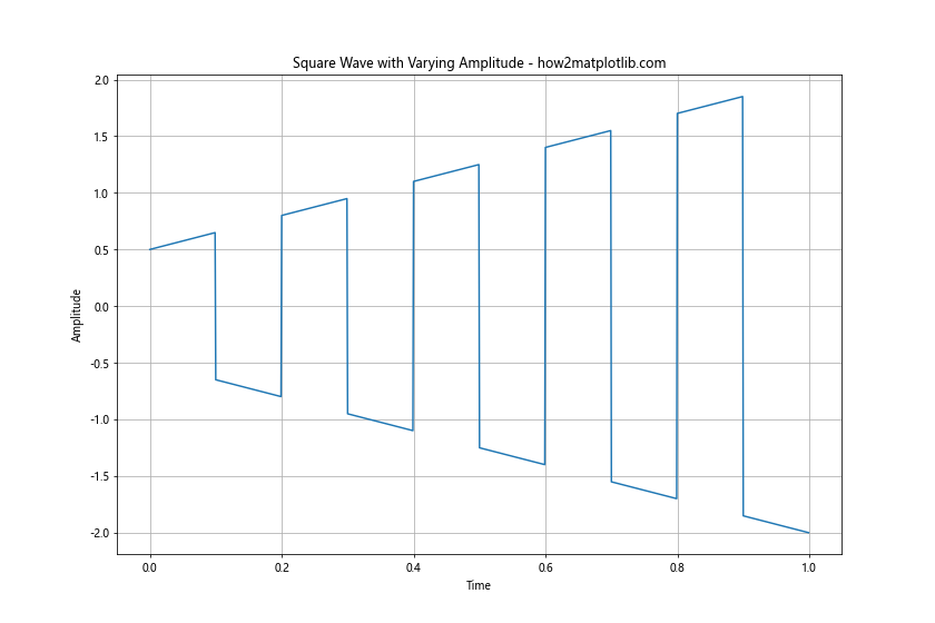
This example demonstrates how to create a square wave with an amplitude that increases linearly over time. We multiply the basic square wave by a linearly increasing amplitude function to achieve this effect.
Plotting Multiple Square Waves with Phase Shift
Phase shift is an important concept in signal processing. Let's create a plot that shows multiple square waves with different phase shifts.
import matplotlib.pyplot as plt
import numpy as np
from scipy import signal

# Generate time points
t = np.linspace(0, 1, 1000, endpoint=False)

# Create square waves with different phase shifts
square_wave_0 = signal.square(2 * np.pi * 5 * t)
square_wave_45 = signal.square(2 * np.pi * 5 * t + np.pi/4)
square_wave_90 = signal.square(2 * np.pi * 5 * t + np.pi/2)

# Plot the square waves
plt.figure(figsize=(12, 8))
plt.plot(t, square_wave_0, label='0° Phase Shift')
plt.plot(t, square_wave_45, label='45° Phase Shift')
plt.plot(t, square_wave_90, label='90° Phase Shift')
plt.title('Square Waves with Different Phase Shifts - how2matplotlib.com')
plt.xlabel('Time')
plt.ylabel('Amplitude')
plt.legend()
plt.grid(True)
plt.show()
Output:
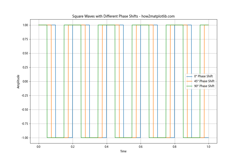
This example shows how to create and plot square waves with different phase shifts. We add phase shifts of 0°, 45°, and 90° to the square waves to illustrate how phase shift affects the timing of the waveform.
Creating a Square Wave Pulse Train
A pulse train is a series of square wave pulses. This is commonly used in digital communication and signal processing. Let's create a plot of a square wave pulse train.
import matplotlib.pyplot as plt
import numpy as np

# Generate time points
t = np.linspace(0, 1, 1000, endpoint=False)

# Create a pulse train
pulse_train = np.zeros_like(t)
pulse_width = 0.1
pulse_period = 0.2
for i in range(int(1/pulse_period)):
    start = i * pulse_period
    end = start + pulse_width
    pulse_train[(t >= start) & (t < end)] = 1

# Plot the pulse train
plt.figure(figsize=(12, 8))
plt.plot(t, pulse_train)
plt.title('Square Wave Pulse Train - how2matplotlib.com')
plt.xlabel('Time')
plt.ylabel('Amplitude')
plt.grid(True)
plt.show()
Output:
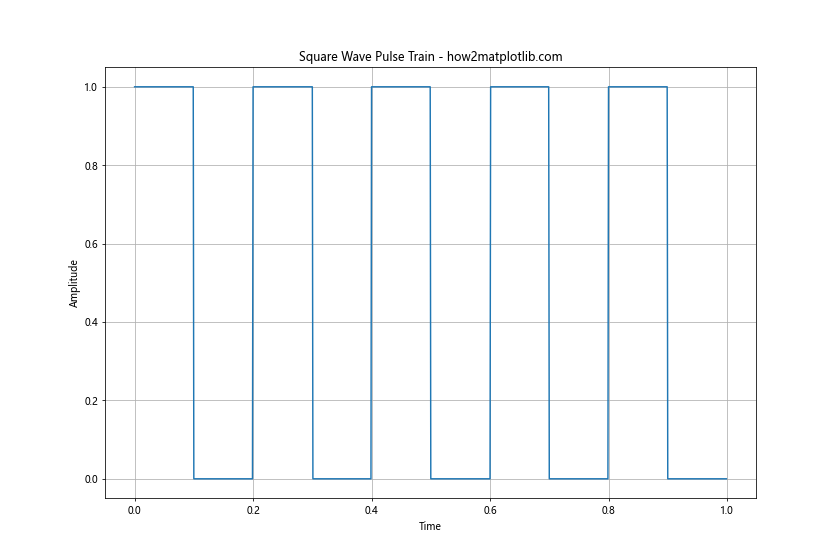
This example demonstrates how to create a square wave pulse train. We use a loop to generate pulses at regular intervals, creating a train of square wave pulses.
Plotting a Square Wave with Custom Colors and Styles
Matplotlib offers a wide range of customization options for plots. Let's create a square wave plot with custom colors, line styles, and markers.
import matplotlib.pyplot as plt
import numpy as np
from scipy import signal

# Generate time points
t = np.linspace(0, 1, 1000, endpoint=False)

# Create a square wave
square_wave = signal.square(2 * np.pi * 5 * t)

# Plot the square wave with custom style
plt.figure(figsize=(12, 8))
plt.plot(t, square_wave, color='red', linestyle='--', linewidth=2, marker='o', markersize=4, markevery=50)
plt.title('Stylized Square Wave Plot - how2matplotlib.com', fontsize=16)
plt.xlabel('Time', fontsize=14)
plt.ylabel('Amplitude', fontsize=14)
plt.grid(True, linestyle=':')
plt.show()
Output:
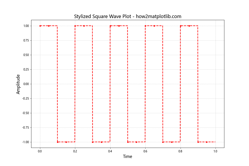
This example shows how to customize the appearance of a square wave plot. We use a red dashed line with circular markers every 50 points. The title and axis labels are also styled with custom font sizes.
Creating a 3D Plot of Multiple Square Waves
For a more advanced visualization, we can create a 3D plot of multiple square waves with different frequencies. This can be useful for analyzing how square waves change over time and frequency.
import matplotlib.pyplot as plt
import numpy as np
from scipy import signal
from mpl_toolkits.mplot3d import Axes3D

# Generate time points and frequencies
t = np.linspace(0, 1, 1000, endpoint=False)
frequencies = np.linspace(1, 10, 10)

# Create a meshgrid
T, F = np.meshgrid(t, frequencies)

# Generate square waves for each frequency
Z = np.array([signal.square(2 * np.pi * f * t) for f in frequencies])

# Create 3D plot
fig = plt.figure(figsize=(12, 8))
ax = fig.add_subplot(111, projection='3d')
ax.plot_surface(T, F, Z, cmap='viridis')
ax.set_title('3D Plot of Multiple Square Waves - how2matplotlib.com')
ax.set_xlabel('Time')
ax.set_ylabel('Frequency')
ax.set_zlabel('Amplitude')
plt.show()
Output:
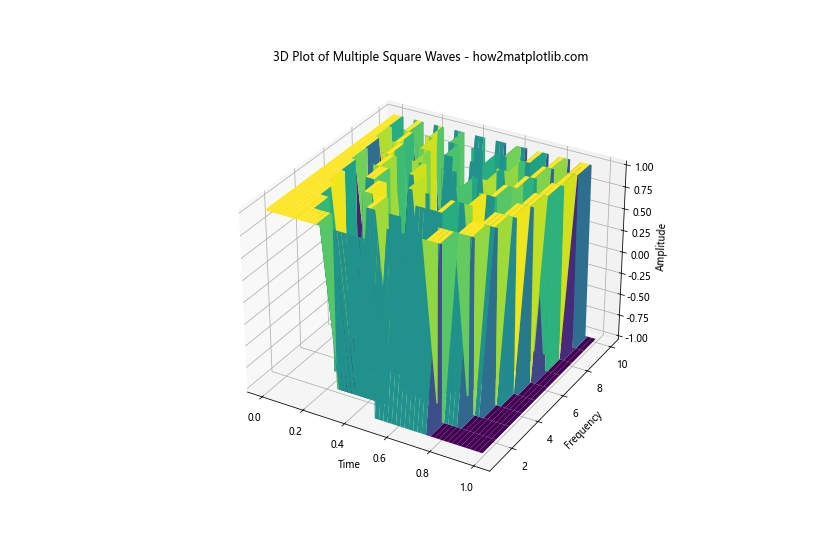
This example creates a 3D surface plot of square waves with frequencies ranging from 1 to 10 Hz. The x-axis represents time, the y-axis represents frequency, and the z-axis represents amplitude. This visualization helps in understanding how square waves change with frequency.
Plotting a Square Wave with Annotations
Adding annotations to your plots can help highlight important features or provide additional information. Let's create a square wave plot with annotations marking key points.
import matplotlib.pyplot as plt
import numpy as np
from scipy import signal

# Generate time points
t = np.linspace(0, 1, 1000, endpoint=False)

# Create a square wave
square_wave = signal.square(2 * np.pi * 2 * t)

# Plot the square wave
plt.figure(figsize=(12, 8))
plt.plot(t, square_wave)
plt.title('Annotated Square Wave Plot - how2matplotlib.com')
plt.xlabel('Time')
plt.ylabel('Amplitude')

# Add annotations
plt.annotate('Peak', xy=(0.125, 1), xytext=(0.125, 1.2),
             arrowprops=dict(facecolor='black', shrink=0.05))
plt.annotate('Trough', xy=(0.375, -1), xytext=(0.375, -1.2),
             arrowprops=dict(facecolor='black', shrink=0.05))
plt.annotate('Period', xy=(0, 0), xytext=(0.25, 0.5),
             arrowprops=dict(facecolor='black', shrink=0.05))

plt.grid(True)
plt.show()
Output:
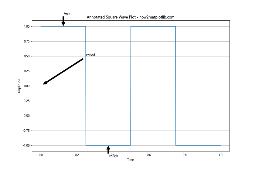
This example shows how to add annotations to a square wave plot. We use plt.annotate to add labels for the peak, trough, and period of the square wave.
Creating a Spectrogram of a Square Wave
A spectrogram is a visual representation of the spectrum of frequencies in a signal as they vary with time. Let's create a spectrogram of a square wave to visualize its frequency content over time.
import matplotlib.pyplot as plt
import numpy as np
from scipy import signal

# Generate time points
t = np.linspace(0, 1, 10000, endpoint=False)

# Create a square wave
square_wave = signal.square(2 * np.pi * 10 * t)

# Create the spectrogram
f, t, Sxx = signal.spectrogram(square_wave, fs=10000)

# Plot the spectrogram
plt.figure(figsize=(12, 8))
plt.pcolormesh(t, f, 10 * np.log10(Sxx), shading='gouraud')
plt.title('Spectrogram of a Square Wave - how2matplotlib.com')
plt.ylabel('Frequency [Hz]')
plt.xlabel('Time [sec]')
plt.colorbar(label='Power/Frequency [dB/Hz]')
plt.show()
Output:
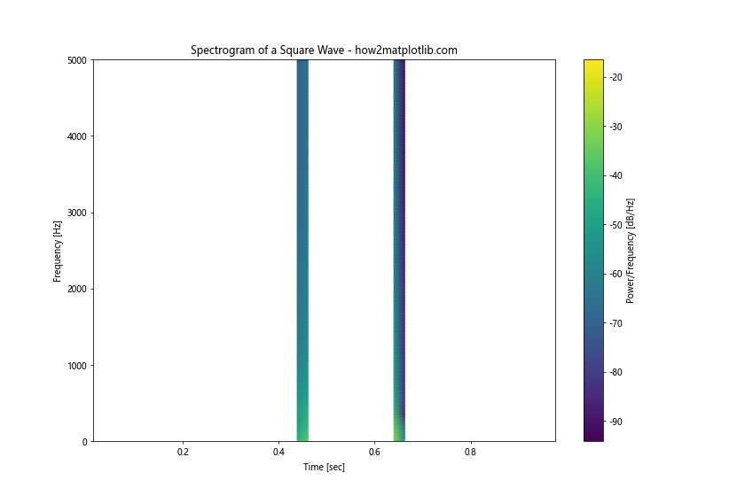
This example demonstrates how to create and plot a spectrogram of a square wave. We use signal.spectrogram to compute the spectrogram and plt.pcolormesh to visualize it. The resulting plot shows the frequency content of the square wave over time.
Plotting Multiple Square Waves in Subplots
When comparing multiple square waves, it can be helpful to use subplots. Let's create a figure with multiple subplots, each showing a square wave with different parameters.
import matplotlib.pyplot as plt
import numpy as np
from scipy import signal

# Generate time points
t = np.linspace(0, 1, 1000, endpoint=False)

# Create square waves with different parameters
square_wave_1 = signal.square(2 * np.pi * 5 * t)
square_wave_2 = signal.square(2 * np.pi * 5 * t, duty=0.25)
square_wave_3 = signal.square(2 * np.pi * 10 * t)

# Create subplots
fig, (ax1, ax2, ax3) = plt.subplots(3, 1, figsize=(12, 12))

# Plot square waves in subplots
ax1.plot(t, square_wave_1)
ax1.set_title('5 Hz, 50% Duty Cycle - how2matplotlib.com')
ax1.set_ylabel('Amplitude')

ax2.plot(t, square_wave_2)
ax2.set_title('5 Hz, 25% Duty Cycle - how2matplotlib.com')
ax2.set_ylabel('Amplitude')

ax3.plot(t, square_wave_3)
ax3.set_title('10 Hz, 50% Duty Cycle - how2matplotlib.com')
ax3.set_xlabel('Time')
ax3.set_ylabel('Amplitude')

plt.tight_layout()
plt.show()
Output:
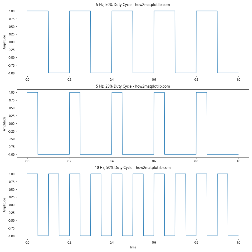
This example shows how to create a figure with multiple subplots, each containing a different square wave. We use plt.subplots to create the figure and axes, then plot each square wave on its respective axis.
Conclusion
In this comprehensive guide, we've explored various techniques for plotting square waves using Matplotlib, Numpy, and Scipy. We've covered everything from basic square wave generation to advanced topics like Fourier series approximations and spectrograms. These techniques provide a solid foundation for working with square waves in Python, whether you're analyzing digital signals, designing electronic circuits, or exploring signal processing concepts.
Remember that Matplotlib, Numpy, and Scipy offer many more features and customization options than we've covered here. As you become more comfortable with these libraries, you'll be able to create even more sophisticated and informative visualizations of square waves and other signals.
When working with square waves, it's important to consider factors such as frequency, duty cycle, amplitude, and phase shift. These parameters can significantly affect the behavior and characteristics of the square wave, and understanding how to manipulate and visualize them is crucial for many applications in engineering and science.