Comprehensive Guide to Matplotlib.axis.Tick.set_path_effects() Function in Python
Matplotlib.axis.Tick.set_path_effects() function in Python is a powerful tool for customizing the appearance of tick marks on plot axes. This function allows you to apply various visual effects to the tick marks, enhancing the overall look and readability of your plots. In this comprehensive guide, we’ll explore the Matplotlib.axis.Tick.set_path_effects() function in detail, covering its usage, parameters, and providing numerous examples to illustrate its capabilities.
Understanding Matplotlib.axis.Tick.set_path_effects()
The Matplotlib.axis.Tick.set_path_effects() function is part of the Matplotlib library, specifically within the axis module. It is used to set the path effects for tick marks on plot axes. Path effects are visual enhancements that can be applied to the lines and text of tick marks, such as shadows, outlines, or glows.
Syntax and Parameters
The basic syntax of the Matplotlib.axis.Tick.set_path_effects() function is as follows:
tick.set_path_effects(effects)
Where:
tickis an instance of the Matplotlib.axis.Tick classeffectsis a list of PathEffect objects
The effects parameter is crucial as it determines the visual effects applied to the tick marks. You can use various PathEffect objects provided by Matplotlib to create different effects.
Let’s start with a simple example to illustrate the basic usage of Matplotlib.axis.Tick.set_path_effects():
import matplotlib.pyplot as plt
import matplotlib.patheffects as path_effects

fig, ax = plt.subplots()
ax.plot([1, 2, 3, 4], [1, 4, 2, 3], label='how2matplotlib.com')

# Apply path effects to x-axis tick marks
for tick in ax.xaxis.get_major_ticks():
    tick.set_path_effects([path_effects.withStroke(linewidth=3, foreground='red')])

plt.title('Matplotlib.axis.Tick.set_path_effects() Example')
plt.legend()
plt.show()
Output:
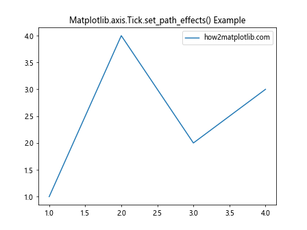
In this example, we create a simple line plot and apply a stroke effect to the x-axis tick marks. The withStroke effect adds a red outline to the tick marks, making them more prominent.
Exploring Different Path Effects
Matplotlib.axis.Tick.set_path_effects() function supports various path effects that can be combined to create unique visual styles for tick marks. Let’s explore some of the most commonly used effects:
1. Stroke Effect
The Stroke effect adds an outline to the tick marks. Here’s an example using Matplotlib.axis.Tick.set_path_effects() with a stroke effect:
import matplotlib.pyplot as plt
import matplotlib.patheffects as path_effects

fig, ax = plt.subplots()
ax.plot([1, 2, 3, 4], [1, 4, 2, 3], label='how2matplotlib.com')

# Apply stroke effect to y-axis tick marks
for tick in ax.yaxis.get_major_ticks():
    tick.set_path_effects([path_effects.Stroke(linewidth=3, foreground='blue')])

plt.title('Stroke Effect with Matplotlib.axis.Tick.set_path_effects()')
plt.legend()
plt.show()
Output:
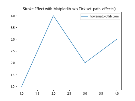
This example applies a blue stroke effect to the y-axis tick marks, making them stand out against the plot background.
2. Shadow Effect
The Shadow effect adds a drop shadow to the tick marks, creating a sense of depth. Here’s how to use Matplotlib.axis.Tick.set_path_effects() with a shadow effect:
import matplotlib.pyplot as plt
import matplotlib.patheffects as path_effects

fig, ax = plt.subplots()
ax.plot([1, 2, 3, 4], [1, 4, 2, 3], label='how2matplotlib.com')

# Apply shadow effect to x-axis tick marks
for tick in ax.xaxis.get_major_ticks():
    tick.set_path_effects([path_effects.withSimplePatchShadow()])

plt.title('Shadow Effect with Matplotlib.axis.Tick.set_path_effects()')
plt.legend()
plt.show()
Output:

This example adds a simple shadow effect to the x-axis tick marks, giving them a subtle 3D appearance.
3. Glow Effect
The Glow effect creates a halo around the tick marks. Here’s an example using Matplotlib.axis.Tick.set_path_effects() to create a glow effect:
import matplotlib.pyplot as plt
import matplotlib.patheffects as path_effects

fig, ax = plt.subplots()
ax.plot([1, 2, 3, 4], [1, 4, 2, 3], label='how2matplotlib.com')

# Apply glow effect to y-axis tick marks
for tick in ax.yaxis.get_major_ticks():
    tick.set_path_effects([path_effects.withSimplePatchShadow(shadow_rgbFace='yellow', alpha=0.8)])

plt.title('Glow Effect with Matplotlib.axis.Tick.set_path_effects()')
plt.legend()
plt.show()
Output:

This example creates a yellow glow effect around the y-axis tick marks, making them appear to emit light.
Combining Multiple Path Effects
One of the powerful features of Matplotlib.axis.Tick.set_path_effects() is the ability to combine multiple effects. By passing a list of PathEffect objects, you can create complex and visually appealing tick mark styles.
Let’s look at an example that combines stroke and shadow effects:
import matplotlib.pyplot as plt
import matplotlib.patheffects as path_effects

fig, ax = plt.subplots()
ax.plot([1, 2, 3, 4], [1, 4, 2, 3], label='how2matplotlib.com')

# Combine stroke and shadow effects for x-axis tick marks
for tick in ax.xaxis.get_major_ticks():
    tick.set_path_effects([
        path_effects.Stroke(linewidth=3, foreground='red'),
        path_effects.withSimplePatchShadow(shadow_rgbFace='black', alpha=0.5)
    ])

plt.title('Combined Effects with Matplotlib.axis.Tick.set_path_effects()')
plt.legend()
plt.show()
Output:

In this example, we apply both a red stroke and a black shadow to the x-axis tick marks, creating a bold and eye-catching appearance.
Customizing Path Effects Parameters
The Matplotlib.axis.Tick.set_path_effects() function allows for fine-tuning of path effects through various parameters. Let’s explore some of these parameters and how they affect the appearance of tick marks.
Adjusting Stroke Width and Color
You can customize the width and color of the stroke effect to achieve different visual styles:
import matplotlib.pyplot as plt
import matplotlib.patheffects as path_effects

fig, ax = plt.subplots()
ax.plot([1, 2, 3, 4], [1, 4, 2, 3], label='how2matplotlib.com')

# Customize stroke width and color for y-axis tick marks
for tick in ax.yaxis.get_major_ticks():
    tick.set_path_effects([path_effects.Stroke(linewidth=5, foreground='green')])

plt.title('Customized Stroke with Matplotlib.axis.Tick.set_path_effects()')
plt.legend()
plt.show()
Output:

This example applies a thick green stroke to the y-axis tick marks, making them highly visible against the plot background.
Modifying Shadow Offset and Color
For shadow effects, you can adjust the offset and color to create different shadow styles:
import matplotlib.pyplot as plt
import matplotlib.patheffects as path_effects

fig, ax = plt.subplots()
ax.plot([1, 2, 3, 4], [1, 4, 2, 3], label='how2matplotlib.com')

# Customize shadow offset and color for x-axis tick marks
for tick in ax.xaxis.get_major_ticks():
    tick.set_path_effects([path_effects.withSimplePatchShadow(
        offset=(2, -2),
        shadow_rgbFace='purple',
        alpha=0.6
    )])

plt.title('Customized Shadow with Matplotlib.axis.Tick.set_path_effects()')
plt.legend()
plt.show()
Output:
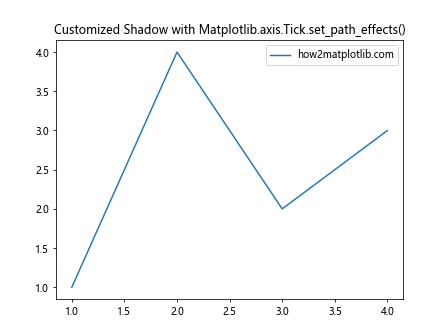
This example creates a purple shadow with a custom offset for the x-axis tick marks, giving them a unique appearance.
Applying Path Effects to Specific Tick Marks
The Matplotlib.axis.Tick.set_path_effects() function can be applied to individual tick marks, allowing for selective enhancement of certain ticks. This can be useful for highlighting specific data points or ranges.
Here’s an example that applies path effects to every other tick mark:
import matplotlib.pyplot as plt
import matplotlib.patheffects as path_effects

fig, ax = plt.subplots()
ax.plot([1, 2, 3, 4, 5, 6], [1, 4, 2, 3, 5, 2], label='how2matplotlib.com')

# Apply path effects to every other x-axis tick mark
for i, tick in enumerate(ax.xaxis.get_major_ticks()):
    if i % 2 == 0:
        tick.set_path_effects([path_effects.withStroke(linewidth=3, foreground='red')])

plt.title('Selective Path Effects with Matplotlib.axis.Tick.set_path_effects()')
plt.legend()
plt.show()
Output:
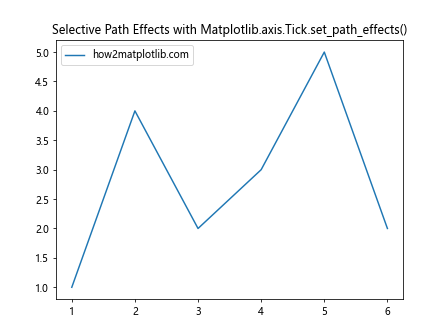
This example applies a red stroke effect to every other x-axis tick mark, creating an alternating pattern of enhanced and normal ticks.
Using Path Effects with Different Plot Types
The Matplotlib.axis.Tick.set_path_effects() function can be used with various types of plots to enhance their tick marks. Let’s explore how to apply path effects to different plot types:
Bar Plot with Enhanced Tick Marks
import matplotlib.pyplot as plt
import matplotlib.patheffects as path_effects

fig, ax = plt.subplots()
ax.bar(['A', 'B', 'C', 'D'], [3, 7, 2, 5], label='how2matplotlib.com')

# Apply path effects to x-axis tick marks in a bar plot
for tick in ax.xaxis.get_major_ticks():
    tick.set_path_effects([path_effects.withStroke(linewidth=2, foreground='orange')])

plt.title('Bar Plot with Enhanced Tick Marks using Matplotlib.axis.Tick.set_path_effects()')
plt.legend()
plt.show()
Output:
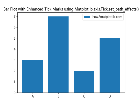
This example creates a bar plot and applies an orange stroke effect to the x-axis tick marks, making them stand out against the bars.
Scatter Plot with Glowing Tick Marks
import matplotlib.pyplot as plt
import matplotlib.patheffects as path_effects
import numpy as np

fig, ax = plt.subplots()
x = np.random.rand(50)
y = np.random.rand(50)
ax.scatter(x, y, label='how2matplotlib.com')

# Apply glow effect to both x and y-axis tick marks in a scatter plot
for axis in [ax.xaxis, ax.yaxis]:
    for tick in axis.get_major_ticks():
        tick.set_path_effects([path_effects.withSimplePatchShadow(
            shadow_rgbFace='cyan',
            alpha=0.8
        )])

plt.title('Scatter Plot with Glowing Tick Marks using Matplotlib.axis.Tick.set_path_effects()')
plt.legend()
plt.show()
Output:
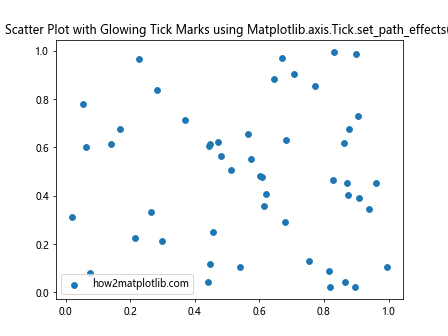
This example creates a scatter plot and applies a cyan glow effect to both x and y-axis tick marks, giving the plot a futuristic appearance.
Animating Path Effects
The Matplotlib.axis.Tick.set_path_effects() function can also be used in animations to create dynamic tick mark effects. Here’s an example of how to create a simple animation with changing path effects:
import matplotlib.pyplot as plt
import matplotlib.patheffects as path_effects
import matplotlib.animation as animation

fig, ax = plt.subplots()
line, = ax.plot([1, 2, 3, 4], [1, 4, 2, 3], label='how2matplotlib.com')

def animate(frame):
    # Change path effects on x-axis tick marks in each frame
    for tick in ax.xaxis.get_major_ticks():
        tick.set_path_effects([path_effects.withStroke(linewidth=frame, foreground='red')])
    return line,

ani = animation.FuncAnimation(fig, animate, frames=range(1, 6), interval=500, blit=True)

plt.title('Animated Path Effects with Matplotlib.axis.Tick.set_path_effects()')
plt.legend()
plt.show()
Output:
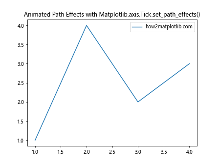
This example creates an animation where the stroke width of the x-axis tick marks changes over time, creating a pulsing effect.
Handling Large Datasets with Path Effects
When working with large datasets, applying path effects to tick marks can help improve the readability of the plot. Here’s an example of how to use Matplotlib.axis.Tick.set_path_effects() with a larger dataset:
import matplotlib.pyplot as plt
import matplotlib.patheffects as path_effects
import numpy as np

fig, ax = plt.subplots(figsize=(12, 6))
x = np.linspace(0, 10, 1000)
y = np.sin(x) * np.exp(-x/10)
ax.plot(x, y, label='how2matplotlib.com')

# Apply path effects to every 5th tick mark for better visibility
for i, tick in enumerate(ax.xaxis.get_major_ticks()):
    if i % 5 == 0:
        tick.set_path_effects([path_effects.withStroke(linewidth=3, foreground='blue')])

plt.title('Large Dataset Plot with Enhanced Tick Marks using Matplotlib.axis.Tick.set_path_effects()')
plt.legend()
plt.show()
Output:
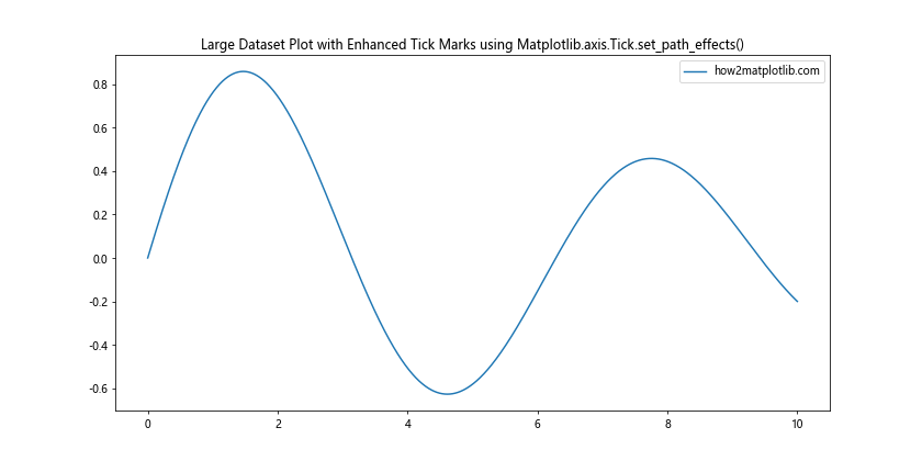
This example plots a large dataset and applies a blue stroke effect to every 5th x-axis tick mark, making it easier to read the axis values in a dense plot.
Combining Path Effects with Tick Formatting
The Matplotlib.axis.Tick.set_path_effects() function can be used in conjunction with tick formatting to create highly customized axis appearances. Here’s an example that combines path effects with custom tick labels:
import matplotlib.pyplot as plt
import matplotlib.patheffects as path_effects

fig, ax = plt.subplots()
ax.plot([1, 2, 3, 4], [1, 4, 2, 3], label='how2matplotlib.com')

# Custom tick formatter
def tick_formatter(x, pos):
    return f'Value: {x:.1f}'

ax.xaxis.set_major_formatter(plt.FuncFormatter(tick_formatter))

# Apply path effects to formatted tick marks
for tick in ax.xaxis.get_major_ticks():
    tick.set_path_effects([
        path_effects.Stroke(linewidth=2, foreground='green'),
        path_effects.Normal()
    ])

plt.title('Formatted Tick Marks with Path Effects using Matplotlib.axis.Tick.set_path_effects()')
plt.legend()
plt.show()
Output:
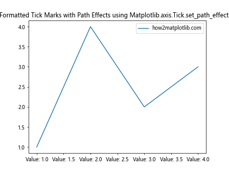
This example applies a custom formatter to the x-axis tick labels and adds a green stroke effect to the formatted tick marks.
Applying Path Effects to Logarithmic Scales
The Matplotlib.axis.Tick.set_path_effects() function can be particularly useful when working with logarithmic scales, where tick marks may be unevenly spaced. Here’s an example:
import matplotlib.pyplot as plt
import matplotlib.patheffects as path_effects
import numpy as np

fig, ax = plt.subplots()
x = np.logspace(0, 3, 50)
y = x**2
ax.loglog(x, y, label='how2matplotlib.com')

# Apply path effects to logarithmic scale tick marks
for axis in [ax.xaxis, ax.yaxis]:
    for tick in axis.get_major_ticks():
        tick.set_path_effects([
            path_effects.Stroke(linewidth=2, foreground='purple'),
            path_effects.Normal()
        ])

plt.title('Logarithmic Plot with Enhanced Tick Marks using Matplotlib.axis.Tick.set_path_effects()')
plt.legend()
plt.show()
Output:
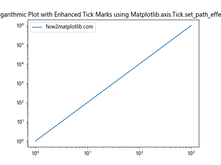
This example creates a log-log plot and applies a purple stroke effect to both x and y-axis tick marks, making them more visible on the logarithmic scale.
Using Path Effects with Polar Plots
The Matplotlib.axis.Tick.set_path_effects() function can also be applied to polar plots to enhance their radial and angular tick marks. Here’s an example:
import matplotlib.pyplot as plt
import matplotlib.patheffects as path_effects
import numpy as np

fig, ax = plt.subplots(subplot_kw=dict(projection='polar'))
r = np.arange(0, 2, 0.01)
theta = 2 * np.pi * r
ax.plot(theta, r, label='how2matplotlib.com')

# Apply path effects to radial and angular tick marks
for tick in ax.xaxis.get_major_ticks():
    tick.set_path_effects([path_effects.withStroke(linewidth=2, foreground='red')])

for tick in ax.yaxis.get_major_ticks():
    tick.set_path_effects([path_effects.withSimplePatchShadow(shadow_rgbFace='green', alpha=0.6)])

plt.title('Polar Plot with Enhanced Tick Marks using Matplotlib.axis.Tick.set_path_effects()')
plt.legend()
plt.show()
Output:
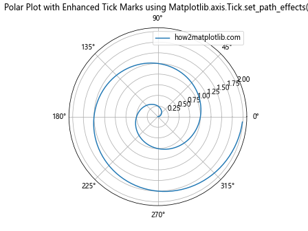
This example creates a polar plot and applies a red stroke effect to the angular tick marks and a green shadow effect to the radial tick marks.
Combining Path Effects with Custom Tick Locations
The Matplotlib.axis.Tick.set_path_effects() function can be used in combination with custom tick locations to create highly specialized axis appearances. Here’s an example:
import matplotlib.pyplot as plt
import matplotlib.patheffects as path_effects
import numpy as np

fig, ax = plt.subplots()
x = np.linspace(0, 10, 100)
y = np.sin(x)
ax.plot(x, y, label='how2matplotlib.com')

# Set custom tick locations
custom_ticks = [0, np.pi, 2*np.pi, 3*np.pi]
ax.set_xticks(custom_ticks)
ax.set_xticklabels(['0', 'π', '2π', '3π'])

# Apply path effects to custom tick marks
for tick in ax.xaxis.get_major_ticks():
    tick.set_path_effects([
        path_effects.Stroke(linewidth=3, foreground='orange'),
        path_effects.Normal()
    ])

plt.title('Custom Tick Locations with Path Effects using Matplotlib.axis.Tick.set_path_effects()')
plt.legend()
plt.show()
Output:
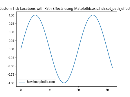
This example sets custom tick locations for a sine wave plot and applies an orange stroke effect to these custom tick marks.
Using Path Effects in 3D Plots
While the Matplotlib.axis.Tick.set_path_effects() function is primarily used for 2D plots, it can also be applied to the axes of 3D plots. Here’s an example:
import matplotlib.pyplot as plt
import matplotlib.patheffects as path_effects
import numpy as np

fig = plt.figure()
ax = fig.add_subplot(111, projection='3d')

x = np.random.rand(100)
y = np.random.rand(100)
z = np.random.rand(100)
ax.scatter(x, y, z, label='how2matplotlib.com')

# Apply path effects to 3D plot axes
for axis in [ax.xaxis, ax.yaxis, ax.zaxis]:
    for tick in axis.get_major_ticks():
        tick.set_path_effects([path_effects.withStroke(linewidth=2, foreground='cyan')])

plt.title('3D Plot with Enhanced Tick Marks using Matplotlib.axis.Tick.set_path_effects()')
ax.legend()
plt.show()
Output:
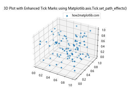
This example creates a 3D scatter plot and applies a cyan stroke effect to the tick marks on all three axes.
Handling Color Maps with Path Effects
When working with color maps, the Matplotlib.axis.Tick.set_path_effects() function can be used to ensure tick marks remain visible regardless of the underlying colors. Here’s an example:
import matplotlib.pyplot as plt
import matplotlib.patheffects as path_effects
import numpy as np

fig, ax = plt.subplots()
data = np.random.rand(10, 10)
im = ax.imshow(data, cmap='viridis')
fig.colorbar(im, label='how2matplotlib.com')

# Apply path effects to ensure tick marks are visible on color map
for axis in [ax.xaxis, ax.yaxis]:
    for tick in axis.get_major_ticks():
        tick.set_path_effects([
            path_effects.Stroke(linewidth=3, foreground='white'),
            path_effects.Normal()
        ])

plt.title('Color Map with Enhanced Tick Marks using Matplotlib.axis.Tick.set_path_effects()')
plt.show()
Output:
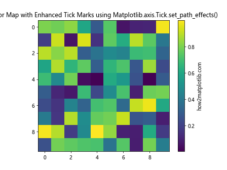
This example creates a color map plot and applies a white stroke effect to the tick marks, ensuring they remain visible against the varying background colors.
Conclusion
The Matplotlib.axis.Tick.set_path_effects() function is a powerful tool for enhancing the visual appeal and readability of plots in Python. By applying various path effects to tick marks, you can create more engaging and informative visualizations. Whether you’re working with simple line plots, complex 3D visualizations, or anything in between, this function offers a wide range of customization options to suit your needs.