How to Add Value Labels on a Matplotlib Bar Chart
Adding value labels on a Matplotlib Bar Chart is an essential skill for data visualization enthusiasts. This article will provide a detailed exploration of the various techniques and best practices for adding value labels to your Matplotlib bar charts. We’ll cover everything from basic label placement to advanced customization options, ensuring you have all the tools necessary to create informative and visually appealing bar charts with clear value labels.
Understanding the Importance of Adding Value Labels on a Matplotlib Bar Chart
Adding value labels on a Matplotlib Bar Chart is crucial for enhancing the readability and interpretability of your data visualizations. By including value labels, you provide viewers with precise numerical information directly on the chart, eliminating the need for guesswork or estimation based on axis scales alone. This practice is particularly beneficial when presenting data to audiences who may not be familiar with interpreting complex charts or when you need to emphasize specific data points.
Let’s start with a basic example of adding value labels on a Matplotlib Bar Chart:
import matplotlib.pyplot as plt

categories = ['Category A', 'Category B', 'Category C', 'Category D']
values = [25, 40, 30, 55]

fig, ax = plt.subplots(figsize=(10, 6))
bars = ax.bar(categories, values)

for bar in bars:
    height = bar.get_height()
    ax.text(bar.get_x() + bar.get_width() / 2, height, f'{height}',
            ha='center', va='bottom')

plt.title('How to Add Value Labels on a Matplotlib Bar Chart - how2matplotlib.com')
plt.xlabel('Categories')
plt.ylabel('Values')
plt.show()
Output:
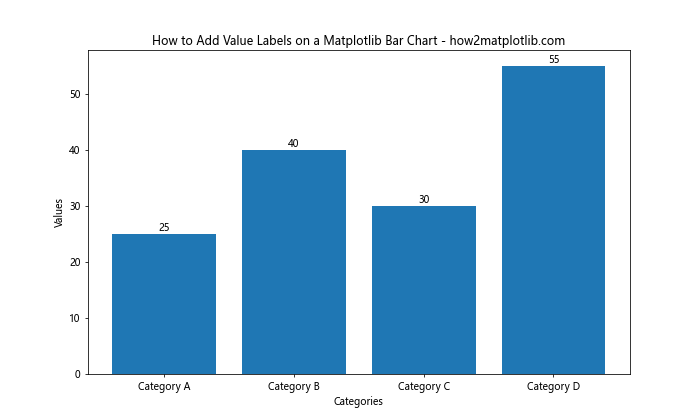
In this example, we create a simple bar chart and add value labels above each bar. The ax.text() function is used to place the labels at the appropriate positions.
Techniques for Adding Value Labels on a Matplotlib Bar Chart
There are several techniques you can employ when adding value labels on a Matplotlib Bar Chart. Let’s explore some of these methods in detail.
1. Basic Value Label Placement
The most straightforward method for adding value labels on a Matplotlib Bar Chart is to place them directly above each bar. This approach works well for simple charts with a small number of bars.
import matplotlib.pyplot as plt

data = {'A': 30, 'B': 45, 'C': 22, 'D': 38}
categories = list(data.keys())
values = list(data.values())

fig, ax = plt.subplots(figsize=(10, 6))
bars = ax.bar(categories, values)

for bar in bars:
    height = bar.get_height()
    ax.text(bar.get_x() + bar.get_width() / 2, height, f'{height}',
            ha='center', va='bottom')

plt.title('Basic Value Label Placement - how2matplotlib.com')
plt.xlabel('Categories')
plt.ylabel('Values')
plt.show()
Output:
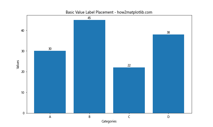
In this example, we iterate through each bar and add a label at its top center position.
2. Formatting Value Labels
When adding value labels on a Matplotlib Bar Chart, you may want to format the labels to improve readability or add additional information. Here’s an example of how to format labels with currency symbols and decimal places:
import matplotlib.pyplot as plt

products = ['Product A', 'Product B', 'Product C']
sales = [1234.56, 2345.67, 3456.78]

fig, ax = plt.subplots(figsize=(10, 6))
bars = ax.bar(products, sales)

for bar in bars:
    height = bar.get_height()
    ax.text(bar.get_x() + bar.get_width() / 2, height, f'${height:,.2f}',
            ha='center', va='bottom')

plt.title('Formatted Value Labels on a Matplotlib Bar Chart - how2matplotlib.com')
plt.xlabel('Products')
plt.ylabel('Sales')
plt.show()
Output:
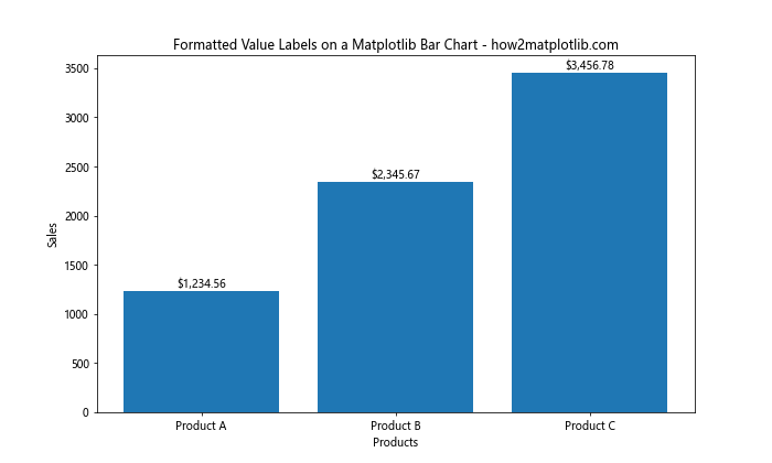
This example demonstrates how to format the value labels as currency with two decimal places.
3. Adjusting Label Position
Sometimes, you may need to adjust the position of value labels on a Matplotlib Bar Chart to avoid overlapping or to improve visibility. Here’s how you can offset the labels:
import matplotlib.pyplot as plt

categories = ['A', 'B', 'C', 'D', 'E']
values = [15, 30, 45, 22, 38]

fig, ax = plt.subplots(figsize=(10, 6))
bars = ax.bar(categories, values)

for bar in bars:
    height = bar.get_height()
    ax.text(bar.get_x() + bar.get_width() / 2, height + 1, f'{height}',
            ha='center', va='bottom')

plt.title('Adjusted Value Label Position - how2matplotlib.com')
plt.xlabel('Categories')
plt.ylabel('Values')
plt.ylim(0, max(values) + 5)  # Increase y-axis limit to accommodate labels
plt.show()
Output:
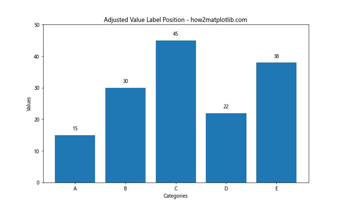
In this example, we add a small offset to the y-coordinate of the labels to position them slightly above the bars.
4. Adding Value Labels to Horizontal Bar Charts
Adding value labels on a Matplotlib Bar Chart is not limited to vertical bar charts. You can also add labels to horizontal bar charts:
import matplotlib.pyplot as plt

categories = ['Category A', 'Category B', 'Category C', 'Category D']
values = [35, 47, 22, 59]

fig, ax = plt.subplots(figsize=(10, 6))
bars = ax.barh(categories, values)

for bar in bars:
    width = bar.get_width()
    ax.text(width, bar.get_y() + bar.get_height() / 2, f'{width}',
            ha='left', va='center')

plt.title('Value Labels on Horizontal Bar Chart - how2matplotlib.com')
plt.xlabel('Values')
plt.ylabel('Categories')
plt.show()
Output:
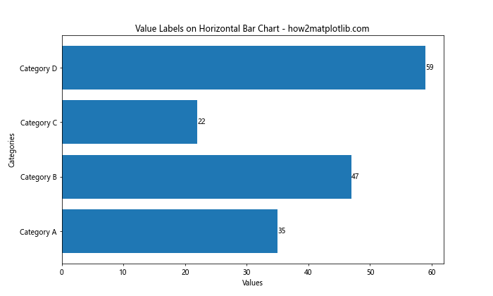
This example demonstrates how to add value labels to a horizontal bar chart, placing them to the right of each bar.
Advanced Techniques for Adding Value Labels on a Matplotlib Bar Chart
Now that we’ve covered the basics, let’s explore some advanced techniques for adding value labels on a Matplotlib Bar Chart.
1. Conditional Formatting of Value Labels
You can apply conditional formatting to value labels based on their values or other criteria. Here’s an example that changes the color of labels based on their values:
import matplotlib.pyplot as plt

categories = ['A', 'B', 'C', 'D', 'E']
values = [20, 35, 30, 45, 25]

fig, ax = plt.subplots(figsize=(10, 6))
bars = ax.bar(categories, values)

for bar in bars:
    height = bar.get_height()
    color = 'green' if height > 30 else 'red'
    ax.text(bar.get_x() + bar.get_width() / 2, height, f'{height}',
            ha='center', va='bottom', color=color)

plt.title('Conditional Formatting of Value Labels - how2matplotlib.com')
plt.xlabel('Categories')
plt.ylabel('Values')
plt.show()
Output:
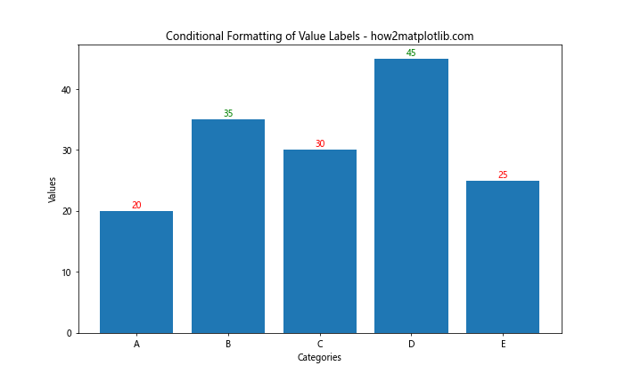
In this example, labels for values greater than 30 are colored green, while others are colored red.
2. Adding Percentage Labels
When working with percentage data, you may want to add percentage symbols to your value labels:
import matplotlib.pyplot as plt

categories = ['Category A', 'Category B', 'Category C', 'Category D']
percentages = [25, 40, 15, 20]

fig, ax = plt.subplots(figsize=(10, 6))
bars = ax.bar(categories, percentages)

for bar in bars:
    height = bar.get_height()
    ax.text(bar.get_x() + bar.get_width() / 2, height, f'{height}%',
            ha='center', va='bottom')

plt.title('Percentage Labels on a Matplotlib Bar Chart - how2matplotlib.com')
plt.xlabel('Categories')
plt.ylabel('Percentage')
plt.ylim(0, 100)
plt.show()
Output:
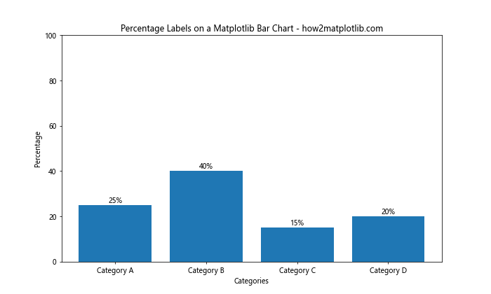
This example demonstrates how to add percentage symbols to value labels on a Matplotlib Bar Chart.
3. Rotating Value Labels
For charts with long labels or limited horizontal space, you may need to rotate the value labels:
import matplotlib.pyplot as plt

categories = ['Long Category A', 'Long Category B', 'Long Category C', 'Long Category D']
values = [42, 55, 33, 61]

fig, ax = plt.subplots(figsize=(12, 6))
bars = ax.bar(categories, values)

for bar in bars:
    height = bar.get_height()
    ax.text(bar.get_x() + bar.get_width() / 2, height, f'{height}',
            ha='center', va='bottom', rotation=45)

plt.title('Rotated Value Labels on a Matplotlib Bar Chart - how2matplotlib.com')
plt.xlabel('Categories')
plt.ylabel('Values')
plt.xticks(rotation=45, ha='right')
plt.tight_layout()
plt.show()
Output:
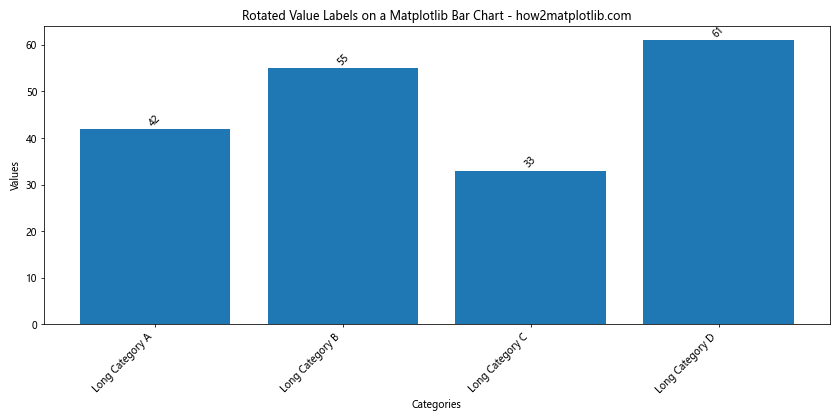
In this example, we rotate both the x-axis labels and the value labels to accommodate longer category names.
4. Adding Value Labels to Stacked Bar Charts
Adding value labels on a Matplotlib Bar Chart becomes more complex with stacked bar charts. Here’s an example of how to add labels to each segment of a stacked bar chart:
import matplotlib.pyplot as plt
import numpy as np

categories = ['A', 'B', 'C', 'D']
values1 = [20, 35, 30, 25]
values2 = [25, 20, 15, 30]
values3 = [15, 25, 20, 20]

fig, ax = plt.subplots(figsize=(10, 6))
bars1 = ax.bar(categories, values1, label='Group 1')
bars2 = ax.bar(categories, values2, bottom=values1, label='Group 2')
bars3 = ax.bar(categories, values3, bottom=np.array(values1) + np.array(values2), label='Group 3')

def add_labels(bars):
    for bar in bars:
        height = bar.get_height()
        ax.text(bar.get_x() + bar.get_width() / 2, bar.get_y() + height / 2, f'{height}',
                ha='center', va='center')

add_labels(bars1)
add_labels(bars2)
add_labels(bars3)

plt.title('Value Labels on Stacked Bar Chart - how2matplotlib.com')
plt.xlabel('Categories')
plt.ylabel('Values')
plt.legend()
plt.show()
Output:
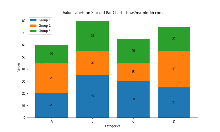
This example shows how to add value labels to each segment of a stacked bar chart, placing them in the center of each segment.
Best Practices for Adding Value Labels on a Matplotlib Bar Chart
When adding value labels on a Matplotlib Bar Chart, it’s important to follow some best practices to ensure your visualizations are clear and effective. Here are some guidelines to consider:
- Consistency: Maintain consistent formatting and positioning of labels across your chart.
- Readability: Ensure that labels are easily readable by using appropriate font sizes and colors.
- Avoid Clutter: If your chart has many bars, consider adding labels only to the most important ones or using an alternative labeling method.
- Color Contrast: Make sure the label color contrasts well with the bar color and background.
- Precision: Use an appropriate number of decimal places for your data.
Let’s implement these best practices in an example:
import matplotlib.pyplot as plt

categories = ['A', 'B', 'C', 'D', 'E', 'F', 'G', 'H']
values = [42, 55, 33, 61, 28, 39, 47, 50]

fig, ax = plt.subplots(figsize=(12, 6))
bars = ax.bar(categories, values, color='skyblue')

# Add labels only to bars above the mean
mean_value = sum(values) / len(values)
for bar in bars:
    height = bar.get_height()
    if height > mean_value:
        ax.text(bar.get_x() + bar.get_width() / 2, height, f'{height}',
                ha='center', va='bottom', fontweight='bold', color='darkblue')

plt.title('Best Practices for Value Labels on a Matplotlib Bar Chart - how2matplotlib.com')
plt.xlabel('Categories')
plt.ylabel('Values')
plt.axhline(y=mean_value, color='red', linestyle='--', label='Mean')
plt.legend()
plt.show()
Output:
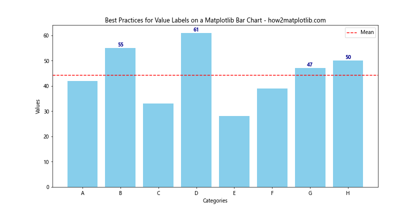
In this example, we only label bars that are above the mean value, use a contrasting color for labels, and add a reference line to provide context.
Customizing Value Labels on a Matplotlib Bar Chart
Customization is key when adding value labels on a Matplotlib Bar Chart. Let’s explore some ways to customize your labels:
1. Using Custom Fonts
You can use custom fonts to make your value labels stand out:
import matplotlib.pyplot as plt
from matplotlib import font_manager

# Add a custom font
font_path = '/path/to/your/font.ttf'  # Replace with your font path
font_manager.fontManager.addfont(font_path)
plt.rcParams['font.family'] = 'Your Font Name'  # Replace with your font name

categories = ['A', 'B', 'C', 'D']
values = [30, 45, 22, 38]

fig, ax = plt.subplots(figsize=(10, 6))
bars = ax.bar(categories, values)

for bar in bars:
    height = bar.get_height()
    ax.text(bar.get_x() + bar.get_width() / 2, height, f'{height}',
            ha='center', va='bottom', fontsize=12, fontweight='bold')

plt.title('Custom Font Value Labels - how2matplotlib.com', fontsize=16)
plt.xlabel('Categories', fontsize=14)
plt.ylabel('Values', fontsize=14)
plt.show()
This example demonstrates how to use a custom font for your value labels and other text elements in the chart.
2. Adding Background to Labels
To make your value labels more prominent, you can add a background:
import matplotlib.pyplot as plt

categories = ['Category A', 'Category B', 'Category C', 'Category D']
values = [35, 47, 22, 59]

fig, ax = plt.subplots(figsize=(10, 6))
bars = ax.bar(categories, values)

for bar in bars:
    height = bar.get_height()
    ax.text(bar.get_x() + bar.get_width() / 2, height, f'{height}',
            ha='center', va='bottom', fontweight='bold',
            bbox=dict(facecolor='white', edgecolor='none', alpha=0.7, pad=3))

plt.title('Value Labels with Background - how2matplotlib.com')
plt.xlabel('Categories')
plt.ylabel('Values')
plt.show()
Output:
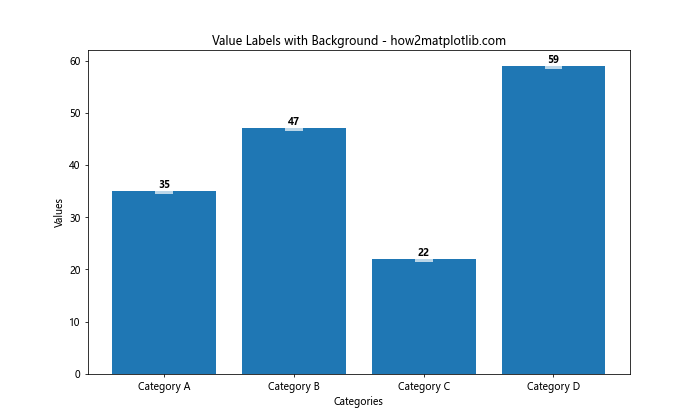
In this example, we add a white background to each value label to make them stand out against the bars.
3. Using Gradient Colors for Labels
You can use gradient colors for your value labels to add visual interest:
import matplotlib.pyplot as plt
import numpy as np

categories = ['A', 'B', 'C', 'D', 'E']
values = [20, 35, 30, 45, 25]

fig, ax = plt.subplots(figsize=(10, 6))
bars = ax.bar(categories, values)

# Create a color map
cmap = plt.cm.get_cmap('coolwarm')
norm = plt.Normalize(min(values), max(values))

for bar in bars:
    height = bar.get_height()
    color = cmap(norm(height))
    ax.text(bar.get_x() + bar.get_width() / 2, height, f'{height}',
            ha='center', va='bottom', color=color)

plt.title('Gradient Color Value Labels - how2matplotlib.com')
plt.xlabel('Categories')
plt.ylabel('Values')
plt.show()
Output:
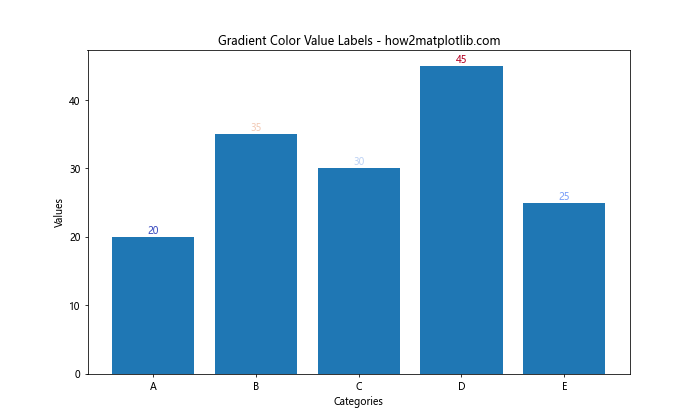
This example uses a color gradient to color the value labels based on their corresponding values.
Handling Special Cases When Adding Value Labels on a Matplotlib Bar Chart
There are some special cases to consider when adding value labels on a Matplotlib Bar Chart. Let’s explore a few of these scenarios:
1. Handling Negative Values
When dealing with negative values, you need to adjust the label placement:
import matplotlib.pyplot as plt

categories = ['A', 'B', 'C', 'D', 'E']
values = [20, -15, 30, -10, 25]

fig, ax = plt.subplots(figsize=(10, 6))
bars = ax.bar(categories, values)

for bar in bars:
    height = bar.get_height()
    y_pos = height if height >= 0 else 0
    va = 'bottom' if height >= 0 else 'top'
    ax.text(bar.get_x() + bar.get_width() / 2, y_pos, f'{height}',
            ha='center', va=va)

plt.title('Handling Negative Values - how2matplotlib.com')
plt.xlabel('Categories')
plt.ylabel('Values')
plt.axhline(y=0, color='black', linewidth=0.5)
plt.show()
Output:
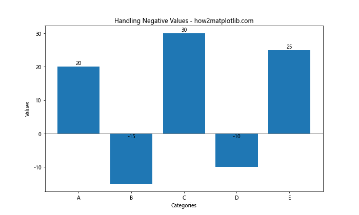
This example demonstrates how to position labels above positive bars and below negative bars.
2. Dealing with Very Small or Large Values
When you have a mix of very small and large values, you may need to use logarithmic scaling:
import matplotlib.pyplot as plt
import numpy as np

categories = ['A', 'B', 'C', 'D', 'E']
values = [10, 100, 1000, 10000, 100000]

fig, ax = plt.subplots(figsize=(10, 6))
bars = ax.bar(categories, values)

ax.set_yscale('log')

for bar in bars:
    height = bar.get_height()
    ax.text(bar.get_x() + bar.get_width() / 2, height, f'{height:,}',
            ha='center', va='bottom')

plt.title('Logarithmic Scale with Value Labels - how2matplotlib.com')
plt.xlabel('Categories')
plt.ylabel('Values (log scale)')
plt.show()
Output:
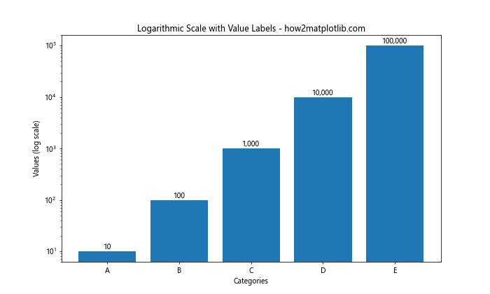
This example uses a logarithmic scale to accommodate a wide range of values and formats the labels with commas for readability.
3. Handling Overlapping Labels
When you have many bars close together, labels may overlap. Here’s a solution using alternating label positions:
import matplotlib.pyplot as plt

categories = [f'Cat {i}' for i in range(1, 21)]
values = [10, 15, 7, 12, 9, 14, 11, 8, 13, 6, 16, 9, 12, 7, 10, 15, 8, 11, 14, 13]

fig, ax = plt.subplots(figsize=(15, 6))
bars = ax.bar(categories, values)

for i, bar in enumerate(bars):
    height = bar.get_height()
    if i % 2 == 0:
        va = 'bottom'
        y_pos = height
    else:
        va = 'top'
        y_pos = height / 2
    ax.text(bar.get_x() + bar.get_width() / 2, y_pos, f'{height}',
            ha='center', va=va, rotation=90)

plt.title('Handling Overlapping Labels - how2matplotlib.com')
plt.xlabel('Categories')
plt.ylabel('Values')
plt.xticks(rotation=45, ha='right')
plt.tight_layout()
plt.show()
Output:
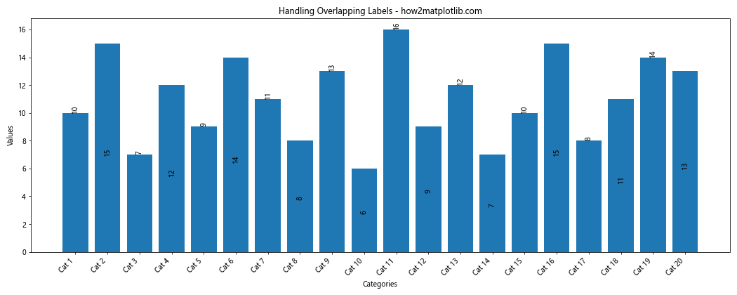
This example alternates between placing labels above the bars and in the middle of the bars to avoid overlapping.
Advanced Customization Techniques for Value Labels on a Matplotlib Bar Chart
Let’s explore some advanced customization techniques for adding value labels on a Matplotlib Bar Chart:
1. Using Icons as Labels
You can use icons or symbols as labels instead of text:
import matplotlib.pyplot as plt

categories = ['A', 'B', 'C', 'D']
values = [3, 7, 2, 5]

fig, ax = plt.subplots(figsize=(10, 6))
bars = ax.bar(categories, values)

for bar in bars:
    height = bar.get_height()
    ax.text(bar.get_x() + bar.get_width() / 2, height, '★' * height,
            ha='center', va='bottom', fontsize=20)

plt.title('Using Icons as Value Labels - how2matplotlib.com')
plt.xlabel('Categories')
plt.ylabel('Values')
plt.show()
Output:
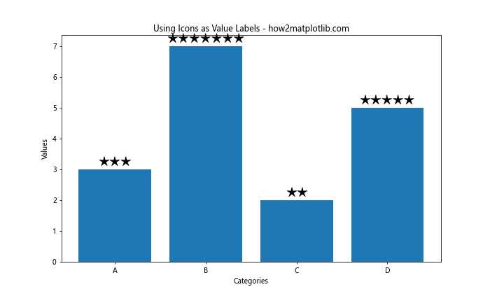
This example uses star symbols to represent the values, with the number of stars corresponding to the value.
2. Animated Value Labels
You can create animated value labels that appear gradually:
import matplotlib.pyplot as plt
import matplotlib.animation as animation

categories = ['A', 'B', 'C', 'D']
values = [30, 45, 22, 38]

fig, ax = plt.subplots(figsize=(10, 6))
bars = ax.bar(categories, values)

def animate(frame):
    for bar in bars:
        height = bar.get_height()
        label = ax.text(bar.get_x() + bar.get_width() / 2, height, '',
                        ha='center', va='bottom')
        label.set_text(f'{int(height * frame / 100)}')
    return bars

anim = animation.FuncAnimation(fig, animate, frames=100, interval=20, blit=True)

plt.title('Animated Value Labels - how2matplotlib.com')
plt.xlabel('Categories')
plt.ylabel('Values')
plt.show()
Output:

This example creates an animation where the value labels count up to their final values.
3. Multi-line Labels
For complex labels, you might need to use multi-line text:
import matplotlib.pyplot as plt

categories = ['Product A', 'Product B', 'Product C', 'Product D']
values = [1000, 1500, 1200, 1800]
percentages = [25, 37.5, 30, 45]

fig, ax = plt.subplots(figsize=(12, 6))
bars = ax.bar(categories, values)

for bar in bars:
    height = bar.get_height()
    index = bars.index(bar)
    ax.text(bar.get_x() + bar.get_width() / 2, height,
            f'Value: {height}\nPercentage: {percentages[index]}%',
            ha='center', va='bottom', multialignment='center')

plt.title('Multi-line Value Labels - how2matplotlib.com')
plt.xlabel('Products')
plt.ylabel('Sales')
plt.show()
Output:
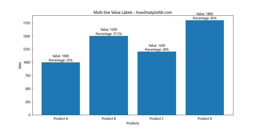
This example demonstrates how to add multi-line labels that include both the value and a percentage.
Troubleshooting Common Issues When Adding Value Labels on a Matplotlib Bar Chart
When adding value labels on a Matplotlib Bar Chart, you may encounter some common issues. Let’s address these problems and their solutions:
1. Labels Extending Beyond Chart Boundaries
If your labels extend beyond the chart boundaries, you can adjust the plot limits:
import matplotlib.pyplot as plt

categories = ['A', 'B', 'C', 'D']
values = [100, 150, 120, 180]

fig, ax = plt.subplots(figsize=(10, 6))
bars = ax.bar(categories, values)

for bar in bars:
    height = bar.get_height()
    ax.text(bar.get_x() + bar.get_width() / 2, height, f'{height}',
            ha='center', va='bottom')

plt.title('Adjusting Plot Limits for Labels - how2matplotlib.com')
plt.xlabel('Categories')
plt.ylabel('Values')
plt.ylim(0, max(values) * 1.1)  # Extend y-axis limit by 10%
plt.tight_layout()
plt.show()
Output:
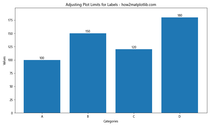
This example extends the y-axis limit to accommodate the labels.
2. Handling Long Decimal Numbers
For values with long decimal numbers, you may want to round or format them:
import matplotlib.pyplot as plt

categories = ['A', 'B', 'C', 'D']
values = [123.4567, 234.5678, 345.6789, 456.7890]

fig, ax = plt.subplots(figsize=(10, 6))
bars = ax.bar(categories, values)

for bar in bars:
    height = bar.get_height()
    ax.text(bar.get_x() + bar.get_width() / 2, height, f'{height:.2f}',
            ha='center', va='bottom')

plt.title('Formatting Long Decimal Numbers - how2matplotlib.com')
plt.xlabel('Categories')
plt.ylabel('Values')
plt.show()
Output:
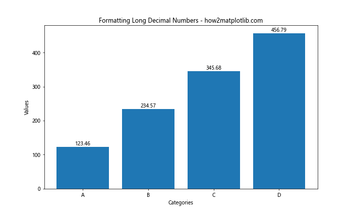
This example formats the labels to display only two decimal places.
3. Dealing with Crowded Labels
When you have many bars and labels, the chart can become crowded. One solution is to use annotations with lines:
import matplotlib.pyplot as plt

categories = [f'Category {i}' for i in range(1, 11)]
values = [10, 15, 7, 12, 9, 14, 11, 8, 13, 6]

fig, ax = plt.subplots(figsize=(12, 6))
bars = ax.bar(categories, values)

for i, bar in enumerate(bars):
    height = bar.get_height()
    ax.annotate(f'{height}',
                xy=(bar.get_x() + bar.get_width() / 2, height),
                xytext=(0, 3),  # 3 points vertical offset
                textcoords="offset points",
                ha='center', va='bottom',
                arrowprops=dict(arrowstyle="-", color="black"))

plt.title('Using Annotations for Crowded Labels - how2matplotlib.com')
plt.xlabel('Categories')
plt.ylabel('Values')
plt.xticks(rotation=45, ha='right')
plt.tight_layout()
plt.show()
Output:
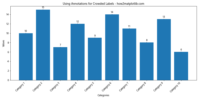
This example uses annotations with lines to connect labels to their respective bars, reducing clutter.
Conclusion
Adding value labels on a Matplotlib Bar Chart is a powerful way to enhance the clarity and informativeness of your data visualizations. Throughout this comprehensive guide, we’ve explored various techniques, from basic label placement to advanced customization options. We’ve covered handling special cases, troubleshooting common issues, and implementing best practices.
Remember that the key to effective value labels is balance – they should provide useful information without overwhelming the viewer or cluttering the chart. Always consider your audience and the purpose of your visualization when deciding how to implement value labels.
By mastering these techniques for adding value labels on a Matplotlib Bar Chart, you’ll be able to create more informative, professional, and visually appealing data visualizations. Whether you’re working on simple bar charts or complex stacked visualizations, the skills you’ve learned here will help you communicate your data more effectively.
Continue to experiment with different approaches and combinations of techniques to find the best way to present your specific data. With practice, you’ll develop an intuitive sense of how to add value labels that enhance rather than detract from your Matplotlib bar charts.