How to Create Custom Legends with Matplotlib
Custom Legends with Matplotlib are an essential aspect of data visualization that allows you to enhance the clarity and interpretability of your plots. By customizing legends, you can provide additional context, highlight specific data points, and make your visualizations more informative and visually appealing. In this comprehensive guide, we’ll explore various techniques and best practices for creating custom legends with Matplotlib, covering everything from basic customization to advanced techniques.
Understanding the Importance of Custom Legends with Matplotlib
Custom Legends with Matplotlib play a crucial role in data visualization by providing a key to interpret the various elements in a plot. They help viewers understand what different colors, markers, or line styles represent in your visualization. By customizing legends, you can:
- Improve clarity: Custom legends can make it easier for viewers to understand complex plots with multiple data series.
- Enhance aesthetics: Tailoring the appearance of legends can make your visualizations more visually appealing and professional.
- Highlight important information: Custom legends allow you to draw attention to specific data points or trends.
- Save space: By customizing legend placement and size, you can optimize the use of space in your plots.
Let’s start with a basic example of creating a custom legend with Matplotlib:
import matplotlib.pyplot as plt
import numpy as np

x = np.linspace(0, 10, 100)
y1 = np.sin(x)
y2 = np.cos(x)

plt.figure(figsize=(10, 6))
plt.plot(x, y1, label='Sine Wave')
plt.plot(x, y2, label='Cosine Wave')
plt.title('Custom Legends with Matplotlib - how2matplotlib.com')
plt.xlabel('X-axis')
plt.ylabel('Y-axis')
plt.legend(title='Custom Legend', loc='upper right', frameon=True, shadow=True)
plt.show()
Output:
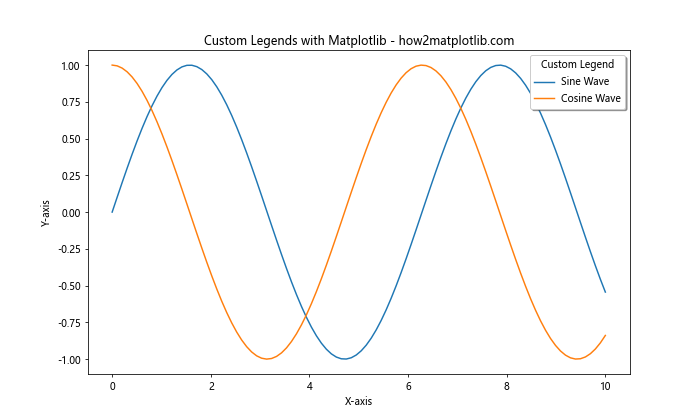
In this example, we create a simple plot with two curves and add a custom legend. The legend() function is used to create the legend, and we customize it by adding a title, specifying its location, and adding a frame with a shadow.
Customizing Legend Appearance with Matplotlib
Custom Legends with Matplotlib offer a wide range of options for customizing their appearance. You can modify various aspects such as font size, color, background, and border. Let’s explore some of these customization options:
import matplotlib.pyplot as plt
import numpy as np

x = np.linspace(0, 10, 100)
y1 = np.sin(x)
y2 = np.cos(x)

plt.figure(figsize=(10, 6))
plt.plot(x, y1, label='Sine Wave')
plt.plot(x, y2, label='Cosine Wave')
plt.title('Custom Legends with Matplotlib - how2matplotlib.com')
plt.xlabel('X-axis')
plt.ylabel('Y-axis')

legend = plt.legend(title='Custom Legend', loc='upper right', frameon=True,
                    fancybox=True, framealpha=0.7, edgecolor='red',
                    fontsize='large', title_fontsize='x-large')
legend.get_frame().set_facecolor('lightblue')

plt.show()
Output:
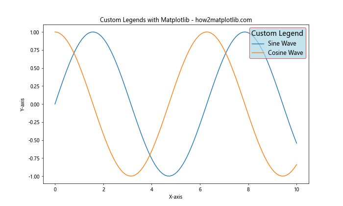
In this example, we customize the legend’s appearance by:
- Setting a fancy box style with
fancybox=True - Adjusting the transparency with
framealpha=0.7 - Changing the edge color to red
- Modifying the font size for both the legend text and title
- Setting a light blue background color for the legend
These customizations demonstrate how you can create visually appealing Custom Legends with Matplotlib to enhance your plots.
Creating Multiple Legends with Matplotlib
Sometimes, you may need to create multiple legends in a single plot. Custom Legends with Matplotlib allow you to achieve this by using the legend() function multiple times. Here’s an example:
import matplotlib.pyplot as plt
import numpy as np

x = np.linspace(0, 10, 100)
y1 = np.sin(x)
y2 = np.cos(x)
y3 = np.tan(x)

fig, ax = plt.subplots(figsize=(10, 6))

line1, = ax.plot(x, y1, label='Sine Wave')
line2, = ax.plot(x, y2, label='Cosine Wave')
line3, = ax.plot(x, y3, label='Tangent Wave')

first_legend = ax.legend(handles=[line1, line2], loc='upper right', title='Trigonometric Functions')
ax.add_artist(first_legend)

second_legend = ax.legend(handles=[line3], loc='lower right', title='Additional Function')

plt.title('Custom Legends with Matplotlib - how2matplotlib.com')
plt.xlabel('X-axis')
plt.ylabel('Y-axis')
plt.show()
Output:
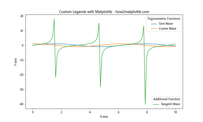
In this example, we create two separate legends:
- The first legend contains the sine and cosine waves.
- The second legend contains the tangent wave.
We use ax.add_artist(first_legend) to ensure that both legends are displayed. This technique is useful when you want to group different elements of your plot into separate legends.
Customizing Legend Markers and Labels
Custom Legends with Matplotlib allow you to modify the appearance of legend markers and labels. You can change the marker style, size, and color, as well as customize the text of the labels. Here’s an example:
import matplotlib.pyplot as plt
import numpy as np

x = np.linspace(0, 10, 100)
y1 = np.sin(x)
y2 = np.cos(x)

fig, ax = plt.subplots(figsize=(10, 6))

line1, = ax.plot(x, y1, label='Sine Wave')
line2, = ax.plot(x, y2, label='Cosine Wave')

custom_lines = [plt.Line2D([0], [0], color=line1.get_color(), lw=2, marker='o'),
                plt.Line2D([0], [0], color=line2.get_color(), lw=2, marker='s')]

legend = ax.legend(custom_lines, ['Custom Sine', 'Custom Cosine'],
                   loc='upper right', title='Custom Legends with Matplotlib')

plt.title('Custom Markers and Labels - how2matplotlib.com')
plt.xlabel('X-axis')
plt.ylabel('Y-axis')
plt.show()
Output:
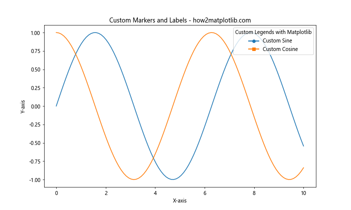
In this example, we create custom legend entries using plt.Line2D(). This allows us to:
- Set custom markers (‘o’ for sine and ‘s’ for cosine)
- Use custom labels (‘Custom Sine’ and ‘Custom Cosine’)
- Maintain the original line colors
This technique is particularly useful when you want to create legend entries that don’t directly correspond to plot elements or when you need more control over the legend appearance.
Creating a Legend for Scatter Plots
Custom Legends with Matplotlib are also useful for scatter plots, where you might want to represent different categories or data points. Here’s an example of creating a custom legend for a scatter plot:
import matplotlib.pyplot as plt
import numpy as np

np.random.seed(42)
x = np.random.rand(50)
y = np.random.rand(50)
colors = np.random.rand(50)
sizes = 1000 * np.random.rand(50)

plt.figure(figsize=(10, 6))
scatter = plt.scatter(x, y, c=colors, s=sizes, alpha=0.5)

legend_elements = [plt.scatter([], [], c='r', s=100, label='Small'),
                   plt.scatter([], [], c='g', s=300, label='Medium'),
                   plt.scatter([], [], c='b', s=500, label='Large')]

plt.legend(handles=legend_elements, title='Point Sizes',
           loc='center left', bbox_to_anchor=(1, 0.5))

plt.title('Custom Legends with Matplotlib for Scatter Plots - how2matplotlib.com')
plt.xlabel('X-axis')
plt.ylabel('Y-axis')
plt.tight_layout()
plt.show()
Output:
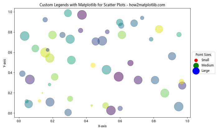
In this example, we create a scatter plot with points of varying sizes and colors. We then create custom legend entries using plt.scatter() with empty data to represent different point sizes. This technique allows you to create a legend that explains the meaning of different point sizes in your scatter plot.
Adding a Colorbar as a Legend
For plots that use color mapping, such as heatmaps or 3D surface plots, you can use a colorbar as a legend. Custom Legends with Matplotlib include the ability to customize colorbars. Here’s an example:
import matplotlib.pyplot as plt
import numpy as np

x = np.linspace(-5, 5, 100)
y = np.linspace(-5, 5, 100)
X, Y = np.meshgrid(x, y)
Z = np.sin(np.sqrt(X**2 + Y**2))

plt.figure(figsize=(10, 6))
im = plt.imshow(Z, cmap='viridis', extent=[-5, 5, -5, 5])

cbar = plt.colorbar(im, label='Value')
cbar.set_label('Custom Colorbar Legend', rotation=270, labelpad=15)

plt.title('Custom Legends with Matplotlib: Colorbar - how2matplotlib.com')
plt.xlabel('X-axis')
plt.ylabel('Y-axis')
plt.show()
Output:
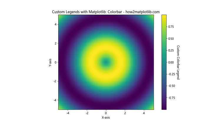
In this example, we create a heatmap using imshow() and add a custom colorbar legend. We customize the colorbar by:
- Setting a label for the colorbar
- Rotating the label text
- Adjusting the label padding
This type of legend is particularly useful for visualizations where color represents a continuous variable.
Creating Legends for Subplots
When working with multiple subplots, you might want to create Custom Legends with Matplotlib for each subplot or a single legend for all subplots. Here’s an example of creating legends for multiple subplots:
import matplotlib.pyplot as plt
import numpy as np

x = np.linspace(0, 10, 100)
y1 = np.sin(x)
y2 = np.cos(x)
y3 = np.tan(x)

fig, (ax1, ax2, ax3) = plt.subplots(1, 3, figsize=(15, 5))

ax1.plot(x, y1, label='Sine')
ax1.set_title('Sine Wave')
ax1.legend()

ax2.plot(x, y2, label='Cosine')
ax2.set_title('Cosine Wave')
ax2.legend()

ax3.plot(x, y3, label='Tangent')
ax3.set_title('Tangent Wave')
ax3.legend()

fig.suptitle('Custom Legends with Matplotlib for Subplots - how2matplotlib.com')
plt.tight_layout()
plt.show()
Output:
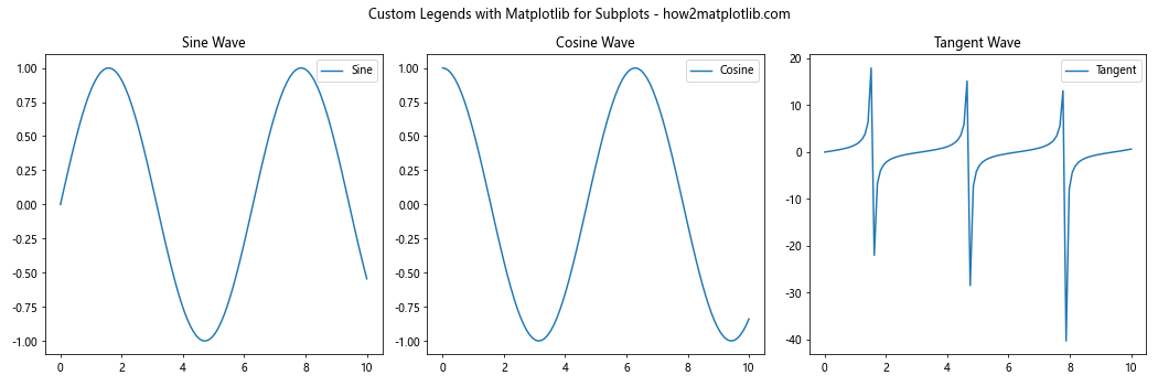
In this example, we create three subplots, each with its own legend. This approach is useful when you want to provide specific information for each subplot.
Alternatively, you can create a single legend for all subplots:
import matplotlib.pyplot as plt
import numpy as np

x = np.linspace(0, 10, 100)
y1 = np.sin(x)
y2 = np.cos(x)
y3 = np.tan(x)

fig, (ax1, ax2, ax3) = plt.subplots(1, 3, figsize=(15, 5))

line1, = ax1.plot(x, y1, label='Sine')
ax1.set_title('Sine Wave')

line2, = ax2.plot(x, y2, label='Cosine')
ax2.set_title('Cosine Wave')

line3, = ax3.plot(x, y3, label='Tangent')
ax3.set_title('Tangent Wave')

fig.legend(handles=[line1, line2, line3], loc='lower center', ncol=3, title='Trigonometric Functions')
fig.suptitle('Custom Legends with Matplotlib: Single Legend for Subplots - how2matplotlib.com')
plt.tight_layout()
plt.show()
Output:
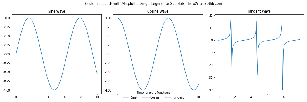
In this version, we create a single legend for all subplots using fig.legend(). This approach is useful when you want to provide a unified legend for all subplots, saving space and reducing redundancy.
Creating Custom Legend Entries
Custom Legends with Matplotlib allow you to create legend entries that don’t correspond directly to plot elements. This is useful when you want to add explanatory information to your legend. Here’s an example:
import matplotlib.pyplot as plt
import matplotlib.patches as mpatches
import numpy as np

x = np.linspace(0, 10, 100)
y1 = np.sin(x)
y2 = np.cos(x)

fig, ax = plt.subplots(figsize=(10, 6))

ax.plot(x, y1, label='Sine Wave')
ax.plot(x, y2, label='Cosine Wave')

custom_patch = mpatches.Patch(color='red', label='Custom Entry')
custom_line = plt.Line2D([0], [0], color='green', lw=2, label='Another Custom Entry')

handles, labels = ax.get_legend_handles_labels()
handles.extend([custom_patch, custom_line])

ax.legend(handles=handles, title='Custom Legends with Matplotlib')

plt.title('Custom Legend Entries - how2matplotlib.com')
plt.xlabel('X-axis')
plt.ylabel('Y-axis')
plt.show()
Output:
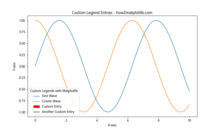
In this example, we create custom legend entries using mpatches.Patch() and plt.Line2D(). We then combine these custom entries with the existing plot elements to create a comprehensive legend.
Adjusting Legend Position and Layout
Custom Legends with Matplotlib offer various options for positioning and layout. You can place the legend inside or outside the plot area and adjust its layout. Here’s an example demonstrating different positioning options:
import matplotlib.pyplot as plt
import numpy as np

x = np.linspace(0, 10, 100)
y1 = np.sin(x)
y2 = np.cos(x)
y3 = np.tan(x)

fig, ((ax1, ax2), (ax3, ax4)) = plt.subplots(2, 2, figsize=(12, 10))

ax1.plot(x, y1, label='Sine')
ax1.plot(x, y2, label='Cosine')
ax1.plot(x, y3, label='Tangent')
ax1.legend(loc='best', title='Best Location')

ax2.plot(x, y1, label='Sine')
ax2.plot(x, y2, label='Cosine')
ax2.plot(x, y3, label='Tangent')
ax2.legend(loc='center left', bbox_to_anchor=(1, 0.5), title='Outside Right')

ax3.plot(x, y1, label='Sine')
ax3.plot(x, y2, label='Cosine')
ax3.plot(x, y3, label='Tangent')
ax3.legend(loc='upper center', bbox_to_anchor=(0.5, -0.05), ncol=3, title='Below Plot')

ax4.plot(x, y1, label='Sine')
ax4.plot(x, y2, label='Cosine')
ax4.plot(x, y3, label='Tangent')
ax4.legend(loc='lower left', bbox_to_anchor=(0, 1.02, 1, 0.2), ncol=3, mode="expand", title='Above Plot')

fig.suptitle('Custom Legends with Matplotlib: Position and Layout - how2matplotlib.com')
plt.tight_layout()
plt.show()
Output:
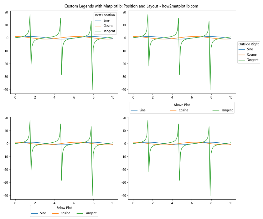
This example demonstrates four different legend positioning techniques:
- Using ‘best’ location (automatically determined)
- Placing the legend outside the plot on the right
- Positioningthe legend below the plot
- Placing the legend above the plot with expanded width
These techniques showcase the flexibility of Custom Legends with Matplotlib in terms of positioning and layout.
Creating Legends for Filled Areas
When working with filled areas in plots, such as those created by fill_between() or bar(), you might want to create custom legends to represent these areas. Here’s an example:
import matplotlib.pyplot as plt
import numpy as np

x = np.linspace(0, 10, 100)
y1 = np.sin(x)
y2 = np.cos(x)

fig, ax = plt.subplots(figsize=(10, 6))

ax.fill_between(x, y1, label='Sine Area')
ax.fill_between(x, y2, label='Cosine Area', alpha=0.5)

ax.legend(title='Custom Legends with Matplotlib')

plt.title('Legends for Filled Areas - how2matplotlib.com')
plt.xlabel('X-axis')
plt.ylabel('Y-axis')
plt.show()
Output:
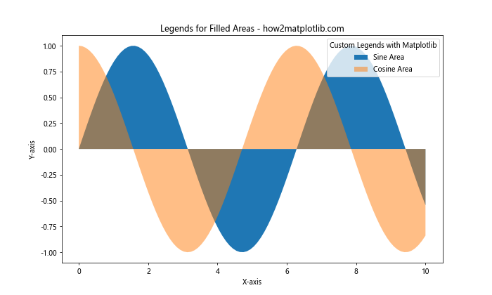
In this example, we create two filled areas using fill_between() and add them to the legend. The legend automatically represents these areas with colored patches.
Creating Legends for Pie Charts
Custom Legends with Matplotlib can also be applied to pie charts. While pie charts often have built-in labels, you might want to create a separate legend for clarity or to save space. Here’s an example:
import matplotlib.pyplot as plt

sizes = [30, 20, 25, 15, 10]
labels = ['A', 'B', 'C', 'D', 'E']
colors = ['red', 'green', 'blue', 'yellow', 'orange']

fig, ax = plt.subplots(figsize=(10, 6))

wedges, texts = ax.pie(sizes, colors=colors, wedgeprops=dict(width=0.5))

ax.legend(wedges, labels, title="Custom Legend", loc="center left", bbox_to_anchor=(1, 0, 0.5, 1))

plt.title('Custom Legends with Matplotlib: Pie Chart - how2matplotlib.com')
plt.axis('equal')
plt.tight_layout()
plt.show()
Output:
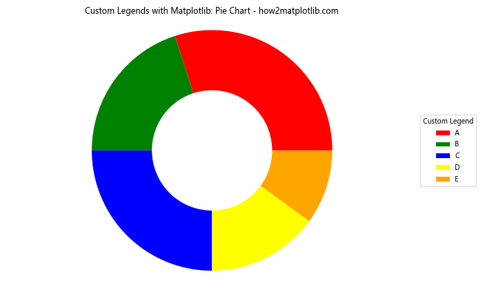
In this example, we create a pie chart and add a custom legend to the right of the chart. This approach can be particularly useful when you have many categories or long labels that might clutter the pie chart itself.
Creating Interactive Legends
Custom Legends with Matplotlib can be made interactive, allowing users to toggle the visibility of plot elements. Here’s an example of how to create an interactive legend:
import matplotlib.pyplot as plt
import numpy as np

x = np.linspace(0, 10, 100)
y1 = np.sin(x)
y2 = np.cos(x)
y3 = np.tan(x)

fig, ax = plt.subplots(figsize=(10, 6))

line1, = ax.plot(x, y1, label='Sine')
line2, = ax.plot(x, y2, label='Cosine')
line3, = ax.plot(x, y3, label='Tangent')

leg = ax.legend(title='Custom Interactive Legend')

lined = {}  # Will map legend lines to original lines
for legline, origline in zip(leg.get_lines(), [line1, line2, line3]):
    legline.set_picker(True)  # Enable picking on the legend line
    lined[legline] = origline

def on_pick(event):
    legline = event.artist
    origline = lined[legline]
    visible = not origline.get_visible()
    origline.set_visible(visible)
    legline.set_alpha(1.0 if visible else 0.2)
    fig.canvas.draw()

fig.canvas.mpl_connect('pick_event', on_pick)

plt.title('Custom Legends with Matplotlib: Interactive Legend - how2matplotlib.com')
plt.xlabel('X-axis')
plt.ylabel('Y-axis')
plt.show()
Output:
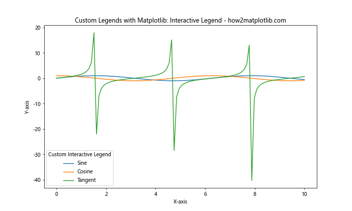
In this example, we create an interactive legend where clicking on a legend item toggles the visibility of the corresponding plot element. This is achieved by:
- Setting up a picker for each legend line
- Creating a mapping between legend lines and plot lines
- Defining a callback function (
on_pick) that toggles visibility when a legend item is clicked
This interactive feature can be particularly useful for plots with many elements, allowing users to focus on specific data series.
Customizing Legend Handles
Custom Legends with Matplotlib allow you to create and customize legend handles independently of the plot elements. This is useful when you want to create a legend that doesn’t directly correspond to plot elements or when you need more control over the appearance of legend items. Here’s an example:
import matplotlib.pyplot as plt
import matplotlib.patches as mpatches
import matplotlib.lines as mlines

fig, ax = plt.subplots(figsize=(10, 6))

# Create custom handles
red_patch = mpatches.Patch(color='red', label='Red Patch')
blue_line = mlines.Line2D([], [], color='blue', marker='*',
                          markersize=15, label='Blue Star')
green_circle = mlines.Line2D([], [], color='green', marker='o',
                             markersize=15, linestyle='None',
                             label='Green Circle')

# Add legend with custom handles
ax.legend(handles=[red_patch, blue_line, green_circle],
          title='Custom Legends with Matplotlib')

plt.title('Custom Legend Handles - how2matplotlib.com')
plt.axis('off')  # Turn off axis
plt.show()
Output:
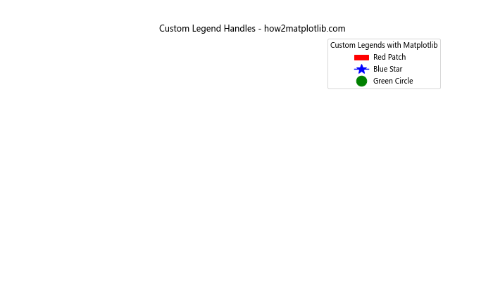
In this example, we create custom legend handles using mpatches.Patch() and mlines.Line2D(). This allows us to:
- Create a legend entry for a colored patch
- Add a legend entry for a line with a star marker
- Include a legend entry for a circle marker without a line
This technique is particularly useful when you want to create a legend that explains various symbols or colors used in your visualization, even if they don’t directly correspond to plotted data.
Creating Legends for 3D Plots
Custom Legends with Matplotlib can also be applied to 3D plots. Here’s an example of how to create a custom legend for a 3D surface plot:
import matplotlib.pyplot as plt
import numpy as np
from mpl_toolkits.mplot3d import Axes3D

fig = plt.figure(figsize=(10, 6))
ax = fig.add_subplot(111, projection='3d')

x = np.linspace(-5, 5, 100)
y = np.linspace(-5, 5, 100)
X, Y = np.meshgrid(x, y)
Z1 = np.sin(np.sqrt(X**2 + Y**2))
Z2 = np.cos(np.sqrt(X**2 + Y**2))

surf1 = ax.plot_surface(X, Y, Z1, cmap='viridis', alpha=0.7)
surf2 = ax.plot_surface(X, Y, Z2, cmap='plasma', alpha=0.7)

# Create proxy artists for the legend
proxy1 = plt.Rectangle((0, 0), 1, 1, fc='viridis')
proxy2 = plt.Rectangle((0, 0), 1, 1, fc='plasma')

ax.legend([proxy1, proxy2], ['Sin Surface', 'Cos Surface'],
          title='Custom Legends with Matplotlib')

ax.set_xlabel('X-axis')
ax.set_ylabel('Y-axis')
ax.set_zlabel('Z-axis')
plt.title('3D Plot with Custom Legend - how2matplotlib.com')
plt.show()
In this example, we create two 3D surfaces and add a custom legend to explain what each surface represents. We use plt.Rectangle() as proxy artists to create color swatches in the legend that correspond to the colormaps used for each surface.
Combining Different Types of Legend Entries
Custom Legends with Matplotlib allow you to combine different types of plot elements in a single legend. This is useful when your visualization includes various types of data representations. Here’s an example:
import matplotlib.pyplot as plt
import numpy as np

x = np.linspace(0, 10, 100)
y1 = np.sin(x)
y2 = np.exp(-x/10)

fig, ax = plt.subplots(figsize=(10, 6))

# Line plot
line, = ax.plot(x, y1, label='Sine Wave')

# Scatter plot
scatter = ax.scatter(x[::10], y2[::10], c='red', label='Exponential Points')

# Filled area
fill = ax.fill_between(x, 0, y2, alpha=0.3, label='Filled Area')

# Custom patch
from matplotlib.patches import Patch
custom_patch = Patch(facecolor='green', edgecolor='black', label='Custom Patch')

# Combine all legend entries
handles = [line, scatter, fill, custom_patch]
ax.legend(handles=handles, title='Custom Legends with Matplotlib')

plt.title('Combining Different Legend Entry Types - how2matplotlib.com')
plt.xlabel('X-axis')
plt.ylabel('Y-axis')
plt.show()
Output:
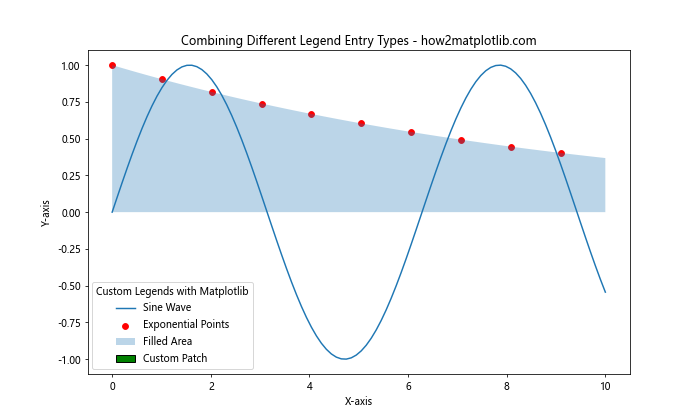
In this example, we combine different types of plot elements in a single legend:
- A line plot
- A scatter plot
- A filled area
- A custom patch
This technique allows you to create comprehensive legends that explain all aspects of your visualization, regardless of the type of plot elements used.
Conclusion
Custom Legends with Matplotlib offer a powerful way to enhance your data visualizations. Throughout this guide, we’ve explored various techniques for creating, customizing, and positioning legends to suit different types of plots and data representations. From basic customization to advanced techniques like interactive legends and 3D plot legends, Matplotlib provides a flexible framework for creating informative and visually appealing legends.
Key takeaways from this guide include:
- The importance of legends in data visualization for clarity and interpretation
- Various methods to customize legend appearance, including colors, fonts, and styles
- Techniques for creating multiple legends and legends for subplots
- Approaches for custom legend entries and handles
- Methods for positioning legends effectively within or outside the plot area
- Creating interactive legends for enhanced user engagement
- Applying custom legends to different types of plots, including scatter plots, pie charts, and 3D plots
By mastering these techniques for creating Custom Legends with Matplotlib, you can significantly improve the quality and effectiveness of your data visualizations. Remember to always consider your audience and the purpose of your visualization when designing your legends, and don’t hesitate to experiment with different approaches to find the most effective way to communicate your data insights.