How to Change the X or Y Ticks of a Matplotlib Figure
Change the x or y ticks of a Matplotlib figure is an essential skill for data visualization in Python. This article will provide a detailed exploration of various methods and techniques to customize the tick marks on your Matplotlib plots. We’ll cover everything from basic tick manipulation to advanced customization options, ensuring you have a thorough understanding of how to change the x or y ticks of a Matplotlib figure.
Understanding Ticks in Matplotlib
Before we dive into changing the x or y ticks of a Matplotlib figure, it’s important to understand what ticks are and their role in data visualization. Ticks are the marks along the axes of a plot that indicate specific values. They help readers interpret the scale and range of the data being displayed. When you change the x or y ticks of a Matplotlib figure, you’re essentially modifying how these reference points are presented on your graph.
Let’s start with a basic example to illustrate how to change the x or y ticks of a Matplotlib figure:
import matplotlib.pyplot as plt
import numpy as np

# Generate sample data
x = np.linspace(0, 10, 100)
y = np.sin(x)

# Create the plot
plt.figure(figsize=(10, 6))
plt.plot(x, y)
plt.title("How to Change X or Y Ticks - how2matplotlib.com")
plt.xlabel("X-axis")
plt.ylabel("Y-axis")

# Change the x ticks
plt.xticks([0, 2, 4, 6, 8, 10])

# Change the y ticks
plt.yticks([-1, -0.5, 0, 0.5, 1])

plt.show()
Output:
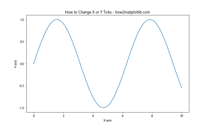
In this example, we’ve used the plt.xticks() and plt.yticks() functions to change the x or y ticks of a Matplotlib figure. These functions allow you to specify the exact locations where you want ticks to appear on the axes.
Changing X Ticks in Matplotlib
Let’s explore more ways to change the x ticks of a Matplotlib figure. We’ll cover various scenarios and techniques to give you a comprehensive understanding of tick manipulation.
Setting Custom X Tick Locations
To change the x ticks of a Matplotlib figure with custom locations, you can pass a list of values to the plt.xticks() function:
import matplotlib.pyplot as plt
import numpy as np

x = np.linspace(0, 20, 100)
y = x**2

plt.figure(figsize=(10, 6))
plt.plot(x, y)
plt.title("Custom X Tick Locations - how2matplotlib.com")
plt.xlabel("X-axis")
plt.ylabel("Y-axis")

# Change the x ticks to custom locations
plt.xticks([0, 5, 10, 15, 20])

plt.show()
Output:
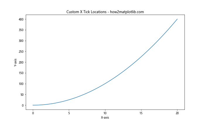
This code demonstrates how to change the x ticks of a Matplotlib figure by specifying exact locations where you want the ticks to appear.
Adding Custom X Tick Labels
You can also change the x ticks of a Matplotlib figure by providing custom labels:
import matplotlib.pyplot as plt
import numpy as np

x = np.arange(5)
y = [2, 4, 6, 8, 10]

plt.figure(figsize=(10, 6))
plt.bar(x, y)
plt.title("Custom X Tick Labels - how2matplotlib.com")
plt.xlabel("Categories")
plt.ylabel("Values")

# Change the x ticks with custom labels
plt.xticks(x, ['A', 'B', 'C', 'D', 'E'])

plt.show()
Output:
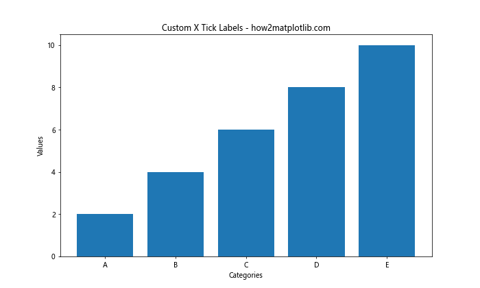
This example shows how to change the x ticks of a Matplotlib figure by replacing the default numeric labels with custom text labels.
Rotating X Tick Labels
Sometimes, when you change the x ticks of a Matplotlib figure, you may need to rotate the labels to prevent overlapping:
import matplotlib.pyplot as plt
import numpy as np

x = np.arange(10)
y = np.random.rand(10)

plt.figure(figsize=(10, 6))
plt.bar(x, y)
plt.title("Rotated X Tick Labels - how2matplotlib.com")
plt.xlabel("Categories")
plt.ylabel("Values")

# Change the x ticks and rotate labels
plt.xticks(x, ['Category ' + str(i) for i in range(1, 11)], rotation=45, ha='right')

plt.tight_layout()
plt.show()
Output:
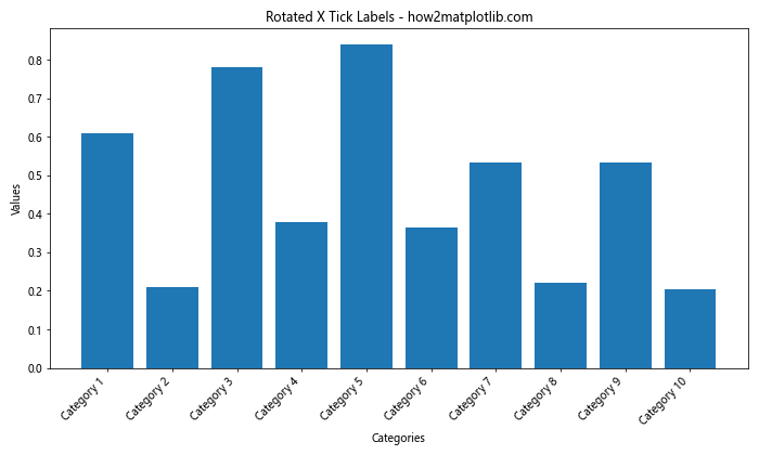
This code demonstrates how to change the x ticks of a Matplotlib figure and rotate the labels for better readability.
Changing Y Ticks in Matplotlib
Now let’s focus on how to change the y ticks of a Matplotlib figure. Many of the techniques we used for x ticks can be applied to y ticks as well.
Setting Custom Y Tick Locations
To change the y ticks of a Matplotlib figure with custom locations, use the plt.yticks() function:
import matplotlib.pyplot as plt
import numpy as np

x = np.linspace(0, 10, 100)
y = np.exp(x)

plt.figure(figsize=(10, 6))
plt.plot(x, y)
plt.title("Custom Y Tick Locations - how2matplotlib.com")
plt.xlabel("X-axis")
plt.ylabel("Y-axis")

# Change the y ticks to custom locations
plt.yticks([0, 100, 1000, 10000, 20000])

plt.show()
Output:
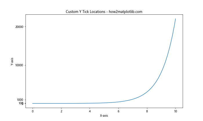
This example shows how to change the y ticks of a Matplotlib figure by specifying exact locations for the ticks.
Adding Custom Y Tick Labels
You can also change the y ticks of a Matplotlib figure by providing custom labels:
import matplotlib.pyplot as plt
import numpy as np

x = np.arange(5)
y = [10, 20, 30, 40, 50]

plt.figure(figsize=(10, 6))
plt.bar(x, y)
plt.title("Custom Y Tick Labels - how2matplotlib.com")
plt.xlabel("Categories")
plt.ylabel("Scores")

# Change the y ticks with custom labels
plt.yticks([10, 20, 30, 40, 50], ['Poor', 'Fair', 'Good', 'Very Good', 'Excellent'])

plt.show()
Output:

This code demonstrates how to change the y ticks of a Matplotlib figure by replacing the default numeric labels with custom text labels.
Using Scientific Notation for Y Ticks
When dealing with very large or small numbers, you might want to change the y ticks of a Matplotlib figure to use scientific notation:
import matplotlib.pyplot as plt
import numpy as np

x = np.linspace(0, 10, 100)
y = x**5

plt.figure(figsize=(10, 6))
plt.plot(x, y)
plt.title("Scientific Notation Y Ticks - how2matplotlib.com")
plt.xlabel("X-axis")
plt.ylabel("Y-axis")

# Change the y ticks to use scientific notation
plt.ticklabel_format(style='sci', axis='y', scilimits=(0,0))

plt.show()
Output:
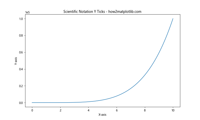
This example shows how to change the y ticks of a Matplotlib figure to use scientific notation for better readability of large numbers.
Advanced Tick Customization
Now that we’ve covered the basics of how to change the x or y ticks of a Matplotlib figure, let’s explore some more advanced customization options.
Using LogScale for Ticks
When dealing with data that spans several orders of magnitude, you might want to change the x or y ticks of a Matplotlib figure to use a logarithmic scale:
import matplotlib.pyplot as plt
import numpy as np

x = np.logspace(0, 5, 100)
y = x**2

plt.figure(figsize=(10, 6))
plt.loglog(x, y)
plt.title("LogScale Ticks - how2matplotlib.com")
plt.xlabel("X-axis (log scale)")
plt.ylabel("Y-axis (log scale)")

# Change the x and y ticks to use log scale
plt.xscale('log')
plt.yscale('log')

plt.show()
Output:
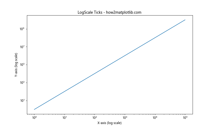
This code demonstrates how to change the x or y ticks of a Matplotlib figure to use a logarithmic scale, which is useful for visualizing data with a wide range of values.
Customizing Tick Appearance
You can change the x or y ticks of a Matplotlib figure by customizing their appearance:
import matplotlib.pyplot as plt
import numpy as np

x = np.linspace(0, 10, 100)
y = np.sin(x)

fig, ax = plt.subplots(figsize=(10, 6))
ax.plot(x, y)
ax.set_title("Customized Tick Appearance - how2matplotlib.com")
ax.set_xlabel("X-axis")
ax.set_ylabel("Y-axis")

# Change the x and y ticks appearance
ax.tick_params(axis='both', which='major', length=10, width=2, color='red', labelsize=12)
ax.tick_params(axis='both', which='minor', length=5, width=1, color='blue', labelsize=10)

plt.show()
Output:
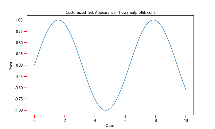
This example shows how to change the x or y ticks of a Matplotlib figure by customizing their length, width, color, and label size.
Adding Minor Ticks
To provide more detailed reference points, you can change the x or y ticks of a Matplotlib figure by adding minor ticks:
import matplotlib.pyplot as plt
import numpy as np

x = np.linspace(0, 10, 100)
y = np.cos(x)

fig, ax = plt.subplots(figsize=(10, 6))
ax.plot(x, y)
ax.set_title("Adding Minor Ticks - how2matplotlib.com")
ax.set_xlabel("X-axis")
ax.set_ylabel("Y-axis")

# Change the x and y ticks by adding minor ticks
ax.minorticks_on()
ax.tick_params(which='minor', length=4, color='r')

plt.show()
Output:
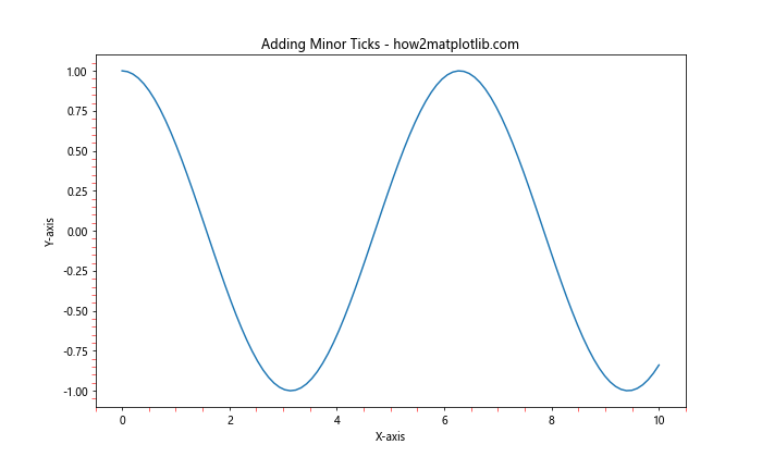
This code demonstrates how to change the x or y ticks of a Matplotlib figure by adding minor ticks and customizing their appearance.
Handling Date and Time Ticks
When working with time series data, you might need to change the x or y ticks of a Matplotlib figure to properly display date and time information.
Formatting Date Ticks
Here’s an example of how to change the x ticks of a Matplotlib figure to display dates:
import matplotlib.pyplot as plt
import numpy as np
import matplotlib.dates as mdates
from datetime import datetime, timedelta

# Generate sample data
start_date = datetime(2023, 1, 1)
dates = [start_date + timedelta(days=i) for i in range(100)]
values = np.cumsum(np.random.randn(100))

plt.figure(figsize=(12, 6))
plt.plot(dates, values)
plt.title("Formatting Date Ticks - how2matplotlib.com")
plt.xlabel("Date")
plt.ylabel("Value")

# Change the x ticks to display dates
plt.gca().xaxis.set_major_formatter(mdates.DateFormatter('%Y-%m-%d'))
plt.gca().xaxis.set_major_locator(mdates.DayLocator(interval=10))
plt.gcf().autofmt_xdate()  # Rotate and align the tick labels

plt.show()
Output:
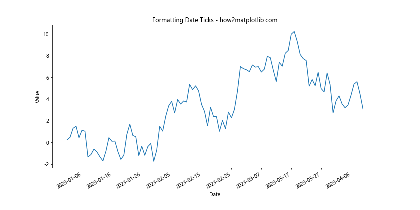
This example demonstrates how to change the x ticks of a Matplotlib figure to properly format and display date information.
Handling Time Ticks
For data with time information, you can change the x ticks of a Matplotlib figure to display time:
import matplotlib.pyplot as plt
import numpy as np
import matplotlib.dates as mdates
from datetime import datetime, timedelta

# Generate sample data
start_time = datetime(2023, 1, 1, 0, 0)
times = [start_time + timedelta(hours=i) for i in range(24)]
values = np.sin(np.linspace(0, 2*np.pi, 24))

plt.figure(figsize=(12, 6))
plt.plot(times, values)
plt.title("Handling Time Ticks - how2matplotlib.com")
plt.xlabel("Time")
plt.ylabel("Value")

# Change the x ticks to display time
plt.gca().xaxis.set_major_formatter(mdates.DateFormatter('%H:%M'))
plt.gca().xaxis.set_major_locator(mdates.HourLocator(interval=2))

plt.show()
Output:
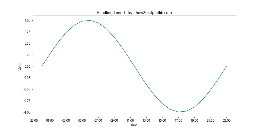
This code shows how to change the x ticks of a Matplotlib figure to display time information at regular intervals.
Customizing Tick Formatters
Matplotlib provides various tick formatters that allow you to change the x or y ticks of a Matplotlib figure in more advanced ways.
Using FuncFormatter
You can use a custom function to change the x or y ticks of a Matplotlib figure:
import matplotlib.pyplot as plt
import numpy as np
from matplotlib.ticker import FuncFormatter

def currency_formatter(x, p):
    return f"${x:,.2f}"

x = np.linspace(0, 1000000, 100)
y = x**2

plt.figure(figsize=(10, 6))
plt.plot(x, y)
plt.title("Custom Tick Formatter - how2matplotlib.com")
plt.xlabel("X-axis")
plt.ylabel("Y-axis")

# Change the y ticks using a custom formatter
plt.gca().yaxis.set_major_formatter(FuncFormatter(currency_formatter))

plt.show()
Output:
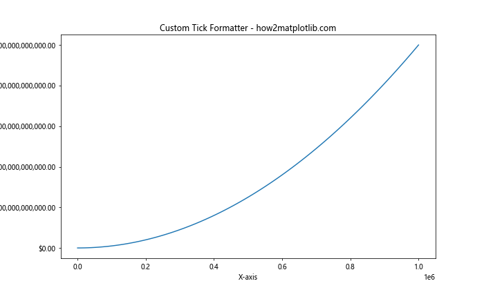
This example demonstrates how to change the y ticks of a Matplotlib figure using a custom formatter function to display values as currency.
Using PercentFormatter
To display ticks as percentages, you can change the x or y ticks of a Matplotlib figure using the PercentFormatter:
import matplotlib.pyplot as plt
import numpy as np
from matplotlib.ticker import PercentFormatter

x = np.linspace(0, 1, 100)
y = x**2

plt.figure(figsize=(10, 6))
plt.plot(x, y)
plt.title("Percent Formatter - how2matplotlib.com")
plt.xlabel("X-axis")
plt.ylabel("Y-axis")

# Change the y ticks to display percentages
plt.gca().yaxis.set_major_formatter(PercentFormatter(1))

plt.show()
Output:
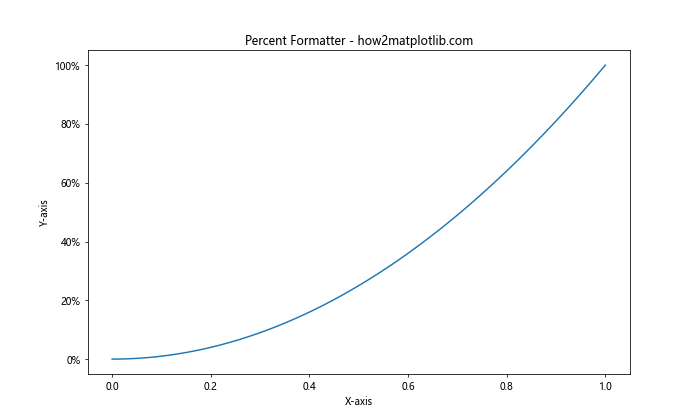
This code shows how to change the y ticks of a Matplotlib figure to display values as percentages.
Handling Categorical Data
When working with categorical data, you might need to change the x or y ticks of a Matplotlib figure to properly represent categories.
Using Categorical Ticks
Here’s an example of how to change the x ticks of a Matplotlib figure for categorical data:
import matplotlib.pyplot as plt
import numpy as np

categories = ['Category A', 'Category B', 'Category C', 'Category D', 'Category E']
values = np.random.rand(5)

plt.figure(figsize=(10, 6))
plt.bar(categories, values)
plt.title("Categorical Ticks - how2matplotlib.com")
plt.xlabel("Categories")
plt.ylabel("Values")

# Change the x ticks to display categories
plt.xticks(range(len(categories)), categories, rotation=45, ha='right')

plt.tight_layout()
plt.show()
Output:
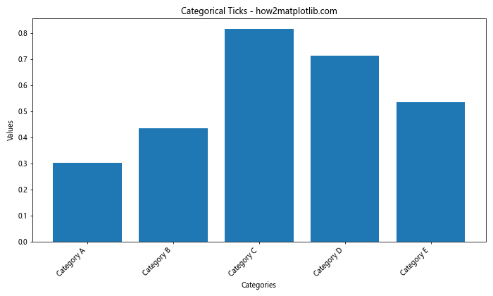
This example demonstrates how to change the x ticks of a Matplotlib figure to display categorical data labels.
Additional Tips and Tricks
Let’s explore some additional tips and tricks for changing the x or y ticks of a Matplotlib figure.
Using Twin Axes
Sometimes, you may need to change the x or y ticks of a Matplotlib figure to display different scales on the same plot. This can be achieved using twin axes:
import matplotlib.pyplot as plt
import numpy as np

x = np.linspace(0, 10, 100)
y1 = np.sin(x)
y2 = np.exp(x)

fig, ax1 = plt.subplots(figsize=(10, 6))

ax1.set_xlabel('X-axis')
ax1.set_ylabel('Sin(x)', color='tab:blue')
ax1.plot(x, y1, color='tab:blue')
ax1.tick_params(axis='y', labelcolor='tab:blue')

ax2 = ax1.twinx()  # Create a twin axis
ax2.set_ylabel('Exp(x)', color='tab:orange')
ax2.plot(x, y2, color='tab:orange')
ax2.tick_params(axis='y', labelcolor='tab:orange')

plt.title("Twin Axes with Different Scales - how2matplotlib.com")
plt.show()
Output:
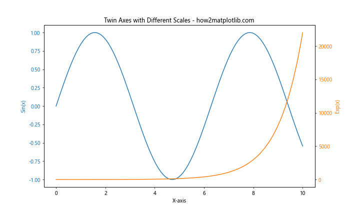
This example demonstrates how to change the y ticks of a Matplotlib figure by creating twin axes with different scales.
Using Locators
Matplotlib provides various locator classes that can help you change the x or y ticks of a Matplotlib figure more precisely:
import matplotlib.pyplot as plt
import numpy as np
from matplotlib.ticker import MultipleLocator, AutoMinorLocator

x = np.linspace(0, 10, 100)
y = np.sin(x)

fig, ax = plt.subplots(figsize=(10, 6))
ax.plot(x, y)

ax.set_title("Using Locators - how2matplotlib.com")
ax.set_xlabel("X-axis")
ax.set_ylabel("Y-axis")

# Change the x ticks using MultipleLocator
ax.xaxis.set_major_locator(MultipleLocator(2))
ax.xaxis.set_minor_locator(AutoMinorLocator())

# Change the y ticks using MultipleLocator
ax.yaxis.set_major_locator(MultipleLocator(0.5))
ax.yaxis.set_minor_locator(AutoMinorLocator())

ax.grid(which='major', color='#CCCCCC', linestyle='--')
ax.grid(which='minor', color='#CCCCCC', linestyle=':')

plt.show()
Output:
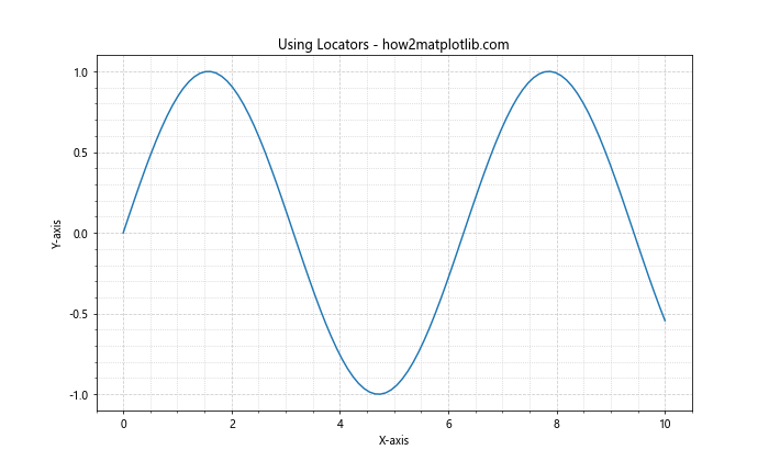
This code shows how to change the x or y ticks of a Matplotlib figure using locators for more precise control over tick placement.
Handling Overlapping Ticks
When you change the x or y ticks of a Matplotlib figure, you might encounter overlapping tick labels. Here’s how to handle this issue:
import matplotlib.pyplot as plt
import numpy as np

x = np.arange(20)
y = np.random.rand(20)

fig, ax = plt.subplots(figsize=(12, 6))
ax.bar(x, y)

ax.set_title("Handling Overlapping Ticks - how2matplotlib.com")
ax.set_xlabel("X-axis")
ax.set_ylabel("Y-axis")

# Change the x ticks and handle overlapping
plt.xticks(x)
plt.setp(ax.xaxis.get_majorticklabels(), rotation=45, ha='right')

plt.tight_layout()
plt.show()
Output:
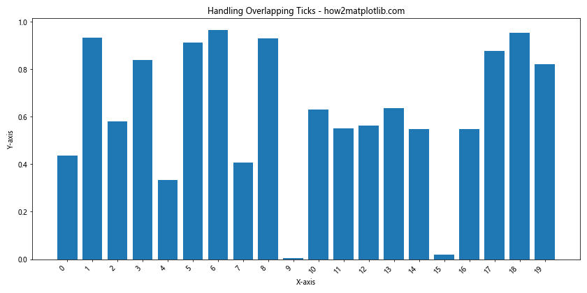
This example demonstrates how to change the x ticks of a Matplotlib figure and handle overlapping labels by rotating them.
Advanced Tick Manipulation
Let’s explore some more advanced techniques to change the x or y ticks of a Matplotlib figure.
Using ScalarFormatter
The ScalarFormatter can be used to change the x or y ticks of a Matplotlib figure with more control over the number format:
import matplotlib.pyplot as plt
import numpy as np
from matplotlib.ticker import ScalarFormatter

x = np.linspace(0, 1e5, 100)
y = x**2

fig, ax = plt.subplots(figsize=(10, 6))
ax.plot(x, y)

ax.set_title("Using ScalarFormatter - how2matplotlib.com")
ax.set_xlabel("X-axis")
ax.set_ylabel("Y-axis")

# Change the y ticks using ScalarFormatter
formatter = ScalarFormatter(useMathText=True)
formatter.set_scientific(True)
formatter.set_powerlimits((-2, 2))
ax.yaxis.set_major_formatter(formatter)

plt.show()
Output:
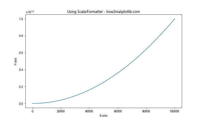
This code demonstrates how to change the y ticks of a Matplotlib figure using ScalarFormatter for better control over scientific notation.
Customizing Tick Parameters
You can change the x or y ticks of a Matplotlib figure by customizing various tick parameters:
import matplotlib.pyplot as plt
import numpy as np

x = np.linspace(0, 10, 100)
y = np.sin(x)

fig, ax = plt.subplots(figsize=(10, 6))
ax.plot(x, y)

ax.set_title("Customizing Tick Parameters - how2matplotlib.com")
ax.set_xlabel("X-axis")
ax.set_ylabel("Y-axis")

# Change the x and y ticks by customizing parameters
ax.tick_params(axis='both', which='major', labelsize=12, length=8, width=2, color='red', pad=10)
ax.tick_params(axis='both', which='minor', labelsize=10, length=4, width=1, color='blue', pad=5)

ax.minorticks_on()

plt.show()
Output:
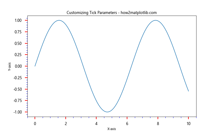
This example shows how to change the x or y ticks of a Matplotlib figure by customizing various tick parameters such as size, length, width, color, and padding.
Handling Special Cases
Let’s look at some special cases where you might need to change the x or y ticks of a Matplotlib figure in unique ways.
Logarithmic Scale with Custom Ticks
When using a logarithmic scale, you might want to change the x or y ticks of a Matplotlib figure to show specific values:
import matplotlib.pyplot as plt
import numpy as np

x = np.logspace(0, 5, 100)
y = x**2

fig, ax = plt.subplots(figsize=(10, 6))
ax.loglog(x, y)

ax.set_title("Logarithmic Scale with Custom Ticks - how2matplotlib.com")
ax.set_xlabel("X-axis")
ax.set_ylabel("Y-axis")

# Change the x ticks for logarithmic scale
ax.set_xticks([1, 10, 100, 1000, 10000, 100000])
ax.set_xticklabels(['1', '10', '100', '1K', '10K', '100K'])

# Change the y ticks for logarithmic scale
ax.set_yticks([1, 1e2, 1e4, 1e6, 1e8, 1e10])
ax.set_yticklabels(['1', '100', '10K', '1M', '100M', '10B'])

plt.show()
Output:
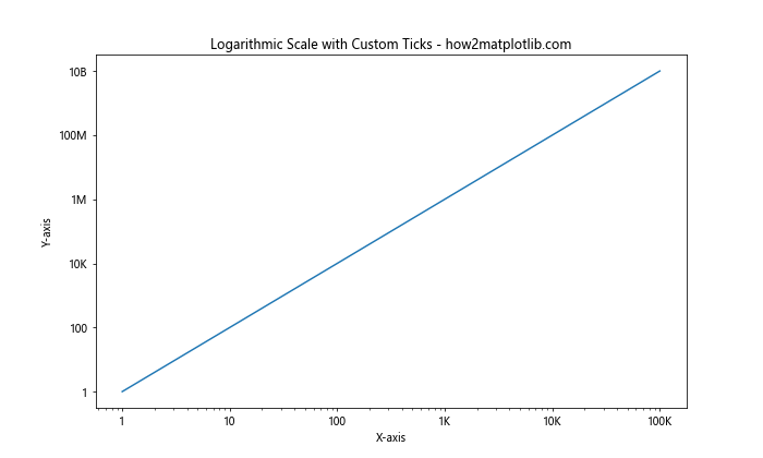
This code demonstrates how to change the x or y ticks of a Matplotlib figure when using a logarithmic scale, providing custom tick locations and labels.
Polar Plot Ticks
When working with polar plots, you might need to change the x or y ticks of a Matplotlib figure in a circular manner:
import matplotlib.pyplot as plt
import numpy as np

r = np.arange(0, 2, 0.01)
theta = 2 * np.pi * r

fig, ax = plt.subplots(figsize=(10, 10), subplot_kw=dict(projection='polar'))
ax.plot(theta, r)

ax.set_title("Polar Plot with Custom Ticks - how2matplotlib.com")

# Change the radial ticks
ax.set_rticks([0.5, 1, 1.5])
ax.set_yticklabels(['0.5', '1.0', '1.5'])

# Change the angular ticks
ax.set_xticks(np.linspace(0, 2*np.pi, 8, endpoint=False))
ax.set_xticklabels(['0°', '45°', '90°', '135°', '180°', '225°', '270°', '315°'])

plt.show()
Output:
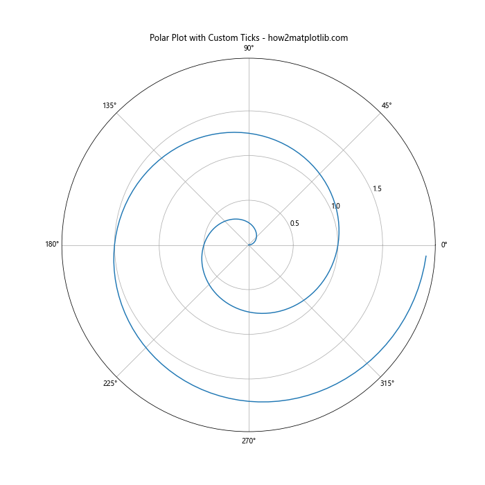
This example shows how to change the x or y ticks of a Matplotlib figure in a polar plot, customizing both radial and angular ticks.
Best Practices for Changing Ticks
When you change the x or y ticks of a Matplotlib figure, it’s important to follow some best practices to ensure your plots are clear and informative:
- Consistency: Maintain consistent tick spacing and formatting across similar plots.
- Readability: Ensure tick labels are easily readable by adjusting font size, rotation, and spacing.
- Relevance: Choose tick locations that are relevant to your data and highlight important values.
- Simplicity: Avoid cluttering your plot with too many ticks. Use major and minor ticks judiciously.
- Context: Consider the context of your data when choosing tick formats (e.g., using percentage format for proportional data).
- Accessibility: Use color-blind friendly colors and sufficient contrast for tick marks and labels.
By following these best practices when you change the x or y ticks of a Matplotlib figure, you’ll create more effective and professional-looking visualizations.
Troubleshooting Common Issues
When changing the x or y ticks of a Matplotlib figure, you might encounter some common issues. Here are some troubleshooting tips:
- Overlapping Labels: If tick labels overlap, try rotating them, increasing figure size, or reducing the number of ticks.
- Missing Ticks: Ensure your tick locations are within the data range and check if you’ve accidentally turned off ticks.
- Incorrect Scale: Double-check that you’re using the appropriate scale (linear, log, symlog) for your data.
- Formatting Errors: Verify that your custom formatters are correctly implemented and handle all possible data values.
- Inconsistent Ticks: When using multiple subplots, ensure tick settings are consistent across all axes for a cohesive look.
By being aware of these potential issues, you’ll be better prepared to troubleshoot when you change the x or y ticks of a Matplotlib figure.
Conclusion
Mastering the art of changing the x or y ticks of a Matplotlib figure is crucial for creating effective data visualizations. Throughout this comprehensive guide, we’ve explored numerous techniques and best practices for customizing ticks in Matplotlib plots. From basic tick manipulation to advanced formatting and special cases, you now have a robust toolkit for enhancing your data presentations.
Remember, the key to successfully changing the x or y ticks of a Matplotlib figure lies in understanding your data, considering your audience, and applying the appropriate techniques. Whether you’re working with time series, categorical data, or complex numerical information, the ability to fine-tune your tick marks will greatly improve the clarity and impact of your visualizations.