How to Change the Tick Frequency on X or Y Axis in Matplotlib
Changing the tick frequency on x or y axis in matplotlib is an essential skill for data visualization. This article will provide a detailed exploration of various methods and techniques to adjust tick frequency in matplotlib plots. We’ll cover everything from basic concepts to advanced customization options, ensuring you have a thorough understanding of how to control tick frequency on both x and y axes.
Understanding Tick Frequency in Matplotlib
Before diving into the specifics of changing the tick frequency on x or y axis in matplotlib, it’s important to understand what tick frequency means in the context of data visualization. Tick frequency refers to the spacing between tick marks on an axis. These tick marks are crucial for interpreting the scale and values of your data points.
In matplotlib, changing the tick frequency on x or y axis allows you to control how often tick marks appear on your plot’s axes. This can be particularly useful when dealing with different scales of data or when you want to emphasize certain ranges of values.
Let’s start with a basic example to illustrate the concept of changing the tick frequency on x or y axis in matplotlib:
import matplotlib.pyplot as plt
import numpy as np

x = np.linspace(0, 10, 100)
y = np.sin(x)

plt.figure(figsize=(10, 6))
plt.plot(x, y)
plt.title('Basic Plot with Default Tick Frequency - how2matplotlib.com')
plt.xlabel('X-axis')
plt.ylabel('Y-axis')
plt.show()
Output:
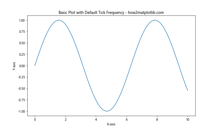
In this example, we’ve created a simple sine wave plot using matplotlib’s default tick frequency. Now, let’s explore how we can change the tick frequency on x or y axis to better suit our needs.
Changing Tick Frequency Using set_xticks() and set_yticks()
One of the most straightforward methods for changing the tick frequency on x or y axis in matplotlib is by using the set_xticks() and set_yticks() functions. These functions allow you to explicitly define the positions where you want tick marks to appear.
Here’s an example of changing the tick frequency on x or y axis using these functions:
import matplotlib.pyplot as plt
import numpy as np

x = np.linspace(0, 10, 100)
y = np.sin(x)

plt.figure(figsize=(10, 6))
plt.plot(x, y)
plt.title('Custom Tick Frequency - how2matplotlib.com')
plt.xlabel('X-axis')
plt.ylabel('Y-axis')

# Changing tick frequency on x-axis
plt.gca().set_xticks(np.arange(0, 11, 2))

# Changing tick frequency on y-axis
plt.gca().set_yticks(np.arange(-1, 1.1, 0.5))

plt.show()
Output:
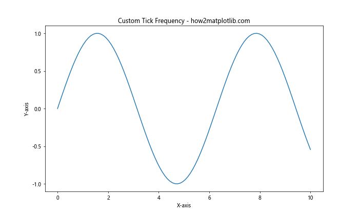
In this example, we’ve changed the tick frequency on x or y axis by setting custom tick positions. For the x-axis, we’ve set ticks at intervals of 2 from 0 to 10. For the y-axis, we’ve set ticks at intervals of 0.5 from -1 to 1.
Using MultipleLocator for Uniform Tick Spacing
When changing the tick frequency on x or y axis in matplotlib, you might want to ensure uniform spacing between ticks. The MultipleLocator class from matplotlib’s ticker module is perfect for this purpose.
Here’s an example of how to use MultipleLocator for changing the tick frequency on x or y axis:
import matplotlib.pyplot as plt
import numpy as np
from matplotlib.ticker import MultipleLocator

x = np.linspace(0, 10, 100)
y = np.cos(x)

fig, ax = plt.subplots(figsize=(10, 6))
ax.plot(x, y)
ax.set_title('Uniform Tick Spacing with MultipleLocator - how2matplotlib.com')
ax.set_xlabel('X-axis')
ax.set_ylabel('Y-axis')

# Changing tick frequency on x-axis
ax.xaxis.set_major_locator(MultipleLocator(1))

# Changing tick frequency on y-axis
ax.yaxis.set_major_locator(MultipleLocator(0.25))

plt.show()
Output:
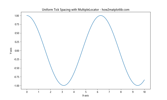
In this example, we’ve used MultipleLocator to set a uniform tick spacing of 1 unit on the x-axis and 0.25 units on the y-axis. This method is particularly useful when changing the tick frequency on x or y axis to maintain consistent intervals across the entire axis.
Customizing Tick Frequency with FuncFormatter
Sometimes, when changing the tick frequency on x or y axis in matplotlib, you might need more control over how the tick labels are displayed. The FuncFormatter class allows you to define a custom function for formatting tick labels.
Here’s an example of using FuncFormatter to customize tick labels while changing the tick frequency on x or y axis:
import matplotlib.pyplot as plt
import numpy as np
from matplotlib.ticker import FuncFormatter, MultipleLocator

def format_func(value, tick_number):
    return f"how2matplotlib.com_{value:.1f}"

x = np.linspace(0, 5, 50)
y = x ** 2

fig, ax = plt.subplots(figsize=(10, 6))
ax.plot(x, y)
ax.set_title('Custom Tick Labels with FuncFormatter - how2matplotlib.com')
ax.set_xlabel('X-axis')
ax.set_ylabel('Y-axis')

# Changing tick frequency and format on x-axis
ax.xaxis.set_major_locator(MultipleLocator(1))
ax.xaxis.set_major_formatter(FuncFormatter(format_func))

# Changing tick frequency and format on y-axis
ax.yaxis.set_major_locator(MultipleLocator(5))
ax.yaxis.set_major_formatter(FuncFormatter(format_func))

plt.show()
Output:
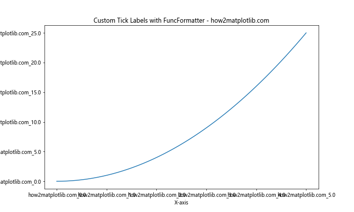
In this example, we’ve defined a custom formatting function that prepends “how2matplotlib.com_” to each tick label. We’ve then applied this formatter to both axes while changing the tick frequency on x or y axis using MultipleLocator.
Logarithmic Scale and Tick Frequency
When dealing with data that spans multiple orders of magnitude, changing the tick frequency on x or y axis in matplotlib might involve using a logarithmic scale. Matplotlib provides built-in support for logarithmic scales, which can be particularly useful in such scenarios.
Here’s an example of changing the tick frequency on x or y axis using a logarithmic scale:
import matplotlib.pyplot as plt
import numpy as np

x = np.logspace(0, 5, 100)
y = x ** 2

fig, ax = plt.subplots(figsize=(10, 6))
ax.loglog(x, y)
ax.set_title('Logarithmic Scale with Custom Tick Frequency - how2matplotlib.com')
ax.set_xlabel('X-axis (log scale)')
ax.set_ylabel('Y-axis (log scale)')

# Changing tick frequency on x-axis
ax.set_xticks([1, 10, 100, 1000, 10000, 100000])

# Changing tick frequency on y-axis
ax.set_yticks([1, 1e2, 1e4, 1e6, 1e8, 1e10])

plt.show()
Output:
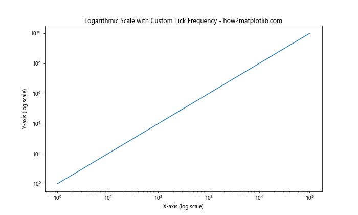
In this example, we’ve used a logarithmic scale for both axes and manually set the tick positions to create a custom tick frequency. This approach is particularly useful when changing the tick frequency on x or y axis for data with exponential growth or decay.
Date and Time Axis Tick Frequency
When working with time series data, changing the tick frequency on x or y axis in matplotlib often involves dealing with date and time formats. Matplotlib provides specialized locators and formatters for handling date and time data.
Here’s an example of changing the tick frequency on x or y axis for a time series plot:
import matplotlib.pyplot as plt
import numpy as np
from matplotlib.dates import DateFormatter, DayLocator, MonthLocator
from datetime import datetime, timedelta

start_date = datetime(2023, 1, 1)
dates = [start_date + timedelta(days=i) for i in range(90)]
values = np.random.randn(90).cumsum()

fig, ax = plt.subplots(figsize=(12, 6))
ax.plot(dates, values)
ax.set_title('Time Series with Custom Tick Frequency - how2matplotlib.com')
ax.set_xlabel('Date')
ax.set_ylabel('Value')

# Changing tick frequency on x-axis
ax.xaxis.set_major_locator(MonthLocator())
ax.xaxis.set_minor_locator(DayLocator(bymonthday=[1, 15]))
ax.xaxis.set_major_formatter(DateFormatter('%Y-%m'))

plt.show()
Output:
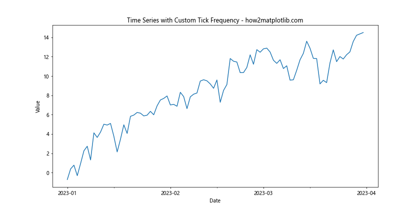
In this example, we’ve used MonthLocator for major ticks and DayLocator for minor ticks when changing the tick frequency on x or y axis. This creates a clear hierarchy of time intervals on the x-axis.
Dynamic Tick Frequency Adjustment
Sometimes, you might want to change the tick frequency on x or y axis in matplotlib dynamically based on the data range or zoom level. The AutoLocator class can be useful for this purpose.
Here’s an example of using AutoLocator for dynamic tick frequency adjustment:
import matplotlib.pyplot as plt
import numpy as np
from matplotlib.ticker import AutoLocator

x = np.linspace(0, 100, 1000)
y = np.sin(x) * np.exp(-x/10)

fig, ax = plt.subplots(figsize=(12, 6))
ax.plot(x, y)
ax.set_title('Dynamic Tick Frequency with AutoLocator - how2matplotlib.com')
ax.set_xlabel('X-axis')
ax.set_ylabel('Y-axis')

# Changing tick frequency dynamically on both axes
ax.xaxis.set_major_locator(AutoLocator())
ax.yaxis.set_major_locator(AutoLocator())

plt.show()
Output:
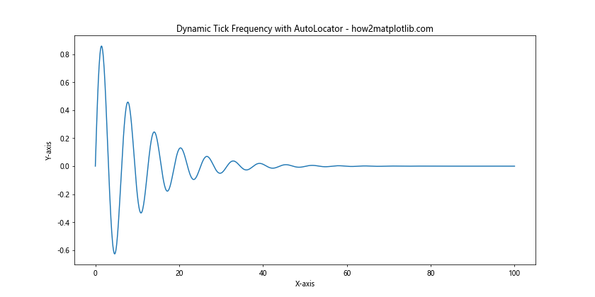
In this example, AutoLocator automatically adjusts the tick frequency on both axes based on the data range and plot size. This can be particularly useful when you’re not sure about the optimal tick frequency or when you want the plot to adapt to different data ranges.
Combining Multiple Locators
For more complex plots, you might need to combine different locators when changing the tick frequency on x or y axis in matplotlib. This can be achieved by using CompositeLocator.
Here’s an example of using multiple locators together:
import matplotlib.pyplot as plt
import numpy as np
from matplotlib.ticker import MultipleLocator, AutoMinorLocator

x = np.linspace(0, 10, 100)
y = np.sin(x) * np.exp(-x/5)

fig, ax = plt.subplots(figsize=(12, 6))
ax.plot(x, y)
ax.set_title('Combined Locators for Complex Tick Frequency - how2matplotlib.com')
ax.set_xlabel('X-axis')
ax.set_ylabel('Y-axis')

# Changing tick frequency with multiple locators
ax.xaxis.set_major_locator(MultipleLocator(2))
ax.xaxis.set_minor_locator(AutoMinorLocator(4))
ax.yaxis.set_major_locator(MultipleLocator(0.2))
ax.yaxis.set_minor_locator(AutoMinorLocator(5))

ax.grid(which='major', linestyle='-', linewidth='0.5', color='red')
ax.grid(which='minor', linestyle=':', linewidth='0.5', color='black')

plt.show()
Output:
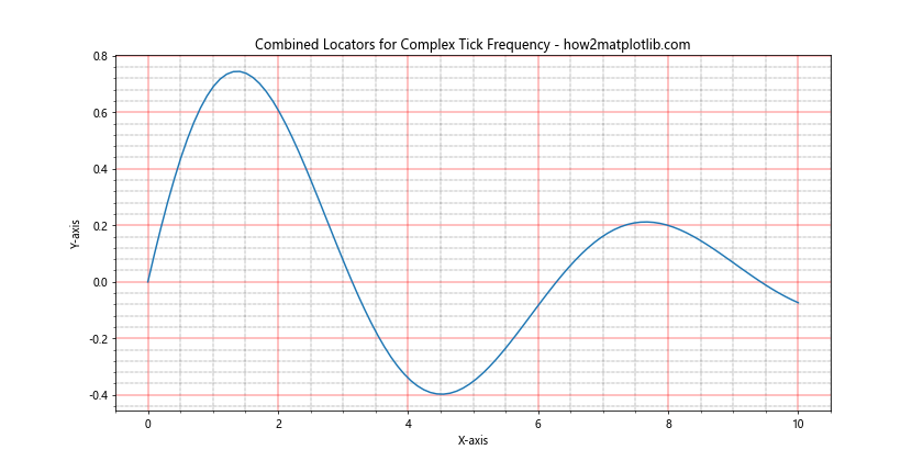
In this example, we’ve used MultipleLocator for major ticks and AutoMinorLocator for minor ticks on both axes. This creates a more detailed and informative tick structure when changing the tick frequency on x or y axis.
Customizing Tick Appearance
When changing the tick frequency on x or y axis in matplotlib, you might also want to customize the appearance of the ticks themselves. Matplotlib provides various options for tick customization.
Here’s an example of customizing tick appearance:
import matplotlib.pyplot as plt
import numpy as np

x = np.linspace(0, 10, 100)
y = np.sin(x)

fig, ax = plt.subplots(figsize=(12, 6))
ax.plot(x, y)
ax.set_title('Customized Tick Appearance - how2matplotlib.com')
ax.set_xlabel('X-axis')
ax.set_ylabel('Y-axis')

# Changing tick frequency and customizing appearance
ax.set_xticks(np.arange(0, 11, 2))
ax.set_yticks(np.arange(-1, 1.1, 0.5))

ax.tick_params(axis='x', which='major', length=10, width=2, color='red', labelsize=12, labelcolor='red')
ax.tick_params(axis='y', which='major', length=8, width=1.5, color='blue', labelsize=10, labelcolor='blue')

plt.show()
Output:
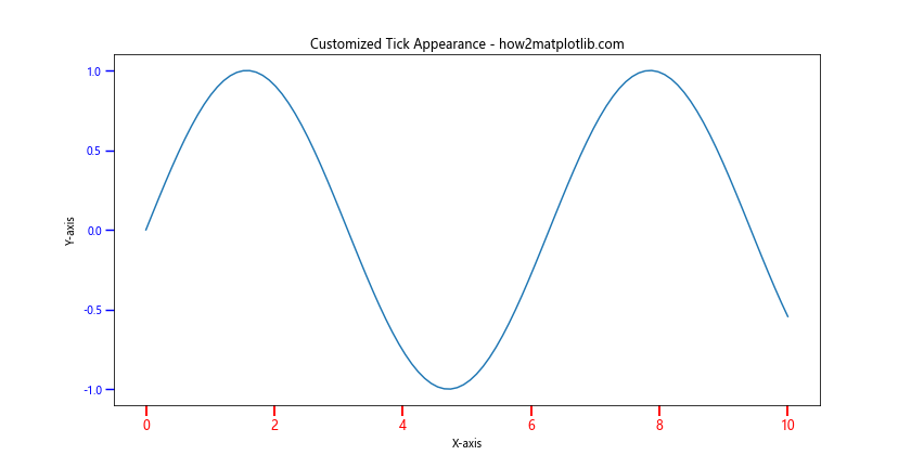
In this example, we’ve not only changed the tick frequency on x or y axis but also customized the length, width, color, and label properties of the ticks. This can help in creating more visually appealing and informative plots.
Handling Overlapping Ticks
When changing the tick frequency on x or y axis in matplotlib, you might encounter situations where tick labels overlap, especially with long labels or dense tick marks. Matplotlib provides several ways to handle this issue.
Here’s an example of dealing with overlapping ticks:
import matplotlib.pyplot as plt
import numpy as np

x = np.linspace(0, 10, 11)
y = x ** 2

fig, ax = plt.subplots(figsize=(12, 6))
ax.plot(x, y)
ax.set_title('Handling Overlapping Ticks - how2matplotlib.com')
ax.set_xlabel('X-axis')
ax.set_ylabel('Y-axis')

# Changing tick frequency and handling overlaps
ax.set_xticks(x)
ax.set_xticklabels([f'Label_{i}' for i in x], rotation=45, ha='right')

plt.tight_layout()
plt.show()
Output:
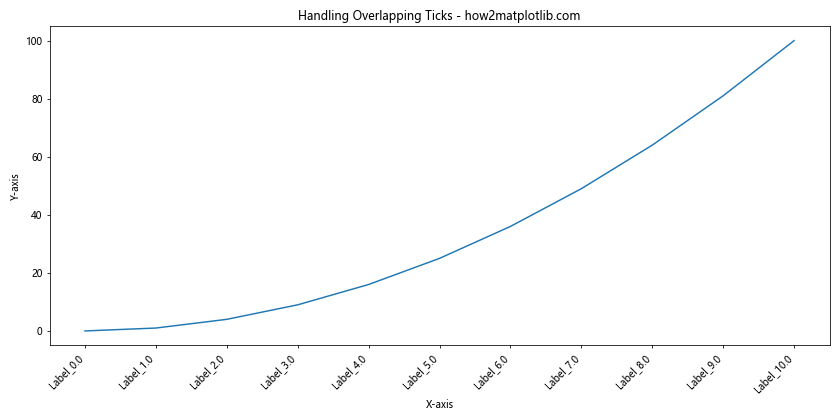
In this example, we’ve rotated the x-axis tick labels and adjusted their alignment to prevent overlap when changing the tick frequency on x or y axis. The tight_layout() function is used to automatically adjust the plot layout to accommodate the rotated labels.
Using ScalarFormatter for Tick Labels
The ScalarFormatter class in matplotlib can be useful when you want to control the format of tick labels while changing the tick frequency on x or y axis. This is particularly helpful for scientific notation or controlling decimal places.
Here’s an example using ScalarFormatter:
import matplotlib.pyplot as plt
import numpy as np
from matplotlib.ticker import ScalarFormatter, MultipleLocator

x = np.linspace(0, 1, 11)
y = x ** 3

fig, ax = plt.subplots(figsize=(12, 6))
ax.plot(x, y)
ax.set_title('ScalarFormatter for Tick Labels - how2matplotlib.com')
ax.set_xlabel('X-axis')
ax.set_ylabel('Y-axis')

# Changing tick frequency and formatting
ax.xaxis.set_major_locator(MultipleLocator(0.1))
ax.yaxis.set_major_locator(MultipleLocator(0.2))

formatter = ScalarFormatter(useMathText=True)
formatter.set_scientific(True)
formatter.set_powerlimits((-1,1))

ax.xaxis.set_major_formatter(formatter)
ax.yaxis.set_major_formatter(formatter)

plt.show()
Output:
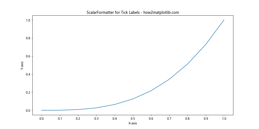
In this example, we’ve used ScalarFormatter to display tick labels in scientific notation when changing the tick frequency on x or y axis. This can be particularly useful for plots with very large or very small numbers.
Tick Frequency in 3D Plots
Changing the tick frequency on x or y axis in matplotlibCertainly! Here’s the continuation of the article:
Tick Frequency in 3D Plots
Changing the tick frequency on x or y axis in matplotlib is not limited to 2D plots. You can also adjust tick frequency in 3D plots, which adds an extra dimension to consider.
Here’s an example of changing tick frequency in a 3D plot:
import matplotlib.pyplot as plt
import numpy as np
from mpl_toolkits.mplot3d import Axes3D

fig = plt.figure(figsize=(12, 8))
ax = fig.add_subplot(111, projection='3d')

x = np.arange(-5, 5, 0.25)
y = np.arange(-5, 5, 0.25)
X, Y = np.meshgrid(x, y)
Z = np.sin(np.sqrt(X**2 + Y**2))

surf = ax.plot_surface(X, Y, Z, cmap='viridis')

ax.set_title('3D Plot with Custom Tick Frequency - how2matplotlib.com')
ax.set_xlabel('X-axis')
ax.set_ylabel('Y-axis')
ax.set_zlabel('Z-axis')

# Changing tick frequency on all axes
ax.set_xticks(np.arange(-5, 6, 2))
ax.set_yticks(np.arange(-5, 6, 2))
ax.set_zticks(np.arange(-1, 1.1, 0.5))

fig.colorbar(surf, shrink=0.5, aspect=5)

plt.show()
Output:
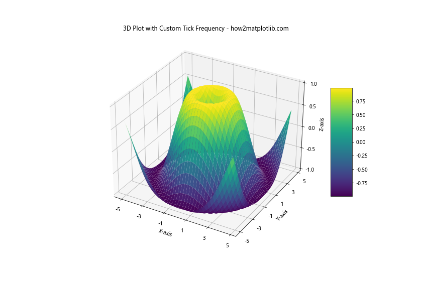
In this example, we’ve created a 3D surface plot and changed the tick frequency on all three axes. This demonstrates how changing the tick frequency on x or y axis in matplotlib can be extended to 3D visualizations.
Tick Frequency in Polar Plots
Changing the tick frequency on x or y axis in matplotlib also applies to specialized plot types like polar plots. In polar plots, you’ll be dealing with radial and angular ticks.
Here’s an example of adjusting tick frequency in a polar plot:
import matplotlib.pyplot as plt
import numpy as np

r = np.arange(0, 2, 0.01)
theta = 2 * np.pi * r

fig, ax = plt.subplots(subplot_kw=dict(projection='polar'), figsize=(10, 10))
ax.plot(theta, r)
ax.set_title('Polar Plot with Custom Tick Frequency - how2matplotlib.com')

# Changing radial tick frequency
ax.set_rticks(np.arange(0.5, 2, 0.5))

# Changing angular tick frequency
ax.set_xticks(np.arange(0, 2*np.pi, np.pi/4))

plt.show()
Output:
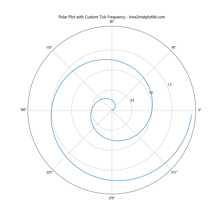
In this example, we’ve adjusted both the radial and angular tick frequencies in a polar plot. This shows how the concept of changing the tick frequency on x or y axis in matplotlib can be applied to different coordinate systems.
Tick Frequency in Subplots
When working with multiple subplots, you might want to change the tick frequency on x or y axis in matplotlib for each subplot individually or apply a consistent tick frequency across all subplots.
Here’s an example of changing tick frequency in subplots:
import matplotlib.pyplot as plt
import numpy as np

fig, (ax1, ax2) = plt.subplots(2, 1, figsize=(12, 10))

x = np.linspace(0, 10, 100)
y1 = np.sin(x)
y2 = np.cos(x)

ax1.plot(x, y1)
ax1.set_title('Subplot 1: Sin(x) - how2matplotlib.com')
ax1.set_xlabel('X-axis')
ax1.set_ylabel('Y-axis')

ax2.plot(x, y2)
ax2.set_title('Subplot 2: Cos(x) - how2matplotlib.com')
ax2.set_xlabel('X-axis')
ax2.set_ylabel('Y-axis')

# Changing tick frequency for both subplots
for ax in (ax1, ax2):
    ax.set_xticks(np.arange(0, 11, 2))
    ax.set_yticks(np.arange(-1, 1.1, 0.5))

plt.tight_layout()
plt.show()
Output:
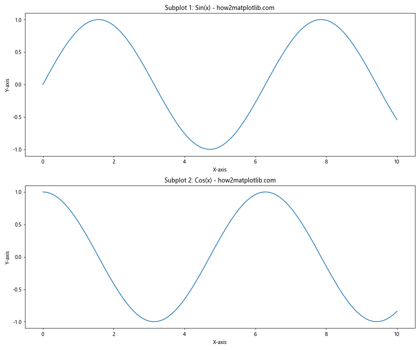
In this example, we’ve created two subplots and applied the same tick frequency to both. This demonstrates how changing the tick frequency on x or y axis in matplotlib can be managed across multiple plots within the same figure.
Tick Frequency in Categorical Plots
Changing the tick frequency on x or y axis in matplotlib is not limited to numerical data. You can also adjust tick frequency and positioning in categorical plots.
Here’s an example of a bar plot with custom tick positioning:
import matplotlib.pyplot as plt
import numpy as np

categories = ['how2matplotlib.com_A', 'how2matplotlib.com_B', 'how2matplotlib.com_C', 'how2matplotlib.com_D', 'how2matplotlib.com_E']
values = [3, 7, 2, 5, 8]

fig, ax = plt.subplots(figsize=(12, 6))
bars = ax.bar(categories, values)

ax.set_title('Categorical Plot with Custom Tick Positioning - how2matplotlib.com')
ax.set_xlabel('Categories')
ax.set_ylabel('Values')

# Changing tick frequency and rotation for x-axis
ax.set_xticks(range(len(categories)))
ax.set_xticklabels(categories, rotation=45, ha='right')

# Changing tick frequency for y-axis
ax.set_yticks(range(0, max(values)+1, 2))

plt.tight_layout()
plt.show()
Output:
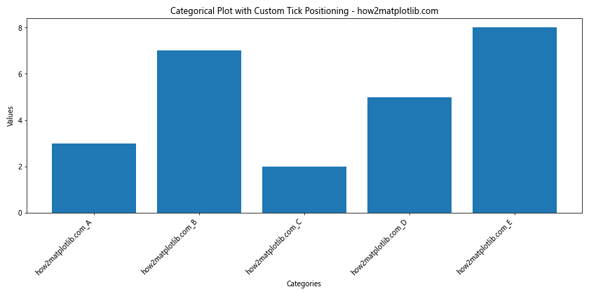
In this example, we’ve customized the x-axis ticks to match our categories and rotated the labels for better readability. We’ve also adjusted the y-axis tick frequency to provide a clear scale for the bar heights.
Tick Frequency in Heatmaps
Heatmaps are another type of plot where changing the tick frequency on x or y axis in matplotlib can significantly impact the visualization’s clarity.
Here’s an example of adjusting tick frequency in a heatmap:
import matplotlib.pyplot as plt
import numpy as np

data = np.random.rand(10, 12)
row_labels = [f'how2matplotlib.com_Row_{i}' for i in range(10)]
col_labels = [f'Col_{i}' for i in range(12)]

fig, ax = plt.subplots(figsize=(12, 8))
im = ax.imshow(data, cmap='YlOrRd')

ax.set_title('Heatmap with Custom Tick Frequency - how2matplotlib.com')

# Changing tick frequency and labels for both axes
ax.set_xticks(np.arange(len(col_labels)))
ax.set_yticks(np.arange(len(row_labels)))
ax.set_xticklabels(col_labels)
ax.set_yticklabels(row_labels)

# Rotate the tick labels and set their alignment
plt.setp(ax.get_xticklabels(), rotation=45, ha="right", rotation_mode="anchor")

# Add colorbar
cbar = ax.figure.colorbar(im, ax=ax)
cbar.ax.set_ylabel("Value", rotation=-90, va="bottom")

plt.tight_layout()
plt.show()
Output:
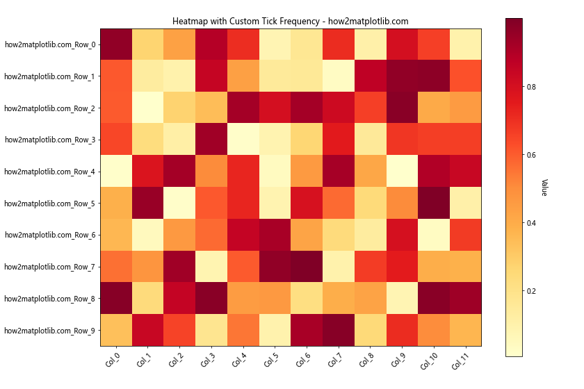
In this heatmap example, we’ve adjusted the tick frequency to match each cell in the heatmap, providing a clear reference for both rows and columns.
Tick Frequency in Logarithmic Plots
When dealing with data that spans multiple orders of magnitude, changing the tick frequency on x or y axis in matplotlib often involves using logarithmic scales. Here’s an example of adjusting tick frequency in a log-log plot:
import matplotlib.pyplot as plt
import numpy as np

x = np.logspace(0, 5, 100)
y = x ** 2

fig, ax = plt.subplots(figsize=(12, 8))
ax.loglog(x, y)

ax.set_title('Log-Log Plot with Custom Tick Frequency - how2matplotlib.com')
ax.set_xlabel('X-axis (log scale)')
ax.set_ylabel('Y-axis (log scale)')

# Changing tick frequency for both axes
ax.set_xticks([1, 10, 100, 1000, 10000, 100000])
ax.set_yticks([1, 1e2, 1e4, 1e6, 1e8, 1e10])

# Adding minor ticks
ax.minorticks_on()

plt.grid(which='major', linestyle='-', linewidth='0.5', color='red')
plt.grid(which='minor', linestyle=':', linewidth='0.5', color='black')

plt.show()
Output:
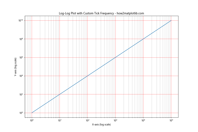
In this example, we’ve set custom major tick positions for both axes and enabled minor ticks to provide additional reference points. This approach to changing the tick frequency on x or y axis in matplotlib is particularly useful for visualizing exponential relationships.
Tick Frequency in Time Series Plots
When working with time series data, changing the tick frequency on x or y axis in matplotlib often involves dealing with date and time formats. Here’s an example of a time series plot with custom tick frequency:
import matplotlib.pyplot as plt
import numpy as np
from matplotlib.dates import DateFormatter, WeekdayLocator, DayLocator, MONDAY
from datetime import datetime, timedelta

# Generate sample data
start_date = datetime(2023, 1, 1)
dates = [start_date + timedelta(days=i) for i in range(90)]
values = np.cumsum(np.random.randn(90))

fig, ax = plt.subplots(figsize=(12, 6))
ax.plot(dates, values)

ax.set_title('Time Series Plot with Custom Tick Frequency - how2matplotlib.com')
ax.set_xlabel('Date')
ax.set_ylabel('Value')

# Changing tick frequency for x-axis
ax.xaxis.set_major_locator(WeekdayLocator(byweekday=MONDAY))
ax.xaxis.set_minor_locator(DayLocator())
ax.xaxis.set_major_formatter(DateFormatter('%Y-%m-%d'))

# Rotate and align the tick labels so they look better
fig.autofmt_xdate()

plt.tight_layout()
plt.show()
Output:
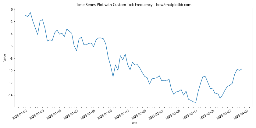
In this time series example, we’ve used WeekdayLocator to set major ticks on Mondays and DayLocator for minor ticks on each day. This creates a clear hierarchy of time intervals when changing the tick frequency on x or y axis in matplotlib for time-based data.
Conclusion
Changing the tick frequency on x or y axis in matplotlib is a powerful technique for enhancing the readability and effectiveness of your data visualizations. Throughout this article, we’ve explored various methods and scenarios for adjusting tick frequency, from basic plots to more complex visualizations like 3D plots, polar plots, and time series.
Key takeaways for changing the tick frequency on x or y axis in matplotlib include:
- Use
set_xticks()andset_yticks()for basic tick frequency adjustment. - Leverage
MultipleLocatorfor uniform tick spacing. - Customize tick labels with
FuncFormatter. - Apply logarithmic scales for data spanning multiple orders of magnitude.
- Utilize specialized locators like
DateLocatorfor time series data. - Combine multiple locators for complex tick structures.
- Consider tick appearance and handle overlapping ticks.
- Adapt tick frequency techniques to different plot types like 3D, polar, and categorical plots.
By mastering these techniques for changing the tick frequency on x or y axis in matplotlib, you’ll be able to create more informative and visually appealing data visualizations. Remember that the optimal tick frequency often depends on your specific data and the story you’re trying to tell with your visualization. Experiment with different approaches and always consider your audience when deciding on the most effective tick frequency for your plots.