How to Create Lollipop Charts with Pandas and Matplotlib
Create lollipop charts with Pandas and Matplotlib to visualize data in a unique and eye-catching way. Lollipop charts are an excellent alternative to bar charts, offering a clean and elegant representation of data points. In this comprehensive guide, we’ll explore various techniques to create lollipop charts using Pandas and Matplotlib, providing you with the skills to enhance your data visualization toolkit.
Understanding Lollipop Charts
Before we dive into creating lollipop charts with Pandas and Matplotlib, let’s first understand what lollipop charts are and why they’re useful. Lollipop charts, also known as lollipop plots or stem plots, are a type of data visualization that combines elements of bar charts and scatter plots. They consist of a line (the “stem”) extending from the x-axis to a circular marker (the “lollipop”) representing the data point.
Lollipop charts are particularly effective when:
- Comparing values across categories
- Highlighting differences between data points
- Visualizing rankings or ordered data
- Presenting data with a large number of categories
Now that we understand the basics, let’s create lollipop charts with Pandas and Matplotlib.
Setting Up the Environment
To create lollipop charts with Pandas and Matplotlib, we first need to set up our environment. Make sure you have the following libraries installed:
- Pandas
- Matplotlib
You can install these libraries using pip:
pip install pandas matplotlib
Once installed, let’s import the necessary modules:
import pandas as pd
import matplotlib.pyplot as plt

print("Ready to create lollipop charts with Pandas and Matplotlib!")
This code sets up our environment and imports the required libraries to create lollipop charts with Pandas and Matplotlib.
Creating a Basic Lollipop Chart
Let’s start by creating a basic lollipop chart using Pandas and Matplotlib. We’ll use a simple dataset of fruit sales:
import pandas as pd
import matplotlib.pyplot as plt

# Create a sample dataset
data = {
    'Fruit': ['Apple', 'Banana', 'Orange', 'Mango', 'Pineapple'],
    'Sales': [100, 80, 60, 40, 20]
}

# Create a DataFrame
df = pd.DataFrame(data)

# Create the lollipop chart
fig, ax = plt.subplots(figsize=(10, 6))

# Plot the stems
ax.vlines(x=df['Fruit'], ymin=0, ymax=df['Sales'], color='skyblue', alpha=0.7, linewidth=2)

# Plot the circles
ax.scatter(x=df['Fruit'], y=df['Sales'], color='blue', alpha=0.7, s=75)

# Customize the chart
ax.set_title('Fruit Sales Lollipop Chart - how2matplotlib.com', fontsize=15)
ax.set_xlabel('Fruit')
ax.set_ylabel('Sales')
ax.set_ylim(0, max(df['Sales']) * 1.1)

# Show the plot
plt.show()
Output:
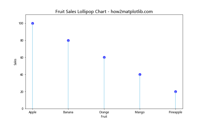
In this example, we create a lollipop chart with Pandas and Matplotlib to visualize fruit sales. The vlines function creates the stems, while the scatter function adds the circular markers. We customize the chart by adding a title, labels, and adjusting the y-axis limits.
Horizontal Lollipop Chart
Create lollipop charts with Pandas and Matplotlib in a horizontal orientation for a different perspective:
import pandas as pd
import matplotlib.pyplot as plt

# Create a sample dataset
data = {
    'Country': ['USA', 'China', 'Japan', 'Germany', 'UK'],
    'GDP': [21400, 14300, 5100, 3800, 2700]
}

# Create a DataFrame
df = pd.DataFrame(data)

# Sort the DataFrame by GDP
df = df.sort_values('GDP', ascending=True)

# Create the horizontal lollipop chart
fig, ax = plt.subplots(figsize=(10, 6))

# Plot the stems
ax.hlines(y=df['Country'], xmin=0, xmax=df['GDP'], color='skyblue', alpha=0.7, linewidth=2)

# Plot the circles
ax.scatter(x=df['GDP'], y=df['Country'], color='blue', alpha=0.7, s=75)

# Customize the chart
ax.set_title('GDP by Country - Horizontal Lollipop Chart - how2matplotlib.com', fontsize=15)
ax.set_xlabel('GDP (Billions USD)')
ax.set_ylabel('Country')

# Show the plot
plt.show()
Output:
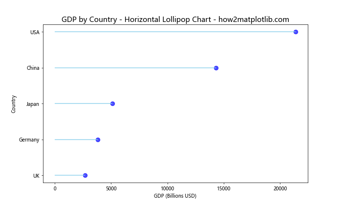
This example demonstrates how to create lollipop charts with Pandas and Matplotlib in a horizontal orientation. We use the hlines function for the stems and adjust the axis labels accordingly.
Customizing Lollipop Charts
Create lollipop charts with Pandas and Matplotlib that are visually appealing by customizing various elements:
import pandas as pd
import matplotlib.pyplot as plt

# Create a sample dataset
data = {
    'Category': ['A', 'B', 'C', 'D', 'E'],
    'Value': [25, 40, 30, 55, 45]
}

# Create a DataFrame
df = pd.DataFrame(data)

# Create the customized lollipop chart
fig, ax = plt.subplots(figsize=(10, 6))

# Plot the stems
ax.vlines(x=df['Category'], ymin=0, ymax=df['Value'], color='lightcoral', alpha=0.7, linewidth=2)

# Plot the circles
ax.scatter(x=df['Category'], y=df['Value'], color='red', alpha=0.7, s=100)

# Customize the chart
ax.set_title('Customized Lollipop Chart - how2matplotlib.com', fontsize=15, fontweight='bold')
ax.set_xlabel('Category', fontsize=12)
ax.set_ylabel('Value', fontsize=12)
ax.set_ylim(0, max(df['Value']) * 1.1)

# Add value labels
for i, v in enumerate(df['Value']):
    ax.text(i, v + 1, str(v), ha='center', va='bottom')

# Customize the grid
ax.grid(axis='y', linestyle='--', alpha=0.7)

# Remove top and right spines
ax.spines['top'].set_visible(False)
ax.spines['right'].set_visible(False)

# Show the plot
plt.show()
Output:
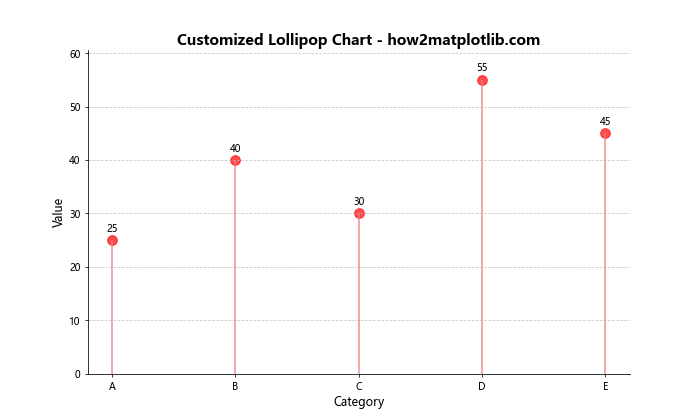
This example shows how to create lollipop charts with Pandas and Matplotlib with custom colors, fonts, and additional elements like value labels and grid lines.
Grouped Lollipop Chart
Create lollipop charts with Pandas and Matplotlib to compare multiple categories:
import pandas as pd
import matplotlib.pyplot as plt

# Create a sample dataset
data = {
    'Product': ['A', 'B', 'C', 'D', 'E'],
    'Sales 2021': [100, 80, 60, 40, 20],
    'Sales 2022': [90, 85, 70, 55, 30]
}

# Create a DataFrame
df = pd.DataFrame(data)

# Create the grouped lollipop chart
fig, ax = plt.subplots(figsize=(12, 6))

# Plot the stems for 2021
ax.vlines(x=df['Product'], ymin=0, ymax=df['Sales 2021'], color='skyblue', alpha=0.7, linewidth=2, label='2021')

# Plot the circles for 2021
ax.scatter(x=df['Product'], y=df['Sales 2021'], color='blue', alpha=0.7, s=75)

# Plot the stems for 2022
ax.vlines(x=df['Product'], ymin=0, ymax=df['Sales 2022'], color='lightcoral', alpha=0.7, linewidth=2, label='2022')

# Plot the circles for 2022
ax.scatter(x=df['Product'], y=df['Sales 2022'], color='red', alpha=0.7, s=75)

# Customize the chart
ax.set_title('Product Sales Comparison - Grouped Lollipop Chart - how2matplotlib.com', fontsize=15)
ax.set_xlabel('Product')
ax.set_ylabel('Sales')
ax.set_ylim(0, max(df['Sales 2021'].max(), df['Sales 2022'].max()) * 1.1)
ax.legend()

# Show the plot
plt.show()
Output:
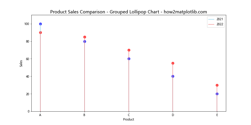
This example demonstrates how to create lollipop charts with Pandas and Matplotlib to compare two sets of data side by side.
Lollipop Chart with Error Bars
Create lollipop charts with Pandas and Matplotlib that include error bars to show data uncertainty:
import numpy as np
import pandas as pd
import matplotlib.pyplot as plt

# Create a sample dataset
np.random.seed(42)
data = {
    'Category': ['A', 'B', 'C', 'D', 'E'],
    'Value': np.random.randint(50, 100, 5),
    'Error': np.random.randint(5, 15, 5)
}

# Create a DataFrame
df = pd.DataFrame(data)

# Create the lollipop chart with error bars
fig, ax = plt.subplots(figsize=(10, 6))

# Plot the stems
ax.vlines(x=df['Category'], ymin=0, ymax=df['Value'], color='skyblue', alpha=0.7, linewidth=2)

# Plot the circles
ax.scatter(x=df['Category'], y=df['Value'], color='blue', alpha=0.7, s=75)

# Add error bars
ax.errorbar(x=df['Category'], y=df['Value'], yerr=df['Error'], fmt='none', color='black', capsize=5)

# Customize the chart
ax.set_title('Lollipop Chart with Error Bars - how2matplotlib.com', fontsize=15)
ax.set_xlabel('Category')
ax.set_ylabel('Value')
ax.set_ylim(0, max(df['Value'] + df['Error']) * 1.1)

# Show the plot
plt.show()
Output:
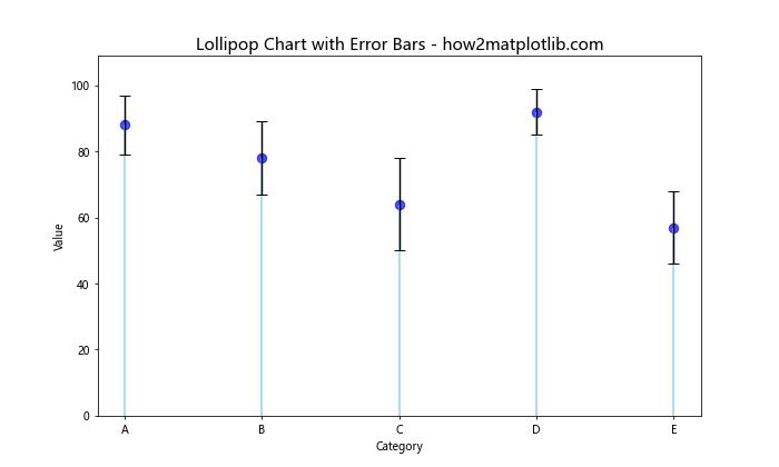
This example shows how to create lollipop charts with Pandas and Matplotlib that include error bars to represent data uncertainty or variability.
Lollipop Chart with Sorted Data
Create lollipop charts with Pandas and Matplotlib using sorted data for better visualization:
import numpy as np
import pandas as pd
import matplotlib.pyplot as plt

# Create a sample dataset
data = {
    'Country': ['USA', 'China', 'Japan', 'Germany', 'UK', 'India', 'France', 'Italy', 'Brazil', 'Canada'],
    'Population': [331, 1439, 126, 83, 68, 1380, 65, 60, 213, 38]
}

# Create a DataFrame
df = pd.DataFrame(data)

# Sort the DataFrame by population
df = df.sort_values('Population', ascending=False)

# Create the lollipop chart with sorted data
fig, ax = plt.subplots(figsize=(12, 8))

# Plot the stems
ax.vlines(x=df['Country'], ymin=0, ymax=df['Population'], color='skyblue', alpha=0.7, linewidth=2)

# Plot the circles
ax.scatter(x=df['Country'], y=df['Population'], color='blue', alpha=0.7, s=75)

# Customize the chart
ax.set_title('Population by Country - Sorted Lollipop Chart - how2matplotlib.com', fontsize=15)
ax.set_xlabel('Country')
ax.set_ylabel('Population (Millions)')
ax.set_ylim(0, max(df['Population']) * 1.1)

# Rotate x-axis labels
plt.xticks(rotation=45, ha='right')

# Add value labels
for i, v in enumerate(df['Population']):
    ax.text(i, v + 10, str(v), ha='center', va='bottom')

# Show the plot
plt.tight_layout()
plt.show()
Output:
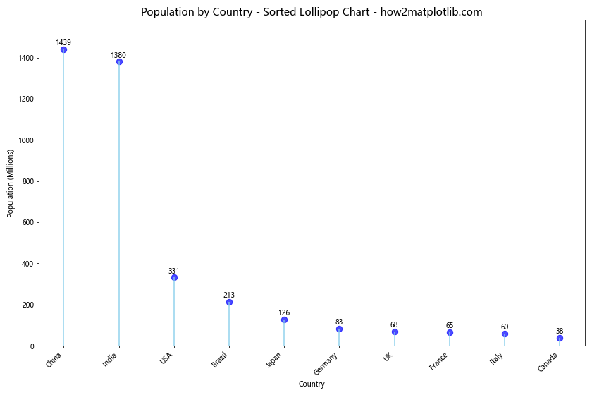
This example demonstrates how to create lollipop charts with Pandas and Matplotlib using sorted data, which can make it easier to identify trends and patterns.
Lollipop Chart with Categorical Colors
Create lollipop charts with Pandas and Matplotlib using different colors for categories:
import numpy as np
import pandas as pd
import matplotlib.pyplot as plt

# Create a sample dataset
data = {
    'Fruit': ['Apple', 'Banana', 'Orange', 'Mango', 'Pineapple', 'Grape', 'Pear', 'Kiwi'],
    'Sales': [100, 80, 60, 40, 20, 70, 50, 30],
    'Category': ['A', 'B', 'A', 'B', 'A', 'B', 'A', 'B']
}

# Create a DataFrame
df = pd.DataFrame(data)

# Create a color map
color_map = {'A': 'skyblue', 'B': 'lightcoral'}

# Create the lollipop chart with categorical colors
fig, ax = plt.subplots(figsize=(12, 6))

# Plot the stems and circles
for category in color_map:
    df_category = df[df['Category'] == category]
    ax.vlines(x=df_category['Fruit'], ymin=0, ymax=df_category['Sales'], color=color_map[category], alpha=0.7, linewidth=2, label=category)
    ax.scatter(x=df_category['Fruit'], y=df_category['Sales'], color=color_map[category], alpha=0.7, s=75)

# Customize the chart
ax.set_title('Fruit Sales by Category - Lollipop Chart - how2matplotlib.com', fontsize=15)
ax.set_xlabel('Fruit')
ax.set_ylabel('Sales')
ax.set_ylim(0, max(df['Sales']) * 1.1)
ax.legend(title='Category')

# Rotate x-axis labels
plt.xticks(rotation=45, ha='right')

# Show the plot
plt.tight_layout()
plt.show()
Output:
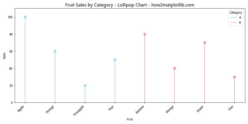
This example shows how to create lollipop charts with Pandas and Matplotlib using different colors for categories, making it easier to distinguish between groups.
Lollipop Chart with Gradient Colors
Create lollipop charts with Pandas and Matplotlib using gradient colors based on values:
import matplotlib.colors as mcolors
import numpy as np
import pandas as pd
import matplotlib.pyplot as plt

# Create a sample dataset
data = {
    'City': ['New York', 'Los Angeles', 'Chicago', 'Houston', 'Phoenix', 'Philadelphia', 'San Antonio', 'San Diego', 'Dallas', 'San Jose'],
    'Population': [8419, 3898, 2746, 2304, 1608, 1603, 1434, 1386, 1304, 1013]
}

# Create a DataFrame
df = pd.DataFrame(data)

# Sort the DataFrame by population
df = df.sort_values('Population', ascending=False)

# Create a color map
cmap = plt.cm.get_cmap('viridis')
norm = mcolors.Normalize(vmin=df['Population'].min(), vmax=df['Population'].max())

# Create the lollipop chart with gradient colors
fig, ax = plt.subplots(figsize=(12, 8))

# Plot the stems and circles
for i, (city, population) in enumerate(zip(df['City'], df['Population'])):
    color = cmap(norm(population))
    ax.vlines(x=i, ymin=0, ymax=population, color=color, alpha=0.7, linewidth=2)
    ax.scatter(x=i, y=population, color=color, alpha=0.7, s=75)

# Customize the chart
ax.set_title('Population by City - Gradient Lollipop Chart - how2matplotlib.com', fontsize=15)
ax.set_xlabel('City')
ax.set_ylabel('Population (Thousands)')
ax.set_ylim(0, max(df['Population']) * 1.1)
ax.set_xticks(range(len(df['City'])))
ax.set_xticklabels(df['City'], rotation=45, ha='right')

# Add a colorbar
sm = plt.cm.ScalarMappable(cmap=cmap, norm=norm)
sm.set_array([])
cbar = plt.colorbar(sm)
cbar.set_label('Population', rotation=270, labelpad=15)

# Show the plot
plt.tight_layout()
plt.show()
This example demonstrates how to create lollipop charts with Pandas and Matplotlib using gradient colors based on population values, providing an additional dimension of information.
Lollipop Chart with Annotations
Create lollipop charts with Pandas and Matplotlib that include annotations for specific data points:
import matplotlib.colors as mcolors
import numpy as np
import pandas as pd
import matplotlib.pyplot as plt

# Create a sample dataset
data = {
    'Year': [2010, 2011, 2012, 2013, 2014, 2015, 2016, 2017, 2018, 2019],
    'Sales': [100, 120, 140, 160, 180, 200, 220, 240, 260, 280]
}

# Create a DataFrame
df = pd.DataFrame(data)

# Create the lollipop chart with annotations
fig, ax = plt.subplots(figsize=(12, 6))

# Plot the stems
ax.vlines(x=df['Year'], ymin=0, ymax=df['Sales'], color='skyblue', alpha=0.7, linewidth=2)

# Plot the circles
ax.scatter(x=df['Year'], y=df['Sales'], color='blue', alpha=0.7, s=75)

# Customize the chart
ax.set_title('Annual Sales - Lollipop Chart with Annotations - how2matplotlib.com', fontsize=15)
ax.set_xlabel('Year')
ax.set_ylabel('Sales')
ax.set_ylim(0, max(df['Sales']) * 1.1)

# Add annotations for specific years
annotations = {
    2012: 'Product Launch',
    2015: 'Expansion',
    2018: 'Record Year'
}

for year, annotation in annotations.items():
    sales = df[df['Year'] == year]['Sales'].values[0]
    ax.annotate(annotation, xy=(year, sales), xytext=(0, 10),
                textcoords='offset points', ha='center', va='bottom',
                bbox=dict(boxstyle='round,pad=0.5', fc='yellow', alpha=0.5),
                arrowprops=dict(arrowstyle='->', connectionstyle='arc3,rad=0'))

# Show the plot
plt.tight_layout()
plt.show()
Output:
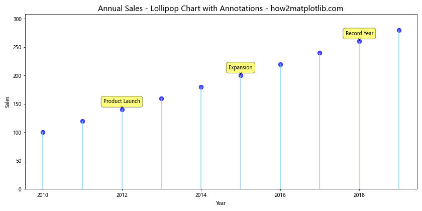
This example shows how to create lollipop charts with Pandas and Matplotlib that include annotations for specific data points, providing additional context to the visualization.
Lollipop Chart with Dual Axes
Create lollipop charts with Pandas and Matplotlib using dual axes to display two related datasets:
import matplotlib.colors as mcolors
import numpy as np
import pandas as pd
import matplotlib.pyplot as plt

# Create a sample dataset
data = {
    'Year': [2010, 2011, 2012, 2013, 2014, 2015, 2016, 2017, 2018, 2019],
    'Revenue': [100, 120, 140, 160, 180, 200, 220, 240, 260, 280],
    'Profit Margin': [10, 12, 11, 13, 15, 14, 16, 17, 18, 19]
}

# Create a DataFrame
df = pd.DataFrame(data)

# Create the lollipop chart with dual axes
fig, ax1 = plt.subplots(figsize=(12, 6))

# Plot revenue on the primary y-axis
ax1.vlines(x=df['Year'], ymin=0, ymax=df['Revenue'], color='skyblue', alpha=0.7, linewidth=2)
ax1.scatter(x=df['Year'], y=df['Revenue'], color='blue', alpha=0.7, s=75, label='Revenue')

ax1.set_xlabel('Year')
ax1.set_ylabel('Revenue', color='blue')
ax1.tick_params(axis='y', labelcolor='blue')

# Create a secondary y-axis for profit margin
ax2 = ax1.twinx()
ax2.plot(df['Year'], df['Profit Margin'], color='red', marker='o', linestyle='--', label='Profit Margin')
ax2.set_ylabel('Profit Margin (%)', color='red')
ax2.tick_params(axis='y', labelcolor='red')

# Customize the chart
plt.title('Revenue and Profit Margin - Dual Axes Lollipop Chart - how2matplotlib.com', fontsize=15)

# Combine legends
lines1, labels1 = ax1.get_legend_handles_labels()
lines2, labels2 = ax2.get_legend_handles_labels()
ax1.legend(lines1 + lines2, labels1 + labels2, loc='upper left')

# Show the plot
plt.tight_layout()
plt.show()
Output:
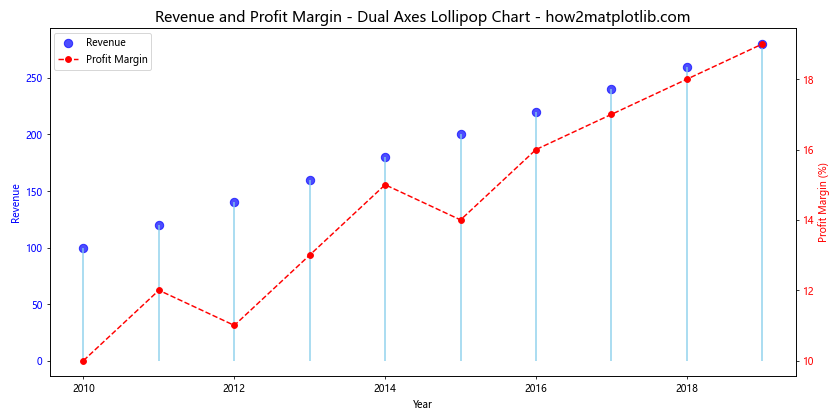
This example demonstrates how to create lollipop charts with Pandas and Matplotlib using dual axes to display two related datasets, allowing for easy comparison between revenue and profit margin.
Lollipop Chart with Subplots
Create lollipop charts with Pandas and Matplotlib using subplots to compare multiple categories:
import matplotlib.colors as mcolors
import numpy as np
import pandas as pd
import matplotlib.pyplot as plt

# Create a sample dataset
data = {
    'Category': ['A', 'B', 'C', 'D', 'E'],
    'Value1': [10, 20, 15, 25, 30],
    'Value2': [15, 25, 20, 30, 35],
    'Value3': [20, 30, 25, 35, 40]
}

# Create a DataFrame
df = pd.DataFrame(data)

# Create the lollipop chart with subplots
fig, axes = plt.subplots(1, 3, figsize=(18, 6))
fig.suptitle('Comparison of Values Across Categories - Lollipop Subplots - how2matplotlib.com', fontsize=16)

for i, column in enumerate(['Value1', 'Value2', 'Value3']):
    ax = axes[i]

    # Plot the stems
    ax.vlines(x=df['Category'], ymin=0, ymax=df[column], color='skyblue', alpha=0.7, linewidth=2)

    # Plot the circles
    ax.scatter(x=df['Category'], y=df[column], color='blue', alpha=0.7, s=75)

    # Customize the subplot
    ax.set_title(f'{column}', fontsize=14)
    ax.set_xlabel('Category')
    ax.set_ylabel('Value')
    ax.set_ylim(0, max(df[column]) * 1.1)

# Adjust layout
plt.tight_layout()
plt.show()
Output:
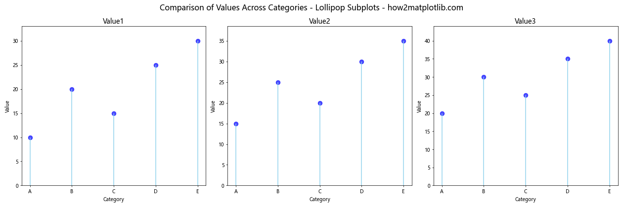
This example shows how to create lollipop charts with Pandas and Matplotlib using subplots to compare multiple categories side by side.
Animated Lollipop Chart
Create lollipop charts with Pandas and Matplotlib that animate to show changes over time:
import matplotlib.animation as animation
import matplotlib.colors as mcolors
import numpy as np
import pandas as pd
import matplotlib.pyplot as plt

# Create a sample dataset
data = {
    'Category': ['A', 'B', 'C', 'D', 'E'],
    'Value1': [10, 20, 15, 25, 30],
    'Value2': [15, 25, 20, 30, 35],
    'Value3': [20, 30, 25, 35, 40],
    'Value4': [25, 35, 30, 40, 45],
    'Value5': [30, 40, 35, 45, 50]
}

# Create a DataFrame
df = pd.DataFrame(data)

# Create the animated lollipop chart
fig, ax = plt.subplots(figsize=(10, 6))

def animate(frame):
    ax.clear()
    column = f'Value{frame+1}'

    # Plot the stems
    ax.vlines(x=df['Category'], ymin=0, ymax=df[column], color='skyblue', alpha=0.7, linewidth=2)

    # Plot the circles
    ax.scatter(x=df['Category'], y=df[column], color='blue', alpha=0.7, s=75)

    # Customize the chart
    ax.set_title(f'Animated Lollipop Chart - Frame {frame+1} - how2matplotlib.com', fontsize=15)
    ax.set_xlabel('Category')
    ax.set_ylabel('Value')
    ax.set_ylim(0, df.iloc[:, 1:].max().max() * 1.1)

# Create the animation
anim = animation.FuncAnimation(fig, animate, frames=5, interval=1000, repeat=True)

# Show the plot
plt.tight_layout()
plt.show()
Output:
This example demonstrates how to create lollipop charts with Pandas and Matplotlib that animate to show changes over time, providing a dynamic visualization of data trends.
Conclusion
In this comprehensive guide, we’ve explored various techniques to create lollipop charts with Pandas and Matplotlib. We’ve covered basic lollipop charts, horizontal orientations, customizations, grouped charts, error bars, sorted data, categorical colors, gradient colors, annotations, dual axes, subplots, and even animated lollipop charts.
Lollipop charts offer a visually appealing alternative to traditional bar charts, allowing you to present data in a clean and elegant manner. By combining the power of Pandas for data manipulation and Matplotlib for visualization, you can create stunning lollipop charts that effectively communicate your data insights.
Remember to experiment with different styles, colors, and layouts to find the best representation for your specific dataset. With the techniques covered in this guide, you’ll be well-equipped to create lollipop charts with Pandas and Matplotlib for a wide range of data visualization needs.