How to Change the Label Size and Tick Label Size of Colorbar Using Matplotlib in Python

How to Change the Label Size and Tick Label Size of Colorbar Using Matplotlib in Python

Change the label size and tick label size of colorbar using Matplotlib in Python is an essential skill for data visualization enthusiasts and professionals alike. This article will delve deep into the intricacies of manipulating colorbar labels and tick labels in Matplotlib, providing you with a thorough understanding of the subject. We’ll explore various techniques, best practices, and common pitfalls to help you master the art of customizing colorbars in your plots.

Understanding Colorbars in Matplotlib

Before we dive into changing the label size and tick label size of colorbar using Matplotlib in Python, it’s crucial to understand what colorbars are and their significance in data visualization. Colorbars are visual representations of the mapping between color and data values in a plot. They provide a legend that helps viewers interpret the meaning of colors in your visualization.

Matplotlib, a popular plotting library in Python, offers robust support for creating and customizing colorbars. Let’s start with a basic example of creating a plot with a colorbar:

import matplotlib.pyplot as plt
import numpy as np

# Create sample data
data = np.random.rand(10, 10)

# Create a figure and axis
fig, ax = plt.subplots()

# Create a heatmap with a colorbar
im = ax.imshow(data)
cbar = plt.colorbar(im)

# Set the title
plt.title("Basic Colorbar Example - how2matplotlib.com")

# Show the plot
plt.show()

Output:

How to Change the Label Size and Tick Label Size of Colorbar Using Matplotlib in Python

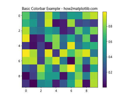
In this example, we create a simple heatmap with a colorbar. The colorbar is automatically added to the plot using plt.colorbar(). However, you might notice that the default label size and tick label size may not always be ideal for your specific visualization needs.

Changing the Label Size of Colorbar

Change the label size and tick label size of colorbar using Matplotlib in Python is often necessary to improve the readability and aesthetics of your plots. Let’s start by focusing on changing the label size of the colorbar.

To change the label size of a colorbar, you can use the set_label() method of the colorbar object and specify the fontsize parameter. Here’s an example:

import matplotlib.pyplot as plt
import numpy as np

# Create sample data
data = np.random.rand(10, 10)

# Create a figure and axis
fig, ax = plt.subplots()

# Create a heatmap with a colorbar
im = ax.imshow(data)
cbar = plt.colorbar(im)

# Change the label size of the colorbar
cbar.set_label("Values - how2matplotlib.com", fontsize=16)

# Set the title
plt.title("Colorbar with Custom Label Size")

# Show the plot
plt.show()

Output:

How to Change the Label Size and Tick Label Size of Colorbar Using Matplotlib in Python

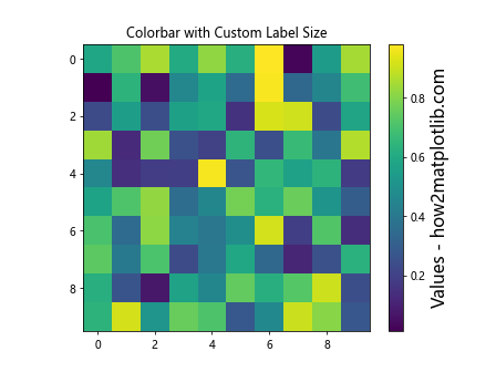
In this example, we use cbar.set_label() to set the label text and its size. The fontsize parameter allows you to specify the desired font size for the label.

You can also change the label size using the labelsize parameter when creating the colorbar:

import matplotlib.pyplot as plt
import numpy as np

# Create sample data
data = np.random.rand(10, 10)

# Create a figure and axis
fig, ax = plt.subplots()

# Create a heatmap with a colorbar
im = ax.imshow(data)
cbar = plt.colorbar(im, label="Values - how2matplotlib.com", labelsize=16)

# Set the title
plt.title("Colorbar with Custom Label Size (Alternative Method)")

# Show the plot
plt.show()

This method allows you to set the label and its size in a single line of code when creating the colorbar.

Changing the Tick Label Size of Colorbar

Now that we’ve covered how to change the label size, let’s focus on changing the tick label size of colorbar using Matplotlib in Python. Tick labels are the numerical values displayed along the colorbar, indicating the range of values represented by the colors.

To change the tick label size of a colorbar, you can use the ax.tick_params() method or modify the tick_params property of the colorbar. Here’s an example:

import matplotlib.pyplot as plt
import numpy as np

# Create sample data
data = np.random.rand(10, 10)

# Create a figure and axis
fig, ax = plt.subplots()

# Create a heatmap with a colorbar
im = ax.imshow(data)
cbar = plt.colorbar(im)

# Change the tick label size of the colorbar
cbar.ax.tick_params(labelsize=14)

# Set the label and title
cbar.set_label("Values - how2matplotlib.com", fontsize=16)
plt.title("Colorbar with Custom Tick Label Size")

# Show the plot
plt.show()

Output:

How to Change the Label Size and Tick Label Size of Colorbar Using Matplotlib in Python

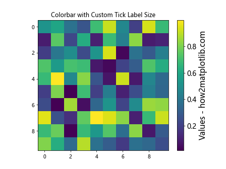
In this example, we use cbar.ax.tick_params(labelsize=14) to change the tick label size of the colorbar. The labelsize parameter allows you to specify the desired font size for the tick labels.

Alternatively, you can change the tick label size using the tick_params property of the colorbar:

import matplotlib.pyplot as plt
import numpy as np

# Create sample data
data = np.random.rand(10, 10)

# Create a figure and axis
fig, ax = plt.subplots()

# Create a heatmap with a colorbar
im = ax.imshow(data)
cbar = plt.colorbar(im)

# Change the tick label size of the colorbar
cbar.ax.tick_params(axis='both', which='major', labelsize=14)

# Set the label and title
cbar.set_label("Values - how2matplotlib.com", fontsize=16)
plt.title("Colorbar with Custom Tick Label Size (Alternative Method)")

# Show the plot
plt.show()

Output:

How to Change the Label Size and Tick Label Size of Colorbar Using Matplotlib in Python

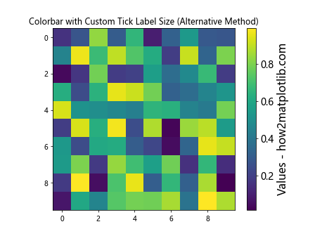
This method provides more control over the tick label size, allowing you to specify different sizes for major and minor ticks if needed.

Combining Label and Tick Label Size Changes

To change the label size and tick label size of colorbar using Matplotlib in Python simultaneously, you can combine the techniques we’ve discussed. Here’s an example that demonstrates how to change both the label size and tick label size in a single plot:

import matplotlib.pyplot as plt
import numpy as np

# Create sample data
data = np.random.rand(10, 10)

# Create a figure and axis
fig, ax = plt.subplots()

# Create a heatmap with a colorbar
im = ax.imshow(data)
cbar = plt.colorbar(im)

# Change the label size and tick label size of the colorbar
cbar.set_label("Values - how2matplotlib.com", fontsize=18)
cbar.ax.tick_params(labelsize=14)

# Set the title
plt.title("Colorbar with Custom Label and Tick Label Sizes")

# Show the plot
plt.show()

Output:

How to Change the Label Size and Tick Label Size of Colorbar Using Matplotlib in Python

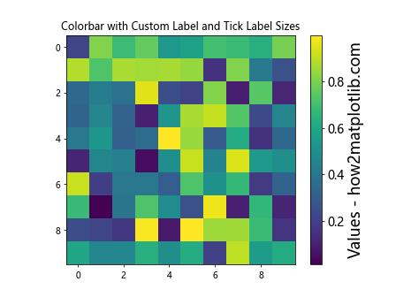
In this example, we use cbar.set_label() to change the label size and cbar.ax.tick_params() to change the tick label size. This approach gives you full control over both aspects of the colorbar’s appearance.

Advanced Techniques for Colorbar Customization

While changing the label size and tick label size of colorbar using Matplotlib in Python is essential, there are many other aspects of colorbar customization that you might want to explore. Let’s dive into some advanced techniques that can help you create even more polished and informative visualizations.

Changing Colorbar Orientation

By default, colorbars are displayed vertically on the right side of the plot. However, you can easily change the orientation to horizontal or place the colorbar on a different side of the plot. Here’s an example:

import matplotlib.pyplot as plt
import numpy as np

# Create sample data
data = np.random.rand(10, 10)

# Create a figure and axis
fig, ax = plt.subplots()

# Create a heatmap with a horizontal colorbar
im = ax.imshow(data)
cbar = plt.colorbar(im, orientation='horizontal', pad=0.2)

# Change the label size and tick label size of the colorbar
cbar.set_label("Values - how2matplotlib.com", fontsize=16)
cbar.ax.tick_params(labelsize=12)

# Set the title
plt.title("Horizontal Colorbar with Custom Label and Tick Label Sizes")

# Show the plot
plt.show()

Output:

How to Change the Label Size and Tick Label Size of Colorbar Using Matplotlib in Python

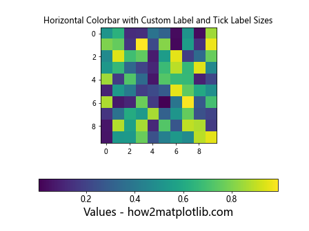
In this example, we use the orientation='horizontal' parameter to create a horizontal colorbar. The pad parameter adjusts the spacing between the plot and the colorbar.

Customizing Colorbar Ticks

You can also customize the number and position of ticks on your colorbar. This is particularly useful when you want to highlight specific values or ranges in your data. Here’s an example:

import matplotlib.pyplot as plt
import numpy as np

# Create sample data
data = np.random.rand(10, 10)

# Create a figure and axis
fig, ax = plt.subplots()

# Create a heatmap with a colorbar
im = ax.imshow(data, vmin=0, vmax=1)
cbar = plt.colorbar(im, ticks=[0, 0.2, 0.4, 0.6, 0.8, 1])

# Change the label size and tick label size of the colorbar
cbar.set_label("Custom Ticks - how2matplotlib.com", fontsize=16)
cbar.ax.tick_params(labelsize=12)

# Set the title
plt.title("Colorbar with Custom Ticks")

# Show the plot
plt.show()

Output:

How to Change the Label Size and Tick Label Size of Colorbar Using Matplotlib in Python

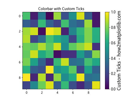
In this example, we use the ticks parameter to specify custom tick locations on the colorbar. We also set vmin and vmax to ensure that the colorbar covers the full range of our data.

Using Scientific Notation for Tick Labels

When dealing with very large or very small numbers, it can be helpful to use scientific notation for the tick labels. Matplotlib provides a convenient way to do this:

import matplotlib.pyplot as plt
import numpy as np

# Create sample data
data = np.random.rand(10, 10) * 1e6

# Create a figure and axis
fig, ax = plt.subplots()

# Create a heatmap with a colorbar
im = ax.imshow(data)
cbar = plt.colorbar(im, format='%.2e')

# Change the label size and tick label size of the colorbar
cbar.set_label("Scientific Notation - how2matplotlib.com", fontsize=16)
cbar.ax.tick_params(labelsize=12)

# Set the title
plt.title("Colorbar with Scientific Notation")

# Show the plot
plt.show()

Output:

How to Change the Label Size and Tick Label Size of Colorbar Using Matplotlib in Python

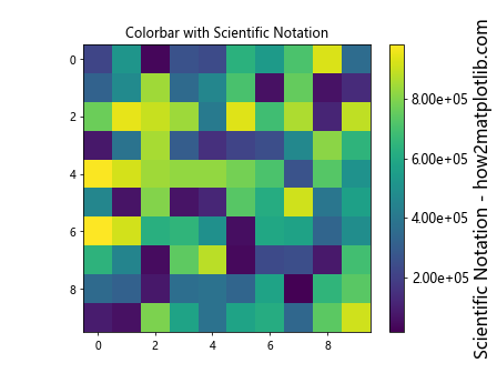
In this example, we use the format='%.2e' parameter to display tick labels in scientific notation with two decimal places.

Best Practices for Colorbar Customization

When you change the label size and tick label size of colorbar using Matplotlib in Python, it’s important to keep some best practices in mind to ensure your visualizations are both informative and visually appealing:

  1. Consistency: Maintain consistent font sizes across your plot, including the main title, axis labels, and colorbar labels.

  2. Readability: Ensure that the label and tick label sizes are large enough to be easily read, especially if your plot will be displayed on a small screen or printed in a reduced size.

  3. Color choice: Select appropriate color maps that are both visually appealing and suitable for your data type (e.g., sequential, diverging, or qualitative).

  4. Aspect ratio: Consider the aspect ratio of your plot when deciding on the orientation and size of your colorbar.

  5. Tick density: Avoid overcrowding the colorbar with too many ticks, which can make it difficult to read.

Let’s implement these best practices in an example:

import matplotlib.pyplot as plt
import numpy as np

# Create sample data
data = np.random.rand(20, 20)

# Create a figure and axis with a specific size and DPI
fig, ax = plt.subplots(figsize=(10, 8), dpi=100)

# Create a heatmap with a colorbar
im = ax.imshow(data, cmap='viridis')
cbar = plt.colorbar(im, aspect=30)

# Change the label size and tick label size of the colorbar
cbar.set_label("Values - how2matplotlib.com", fontsize=14)
cbar.ax.tick_params(labelsize=12)

# Set the title and axis labels
plt.title("Best Practices for Colorbar Customization", fontsize=16)
ax.set_xlabel("X-axis", fontsize=14)
ax.set_ylabel("Y-axis", fontsize=14)

# Adjust tick label sizes for the main plot
ax.tick_params(axis='both', which='major', labelsize=12)

# Adjust layout to prevent overlapping
plt.tight_layout()

# Show the plot
plt.show()

Output:

How to Change the Label Size and Tick Label Size of Colorbar Using Matplotlib in Python

This example demonstrates how to create a well-balanced plot with consistent font sizes, appropriate color choices, and good overall readability.

Common Pitfalls and How to Avoid Them

When you change the label size and tick label size of colorbar using Matplotlib in Python, there are some common pitfalls that you should be aware of:

  1. Overlapping labels: If you increase the font size too much, labels may overlap or extend beyond the plot area.

  2. Inconsistent sizing: Using different font sizes for various elements of your plot can make it look unprofessional.

  3. Poor color contrast: Choosing a color map that doesn’t provide enough contrast can make your colorbar difficult to read.

  4. Incorrect data range: Not setting the appropriate vmin and vmax values can result in a colorbar that doesn’t accurately represent your data.

Let’s look at an example that addresses these pitfalls:

import matplotlib.pyplot as plt
import numpy as np

# Create sample data
data = np.random.rand(15, 15)

# Create a figure and axis
fig, ax = plt.subplots(figsize=(10, 8))

# Create a heatmap with a colorbar
im = ax.imshow(data, cmap='coolwarm', vmin=0, vmax=1)
cbar = plt.colorbar(im, aspect=20)

# Change the label size and tick label size of the colorbar
cbar.set_label("Values - how2matplotlib.com", fontsize=14)
cbar.ax.tick_params(labelsize=12)

# Set the title and axis labels
plt.title("Avoiding Common Pitfalls", fontsize=16)
ax.set_xlabel("X-axis", fontsize=14)
ax.set_ylabel("Y-axis", fontsize=14)

# Adjust tick label sizes for the main plot
ax.tick_params(axis='both', which='major', labelsize=12)

# Adjust layout to prevent overlapping
plt.tight_layout()

# Show the plot
plt.show()

Output:

How to Change the Label Size and Tick Label Size of Colorbar Using Matplotlib in Python

In this example, we’ve addressed the common pitfalls by:

  1. Using consistent font sizes across the plot.
  2. Choosing a color map (‘coolwarm’) that provides good contrast.
  3. Setting appropriate vmin and vmax values to ensure the full data range is represented.
  4. Using plt.tight_layout() to prevent overlapping elements.

Advanced Colorbar Techniques

As you become more proficient in changing the label size and tick label size of colorbar using Matplotlib in Python, you may want to explore some advanced techniques to create even more sophisticated visualizations. Let’s look at a few examples:

Multiple Colorbars

In some cases, you might need to display multiple colorbars in a single plot. This can be useful when you have different data sets or want to show different aspects of the same data. Here’s an example:

import matplotlib.pyplot as plt
import numpy as np

# Create sample data
data1 = np.random.rand(10, 10)
data2 = np.random.rand(10, 10) * 100

# Create a figure and axes
fig, (ax1, ax2) = plt.subplots(1, 2, figsize=(12, 5))

# Create heatmaps with colorbars
im1 = ax1.imshow(data1, cmap='viridis')
im2 = ax2.imshow(data2, cmap='plasma')

cbar1 = plt.colorbar(im1,ax=ax1)
cbar2 = plt.colorbar(im2, ax=ax2)

# Change the label size and tick label size of the colorbars
cbar1.set_label("Values 1 - how2matplotlib.com", fontsize=12)
cbar1.ax.tick_params(labelsize=10)
cbar2.set_label("Values 2 - how2matplotlib.com", fontsize=12)
cbar2.ax.tick_params(labelsize=10)

# Set titles
ax1.set_title("Dataset 1", fontsize=14)
ax2.set_title("Dataset 2", fontsize=14)

# Adjust layout
plt.tight_layout()

# Show the plot
plt.show()

Output:

How to Change the Label Size and Tick Label Size of Colorbar Using Matplotlib in Python

This example demonstrates how to create two separate plots with their own colorbars, each customized with appropriate label and tick label sizes.

Discrete Colorbars

Sometimes, you may want to use a discrete colorbar instead of a continuous one. This is particularly useful for categorical data or when you want to highlight specific ranges of values. Here’s how you can create a discrete colorbar:

import matplotlib.pyplot as plt
import numpy as np
from matplotlib.colors import BoundaryNorm
from matplotlib.cm import ScalarMappable

# Create sample data
data = np.random.randint(0, 5, size=(10, 10))

# Define discrete color levels
levels = [0, 1, 2, 3, 4, 5]
colors = ['#1f77b4', '#ff7f0e', '#2ca02c', '#d62728', '#9467bd']

# Create a BoundaryNorm
norm = BoundaryNorm(levels, len(colors))

# Create a figure and axis
fig, ax = plt.subplots()

# Create a heatmap with a discrete colorbar
im = ax.imshow(data, cmap=plt.cm.get_cmap('viridis', len(colors)), norm=norm)
cbar = plt.colorbar(ScalarMappable(norm=norm, cmap=plt.cm.get_cmap('viridis', len(colors))), ax=ax, ticks=levels[:-1] + 0.5)

# Change the label size and tick label size of the colorbar
cbar.set_label("Discrete Values - how2matplotlib.com", fontsize=14)
cbar.ax.tick_params(labelsize=12)
cbar.set_ticklabels(['Low', 'Medium-Low', 'Medium', 'Medium-High', 'High'])

# Set the title
plt.title("Discrete Colorbar Example", fontsize=16)

# Show the plot
plt.show()

This example creates a discrete colorbar with custom labels for each level, demonstrating how to use BoundaryNorm and ScalarMappable to achieve this effect.

Colorbar Styling and Aesthetics

When you change the label size and tick label size of colorbar using Matplotlib in Python, you might also want to consider other styling aspects to make your visualization more appealing and informative. Let’s explore some additional styling techniques:

Custom Colormap

Creating a custom colormap can help you tailor the colors to your specific needs or brand guidelines. Here’s an example of how to create and use a custom colormap:

import matplotlib.pyplot as plt
import numpy as np
from matplotlib.colors import LinearSegmentedColormap

# Create sample data
data = np.random.rand(10, 10)

# Define custom colors
colors = ['#FFA07A', '#98FB98', '#87CEFA']
n_bins = 100
cmap_name = 'custom_cmap'

# Create the colormap
cm = LinearSegmentedColormap.from_list(cmap_name, colors, N=n_bins)

# Create a figure and axis
fig, ax = plt.subplots()

# Create a heatmap with a colorbar using the custom colormap
im = ax.imshow(data, cmap=cm)
cbar = plt.colorbar(im)

# Change the label size and tick label size of the colorbar
cbar.set_label("Custom Colormap - how2matplotlib.com", fontsize=14)
cbar.ax.tick_params(labelsize=12)

# Set the title
plt.title("Custom Colormap Example", fontsize=16)

# Show the plot
plt.show()

Output:

How to Change the Label Size and Tick Label Size of Colorbar Using Matplotlib in Python

This example demonstrates how to create a custom colormap using LinearSegmentedColormap and apply it to your plot.

Colorbar with Logarithmic Scale

For data that spans several orders of magnitude, a logarithmic scale can be more appropriate. Here’s how to create a colorbar with a logarithmic scale:

import matplotlib.pyplot as plt
import numpy as np

# Create sample data with exponential distribution
data = np.random.exponential(scale=1000, size=(10, 10))

# Create a figure and axis
fig, ax = plt.subplots()

# Create a heatmap with a logarithmic colorbar
im = ax.imshow(data, norm=plt.LogNorm())
cbar = plt.colorbar(im)

# Change the label size and tick label size of the colorbar
cbar.set_label("Log Scale Values - how2matplotlib.com", fontsize=14)
cbar.ax.tick_params(labelsize=12)

# Set the title
plt.title("Logarithmic Colorbar Example", fontsize=16)

# Show the plot
plt.show()

This example uses plt.LogNorm() to create a logarithmic scale for the colorbar, which is useful for data with a wide range of values.

Integrating Colorbars with Other Matplotlib Features

As you become more proficient in changing the label size and tick label size of colorbar using Matplotlib in Python, you’ll want to integrate these skills with other Matplotlib features to create more complex and informative visualizations. Let’s explore some examples:

Colorbar with Contour Plot

Combining a contour plot with a colorbar can provide a detailed view of your data’s structure. Here’s an example:

import matplotlib.pyplot as plt
import numpy as np

# Create sample data
x = np.linspace(-3, 3, 100)
y = np.linspace(-3, 3, 100)
X, Y = np.meshgrid(x, y)
Z = np.sin(X) * np.cos(Y)

# Create a figure and axis
fig, ax = plt.subplots(figsize=(10, 8))

# Create a contour plot with a colorbar
cs = ax.contourf(X, Y, Z, levels=20, cmap='coolwarm')
cbar = plt.colorbar(cs)

# Change the label size and tick label size of the colorbar
cbar.set_label("Z Values - how2matplotlib.com", fontsize=14)
cbar.ax.tick_params(labelsize=12)

# Set the title and axis labels
plt.title("Contour Plot with Colorbar", fontsize=16)
ax.set_xlabel("X-axis", fontsize=14)
ax.set_ylabel("Y-axis", fontsize=14)

# Show the plot
plt.show()

Output:

How to Change the Label Size and Tick Label Size of Colorbar Using Matplotlib in Python

This example creates a contour plot with a colorbar, demonstrating how to integrate the colorbar with more complex plot types.

Colorbar with 3D Surface Plot

You can also use colorbars with 3D plots to provide additional information about the surface color. Here’s an example:

import matplotlib.pyplot as plt
import numpy as np
from mpl_toolkits.mplot3d import Axes3D

# Create sample data
x = np.linspace(-3, 3, 100)
y = np.linspace(-3, 3, 100)
X, Y = np.meshgrid(x, y)
Z = np.sin(X) * np.cos(Y)

# Create a figure and 3D axis
fig = plt.figure(figsize=(10, 8))
ax = fig.add_subplot(111, projection='3d')

# Create a 3D surface plot with a colorbar
surf = ax.plot_surface(X, Y, Z, cmap='viridis')
cbar = fig.colorbar(surf)

# Change the label size and tick label size of the colorbar
cbar.set_label("Z Values - how2matplotlib.com", fontsize=14)
cbar.ax.tick_params(labelsize=12)

# Set the title and axis labels
ax.set_title("3D Surface Plot with Colorbar", fontsize=16)
ax.set_xlabel("X-axis", fontsize=14)
ax.set_ylabel("Y-axis", fontsize=14)
ax.set_zlabel("Z-axis", fontsize=14)

# Show the plot
plt.show()

Output:

How to Change the Label Size and Tick Label Size of Colorbar Using Matplotlib in Python

This example demonstrates how to create a 3D surface plot with a colorbar, showing how to integrate colorbars with more advanced plot types.

Conclusion

In this comprehensive guide, we’ve explored various aspects of how to change the label size and tick label size of colorbar using Matplotlib in Python. We’ve covered basic techniques, advanced customization options, best practices, and common pitfalls to avoid. By mastering these skills, you’ll be able to create more informative and visually appealing data visualizations.

Remember that the key to effective data visualization is not just in the technical implementation, but also in understanding your data and choosing the most appropriate ways to represent it. As you continue to work with Matplotlib and colorbars, experiment with different techniques and styles to find what works best for your specific use cases.

Some final tips to keep in mind:

  1. Always consider your audience when designing your visualizations.
  2. Strive for clarity and simplicity in your plots.
  3. Use consistent styling across related visualizations.
  4. Don’t be afraid to iterate and refine your plots based on feedback.

By applying the techniques and principles discussed in this article, you’ll be well-equipped to create professional-quality visualizations that effectively communicate your data insights. Keep practicing and exploring new ways to leverage Matplotlib’s powerful features to enhance your data storytelling capabilities.

Like(0)