How to Create a 3D Sine Wave Using Matplotlib
3D Sine Wave Using Matplotlib is a powerful visualization technique that allows you to represent complex mathematical functions in a three-dimensional space. This article will explore the various aspects of creating a 3D Sine Wave Using Matplotlib, providing detailed explanations and code examples to help you master this visualization technique.
Understanding 3D Sine Waves
Before diving into the implementation of a 3D Sine Wave Using Matplotlib, it’s essential to understand what a 3D sine wave is and why it’s useful. A 3D sine wave is a representation of a sine function in three-dimensional space, where the x and y coordinates form a grid, and the z coordinate represents the amplitude of the sine wave at each point.
3D Sine Wave Using Matplotlib allows us to visualize complex mathematical relationships and patterns that may not be apparent in two-dimensional representations. This technique is particularly useful in fields such as physics, engineering, and data science, where understanding the behavior of oscillating systems is crucial.
Setting Up the Environment for 3D Sine Wave Using Matplotlib
To create a 3D Sine Wave Using Matplotlib, you’ll need to have Python installed on your system along with the Matplotlib library. If you haven’t already installed Matplotlib, you can do so using pip:
pip install matplotlib
Once you have Matplotlib installed, you’re ready to start creating your 3D Sine Wave Using Matplotlib.
Basic 3D Sine Wave Using Matplotlib
Let’s begin with a simple example of creating a 3D Sine Wave Using Matplotlib. This example will demonstrate the fundamental steps required to generate and visualize a 3D sine wave.
import numpy as np
import matplotlib.pyplot as plt
from mpl_toolkits.mplot3d import Axes3D

# Create data for the 3D sine wave
x = np.linspace(-5, 5, 100)
y = np.linspace(-5, 5, 100)
X, Y = np.meshgrid(x, y)
Z = np.sin(np.sqrt(X**2 + Y**2))

# Create the 3D plot
fig = plt.figure()
ax = fig.add_subplot(111, projection='3d')
surf = ax.plot_surface(X, Y, Z, cmap='viridis')

# Add labels and title
ax.set_xlabel('X axis')
ax.set_ylabel('Y axis')
ax.set_zlabel('Z axis')
ax.set_title('3D Sine Wave Using Matplotlib - how2matplotlib.com')

# Add a color bar
fig.colorbar(surf)

plt.show()
Output:
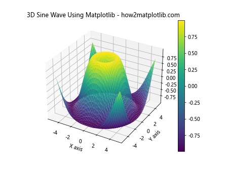
In this example, we first import the necessary libraries: NumPy for numerical computations and Matplotlib for plotting. We then create a grid of x and y values using np.linspace() and np.meshgrid(). The z values are calculated using the sine function of the Euclidean distance from the origin.
We create a 3D plot using fig.add_subplot(111, projection='3d') and use ax.plot_surface() to render the 3D sine wave. Finally, we add labels, a title, and a color bar to enhance the visualization.
Customizing the 3D Sine Wave Using Matplotlib
One of the advantages of using Matplotlib for 3D sine wave visualization is the ability to customize various aspects of the plot. Let’s explore some ways to enhance our 3D Sine Wave Using Matplotlib.
Changing the Colormap
Matplotlib offers a wide range of colormaps that can be used to represent the z-values of our 3D Sine Wave Using Matplotlib. Here’s an example using a different colormap:
import numpy as np
import matplotlib.pyplot as plt
from mpl_toolkits.mplot3d import Axes3D

x = np.linspace(-5, 5, 100)
y = np.linspace(-5, 5, 100)
X, Y = np.meshgrid(x, y)
Z = np.sin(np.sqrt(X**2 + Y**2))

fig = plt.figure()
ax = fig.add_subplot(111, projection='3d')
surf = ax.plot_surface(X, Y, Z, cmap='coolwarm')

ax.set_xlabel('X axis')
ax.set_ylabel('Y axis')
ax.set_zlabel('Z axis')
ax.set_title('3D Sine Wave Using Matplotlib with Custom Colormap - how2matplotlib.com')

fig.colorbar(surf)

plt.show()
Output:
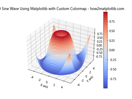
In this example, we’ve changed the colormap to ‘coolwarm’, which uses cool colors (blues) for low values and warm colors (reds) for high values. This can help emphasize the peaks and troughs of the 3D Sine Wave Using Matplotlib.
Adjusting the View Angle
To get a better perspective of your 3D Sine Wave Using Matplotlib, you can adjust the view angle. Here’s how you can do that:
import numpy as np
import matplotlib.pyplot as plt
from mpl_toolkits.mplot3d import Axes3D

x = np.linspace(-5, 5, 100)
y = np.linspace(-5, 5, 100)
X, Y = np.meshgrid(x, y)
Z = np.sin(np.sqrt(X**2 + Y**2))

fig = plt.figure()
ax = fig.add_subplot(111, projection='3d')
surf = ax.plot_surface(X, Y, Z, cmap='viridis')

ax.set_xlabel('X axis')
ax.set_ylabel('Y axis')
ax.set_zlabel('Z axis')
ax.set_title('3D Sine Wave Using Matplotlib with Custom View Angle - how2matplotlib.com')

ax.view_init(elev=20, azim=45)

fig.colorbar(surf)

plt.show()
Output:
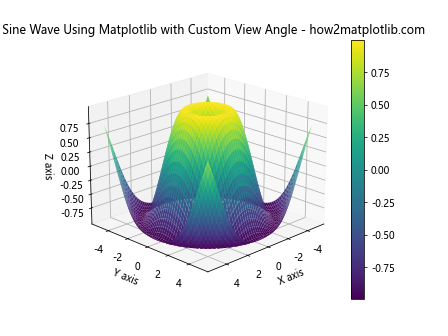
In this example, we use ax.view_init(elev=20, azim=45) to set the elevation and azimuth angles of the view. This allows us to see the 3D Sine Wave Using Matplotlib from a different perspective, potentially revealing patterns that might not be visible from the default view.
Adding Interactivity to 3D Sine Wave Using Matplotlib
One of the powerful features of Matplotlib is its ability to create interactive plots. Let’s explore how we can add interactivity to our 3D Sine Wave Using Matplotlib.
Rotating the 3D Sine Wave
We can create an animation that rotates our 3D Sine Wave Using Matplotlib, allowing us to view it from different angles:
import numpy as np
import matplotlib.pyplot as plt
from mpl_toolkits.mplot3d import Axes3D
from matplotlib.animation import FuncAnimation

def update(frame):
    ax.view_init(elev=10, azim=frame)
    return fig,

x = np.linspace(-5, 5, 100)
y = np.linspace(-5, 5, 100)
X, Y = np.meshgrid(x, y)
Z = np.sin(np.sqrt(X**2 + Y**2))

fig = plt.figure()
ax = fig.add_subplot(111, projection='3d')
surf = ax.plot_surface(X, Y, Z, cmap='viridis')

ax.set_xlabel('X axis')
ax.set_ylabel('Y axis')
ax.set_zlabel('Z axis')
ax.set_title('Rotating 3D Sine Wave Using Matplotlib - how2matplotlib.com')

ani = FuncAnimation(fig, update, frames=np.linspace(0, 360, 100), interval=50, blit=True)
plt.show()
Output:
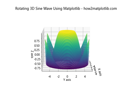
In this example, we define an update function that changes the view angle of the plot. We then use FuncAnimation to create an animation that calls this function repeatedly, resulting in a rotating 3D Sine Wave Using Matplotlib.
Advanced Techniques for 3D Sine Wave Using Matplotlib
Now that we’ve covered the basics, let’s explore some more advanced techniques for creating and customizing 3D Sine Wave Using Matplotlib.
Multiple 3D Sine Waves
We can create multiple 3D sine waves on the same plot to compare different frequencies or amplitudes:
import numpy as np
import matplotlib.pyplot as plt
from mpl_toolkits.mplot3d import Axes3D

x = np.linspace(-5, 5, 100)
y = np.linspace(-5, 5, 100)
X, Y = np.meshgrid(x, y)

Z1 = np.sin(np.sqrt(X**2 + Y**2))
Z2 = np.sin(2 * np.sqrt(X**2 + Y**2))

fig = plt.figure(figsize=(12, 5))

ax1 = fig.add_subplot(121, projection='3d')
surf1 = ax1.plot_surface(X, Y, Z1, cmap='viridis')
ax1.set_title('3D Sine Wave 1 - how2matplotlib.com')

ax2 = fig.add_subplot(122, projection='3d')
surf2 = ax2.plot_surface(X, Y, Z2, cmap='plasma')
ax2.set_title('3D Sine Wave 2 - how2matplotlib.com')

for ax in [ax1, ax2]:
    ax.set_xlabel('X axis')
    ax.set_ylabel('Y axis')
    ax.set_zlabel('Z axis')

plt.tight_layout()
plt.show()
Output:
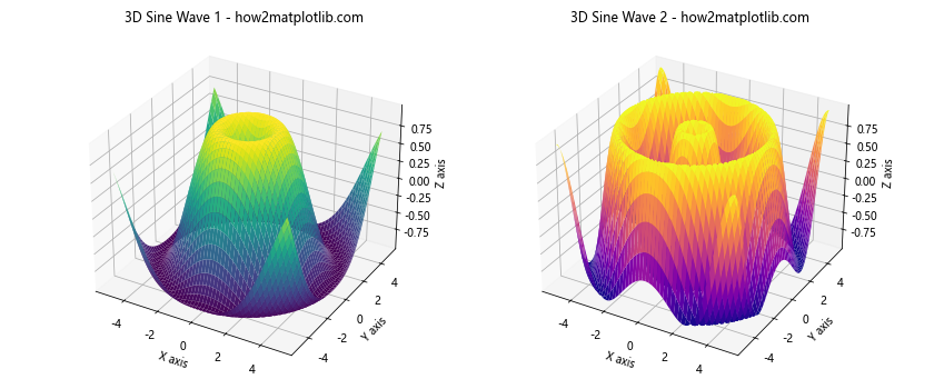
In this example, we create two 3D sine waves with different frequencies and plot them side by side. This allows for easy comparison of the two waves.
Combining 3D Sine Waves
We can also combine multiple sine waves to create more complex 3D surfaces:
import numpy as np
import matplotlib.pyplot as plt
from mpl_toolkits.mplot3d import Axes3D

x = np.linspace(-5, 5, 100)
y = np.linspace(-5, 5, 100)
X, Y = np.meshgrid(x, y)

Z = np.sin(np.sqrt(X**2 + Y**2)) + 0.5 * np.sin(2 * np.sqrt(X**2 + Y**2))

fig = plt.figure()
ax = fig.add_subplot(111, projection='3d')
surf = ax.plot_surface(X, Y, Z, cmap='viridis')

ax.set_xlabel('X axis')
ax.set_ylabel('Y axis')
ax.set_zlabel('Z axis')
ax.set_title('Combined 3D Sine Waves Using Matplotlib - how2matplotlib.com')

fig.colorbar(surf)

plt.show()
Output:
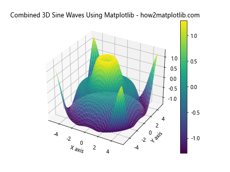
In this example, we combine two sine waves with different frequencies and amplitudes to create a more complex 3D surface. This technique can be used to model more intricate wave patterns or interference effects.
Customizing the Appearance of 3D Sine Wave Using Matplotlib
Matplotlib offers numerous options for customizing the appearance of your 3D Sine Wave Using Matplotlib. Let’s explore some of these options.
Changing the Surface Style
We can change the style of the surface plot to create different visual effects:
import numpy as np
import matplotlib.pyplot as plt
from mpl_toolkits.mplot3d import Axes3D

x = np.linspace(-5, 5, 100)
y = np.linspace(-5, 5, 100)
X, Y = np.meshgrid(x, y)
Z = np.sin(np.sqrt(X**2 + Y**2))

fig = plt.figure(figsize=(12, 5))

ax1 = fig.add_subplot(121, projection='3d')
surf1 = ax1.plot_surface(X, Y, Z, cmap='viridis', rstride=1, cstride=1, linewidth=0, antialiased=False)
ax1.set_title('Smooth Surface - how2matplotlib.com')

ax2 = fig.add_subplot(122, projection='3d')
surf2 = ax2.plot_surface(X, Y, Z, cmap='viridis', rstride=5, cstride=5, linewidth=1, antialiased=True)
ax2.set_title('Wireframe Surface - how2matplotlib.com')

for ax in [ax1, ax2]:
    ax.set_xlabel('X axis')
    ax.set_ylabel('Y axis')
    ax.set_zlabel('Z axis')

plt.tight_layout()
plt.show()
Output:
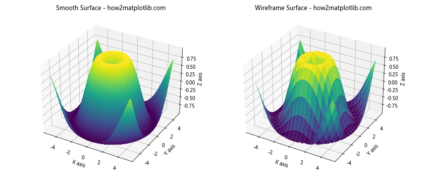
In this example, we create two different styles of 3D Sine Wave Using Matplotlib. The first is a smooth surface, while the second is a wireframe surface. This is achieved by adjusting the rstride, cstride, linewidth, and antialiased parameters of the plot_surface function.
Adding Contours to 3D Sine Wave Using Matplotlib
We can add contour lines to our 3D Sine Wave Using Matplotlib to highlight specific z-values:
import numpy as np
import matplotlib.pyplot as plt
from mpl_toolkits.mplot3d import Axes3D

x = np.linspace(-5, 5, 100)
y = np.linspace(-5, 5, 100)
X, Y = np.meshgrid(x, y)
Z = np.sin(np.sqrt(X**2 + Y**2))

fig = plt.figure()
ax = fig.add_subplot(111, projection='3d')
surf = ax.plot_surface(X, Y, Z, cmap='viridis', alpha=0.8)

# Add contour lines
contours = ax.contour(X, Y, Z, zdir='z', offset=-1, cmap='coolwarm')
ax.clabel(contours, fontsize=10, colors='k')

ax.set_xlabel('X axis')
ax.set_ylabel('Y axis')
ax.set_zlabel('Z axis')
ax.set_title('3D Sine Wave with Contours Using Matplotlib - how2matplotlib.com')

fig.colorbar(surf)

plt.show()
Output:

In this example, we add contour lines to the base of our 3D Sine Wave Using Matplotlib. The contour function is used to create these lines, and clabel is used to add labels to the contours.
Analyzing 3D Sine Wave Using Matplotlib
Beyond just visualization, Matplotlib can be used to analyze the properties of our 3D Sine Wave Using Matplotlib. Let’s explore some analytical techniques.
Finding Peaks and Troughs
We can use NumPy functions to find the peaks and troughs of our 3D Sine Wave Using Matplotlib:
import numpy as np
import matplotlib.pyplot as plt
from mpl_toolkits.mplot3d import Axes3D
from scipy.signal import find_peaks

x = np.linspace(-5, 5, 100)
y = np.linspace(-5, 5, 100)
X, Y = np.meshgrid(x, y)
Z = np.sin(np.sqrt(X**2 + Y**2))

# Find peaks
peaks, _ = find_peaks(Z.ravel())
peak_x = X.ravel()[peaks]
peak_y = Y.ravel()[peaks]
peak_z = Z.ravel()[peaks]

fig = plt.figure()
ax = fig.add_subplot(111, projection='3d')
surf = ax.plot_surface(X, Y, Z, cmap='viridis', alpha=0.8)

# Plot peaks
ax.scatter(peak_x, peak_y, peak_z, color='red', s=50, label='Peaks')

ax.set_xlabel('X axis')
ax.set_ylabel('Y axis')
ax.set_zlabel('Z axis')
ax.set_title('3D Sine Wave with Peaks Using Matplotlib - how2matplotlib.com')
ax.legend()

fig.colorbar(surf)

plt.show()
Output:
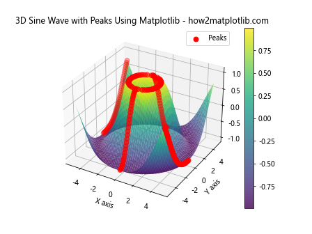
In this example, we use the find_peaks function from SciPy to identify the peaks of our 3D Sine Wave Using Matplotlib.We then plot these peaks as red scatter points on top of our 3D surface.
Calculating Volume Under the 3D Sine Wave
We can use numerical integration to calculate the volume under our 3D Sine Wave Using Matplotlib:
import numpy as np
import matplotlib.pyplot as plt
from mpl_toolkits.mplot3d import Axes3D
from scipy import integrate

x = np.linspace(-5, 5, 100)
y = np.linspace(-5, 5, 100)
X, Y = np.meshgrid(x, y)
Z = np.sin(np.sqrt(X**2 + Y**2))

# Calculate volume
volume = integrate.simps([integrate.simps(z, x) for z in Z], y)

fig = plt.figure()
ax = fig.add_subplot(111, projection='3d')
surf = ax.plot_surface(X, Y, Z, cmap='viridis')

ax.set_xlabel('X axis')
ax.set_ylabel('Y axis')
ax.set_zlabel('Z axis')
ax.set_title(f'3D Sine Wave - Volume: {volume:.2f} - how2matplotlib.com')

fig.colorbar(surf)

plt.show()
Output:

In this example, we use SciPy’s integrate.simps function to perform numerical integration and calculate the volume under our 3D Sine Wave Using Matplotlib. The result is displayed in the plot title.
Advanced Visualization Techniques for 3D Sine Wave Using Matplotlib
Let’s explore some more advanced visualization techniques for our 3D Sine Wave Using Matplotlib.
Creating a Gradient Plot
We can create a gradient plot to highlight the rate of change of our 3D Sine Wave Using Matplotlib:
import numpy as np
import matplotlib.pyplot as plt
from mpl_toolkits.mplot3d import Axes3D

x = np.linspace(-5, 5, 100)
y = np.linspace(-5, 5, 100)
X, Y = np.meshgrid(x, y)
Z = np.sin(np.sqrt(X**2 + Y**2))

# Calculate gradient
dx, dy = np.gradient(Z)
gradient = np.sqrt(dx**2 + dy**2)

fig = plt.figure(figsize=(12, 5))

ax1 = fig.add_subplot(121, projection='3d')
surf1 = ax1.plot_surface(X, Y, Z, cmap='viridis')
ax1.set_title('3D Sine Wave - how2matplotlib.com')

ax2 = fig.add_subplot(122, projection='3d')
surf2 = ax2.plot_surface(X, Y, Z, facecolors=plt.cm.viridis(gradient), shade=False)
ax2.set_title('3D Sine Wave Gradient - how2matplotlib.com')

for ax in [ax1, ax2]:
    ax.set_xlabel('X axis')
    ax.set_ylabel('Y axis')
    ax.set_zlabel('Z axis')

plt.tight_layout()
plt.show()
Output:
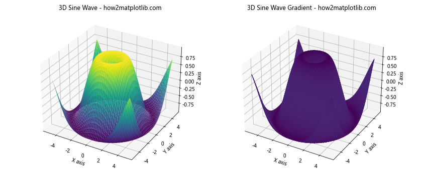
In this example, we calculate the gradient of our 3D Sine Wave Using Matplotlib and use it to color the surface plot. This highlights areas of rapid change in the sine wave.
Creating a Slice Plot
We can create a slice plot to visualize cross-sections of our 3D Sine Wave Using Matplotlib:
import numpy as np
import matplotlib.pyplot as plt
from mpl_toolkits.mplot3d import Axes3D

x = np.linspace(-5, 5, 100)
y = np.linspace(-5, 5, 100)
X, Y = np.meshgrid(x, y)
Z = np.sin(np.sqrt(X**2 + Y**2))

fig = plt.figure()
ax = fig.add_subplot(111, projection='3d')

# Plot the surface
surf = ax.plot_surface(X, Y, Z, cmap='viridis', alpha=0.7)

# Plot slices
ax.contourf(X, Y, Z, zdir='x', offset=-5, cmap='viridis')
ax.contourf(X, Y, Z, zdir='y', offset=5, cmap='viridis')
ax.contourf(X, Y, Z, zdir='z', offset=-1, cmap='viridis')

ax.set_xlabel('X axis')
ax.set_ylabel('Y axis')
ax.set_zlabel('Z axis')
ax.set_title('3D Sine Wave with Slices Using Matplotlib - how2matplotlib.com')

fig.colorbar(surf)

plt.show()
Output:
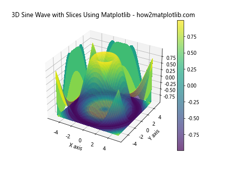
In this example, we create a 3D Sine Wave Using Matplotlib and add slice plots along each axis. This allows us to see cross-sections of the sine wave at specific points.
Optimizing Performance for 3D Sine Wave Using Matplotlib
When working with large datasets or complex 3D Sine Wave Using Matplotlib, performance can become an issue. Here are some techniques to optimize the performance of your plots.
Using Downsampling
If your dataset is very large, you can downsample it to improve performance:
import numpy as np
import matplotlib.pyplot as plt
from mpl_toolkits.mplot3d import Axes3D

x = np.linspace(-5, 5, 1000)
y = np.linspace(-5, 5, 1000)
X, Y = np.meshgrid(x, y)
Z = np.sin(np.sqrt(X**2 + Y**2))

# Downsample
downsample = 10
X_down = X[::downsample, ::downsample]
Y_down = Y[::downsample, ::downsample]
Z_down = Z[::downsample, ::downsample]

fig = plt.figure()
ax = fig.add_subplot(111, projection='3d')
surf = ax.plot_surface(X_down, Y_down, Z_down, cmap='viridis')

ax.set_xlabel('X axis')
ax.set_ylabel('Y axis')
ax.set_zlabel('Z axis')
ax.set_title('Downsampled 3D Sine Wave Using Matplotlib - how2matplotlib.com')

fig.colorbar(surf)

plt.show()
Output:

In this example, we create a large dataset and then downsample it before plotting. This can significantly improve performance while still maintaining the overall shape of the 3D Sine Wave Using Matplotlib.
Using Stride
Another way to improve performance is to use stride when plotting:
import numpy as np
import matplotlib.pyplot as plt
from mpl_toolkits.mplot3d import Axes3D

x = np.linspace(-5, 5, 500)
y = np.linspace(-5, 5, 500)
X, Y = np.meshgrid(x, y)
Z = np.sin(np.sqrt(X**2 + Y**2))

fig = plt.figure()
ax = fig.add_subplot(111, projection='3d')
surf = ax.plot_surface(X, Y, Z, cmap='viridis', rstride=10, cstride=10)

ax.set_xlabel('X axis')
ax.set_ylabel('Y axis')
ax.set_zlabel('Z axis')
ax.set_title('3D Sine Wave Using Matplotlib with Stride - how2matplotlib.com')

fig.colorbar(surf)

plt.show()
Output:

In this example, we use the rstride and cstride parameters in plot_surface to plot only every 10th row and column. This reduces the number of polygons that need to be rendered, improving performance.
Conclusion
In this comprehensive guide, we’ve explored the various aspects of creating a 3D Sine Wave Using Matplotlib. We’ve covered everything from basic plotting to advanced customization and analysis techniques. We’ve seen how to create interactive plots, combine multiple sine waves, analyze wave properties, and optimize performance for large datasets.
3D Sine Wave Using Matplotlib is a powerful tool for visualizing complex mathematical functions and data patterns. Whether you’re a student learning about wave mechanics, a scientist analyzing oscillating systems, or a data scientist exploring multidimensional datasets, the techniques we’ve covered in this guide will help you create informative and visually appealing 3D visualizations.
Remember, the key to mastering 3D Sine Wave Using Matplotlib is practice and experimentation. Don’t be afraid to try different parameters, combine techniques, or explore new ways of visualizing your data. With Matplotlib’s extensive capabilities and the foundation provided in this guide, you’re well-equipped to create stunning 3D sine wave visualizations for any project or application.