How to Add Error Bars to a Matplotlib Bar Plot
Add error bars to a Matplotlib bar plot to enhance the visual representation of data uncertainty in your charts. Error bars are crucial for displaying the variability of data points in bar plots, providing a more accurate and informative visualization. This article will guide you through the process of adding error bars to your Matplotlib bar plots, covering various techniques and customization options.
Understanding Error Bars in Matplotlib Bar Plots
Before we dive into the specifics of how to add error bars to a Matplotlib bar plot, let’s first understand what error bars are and why they’re important. Error bars in a bar plot represent the uncertainty or variability associated with each data point. They typically extend above and below the top of each bar, indicating the range of possible values for that particular measurement.
Adding error bars to a Matplotlib bar plot can significantly enhance the information conveyed by your visualization. It allows viewers to quickly assess the reliability of the data and make more informed interpretations of the results.
Basic Syntax for Adding Error Bars to a Matplotlib Bar Plot
To add error bars to a Matplotlib bar plot, you’ll primarily use the plt.bar() function along with the yerr parameter. Here’s a basic example to get you started:
import matplotlib.pyplot as plt
import numpy as np

# Data for the bar plot
categories = ['A', 'B', 'C', 'D']
values = [10, 15, 8, 12]
errors = [1, 2, 1.5, 1.8]

# Create the bar plot with error bars
plt.figure(figsize=(8, 6))
plt.bar(categories, values, yerr=errors, capsize=5)

plt.title('Bar Plot with Error Bars - how2matplotlib.com')
plt.xlabel('Categories')
plt.ylabel('Values')
plt.show()
Output:

In this example, we create a simple bar plot with four categories and their corresponding values. The yerr parameter is used to specify the error values for each bar. The capsize parameter determines the width of the error bar caps.
Customizing Error Bars in Matplotlib Bar Plots
Now that we’ve covered the basics, let’s explore various ways to customize error bars in your Matplotlib bar plots.
Adjusting Error Bar Colors
You can change the color of the error bars to make them stand out or match your plot’s color scheme:
import matplotlib.pyplot as plt
import numpy as np

categories = ['A', 'B', 'C', 'D']
values = [10, 15, 8, 12]
errors = [1, 2, 1.5, 1.8]

plt.figure(figsize=(8, 6))
plt.bar(categories, values, yerr=errors, capsize=5, ecolor='red')

plt.title('Bar Plot with Colored Error Bars - how2matplotlib.com')
plt.xlabel('Categories')
plt.ylabel('Values')
plt.show()
Output:

In this example, we use the ecolor parameter to set the error bar color to red.
Modifying Error Bar Line Styles
You can also change the line style of the error bars:
import matplotlib.pyplot as plt
import numpy as np

categories = ['A', 'B', 'C', 'D']
values = [10, 15, 8, 12]
errors = [1, 2, 1.5, 1.8]

plt.figure(figsize=(8, 6))
plt.bar(categories, values, yerr=errors, capsize=5, ecolor='black', ls='--')

plt.title('Bar Plot with Dashed Error Bars - how2matplotlib.com')
plt.xlabel('Categories')
plt.ylabel('Values')
plt.show()
Output:

Here, we use the ls parameter to set the error bar line style to dashed.
Adding Error Bars to Horizontal Bar Plots
You can also add error bars to horizontal bar plots using the xerr parameter:
import matplotlib.pyplot as plt
import numpy as np

categories = ['A', 'B', 'C', 'D']
values = [10, 15, 8, 12]
errors = [1, 2, 1.5, 1.8]

plt.figure(figsize=(8, 6))
plt.barh(categories, values, xerr=errors, capsize=5)

plt.title('Horizontal Bar Plot with Error Bars - how2matplotlib.com')
plt.xlabel('Values')
plt.ylabel('Categories')
plt.show()
Output:
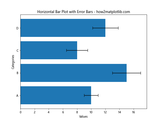
This example creates a horizontal bar plot with error bars using plt.barh() and xerr.
Advanced Techniques for Adding Error Bars to Matplotlib Bar Plots
Let’s explore some more advanced techniques for adding error bars to your Matplotlib bar plots.
Asymmetric Error Bars
Sometimes, you may need to display asymmetric error bars, where the upper and lower error values are different:
import matplotlib.pyplot as plt
import numpy as np

categories = ['A', 'B', 'C', 'D']
values = [10, 15, 8, 12]
errors_lower = [1, 1.5, 0.8, 1.2]
errors_upper = [1.5, 2.5, 1.2, 2]

plt.figure(figsize=(8, 6))
plt.bar(categories, values, yerr=[errors_lower, errors_upper], capsize=5)

plt.title('Bar Plot with Asymmetric Error Bars - how2matplotlib.com')
plt.xlabel('Categories')
plt.ylabel('Values')
plt.show()
Output:
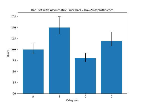
In this example, we pass a list of two arrays to yerr: one for the lower errors and one for the upper errors.
Error Bars with Confidence Intervals
You can use error bars to represent confidence intervals:
import matplotlib.pyplot as plt
import numpy as np

categories = ['A', 'B', 'C', 'D']
values = [10, 15, 8, 12]
confidence_intervals = [1.2, 1.8, 1.5, 2]

plt.figure(figsize=(8, 6))
plt.bar(categories, values, yerr=confidence_intervals, capsize=5)

plt.title('Bar Plot with Confidence Intervals - how2matplotlib.com')
plt.xlabel('Categories')
plt.ylabel('Values')
plt.legend(['95% Confidence Interval'])
plt.show()
Output:
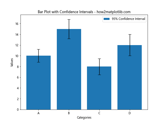
This example uses error bars to represent 95% confidence intervals for each bar.
Error Bars with Standard Deviation
You can also use error bars to show standard deviation:
import matplotlib.pyplot as plt
import numpy as np

categories = ['A', 'B', 'C', 'D']
values = [10, 15, 8, 12]
std_dev = [1.5, 2, 1.2, 1.8]

plt.figure(figsize=(8, 6))
plt.bar(categories, values, yerr=std_dev, capsize=5)

plt.title('Bar Plot with Standard Deviation - how2matplotlib.com')
plt.xlabel('Categories')
plt.ylabel('Values')
plt.legend(['Standard Deviation'])
plt.show()
Output:

This example uses error bars to represent the standard deviation of each data point.
Combining Error Bars with Other Plot Elements
Adding error bars to a Matplotlib bar plot doesn’t mean you can’t include other plot elements. Let’s explore how to combine error bars with other features.
Error Bars and Data Labels
You can add data labels to your bars while still including error bars:
import matplotlib.pyplot as plt
import numpy as np

categories = ['A', 'B', 'C', 'D']
values = [10, 15, 8, 12]
errors = [1, 2, 1.5, 1.8]

plt.figure(figsize=(8, 6))
bars = plt.bar(categories, values, yerr=errors, capsize=5)

# Add data labels
for bar in bars:
    height = bar.get_height()
    plt.text(bar.get_x() + bar.get_width()/2., height,
             f'{height}', ha='center', va='bottom')

plt.title('Bar Plot with Error Bars and Data Labels - how2matplotlib.com')
plt.xlabel('Categories')
plt.ylabel('Values')
plt.show()
Output:

This example adds data labels to each bar while still including error bars.
Error Bars in Grouped Bar Charts
You can also add error bars to grouped bar charts:
import matplotlib.pyplot as plt
import numpy as np

categories = ['A', 'B', 'C', 'D']
values1 = [10, 15, 8, 12]
values2 = [8, 11, 13, 9]
errors1 = [1, 2, 1.5, 1.8]
errors2 = [1.2, 1.5, 1.8, 1.3]

x = np.arange(len(categories))
width = 0.35

fig, ax = plt.subplots(figsize=(10, 6))
rects1 = ax.bar(x - width/2, values1, width, yerr=errors1, capsize=5, label='Group 1')
rects2 = ax.bar(x + width/2, values2, width, yerr=errors2, capsize=5, label='Group 2')

ax.set_xlabel('Categories')
ax.set_ylabel('Values')
ax.set_title('Grouped Bar Chart with Error Bars - how2matplotlib.com')
ax.set_xticks(x)
ax.set_xticklabels(categories)
ax.legend()

plt.show()
Output:
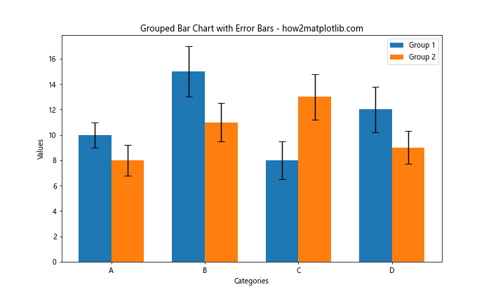
This example creates a grouped bar chart with error bars for each group.
Handling Large Datasets with Error Bars
When dealing with larger datasets, adding error bars to a Matplotlib bar plot requires some additional considerations. Let’s explore some techniques for handling larger datasets.
Error Bars with Many Categories
When you have many categories, you might need to adjust the figure size and rotate the x-axis labels:
import matplotlib.pyplot as plt
import numpy as np

categories = [f'Category {i}' for i in range(20)]
values = np.random.randint(5, 20, 20)
errors = np.random.rand(20)

plt.figure(figsize=(15, 6))
plt.bar(categories, values, yerr=errors, capsize=3)

plt.title('Bar Plot with Many Categories and Error Bars - how2matplotlib.com')
plt.xlabel('Categories')
plt.ylabel('Values')
plt.xticks(rotation=45, ha='right')
plt.tight_layout()
plt.show()
Output:
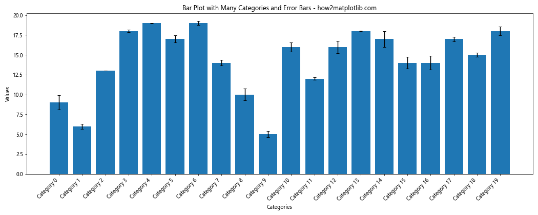
This example creates a bar plot with 20 categories, rotating the x-axis labels for better readability.
Error Bars with Subplots
For complex datasets, you might want to use subplots to organize your data:
import matplotlib.pyplot as plt
import numpy as np

categories = ['A', 'B', 'C', 'D']
datasets = [
    np.random.randint(5, 20, 4),
    np.random.randint(5, 20, 4),
    np.random.randint(5, 20, 4)
]
errors = [
    np.random.rand(4),
    np.random.rand(4),
    np.random.rand(4)
]

fig, axs = plt.subplots(1, 3, figsize=(15, 5))
fig.suptitle('Multiple Bar Plots with Error Bars - how2matplotlib.com')

for i, ax in enumerate(axs):
    ax.bar(categories, datasets[i], yerr=errors[i], capsize=5)
    ax.set_title(f'Dataset {i+1}')
    ax.set_xlabel('Categories')
    ax.set_ylabel('Values')

plt.tight_layout()
plt.show()
Output:
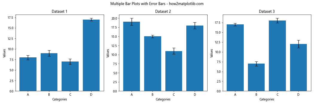
This example creates three subplots, each with its own bar plot and error bars.
Customizing Error Bar Appearance
Let’s explore more ways to customize the appearance of error bars in your Matplotlib bar plots.
Adjusting Error Bar Width
You can adjust the width of the error bars:
import matplotlib.pyplot as plt
import numpy as np

categories = ['A', 'B', 'C', 'D']
values = [10, 15, 8, 12]
errors = [1, 2, 1.5, 1.8]

plt.figure(figsize=(8, 6))
plt.bar(categories, values, yerr=errors, capsize=5, error_kw={'elinewidth': 3})

plt.title('Bar Plot with Thick Error Bars - how2matplotlib.com')
plt.xlabel('Categories')
plt.ylabel('Values')
plt.show()
Output:

In this example, we use the error_kw parameter to set the elinewidth to 3, making the error bars thicker.
Customizing Error Bar Caps
You can also customize the appearance of the error bar caps:
import matplotlib.pyplot as plt
import numpy as np

categories = ['A', 'B', 'C', 'D']
values = [10, 15, 8, 12]
errors = [1, 2, 1.5, 1.8]

plt.figure(figsize=(8, 6))
plt.bar(categories, values, yerr=errors, capsize=10, error_kw={'capthick': 2})

plt.title('Bar Plot with Custom Error Bar Caps - how2matplotlib.com')
plt.xlabel('Categories')
plt.ylabel('Values')
plt.show()
Output:

Here, we increase the capsize and use capthick in the error_kw dictionary to make the caps more prominent.
Error Bars in Stacked Bar Charts
Adding error bars to stacked bar charts requires a slightly different approach:
import matplotlib.pyplot as plt
import numpy as np

categories = ['A', 'B', 'C', 'D']
values1 = [10, 15, 8, 12]
values2 = [5, 8, 6, 7]
errors1 = [1, 2, 1.5, 1.8]
errors2 = [0.8, 1.2, 1, 1.5]

plt.figure(figsize=(8, 6))
plt.bar(categories, values1, yerr=errors1, capsize=5, label='Group 1')
plt.bar(categories, values2, bottom=values1, yerr=errors2, capsize=5, label='Group 2')

plt.title('Stacked Bar Chart with Error Bars - how2matplotlib.com')
plt.xlabel('Categories')
plt.ylabel('Values')
plt.legend()
plt.show()
Output:
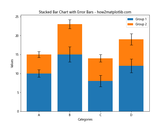
This example creates a stacked bar chart with error bars for each group.
Error Bars with Pandas DataFrames
If you’re working with Pandas DataFrames, you can easily add error bars to your Matplotlib bar plots:
import matplotlib.pyplot as plt
import pandas as pd
import numpy as np

# Create a sample DataFrame
df = pd.DataFrame({
    'Category': ['A', 'B', 'C', 'D'],
    'Value': [10, 15, 8, 12],
    'Error': [1, 2, 1.5, 1.8]
})

plt.figure(figsize=(8, 6))
df.plot(x='Category', y='Value', kind='bar', yerr='Error', capsize=5, ax=plt.gca())

plt.title('Bar Plot with Error Bars from DataFrame - how2matplotlib.com')
plt.xlabel('Categories')
plt.ylabel('Values')
plt.show()
Output:
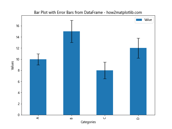
This example demonstrates how to create a bar plot with error bars directly from a Pandas DataFrame.
Combining Error Bars with Other Statistical Representations
Error bars can be combined with other statistical representations to provide a more comprehensive view of your data.
Error Bars with Box Plots
You can combine error bars with box plots to show both the mean (with error bars) and the distribution of your data:
import matplotlib.pyplot as plt
import numpy as np

np.random.seed(42)
data = [np.random.normal(10, 2, 100), np.random.normal(15, 3, 100),
        np.random.normal(8, 1.5, 100), np.random.normal(12, 2.5, 100)]

fig, ax = plt.subplots(figsize=(10, 6))

bp = ax.boxplot(data, positions=[1, 2, 3, 4], widths=0.6)
means = [np.mean(d) for d in data]
errors = [np.std(d) for d in data]

ax.errorbar([1, 2, 3, 4], means, yerr=errors, fmt='ro', capsize=5)

ax.set_xticklabels(['A', 'B', 'C', 'D'])
ax.set_title('Box Plot with Error Bars - how2matplotlib.com')
ax.set_xlabel('Categories')
ax.set_ylabel('Values')

plt.show()
Output:
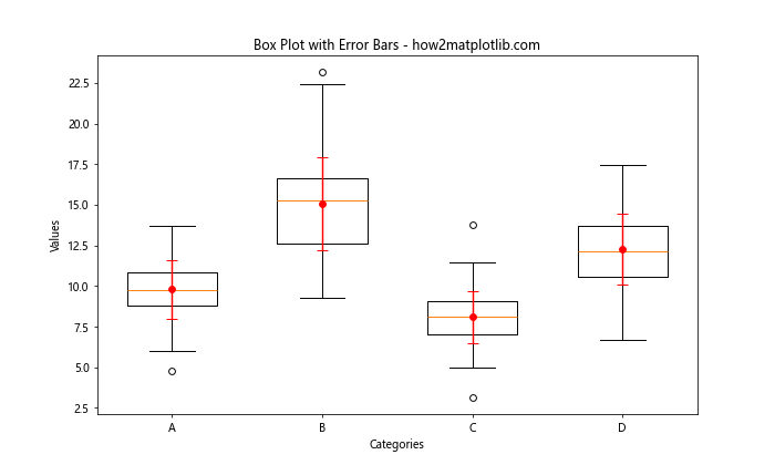
This example creates a box plot for each category and overlays error bars representing the mean and standard deviation.
Error Bars in 3D Bar Plots
You can also add error bars to 3D bar plots, although it requires a bit more setup:
import matplotlib.pyplot as plt
import numpy as np
from mpl_toolkits.mplot3d import Axes3D

fig = plt.figure(figsize=(10, 8))
ax = fig.add_subplot(111, projection='3d')

x = np.array([0, 1, 2, 3])
y = np.array([0, 1, 2, 3])
z = np.array([10, 15, 8, 12])
dx = dy = 0.5
dz = np.array([1, 2, 1.5, 1.8])

ax.bar3d(x, y, np.zeros_like(z), dx, dy, z, shade=True)

for i in range(len(x)):
    ax.plot([x[i]+dx/2, x[i]+dx/2], [y[i]+dy/2, y[i]+dy/2], [z[i], z[i]+dz[i]], color='red')

ax.set_title('3D Bar Plot with Error Bars - how2matplotlib.com')
ax.set_xlabel('X')
ax.set_ylabel('Y')
ax.set_zlabel('Z')

plt.show()
Output:
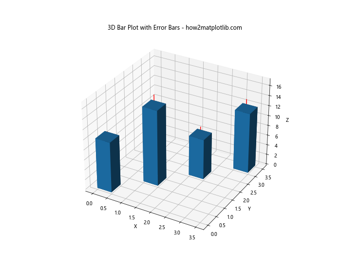
This example creates a 3D bar plot and adds error bars to each bar.
Best Practices for Adding Error Bars to Matplotlib Bar Plots
When adding error bars to your Matplotlib bar plots, consider the following best practices:
- Choose appropriate error values: Make sure your error values accurately represent the uncertainty or variability in your data.
Keep it simple: Don’t overcrowd your plot with too many error bars or other elements that might make it hard to read.
Use color effectively: Choose colors for your error bars that contrast well with your bars and background.
Explain your error bars: Always include a legend or caption explaining what your error bars represent (e.g., standard deviation, confidence interval).
Consider your audience: Tailor the complexity of your error bar representation to your audience’s familiarity with statistical concepts.
Be consistent: If you’re creating multiple plots, use consistent styles for your error bars across all of them.
Troubleshooting Common Issues with Error Bars in Matplotlib Bar Plots
When adding error bars to Matplotlib bar plots, you might encounter some common issues. Here are some problems and their solutions: