How to Change Grid Line Thickness in 3D Surface Plot in Matplotlib
Change grid line thickness in 3D surface plot in Matplotlib is an essential skill for data visualization enthusiasts and professionals alike. This article will delve deep into the intricacies of manipulating grid line thickness in 3D surface plots using Matplotlib, providing you with a thorough understanding of the topic and equipping you with practical skills to enhance your data visualization projects.
Understanding the Basics of 3D Surface Plots in Matplotlib
Before we dive into changing grid line thickness in 3D surface plot in Matplotlib, it’s crucial to understand the fundamentals of 3D surface plots. A 3D surface plot is a three-dimensional representation of data where the z-axis represents the dependent variable, while the x and y axes represent the independent variables. Matplotlib, a powerful plotting library in Python, provides robust tools for creating and customizing 3D surface plots.
Let’s start with a basic example of creating a 3D surface plot:
import numpy as np
import matplotlib.pyplot as plt
from mpl_toolkits.mplot3d import Axes3D

# Generate data
x = np.linspace(-5, 5, 100)
y = np.linspace(-5, 5, 100)
X, Y = np.meshgrid(x, y)
Z = np.sin(np.sqrt(X**2 + Y**2))

# Create the plot
fig = plt.figure()
ax = fig.add_subplot(111, projection='3d')
surf = ax.plot_surface(X, Y, Z)

# Add title
plt.title('3D Surface Plot - how2matplotlib.com')

plt.show()
Output:
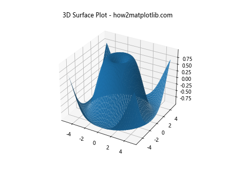
In this example, we create a simple 3D surface plot of the function z = sin(sqrt(x^2 + y^2)). The plot_surface function is used to generate the surface plot.
The Importance of Grid Lines in 3D Surface Plots
Grid lines play a crucial role in 3D surface plots. They help viewers understand the spatial relationships between data points and provide a reference for interpreting the plot’s depth and scale. When you change grid line thickness in 3D surface plot in Matplotlib, you can enhance the readability and aesthetic appeal of your visualization.
How to Change Grid Line Thickness in 3D Surface Plot in Matplotlib
Now, let’s focus on our main topic: how to change grid line thickness in 3D surface plot in Matplotlib. The process involves manipulating the linewidth parameter of the surface plot.
Here’s an example demonstrating how to change grid line thickness in 3D surface plot in Matplotlib:
import numpy as np
import matplotlib.pyplot as plt
from mpl_toolkits.mplot3d import Axes3D

# Generate data
x = np.linspace(-5, 5, 100)
y = np.linspace(-5, 5, 100)
X, Y = np.meshgrid(x, y)
Z = np.sin(np.sqrt(X**2 + Y**2))

# Create the plot
fig = plt.figure()
ax = fig.add_subplot(111, projection='3d')
surf = ax.plot_surface(X, Y, Z, linewidth=2, rstride=5, cstride=5)

# Add title
plt.title('3D Surface Plot with Thicker Grid Lines - how2matplotlib.com')

plt.show()
Output:
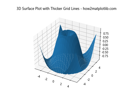
In this example, we’ve added the linewidth parameter to the plot_surface function and set it to 2. This increases the thickness of the grid lines. The rstride and cstride parameters control the density of the grid lines.
Fine-tuning Grid Line Thickness for Optimal Visualization
When you change grid line thickness in 3D surface plot in Matplotlib, it’s important to find the right balance. Grid lines that are too thick can overshadow the data, while lines that are too thin may be difficult to see. Let’s explore how to fine-tune the grid line thickness:
import numpy as np
import matplotlib.pyplot as plt
from mpl_toolkits.mplot3d import Axes3D

# Generate data
x = np.linspace(-5, 5, 100)
y = np.linspace(-5, 5, 100)
X, Y = np.meshgrid(x, y)
Z = np.sin(np.sqrt(X**2 + Y**2))

# Create the plot
fig = plt.figure()
ax = fig.add_subplot(111, projection='3d')
surf = ax.plot_surface(X, Y, Z, linewidth=0.5, rstride=10, cstride=10)

# Add title
plt.title('3D Surface Plot with Fine-tuned Grid Lines - how2matplotlib.com')

plt.show()
Output:

In this example, we’ve reduced the linewidth to 0.5 and increased the rstride and cstride values to 10. This results in thinner, more spaced-out grid lines, which can be ideal for certain types of data.
Changing Grid Line Thickness and Color Simultaneously
When you change grid line thickness in 3D surface plot in Matplotlib, you might also want to adjust the color of the grid lines for better contrast. Here’s how you can do both:
import numpy as np
import matplotlib.pyplot as plt
from mpl_toolkits.mplot3d import Axes3D

# Generate data
x = np.linspace(-5, 5, 100)
y = np.linspace(-5, 5, 100)
X, Y = np.meshgrid(x, y)
Z = np.sin(np.sqrt(X**2 + Y**2))

# Create the plot
fig = plt.figure()
ax = fig.add_subplot(111, projection='3d')
surf = ax.plot_surface(X, Y, Z, linewidth=1.5, rstride=8, cstride=8, edgecolors='black')

# Add title
plt.title('3D Surface Plot with Custom Grid Lines - how2matplotlib.com')

plt.show()
Output:
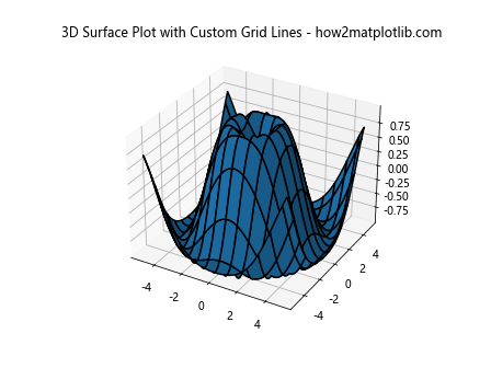
In this example, we’ve set the linewidth to 1.5 and added the edgecolors parameter to change the color of the grid lines to black.
Advanced Techniques to Change Grid Line Thickness in 3D Surface Plot in Matplotlib
As you become more comfortable with the basics of how to change grid line thickness in 3D surface plot in Matplotlib, you can explore more advanced techniques. Let’s look at some of these:
Using Colormaps with Custom Grid Lines
You can combine custom grid lines with colormaps to create visually striking 3D surface plots:
import numpy as np
import matplotlib.pyplot as plt
from mpl_toolkits.mplot3d import Axes3D

# Generate data
x = np.linspace(-5, 5, 100)
y = np.linspace(-5, 5, 100)
X, Y = np.meshgrid(x, y)
Z = np.sin(np.sqrt(X**2 + Y**2))

# Create the plot
fig = plt.figure()
ax = fig.add_subplot(111, projection='3d')
surf = ax.plot_surface(X, Y, Z, cmap='viridis', linewidth=1, rstride=8, cstride=8, edgecolors='white')

# Add colorbar
fig.colorbar(surf)

# Add title
plt.title('3D Surface Plot with Colormap and Custom Grid Lines - how2matplotlib.com')

plt.show()
Output:
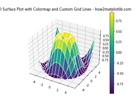
In this example, we’ve added a colormap (‘viridis’) to the surface plot while maintaining custom grid lines. The edgecolors parameter is set to ‘white’ to provide contrast against the colormap.
Adjusting Grid Line Thickness Based on Z-values
You can create more dynamic visualizations by adjusting the grid line thickness based on the Z-values:
import numpy as np
import matplotlib.pyplot as plt
from mpl_toolkits.mplot3d import Axes3D

# Generate data
x = np.linspace(-5, 5, 100)
y = np.linspace(-5, 5, 100)
X, Y = np.meshgrid(x, y)
Z = np.sin(np.sqrt(X**2 + Y**2))

# Create the plot
fig = plt.figure()
ax = fig.add_subplot(111, projection='3d')

# Plot the surface with varying line thickness
for i in range(0, len(Z), 5):
    ax.plot(X[i], Y[i], Z[i], color='black', linewidth=0.5 + Z[i].max())

# Add title
plt.title('3D Surface Plot with Z-dependent Grid Lines - how2matplotlib.com')

plt.show()
Output:
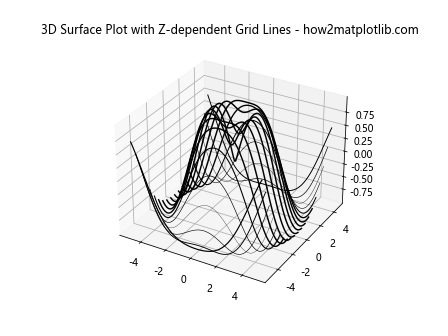
In this advanced example, we’re plotting individual lines with thickness dependent on the maximum Z-value of each line. This creates a unique effect where the grid lines are thicker in areas with higher Z-values.
Common Challenges When Changing Grid Line Thickness in 3D Surface Plot in Matplotlib
While learning how to change grid line thickness in 3D surface plot in Matplotlib, you might encounter some challenges. Let’s address a few common ones:
Balancing Thickness and Density
One challenge is finding the right balance between grid line thickness and density. If you increase the thickness too much while keeping a high density of lines, your plot might become cluttered. Here’s an example of how to address this:
import numpy as np
import matplotlib.pyplot as plt
from mpl_toolkits.mplot3d import Axes3D

# Generate data
x = np.linspace(-5, 5, 100)
y = np.linspace(-5, 5, 100)
X, Y = np.meshgrid(x, y)
Z = np.sin(np.sqrt(X**2 + Y**2))

# Create the plot
fig = plt.figure()
ax = fig.add_subplot(111, projection='3d')
surf = ax.plot_surface(X, Y, Z, linewidth=1, rstride=20, cstride=20)

# Add title
plt.title('3D Surface Plot with Balanced Grid Lines - how2matplotlib.com')

plt.show()
Output:
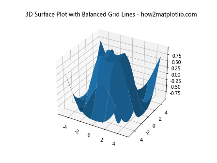
In this example, we’ve increased the rstride and cstride values to 20, which reduces the density of the grid lines. This allows us to use a linewidth of 1 without cluttering the plot.
Maintaining Visibility on Different Backgrounds
Another challenge is ensuring that your grid lines remain visible on different background colors. Here’s how you can address this:
import numpy as np
import matplotlib.pyplot as plt
from mpl_toolkits.mplot3d import Axes3D

# Generate data
x = np.linspace(-5, 5, 100)
y = np.linspace(-5, 5, 100)
X, Y = np.meshgrid(x, y)
Z = np.sin(np.sqrt(X**2 + Y**2))

# Create the plot
fig = plt.figure()
ax = fig.add_subplot(111, projection='3d')
surf = ax.plot_surface(X, Y, Z, linewidth=1, rstride=10, cstride=10, edgecolors='white')

# Set background color
ax.set_facecolor('lightblue')

# Add title
plt.title('3D Surface Plot with Visible Grid Lines on Colored Background - how2matplotlib.com')

plt.show()
Output:
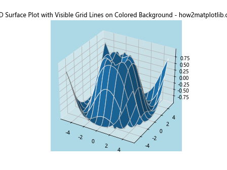
In this example, we’ve set the background color to light blue using ax.set_facecolor('lightblue') and made the grid lines white to ensure they remain visible.
Best Practices for Changing Grid Line Thickness in 3D Surface Plot in Matplotlib
As you continue to explore how to change grid line thickness in 3D surface plot in Matplotlib, keep these best practices in mind:
- Consistency: Maintain consistent grid line thickness across different plots in the same project for a cohesive look.
Contrast: Ensure your grid lines have enough contrast with the surface color for visibility.
Balance: Find the right balance between grid line thickness and density to avoid cluttering your plot.
Purpose: Adjust grid line thickness based on the purpose of your visualization. Thicker lines might be better for presentations, while thinner lines might work better for detailed analysis.
Experimentation: Don’t be afraid to experiment with different combinations of thickness, color, and density to find what works best for your data.
Here’s an example that incorporates these best practices: