How to Draw a Circle Using Matplotlib
How to Draw a Circle Using Matplotlib is an essential skill for data visualization and scientific plotting. Matplotlib is a powerful Python library that allows you to create a wide variety of plots and charts, including circles. In this comprehensive guide, we’ll explore various methods and techniques for drawing circles using Matplotlib, providing detailed explanations and easy-to-understand code examples.
Understanding the Basics of Drawing Circles in Matplotlib
Before we dive into the specifics of how to draw a circle using Matplotlib, it’s important to understand the fundamental concepts. Matplotlib provides several ways to create circles, each with its own advantages and use cases. We’ll start with the simplest methods and gradually move on to more advanced techniques.
Using plt.Circle() to Draw a Circle
One of the most straightforward ways to draw a circle using Matplotlib is by utilizing the plt.Circle() function. This function allows you to create a circle patch that can be added to your plot. Here’s a simple example:
import matplotlib.pyplot as plt

fig, ax = plt.subplots()
circle = plt.Circle((0.5, 0.5), 0.2, fill=False)
ax.add_artist(circle)
ax.set_aspect('equal')
ax.set_title('How to Draw a Circle Using Matplotlib - plt.Circle()')
plt.text(0.5, 0.1, 'how2matplotlib.com', ha='center')
plt.show()
Output:
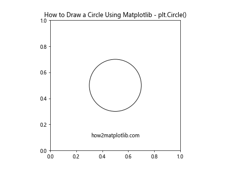
In this example, we create a circle centered at (0.5, 0.5) with a radius of 0.2. The fill=False parameter ensures that the circle is not filled. We then add the circle to the plot using ax.add_artist() and set the aspect ratio to ‘equal’ to ensure the circle appears circular.
Drawing Multiple Circles
When learning how to draw a circle using Matplotlib, it’s often useful to create multiple circles in a single plot. This can be achieved by calling plt.Circle() multiple times and adding each circle to the plot. Here’s an example:
import matplotlib.pyplot as plt

fig, ax = plt.subplots()
circle1 = plt.Circle((0.3, 0.3), 0.1, fill=False)
circle2 = plt.Circle((0.7, 0.7), 0.2, fill=True, color='r')
ax.add_artist(circle1)
ax.add_artist(circle2)
ax.set_aspect('equal')
ax.set_title('How to Draw a Circle Using Matplotlib - Multiple Circles')
plt.text(0.5, 0.1, 'how2matplotlib.com', ha='center')
plt.show()
Output:
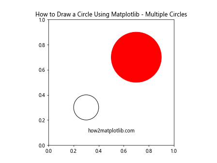
In this example, we create two circles with different properties. The first circle is unfilled, while the second is filled with a red color. By adding both circles to the plot, we can see how they interact and overlap.
Advanced Techniques for Drawing Circles in Matplotlib
As we delve deeper into how to draw a circle using Matplotlib, we’ll explore more advanced techniques that offer greater control and flexibility.
Using patches.Circle for More Control
While plt.Circle() is convenient, using patches.Circle from Matplotlib gives you more control over the circle’s properties. Here’s an example:
import matplotlib.pyplot as plt
from matplotlib.patches import Circle

fig, ax = plt.subplots()
circle = Circle((0.5, 0.5), 0.2, fill=False, linewidth=2, edgecolor='b')
ax.add_patch(circle)
ax.set_aspect('equal')
ax.set_title('How to Draw a Circle Using Matplotlib - patches.Circle')
plt.text(0.5, 0.1, 'how2matplotlib.com', ha='center')
plt.show()
Output:
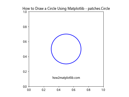
In this example, we use patches.Circle to create a circle with a blue edge and a linewidth of 2. This method allows for more detailed customization of the circle’s appearance.
Drawing Circles with Different Styles
When learning how to draw a circle using Matplotlib, it’s important to explore different styles and appearances. Matplotlib offers various options for customizing the look of your circles. Here’s an example showcasing different styles:
import matplotlib.pyplot as plt
from matplotlib.patches import Circle

fig, ax = plt.subplots()
styles = ['-', '--', '-.', ':']
for i, style in enumerate(styles):
    circle = Circle((0.2 + i*0.2, 0.5), 0.1, fill=False, linestyle=style)
    ax.add_patch(circle)
ax.set_aspect('equal')
ax.set_title('How to Draw a Circle Using Matplotlib - Different Styles')
plt.text(0.5, 0.1, 'how2matplotlib.com', ha='center')
plt.show()
Output:
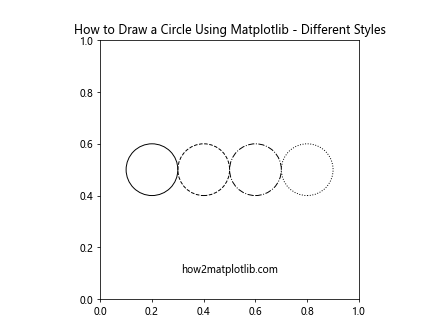
This example demonstrates how to create circles with different line styles, including solid, dashed, dash-dot, and dotted lines.
Creating Animated Circles with Matplotlib
Animation can add an extra dimension to your visualizations when learning how to draw a circle using Matplotlib. Let’s explore how to create a simple animation of a growing circle:
import matplotlib.pyplot as plt
from matplotlib.animation import FuncAnimation
from matplotlib.patches import Circle

fig, ax = plt.subplots()
circle = Circle((0.5, 0.5), 0, fill=False)
ax.add_patch(circle)
ax.set_xlim(0, 1)
ax.set_ylim(0, 1)
ax.set_aspect('equal')

def update(frame):
    circle.set_radius(frame / 100)
    return circle,

ani = FuncAnimation(fig, update, frames=range(50), interval=50, blit=True)
ax.set_title('How to Draw a Circle Using Matplotlib - Animated Circle')
plt.text(0.5, 0.1, 'how2matplotlib.com', ha='center')
plt.show()
Output:
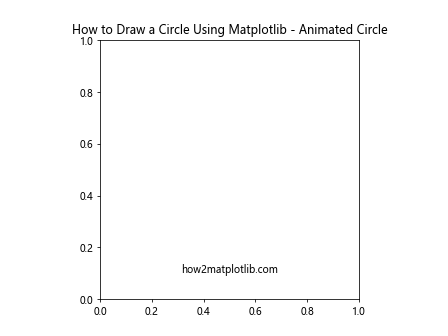
This example creates an animation of a circle growing from a point to a larger size. The FuncAnimation class is used to update the circle’s radius in each frame of the animation.
Drawing Circles on Geographic Maps
When learning how to draw a circle using Matplotlib, you might encounter scenarios where you need to draw circles on geographic maps. Matplotlib can be combined with libraries like Cartopy to achieve this. Here’s an example:
import matplotlib.pyplot as plt
import cartopy.crs as ccrs
from matplotlib.patches import Circle

fig, ax = plt.subplots(subplot_kw={'projection': ccrs.PlateCarree()})
ax.stock_img()

circle = Circle((-0.1, 51.5), 0.2, transform=ccrs.PlateCarree(), fill=False, color='r')
ax.add_patch(circle)

ax.set_title('How to Draw a Circle Using Matplotlib - Geographic Circle')
plt.text(0, -20, 'how2matplotlib.com', ha='center', transform=ccrs.PlateCarree())
plt.show()
Output:
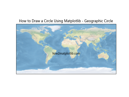
In this example, we draw a circle centered on London using geographic coordinates. The circle is transformed to match the map projection.
Creating Circular Heatmaps
Circular heatmaps can be an interesting way to visualize data when learning how to draw a circle using Matplotlib. Here’s an example of how to create a simple circular heatmap:
import matplotlib.pyplot as plt
import numpy as np

theta = np.linspace(0, 2*np.pi, 100)
r = np.linspace(0, 1, 50)
T, R = np.meshgrid(theta, r)
Z = np.sin(5*T) * np.cos(5*R)

fig, ax = plt.subplots(subplot_kw=dict(projection='polar'))
c = ax.pcolormesh(theta, r, Z, cmap='viridis')
fig.colorbar(c)
ax.set_title('How to Draw a Circle Using Matplotlib - Circular Heatmap')
plt.text(0, -0.1, 'how2matplotlib.com', ha='center', transform=ax.transAxes)
plt.show()
Output:
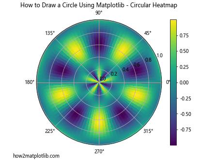
This example creates a circular heatmap using polar coordinates. The pcolormesh function is used to visualize the data in a circular format.
Drawing Circles with Gradients
Adding gradients to circles can create visually appealing effects when learning how to draw a circle using Matplotlib. Here’s an example of how to create a circle with a radial gradient:
import matplotlib.pyplot as plt
import numpy as np
from matplotlib.patches import Circle
from matplotlib.colors import LinearSegmentedColormap

fig, ax = plt.subplots()

# Create a radial gradient
n = 512
x = np.linspace(-1, 1, n)
X, Y = np.meshgrid(x, x)
R = np.sqrt(X**2 + Y**2)
cmap = LinearSegmentedColormap.from_list("", ["blue", "red"])
im = ax.imshow(R, cmap=cmap, extent=[-1, 1, -1, 1])

# Add a circular mask
circle = Circle((0, 0), 1, transform=ax.transData, fill=False, edgecolor='black')
im.set_clip_path(circle)
ax.add_artist(circle)

ax.set_aspect('equal')
ax.set_title('How to Draw a Circle Using Matplotlib - Gradient Circle')
plt.text(0, -1.2, 'how2matplotlib.com', ha='center')
plt.show()
Output:
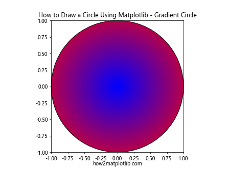
This example demonstrates how to create a circle filled with a radial gradient from blue to red. The gradient is created using a custom colormap, and a circular mask is applied to clip the gradient to the shape of a circle.
Creating Pie Charts with Circular Sectors
When learning how to draw a circle using Matplotlib, it’s important to understand that pie charts are essentially circles divided into sectors. Here’s an example of how to create a simple pie chart:
import matplotlib.pyplot as plt

sizes = [30, 20, 25, 15, 10]
labels = ['A', 'B', 'C', 'D', 'E']
colors = ['#ff9999', '#66b3ff', '#99ff99', '#ffcc99', '#ff99cc']

fig, ax = plt.subplots()
ax.pie(sizes, labels=labels, colors=colors, autopct='%1.1f%%', startangle=90)
ax.axis('equal')
ax.set_title('How to Draw a Circle Using Matplotlib - Pie Chart')
plt.text(0, -1.2, 'how2matplotlib.com', ha='center', transform=ax.transAxes)
plt.show()
Output:
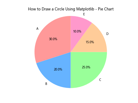
This example creates a pie chart with five sectors, each representing a different percentage of the whole. The autopct parameter is used to display the percentage values on each sector.
Drawing Concentric Circles
Concentric circles can be useful for various visualizations when learning how to draw a circle using Matplotlib. Here’s an example of how to create concentric circles:
import matplotlib.pyplot as plt
from matplotlib.patches import Circle

fig, ax = plt.subplots()

for i in range(1, 6):
    circle = Circle((0.5, 0.5), i*0.1, fill=False)
    ax.add_artist(circle)

ax.set_xlim(0, 1)
ax.set_ylim(0, 1)
ax.set_aspect('equal')
ax.set_title('How to Draw a Circle Using Matplotlib - Concentric Circles')
plt.text(0.5, 0.1, 'how2matplotlib.com', ha='center')
plt.show()
Output:
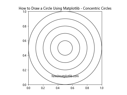
This example creates five concentric circles with increasing radii. Each circle is centered at the same point but has a different radius.
Creating a Circular Color Wheel
A circular color wheel is an interesting application of circles in Matplotlib. Here’s how you can create a simple color wheel:
import matplotlib.pyplot as plt
import numpy as np

fig, ax = plt.subplots()

theta = np.linspace(0, 2*np.pi, 256)
r = np.linspace(0.25, 1, 128)
T, R = np.meshgrid(theta, r)

hsv = np.zeros((128, 256, 3))
hsv[:,:,0] = T / (2*np.pi)
hsv[:,:,1] = R
hsv[:,:,2] = 1

rgb = plt.cm.hsv(hsv)
ax.imshow(rgb, origin='lower', extent=[0, 2*np.pi, 0.25, 1])
ax.set_aspect('equal')
ax.set_yticks([])
ax.set_xticks([])
ax.set_title('How to Draw a Circle Using Matplotlib - Color Wheel')
plt.text(np.pi, 0.1, 'how2matplotlib.com', ha='center')
plt.show()
This example creates a circular color wheel using the HSV color space. The hue is mapped to the angle around the circle, while the saturation is mapped to the radius.
Drawing Circles with Shadows
Adding shadows to circles can create a 3D effect. Here’s an example of how to draw a circle with a shadow using Matplotlib:
import matplotlib.pyplot as plt
from matplotlib.patches import Circle
from matplotlib.patheffects import withSimplePatchShadow

fig, ax = plt.subplots()

circle = Circle((0.5, 0.5), 0.3, facecolor='lightblue', edgecolor='blue')
circle.set_path_effects([withSimplePatchShadow()])
ax.add_artist(circle)

ax.set_xlim(0, 1)
ax.set_ylim(0, 1)
ax.set_aspect('equal')
ax.set_title('How to Draw a Circle Using Matplotlib - Circle with Shadow')
plt.text(0.5, 0.1, 'how2matplotlib.com', ha='center')
plt.show()
Output:
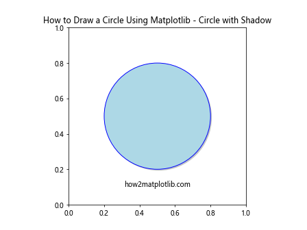
This example creates a circle with a light blue fill and blue edge, and adds a simple shadow effect using withSimplePatchShadow().
Creating a Circular Barplot
A circular barplot is an interesting way to visualize data in a circular format. Here’s how you can create one using Matplotlib:
import matplotlib.pyplot as plt
import numpy as np

fig, ax = plt.subplots(subplot_kw=dict(projection='polar'))

N = 10
theta = np.linspace(0.0, 2 * np.pi, N, endpoint=False)
radii = 10 * np.random.rand(N)
width = np.pi / 4 * np.random.rand(N)

bars = ax.bar(theta, radii, width=width, bottom=0.0)

for r, bar in zip(radii, bars):
    bar.set_facecolor(plt.cm.viridis(r / 10.))
    bar.set_alpha(0.5)

ax.set_title('How to Draw a Circle Using Matplotlib - Circular Barplot')
plt.text(0, 0, 'how2matplotlib.com', ha='center', va='center')
plt.show()
Output:
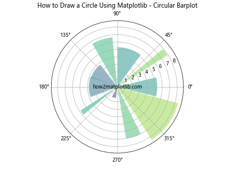
This example creates a circular barplot where each bar represents a value, and the color of the bar is determined by its height.
Drawing Circles with Patterns
Adding patterns to circles can create interesting visual effects. Here’s an example of how to draw a circle with a hatched pattern:
import matplotlib.pyplot as plt
from matplotlib.patches import Circle

fig, ax = plt.subplots()

circle = Circle((0.5, 0.5), 0.3, facecolor='none', edgecolor='blue', hatch='///')
ax.add_artist(circle)

ax.set_xlim(0, 1)
ax.set_ylim(0, 1)
ax.set_aspect('equal')
ax.set_title('How to Draw a Circle Using Matplotlib - Circle with Pattern')
plt.text(0.5, 0.1, 'how2matplotlib.com', ha='center')
plt.show()
Output:
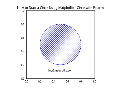
This example creates a circle with a blue edge and a hatched pattern fill. The hatch parameter is used to specify the pattern.
Creating a Circular Histogram
A circular histogram, also known as a rose diagram, is a useful way to visualize directional or cyclical data. Here’s how to create one using Matplotlib:
import matplotlib.pyplot as plt
import numpy as np

fig, ax = plt.subplots(subplot_kw=dict(projection='polar'))

# Generate some sample data
N = 500
r = np.random.randn(N)
theta = 2 * np.pi * np.random.rand(N)

# Create the histogram
ax.hist(theta, bins=16, bottom=0.1)

ax.set_title('How to Draw a Circle Using Matplotlib - Circular Histogram')
plt.text(0, 0, 'how2matplotlib.com', ha='center', va='center', transform=ax.transAxes)
plt.show()
Output:
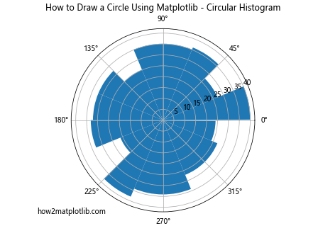
This example creates a circular histogram using randomly generated angular data. The hist function is used with polar coordinates to create the circular histogram.
Drawing Circles with Text
Adding text to circles can be useful for labeling or creating more complex visualizations. Here’s an example of how to draw circles with text:
import matplotlib.pyplot as plt
from matplotlib.patches import Circle

fig, ax = plt.subplots()

circles = [
    (0.3, 0.3, 'A'),
    (0.7, 0.3, 'B'),
    (0.5, 0.7, 'C')
]

for x, y, label in circles:
    circle = Circle((x, y), 0.1, fill=False)
    ax.add_artist(circle)
    ax.text(x, y, label, ha='center', va='center')

ax.set_xlim(0, 1)
ax.set_ylim(0, 1)
ax.set_aspect('equal')
ax.set_title('How to Draw a Circle Using Matplotlib - Circles with Text')
plt.text(0.5, 0.1, 'how2matplotlib.com', ha='center')
plt.show()
Output:
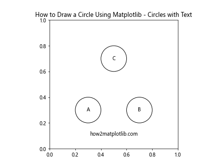
This example creates three circles and adds a label to the center of each circle using the text function.
Creating a Circular Network Graph
Circular network graphs can be an effective way to visualize relationships between entities. Here’s an example of how to create a simple circular network graph:
import matplotlib.pyplot as plt
import networkx as nx

G = nx.cycle_graph(10)
pos = nx.circular_layout(G)

fig, ax = plt.subplots()
nx.draw(G, pos, ax=ax, with_labels=True, node_color='lightblue', node_size=500, font_size=10)

ax.set_title('How to Draw a Circle Using Matplotlib - Circular Network Graph')
plt.text(0, -1.2, 'how2matplotlib.com', ha='center', transform=ax.transAxes)
plt.show()
Output:
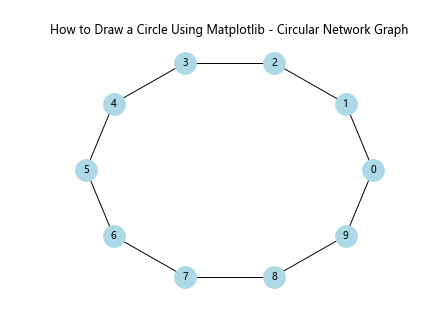
This example uses the NetworkX library in conjunction with Matplotlib to create a circular network graph. The nodes are arranged in a circle, and edges connect adjacent nodes.
Conclusion: Mastering How to Draw a Circle Using Matplotlib
Throughout this comprehensive guide, we’ve explored various techniques and applications for drawing circles using Matplotlib. From basic circle creation to advanced visualizations like circular heatmaps and network graphs, we’ve covered a wide range of topics to help you master how to draw a circle using Matplotlib.
Key takeaways from this guide include:
- The versatility of Matplotlib in creating circular visualizations
- Different methods for drawing circles, including
plt.Circle()andpatches.Circle - Advanced techniques like adding gradients, shadows, and patterns to circles
- Creating circular plots such as pie charts, color wheels, and circular histograms
- Combining circles with other elements like text and network graphs
By understanding these concepts and practicing with the provided examples, you’ll be well-equipped to incorporate circles into your data visualizations and scientific plots. Remember that mastering how to draw a circle using Matplotlib is just the beginning – these techniques can be combined and extended to create even more complex and informative visualizations.