How to Master Matplotlib Figure Size and Subplots
Matplotlib figure size and subplots are essential concepts for creating effective data visualizations in Python. This comprehensive guide will explore various aspects of manipulating figure size and working with subplots in Matplotlib. We’ll cover everything from basic concepts to advanced techniques, providing you with the knowledge and tools to create stunning and informative visualizations.
Understanding Matplotlib Figure Size
Matplotlib figure size is a crucial aspect of creating visually appealing and informative plots. The figure size determines the overall dimensions of your plot, including all subplots and other elements. By default, Matplotlib creates figures with a size of 6.4 inches by 4.8 inches, but you can easily customize this to suit your needs.
To set the figure size in Matplotlib, you can use the figsize parameter when creating a new figure. This parameter takes a tuple of two values, representing the width and height of the figure in inches.
Here’s a simple example of how to create a figure with a custom size:
import matplotlib.pyplot as plt

# Create a figure with a custom size
plt.figure(figsize=(10, 6))

# Plot some data
plt.plot([1, 2, 3, 4], [1, 4, 2, 3], label='Data from how2matplotlib.com')

# Add labels and title
plt.xlabel('X-axis')
plt.ylabel('Y-axis')
plt.title('Custom Figure Size Example')
plt.legend()

# Display the plot
plt.show()
Output:
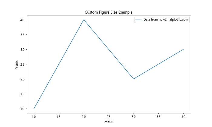
In this example, we create a figure with a width of 10 inches and a height of 6 inches. This larger figure size allows for more detailed visualizations and can be particularly useful when working with complex plots or multiple subplots.
Working with Matplotlib Subplots
Matplotlib subplots allow you to create multiple plots within a single figure. This is particularly useful when you want to compare different datasets or show various aspects of your data side by side. Subplots are organized in a grid-like structure, where you can specify the number of rows and columns.
To create subplots in Matplotlib, you can use the plt.subplots() function. This function returns a figure object and an array of axes objects, which you can use to plot your data.
Here’s an example of creating a figure with four subplots arranged in a 2×2 grid:
import matplotlib.pyplot as plt
import numpy as np

# Create a figure with 2x2 subplots
fig, axs = plt.subplots(2, 2, figsize=(12, 8))

# Generate some sample data
x = np.linspace(0, 10, 100)
y1 = np.sin(x)
y2 = np.cos(x)
y3 = np.exp(-x/10)
y4 = np.log(x + 1)

# Plot data in each subplot
axs[0, 0].plot(x, y1, label='Sine')
axs[0, 1].plot(x, y2, label='Cosine')
axs[1, 0].plot(x, y3, label='Exponential')
axs[1, 1].plot(x, y4, label='Logarithmic')

# Add labels and titles to each subplot
for i in range(2):
    for j in range(2):
        axs[i, j].set_xlabel('X-axis')
        axs[i, j].set_ylabel('Y-axis')
        axs[i, j].set_title(f'Subplot {i+1},{j+1} - how2matplotlib.com')
        axs[i, j].legend()

# Adjust the layout and display the plot
plt.tight_layout()
plt.show()
Output:
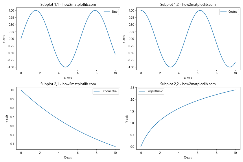
In this example, we create a figure with four subplots arranged in a 2×2 grid. We then plot different functions in each subplot, add labels and titles, and adjust the layout using plt.tight_layout() to prevent overlapping.
Customizing Matplotlib Figure Size and Subplots
Now that we’ve covered the basics of Matplotlib figure size and subplots, let’s explore some more advanced techniques for customizing your visualizations.
Creating Subplots with Different Sizes
In some cases, you may want to create subplots with different sizes within the same figure. Matplotlib provides the gridspec module for more advanced subplot layouts. Here’s an example of creating subplots with different sizes:
import matplotlib.pyplot as plt
import matplotlib.gridspec as gridspec
import numpy as np

# Create a figure with a custom gridspec
fig = plt.figure(figsize=(12, 8))
gs = gridspec.GridSpec(2, 3, width_ratios=[1, 2, 1], height_ratios=[1, 1.5])

# Create subplots with different sizes
ax1 = fig.add_subplot(gs[0, 0])
ax2 = fig.add_subplot(gs[0, 1:])
ax3 = fig.add_subplot(gs[1, :2])
ax4 = fig.add_subplot(gs[1, 2])

# Generate some sample data
x = np.linspace(0, 10, 100)
y1 = np.sin(x)
y2 = np.cos(x)
y3 = np.exp(-x/10)
y4 = np.log(x + 1)

# Plot data in each subplot
ax1.plot(x, y1, label='Sine')
ax2.plot(x, y2, label='Cosine')
ax3.plot(x, y3, label='Exponential')
ax4.plot(x, y4, label='Logarithmic')

# Add labels and titles to each subplot
for ax in [ax1, ax2, ax3, ax4]:
    ax.set_xlabel('X-axis')
    ax.set_ylabel('Y-axis')
    ax.legend()

ax1.set_title('Small Subplot - how2matplotlib.com')
ax2.set_title('Wide Subplot - how2matplotlib.com')
ax3.set_title('Large Subplot - how2matplotlib.com')
ax4.set_title('Tall Subplot - how2matplotlib.com')

# Adjust the layout and display the plot
plt.tight_layout()
plt.show()
Output:
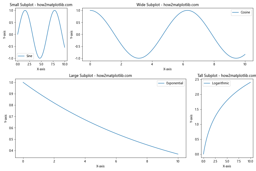
This example uses gridspec to create a custom layout with subplots of different sizes. The width_ratios and height_ratios parameters allow you to specify the relative sizes of columns and rows, respectively.
Advanced Techniques for Matplotlib Figure Size and Subplots
Now that we’ve covered the basics and some intermediate techniques, let’s explore some advanced concepts related to Matplotlib figure size and subplots.
Creating Nested Subplots
Sometimes, you may want to create nested subplots within a larger subplot. This can be useful for displaying hierarchical data or creating more complex layouts. Here’s an example of how to create nested subplots:
import matplotlib.pyplot as plt
import numpy as np

# Create the main figure and outer subplots
fig, (ax1, ax2) = plt.subplots(1, 2, figsize=(12, 6))

# Create nested subplots within ax2
gs = ax2.get_gridspec()
inner_gs = gs[1].subgridspec(2, 2)
ax2.remove()
ax2_00 = fig.add_subplot(inner_gs[0, 0])
ax2_01 = fig.add_subplot(inner_gs[0, 1])
ax2_10 = fig.add_subplot(inner_gs[1, 0])
ax2_11 = fig.add_subplot(inner_gs[1, 1])

# Generate some sample data
x = np.linspace(0, 10, 100)
y1 = np.sin(x)
y2 = np.cos(x)
y3 = np.exp(-x/10)
y4 = np.log(x + 1)
y5 = x**2

# Plot data in each subplot
ax1.plot(x, y1, label='Sine')
ax2_00.plot(x, y2, label='Cosine')
ax2_01.plot(x, y3, label='Exponential')
ax2_10.plot(x, y4, label='Logarithmic')
ax2_11.plot(x, y5, label='Quadratic')

# Add labels and titles to each subplot
ax1.set_title('Main Subplot - how2matplotlib.com')
ax2_00.set_title('Nested 1 - how2matplotlib.com')
ax2_01.set_title('Nested 2 - how2matplotlib.com')
ax2_10.set_title('Nested 3 - how2matplotlib.com')
ax2_11.set_title('Nested 4 - how2matplotlib.com')

for ax in [ax1, ax2_00, ax2_01, ax2_10, ax2_11]:
    ax.set_xlabel('X-axis')
    ax.set_ylabel('Y-axis')
    ax.legend()

# Adjust the layout and display the plot
plt.tight_layout()
plt.show()
Output:
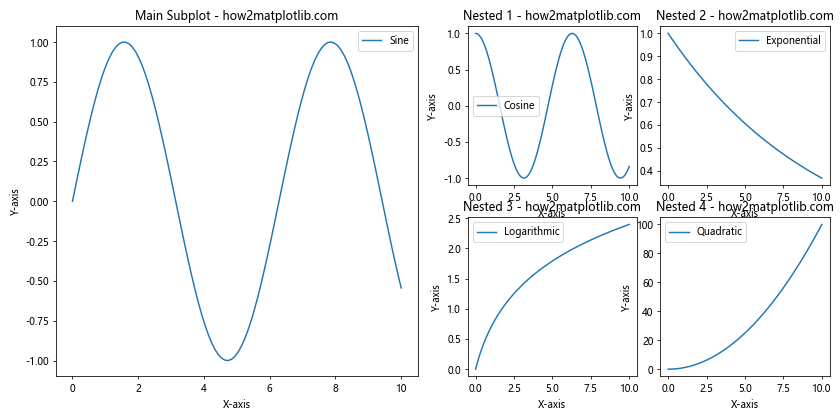
This example demonstrates how to create nested subplots within a larger subplot using the subgridspec function. This technique allows for more complex and hierarchical layouts.
Creating Subplots with Shared Axes
When working with multiple subplots, it’s often useful to have shared axes between them. This can make it easier to compare data across different plots. Matplotlib provides options for sharing x-axes, y-axes, or both. Here’s an example:
import matplotlib.pyplot as plt
import numpy as np

# Create a figure with subplots and shared axes
fig, axs = plt.subplots(2, 2, figsize=(12, 8), sharex='col', sharey='row')

# Generate some sample data
x = np.linspace(0, 10, 100)
y1 = np.sin(x)
y2 = np.cos(x)
y3 = np.exp(-x/10)
y4 = np.log(x + 1)

# Plot data in each subplot
axs[0, 0].plot(x, y1, label='Sine')
axs[0, 1].plot(x, y2, label='Cosine')
axs[1, 0].plot(x, y3, label='Exponential')
axs[1, 1].plot(x, y4, label='Logarithmic')

# Add labels and titles to each subplot
for i in range(2):
    for j in range(2):
        axs[i, j].set_title(f'Subplot {i+1},{j+1} - how2matplotlib.com')
        axs[i, j].legend()

# Add common x and y labels
fig.text(0.5, 0.04, 'X-axis', ha='center')
fig.text(0.04, 0.5, 'Y-axis', va='center', rotation='vertical')

# Adjust the layout and display the plot
plt.tight_layout()
plt.show()
Output:
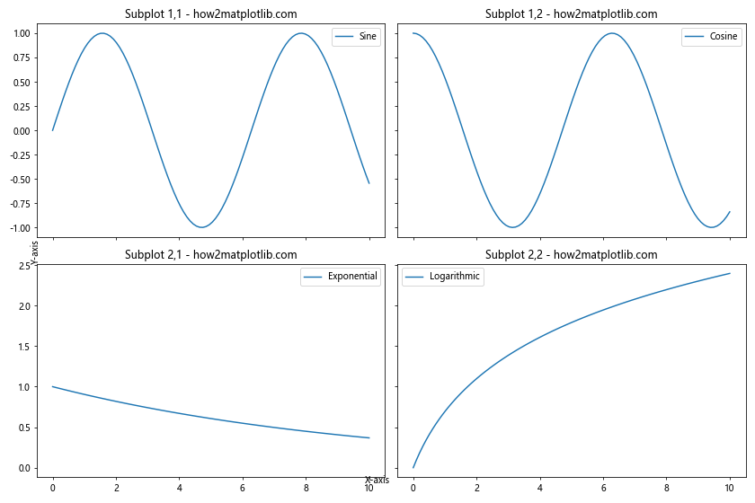
In this example, we use the sharex and sharey parameters when creating the subplots to share the x-axes within columns and y-axes within rows. This results in a more compact and easier-to-read visualization.
Handling Large Datasets with Matplotlib Figure Size and Subplots
When working with large datasets, it’s important to consider how to effectively visualize the data without overwhelming the viewer or compromising performance. Here are some techniques for handling large datasets using Matplotlib figure size and subplots.
Using Subplots to Break Down Large Datasets
One approach to handling large datasets is to break them down into smaller, more manageable chunks using subplots. Here’s an example:
import matplotlib.pyplot as plt
import numpy as np

# Generate a large dataset
np.random.seed(42)
num_points = 1000000
x = np.random.rand(num_points)
y = np.random.rand(num_points)

# Create a figure with subplots
fig, axs = plt.subplots(2, 2, figsize=(12, 10))

# Plot data in each subplot
for i in range(2):
    for j in range(2):
        start = i * 2 + j
        end = start + 1
        subset_x = x[int(start * num_points / 4):int(end * num_points / 4)]
        subset_y = y[int(start * num_points / 4):int(end * num_points / 4)]
        axs[i, j].scatter(subset_x, subset_y, alpha=0.1, s=1)
        axs[i, j].set_title(f'Subset {start+1} - how2matplotlib.com')
        axs[i, j].set_xlabel('X-axis')
        axs[i, j].set_ylabel('Y-axis')

# Adjust the layout and display the plot
plt.tight_layout()
plt.show()
Output:
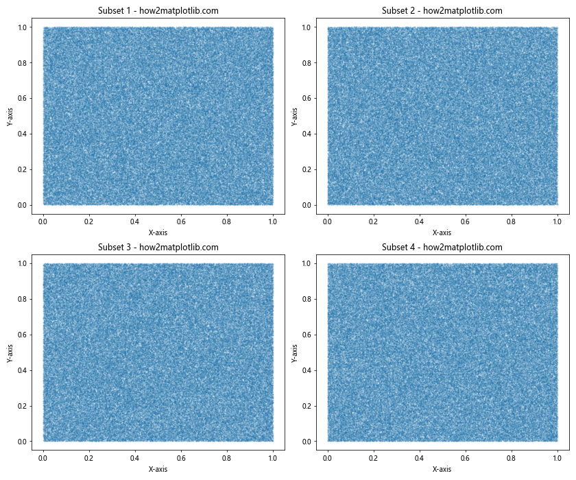
This example demonstrates how to break down a large dataset into four subsets and plot each subset in a separate subplot. This approach can help make the visualization more manageable and easier to interpret.
Using Hexbin Plots for Large Datasets
Another technique for visualizing large datasets is to use hexbin plots, which aggregate data points into hexagonal bins. This can provide a more efficient representation of dense data. Here’s an example:
import matplotlib.pyplot as plt
import numpy as np

# Generate a large dataset
np.random.seed(42)
num_points = 1000000
x = np.random.randn(num_points)
y = np.random.randn(num_points)

# Create a figure with subplots
fig, (ax1, ax2) = plt.subplots(1, 2, figsize=(16, 6))

# Create a scatter plot (for comparison)
ax1.scatter(x, y, alpha=0.1, s=1)
ax1.set_title('Scatter Plot - how2matplotlib.com')
ax1.set_xlabel('X-axis')
ax1.set_ylabel('Y-axis')

# Create a hexbin plot
hb = ax2.hexbin(x, y, gridsize=50, cmap='viridis')
ax2.set_title('Hexbin Plot - how2matplotlib.com')
ax2.set_xlabel('X-axis')
ax2.set_ylabel('Y-axis')

# Add a colorbar to the hexbin plot
cb = plt.colorbar(hb, ax=ax2)
cb.set_label('Count')

# Adjust the layout and display the plot
plt.tight_layout()
plt.show()
Output:
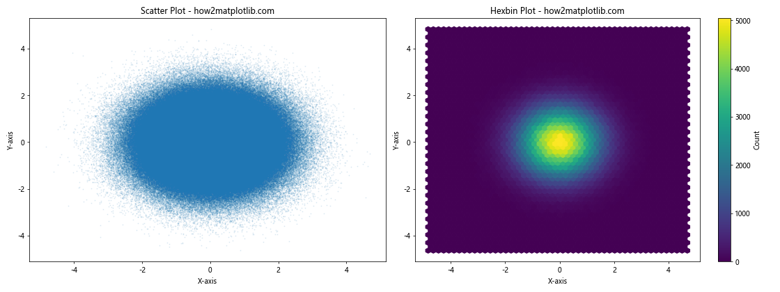
This example compares a traditional scatter plot with a hexbin plot for a large dataset. The hexbin plot provides a more efficient visualization of the data density.
Customizing Matplotlib Figure Size and Subplots for Different Plot Types
Different types of plots may require different approaches to figure size and subplot layout. Let’s explore some examples of customizing Matplotlib figure size and subplots for various plot types.
Creating a Dashboard-style Layout
For complex data visualizations, you might want to create a dashboard-style layout with multiple plot types. Here’s an example:
import matplotlib.pyplot as plt
import numpy as np

# Generate some sample data
np.random.seed(42)
x = np.linspace(0, 10, 100)
y1 = np.sin(x)
y2 = np.cos(x)
categories = ['A', 'B', 'C', 'D']
values = np.random.rand(4)

# Create a figure with a custom layout
fig = plt.figure(figsize=(16, 10))
gs = fig.add_gridspec(3, 3)

# Line plot
ax1 = fig.add_subplot(gs[0, :2])
ax1.plot(x, y1, label='Sine')
ax1.plot(x, y2, label='Cosine')
ax1.set_title('Line Plot - how2matplotlib.com')
ax1.set_xlabel('X-axis')
ax1.set_ylabel('Y-axis')
ax1.legend()

# Bar plot
ax2 = fig.add_subplot(gs[1, :2])
ax2.bar(categories, values)
ax2.set_title('Bar Plot - how2matplotlib.com')
ax2.set_xlabel('Categories')
ax2.set_ylabel('Values')

# Scatter plot
ax3 = fig.add_subplot(gs[2, :2])
ax3.scatter(y1, y2)
ax3.set_title('Scatter Plot - how2matplotlib.com')
ax3.set_xlabel('Sine')
ax3.set_ylabel('Cosine')

# Pie chart
ax4 = fig.add_subplot(gs[:2, 2])
ax4.pie(values, labels=categories, autopct='%1.1f%%')
ax4.set_title('Pie Chart - how2matplotlib.com')

# Histogram
ax5 = fig.add_subplot(gs[2, 2])
ax5.hist(np.random.randn(1000), bins=30)
ax5.set_title('Histogram - how2matplotlib.com')
ax5.set_xlabel('Value')
ax5.set_ylabel('Frequency')

# Adjust the layout and display the plot
plt.tight_layout()
plt.show()
Output:
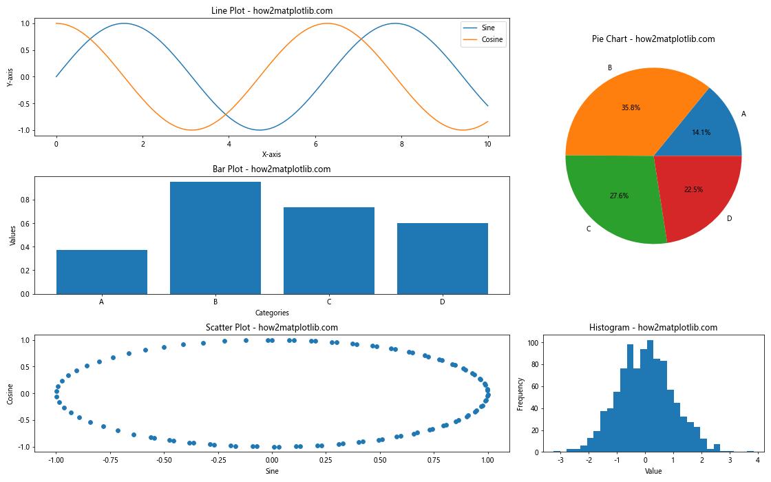
This example creates a dashboard-style layout with multiple plot types, demonstrating how to use Matplotlib’s gridspec to create a custom arrangement of subplots.
Best Practices for Matplotlib Figure Size and Subplots
When working with Matplotlib figure size and subplots, it’s important to follow some best practices to ensure your visualizations are effective and easy to understand. Here are some tips:
- Choose an appropriate figure size: Consider the content of your plots and the medium where they will be displayed (e.g., screen, print, presentation) when selecting a figure size.
Use consistent sizes and layouts: When creating multiple figures, try to maintain consistent sizes and layouts to create a cohesive visual style.
Leverage subplots for comparisons: Use subplots to compare different datasets or show multiple aspects of the same data side by side.
Adjust spacing between subplots: Use
plt.tight_layout()or manually adjust subplot parameters to ensure proper spacing between plots.Use shared axes when appropriate: Share x or y axes between subplots to make comparisons easier and save space.
Consider the aspect ratio: Choose an aspect ratio that best suits your data and the story you want to tell.
Optimize for different output formats: Adjust DPI and figure size based on the intended output format (e.g., screen, print, web).
Use meaningful titles and labels: Provide clear titles for each subplot and label axes appropriately.
Leverage color and style: Use consistent color schemes and styles across subplots to create a cohesive look.
Don’t overcrowd: Avoid cramming too much information into a single figure or subplot. If necessary, create multiple figures or use interactive visualizations.
Conclusion
Mastering Matplotlib figure size and subplots is essential for creating effective and visually appealing data visualizations. By understanding how to manipulate figure size, create and customize subplots, and optimize for different scenarios, you can create powerful and informative visualizations that effectively communicate your data insights. Throughout this guide, we’ve covered a wide range of topics related to Matplotlib figure size and subplots, including: