Matplotlib bar figure size is an essential aspect of data visualization that can significantly impact the clarity and effectiveness of your plots. In this comprehensive guide, we’ll explore various techniques to customize the size of bar figures in Matplotlib, providing you with the tools to create visually appealing and informative charts. Whether you’re a beginner or an experienced data scientist, this article will help you master the art of adjusting Matplotlib bar figure sizes to suit your specific needs.
Understanding Matplotlib Bar Figure Size
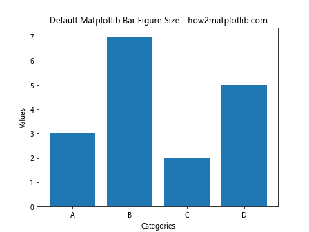
Before diving into the specifics of customizing Matplotlib bar figure size, it’s crucial to understand what figure size means in the context of Matplotlib. The figure size refers to the overall dimensions of the plot, including the axes, labels, and any additional elements. By default, Matplotlib creates figures with a size of 6.4 inches by 4.8 inches, but this can be easily adjusted to accommodate different types of data and presentation requirements.
Let’s start with a basic example of creating a bar plot with default figure size:
In this example, we create a simple bar plot using the default figure size. The plt.bar() function is used to create the bars, and we add a title and axis labels for clarity. This serves as our baseline for comparing different figure size adjustments.
Adjusting Matplotlib Bar Figure Size with figsize
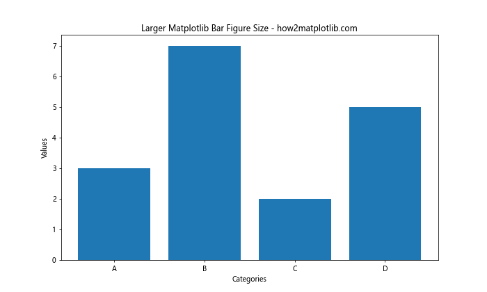
One of the most straightforward ways to customize the Matplotlib bar figure size is by using the figsize parameter when creating a new figure. This parameter allows you to specify the width and height of the figure in inches.
Here’s an example of how to create a larger bar figure:
In this code, we use plt.figure(figsize=(10, 6)) to create a figure that is 10 inches wide and 6 inches tall. This results in a larger bar plot compared to the default size. The figsize parameter takes a tuple of two values: (width, height) in inches.
Creating Smaller Matplotlib Bar Figures
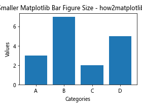
Sometimes, you may need to create smaller bar figures, especially when working with multiple subplots or when space is limited. Here’s how you can create a smaller bar figure:
In this example, we set the figure size to 4 inches by 3 inches using plt.figure(figsize=(4, 3)). Notice the addition of plt.tight_layout(), which automatically adjusts the spacing between plot elements to prevent overlapping in smaller figures.
Customizing Matplotlib Bar Figure Size for Multiple Subplots
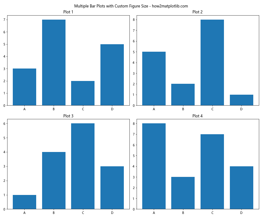
When working with multiple subplots, you can adjust the overall figure size to accommodate all the plots. Here’s an example of creating a 2×2 grid of bar plots with a custom figure size:
In this code, we use plt.subplots(2, 2, figsize=(12, 10)) to create a 2×2 grid of subplots with an overall figure size of 12 inches by 10 inches. Each subplot is then populated with a bar plot, and we use plt.tight_layout() to ensure proper spacing between the subplots.
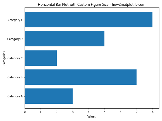
Customizing Matplotlib Bar Figure Size for Horizontal Bar Plots
Horizontal bar plots often require different figure size considerations compared to vertical bar plots. Here’s an example of how to adjust the figure size for a horizontal bar plot:
In this code, we use plt.figure(figsize=(8, 6)) to create a figure that is 8 inches wide and 6 inches tall, which is suitable for a horizontal bar plot. The plt.barh() function is used to create horizontal bars instead of vertical ones.
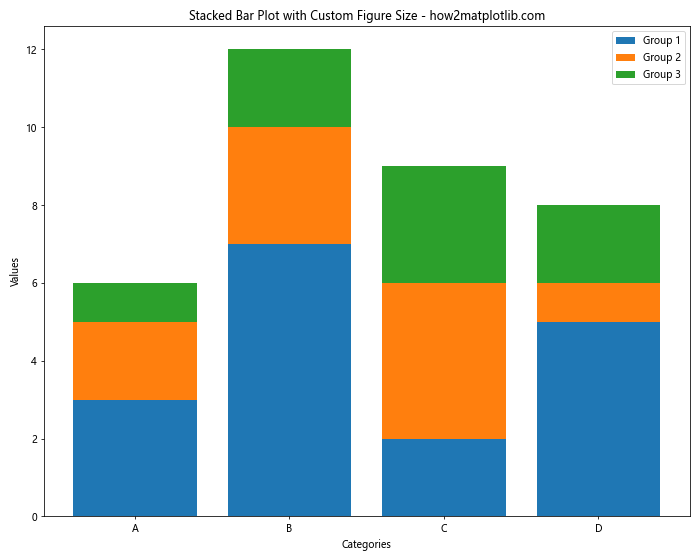
Adjusting Matplotlib Bar Figure Size for Stacked Bar Plots
Stacked bar plots may require additional vertical space to accommodate multiple categories. Here’s an example of how to adjust the figure size for a stacked bar plot:
In this example, we set the figure size to 10 inches by 8 inches using plt.figure(figsize=(10, 8)). This provides enough vertical space to accommodate the stacked bars and the legend.
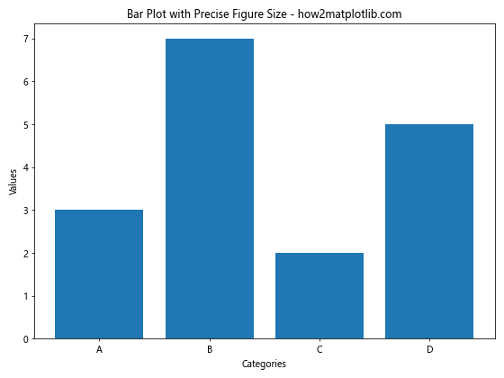
Fine-tuning Matplotlib Bar Figure Size with Inches and DPI
For precise control over the Matplotlib bar figure size, you can combine the figsize parameter with the dpi (dots per inch) setting. This allows you to specify the exact pixel dimensions of your figure. Here’s an example:
import matplotlib.pyplot as plt
import numpy as np

categories = ['A', 'B', 'C', 'D']
values = [3, 7, 2, 5]

# Set figure size in inches and DPI
width_inches = 8
height_inches = 6
dpi = 100

plt.figure(figsize=(width_inches, height_inches), dpi=dpi)
plt.bar(categories, values)
plt.title(f'Bar Plot with Precise Figure Size - how2matplotlib.com')
plt.xlabel('Categories')
plt.ylabel('Values')
plt.tight_layout()
plt.show()

print(f"Figure size in pixels: {width_inches * dpi} x {height_inches * dpi}")
Output:
In this code, we set the figure size to 8 inches by 6 inches and specify a DPI of 100. This results in a figure that is 800 pixels wide and 600 pixels tall. The print statement at the end confirms the pixel dimensions of the figure.
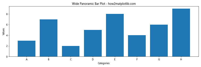
Adjusting Matplotlib Bar Figure Size for Different Aspect Ratios
Sometimes, you may need to create bar plots with specific aspect ratios, such as square plots or wide panoramic plots. Here’s an example of how to create a square bar plot:
In this example, we set both the width and height of the figure to 6 inches, creating a perfect square. This can be useful for certain types of data visualization where maintaining equal proportions is important.
For a wide panoramic bar plot, you can adjust the aspect ratio accordingly:
Here, we set the figure size to 12 inches wide and 4 inches tall, creating a wide panoramic view that’s suitable for displaying a larger number of categories.
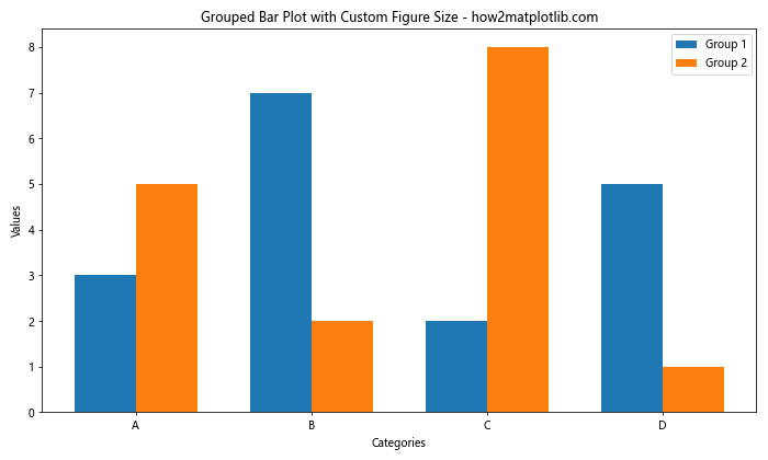
Customizing Matplotlib Bar Figure Size for Grouped Bar Plots
Grouped bar plots often require additional horizontal space to accommodate multiple groups. Here’s an example of how to adjust the figure size for a grouped bar plot:
In this code, we set the figure size to 10 inches wide and 6 inches tall using plt.figure(figsize=(10, 6)). This provides enough horizontal space to accommodate the grouped bars and ensures that the labels and legend are clearly visible.
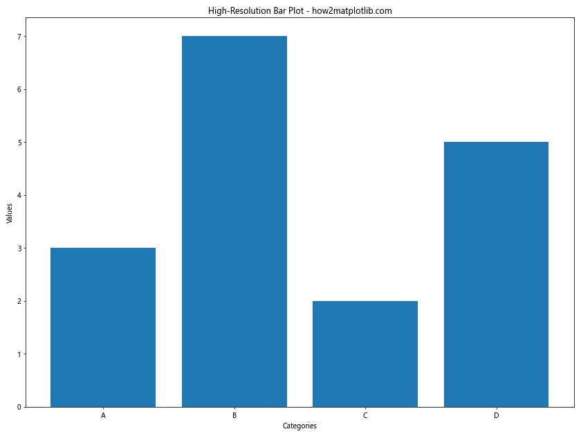
Adjusting Matplotlib Bar Figure Size for Different Screen Resolutions
When creating bar plots for different screen resolutions or display devices, you may need to adjust the figure size accordingly. Here’s an example of how to create a bar plot optimized for a high-resolution display:
import matplotlib.pyplot as plt
import numpy as np

categories = ['A', 'B', 'C', 'D']
values = [3, 7, 2, 5]

# Set figure size for high-resolution display
plt.figure(figsize=(12, 9), dpi=200)
plt.bar(categories, values)
plt.title('High-Resolution Bar Plot - how2matplotlib.com')
plt.xlabel('Categories')
plt.ylabel('Values')
plt.tight_layout()
plt.show()
Output:
In this example, we set the figure size to 12 inches by 9 inches and increase the DPI to 200. This results in a larger, higher-resolution figure that looks crisp on high-resolution displays.
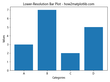
For lower-resolution displays or when file size is a concern, you can adjust the figure size and DPI accordingly:
import matplotlib.pyplot as plt
import numpy as np

categories = ['A', 'B', 'C', 'D']
values = [3, 7, 2, 5]

# Set figure size for lower-resolution display
plt.figure(figsize=(6, 4.5), dpi=72)
plt.bar(categories, values)
plt.title('Lower-Resolution Bar Plot - how2matplotlib.com')
plt.xlabel('Categories')
plt.ylabel('Values')
plt.tight_layout()
plt.show()
Output:
Here, we reduce the figure size to 6 inches by 4.5 inches and set the DPI to 72, which is suitable for most standard displays and results in a smaller file size.
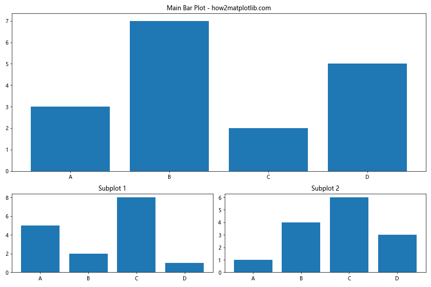
Fine-tuning Matplotlib Bar Figure Size with Subplots and GridSpec
For more complex layouts, you can use Matplotlib’s GridSpec to create custom grid arrangements and adjust the figure size accordingly. Here’s an example of creating a bar plot with an uneven grid layout:
In this example, we create a figure with a size of 12 inches by 8 inches and use GridSpec to create an uneven grid layout. The main bar plot occupies the entire top row, while two smaller bar plots are placed side by side in the bottom row. This approach allows for more flexible and complex arrangements of bar plots within a single figure.
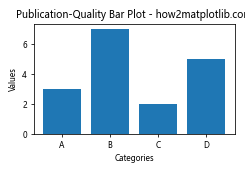
Adjusting Matplotlib Bar Figure Size for Publication-Quality Plots
When preparing bar plots for publication, you may need to adhere to specific size requirements. Here’s an example of creating a publication-quality bar plot with precise dimensions:
import matplotlib.pyplot as plt
import numpy as np

categories = ['A', 'B', 'C', 'D']
values = [3, 7, 2, 5]

# Set figure size for publication (e.g., 3.5 inches wide, 1-column width)
fig_width = 3.5  # inches
fig_height = fig_width * 0.7  # Set height to 70% of width for a pleasing aspect ratio

plt.figure(figsize=(fig_width, fig_height), dpi=300)
plt.bar(categories, values)
plt.title('Publication-Quality Bar Plot - how2matplotlib.com', fontsize=10)
plt.xlabel('Categories', fontsize=8)
plt.ylabel('Values', fontsize=8)
plt.tick_params(axis='both', which='major', labelsize=8)
plt.tight_layout()
plt.savefig('publication_bar_plot.png', dpi=300, bbox_inches='tight')
plt.show()
Output:
In this code, we set the figure width to 3.5 inches (a common requirement for single-column figures in scientific journals) and calculate the height based on a pleasing aspect ratio. We use a high DPI of 300 for print-quality resolution and adjust font sizes for readability. The plt.savefig() function is used to save the figure as a high-resolution PNG file.
Customizing Matplotlib Bar Figure Size for Responsive Web Design
When creating bar plots for web applications, you may want to make them responsive to different screen sizes. While Matplotlib itself doesn’t have built-in responsive capabilities, you can create multiple versions of the plot at different sizes and use CSS media queries to display the appropriate version. Here’s an example of how to create multiple sizes of the same bar plot:
This script creates four versions of the same bar plot at different sizes. You can then use HTML and CSS to display the appropriate version based on the screen size:
This HTML code uses the element to provide different versions of the image based on the screen width, ensuring that the appropriate size is displayed for each device.
Adjusting Matplotlib Bar Figure Size for Different Bar Orientations
The orientation of your bars can affect the optimal figure size. Here’s an example of how to adjust the figure size for vertical and horizontal bar plots:
In this example, we use a wider figure (8×6) for the vertical bar plot to accommodate the rotated x-axis labels, and a taller figure (6×8) for the horizontal bar plot to provide enough vertical space for the category labels.
Conclusion
Mastering the art of customizing Matplotlib bar figure size is crucial for creating effective and visually appealing data visualizations. Throughout this comprehensive guide, we’ve explored various techniques for adjusting figure sizes to suit different types of bar plots, data characteristics, and presentation requirements.
We’ve covered everything from basic size adjustments using the figsize parameter to more advanced techniques like dynamic sizing, responsive design, and publication-quality plots. By applying these methods, you can ensure that your Matplotlib bar plots are optimized for clarity, readability, and impact across various platforms and use cases.