How to Draw 2D Heatmaps Using Matplotlib
How to draw 2D Heatmap using Matplotlib is an essential skill for data visualization enthusiasts and professionals alike. Heatmaps are powerful tools for representing complex data in a visually appealing and easily interpretable format. In this comprehensive guide, we’ll explore various techniques and best practices for creating stunning 2D heatmaps using Matplotlib, one of the most popular plotting libraries in Python.
Understanding 2D Heatmaps and Their Importance
Before diving into the specifics of how to draw 2D heatmaps using Matplotlib, let’s first understand what heatmaps are and why they’re important. A heatmap is a graphical representation of data where individual values are represented as colors. In a 2D heatmap, data is displayed in a grid-like structure, with each cell’s color intensity corresponding to its value.
Heatmaps are particularly useful for visualizing large datasets and identifying patterns, trends, or anomalies that might not be immediately apparent in raw numerical data. They’re commonly used in various fields, including:
- Biology: Visualizing gene expression data
- Climate science: Representing temperature or precipitation patterns
- Business analytics: Displaying customer behavior or sales performance
- Sports analytics: Showing player positioning or shot accuracy
Now that we understand the importance of heatmaps, let’s explore how to draw 2D heatmaps using Matplotlib.
Setting Up Your Environment
To get started with drawing 2D heatmaps using Matplotlib, you’ll need to ensure you have the necessary libraries installed. Here’s a simple example of how to import the required modules:
import matplotlib.pyplot as plt
import numpy as np

print("Welcome to how2matplotlib.com!")
This code snippet imports Matplotlib’s pyplot module and NumPy, which we’ll use for generating sample data. Make sure you have both libraries installed in your Python environment before proceeding.
Creating a Basic 2D Heatmap
Let’s start with a simple example of how to draw a 2D heatmap using Matplotlib. We’ll create a 5×5 grid with random values:
import matplotlib.pyplot as plt
import numpy as np

# Generate random data
data = np.random.rand(5, 5)

# Create a heatmap
plt.imshow(data, cmap='hot')
plt.colorbar()
plt.title("How to Draw 2D Heatmap using Matplotlib - Basic Example")
plt.xlabel("X-axis")
plt.ylabel("Y-axis")
plt.text(2, 5.5, "how2matplotlib.com", ha='center')
plt.show()
Output:
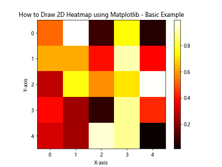
In this example, we use np.random.rand() to generate a 5×5 array of random values between 0 and 1. The plt.imshow() function is used to display the data as a heatmap. We’ve chosen the ‘hot’ colormap, which ranges from black (low values) to white (high values), passing through red and yellow.
The plt.colorbar() function adds a color scale to the plot, helping viewers interpret the values represented by different colors. We’ve also added a title, axis labels, and a watermark using plt.text().
Customizing Colormaps for 2D Heatmaps
One of the key aspects of how to draw 2D heatmaps using Matplotlib is choosing the right colormap. Matplotlib offers a wide variety of colormaps, each suited for different types of data and visualization goals. Let’s explore a few options:
import matplotlib.pyplot as plt
import numpy as np

# Generate sample data
data = np.random.rand(10, 10)

# Create a figure with multiple subplots
fig, axes = plt.subplots(2, 2, figsize=(12, 10))

# List of colormaps to demonstrate
cmaps = ['viridis', 'plasma', 'coolwarm', 'RdYlBu']

for ax, cmap in zip(axes.flat, cmaps):
    im = ax.imshow(data, cmap=cmap)
    ax.set_title(f"Heatmap with {cmap} colormap")
    plt.colorbar(im, ax=ax)
    ax.text(5, 10.5, "how2matplotlib.com", ha='center')

plt.suptitle("How to Draw 2D Heatmap using Matplotlib - Colormap Comparison")
plt.tight_layout()
plt.show()
Output:
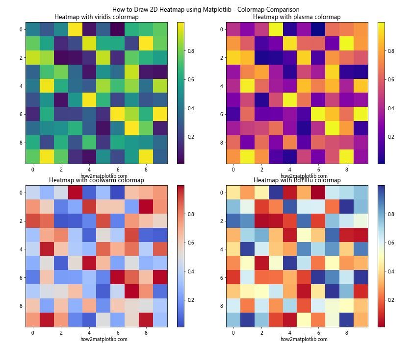
This example demonstrates four different colormaps: ‘viridis’, ‘plasma’, ‘coolwarm’, and ‘RdYlBu’. Each subplot shows the same data with a different colormap, allowing you to compare and choose the most suitable one for your specific visualization needs.
When selecting a colormap for your 2D heatmap, consider the following factors:
- Data type: Is your data sequential, diverging, or categorical?
- Perceptual uniformity: Choose colormaps that represent data changes uniformly.
- Color blindness: Opt for colormaps that are accessible to color-blind individuals.
- Printing considerations: If your heatmap will be printed in grayscale, ensure the colormap translates well to black and white.
Adding Annotations to 2D Heatmaps
When learning how to draw 2D heatmaps using Matplotlib, it’s important to know how to add annotations to provide additional context or highlight specific data points. Here’s an example of how to add text annotations to a heatmap:
import matplotlib.pyplot as plt
import numpy as np

# Generate sample data
data = np.random.randint(0, 100, size=(5, 5))

# Create a heatmap with annotations
fig, ax = plt.subplots(figsize=(10, 8))
im = ax.imshow(data, cmap='YlOrRd')

# Add colorbar
cbar = ax.figure.colorbar(im, ax=ax)
cbar.ax.set_ylabel("Value", rotation=-90, va="bottom")

# Add text annotations
for i in range(5):
    for j in range(5):
        text = ax.text(j, i, data[i, j], ha="center", va="center", color="black")

ax.set_title("How to Draw 2D Heatmap using Matplotlib - With Annotations")
ax.set_xlabel("X-axis")
ax.set_ylabel("Y-axis")
plt.text(2, 5.5, "how2matplotlib.com", ha='center')
plt.show()
Output:
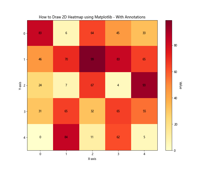
In this example, we’ve created a 5×5 grid of random integer values. We then use nested loops to add text annotations for each cell, displaying the actual value. The ax.text() function is used to place the text at the center of each cell.
This technique is particularly useful when you want to show both the color representation and the exact values in your heatmap.
Creating Heatmaps from Pandas DataFrames
Often, when working with real-world data, you’ll have your information stored in a Pandas DataFrame. Let’s explore how to draw 2D heatmaps using Matplotlib with data from a DataFrame:
import matplotlib.pyplot as plt
import pandas as pd
import numpy as np

# Create a sample DataFrame
data = {
    'A': np.random.rand(5),
    'B': np.random.rand(5),
    'C': np.random.rand(5),
    'D': np.random.rand(5),
    'E': np.random.rand(5)
}
df = pd.DataFrame(data, index=['V', 'W', 'X', 'Y', 'Z'])

# Create a heatmap from the DataFrame
fig, ax = plt.subplots(figsize=(10, 8))
im = ax.imshow(df, cmap='viridis')

# Add colorbar
cbar = ax.figure.colorbar(im, ax=ax)
cbar.ax.set_ylabel("Value", rotation=-90, va="bottom")

# Show all ticks and label them
ax.set_xticks(np.arange(len(df.columns)))
ax.set_yticks(np.arange(len(df.index)))
ax.set_xticklabels(df.columns)
ax.set_yticklabels(df.index)

# Rotate the tick labels and set their alignment
plt.setp(ax.get_xticklabels(), rotation=45, ha="right", rotation_mode="anchor")

# Loop over data dimensions and create text annotations
for i in range(len(df.index)):
    for j in range(len(df.columns)):
        text = ax.text(j, i, f"{df.iloc[i, j]:.2f}", ha="center", va="center", color="white")

ax.set_title("How to Draw 2D Heatmap using Matplotlib - From DataFrame")
plt.text(2, 5.5, "how2matplotlib.com", ha='center')
plt.tight_layout()
plt.show()
Output:
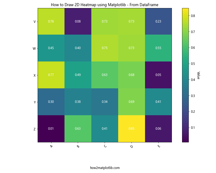
This example demonstrates how to create a heatmap from a Pandas DataFrame. We first create a sample DataFrame with random values, then use ax.imshow() to display it as a heatmap. The column and index labels from the DataFrame are used to label the axes, providing context to the data.
Creating Masked Heatmaps
Sometimes, you may want to hide certain parts of your heatmap or emphasize specific regions. This is where masked heatmaps come in handy. Let’s explore how to draw 2D heatmaps using Matplotlib with masking:
import matplotlib.pyplot as plt
import numpy as np
import numpy.ma as ma

# Generate sample data
data = np.random.rand(10, 10)

# Create a mask
mask = np.zeros_like(data)
mask[data < 0.5] = True

# Apply the mask to the data
masked_data = ma.masked_array(data, mask)

# Create the heatmap
fig, ax = plt.subplots(figsize=(10, 8))
im = ax.imshow(masked_data, cmap='viridis')

# Add colorbar
cbar = ax.figure.colorbar(im, ax=ax)
cbar.ax.set_ylabel("Value", rotation=-90, va="bottom")

ax.set_title("How to Draw 2D Heatmap using Matplotlib - Masked Heatmap")
ax.set_xlabel("X-axis")
ax.set_ylabel("Y-axis")
plt.text(5, 10.5, "how2matplotlib.com", ha='center')
plt.show()
Output:

In this example, we create a mask that hides all values below 0.5 in our dataset. The ma.masked_array() function is used to apply the mask to our data. When plotted, the masked areas will appear in a different color (typically white or transparent), allowing you to focus on specific parts of your data.
Creating Heatmaps with Unequal Bin Sizes
When learning how to draw 2D heatmaps using Matplotlib, you might encounter situations where your data doesn't fit neatly into equal-sized bins. In such cases, you can use pcolormesh() to create heatmaps with unequal bin sizes:
import matplotlib.pyplot as plt
import numpy as np

# Generate sample data with unequal bin sizes
x = np.array([0, 1, 2, 3, 4, 5, 7, 9, 12, 15])
y = np.array([0, 1, 2, 3, 4, 6, 8, 10])
z = np.random.rand(len(y)-1, len(x)-1)

# Create the heatmap
fig, ax = plt.subplots(figsize=(12, 8))
im = ax.pcolormesh(x, y, z, cmap='coolwarm', shading='auto')

# Add colorbar
cbar = ax.figure.colorbar(im, ax=ax)
cbar.ax.set_ylabel("Value", rotation=-90, va="bottom")

ax.set_title("How to Draw 2D Heatmap using Matplotlib - Unequal Bin Sizes")
ax.set_xlabel("X-axis")
ax.set_ylabel("Y-axis")
plt.text(7.5, 10.5, "how2matplotlib.com", ha='center')
plt.show()
Output:
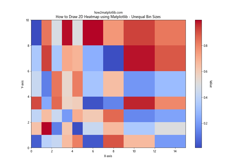
In this example, we define x and y arrays with unequal intervals. The pcolormesh() function is then used to create a heatmap where the cell sizes correspond to these intervals. This is particularly useful when dealing with data that has natural, non-uniform divisions, such as time series data with varying time intervals.
Creating Animated Heatmaps
When dealing with time-series data, you might want to create animated heatmaps to show how patterns change over time. Here's an example of how to draw 2D heatmaps using Matplotlib with animation:
import matplotlib.pyplot as plt
import numpy as np
from matplotlib.animation import FuncAnimation

# Generate sample data
def generate_data():
    return np.random.rand(10, 10)

# Set up the figure and axis
fig, ax = plt.subplots(figsize=(10, 8))
im = ax.imshow(generate_data(), cmap='viridis', animated=True)
plt.colorbar(im)

# Update function for animation
def update(frame):
    im.set_array(generate_data())
    ax.set_title(f"How to Draw 2D Heatmap using Matplotlib - Frame {frame}")
    return [im]

# Create the animation
anim = FuncAnimation(fig, update, frames=50, interval=200, blit=True)

plt.text(5, 10.5, "how2matplotlib.com", ha='center')
plt.show()
Output:
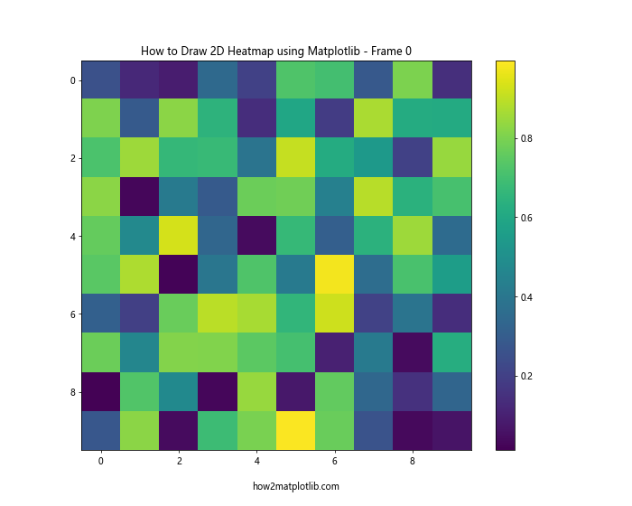
This example creates an animated heatmap that updates every 200 milliseconds. The FuncAnimation class is used to create the animation, with the update function generating new random data for each frame. This technique can be particularly useful for visualizing how heatmap patterns change over time or through different iterations of a process.
Creating Heatmaps with Custom Color Normalization
Sometimes, you may want to emphasize certain ranges of values in your heatmap. This can be achieved by using custom color normalization. Here's an example of how to draw 2D heatmaps using Matplotlib with custom normalization:
import matplotlib.pyplot as plt
import numpy as np
from matplotlib.colors import BoundaryNorm
from matplotlib.ticker import MaxNLocator

# Generate sample data
np.random.seed(42)
data = np.random.rand(20, 20) * 100

# Define the boundaries for color mapping
bounds = [0, 20, 40, 60, 80, 100]
norm = BoundaryNorm(bounds, plt.get_cmap('viridis').N)

# Create the heatmap
fig, ax = plt.subplots(figsize=(10, 8))
im = ax.imshow(data, cmap='viridis', norm=norm)

# Add colorbar
cbar = ax.figure.colorbar(im, ax=ax, extend='both', ticks=bounds)
cbar.ax.set_ylabel("Value", rotation=-90, va="bottom")

ax.set_title("How to Draw 2D Heatmap using Matplotlib - Custom Color Normalization")
ax.set_xlabel("X-axis")
ax.set_ylabel("Y-axis")
plt.text(10, 20.5, "how2matplotlib.com", ha='center')
plt.show()
Output:
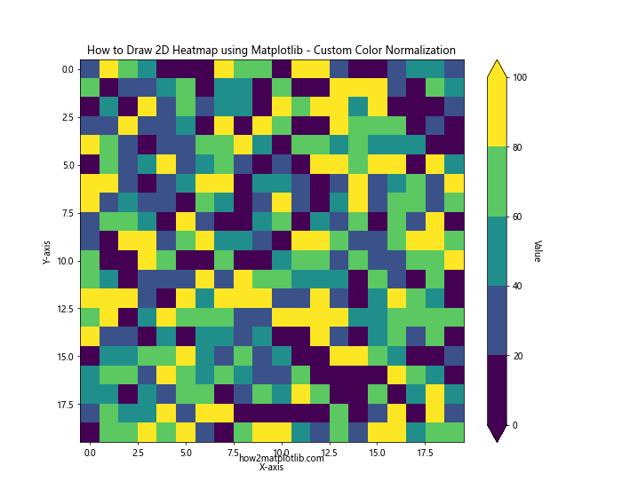
In this example, we use BoundaryNorm to define custom boundaries for our color mapping. This allows us to create distinct color bands for different ranges of values, which can be particularly useful when you want to emphasize specific thresholds or ranges in your data.
Creating Heatmaps with Discrete Colors
While continuous color scales are common for heatmaps, sometimes you might want to use discrete colors to represent different categories or ranges. Here's how to draw 2D heatmaps using Matplotlib with discrete colors:
import matplotlib.pyplot as plt
import numpy as np
from matplotlib.colors import ListedColormap, BoundaryNorm

# Generate sample data
np.random.seed(42)
data = np.random.randint(0, 5, (10, 10))

# Define discrete colors and boundaries
colors = ['#FFA07A', '#98FB98', '#87CEFA', '#DDA0DD', '#F0E68C']
cmap = ListedColormap(colors)
bounds = [0, 1, 2, 3, 4, 5]
norm = BoundaryNorm(bounds, cmap.N)

# Create the heatmap
fig, ax = plt.subplots(figsize=(10, 8))
im = ax.imshow(data, cmap=cmap, norm=norm)

# Add colorbar
cbar = ax.figure.colorbar(im, ax=ax, ticks=[0.5, 1.5, 2.5, 3.5, 4.5])
cbar.ax.set_yticklabels(['Category A', 'Category B', 'Category C', 'Category D', 'Category E'])

ax.set_title("How to Draw 2D Heatmap using Matplotlib - Discrete Colors")
ax.set_xlabel("X-axis")
ax.set_ylabel("Y-axis")
plt.text(5, 10.5, "how2matplotlib.com", ha='center')
plt.show()
Output:
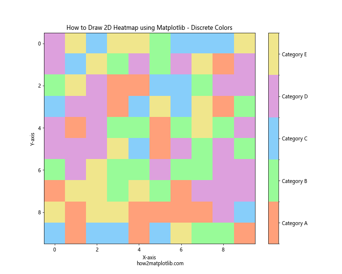
In this example, we define a custom colormap using ListedColormap with five distinct colors. We then use BoundaryNorm to map our integer data values to these colors. This approach is particularly useful when your data represents distinct categories rather than continuous values.
Creating Heatmaps with Diverging Color Scales
When your data has a natural midpoint (such as zero for temperature anomalies), using a diverging color scale can be very effective. Here's an example of how to draw 2D heatmaps using Matplotlib with a diverging color scale:
import matplotlib.pyplot as plt
import numpy as np

# Generate sample data
np.random.seed(42)
data = np.random.randn(20, 20)

# Create the heatmap with a diverging color scale
fig, ax = plt.subplots(figsize=(10, 8))
im = ax.imshow(data, cmap='RdBu_r')

# Add colorbar
cbar = ax.figure.colorbar(im, ax=ax)
cbar.ax.set_ylabel("Value", rotation=-90, va="bottom")

ax.set_title("How to Draw 2D Heatmap using Matplotlib - Diverging Color Scale")
ax.set_xlabel("X-axis")
ax.set_ylabel("Y-axis")
plt.text(10, 20.5, "how2matplotlib.com", ha='center')
plt.show()
Output:
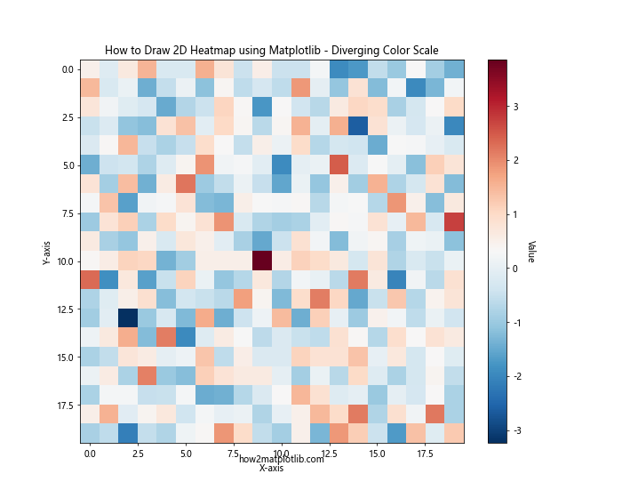
In this example, we use the 'RdBu_r' colormap, which is a reversed Red-Blue diverging colormap. This type of colormap is particularly useful for data that has both positive and negative values, with zero as the midpoint. The color scale transitions from red (negative values) through white (values near zero) to blue (positive values).
Creating Heatmaps with Multiple Subplots
When you need to compare multiple heatmaps side by side, creating a figure with multiple subplots can be very useful. Here's an example of how to draw 2D heatmaps using Matplotlib with multiple subplots:
import matplotlib.pyplot as plt
import numpy as np

# Generate sample data
np.random.seed(42)
data1 = np.random.rand(10, 10)
data2 = np.random.rand(10, 10)
data3 = np.random.rand(10, 10)
data4 = np.random.rand(10, 10)

# Create a figure with multiple subplots
fig, axs = plt.subplots(2, 2, figsize=(12, 10))
fig.suptitle("How to Draw 2D Heatmap using Matplotlib - Multiple Subplots")

# Plot heatmaps in each subplot
im1 = axs[0, 0].imshow(data1, cmap='viridis')
axs[0, 0].set_title("Heatmap 1")
fig.colorbar(im1, ax=axs[0, 0])

im2 = axs[0, 1].imshow(data2, cmap='plasma')
axs[0, 1].set_title("Heatmap 2")
fig.colorbar(im2, ax=axs[0, 1])

im3 = axs[1, 0].imshow(data3, cmap='inferno')
axs[1, 0].set_title("Heatmap 3")
fig.colorbar(im3, ax=axs[1, 0])

im4 = axs[1, 1].imshow(data4, cmap='magma')
axs[1, 1].set_title("Heatmap 4")
fig.colorbar(im4, ax=axs[1, 1])

plt.text(0, -1, "how2matplotlib.com", ha='center', transform=axs[1, 1].transAxes)
plt.tight_layout()
plt.show()
Output:
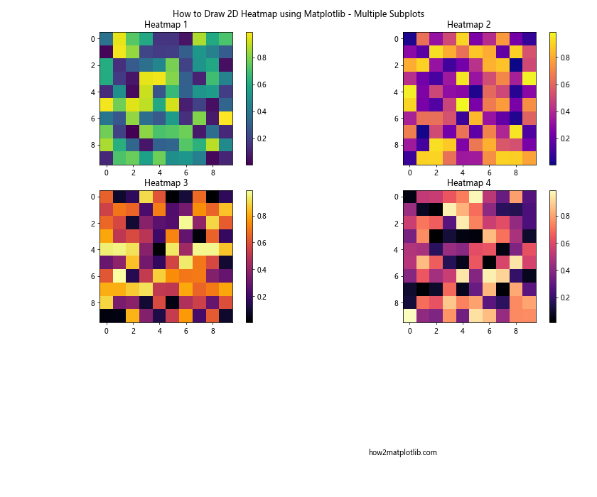
This example creates a 2x2 grid of subplots, each containing a different heatmap. We use different colormaps for each subplot to demonstrate the variety of options available. This approach is particularly useful when you want to compare different datasets or the same dataset under different conditions.
Creating Heatmaps with Hierarchical Clustering
Hierarchical clustering can be a powerful tool when combined with heatmaps, especially for visualizing relationships in high-dimensional data. Here's an example of how to draw 2D heatmaps using Matplotlib with hierarchical clustering:
import matplotlib.pyplot as plt
import numpy as np
from scipy.cluster import hierarchy
from scipy.spatial import distance

# Generate sample data
np.random.seed(42)
data = np.random.rand(20, 20)

# Perform hierarchical clustering
linkage = hierarchy.linkage(distance.pdist(data), method='average')

# Create the heatmap with dendrograms
fig, ax = plt.subplots(figsize=(12, 10))

# Plot the row dendrogram
dendro_ax = fig.add_axes([0.09, 0.1, 0.2, 0.6])
dendro = hierarchy.dendrogram(linkage, orientation='left', ax=dendro_ax)
dendro_ax.set_axis_off()

# Reorder the data based on the clustering
idx = dendro['leaves']
data = data[idx, :]
data = data[:, idx]

# Plot the heatmap
im = ax.imshow(data, aspect='auto', origin='lower', cmap='viridis')
ax.set_xticks(range(data.shape[1]))
ax.set_yticks(range(data.shape[0]))
ax.set_xticklabels(idx)
ax.set_yticklabels(idx)

# Add colorbar
cbar_ax = fig.add_axes([0.92, 0.1, 0.02, 0.6])
fig.colorbar(im, cax=cbar_ax)

ax.set_title("How to Draw 2D Heatmap using Matplotlib - With Hierarchical Clustering")
plt.text(10, -2, "how2matplotlib.com", ha='center')
plt.show()
Output:
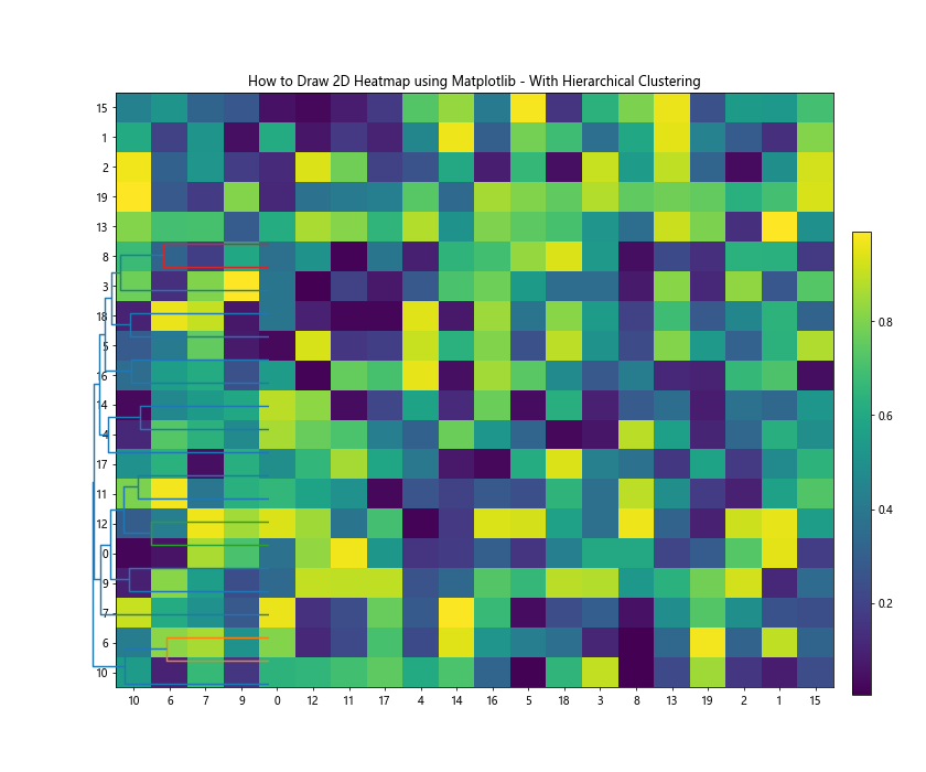
In this example, we first perform hierarchical clustering on our data using SciPy's hierarchy module. We then create a dendrogram to visualize the clustering hierarchy and reorder our data accordingly. The resulting heatmap shows the data organized by similarity, with similar rows and columns grouped together.
Conclusion
In this comprehensive guide, we've explored various techniques for how to draw 2D heatmaps using Matplotlib. We've covered everything from basic heatmaps to more advanced techniques like custom color normalization, animated heatmaps, and heatmaps with hierarchical clustering.
Heatmaps are versatile tools for data visualization, capable of representing complex datasets in an intuitive and visually appealing manner. By mastering these techniques, you'll be well-equipped to create informative and engaging heatmaps for a wide range of applications.
Remember that the key to creating effective heatmaps lies in choosing the right color scheme, normalization method, and additional features (like annotations or clustering) that best suit your data and the story you want to tell with it.