Add a Custom Border to Certain Cells in a Matplotlib / Seaborn Plot
When visualizing data, the clarity and emphasis of certain elements can significantly enhance the understanding of the data presented. In this article, we will explore how to add custom borders to specific cells in plots created using Matplotlib and Seaborn. This technique is particularly useful in heatmaps or any grid-based visualization where highlighting specific data points can provide better insight.
Introduction to Matplotlib and Seaborn
Matplotlib is a comprehensive library for creating static, animated, and interactive visualizations in Python. Seaborn is a statistical data visualization library built on top of Matplotlib and integrates closely with pandas data structures.
Both libraries offer extensive customization options for creating and displaying plots, but sometimes specific tasks like customizing cell borders in a plot require deeper manipulation of the libraries’ components.
Basic Plot Setup
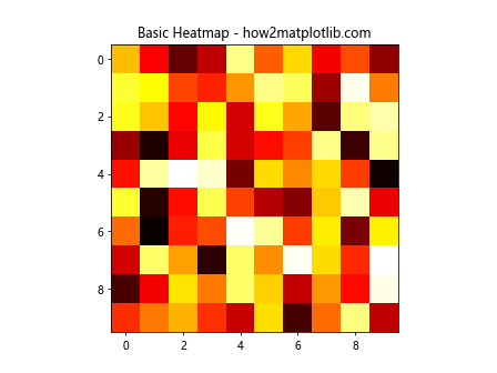
Before diving into the specifics of adding custom borders, let’s set up a basic plot. We’ll use a heatmap for our examples, as it’s a common use case for needing cell-specific emphasis.
Example 1: Creating a Basic Heatmap with Matplotlib
import matplotlib.pyplot as plt
import numpy as np

data = np.random.rand(10,10)
plt.imshow(data, cmap='hot', interpolation='nearest')
plt.title("Basic Heatmap - how2matplotlib.com")
plt.show()
Output:
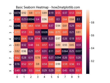
Example 2: Creating a Basic Heatmap with Seaborn
import matplotlib.pyplot as plt
import seaborn as sns
import pandas as pd
import numpy as np

data = pd.DataFrame(np.random.rand(10,10))
sns.heatmap(data, annot=True)
plt.title("Basic Seaborn Heatmap - how2matplotlib.com")
plt.show()
Output:
Adding Custom Borders to Cells
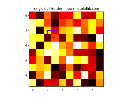
To add custom borders to specific cells, we need to overlay additional elements on the plot. We’ll use Matplotlib’s patches module, which allows us to draw shapes.
Example 3: Adding a Custom Border to a Single Cell in Matplotlib
import matplotlib.patches as patches
import matplotlib.pyplot as plt
import numpy as np
import pandas as pd

data = np.random.rand(10,10)
fig, ax = plt.subplots()
ax.imshow(data, cmap='hot', interpolation='nearest')
rect = patches.Rectangle((2,2), 1, 1, linewidth=2, edgecolor='blue', facecolor='none')
ax.add_patch(rect)
plt.title("Single Cell Border - how2matplotlib.com")
plt.show()
Output:
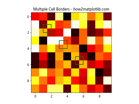
Example 4: Adding Multiple Custom Borders in Matplotlib
import matplotlib.patches as patches
import matplotlib.pyplot as plt
import numpy as np
import pandas as pd

data = np.random.rand(10,10)
fig, ax = plt.subplots()
ax.imshow(data, cmap='hot', interpolation='nearest')
coordinates = [(1,1), (3,3), (5,5)]
for (x, y) in coordinates:
    rect = patches.Rectangle((x,y), 1, 1, linewidth=2, edgecolor='green', facecolor='none')
    ax.add_patch(rect)
plt.title("Multiple Cell Borders - how2matplotlib.com")
plt.show()
Output:
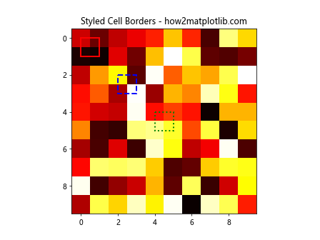
Example 5: Custom Borders with Different Styles
import matplotlib.patches as patches
import matplotlib.pyplot as plt
import numpy as np
import pandas as pd

data = np.random.rand(10,10)
fig, ax = plt.subplots()
ax.imshow(data, cmap='hot', interpolation='nearest')
styles = ['solid', 'dashed', 'dotted']
colors = ['red', 'blue', 'green']
for i, (style, color) in enumerate(zip(styles, colors)):
    rect = patches.Rectangle((i*2,i*2), 1, 1, linewidth=2, linestyle=style, edgecolor=color, facecolor='none')
    ax.add_patch(rect)
plt.title("Styled Cell Borders - how2matplotlib.com")
plt.show()
Output:
Advanced Customization
While adding borders, you might want to consider more complex scenarios like conditional borders based on data values or integrating with Seaborn’s advanced plotting functions.
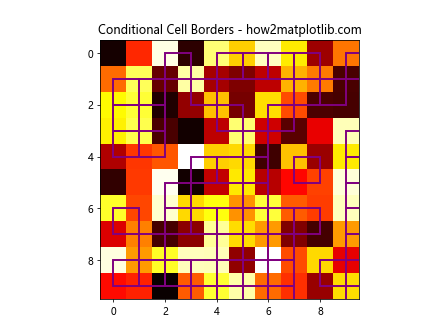
Example 6: Conditional Borders Based on Data Values
import matplotlib.patches as patches
import matplotlib.pyplot as plt
import numpy as np
import pandas as pd

data = np.random.rand(10,10)
fig, ax = plt.subplots()
heatmap = ax.imshow(data, cmap='hot', interpolation='nearest')
threshold = 0.5
for i in range(data.shape[0]):
    for j in range(data.shape[1]):
        if data[i, j] > threshold:
            rect = patches.Rectangle((j,i), 1, 1, linewidth=2, edgecolor='purple', facecolor='none')
            ax.add_patch(rect)
plt.title("Conditional Cell Borders - how2matplotlib.com")
plt.show()
Output:
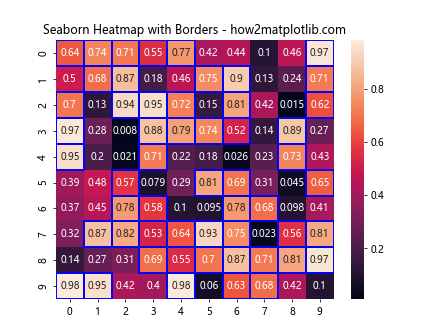
Example 7: Integrating Custom Borders in Seaborn Heatmaps
import matplotlib.patches as patches
import matplotlib.pyplot as plt
import numpy as np
import pandas as pd
import seaborn as sns

data = np.random.rand(10,10)
data_df = pd.DataFrame(data)
sns.heatmap(data_df, annot=True)
plt.title("Seaborn Heatmap with Borders - how2matplotlib.com")

for i in range(data_df.shape[0]):
    for j in range(data_df.shape[1]):
        if data_df.iloc[i, j] > 0.5:
            plt.gca().add_patch(patches.Rectangle((j, i), 1, 1, fill=False, edgecolor='blue', lw=2))
plt.show()
Output:
Conclusion
Adding custom borders to specific cells in Matplotlib and Seaborn plots can significantly enhance the visual appeal and effectiveness of your data visualizations. By using the techniques described above, you can highlight important data points, draw attention to outliers, or simply make your plots more informative and engaging.
Remember, the key to effective visualization is not just in presenting data, but in making it understandable and actionable. Customizing plots with Matplotlib and Seaborn offers endless possibilities to achieve these goals.