Matplotlib: Plot Many Lines
Matplotlib is a powerful Python library for creating interactive and static visualizations in Python. One common task in data visualization is to plot many lines on the same graph. In this article, we will explore different ways to achieve this using Matplotlib.
Basic Line Plot
Let’s start by creating a basic line plot with multiple lines. Here is an example code snippet:
import matplotlib.pyplot as plt
import numpy as np

x = np.linspace(0, 10, 100)
y1 = np.sin(x)
y2 = np.cos(x)
y3 = np.tan(x)

plt.plot(x, y1, label='Sin')
plt.plot(x, y2, label='Cos')
plt.plot(x, y3, label='Tan')
plt.legend()
plt.show()
Output:
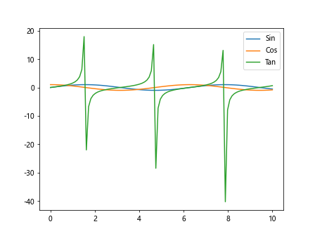
In this code snippet, we generate three arrays y1, y2, and y3 using numpy functions and plot them using the plt.plot() function. We also add labels to each line using the label parameter and display a legend using the plt.legend() function.
Plotting Multiple Lines with Different Styles
Sometimes, it is helpful to distinguish between different lines using different line styles. Here is an example code snippet:
import matplotlib.pyplot as plt
import numpy as np

x = np.linspace(0, 10, 100)
y1 = np.sin(x)
y2 = np.cos(x)
y3 = np.tan(x)

plt.plot(x, y1, linestyle='-', label='Sin')
plt.plot(x, y2, linestyle='--', label='Cos')
plt.plot(x, y3, linestyle=':', label='Tan')
plt.legend()
plt.show()
Output:
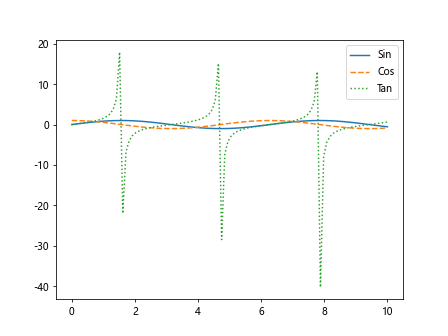
In this code snippet, we use the linestyle parameter to specify different line styles for each line. We use solid, dashed, and dotted lines for the sine, cosine, and tangent functions respectively.
Customizing Line Colors
You can also customize the line colors to make your plot visually appealing. Here is an example code snippet:
import matplotlib.pyplot as plt
import numpy as np

x = np.linspace(0, 10, 100)
y1 = np.sin(x)
y2 = np.cos(x)
y3 = np.tan(x)

plt.plot(x, y1, color='blue', label='Sin')
plt.plot(x, y2, color='red', label='Cos')
plt.plot(x, y3, color='green', label='Tan')
plt.legend()
plt.show()
Output:
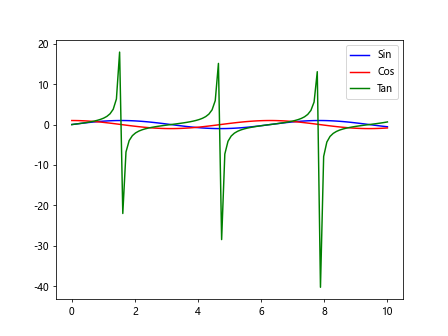
In this code snippet, we use the color parameter to specify different colors for each line. We use blue, red, and green colors for the sine, cosine, and tangent functions respectively.
Adding Marker to Lines
You can also add markers to the lines to highlight specific data points. Here is an example code snippet:
import matplotlib.pyplot as plt
import numpy as np

x = np.linspace(0, 10, 100)
y1 = np.sin(x)
y2 = np.cos(x)
y3 = np.tan(x)

plt.plot(x, y1, marker='o', label='Sin')
plt.plot(x, y2, marker='s', label='Cos')
plt.plot(x, y3, marker='^', label='Tan')
plt.legend()
plt.show()
Output:
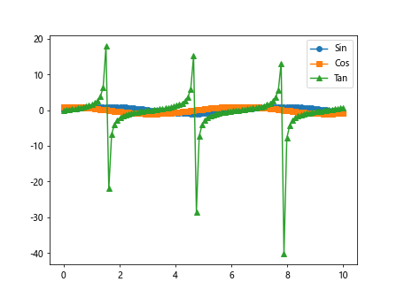
In this code snippet, we use the marker parameter to specify different markers for each line. We use circle, square, and triangle markers for the sine, cosine, and tangent functions respectively.
Plotting Lines with Different Line Widths
You can adjust the line widths to make the lines more prominent on the plot. Here is an example code snippet:
import matplotlib.pyplot as plt
import numpy as np

x = np.linspace(0, 10, 100)
y1 = np.sin(x)
y2 = np.cos(x)
y3 = np.tan(x)

plt.plot(x, y1, linewidth=2, label='Sin')
plt.plot(x, y2, linewidth=3, label='Cos')
plt.plot(x, y3, linewidth=4, label='Tan')
plt.legend()
plt.show()
Output:
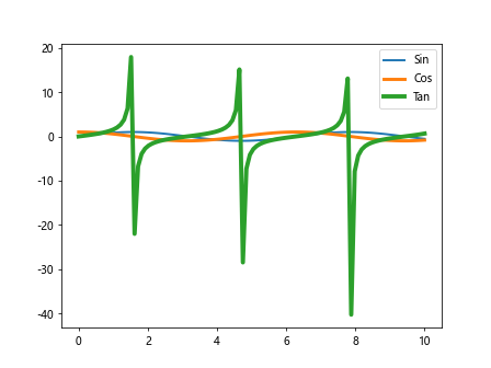
In this code snippet, we use the linewidth parameter to specify different line widths for each line. We use line widths of 2, 3, and 4 for the sine, cosine, and tangent functions respectively.
Plotting Lines with Transparency
You can also adjust the transparency of the lines to make overlapping lines more distinguishable. Here is an example code snippet:
import matplotlib.pyplot as plt
import numpy as np

x = np.linspace(0, 10, 100)
y1 = np.sin(x)
y2 = np.cos(x)
y3 = np.tan(x)

plt.plot(x, y1, alpha=0.5, label='Sin')
plt.plot(x, y2, alpha=0.7, label='Cos')
plt.plot(x, y3, alpha=0.9, label='Tan')
plt.legend()
plt.show()
Output:
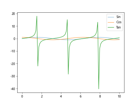
In this code snippet, we use the alpha parameter to specify different levels of transparency for each line. We use alpha values of 0.5, 0.7, and 0.9 for the sine, cosine, and tangent functions respectively.
Plotting Lines with Different Line Styles
You can use different line styles to make the lines visually distinct from each other. Here is an example code snippet:
import matplotlib.pyplot as plt
import numpy as np

x = np.linspace(0, 10, 100)
y1 = np.sin(x)
y2 = np.cos(x)
y3 = np.tan(x)

plt.plot(x, y1, linestyle='-', label='Sin')
plt.plot(x, y2, linestyle='--', label='Cos')
plt.plot(x, y3, linestyle='-.', label='Tan')
plt.legend()
plt.show()
Output:
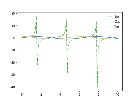
In this code snippet, we use different line styles such as solid, dashed, and dash-dot for the sine, cosine, and tangent functions respectively.
Subplots with Multiple Lines
You can also create subplots with multiple lines to compare different plots side by side. Here is an example code snippet:
import matplotlib.pyplot as plt
import numpy as np

fig, ax = plt.subplots(2, 2)

x = np.linspace(0, 10, 100)
y1 = np.sin(x)
y2 = np.cos(x)
y3 = np.tan(x)

ax[0, 0].plot(x, y1, label='Sin')
ax[0, 1].plot(x, y2, label='Cos')
ax[1, 0].plot(x, y3, label='Tan')

plt.show()
Output:
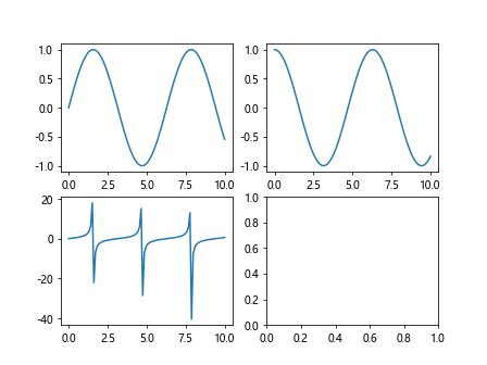
In this code snippet, we create a 2×2 grid of subplots and plot the sine, cosine, and tangent functions in different subplots.
Plotting Lines with Legends Outside the Plot
If you have many lines on the plot, it may be helpful to place the legend outside the plot to avoid clutter. Here is an example code snippet:
import matplotlib.pyplot as plt
import numpy as np

x = np.linspace(0, 10, 100)
y1 = np.sin(x)
y2 = np.cos(x)
y3 = np.tan(x)

plt.plot(x, y1, label='Sin')
plt.plot(x, y2, label='Cos')
plt.plot(x, y3, label='Tan')
plt.legend(loc='center left', bbox_to_anchor=(1, 0.5))
plt.show()
Output:
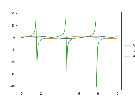
In this code snippet, we use the loc and bbox_to_anchor parameters to place the legend outside the plot on the right side.
Plotting Lines with Logarithmic Scale
Sometimes, it may be useful to plot lines on a logarithmic scale to visualize data with a wide range of values. Here is an example code snippet:
import matplotlib.pyplot as plt
import numpy as np

x = np.linspace(1, 10, 100)
y1 = np.exp(x)
y2 = np.log(x)

plt.plot(x, y1, label='Exponential')
plt.plot(x, y2, label='Logarithmic')
plt.yscale('log')
plt.legend()
plt.show()
Output:
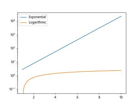
In this code snippet, we use the yscale parameter to set the y-axis to a logarithmic scale for better visualization of exponential and logarithmic functions.
Conclusion
In this article, we have explored different techniques for plotting many lines on a single graph using Matplotlib. From customizing line styles and colors to adding markers and legends, Matplotlib provides a wide range of options for creating visually appealing plots with multiple lines. Experiment with the examples provided in this article to create your own beautiful and informative plots with Matplotlib.