Adding Extra Axis Ticks Using Matplotlib
Matplotlib is a powerful plotting library in Python that is used extensively in data visualization. One of the common tasks in creating charts is customizing the appearance of axis ticks to improve the readability or to highlight specific data points. In this article, we will explore how to add extra axis ticks using Matplotlib, providing detailed examples to illustrate different techniques and scenarios.
Introduction to Matplotlib
Matplotlib is a comprehensive library for creating static, animated, and interactive visualizations in Python. It offers an object-oriented API for embedding plots into applications using general-purpose GUI toolkits like Tkinter, wxPython, Qt, or GTK. Before diving into the specifics of adding extra axis ticks, it’s essential to understand some basic concepts of Matplotlib.
Basic Plotting
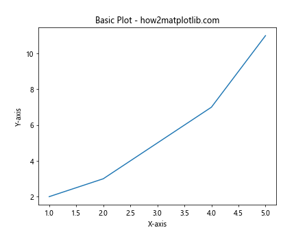
Here is a simple example of how to create a basic line plot in Matplotlib:
import matplotlib.pyplot as plt

x = [1, 2, 3, 4, 5]
y = [2, 3, 5, 7, 11]
plt.plot(x, y)
plt.title("Basic Plot - how2matplotlib.com")
plt.xlabel("X-axis")
plt.ylabel("Y-axis")
plt.show()
Output:
Adding Extra Ticks on Axes
Sometimes, you might want to add extra ticks on the axes for specific data points or to enhance the granularity of the information displayed. Matplotlib provides several ways to customize ticks, including setting their locations and formatting their labels.
Adding Extra Ticks on the X-axis
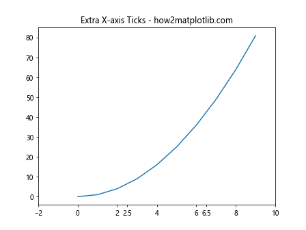
Here is how you can add extra ticks on the x-axis:
import matplotlib.pyplot as plt

x = range(10)
y = [xi**2 for xi in x]
plt.plot(x, y)
plt.xticks(list(plt.xticks()[0]) + [2.5, 6.5], labels=list(plt.xticks()[1]) + ['2.5', '6.5'])
plt.title("Extra X-axis Ticks - how2matplotlib.com")
plt.show()
Output:
Adding Extra Ticks on the Y-axis
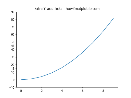
Similarly, extra ticks can be added on the y-axis:
import matplotlib.pyplot as plt

x = range(10)
y = [xi**2 for xi in x]
plt.plot(x, y)
plt.yticks(list(plt.yticks()[0]) + [15, 45], labels=list(plt.yticks()[1]) + ['15', '45'])
plt.title("Extra Y-axis Ticks - how2matplotlib.com")
plt.show()
Output:
Customizing Tick Labels
Beyond just adding ticks, you might want to customize their labels for better clarity or presentation.
Formatting Tick Labels
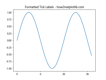
Here’s how to format tick labels:
import matplotlib.pyplot as plt
import numpy as np

x = np.linspace(0, 10, 100)
y = np.sin(x)
plt.plot(x, y)
plt.xticks([0, np.pi, 2*np.pi, 3*np.pi], ['0', 'π', '2π', '3π'])
plt.title("Formatted Tick Labels - how2matplotlib.com")
plt.show()
Output:
Rotating Tick Labels
Rotating tick labels can help in cases where labels overlap or are too long:
import matplotlib.pyplot as plt

x = range(10)
y = [xi**2 for xi in x]
plt.plot(x, y)
plt.xticks(rotation=45)
plt.title("Rotated Tick Labels - how2matplotlib.com")
plt.show()
Output:

Advanced Tick Customization
Matplotlib also allows for more advanced customization of ticks, such as using different scales or transforming ticks.
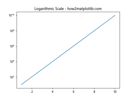
Logarithmic Scale
Applying a logarithmic scale to the y-axis:
import matplotlib.pyplot as plt

x = range(1, 11)
y = [10**xi for xi in x]
plt.plot(x, y)
plt.yscale('log')
plt.title("Logarithmic Scale - how2matplotlib.com")
plt.show()
Output:
Custom Tick Formatter
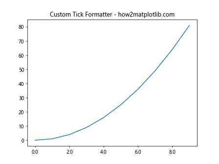
Using a custom formatter for tick labels:
import matplotlib.pyplot as plt
import matplotlib.ticker as ticker

x = range(10)
y = [xi**2 for xi in x]
plt.plot(x, y)
plt.gca().xaxis.set_major_formatter(ticker.FormatStrFormatter('%0.1f'))
plt.title("Custom Tick Formatter - how2matplotlib.com")
plt.show()
Output:
Conclusion
In this article, we explored various ways to add and customize extra axis ticks in Matplotlib. By adjusting tick locations, formatting their labels, and applying different scales, you can enhance the readability and presentation of your plots. These techniques are essential for creating effective visualizations that communicate data clearly and effectively.
Remember, the examples provided here are standalone and can be run directly in any Python environment with Matplotlib installed. They are designed to be as practical as possible, helping you to apply these techniques in your own data visualization tasks.