Adding Extra Contour Lines Using Matplotlib 2D Contour Plotting
Matplotlib is a powerful plotting library in Python that is used extensively in data visualization. One of the key features of Matplotlib is its ability to create contour plots. Contour plots are useful for visualizing three-dimensional data in two dimensions using contour lines. In this article, we will explore how to enhance contour plots by adding extra contour lines, which can help in highlighting specific features of the data.
Introduction to Contour Plots
A contour plot is a graphical technique which portrays a 3-dimensional surface on a 2-dimensional format. It does this by drawing lines that connect points of equal value. This is particularly useful in fields like meteorology, geography, or any field dealing with geographical data.
Basic Contour Plot
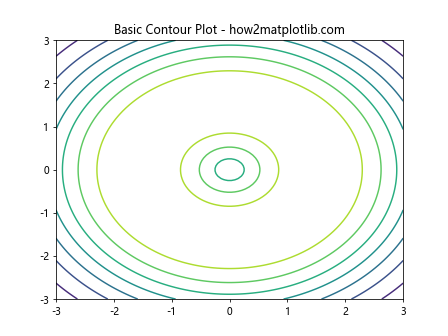
Before we dive into adding extra contour lines, let’s start with a basic contour plot. Here’s how you can create a simple contour plot using Matplotlib:
import matplotlib.pyplot as plt
import numpy as np

# Create data
x = np.linspace(-3.0, 3.0, 100)
y = np.linspace(-3.0, 3.0, 100)
X, Y = np.meshgrid(x, y)
Z = np.sin(np.sqrt(X**2 + Y**2))

# Create a contour plot
plt.figure()
cp = plt.contour(X, Y, Z)
plt.title('Basic Contour Plot - how2matplotlib.com')
plt.show()
Output:
Adding Extra Contour Lines
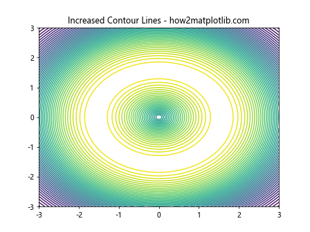
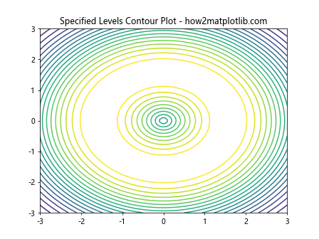
To add extra contour lines, you can simply adjust the number of levels in the contour plot or specify the levels manually.
Example 1: Increasing the Number of Contour Lines
import matplotlib.pyplot as plt
import numpy as np

# Create data
x = np.linspace(-3.0, 3.0, 100)
y = np.linspace(-3.0, 3.0, 100)
X, Y = np.meshgrid(x, y)
Z = np.sin(np.sqrt(X**2 + Y**2))

plt.figure()
cp = plt.contour(X, Y, Z, 50)  # Increase the number of levels
plt.title('Increased Contour Lines - how2matplotlib.com')
plt.show()
Output:
Example 2: Specifying Contour Levels Manually
import matplotlib.pyplot as plt
import numpy as np

# Create data
x = np.linspace(-3.0, 3.0, 100)
y = np.linspace(-3.0, 3.0, 100)
X, Y = np.meshgrid(x, y)
Z = np.sin(np.sqrt(X**2 + Y**2))

levels = np.arange(-1, 1, 0.1)
plt.figure()
cp = plt.contour(X, Y, Z, levels)
plt.title('Specified Levels Contour Plot - how2matplotlib.com')
plt.show()
Output:
Highlighting Specific Contour Lines
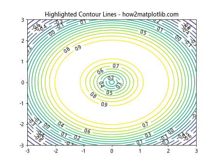
Sometimes, you might want to highlight specific contour lines to emphasize particular values.
Example 3: Highlighting Contour Lines
import matplotlib.pyplot as plt
import numpy as np

# Create data
x = np.linspace(-3.0, 3.0, 100)
y = np.linspace(-3.0, 3.0, 100)
X, Y = np.meshgrid(x, y)
Z = np.sin(np.sqrt(X**2 + Y**2))

levels = np.arange(-1, 1, 0.1)
plt.figure()
cp = plt.contour(X, Y, Z, levels)
plt.clabel(cp, inline=True, fontsize=10, colors='black')
plt.title('Highlighted Contour Lines - how2matplotlib.com')
plt.show()
Output:
Using Different Colormaps
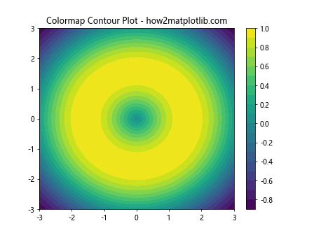
Changing the colormap of the contour plot can significantly change the visual output and highlight different data features.
Example 4: Applying a Colormap
import matplotlib.pyplot as plt
import numpy as np

# Create data
x = np.linspace(-3.0, 3.0, 100)
y = np.linspace(-3.0, 3.0, 100)
X, Y = np.meshgrid(x, y)
Z = np.sin(np.sqrt(X**2 + Y**2))

levels = np.arange(-1, 1, 0.1)
plt.figure()
cp = plt.contourf(X, Y, Z, 20, cmap='viridis')
plt.title('Colormap Contour Plot - how2matplotlib.com')
plt.colorbar()
plt.show()
Output:
Adding Color Bar
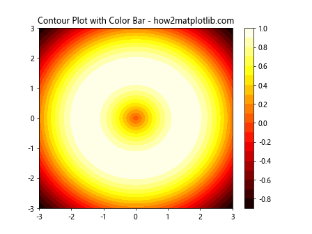
A color bar can be added to a contour plot to indicate the color scale.
Example 5: Adding a Color Bar
import matplotlib.pyplot as plt
import numpy as np

# Create data
x = np.linspace(-3.0, 3.0, 100)
y = np.linspace(-3.0, 3.0, 100)
X, Y = np.meshgrid(x, y)
Z = np.sin(np.sqrt(X**2 + Y**2))

levels = np.arange(-1, 1, 0.1)
plt.figure()
cp = plt.contourf(X, Y, Z, 20, cmap='hot')
plt.colorbar()
plt.title('Contour Plot with Color Bar - how2matplotlib.com')
plt.show()
Output:
Combining Contour and Quiver Plots
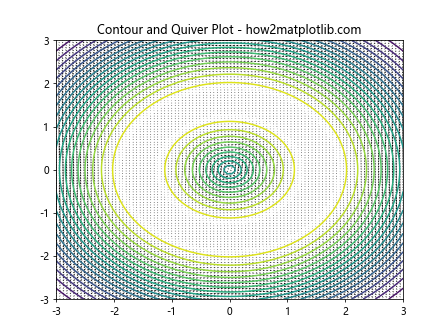
Combining different types of plots can be useful for detailed data analysis. Here’s how you can combine a contour plot with a quiver plot.
Example 6: Contour Plot with Quiver
import matplotlib.pyplot as plt
import numpy as np

# Create data
x = np.linspace(-3.0, 3.0, 100)
y = np.linspace(-3.0, 3.0, 100)
X, Y = np.meshgrid(x, y)
Z = np.sin(np.sqrt(X**2 + Y**2))

levels = np.arange(-1, 1, 0.1)
U, V = np.gradient(Z)
plt.figure()
plt.contour(X, Y, Z, 20)
plt.quiver(X, Y, U, V)
plt.title('Contour and Quiver Plot - how2matplotlib.com')
plt.show()
Output:
Advanced Contour Techniques
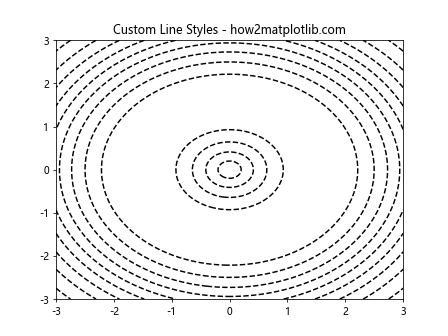
Example 7: Customizing Line Styles
import matplotlib.pyplot as plt
import numpy as np

# Create data
x = np.linspace(-3.0, 3.0, 100)
y = np.linspace(-3.0, 3.0, 100)
X, Y = np.meshgrid(x, y)
Z = np.sin(np.sqrt(X**2 + Y**2))
levels = np.arange(-1, 1, 0.1)

plt.figure()
cp = plt.contour(X, Y, Z, 10, colors='black', linestyles='dashed')
plt.title('Custom Line Styles - how2matplotlib.com')
plt.show()
Output:
Conclusion
In this article, we explored various techniques to enhance 2D contour plots using Matplotlib. By adjusting the number of contour lines, specifying levels manually, applying different colormaps, and combining contour plots with other plot types, you can create powerful visual representations of 3D data. These techniques are invaluable for data analysis and visualization in many scientific and engineering fields.