Adding a Scatter of Points to a Boxplot Using Matplotlib
In this article, we will explore how to enhance boxplots by adding a scatter of points using Matplotlib, a powerful plotting library in Python. This technique is particularly useful for visualizing the distribution of data along with individual data points, which can provide deeper insights into the dataset. We will cover various aspects of creating and customizing boxplots and scatter plots, and how to combine them effectively.
Introduction to Boxplots and Scatter Plots
A boxplot is a standardized way of displaying the distribution of data based on a five-number summary: minimum, first quartile (Q1), median, third quartile (Q3), and maximum. It can tell you about your outliers and what their values are. It can also tell you if your data is symmetrical, how tightly your data is grouped, and if and how your data is skewed.
Scatter plots, on the other hand, show all individual data points on the plot. This can be useful to identify patterns, clusters, or outliers that might not be visible in boxplots alone.
Combining these two plots can provide a comprehensive view of the data, showing both the overall distribution and the raw data points.
Basic Boxplot
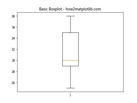
Let’s start by creating a basic boxplot. We will use Matplotlib’s boxplot function.
Example 1: Basic Boxplot
import matplotlib.pyplot as plt

# Sample data
data = [25, 28, 29, 29, 30, 34, 35, 37, 38]

fig, ax = plt.subplots()
ax.boxplot(data)
ax.set_title('Basic Boxplot - how2matplotlib.com')
plt.show()
Output:
Adding a Scatter to a Boxplot
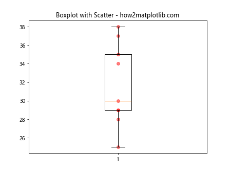
To add a scatter of points to a boxplot, we can use the scatter function from Matplotlib. This involves plotting the same data points over the boxplot.
Example 2: Adding Scatter to Boxplot
import matplotlib.pyplot as plt

# Sample data
data = [25, 28, 29, 29, 30, 34, 35, 37, 38]

fig, ax = plt.subplots()
ax.boxplot(data)
ax.scatter([1]*len(data), data, color='red', alpha=0.5)
ax.set_title('Boxplot with Scatter - how2matplotlib.com')
plt.show()
Output:
Customizing Scatter Points
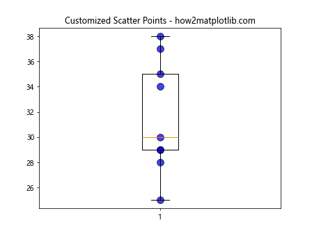
You can customize the appearance of the scatter points by changing their color, size, and transparency. This helps in distinguishing the scatter points from the boxplot more clearly.
Example 3: Customized Scatter Points
import matplotlib.pyplot as plt

# Sample data
data = [25, 28, 29, 29, 30, 34, 35, 37, 38]

fig, ax = plt.subplots()
ax.boxplot(data)
ax.scatter([1]*len(data), data, color='blue', s=100, edgecolor='black', alpha=0.75)
ax.set_title('Customized Scatter Points - how2matplotlib.com')
plt.show()
Output:
Multiple Groups with Scatters
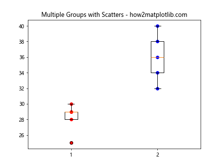
When dealing with multiple groups of data, you can plot each group as a separate boxplot and scatter plot on the same chart.
Example 4: Multiple Groups
import matplotlib.pyplot as plt

# Sample data
data1 = [25, 28, 29, 29, 30]
data2 = [32, 34, 36, 38, 40]

fig, ax = plt.subplots()
ax.boxplot([data1, data2], positions=[1, 2])
ax.scatter([1]*len(data1), data1, color='red')
ax.scatter([2]*len(data2), data2, color='blue')
ax.set_title('Multiple Groups with Scatters - how2matplotlib.com')
plt.show()
Output:
Handling Outliers
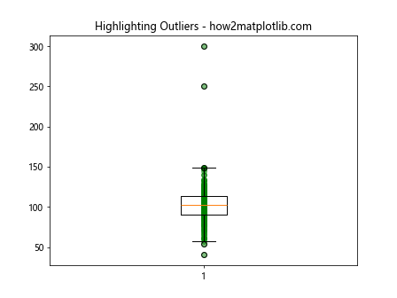
In boxplots, outliers are typically plotted as individual points anyway, but adding a scatter plot gives you more control over their appearance.
Example 5: Highlighting Outliers
import matplotlib.pyplot as plt
import numpy as np

# Generating random data with outliers
np.random.seed(10)
data = np.random.normal(100, 20, 200)
data = np.append(data, [250, 300])  # Adding outliers

fig, ax = plt.subplots()
ax.boxplot(data)
ax.scatter([1]*len(data), data, color='green', alpha=0.5)
ax.set_title('Highlighting Outliers - how2matplotlib.com')
plt.show()
Output:
Advanced Customization
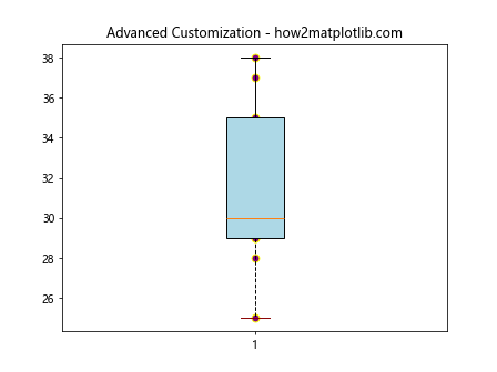
You can further customize your plots by adding labels, changing the style of the boxplot, and adjusting the layout to better suit your data visualization needs.
Example 6: Advanced Customization
import matplotlib.pyplot as plt

# Sample data
data = [25, 28, 29, 29, 30, 34, 35, 37, 38]

fig, ax = plt.subplots()
box = ax.boxplot(data, patch_artist=True)
ax.scatter([1]*len(data), data, color='purple', s=50, edgecolor='yellow')

# Customizing boxplot
box['boxes'][0].set_facecolor('lightblue')
box['caps'][0].set_color('darkred')
box['whiskers'][0].set_linestyle('--')

ax.set_title('Advanced Customization - how2matplotlib.com')
plt.show()
Output:
Conclusion
Adding a scatter of points to a boxplot in Matplotlib is a straightforward process that can greatly enhance the informativeness of your plots. By following the examples provided, you can customize your plots to suit a wide range of data visualization needs. Whether you’re dealing with a simple dataset or multiple groups, the combination of boxplots and scatter plots provides a robust tool for data analysis and presentation.