Adding a Line to a Scatter Plot Using Python’s Matplotlib
Creating visualizations is a crucial part of data analysis and presentation in many fields. Python, with its rich ecosystem of libraries, offers powerful tools for data visualization, one of which is Matplotlib. This article will focus on how to enhance scatter plots by adding lines, using Matplotlib. This can be useful for showing trends, making predictions, or highlighting relationships in data.
Introduction to Matplotlib
Matplotlib is a comprehensive library for creating static, animated, and interactive visualizations in Python. It is highly customizable and works well with many operating systems and graphics backends. Matplotlib is particularly well-suited for generating figures for scientific publications because of its high-quality output in formats like PDF, SVG, JPG, PNG, BMP, and GIF.
Basics of Scatter Plots
A scatter plot is a type of data visualization that uses dots to represent the values obtained for two different variables – one plotted along the x-axis and the other plotted along the y-axis. Scatter plots are used to observe relationships between variables.
Adding a Line to a Scatter Plot
Adding a line to a scatter plot can help in understanding trends, making predictions, or simply highlighting parts of the data. In Matplotlib, this can be done by using the plot function in conjunction with the scatter function.
Example 1: Basic Scatter Plot
import matplotlib.pyplot as plt

x = [1, 2, 3, 4, 5]
y = [2, 3, 5, 7, 11]

plt.scatter(x, y)
plt.title("Basic Scatter Plot - how2matplotlib.com")
plt.xlabel("X-axis")
plt.ylabel("Y-axis")
plt.show()
Output:
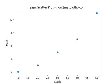
Example 2: Adding a Simple Line
import matplotlib.pyplot as plt

x = [1, 2, 3, 4, 5]
y = [2, 3, 5, 7, 11]
line_x = [1, 5]
line_y = [2, 11]

plt.scatter(x, y)
plt.plot(line_x, line_y, label='Line', color='red')  # Adding a line
plt.title("Scatter Plot with a Line - how2matplotlib.com")
plt.xlabel("X-axis")
plt.ylabel("Y-axis")
plt.legend()
plt.show()
Output:
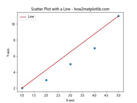
Example 3: Line of Best Fit
import matplotlib.pyplot as plt
import numpy as np

x = np.random.rand(50)
y = 2 * x + np.random.normal(0, 0.1, 50)

plt.scatter(x, y)
m, b = np.polyfit(x, y, 1)
plt.plot(x, m*x + b, color='red')  # Line of best fit
plt.title("Scatter Plot with Line of Best Fit - how2matplotlib.com")
plt.xlabel("X-axis")
plt.ylabel("Y-axis")
plt.show()
Output:
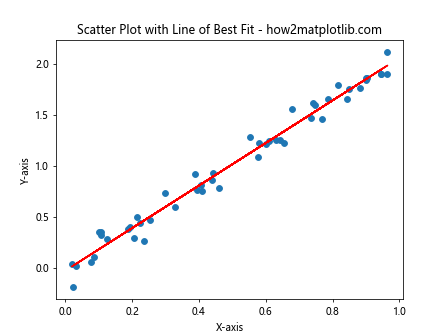
Example 4: Multiple Lines
import matplotlib.pyplot as plt

x = [1, 2, 3, 4, 5]
y = [2, 3, 5, 7, 11]
plt.scatter(x, y)

# Adding multiple lines
plt.plot([1, 5], [2, 11], label='Line 1', color='red')
plt.plot([1, 5], [11, 2], label='Line 2', color='green')

plt.title("Scatter Plot with Multiple Lines - how2matplotlib.com")
plt.xlabel("X-axis")
plt.ylabel("Y-axis")
plt.legend()
plt.show()
Output:
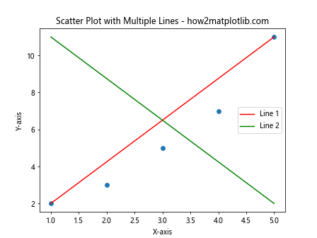
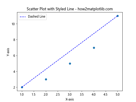
Example 5: Styling Lines
import matplotlib.pyplot as plt

x = [1, 2, 3, 4, 5]
y = [2, 3, 5, 7, 11]
plt.scatter(x, y)

# Adding a styled line
plt.plot([1, 5], [2, 11], label='Dashed Line', color='blue', linestyle='--')

plt.title("Scatter Plot with Styled Line - how2matplotlib.com")
plt.xlabel("X-axis")
plt.ylabel("Y-axis")
plt.legend()
plt.show()
Output:
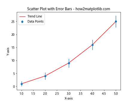
Example 6: Error Bars
import matplotlib.pyplot as plt
import numpy as np

x = np.arange(1, 6)
y = np.power(x, 2)  # y = x^2
errors = np.sqrt(x)  # Error increases with x

plt.errorbar(x, y, yerr=errors, fmt='o', label='Data Points')
plt.plot(x, y, label='Trend Line', color='red')

plt.title("Scatter Plot with Error Bars - how2matplotlib.com")
plt.xlabel("X-axis")
plt.ylabel("Y-axis")
plt.legend()
plt.show()
Output:
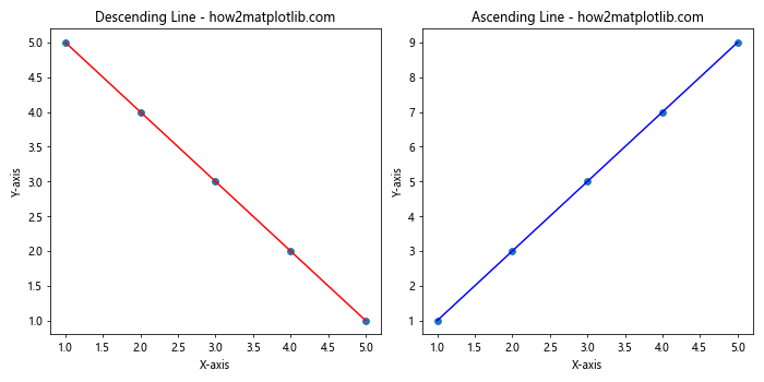
Example 7: Using Subplots
import matplotlib.pyplot as plt

# Data
x = [1, 2, 3, 4, 5]
y = [5, 4, 3, 2, 1]
z = [1, 3, 5, 7, 9]

fig, (ax1, ax2) = plt.subplots(1, 2, figsize=(10, 5))

# First subplot
ax1.scatter(x, y)
ax1.plot([1, 5], [5, 1], color='red')
ax1.set_title("Descending Line - how2matplotlib.com")
ax1.set_xlabel("X-axis")
ax1.set_ylabel("Y-axis")

# Second subplot
ax2.scatter(x, z)
ax2.plot([1, 5], [1, 9], color='blue')
ax2.set_title("Ascending Line - how2matplotlib.com")
ax2.set_xlabel("X-axis")
ax2.set_ylabel("Y-axis")

plt.tight_layout()
plt.show()
Output:
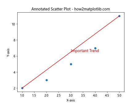
Example 8: Annotating Lines
import matplotlib.pyplot as plt

x = [1, 2, 3, 4, 5]
y = [2, 3, 5, 7, 11]
plt.scatter(x, y)
plt.plot([1, 5], [2, 11], color='red')

plt.text(3, 6.5, "Important Trend", fontsize=12, color='red')
plt.title("Annotated Scatter Plot - how2matplotlib.com")
plt.xlabel("X-axis")
plt.ylabel("Y-axis")
plt.show()
Output:
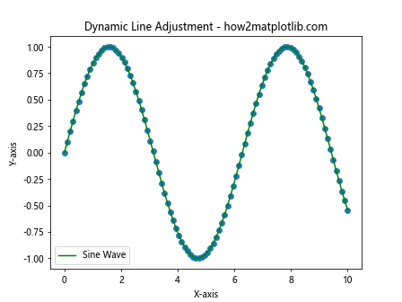
Example 9: Dynamic Line Adjustment
import matplotlib.pyplot as plt
import numpy as np

x = np.linspace(0, 10, 100)
y = np.sin(x)
plt.scatter(x, y)
plt.plot(x, np.sin(x), label='Sine Wave', color='green')

plt.title("Dynamic Line Adjustment - how2matplotlib.com")
plt.xlabel("X-axis")
plt.ylabel("Y-axis")
plt.legend()
plt.show()
Output:
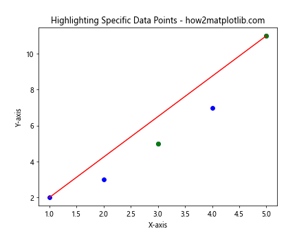
Example 10: Highlighting Specific Data Points
import matplotlib.pyplot as plt

x = [1, 2, 3, 4, 5]
y = [2, 3, 5, 7, 11]
highlight = [False, False, True, False, True]

plt.scatter(x, y, color='blue')
plt.plot([1, 5], [2, 11], color='red')

# Highlight specific points
for i, (xi, yi, hl) in enumerate(zip(x, y, highlight)):
    if hl:
        plt.scatter([xi], [yi], color='green')

plt.title("Highlighting Specific Data Points - how2matplotlib.com")
plt.xlabel("X-axis")
plt.ylabel("Y-axis")
plt.show()
Output:
Conclusion
In this article, we explored various ways to add lines to scatter plots using Matplotlib. This included simple lines, lines of best fit, multiple lines, styled lines, and dynamically adjusted lines. Each example provided a complete, standalone code snippet that can be run independently to reproduce the described visualization. Adding lines to scatter plots can significantly enhance the interpretability of the data, helping to draw attention to trends, relationships, or specific data points. Whether for exploratory data analysis, data presentation, or scientific publications, these techniques are invaluable tools in the data scientist’s toolkit.