Adding a Legend to a Matplotlib Boxplot with Multiple Plots on the Same Axis
Creating visualizations with Matplotlib in Python is a common practice for data analysis and presentation. One of the challenges often faced is managing multiple plots on the same axis and distinguishing between them effectively. This article focuses on adding legends to boxplots when multiple plots share the same axis, enhancing readability and providing context to the visualized data.
Introduction to Boxplots in Matplotlib
Boxplots are a standard way of displaying data distribution with their quartiles and outliers. They summarize data from a five-number summary: the minimum, first quartile (Q1), median (second quartile, Q2), third quartile (Q3), and the maximum. These plots are especially useful for comparing distributions between several groups or datasets.
Basic Boxplot
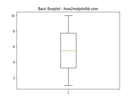
Before diving into multiple boxplots and legends, let’s start with a basic single boxplot.
import matplotlib.pyplot as plt

data = [1, 2, 3, 4, 5, 6, 7, 8, 9, 10]
plt.boxplot(data)
plt.title("Basic Boxplot - how2matplotlib.com")
plt.show()
Output:
Adding Multiple Boxplots
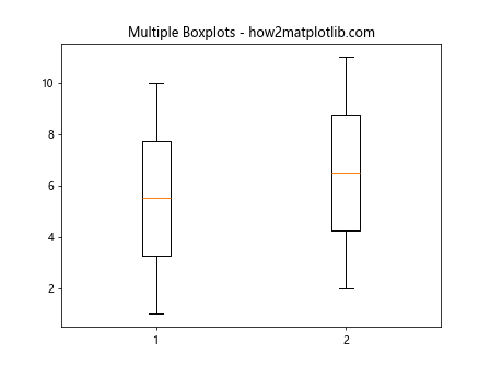
When dealing with multiple datasets, it’s common to plot them side-by-side for comparison.
Multiple Boxplots Example
import matplotlib.pyplot as plt

data1 = [1, 2, 3, 4, 5, 6, 7, 8, 9, 10]
data2 = [2, 3, 4, 5, 6, 7, 8, 9, 10, 11]
plt.boxplot([data1, data2])
plt.title("Multiple Boxplots - how2matplotlib.com")
plt.show()
Output:
Adding a Legend to Boxplots
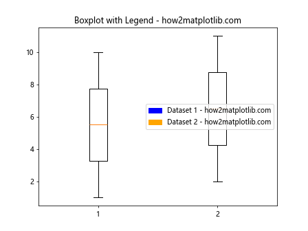
Adding a legend to boxplots involves using labels and calling the legend() function. However, since boxplots do not directly support labels as plot lines do, we need to create custom legend handles.
Basic Legend on Boxplots
import matplotlib.pyplot as plt
import matplotlib.patches as mpatches

data1 = [1, 2, 3, 4, 5, 6, 7, 8, 9, 10]
data2 = [2, 3, 4, 5, 6, 7, 8, 9, 10, 11]
plt.boxplot([data1, data2])

# Creating legend
legend_handle1 = mpatches.Patch(color='blue', label='Dataset 1 - how2matplotlib.com')
legend_handle2 = mpatches.Patch(color='orange', label='Dataset 2 - how2matplotlib.com')
plt.legend(handles=[legend_handle1, legend_handle2])

plt.title("Boxplot with Legend - how2matplotlib.com")
plt.show()
Output:
Customizing Legend Appearance
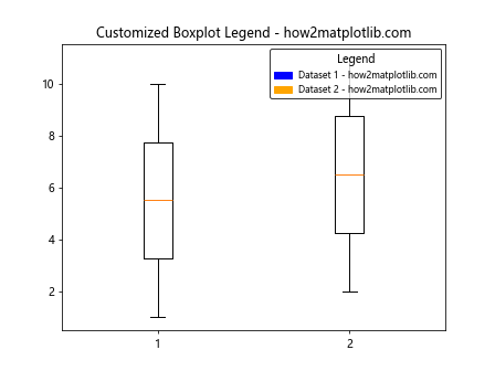
Legends can be customized in various ways, such as changing the location, font size, and border.
Customized Legend Example
import matplotlib.pyplot as plt
import matplotlib.patches as mpatches

data1 = [1, 2, 3, 4, 5, 6, 7, 8, 9, 10]
data2 = [2, 3, 4, 5, 6, 7, 8, 9, 10, 11]
plt.boxplot([data1, data2])

# Customizing legend
legend_handle1 = mpatches.Patch(color='blue', label='Dataset 1 - how2matplotlib.com')
legend_handle2 = mpatches.Patch(color='orange', label='Dataset 2 - how2matplotlib.com')
plt.legend(handles=[legend_handle1, legend_handle2], loc='upper right', title='Legend', fontsize='small', title_fontsize='medium', edgecolor='black')

plt.title("Customized Boxplot Legend - how2matplotlib.com")
plt.show()
Output:
Advanced Topics
Handling Outliers
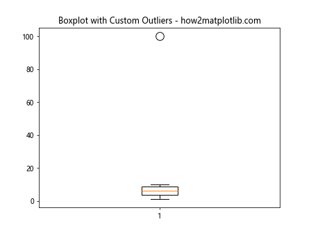
Outliers can significantly affect the appearance and interpretation of boxplots. Customizing the representation of outliers is crucial for clear data presentation.
Outlier Customization Example
import matplotlib.pyplot as plt

data = [1, 2, 3, 4, 5, 6, 7, 8, 9, 10, 100]  # Notice the outlier
plt.boxplot(data, flierprops=dict(marker='o', color='red', markersize=12))
plt.title("Boxplot with Custom Outliers - how2matplotlib.com")
plt.show()
Output:
Combining Boxplots with Other Plots
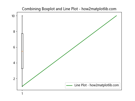
Combining boxplots with other types of plots can provide deeper insights into the data.
Combination with Line Plot Example
import matplotlib.pyplot as plt

data = [1, 2, 3, 4, 5, 6, 7, 8, 9, 10]
plt.boxplot(data)
plt.plot(range(1, 11), data, label='Line Plot - how2matplotlib.com', color='green')
plt.legend()
plt.title("Combining Boxplot and Line Plot - how2matplotlib.com")
plt.show()
Output:
Conclusion
Adding legends to boxplots in Matplotlib enhances the clarity and effectiveness of data visualizations, especially when dealing with multiple datasets. By following the examples provided, you can effectively implement legends in your boxplots, customize their appearance, and combine different types of plots for comprehensive data analysis.