How to Create a Stacked Percentage Bar Plot in Matplotlib
Stacked Percentage Bar Plot In MatPlotLib is a powerful visualization technique that allows you to represent data as percentages in a stacked bar format. This type of plot is particularly useful when you want to show the relative proportions of different categories within a whole. In this comprehensive guide, we’ll explore how to create Stacked Percentage Bar Plot In MatPlotLib, covering various aspects and providing numerous examples to help you master this visualization technique.
Understanding Stacked Percentage Bar Plot In MatPlotLib
Before we dive into the details of creating a Stacked Percentage Bar Plot In MatPlotLib, let’s first understand what it is and why it’s useful. A Stacked Percentage Bar Plot In MatPlotLib is a variation of a stacked bar chart where each bar represents 100%, and the segments within the bar show the relative percentages of different categories. This type of plot is excellent for comparing the composition of different groups or showing how proportions change over time.
Here’s a simple example to illustrate the concept of a Stacked Percentage Bar Plot In MatPlotLib:
import matplotlib.pyplot as plt
import numpy as np

categories = ['Category A', 'Category B', 'Category C']
group1 = [30, 40, 30]
group2 = [20, 50, 30]

fig, ax = plt.subplots(figsize=(10, 6))

ax.bar(categories, group1, label='Group 1', color='skyblue')
ax.bar(categories, group2, bottom=group1, label='Group 2', color='lightgreen')

ax.set_ylabel('Percentage')
ax.set_title('Stacked Percentage Bar Plot In MatPlotLib - how2matplotlib.com')
ax.legend()

plt.tight_layout()
plt.show()
Output:
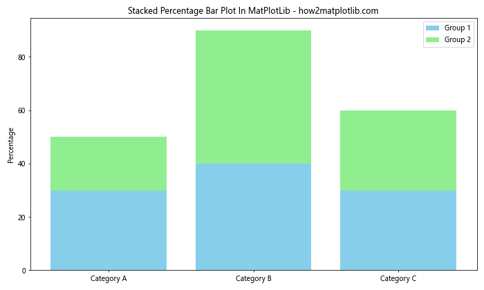
In this example, we’ve created a simple stacked bar plot with two groups. However, it’s not yet a percentage plot. To convert this into a Stacked Percentage Bar Plot In MatPlotLib, we need to normalize the data so that each bar represents 100%.
Creating a Basic Stacked Percentage Bar Plot In MatPlotLib
Now, let’s create a basic Stacked Percentage Bar Plot In MatPlotLib by normalizing our data:
import matplotlib.pyplot as plt
import numpy as np

categories = ['Category A', 'Category B', 'Category C']
group1 = [30, 40, 30]
group2 = [20, 50, 30]

total = np.array(group1) + np.array(group2)
group1_percentage = np.array(group1) / total * 100
group2_percentage = np.array(group2) / total * 100

fig, ax = plt.subplots(figsize=(10, 6))

ax.bar(categories, group1_percentage, label='Group 1', color='skyblue')
ax.bar(categories, group2_percentage, bottom=group1_percentage, label='Group 2', color='lightgreen')

ax.set_ylabel('Percentage')
ax.set_title('Stacked Percentage Bar Plot In MatPlotLib - how2matplotlib.com')
ax.legend()

plt.tight_layout()
plt.show()
Output:
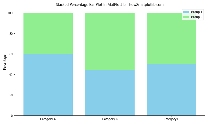
In this example, we’ve normalized the data by calculating the percentages for each group. The bottom parameter in the second ax.bar() call ensures that the bars are stacked on top of each other.
Customizing Colors in Stacked Percentage Bar Plot In MatPlotLib
One way to enhance your Stacked Percentage Bar Plot In MatPlotLib is by customizing the colors. Let’s create a plot with a custom color palette:
import matplotlib.pyplot as plt
import numpy as np

categories = ['Category A', 'Category B', 'Category C', 'Category D']
group1 = [25, 35, 20, 20]
group2 = [30, 25, 30, 15]
group3 = [20, 25, 30, 25]

total = np.array(group1) + np.array(group2) + np.array(group3)
group1_percentage = np.array(group1) / total * 100
group2_percentage = np.array(group2) / total * 100
group3_percentage = np.array(group3) / total * 100

fig, ax = plt.subplots(figsize=(12, 7))

colors = ['#FF9999', '#66B2FF', '#99FF99']

ax.bar(categories, group1_percentage, label='Group 1', color=colors[0])
ax.bar(categories, group2_percentage, bottom=group1_percentage, label='Group 2', color=colors[1])
ax.bar(categories, group3_percentage, bottom=group1_percentage+group2_percentage, label='Group 3', color=colors[2])

ax.set_ylabel('Percentage')
ax.set_title('Stacked Percentage Bar Plot In MatPlotLib with Custom Colors - how2matplotlib.com')
ax.legend()

plt.tight_layout()
plt.show()
Output:
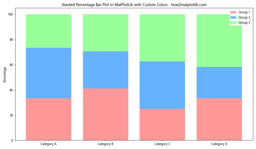
In this example, we’ve used a custom color palette to make the Stacked Percentage Bar Plot In MatPlotLib more visually appealing.
Adding Data Labels to Stacked Percentage Bar Plot In MatPlotLib
To make your Stacked Percentage Bar Plot In MatPlotLib more informative, you can add data labels to each segment. Here’s how you can do that:
import matplotlib.pyplot as plt
import numpy as np

categories = ['Category A', 'Category B', 'Category C']
group1 = [30, 40, 30]
group2 = [20, 50, 30]
group3 = [50, 10, 40]

total = np.array(group1) + np.array(group2) + np.array(group3)
group1_percentage = np.array(group1) / total * 100
group2_percentage = np.array(group2) / total * 100
group3_percentage = np.array(group3) / total * 100

fig, ax = plt.subplots(figsize=(12, 7))

colors = ['#FF9999', '#66B2FF', '#99FF99']

ax.bar(categories, group1_percentage, label='Group 1', color=colors[0])
ax.bar(categories, group2_percentage, bottom=group1_percentage, label='Group 2', color=colors[1])
ax.bar(categories, group3_percentage, bottom=group1_percentage+group2_percentage, label='Group 3', color=colors[2])

ax.set_ylabel('Percentage')
ax.set_title('Stacked Percentage Bar Plot In MatPlotLib with Data Labels - how2matplotlib.com')
ax.legend()

def add_labels(percentages):
    for i, percentage in enumerate(percentages):
        ax.text(i, percentage/2, f'{percentage:.1f}%', ha='center', va='center')

add_labels(group1_percentage)
add_labels(group2_percentage + group1_percentage)
add_labels(group3_percentage + group2_percentage + group1_percentage)

plt.tight_layout()
plt.show()
Output:
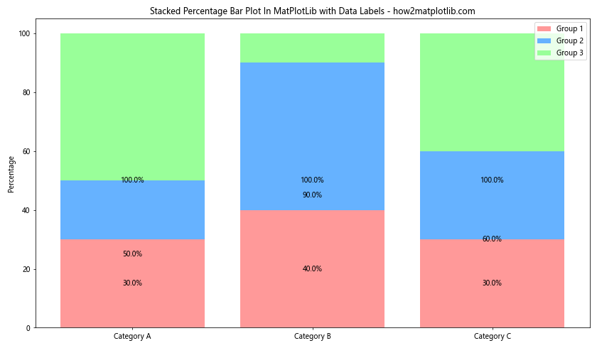
In this example, we’ve added a function add_labels() that places text labels in the center of each bar segment, showing the percentage value.
Creating a Horizontal Stacked Percentage Bar Plot In MatPlotLib
Sometimes, a horizontal orientation might be more suitable for your data. Here’s how to create a horizontal Stacked Percentage Bar Plot In MatPlotLib:
import matplotlib.pyplot as plt
import numpy as np

categories = ['Category A', 'Category B', 'Category C', 'Category D']
group1 = [25, 35, 20, 20]
group2 = [30, 25, 30, 15]
group3 = [20, 25, 30, 25]

total = np.array(group1) + np.array(group2) + np.array(group3)
group1_percentage = np.array(group1) / total * 100
group2_percentage = np.array(group2) / total * 100
group3_percentage = np.array(group3) / total * 100

fig, ax = plt.subplots(figsize=(12, 8))

colors = ['#FF9999', '#66B2FF', '#99FF99']

ax.barh(categories, group1_percentage, label='Group 1', color=colors[0])
ax.barh(categories, group2_percentage, left=group1_percentage, label='Group 2', color=colors[1])
ax.barh(categories, group3_percentage, left=group1_percentage+group2_percentage, label='Group 3', color=colors[2])

ax.set_xlabel('Percentage')
ax.set_title('Horizontal Stacked Percentage Bar Plot In MatPlotLib - how2matplotlib.com')
ax.legend(loc='lower right')

plt.tight_layout()
plt.show()
Output:
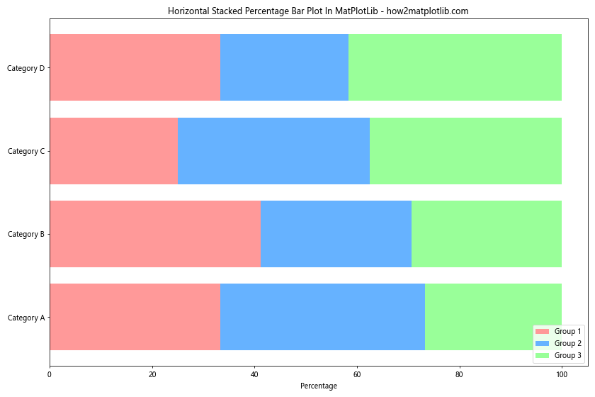
In this example, we’ve used ax.barh() instead of ax.bar() to create horizontal bars. The left parameter is used instead of bottom to stack the bars horizontally.
Adding a Grid to Stacked Percentage Bar Plot In MatPlotLib
Adding a grid to your Stacked Percentage Bar Plot In MatPlotLib can help readers better interpret the percentages. Here’s how to add a grid:
import matplotlib.pyplot as plt
import numpy as np

categories = ['Category A', 'Category B', 'Category C', 'Category D']
group1 = [25, 35, 20, 20]
group2 = [30, 25, 30, 15]
group3 = [20, 25, 30, 25]

total = np.array(group1) + np.array(group2) + np.array(group3)
group1_percentage = np.array(group1) / total * 100
group2_percentage = np.array(group2) / total * 100
group3_percentage = np.array(group3) / total * 100

fig, ax = plt.subplots(figsize=(12, 7))

colors = ['#FF9999', '#66B2FF', '#99FF99']

ax.bar(categories, group1_percentage, label='Group 1', color=colors[0])
ax.bar(categories, group2_percentage, bottom=group1_percentage, label='Group 2', color=colors[1])
ax.bar(categories, group3_percentage, bottom=group1_percentage+group2_percentage, label='Group 3', color=colors[2])

ax.set_ylabel('Percentage')
ax.set_title('Stacked Percentage Bar Plot In MatPlotLib with Grid - how2matplotlib.com')
ax.legend()

ax.grid(axis='y', linestyle='--', alpha=0.7)
ax.set_axisbelow(True)

plt.tight_layout()
plt.show()
Output:
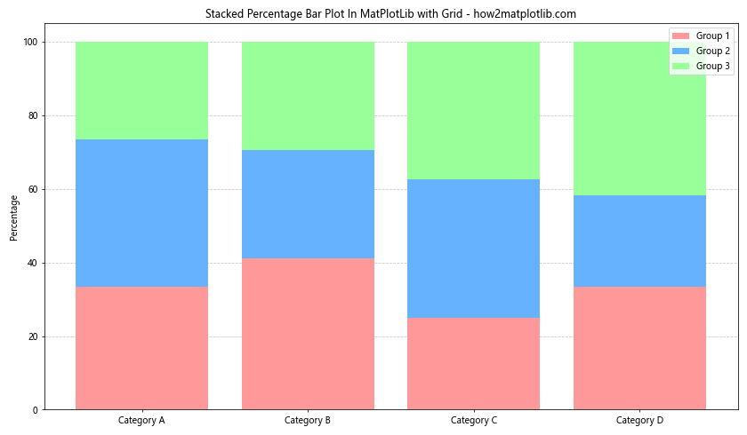
In this example, we’ve added a horizontal grid using ax.grid() and set it behind the bars using ax.set_axisbelow(True).
Customizing the Legend in Stacked Percentage Bar Plot In MatPlotLib
The legend is an important part of your Stacked Percentage Bar Plot In MatPlotLib. Let’s customize it to make it more informative:
import matplotlib.pyplot as plt
import numpy as np

categories = ['Category A', 'Category B', 'Category C', 'Category D']
group1 = [25, 35, 20, 20]
group2 = [30, 25, 30, 15]
group3 = [20, 25, 30, 25]

total = np.array(group1) + np.array(group2) + np.array(group3)
group1_percentage = np.array(group1) / total * 100
group2_percentage = np.array(group2) / total * 100
group3_percentage = np.array(group3) / total * 100

fig, ax = plt.subplots(figsize=(12, 7))

colors = ['#FF9999', '#66B2FF', '#99FF99']

ax.bar(categories, group1_percentage, label='Group 1', color=colors[0])
ax.bar(categories, group2_percentage, bottom=group1_percentage, label='Group 2', color=colors[1])
ax.bar(categories, group3_percentage, bottom=group1_percentage+group2_percentage, label='Group 3', color=colors[2])

ax.set_ylabel('Percentage')
ax.set_title('Stacked Percentage Bar Plot In MatPlotLib with Custom Legend - how2matplotlib.com')

legend = ax.legend(title='Groups', loc='upper right', bbox_to_anchor=(1.25, 1))
legend.get_title().set_fontweight('bold')

plt.tight_layout()
plt.show()
Output:
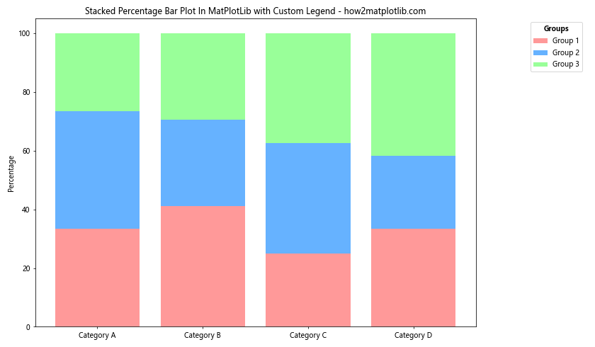
In this example, we’ve customized the legend by adding a title, changing its location, and making the title bold.
Creating a Stacked Percentage Bar Plot In MatPlotLib with Error Bars
Adding error bars to your Stacked Percentage Bar Plot In MatPlotLib can provide information about the uncertainty or variability in your data. Here’s how to add error bars:
import matplotlib.pyplot as plt
import numpy as np

categories = ['Category A', 'Category B', 'Category C']
group1 = [30, 40, 30]
group2 = [20, 50, 30]
group3 = [50, 10, 40]
errors = [5, 3, 4]

total = np.array(group1) + np.array(group2) + np.array(group3)
group1_percentage = np.array(group1) / total * 100
group2_percentage = np.array(group2) / total * 100
group3_percentage = np.array(group3) / total * 100

fig, ax = plt.subplots(figsize=(12, 7))

colors = ['#FF9999', '#66B2FF', '#99FF99']

ax.bar(categories, group1_percentage, label='Group 1', color=colors[0])
ax.bar(categories, group2_percentage, bottom=group1_percentage, label='Group 2', color=colors[1])
bars = ax.bar(categories, group3_percentage, bottom=group1_percentage+group2_percentage, label='Group 3', color=colors[2])

ax.errorbar(categories, group1_percentage+group2_percentage+group3_percentage, yerr=errors, fmt='none', color='black', capsize=5)

ax.set_ylabel('Percentage')
ax.set_title('Stacked Percentage Bar Plot In MatPlotLib with Error Bars - how2matplotlib.com')
ax.legend()

plt.tight_layout()
plt.show()
Output:
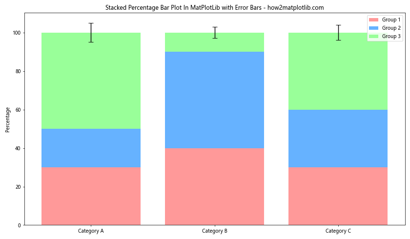
In this example, we’ve added error bars to the top of each stacked bar using ax.errorbar().
Creating a Grouped Stacked Percentage Bar Plot In MatPlotLib
Sometimes, you might want to compare multiple sets of stacked percentages side by side. Here’s how to create a grouped Stacked Percentage Bar Plot In MatPlotLib:
import matplotlib.pyplot as plt
import numpy as np

categories = ['Category A', 'Category B', 'Category C']
group1_set1 = [30, 40, 30]
group2_set1 = [20, 50, 30]
group3_set1 = [50, 10, 40]
group1_set2 = [35, 35, 30]
group2_set2 = [25, 45, 30]
group3_set2 = [40, 20, 40]

def calculate_percentages(group1, group2, group3):
    total = np.array(group1) + np.array(group2) + np.array(group3)
    return (np.array(group1) / total * 100,
            np.array(group2) / total * 100,
            np.array(group3) / total * 100)

group1_percentage_set1, group2_percentage_set1, group3_percentage_set1 = calculate_percentages(group1_set1, group2_set1, group3_set1)
group1_percentage_set2, group2_percentage_set2, group3_percentage_set2 = calculate_percentages(group1_set2, group2_set2, group3_set2)

fig, ax = plt.subplots(figsize=(14, 8))

x = np.arange(len(categories))
width = 0.35

ax.bar(x - width/2, group1_percentage_set1, width, label='Group 1 (Set 1)', color='#FF9999')
ax.bar(x - width/2, group2_percentage_set1, width, bottom=group1_percentage_set1, label='Group 2 (Set 1)', color='#66B2FF')
ax.bar(x - width/2, group3_percentage_set1, width, bottom=group1_percentage_set1+group2_percentage_set1, label='Group 3 (Set 1)', color='#99FF99')

ax.bar(x + width/2, group1_percentage_set2, width, label='Group 1 (Set 2)', color='#FF9999', alpha=0.7)
ax.bar(x + width/2, group2_percentage_set2, width, bottom=group1_percentage_set2, label='Group 2 (Set 2)', color='#66B2FF', alpha=0.7)
ax.bar(x + width/2, group3_percentage_set2, width, bottom=group1_percentage_set2+group2_percentage_set2, label='Group 3 (Set 2)', color='#99FF99', alpha=0.7)

ax.set_ylabel('Percentage')
ax.set_title('Grouped Stacked Percentage Bar Plot In MatPlotLib - how2matplotlib.com')
ax.set_xticks(x)
ax.set_xticklabels(categories)
ax.legend(loc='upper left', bbox_to_anchor=(1, 1))

plt.tight_layout()
plt.show()
Output:
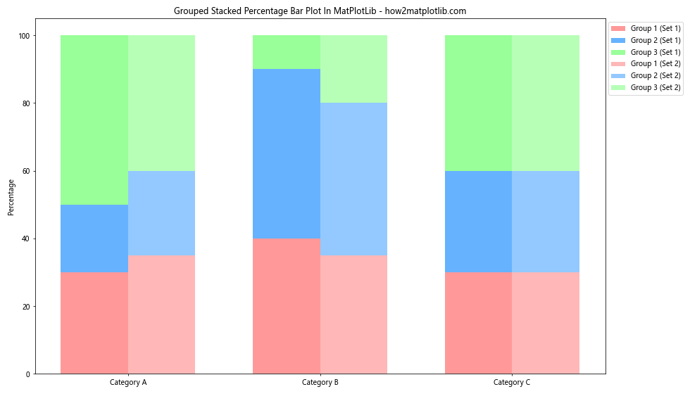
In this example, we’ve created two sets of stacked bars side by side for each category. This allows for easy comparison between the two sets.
Adding Annotations to Stacked Percentage Bar Plot In MatPlotLib
Annotations can provide additional context or highlight specific points in your Stacked Percentage Bar Plot In MatPlotLib. Here’s an example of how to add annotations:
import matplotlib.pyplot as plt
import numpy as np

categories = ['Category A', 'Category B', 'Category C', 'Category D']
group1 = [25, 35, 20, 20]
group2 = [30, 25, 30, 15]
group3 = [20, 25, 30, 25]

total = np.array(group1) + np.array(group2) + np.array(group3)
group1_percentage = np.array(group1) / total * 100
group2_percentage = np.array(group2) / total * 100
group3_percentage = np.array(group3) / total * 100

fig, ax = plt.subplots(figsize=(12, 7))

colors = ['#FF9999', '#66B2FF', '#99FF99']

ax.bar(categories, group1_percentage, label='Group 1', color=colors[0])
ax.bar(categories, group2_percentage, bottom=group1_percentage, label='Group 2', color=colors[1])
ax.bar(categories, group3_percentage, bottom=group1_percentage+group2_percentage, label='Group 3', color=colors[2])

ax.set_ylabel('Percentage')
ax.set_title('Stacked Percentage Bar Plot In MatPlotLib with Annotations - how2matplotlib.com')
ax.legend()

# Adding annotations
ax.annotate('Highest in Group 1', xy=(0, group1_percentage[0]), xytext=(0, group1_percentage[0]+10),
            arrowprops=dict(facecolor='black', shrink=0.05), ha='center')

ax.annotate('Lowest in Group 2', xy=(3, group1_percentage[3]+group2_percentage[3]),
            xytext=(3, group1_percentage[3]+group2_percentage[3]-15),
            arrowprops=dict(facecolor='black', shrink=0.05), ha='center')

plt.tight_layout()
plt.show()
Output:
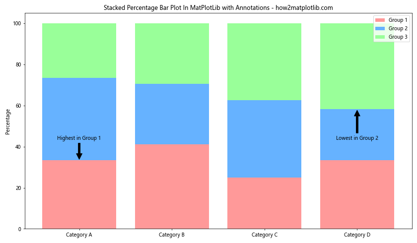
In this example, we’ve added two annotations to highlight specific points in the plot.
Creating a Stacked Percentage Bar Plot In MatPlotLib with Subplots
Sometimes, you might want to create multiple Stacked Percentage Bar Plot In MatPlotLib side by side for comparison. Here’s how to do that using subplots:
import matplotlib.pyplot as plt
import numpy as np

categories = ['Category A', 'Category B', 'Category C', 'Category D']
data1 = np.random.rand(3, 4)  # 3 groups, 4 categories
data2 = np.random.rand(3, 4)  # 3 groups, 4 categories

data1_perc = data1 / data1.sum(axis=0) * 100
data2_perc = data2 / data2.sum(axis=0) * 100

fig, (ax1, ax2) = plt.subplots(1, 2, figsize=(16, 7))

colors = ['#FF9999', '#66B2FF', '#99FF99']

for i in range(3):
    ax1.bar(categories, data1_perc[i], bottom=np.sum(data1_perc[:i], axis=0), label=f'Group {i+1}', color=colors[i])
    ax2.bar(categories, data2_perc[i], bottom=np.sum(data2_perc[:i], axis=0), label=f'Group {i+1}', color=colors[i])

ax1.set_ylabel('Percentage')
ax1.set_title('Stacked Percentage Bar Plot In MatPlotLib - Dataset 1 - how2matplotlib.com')
ax1.legend()

ax2.set_ylabel('Percentage')
ax2.set_title('Stacked Percentage Bar Plot In MatPlotLib - Dataset 2 - how2matplotlib.com')
ax2.legend()

plt.tight_layout()
plt.show()
Output:
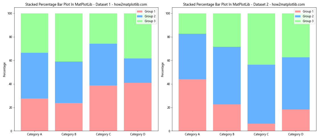
In this example, we’ve created two Stacked Percentage Bar Plot In MatPlotLib side by side using subplots.
Creating a Stacked Percentage Bar Plot In MatPlotLib with Pandas
If you’re working with data in a Pandas DataFrame, you can easily create a Stacked Percentage Bar Plot In MatPlotLib. Here’s how:
import matplotlib.pyplot as plt
import pandas as pd
import numpy as np

# Create a sample DataFrame
data = {
    'Category': ['A', 'B', 'C', 'D'] * 3,
    'Group': ['Group 1'] * 4 + ['Group 2'] * 4 + ['Group 3'] * 4,
    'Value': np.random.randint(10, 100, 12)
}
df = pd.DataFrame(data)

# Pivot the data and calculate percentages
df_pivot = df.pivot(index='Category', columns='Group', values='Value')
df_percentage = df_pivot.div(df_pivot.sum(axis=1), axis=0) * 100

# Create the stacked bar plot
ax = df_percentage.plot(kind='bar', stacked=True, figsize=(12, 7))

ax.set_ylabel('Percentage')
ax.set_title('Stacked Percentage Bar Plot In MatPlotLib with Pandas - how2matplotlib.com')
ax.legend(title='Groups', bbox_to_anchor=(1.05, 1), loc='upper left')

plt.tight_layout()
plt.show()
Output:
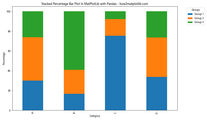
In this example, we’ve used Pandas to create a DataFrame, pivot the data, calculate percentages, and then create a Stacked Percentage Bar Plot In MatPlotLib.
Conclusion
In this comprehensive guide, we’ve explored various aspects of creating a Stacked Percentage Bar Plot In MatPlotLib. We’ve covered basic plots, customization options, adding data labels, creating horizontal plots, adding grids and error bars, grouping bars, adding annotations, using colorbars, creating subplots, and using Pandas for data manipulation.
Stacked Percentage Bar Plot In MatPlotLib is a versatile and powerful tool for visualizing proportional data. By mastering these techniques, you’ll be able to create informative and visually appealing plots that effectively communicate your data.