Mastering Three-dimensional Plotting in Python using Matplotlib
Three-dimensional Plotting in Python using Matplotlib is a powerful technique for visualizing complex data and relationships in a 3D space. This article will explore the various aspects of creating 3D plots with Matplotlib, providing detailed explanations and examples to help you become proficient in this essential data visualization skill.
Introduction to Three-dimensional Plotting in Python using Matplotlib
Three-dimensional Plotting in Python using Matplotlib allows data scientists, researchers, and analysts to represent data in a three-dimensional space, providing a more comprehensive view of complex relationships and patterns. Matplotlib, a widely-used plotting library in Python, offers robust tools for creating 3D visualizations, making it an essential skill for anyone working with data analysis and visualization.
To get started with Three-dimensional Plotting in Python using Matplotlib, you’ll need to import the necessary modules:
import matplotlib.pyplot as plt
from mpl_toolkits.mplot3d import Axes3D
import numpy as np

# Create a figure and a 3D axis
fig = plt.figure(figsize=(10, 8))
ax = fig.add_subplot(111, projection='3d')

# Your 3D plotting code will go here

plt.title('Three-dimensional Plotting in Python using Matplotlib - how2matplotlib.com')
plt.show()
Output:
This code sets up the basic structure for creating a 3D plot using Matplotlib. The Axes3D module is crucial for enabling 3D plotting capabilities.
Types of Three-dimensional Plots in Matplotlib
Matplotlib supports various types of Three-dimensional Plotting in Python. Let’s explore some of the most common types:
1. 3D Scatter Plots
3D scatter plots are excellent for visualizing the distribution of data points in three-dimensional space. Here’s an example of how to create a 3D scatter plot:
import matplotlib.pyplot as plt
from mpl_toolkits.mplot3d import Axes3D
import numpy as np

# Generate random data
n = 100
x = np.random.rand(n)
y = np.random.rand(n)
z = np.random.rand(n)
colors = np.random.rand(n)
sizes = 1000 * np.random.rand(n)

# Create the plot
fig = plt.figure(figsize=(10, 8))
ax = fig.add_subplot(111, projection='3d')
scatter = ax.scatter(x, y, z, c=colors, s=sizes, alpha=0.6)

ax.set_xlabel('X-axis')
ax.set_ylabel('Y-axis')
ax.set_zlabel('Z-axis')
plt.title('3D Scatter Plot - Three-dimensional Plotting in Python using Matplotlib - how2matplotlib.com')
plt.colorbar(scatter)
plt.show()
Output:
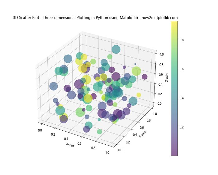
This example creates a 3D scatter plot with randomly generated data points. The color and size of each point vary based on additional data dimensions.
2. 3D Surface Plots
Surface plots are ideal for visualizing functions of two variables. Here’s how to create a 3D surface plot:
import matplotlib.pyplot as plt
from mpl_toolkits.mplot3d import Axes3D
import numpy as np

# Create data for the surface
x = np.linspace(-5, 5, 100)
y = np.linspace(-5, 5, 100)
X, Y = np.meshgrid(x, y)
Z = np.sin(np.sqrt(X**2 + Y**2))

# Create the plot
fig = plt.figure(figsize=(12, 8))
ax = fig.add_subplot(111, projection='3d')
surf = ax.plot_surface(X, Y, Z, cmap='viridis')

ax.set_xlabel('X-axis')
ax.set_ylabel('Y-axis')
ax.set_zlabel('Z-axis')
plt.title('3D Surface Plot - Three-dimensional Plotting in Python using Matplotlib - how2matplotlib.com')
plt.colorbar(surf)
plt.show()
Output:
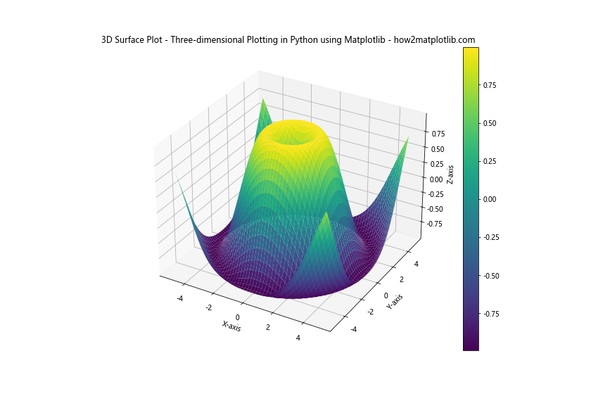
This example creates a 3D surface plot of the function f(x, y) = sin(sqrt(x^2 + y^2)).
3. 3D Wire Frame Plots
Wire frame plots are similar to surface plots but display the surface as a mesh of lines. Here’s an example:
import matplotlib.pyplot as plt
from mpl_toolkits.mplot3d import Axes3D
import numpy as np

# Create data for the wire frame
x = np.linspace(-5, 5, 20)
y = np.linspace(-5, 5, 20)
X, Y = np.meshgrid(x, y)
Z = np.sin(np.sqrt(X**2 + Y**2))

# Create the plot
fig = plt.figure(figsize=(12, 8))
ax = fig.add_subplot(111, projection='3d')
wire = ax.plot_wireframe(X, Y, Z, color='blue')

ax.set_xlabel('X-axis')
ax.set_ylabel('Y-axis')
ax.set_zlabel('Z-axis')
plt.title('3D Wire Frame Plot - Three-dimensional Plotting in Python using Matplotlib - how2matplotlib.com')
plt.show()
Output:
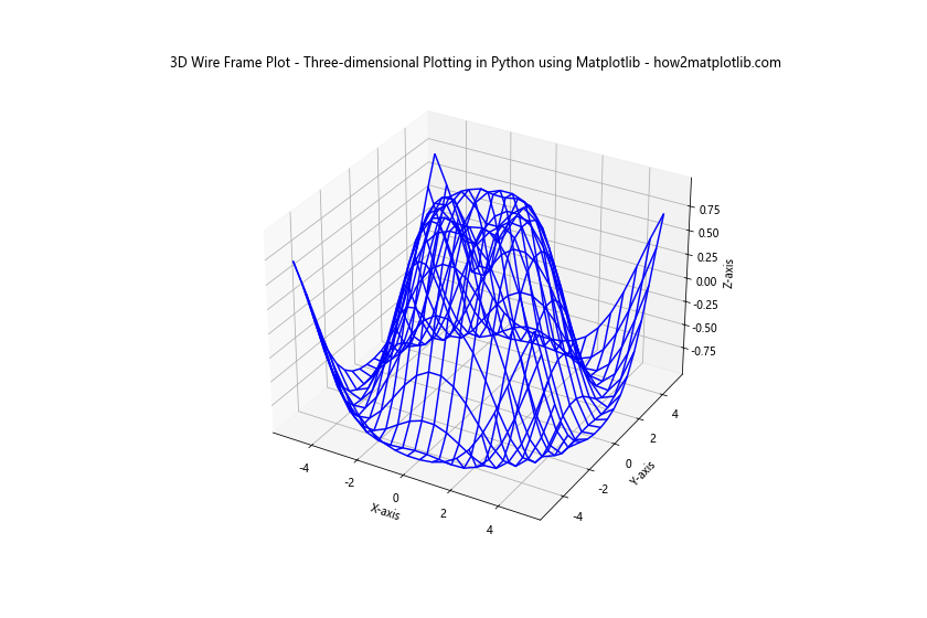
This example creates a 3D wire frame plot of the same function as the surface plot example.
4. 3D Contour Plots
Contour plots in 3D space can help visualize the levels of a function. Here’s how to create a 3D contour plot:
import matplotlib.pyplot as plt
from mpl_toolkits.mplot3d import Axes3D
import numpy as np

# Create data for the contour plot
x = np.linspace(-5, 5, 100)
y = np.linspace(-5, 5, 100)
X, Y = np.meshgrid(x, y)
Z = np.sin(np.sqrt(X**2 + Y**2))

# Create the plot
fig = plt.figure(figsize=(12, 8))
ax = fig.add_subplot(111, projection='3d')
contour = ax.contour3D(X, Y, Z, 50, cmap='viridis')

ax.set_xlabel('X-axis')
ax.set_ylabel('Y-axis')
ax.set_zlabel('Z-axis')
plt.title('3D Contour Plot - Three-dimensional Plotting in Python using Matplotlib - how2matplotlib.com')
plt.colorbar(contour)
plt.show()
Output:
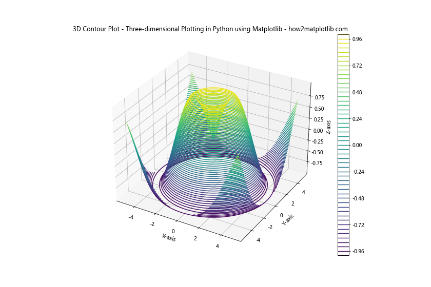
This example creates a 3D contour plot of the same function used in previous examples.
Customizing Three-dimensional Plots in Matplotlib
Customization is a crucial aspect of Three-dimensional Plotting in Python using Matplotlib. Let’s explore various ways to enhance your 3D plots:
Color Maps and Color Bars
Color maps can significantly improve the readability of your 3D plots. Here’s an example of using a custom color map:
import matplotlib.pyplot as plt
from mpl_toolkits.mplot3d import Axes3D
import numpy as np

# Create data
x = np.linspace(-5, 5, 100)
y = np.linspace(-5, 5, 100)
X, Y = np.meshgrid(x, y)
Z = np.sin(np.sqrt(X**2 + Y**2))

# Create the plot with a custom color map
fig = plt.figure(figsize=(12, 8))
ax = fig.add_subplot(111, projection='3d')
surf = ax.plot_surface(X, Y, Z, cmap='coolwarm')

ax.set_xlabel('X-axis')
ax.set_ylabel('Y-axis')
ax.set_zlabel('Z-axis')
plt.title('Custom Color Map - Three-dimensional Plotting in Python using Matplotlib - how2matplotlib.com')
plt.colorbar(surf, label='Z values')
plt.show()
Output:
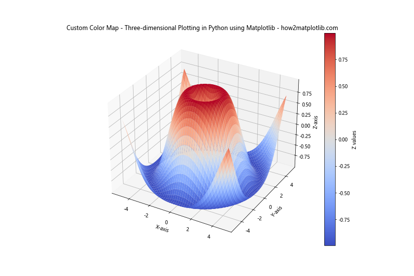
This example uses the ‘coolwarm’ color map and adds a labeled color bar to the plot.
Adjusting View Angle
You can adjust the viewing angle of your 3D plot to highlight specific features:
import matplotlib.pyplot as plt
from mpl_toolkits.mplot3d import Axes3D
import numpy as np

# Create data
x = np.linspace(-5, 5, 100)
y = np.linspace(-5, 5, 100)
X, Y = np.meshgrid(x, y)
Z = np.sin(np.sqrt(X**2 + Y**2))

# Create the plot with a custom view angle
fig = plt.figure(figsize=(12, 8))
ax = fig.add_subplot(111, projection='3d')
surf = ax.plot_surface(X, Y, Z, cmap='viridis')

ax.view_init(elev=20, azim=45)  # Set elevation and azimuth angles

ax.set_xlabel('X-axis')
ax.set_ylabel('Y-axis')
ax.set_zlabel('Z-axis')
plt.title('Custom View Angle - Three-dimensional Plotting in Python using Matplotlib - how2matplotlib.com')
plt.colorbar(surf)
plt.show()
Output:
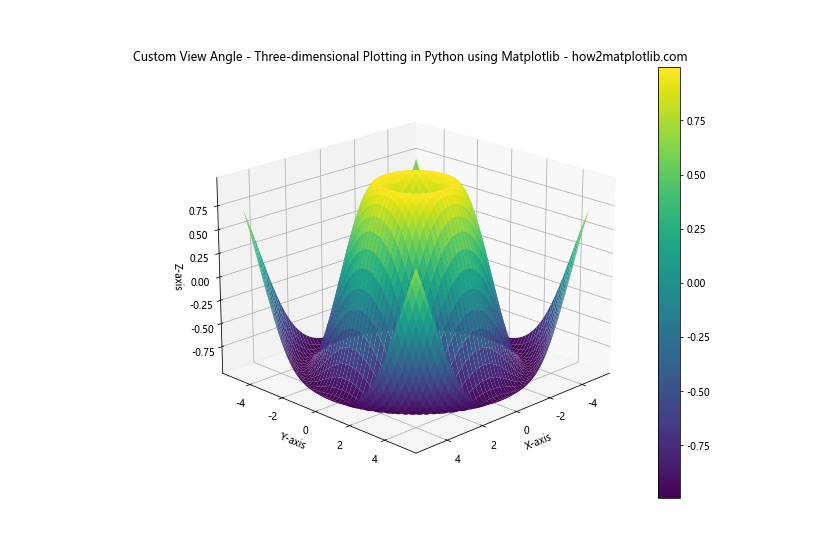
This example sets the elevation to 20 degrees and the azimuth to 45 degrees, providing a different perspective on the data.
Adding Text and Annotations
Adding text and annotations to your 3D plots can provide context and highlight important features:
import matplotlib.pyplot as plt
from mpl_toolkits.mplot3d import Axes3D
import numpy as np

# Create data
x = np.linspace(-5, 5, 100)
y = np.linspace(-5, 5, 100)
X, Y = np.meshgrid(x, y)
Z = np.sin(np.sqrt(X**2 + Y**2))

# Create the plot with annotations
fig = plt.figure(figsize=(12, 8))
ax = fig.add_subplot(111, projection='3d')
surf = ax.plot_surface(X, Y, Z, cmap='viridis')

ax.text(0, 0, 1, "Peak", color='red', fontsize=12)
ax.text(4, 4, -0.5, "Trough", color='blue', fontsize=12)

ax.set_xlabel('X-axis')
ax.set_ylabel('Y-axis')
ax.set_zlabel('Z-axis')
plt.title('Annotated 3D Plot - Three-dimensional Plotting in Python using Matplotlib - how2matplotlib.com')
plt.colorbar(surf)
plt.show()
Output:
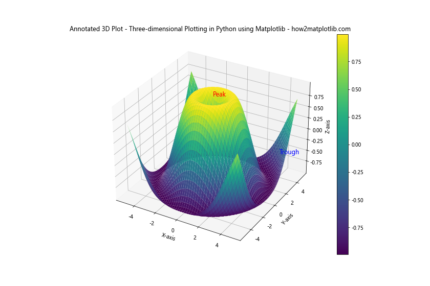
This example adds text annotations to highlight the peak and trough of the surface.
Advanced Techniques in Three-dimensional Plotting using Matplotlib
Let’s explore some advanced techniques for Three-dimensional Plotting in Python using Matplotlib:
Combining Multiple 3D Plots
You can create subplots to compare different 3D visualizations side by side:
import matplotlib.pyplot as plt
from mpl_toolkits.mplot3d import Axes3D
import numpy as np

# Create data
x = np.linspace(-5, 5, 100)
y = np.linspace(-5, 5, 100)
X, Y = np.meshgrid(x, y)
Z1 = np.sin(np.sqrt(X**2 + Y**2))
Z2 = np.cos(np.sqrt(X**2 + Y**2))

# Create the plot with multiple subplots
fig = plt.figure(figsize=(16, 8))

ax1 = fig.add_subplot(121, projection='3d')
surf1 = ax1.plot_surface(X, Y, Z1, cmap='viridis')
ax1.set_title('Sine Function')

ax2 = fig.add_subplot(122, projection='3d')
surf2 = ax2.plot_surface(X, Y, Z2, cmap='plasma')
ax2.set_title('Cosine Function')

plt.suptitle('Multiple 3D Plots - Three-dimensional Plotting in Python using Matplotlib - how2matplotlib.com')
plt.show()
Output:
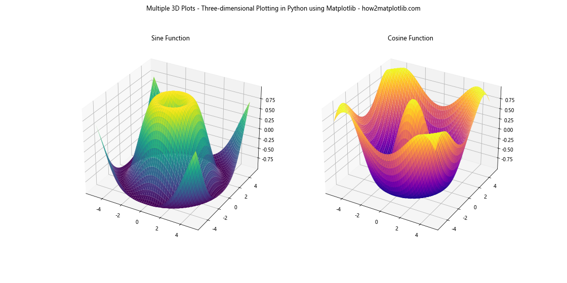
This example creates two 3D surface plots side by side, comparing sine and cosine functions.
Animating 3D Plots
You can create animated 3D plots to show how data changes over time:
import matplotlib.pyplot as plt
from mpl_toolkits.mplot3d import Axes3D
import numpy as np
from matplotlib.animation import FuncAnimation

def update(frame):
    ax.view_init(elev=10, azim=frame)
    return fig,

# Create data
x = np.linspace(-5, 5, 100)
y = np.linspace(-5, 5, 100)
X, Y = np.meshgrid(x, y)
Z = np.sin(np.sqrt(X**2 + Y**2))

# Create the plot
fig = plt.figure(figsize=(10, 8))
ax = fig.add_subplot(111, projection='3d')
surf = ax.plot_surface(X, Y, Z, cmap='viridis')

ax.set_xlabel('X-axis')
ax.set_ylabel('Y-axis')
ax.set_zlabel('Z-axis')
plt.title('Animated 3D Plot - Three-dimensional Plotting in Python using Matplotlib - how2matplotlib.com')

# Create the animation
ani = FuncAnimation(fig, update, frames=np.linspace(0, 360, 100), interval=50, blit=True)
plt.show()
Output:
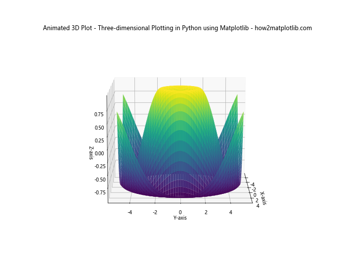
This example creates an animated 3D plot that rotates around the z-axis.
3D Bar Plots
3D bar plots can be useful for comparing multiple categories of data:
import matplotlib.pyplot as plt
from mpl_toolkits.mplot3d import Axes3D
import numpy as np

# Create data
x = np.arange(5)
y = np.arange(5)
z = np.random.randint(10, size=(5, 5))

# Create the plot
fig = plt.figure(figsize=(12, 8))
ax = fig.add_subplot(111, projection='3d')

x, y = np.meshgrid(x, y)
x = x.flatten()
y = y.flatten()
z = z.flatten()

ax.bar3d(x, y, np.zeros_like(z), 0.5, 0.5, z, shade=True)

ax.set_xlabel('X-axis')
ax.set_ylabel('Y-axis')
ax.set_zlabel('Z-axis')
plt.title('3D Bar Plot - Three-dimensional Plotting in Python using Matplotlib - how2matplotlib.com')
plt.show()
Output:
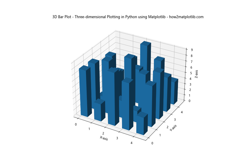
This example creates a 3D bar plot with randomly generated data.
Best Practices for Three-dimensional Plotting in Python using Matplotlib
When working with Three-dimensional Plotting in Python using Matplotlib, it’s important to follow best practices to create effective and informative visualizations:
- Choose the right type of 3D plot for your data and purpose.
- Use appropriate color maps to enhance readability.
- Adjust the view angle to highlight important features.
- Add clear labels and titles to provide context.
- Use annotations to draw attention to specific data points or regions.
- Consider combining multiple plots for comparison.
- Use animations sparingly and purposefully.
- Ensure your plot is not overcrowded with data or decorations.
Common Challenges in Three-dimensional Plotting using Matplotlib
While Three-dimensional Plotting in Python using Matplotlib is powerful, it can present some challenges:
Dealing with Occlusion
In 3D plots, some data points may be hidden behind others. Here’s an example of how to deal with this using transparency:
import matplotlib.pyplot as plt
from mpl_toolkits.mplot3d import Axes3D
import numpy as np

# Create data
n = 100
x = np.random.rand(n)
y = np.random.rand(n)
z = np.random.rand(n)

# Create the plot with transparency
fig = plt.figure(figsize=(10, 8))
ax = fig.add_subplot(111, projection='3d')
scatter = ax.scatter(x, y, z, c=z, cmap='viridis', alpha=0.5)

ax.set_xlabel('X-axis')
ax.set_ylabel('Y-axis')
ax.set_zlabel('Z-axis')
plt.title('3D Scatter Plot with Transparency - Three-dimensional Plotting in Python using Matplotlib - how2matplotlib.com')
plt.colorbar(scatter)
plt.show()
Output:
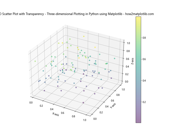
This example uses transparency (alpha=0.5) to make overlapping points visible.
Performance Issues with Large Datasets
Large datasets can slow down rendering and interaction. Here’s an example of how to downsample data:
import matplotlib.pyplot as plt
from mpl_toolkits.mplot3d import Axes3D
import numpy as np

# Create a large dataset
n = 1000000
x = np.random.rand(n)
y = np.random.rand(n)
z = np.random.rand(n)

# Downsample the data
sample_size = 10000
indices = np.random.choice(n, sample_size, replace=False)
x_sample = x[indices]
y_sample = y[indices]
z_sample = z[indices]

# Create the plot with downsampled data
fig = plt.figure(figsize=(10, 8))
ax = fig.add_subplot(111, projection='3d')
scatter = ax.scatter(x_sample, y_sample, z_sample, c=z_sample, cmap='viridis')

ax.set_xlabel('X-axis')
ax.set_ylabel('Y-axis')
ax.set_zlabel('Z-axis')
plt.title('Downsampled 3D Scatter Plot - Three-dimensional Plotting in Python using Matplotlib - how2matplotlib.com')
plt.colorbar(scatter)
plt.show()
Output:
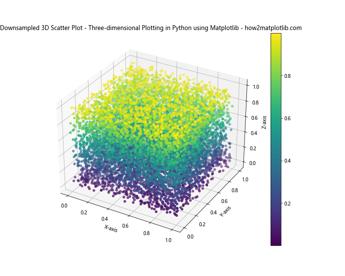
This example demonstrates how to downsample a large dataset for better performance.
Advanced Applications of Three-dimensional Plotting in Python using Matplotlib
Let’s explore some advanced applications of Three-dimensional Plotting in Python using Matplotlib:
Visualizing Mathematical Functions
3D plots are excellent for visualizing complex mathematical functions. Here’s an example of plotting a multivariate Gaussian distribution:
import matplotlib.pyplot as plt
from mpl_toolkits.mplot3d import Axes3D
import numpy as np

def multivariate_gaussian(pos, mu, Sigma):
    n = mu.shape[0]
    Sigma_det = np.linalg.det(Sigma)
    Sigma_inv = np.linalg.inv(Sigma)
    N = np.sqrt((2*np.pi)**n * Sigma_det)
    fac = np.einsum('...k,kl,...l->...', pos-mu, Sigma_inv, pos-mu)
    return np.exp(-fac / 2) / N

# Parameters
N = 60
X = np.linspace(-3, 3, N)
Y = np.linspace(-3, 4, N)
X, Y = np.meshgrid(X, Y)

# Mean and covariance
mu = np.array([0., 1.])
Sigma = np.array([[1., -0.5], [-0.5, 1.5]])

# Create a grid of positions
pos = np.empty(X.shape + (2,))
pos[:, :, 0] = X
pos[:, :, 1] = Y

# Calculate the multivariate Gaussian
Z = multivariate_gaussian(pos, mu, Sigma)

# Plot
fig = plt.figure(figsize=(10, 8))
ax = fig.add_subplot(111, projection='3d')
surf = ax.plot_surface(X, Y, Z, cmap='viridis')

ax.set_xlabel('X-axis')
ax.set_ylabel('Y-axis')
ax.set_zlabel('Z-axis')
plt.title('Multivariate Gaussian Distribution - Three-dimensional Plotting in Python using Matplotlib - how2matplotlib.com')
plt.colorbar(surf)
plt.show()
Output:
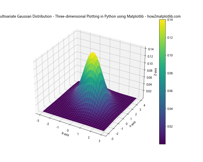
This example visualizes a multivariate Gaussian distribution in 3D space.
Visualizing Scientific Data
Three-dimensional Plotting in Python using Matplotlib is particularly useful for scientific data visualization. Here’s an example of plotting magnetic field lines:
import matplotlib.pyplot as plt
from mpl_toolkits.mplot3d import Axes3D
import numpy as np

def magnetic_field(x, y, z):
    r = np.sqrt(x**2 + y**2 + z**2)
    return 3 * x * z / r**5, 3 * y * z / r**5, (3 * z**2 - r**2) / r**5

# Create a grid of points
n = 20
x, y, z = np.meshgrid(np.linspace(-2, 2, n),
                      np.linspace(-2, 2, n),
                      np.linspace(-2, 2, n))

# Calculate the field at these points
Bx, By, Bz = magnetic_field(x, y, z)

# Create the plot
fig = plt.figure(figsize=(10, 8))
ax = fig.add_subplot(111, projection='3d')

# Plot the vector field
ax.quiver(x, y, z, Bx, By, Bz, length=0.2, normalize=True)

ax.set_xlabel('X-axis')
ax.set_ylabel('Y-axis')
ax.set_zlabel('Z-axis')
plt.title('Magnetic Field Lines - Three-dimensional Plotting in Python using Matplotlib - how2matplotlib.com')
plt.show()
Output:
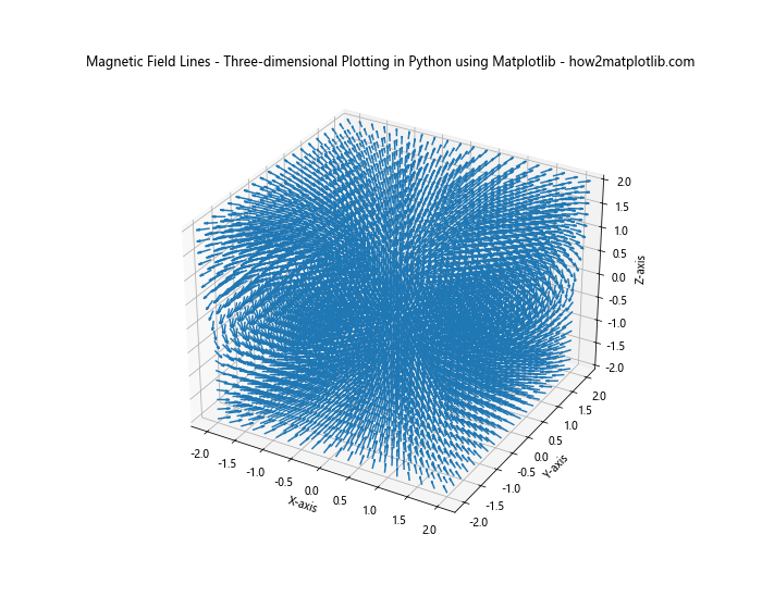
This example visualizes magnetic field lines in 3D space.
Integrating Three-dimensional Plotting with Other Libraries
While Matplotlib is powerful for Three-dimensional Plotting in Python, it can be integrated with other libraries for enhanced functionality:
Combining with Pandas for Data Manipulation
Here’s an example of using Pandas with Matplotlib for 3D plotting:
import matplotlib.pyplot as plt
from mpl_toolkits.mplot3d import Axes3D
import numpy as np
import pandas as pd

# Create a DataFrame
df = pd.DataFrame({
    'X': np.random.rand(100),
    'Y': np.random.rand(100),
    'Z': np.random.rand(100),
    'Category': np.random.choice(['A', 'B', 'C'], 100)
})

# Create the plot
fig = plt.figure(figsize=(10, 8))
ax = fig.add_subplot(111, projection='3d')

# Plot each category with a different color
for category, group in df.groupby('Category'):
    ax.scatter(group['X'], group['Y'], group['Z'], label=category)

ax.set_xlabel('X-axis')
ax.set_ylabel('Y-axis')
ax.set_zlabel('Z-axis')
plt.title('3D Scatter Plot with Pandas Data - Three-dimensional Plotting in Python using Matplotlib - how2matplotlib.com')
plt.legend()
plt.show()
Output:
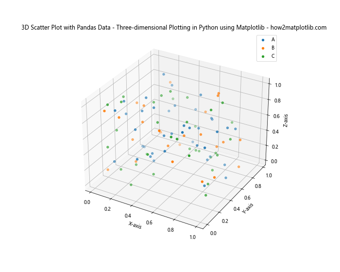
This example demonstrates how to use Pandas DataFrames with Matplotlib for 3D plotting.
Using Seaborn for Statistical Visualizations
While Seaborn doesn’t directly support 3D plotting, you can use it in combination with Matplotlib:
import matplotlib.pyplot as plt
from mpl_toolkits.mplot3d import Axes3D
import numpy as np
import pandas as pd
import seaborn as sns

# Create a DataFrame
df = pd.DataFrame({
    'X': np.random.rand(100),
    'Y': np.random.rand(100),
    'Z': np.random.rand(100),
    'Category': np.random.choice(['A', 'B', 'C'], 100)
})

# Set the Seaborn style
sns.set(style="darkgrid")

# Create the plot
fig = plt.figure(figsize=(10, 8))
ax = fig.add_subplot(111, projection='3d')

# Plot each category with a different color using Seaborn's color palette
palette = sns.color_palette("husl", 3)
for i, (category, group) in enumerate(df.groupby('Category')):
    ax.scatter(group['X'], group['Y'], group['Z'], c=[palette[i]], label=category)

ax.set_xlabel('X-axis')
ax.set_ylabel('Y-axis')
ax.set_zlabel('Z-axis')
plt.title('3D Scatter Plot with Seaborn Styling - Three-dimensional Plotting in Python using Matplotlib - how2matplotlib.com')
plt.legend()
plt.show()
Output:
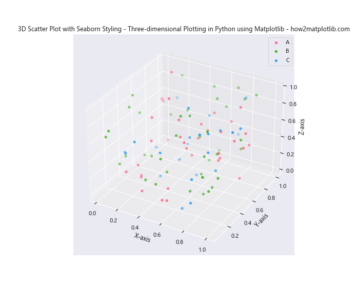
This example uses Seaborn’s styling and color palettes with Matplotlib’s 3D plotting capabilities.
Conclusion
Three-dimensional Plotting in Python using Matplotlib is a powerful tool for data visualization and analysis. It allows you to represent complex data relationships in a visually intuitive way, making it easier to identify patterns, trends, and outliers in your data.
Throughout this article, we’ve explored various aspects of Three-dimensional Plotting in Python using Matplotlib, including:
- Different types of 3D plots (scatter, surface, wire frame, contour)
- Customization techniques (color maps, view angles, annotations)
- Advanced techniques (combining plots, animations, 3D bar plots)
- Best practices and common challenges
- Advanced applications in mathematics and science
- Integration with other libraries like Pandas and Seaborn
By mastering these techniques, you’ll be well-equipped to create compelling and informative 3D visualizations for your data analysis projects. Remember to always consider your audience and the story you want to tell with your data when choosing and designing your 3D plots.