How to Create Normal Distribution Plots using Numpy and Matplotlib
Normal Distribution Plot using Numpy and Matplotlib is a powerful tool for visualizing statistical data and understanding probability distributions. This article will provide an in-depth exploration of creating Normal Distribution Plots using Numpy and Matplotlib, two essential Python libraries for data analysis and visualization. We’ll cover various aspects of Normal Distribution Plot using Numpy and Matplotlib, from basic concepts to advanced techniques, with plenty of code examples to help you master this important skill.
Understanding Normal Distribution Plot using Numpy and Matplotlib
Before diving into the specifics of creating Normal Distribution Plot using Numpy and Matplotlib, it’s essential to understand what a normal distribution is and why it’s important in data analysis. A normal distribution, also known as a Gaussian distribution, is a symmetric probability distribution that follows a bell-shaped curve. It’s characterized by its mean (μ) and standard deviation (σ), which determine the center and spread of the distribution, respectively.
Normal Distribution Plot using Numpy and Matplotlib allows us to visualize this distribution and analyze its properties. Numpy provides the mathematical functions to generate the data, while Matplotlib offers the plotting capabilities to create visually appealing and informative graphs.
Let’s start with a basic example of creating a Normal Distribution Plot using Numpy and Matplotlib:
import numpy as np
import matplotlib.pyplot as plt

# Generate data for the normal distribution
mu, sigma = 0, 1  # mean and standard deviation
x = np.linspace(mu - 3*sigma, mu + 3*sigma, 100)
y = 1/(sigma * np.sqrt(2 * np.pi)) * np.exp(-(x - mu)**2 / (2 * sigma**2))

# Create the plot
plt.figure(figsize=(10, 6))
plt.plot(x, y, label='Normal Distribution')
plt.title('Normal Distribution Plot using Numpy and Matplotlib - how2matplotlib.com')
plt.xlabel('X-axis')
plt.ylabel('Probability Density')
plt.legend()
plt.grid(True)
plt.show()
Output:
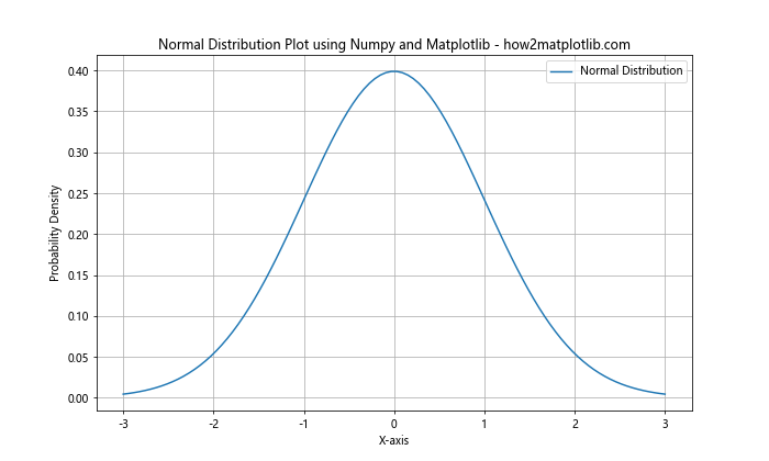
In this example, we use Numpy to generate the data points for a normal distribution with a mean of 0 and a standard deviation of 1. We then use Matplotlib to create a line plot of this distribution. The plt.figure() function sets the size of the plot, while plt.plot() creates the actual line. We add labels, a title, and a legend to make the plot more informative.
Customizing Normal Distribution Plot using Numpy and Matplotlib
One of the advantages of using Matplotlib for Normal Distribution Plot is the high degree of customization it offers. You can adjust various aspects of the plot to suit your needs and preferences. Let’s explore some ways to customize your Normal Distribution Plot using Numpy and Matplotlib.
Changing Colors and Styles
You can easily change the color and style of your Normal Distribution Plot using Numpy and Matplotlib. Here’s an example:
import numpy as np
import matplotlib.pyplot as plt

mu, sigma = 0, 1
x = np.linspace(mu - 3*sigma, mu + 3*sigma, 100)
y = 1/(sigma * np.sqrt(2 * np.pi)) * np.exp(-(x - mu)**2 / (2 * sigma**2))

plt.figure(figsize=(10, 6))
plt.plot(x, y, color='red', linestyle='--', linewidth=2)
plt.title('Customized Normal Distribution Plot - how2matplotlib.com')
plt.xlabel('X-axis')
plt.ylabel('Probability Density')
plt.grid(True, linestyle=':')
plt.show()
Output:
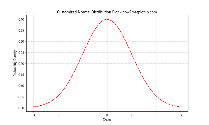
In this example, we’ve changed the color of the line to red, used a dashed line style, and increased the line width. We’ve also customized the grid to use a dotted line style.
Adding Multiple Distributions
You can plot multiple Normal Distribution Plot using Numpy and Matplotlib on the same graph to compare different distributions. Here’s how:
import numpy as np
import matplotlib.pyplot as plt

x = np.linspace(-5, 5, 100)
y1 = 1/(1 * np.sqrt(2 * np.pi)) * np.exp(-(x - 0)**2 / (2 * 1**2))
y2 = 1/(1.5 * np.sqrt(2 * np.pi)) * np.exp(-(x - 1)**2 / (2 * 1.5**2))

plt.figure(figsize=(10, 6))
plt.plot(x, y1, label='μ=0, σ=1')
plt.plot(x, y2, label='μ=1, σ=1.5')
plt.title('Multiple Normal Distributions - how2matplotlib.com')
plt.xlabel('X-axis')
plt.ylabel('Probability Density')
plt.legend()
plt.grid(True)
plt.show()
Output:
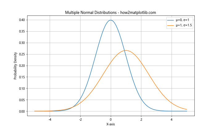
This example plots two normal distributions with different means and standard deviations, allowing for easy comparison.
Advanced Techniques for Normal Distribution Plot using Numpy and Matplotlib
As you become more comfortable with creating basic Normal Distribution Plot using Numpy and Matplotlib, you can explore more advanced techniques to enhance your visualizations and extract more insights from your data.
Filling Under the Curve
One useful technique is filling the area under the normal distribution curve. This can be particularly helpful when visualizing probabilities or comparing different regions of the distribution.
import numpy as np
import matplotlib.pyplot as plt

mu, sigma = 0, 1
x = np.linspace(mu - 3*sigma, mu + 3*sigma, 100)
y = 1/(sigma * np.sqrt(2 * np.pi)) * np.exp(-(x - mu)**2 / (2 * sigma**2))

plt.figure(figsize=(10, 6))
plt.plot(x, y, 'b', linewidth=2)
plt.fill_between(x, y, where=(x > -1) & (x < 1), color='skyblue', alpha=0.5)
plt.title('Normal Distribution with Filled Area - how2matplotlib.com')
plt.xlabel('X-axis')
plt.ylabel('Probability Density')
plt.text(0, 0.2, '68% of data', ha='center')
plt.grid(True)
plt.show()
Output:
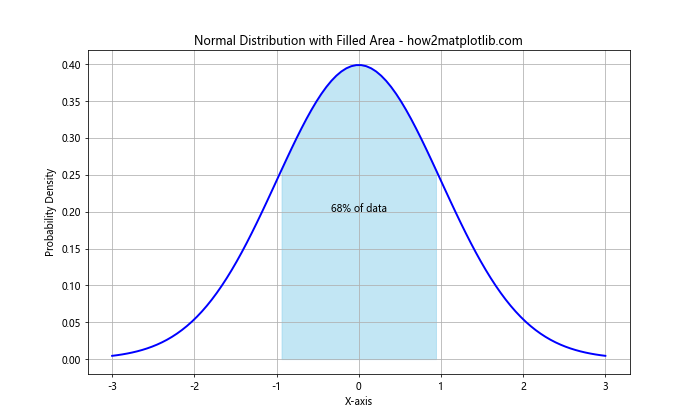
In this example, we use plt.fill_between() to shade the area between -1 and 1 standard deviations, which represents approximately 68% of the data in a normal distribution.
Creating a Histogram with Normal Distribution Overlay
Another useful technique is to create a histogram of your data and overlay a Normal Distribution Plot using Numpy and Matplotlib. This allows you to compare your actual data distribution to the theoretical normal distribution.
import numpy as np
import matplotlib.pyplot as plt

# Generate some random data
data = np.random.normal(0, 1, 1000)

# Create the histogram
plt.figure(figsize=(10, 6))
plt.hist(data, bins=30, density=True, alpha=0.7, color='skyblue')

# Generate points for the normal distribution line
x = np.linspace(-4, 4, 100)
y = 1/(1 * np.sqrt(2 * np.pi)) * np.exp(-(x - 0)**2 / (2 * 1**2))

# Plot the normal distribution line
plt.plot(x, y, 'r-', linewidth=2)

plt.title('Histogram with Normal Distribution Overlay - how2matplotlib.com')
plt.xlabel('Value')
plt.ylabel('Frequency')
plt.grid(True)
plt.show()
Output:
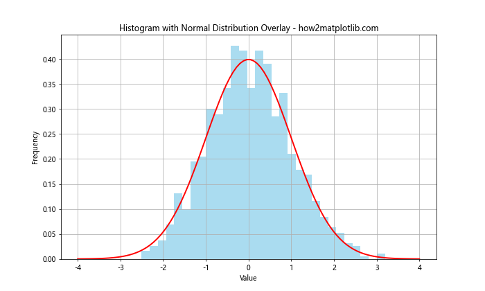
This example generates random data from a normal distribution, creates a histogram of this data, and then overlays the theoretical normal distribution curve.
Exploring Different Types of Normal Distribution Plot using Numpy and Matplotlib
While the standard line plot is the most common way to visualize a normal distribution, there are other types of plots that can provide different insights or be more suitable for certain types of data or analysis.
Cumulative Distribution Function (CDF) Plot
The Cumulative Distribution Function (CDF) is another way to visualize a Normal Distribution Plot using Numpy and Matplotlib. It shows the probability that a random variable is less than or equal to a given value.
import numpy as np
import matplotlib.pyplot as plt
from scipy.stats import norm

x = np.linspace(-3, 3, 100)
cdf = norm.cdf(x)

plt.figure(figsize=(10, 6))
plt.plot(x, cdf, 'b-', linewidth=2)
plt.title('Cumulative Distribution Function - how2matplotlib.com')
plt.xlabel('X-axis')
plt.ylabel('Cumulative Probability')
plt.grid(True)
plt.show()
Output:
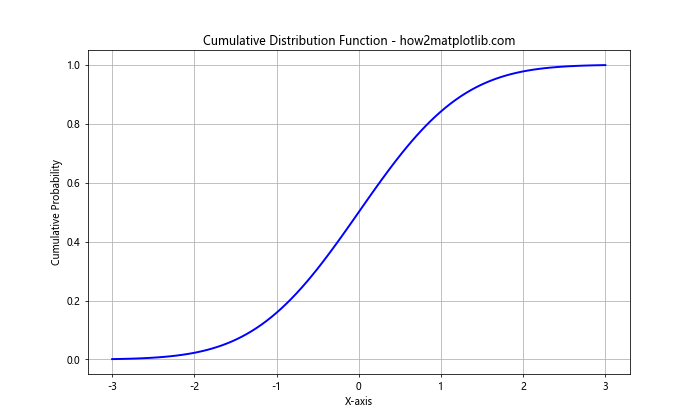
In this example, we use the scipy.stats module to calculate the CDF of a standard normal distribution.
Q-Q Plot
A Q-Q (Quantile-Quantile) plot is used to compare the distribution of a sample to a theoretical distribution, such as the normal distribution. It's a useful tool for assessing whether a dataset follows a normal distribution.
import numpy as np
import matplotlib.pyplot as plt
from scipy import stats

# Generate some sample data
data = np.random.normal(0, 1, 1000)

# Create Q-Q plot
fig, ax = plt.subplots(figsize=(10, 6))
stats.probplot(data, dist="norm", plot=ax)
ax.set_title("Q-Q Plot - how2matplotlib.com")
plt.grid(True)
plt.show()
Output:
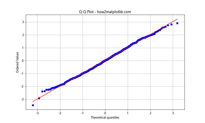
This example creates a Q-Q plot comparing a sample of random data to a normal distribution. If the points roughly follow a straight line, it suggests that the data is normally distributed.
Practical Applications of Normal Distribution Plot using Numpy and Matplotlib
Understanding how to create and interpret Normal Distribution Plot using Numpy and Matplotlib is valuable in many fields and applications. Let's explore some practical scenarios where these skills can be applied.
Analyzing Test Scores
Suppose you're an educator analyzing the distribution of test scores in your class. You can use a Normal Distribution Plot using Numpy and Matplotlib to visualize the distribution and identify any patterns or anomalies.
import numpy as np
import matplotlib.pyplot as plt

# Generate some sample test scores
scores = np.random.normal(75, 10, 100)

# Create histogram
plt.figure(figsize=(10, 6))
plt.hist(scores, bins=20, density=True, alpha=0.7, color='skyblue')

# Generate points for the normal distribution line
x = np.linspace(40, 110, 100)
y = 1/(10 * np.sqrt(2 * np.pi)) * np.exp(-(x - 75)**2 / (2 * 10**2))

# Plot the normal distribution line
plt.plot(x, y, 'r-', linewidth=2)

plt.title('Distribution of Test Scores - how2matplotlib.com')
plt.xlabel('Score')
plt.ylabel('Frequency')
plt.grid(True)
plt.show()
Output:
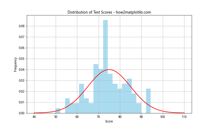
This example creates a histogram of test scores and overlays a normal distribution curve, allowing you to quickly assess how well the scores fit a normal distribution.
Quality Control in Manufacturing
In manufacturing, Normal Distribution Plot using Numpy and Matplotlib can be used to analyze the distribution of product measurements and ensure they fall within acceptable limits.
import numpy as np
import matplotlib.pyplot as plt

# Generate some sample measurements
measurements = np.random.normal(100, 2, 1000)

# Set specification limits
lower_limit, upper_limit = 95, 105

# Create the plot
plt.figure(figsize=(10, 6))
plt.hist(measurements, bins=30, density=True, alpha=0.7, color='skyblue')

# Generate points for the normal distribution line
x = np.linspace(90, 110, 100)
y = 1/(2 * np.sqrt(2 * np.pi)) * np.exp(-(x - 100)**2 / (2 * 2**2))

# Plot the normal distribution line
plt.plot(x, y, 'r-', linewidth=2)

# Add specification limits
plt.axvline(lower_limit, color='g', linestyle='--', label='Lower Limit')
plt.axvline(upper_limit, color='g', linestyle='--', label='Upper Limit')

plt.title('Product Measurements Distribution - how2matplotlib.com')
plt.xlabel('Measurement')
plt.ylabel('Frequency')
plt.legend()
plt.grid(True)
plt.show()
Output:
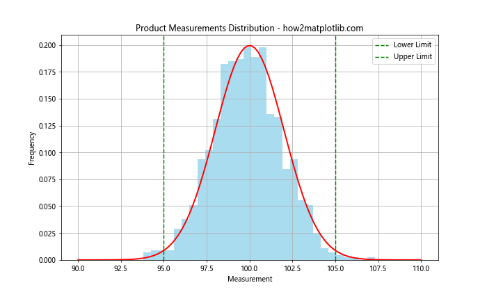
This example visualizes the distribution of product measurements and includes specification limits, allowing quality control personnel to quickly assess whether the production process is in control.
Advanced Customization of Normal Distribution Plot using Numpy and Matplotlib
As you become more proficient with Normal Distribution Plot using Numpy and Matplotlib, you may want to create more complex and informative visualizations. Let's explore some advanced customization techniques.
Adding Annotations
Annotations can provide additional context or highlight specific points of interest in your Normal Distribution Plot using Numpy and Matplotlib.
import numpy as np
import matplotlib.pyplot as plt

mu, sigma = 0, 1
x = np.linspace(mu - 3*sigma, mu + 3*sigma, 100)
y = 1/(sigma * np.sqrt(2 * np.pi)) * np.exp(-(x - mu)**2 / (2 * sigma**2))

plt.figure(figsize=(10, 6))
plt.plot(x, y, 'b-', linewidth=2)

# Add annotations
plt.annotate('Mean', xy=(0, 0.4), xytext=(0.5, 0.3),
             arrowprops=dict(facecolor='black', shrink=0.05))
plt.annotate('1 Std Dev', xy=(1, 0.24), xytext=(1.5, 0.15),
             arrowprops=dict(facecolor='black', shrink=0.05))

plt.title('Annotated Normal Distribution - how2matplotlib.com')
plt.xlabel('X-axis')
plt.ylabel('Probability Density')
plt.grid(True)
plt.show()
Output:
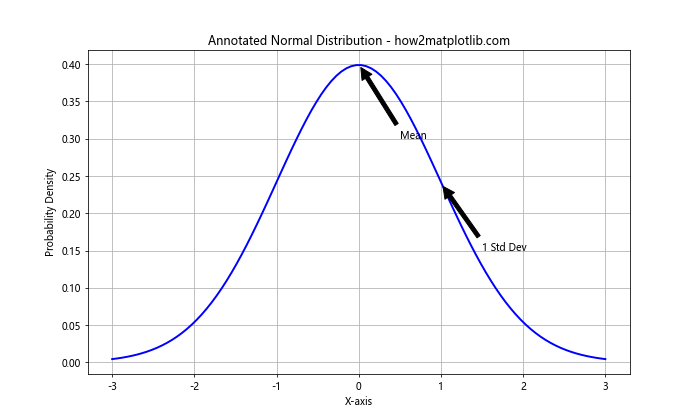
This example adds annotations to highlight the mean and one standard deviation from the mean.
Creating Subplots
Subplots allow you to display multiple Normal Distribution Plot using Numpy and Matplotlib side by side, which can be useful for comparing different distributions or aspects of the same distribution.
import numpy as np
import matplotlib.pyplot as plt

x = np.linspace(-5, 5, 100)

fig, (ax1, ax2) = plt.subplots(1, 2, figsize=(15, 6))

# Plot 1: Standard Normal Distribution
y1 = 1/(1 * np.sqrt(2 * np.pi)) * np.exp(-(x - 0)**2 / (2 * 1**2))
ax1.plot(x, y1, 'b-', linewidth=2)
ax1.set_title('Standard Normal Distribution - how2matplotlib.com')
ax1.set_xlabel('X-axis')
ax1.set_ylabel('Probability Density')
ax1.grid(True)

# Plot 2: Normal Distribution with different mean and std dev
y2 = 1/(1.5 * np.sqrt(2 * np.pi)) * np.exp(-(x - 1)**2 / (2 * 1.5**2))
ax2.plot(x, y2, 'r-', linewidth=2)
ax2.set_title('Normal Distribution (μ=1, σ=1.5) - how2matplotlib.com')
ax2.set_xlabel('X-axis')
ax2.set_ylabel('Probability Density')
ax2.grid(True)

plt.tight_layout()
plt.show()
Output:
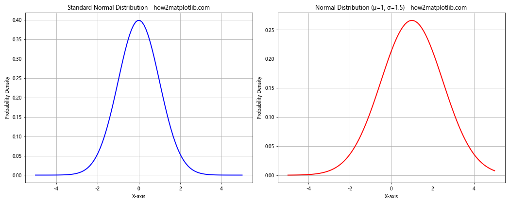
This example creates two subplots, each showing a different normal distribution, allowing for easy comparison.
Comparing Multiple Distributions
Often, you may need to compare multiple normal distributions or compare a normal distribution with other types of distributions. Let's explore how to create such comparisons using Normal Distribution Plot using Numpy and Matplotlib.
Comparing Normal Distributions with Different Parameters
Here's an example that compares three normal distributions with different means and standard deviations:
import numpy as np
import matplotlib.pyplot as plt

x = np.linspace(-5, 5, 100)

y1 = 1/(1 * np.sqrt(2 * np.pi)) * np.exp(-(x - 0)**2 / (2 * 1**2))
y2 = 1/(1.5 * np.sqrt(2 * np.pi)) * np.exp(-(x - 0.5)**2 / (2 * 1.5**2))
y3 = 1/(0.5 * np.sqrt(2 * np.pi)) * np.exp(-(x + 1)**2 / (2 * 0.5**2))

plt.figure(figsize=(12, 6))
plt.plot(x, y1, 'b-', linewidth=2, label='μ=0, σ=1')
plt.plot(x, y2, 'r-', linewidth=2, label='μ=0.5, σ=1.5')
plt.plot(x, y3, 'g-', linewidth=2, label='μ=-1, σ=0.5')

plt.title('Comparison of Normal Distributions - how2matplotlib.com')
plt.xlabel('X-axis')
plt.ylabel('Probability Density')
plt.legend()
plt.grid(True)
plt.show()
Output:
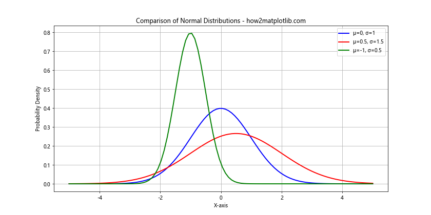
This plot allows you to visually compare how changes in the mean and standard deviation affect the shape and position of the normal distribution curve.
Comparing Normal Distribution with Other Distributions
You might also want to compare a normal distribution with other types of distributions. Here's an example comparing a normal distribution with a uniform distribution:
import numpy as np
import matplotlib.pyplot as plt
from scipy import stats

x = np.linspace(-4, 4, 100)

# Normal distribution
y_normal = stats.norm.pdf(x, 0, 1)

# Uniform distribution
y_uniform = stats.uniform.pdf(x, -2, 4)

plt.figure(figsize=(12, 6))
plt.plot(x, y_normal, 'b-', linewidth=2, label='Normal Distribution')
plt.plot(x, y_uniform, 'r-', linewidth=2, label='Uniform Distribution')

plt.title('Normal vs Uniform Distribution - how2matplotlib.com')
plt.xlabel('X-axis')
plt.ylabel('Probability Density')
plt.legend()
plt.grid(True)
plt.show()
Output:
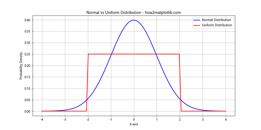
This example uses SciPy's stats module to generate the probability density functions for both normal and uniform distributions, allowing for easy comparison.
Advanced Statistical Analysis with Normal Distribution Plot using Numpy and Matplotlib
Normal Distribution Plot using Numpy and Matplotlib can be powerful tools for more advanced statistical analysis. Let's explore some of these applications.
Confidence Intervals
Confidence intervals are a range of values that are likely to contain the true population parameter with a certain level of confidence. We can visualize confidence intervals on a Normal Distribution Plot using Numpy and Matplotlib:
import numpy as np
import matplotlib.pyplot as plt
from scipy import stats

mu, sigma = 0, 1
x = np.linspace(mu - 3*sigma, mu + 3*sigma, 100)
y = stats.norm.pdf(x, mu, sigma)

plt.figure(figsize=(12, 6))
plt.plot(x, y, 'b-', linewidth=2)

# 95% confidence interval
ci_lower, ci_upper = stats.norm.interval(0.95, mu, sigma)
plt.fill_between(x, y, where=(x > ci_lower) & (x < ci_upper), color='skyblue', alpha=0.5)

plt.title('Normal Distribution with 95% Confidence Interval - how2matplotlib.com')
plt.xlabel('X-axis')
plt.ylabel('Probability Density')
plt.text(0, 0.2, '95% Confidence Interval', ha='center')
plt.grid(True)
plt.show()
Output:
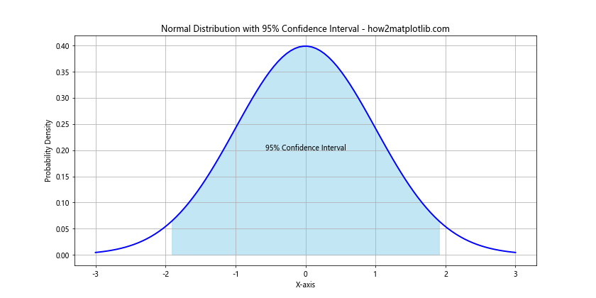
This example shades the area representing the 95% confidence interval on a standard normal distribution.
Hypothesis Testing
Normal Distribution Plot using Numpy and Matplotlib can also be used to visualize concepts in hypothesis testing, such as the p-value:
import numpy as np
import matplotlib.pyplot as plt
from scipy import stats

mu, sigma = 0, 1
x = np.linspace(mu - 4*sigma, mu + 4*sigma, 100)
y = stats.norm.pdf(x, mu, sigma)

plt.figure(figsize=(12, 6))
plt.plot(x, y, 'b-', linewidth=2)

# Hypothetical test statistic
test_statistic = 2
p_value = 1 - stats.norm.cdf(test_statistic)

# Shade p-value area
x_fill = np.linspace(test_statistic, mu + 4*sigma, 100)
y_fill = stats.norm.pdf(x_fill, mu, sigma)
plt.fill_between(x_fill, y_fill, color='red', alpha=0.5)

plt.title('Visualization of p-value - how2matplotlib.com')
plt.xlabel('X-axis')
plt.ylabel('Probability Density')
plt.text(2.5, 0.05, f'p-value = {p_value:.4f}', ha='center')
plt.axvline(test_statistic, color='r', linestyle='--')
plt.grid(True)
plt.show()
Output:
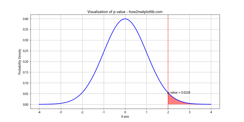
This example visualizes the p-value as the area under the curve to the right of a hypothetical test statistic.
Best Practices for Normal Distribution Plot using Numpy and Matplotlib
When creating Normal Distribution Plot using Numpy and Matplotlib, it's important to follow some best practices to ensure your visualizations are clear, informative, and professional. Here are some tips:
- Always label your axes and include a title. This provides context for your plot.
- Use appropriate scales. Sometimes a logarithmic scale might be more appropriate than a linear scale.
- Choose colors wisely. Use colors that are easy to distinguish and consider color-blind friendly palettes.
- Include a legend when plotting multiple distributions or datasets.
- Use gridlines to make it easier to read values from the plot.
- When appropriate, include error bars or confidence intervals to show uncertainty.
- Keep your plots simple and avoid cluttering them with unnecessary information.
Here's an example that incorporates many of these best practices:
import numpy as np
import matplotlib.pyplot as plt

# Generate data for three normal distributions
x = np.linspace(-5, 5, 100)
y1 = 1/(1 * np.sqrt(2 * np.pi)) * np.exp(-(x - 0)**2 / (2 * 1**2))
y2 = 1/(1.5 * np.sqrt(2 * np.pi)) * np.exp(-(x - 0.5)**2 / (2 * 1.5**2))
y3 = 1/(0.5 * np.sqrt(2 * np.pi)) * np.exp(-(x + 1)**2 / (2 * 0.5**2))

# Create the plot
plt.figure(figsize=(12, 6))
plt.plot(x, y1, 'b-', linewidth=2, label='Distribution 1 (μ=0, σ=1)')
plt.plot(x, y2, 'r-', linewidth=2, label='Distribution 2 (μ=0.5, σ=1.5)')
plt.plot(x, y3, 'g-', linewidth=2, label='Distribution 3 (μ=-1, σ=0.5)')

# Customize the plot
plt.title('Comparison of Normal Distributions - how2matplotlib.com', fontsize=16)
plt.xlabel('X-axis', fontsize=12)
plt.ylabel('Probability Density', fontsize=12)
plt.legend(fontsize=10)
plt.grid(True, linestyle='--', alpha=0.7)

# Set axis limits
plt.xlim(-5, 5)
plt.ylim(0, 0.9)

# Add a text box with additional information
plt.text(3, 0.8, 'This plot compares three\nnormal distributions\nwith different parameters',
         bbox=dict(facecolor='white', alpha=0.5))

plt.tight_layout()
plt.show()
Output:
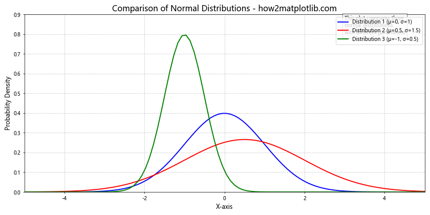
This example incorporates clear labeling, a legend, appropriate use of color, gridlines, and additional text information to create a comprehensive and informative plot.
Conclusion
Normal Distribution Plot using Numpy and Matplotlib is a powerful tool for data visualization and statistical analysis. From basic plots to advanced techniques, these libraries offer a wide range of capabilities for creating informative and visually appealing normal distribution plots.
By mastering these techniques, you'll be well-equipped to analyze and present data in various fields, from education and manufacturing to scientific research and beyond. Remember to always consider your audience and the story you're trying to tell with your data when creating your plots.