How to Customize Matplotlib Xticks Frequency: A Comprehensive Guide
Matplotlib xticks frequency is an essential aspect of data visualization that allows you to control the appearance and spacing of tick marks on the x-axis of your plots. By mastering the techniques to adjust matplotlib xticks frequency, you can create more readable and informative charts. This comprehensive guide will explore various methods and best practices for customizing matplotlib xticks frequency, providing you with the tools to enhance your data visualizations effectively.
Understanding Matplotlib Xticks Frequency
Matplotlib xticks frequency refers to the number and placement of tick marks along the x-axis of a plot. These tick marks serve as reference points for interpreting data and are typically accompanied by labels. By adjusting the matplotlib xticks frequency, you can control how often tick marks appear and what values they represent.
Let’s start with a basic example to illustrate the concept of matplotlib xticks frequency:
import matplotlib.pyplot as plt
import numpy as np

x = np.arange(0, 10, 0.1)
y = np.sin(x)

plt.plot(x, y)
plt.title('Basic Plot with Default Matplotlib Xticks Frequency')
plt.xlabel('X-axis')
plt.ylabel('Y-axis')
plt.text(5, 0.5, 'how2matplotlib.com', fontsize=12, ha='center')
plt.show()
Output:
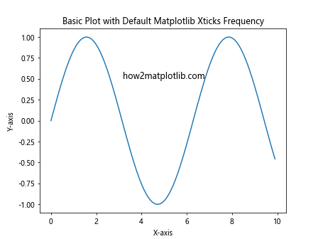
In this example, we create a simple sine wave plot using the default matplotlib xticks frequency. The x-axis tick marks are automatically placed by Matplotlib based on the data range and plot size.
Adjusting Matplotlib Xticks Frequency with set_xticks()
One of the most straightforward ways to customize matplotlib xticks frequency is by using the set_xticks() method. This method allows you to explicitly define the positions of the tick marks on the x-axis.
Here’s an example demonstrating how to use set_xticks() to adjust the matplotlib xticks frequency:
import matplotlib.pyplot as plt
import numpy as np

x = np.arange(0, 10, 0.1)
y = np.sin(x)

plt.plot(x, y)
plt.title('Custom Matplotlib Xticks Frequency with set_xticks()')
plt.xlabel('X-axis')
plt.ylabel('Y-axis')

# Set custom tick positions
plt.xticks(np.arange(0, 11, 2))

plt.text(5, 0.5, 'how2matplotlib.com', fontsize=12, ha='center')
plt.show()
Output:
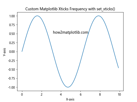
In this example, we use plt.xticks(np.arange(0, 11, 2)) to set custom tick positions at intervals of 2 units from 0 to 10. This results in a more controlled matplotlib xticks frequency compared to the default behavior.
Using Locators to Control Matplotlib Xticks Frequency
Matplotlib provides a powerful set of locator classes that offer more advanced control over tick placement and frequency. These locators can be used to automatically determine appropriate tick positions based on various criteria.
Let’s explore some commonly used locators for adjusting matplotlib xticks frequency:
MultipleLocator
The MultipleLocator is useful when you want to place ticks at regular intervals. Here’s an example:
import matplotlib.pyplot as plt
import numpy as np
from matplotlib.ticker import MultipleLocator

x = np.arange(0, 10, 0.1)
y = np.sin(x)

fig, ax = plt.subplots()
ax.plot(x, y)
ax.set_title('Matplotlib Xticks Frequency with MultipleLocator')
ax.set_xlabel('X-axis')
ax.set_ylabel('Y-axis')

# Set tick frequency to every 0.5 units
ax.xaxis.set_major_locator(MultipleLocator(0.5))

ax.text(5, 0.5, 'how2matplotlib.com', fontsize=12, ha='center')
plt.show()
Output:
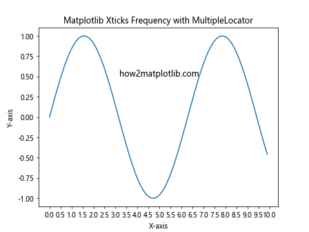
In this example, we use MultipleLocator(0.5) to place ticks every 0.5 units along the x-axis, resulting in a higher matplotlib xticks frequency.
MaxNLocator
The MaxNLocator allows you to specify the maximum number of ticks you want on the axis. Matplotlib will then try to choose the best tick locations within that constraint. Here’s an example:
import matplotlib.pyplot as plt
import numpy as np
from matplotlib.ticker import MaxNLocator

x = np.arange(0, 10, 0.1)
y = np.sin(x)

fig, ax = plt.subplots()
ax.plot(x, y)
ax.set_title('Matplotlib Xticks Frequency with MaxNLocator')
ax.set_xlabel('X-axis')
ax.set_ylabel('Y-axis')

# Set maximum number of ticks to 6
ax.xaxis.set_major_locator(MaxNLocator(6))

ax.text(5, 0.5, 'how2matplotlib.com', fontsize=12, ha='center')
plt.show()
Output:
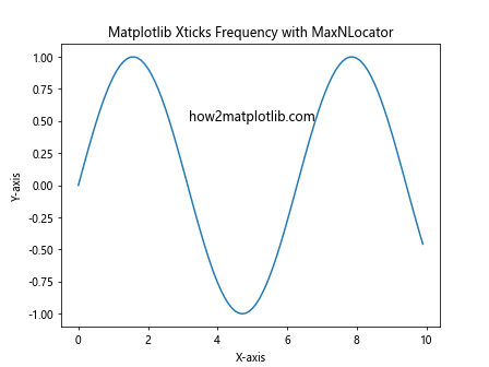
This example uses MaxNLocator(6) to limit the number of major ticks on the x-axis to a maximum of 6, allowing Matplotlib to determine the best matplotlib xticks frequency within this constraint.
AutoLocator
The AutoLocator is the default locator used by Matplotlib. It attempts to choose a reasonable number of ticks based on the data range and plot size. While it’s used by default, you can explicitly set it if you want to reset to default behavior:
import matplotlib.pyplot as plt
import numpy as np
from matplotlib.ticker import AutoLocator

x = np.arange(0, 10, 0.1)
y = np.sin(x)

fig, ax = plt.subplots()
ax.plot(x, y)
ax.set_title('Matplotlib Xticks Frequency with AutoLocator')
ax.set_xlabel('X-axis')
ax.set_ylabel('Y-axis')

# Set AutoLocator explicitly
ax.xaxis.set_major_locator(AutoLocator())

ax.text(5, 0.5, 'how2matplotlib.com', fontsize=12, ha='center')
plt.show()
Output:
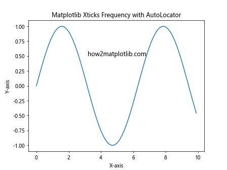
This example demonstrates the use of AutoLocator() to reset the matplotlib xticks frequency to the default behavior.
Fine-tuning Matplotlib Xticks Frequency with Minor Ticks
In addition to major ticks, you can also add minor ticks to your plots to provide more detailed reference points. Minor ticks can be particularly useful when dealing with large data ranges or when you need to show finer gradations without cluttering the axis with too many labels.
Here’s an example of how to add minor ticks to adjust the matplotlib xticks frequency:
import matplotlib.pyplot as plt
import numpy as np
from matplotlib.ticker import AutoMinorLocator

x = np.arange(0, 10, 0.1)
y = np.sin(x)

fig, ax = plt.subplots()
ax.plot(x, y)
ax.set_title('Matplotlib Xticks Frequency with Minor Ticks')
ax.set_xlabel('X-axis')
ax.set_ylabel('Y-axis')

# Add minor ticks
ax.xaxis.set_minor_locator(AutoMinorLocator())

ax.text(5, 0.5, 'how2matplotlib.com', fontsize=12, ha='center')
plt.show()
Output:

In this example, we use AutoMinorLocator() to automatically add minor ticks between the major ticks, effectively increasing the matplotlib xticks frequency without adding more labels.
Customizing Matplotlib Xticks Frequency for Date and Time Data
When working with date and time data, adjusting the matplotlib xticks frequency requires special consideration. Matplotlib provides specific locators and formatters designed for handling date and time information.
Let’s look at an example of how to customize matplotlib xticks frequency for a time series plot:
import matplotlib.pyplot as plt
import numpy as np
from datetime import datetime, timedelta
from matplotlib.dates import DateFormatter, DayLocator, HourLocator

# Generate sample date and time data
start_date = datetime(2023, 1, 1)
dates = [start_date + timedelta(hours=i) for i in range(168)]  # One week of hourly data
values = np.random.randn(len(dates))

fig, ax = plt.subplots(figsize=(12, 6))
ax.plot(dates, values)
ax.set_title('Matplotlib Xticks Frequency for Date and Time Data')
ax.set_xlabel('Date')
ax.set_ylabel('Value')

# Set major ticks to appear daily
ax.xaxis.set_major_locator(DayLocator())
ax.xaxis.set_major_formatter(DateFormatter('%Y-%m-%d'))

# Set minor ticks to appear every 6 hours
ax.xaxis.set_minor_locator(HourLocator(byhour=range(0, 24, 6)))

plt.xticks(rotation=45)
fig.tight_layout()

ax.text(dates[len(dates)//2], 0, 'how2matplotlib.com', fontsize=12, ha='center')
plt.show()
Output:
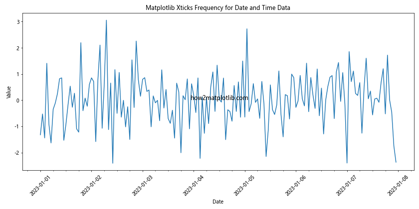
In this example, we use DayLocator() for major ticks (showing dates) and HourLocator(byhour=range(0, 24, 6)) for minor ticks (showing 6-hour intervals). This combination provides a clear representation of the time series data with an appropriate matplotlib xticks frequency.
Adjusting Matplotlib Xticks Frequency for Logarithmic Scales
When dealing with data that spans several orders of magnitude, a logarithmic scale can be more appropriate. Adjusting the matplotlib xticks frequency for logarithmic scales requires a different approach.
Here’s an example of how to customize matplotlib xticks frequency on a logarithmic scale:
import matplotlib.pyplot as plt
import numpy as np
from matplotlib.ticker import LogLocator, LogFormatter

x = np.logspace(0, 5, 100)
y = x**2

fig, ax = plt.subplots()
ax.loglog(x, y)
ax.set_title('Matplotlib Xticks Frequency on Logarithmic Scale')
ax.set_xlabel('X-axis (log scale)')
ax.set_ylabel('Y-axis (log scale)')

# Customize tick locations and labels
ax.xaxis.set_major_locator(LogLocator(base=10, numticks=6))
ax.xaxis.set_major_formatter(LogFormatter(base=10, labelOnlyBase=False))

ax.text(1e3, 1e6, 'how2matplotlib.com', fontsize=12, ha='center')
plt.show()
Output:
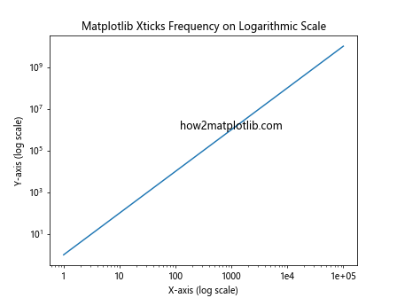
In this example, we use LogLocator(base=10, numticks=6) to set the major tick locations on the logarithmic scale, and LogFormatter(base=10, labelOnlyBase=False) to format the tick labels. This results in a clear and informative matplotlib xticks frequency for the logarithmic scale.
Handling Overlapping Labels in Matplotlib Xticks Frequency
When dealing with dense data or long labels, you may encounter overlapping labels as you adjust the matplotlib xticks frequency. There are several strategies to address this issue:
Rotating Labels
One simple solution is to rotate the tick labels:
import matplotlib.pyplot as plt
import numpy as np

x = np.arange(10)
y = np.random.rand(10)

fig, ax = plt.subplots()
ax.bar(x, y)
ax.set_title('Matplotlib Xticks Frequency with Rotated Labels')
ax.set_xlabel('Categories')
ax.set_ylabel('Values')

# Set custom tick positions and labels
ax.set_xticks(x)
ax.set_xticklabels([f'Category {i}\nhow2matplotlib.com' for i in x])

# Rotate labels
plt.xticks(rotation=45, ha='right')

plt.tight_layout()
plt.show()
Output:
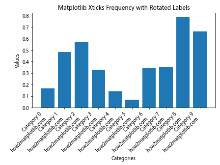
In this example, we rotate the labels by 45 degrees and align them to the right, which can help prevent overlap when increasing the matplotlib xticks frequency.
Using Tick Locators to Reduce Frequency
Another approach is to use tick locators to reduce the frequency of labels:
import matplotlib.pyplot as plt
import numpy as np
from matplotlib.ticker import MaxNLocator

x = np.arange(20)
y = np.random.rand(20)

fig, ax = plt.subplots()
ax.plot(x, y, 'o-')
ax.set_title('Matplotlib Xticks Frequency with Reduced Labels')
ax.set_xlabel('X-axis')
ax.set_ylabel('Y-axis')

# Reduce the number of ticks
ax.xaxis.set_major_locator(MaxNLocator(5))

ax.text(10, 0.5, 'how2matplotlib.com', fontsize=12, ha='center')
plt.show()
Output:
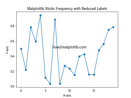
In this example, we use MaxNLocator(5) to limit the number of ticks, effectively reducing the matplotlib xticks frequency and preventing label overlap.
Advanced Techniques for Matplotlib Xticks Frequency Customization
For more complex scenarios, you might need to employ advanced techniques to achieve the desired matplotlib xticks frequency. Let’s explore some of these methods:
Custom Locator Function
You can create a custom locator function to have full control over tick placement:
import matplotlib.pyplot as plt
import numpy as np
from matplotlib.ticker import FuncFormatter

def custom_locator(min_val, max_val, nb_ticks=5):
    return np.linspace(min_val, max_val, nb_ticks)

x = np.arange(0, 100, 0.1)
y = np.sin(x / 10) * np.exp(-x / 50)

fig, ax = plt.subplots()
ax.plot(x, y)
ax.set_title('Matplotlib Xticks Frequency with Custom Locator')
ax.set_xlabel('X-axis')
ax.set_ylabel('Y-axis')

# Apply custom locator
ax.xaxis.set_major_locator(plt.FuncLocator(lambda v: custom_locator(x.min(), x.max())))
ax.xaxis.set_major_formatter(FuncFormatter(lambda v, p: f'{v:.1f}\nhow2matplotlib.com'))

plt.show()
This example demonstrates how to create and use a custom locator function to control the matplotlib xticks frequency precisely.
Combining Multiple Locators
In some cases, you might want to combine different locators to achieve a specific matplotlib xticks frequency pattern:
import matplotlib.pyplot as plt
import numpy as np
from matplotlib.ticker import MultipleLocator, AutoMinorLocator

x = np.arange(0, 10, 0.1)
y = np.sin(x)

fig, ax = plt.subplots()
ax.plot(x, y)
ax.set_title('Matplotlib Xticks Frequency with Combined Locators')
ax.set_xlabel('X-axis')
ax.set_ylabel('Y-axis')

# Combine multiple locators
ax.xaxis.set_major_locator(MultipleLocator(2))
ax.xaxis.set_minor_locator(AutoMinorLocator(4))

ax.text(5, 0.5, 'how2matplotlib.com', fontsize=12, ha='center')
plt.show()
Output:
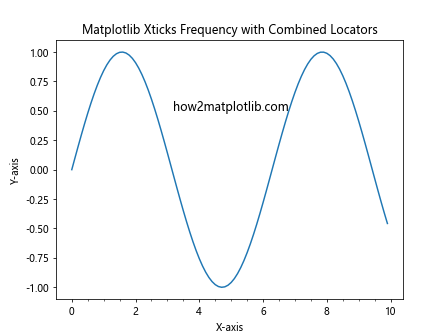
In this example, we combine MultipleLocator for major ticks and AutoMinorLocator for minor ticks to create a more complex matplotlib xticks frequency pattern.
Best Practices for Matplotlib Xticks Frequency
When working with matplotlib xticks frequency, it’s important to keep some best practices in mind to ensure your plots are both informative and visually appealing:
- Balance Information and Clarity: Strive for a matplotlib xticks frequency that provides enough information without cluttering the plot. Too many ticks can make the plot hard to read, while too few canleave out important details.
Consider Data Range: Adjust the matplotlib xticks frequency based on the range of your data. Larger ranges may require fewer ticks, while smaller ranges might benefit from more frequent ticks.
Use Appropriate Scales: Choose between linear, logarithmic, or other scales based on your data distribution. This choice will affect how you approach matplotlib xticks frequency.
Align with Data Points: When possible, try to align tick marks with significant data points or intervals to make the plot more intuitive.
Consistent Formatting: Maintain consistent formatting for tick labels across your plots to ensure a professional appearance.
Consider Plot Size: The optimal matplotlib xticks frequency may vary depending on the size of your plot. Adjust accordingly for different display sizes.
Use Minor Ticks Judiciously: Minor ticks can provide additional reference points, but use them sparingly to avoid visual clutter.
Test Different Options: Experiment with various locators and formatters to find the best matplotlib xticks frequency for your specific data and visualization goals.
Troubleshooting Common Matplotlib Xticks Frequency Issues
Even with careful planning, you may encounter issues when customizing matplotlib xticks frequency. Here are some common problems and their solutions: