Comprehensive Guide to Matplotlib.axis.Axis.set_label_position() Function in Python
Matplotlib.axis.Axis.set_label_position() function in Python is a powerful tool for customizing the position of axis labels in Matplotlib plots. This function allows you to precisely control where the labels appear relative to the axis, enhancing the readability and aesthetics of your visualizations. In this comprehensive guide, we’ll explore the Matplotlib.axis.Axis.set_label_position() function in depth, covering its usage, parameters, and various applications with practical examples.
Understanding the Matplotlib.axis.Axis.set_label_position() Function
The Matplotlib.axis.Axis.set_label_position() function is a method of the Axis class in Matplotlib. It is used to set the position of the axis label relative to the axis. This function is particularly useful when you want to fine-tune the appearance of your plots by adjusting the placement of axis labels.
Basic Syntax
The basic syntax of the Matplotlib.axis.Axis.set_label_position() function is as follows:
axis.set_label_position(position)
Where:
axisis the Axis object on which you want to set the label positionpositionis a string specifying the desired position of the label
Let’s look at a simple example to illustrate the usage of Matplotlib.axis.Axis.set_label_position():
import matplotlib.pyplot as plt

# Create a figure and axis
fig, ax = plt.subplots()

# Plot some data
ax.plot([1, 2, 3, 4], [1, 4, 2, 3])

# Set x-axis label position to 'top'
ax.xaxis.set_label_position('top')
ax.set_xlabel('X-axis (how2matplotlib.com)')

# Set y-axis label position to 'right'
ax.yaxis.set_label_position('right')
ax.set_ylabel('Y-axis (how2matplotlib.com)')

plt.show()
Output:
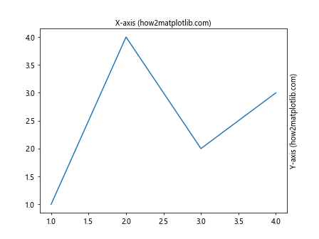
In this example, we use Matplotlib.axis.Axis.set_label_position() to move the x-axis label to the top of the plot and the y-axis label to the right side of the plot. This demonstrates how you can easily customize the position of axis labels using this function.
Parameters of Matplotlib.axis.Axis.set_label_position()
The Matplotlib.axis.Axis.set_label_position() function takes a single parameter:
position(str): This parameter specifies the position of the axis label. The allowed values depend on the axis:- For the x-axis: ‘top’ or ‘bottom’
- For the y-axis: ‘left’ or ‘right’
Understanding these parameters is crucial for effectively using the Matplotlib.axis.Axis.set_label_position() function. Let’s explore each of them in more detail with examples.
X-axis Label Positioning
For the x-axis, you can set the label position to either ‘top’ or ‘bottom’. Here’s an example demonstrating both options:
import matplotlib.pyplot as plt

fig, (ax1, ax2) = plt.subplots(2, 1, figsize=(8, 8))

# Plot for bottom label position (default)
ax1.plot([1, 2, 3, 4], [1, 4, 2, 3])
ax1.set_xlabel('X-axis (Bottom) (how2matplotlib.com)')
ax1.set_title('Default X-axis Label Position')

# Plot for top label position
ax2.plot([1, 2, 3, 4], [1, 4, 2, 3])
ax2.xaxis.set_label_position('top')
ax2.set_xlabel('X-axis (Top) (how2matplotlib.com)')
ax2.set_title('X-axis Label at Top')

plt.tight_layout()
plt.show()
Output:
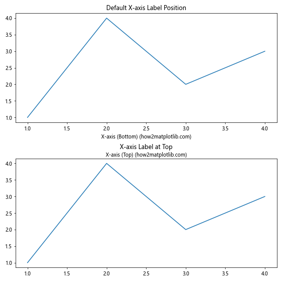
In this example, we create two subplots. The first subplot shows the default x-axis label position (bottom), while the second subplot uses Matplotlib.axis.Axis.set_label_position() to move the x-axis label to the top.
Y-axis Label Positioning
Similarly, for the y-axis, you can set the label position to either ‘left’ or ‘right’. Here’s an example:
import matplotlib.pyplot as plt

fig, (ax1, ax2) = plt.subplots(1, 2, figsize=(12, 5))

# Plot for left label position (default)
ax1.plot([1, 2, 3, 4], [1, 4, 2, 3])
ax1.set_ylabel('Y-axis (Left) (how2matplotlib.com)')
ax1.set_title('Default Y-axis Label Position')

# Plot for right label position
ax2.plot([1, 2, 3, 4], [1, 4, 2, 3])
ax2.yaxis.set_label_position('right')
ax2.set_ylabel('Y-axis (Right) (how2matplotlib.com)')
ax2.set_title('Y-axis Label at Right')

plt.tight_layout()
plt.show()
Output:
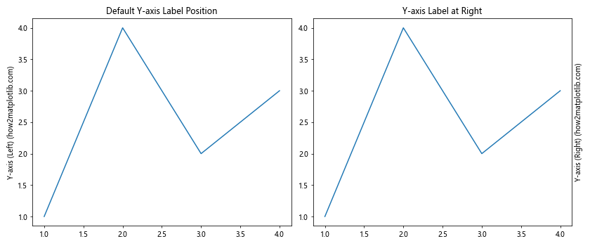
This example creates two side-by-side subplots. The left subplot shows the default y-axis label position (left), while the right subplot uses Matplotlib.axis.Axis.set_label_position() to move the y-axis label to the right side of the plot.
Advanced Usage of Matplotlib.axis.Axis.set_label_position()
While the basic usage of Matplotlib.axis.Axis.set_label_position() is straightforward, there are several advanced techniques and combinations you can use to create more complex and informative visualizations. Let’s explore some of these advanced uses.
Combining X and Y Axis Label Positioning
You can use Matplotlib.axis.Axis.set_label_position() on both x and y axes simultaneously to create unique layouts. Here’s an example:
import matplotlib.pyplot as plt

fig, ax = plt.subplots(figsize=(8, 6))

# Plot some data
ax.plot([1, 2, 3, 4], [1, 4, 2, 3])

# Set x-axis label position to 'top'
ax.xaxis.set_label_position('top')
ax.set_xlabel('X-axis (Top) (how2matplotlib.com)')

# Set y-axis label position to 'right'
ax.yaxis.set_label_position('right')
ax.set_ylabel('Y-axis (Right) (how2matplotlib.com)')

ax.set_title('Combined X and Y Axis Label Positioning')

plt.show()
Output:
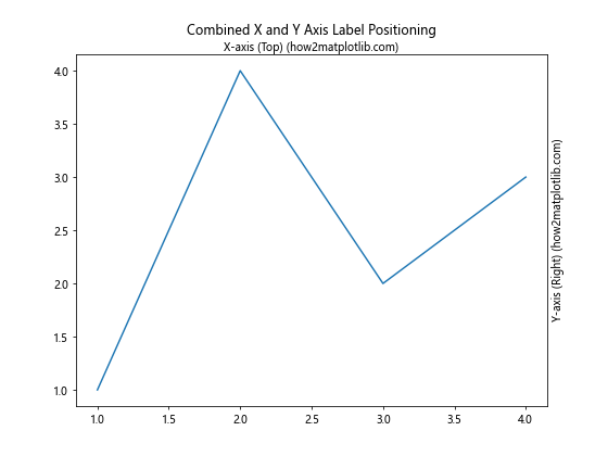
In this example, we use Matplotlib.axis.Axis.set_label_position() to move both the x-axis label to the top and the y-axis label to the right, creating a unique layout that might be useful for certain types of data visualization.
Using set_label_position() with Twin Axes
Matplotlib allows you to create twin axes, which can be useful for plotting data with different scales. You can use Matplotlib.axis.Axis.set_label_position() with twin axes to create clear and informative plots. Here’s an example:
import matplotlib.pyplot as plt
import numpy as np

fig, ax1 = plt.subplots(figsize=(10, 6))

x = np.linspace(0, 10, 100)
y1 = np.sin(x)
y2 = np.exp(x)

# Plot data on the primary y-axis
ax1.plot(x, y1, 'b-', label='sin(x)')
ax1.set_xlabel('X-axis (how2matplotlib.com)')
ax1.set_ylabel('Y1 - sin(x) (how2matplotlib.com)', color='b')
ax1.tick_params(axis='y', labelcolor='b')

# Create a twin axis
ax2 = ax1.twinx()

# Plot data on the secondary y-axis
ax2.plot(x, y2, 'r-', label='exp(x)')
ax2.set_ylabel('Y2 - exp(x) (how2matplotlib.com)', color='r')
ax2.tick_params(axis='y', labelcolor='r')

# Set the position of the secondary y-axis label
ax2.yaxis.set_label_position('left')

plt.title('Twin Axes with Custom Label Positioning')
plt.show()
Output:
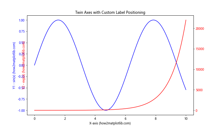
In this example, we create a plot with two y-axes. The primary y-axis shows sin(x), while the secondary y-axis shows exp(x). We use Matplotlib.axis.Axis.set_label_position() to move the label of the secondary y-axis to the left side, creating a clear separation between the two scales.
Customizing Tick Label Positions
While Matplotlib.axis.Axis.set_label_position() is used for axis labels, you can combine it with other Matplotlib functions to create even more customized plots. For example, you can use tick_params() to adjust the position of tick labels. Here’s an example:
import matplotlib.pyplot as plt

fig, ax = plt.subplots(figsize=(8, 6))

# Plot some data
ax.plot([1, 2, 3, 4], [1, 4, 2, 3])

# Set x-axis label position to 'top'
ax.xaxis.set_label_position('top')
ax.set_xlabel('X-axis (Top) (how2matplotlib.com)')

# Set y-axis label position to 'right'
ax.yaxis.set_label_position('right')
ax.set_ylabel('Y-axis (Right) (how2matplotlib.com)')

# Customize tick label positions
ax.tick_params(axis='x', which='both', top=True, bottom=False, labeltop=True, labelbottom=False)
ax.tick_params(axis='y', which='both', left=False, right=True, labelleft=False, labelright=True)

ax.set_title('Custom Label and Tick Positioning')

plt.show()
Output:
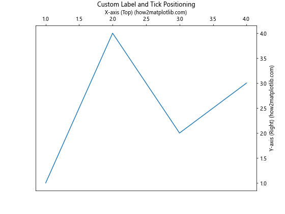
In this example, we not only use Matplotlib.axis.Axis.set_label_position() to move the axis labels but also use tick_params() to move the tick labels to match the new axis label positions. This creates a consistent look where both the axis labels and tick labels are on the top and right sides of the plot.
Practical Applications of Matplotlib.axis.Axis.set_label_position()
Now that we’ve covered the basics and some advanced techniques, let’s explore some practical applications of the Matplotlib.axis.Axis.set_label_position() function in various types of plots.
Creating a Bottom-Right Labeled Plot
Sometimes, you might want to create a plot where both axis labels are at the bottom and right sides. This can be useful for certain types of data visualization or to match specific style guidelines. Here’s how you can achieve this using Matplotlib.axis.Axis.set_label_position():
import matplotlib.pyplot as plt
import numpy as np

fig, ax = plt.subplots(figsize=(8, 6))

# Generate some data
x = np.linspace(0, 10, 100)
y = np.sin(x) * np.exp(-x/10)

# Plot the data
ax.plot(x, y)

# Set x-axis label position to 'bottom' (default)
ax.set_xlabel('X-axis (Bottom) (how2matplotlib.com)')

# Set y-axis label position to 'right'
ax.yaxis.set_label_position('right')
ax.set_ylabel('Y-axis (Right) (how2matplotlib.com)')

# Move y-axis ticks and labels to the right
ax.tick_params(axis='y', which='both', left=False, right=True, labelleft=False, labelright=True)

ax.set_title('Bottom-Right Labeled Plot')

plt.show()
Output:
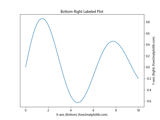
In this example, we create a plot with a sine wave that decays exponentially. We use Matplotlib.axis.Axis.set_label_position() to move the y-axis label to the right side while keeping the x-axis label at the bottom. We also adjust the tick parameters to move the y-axis ticks and labels to the right side for consistency.
Dual-Axis Plot with Custom Label Positioning
When creating dual-axis plots, you can use Matplotlib.axis.Axis.set_label_position() to clearly differentiate between the two axes. Here’s an example:
import matplotlib.pyplot as plt
import numpy as np

fig, ax1 = plt.subplots(figsize=(10, 6))

# Generate data
x = np.linspace(0, 10, 100)
y1 = np.sin(x)
y2 = np.cos(x) * 10

# Plot data on the primary y-axis
color = 'tab:blue'
ax1.set_xlabel('X-axis (how2matplotlib.com)')
ax1.set_ylabel('sin(x) (how2matplotlib.com)', color=color)
ax1.plot(x, y1, color=color)
ax1.tick_params(axis='y', labelcolor=color)

# Create a secondary y-axis
ax2 = ax1.twinx()

# Plot data on the secondary y-axis
color = 'tab:orange'
ax2.set_ylabel('cos(x) * 10 (how2matplotlib.com)', color=color)
ax2.plot(x, y2, color=color)
ax2.tick_params(axis='y', labelcolor=color)

# Set the position of the secondary y-axis label
ax2.yaxis.set_label_position('left')

# Adjust layout and show plot
fig.tight_layout()
plt.title('Dual-Axis Plot with Custom Label Positioning')
plt.show()
Output:
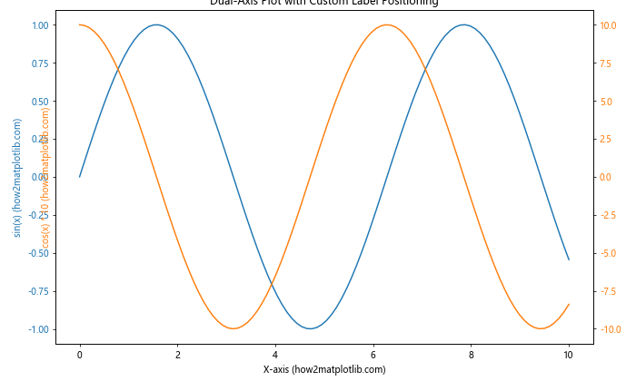
In this example, we create a dual-axis plot showing sin(x) on the primary y-axis and cos(x) * 10 on the secondary y-axis. We use Matplotlib.axis.Axis.set_label_position() to move the label of the secondary y-axis to the left side, creating a clear visual separation between the two scales.
Horizontal Bar Chart with Right-Side Labels
For horizontal bar charts, you might want to position the y-axis label on the right side for better readability. Here’s how you can do this using Matplotlib.axis.Axis.set_label_position():
import matplotlib.pyplot as plt

fig, ax = plt.subplots(figsize=(10, 6))

# Data for the horizontal bar chart
categories = ['Category A', 'Category B', 'Category C', 'Category D', 'Category E']
values = [23, 45, 56, 78, 32]

# Create horizontal bar chart
ax.barh(categories, values)

# Set x-axis label
ax.set_xlabel('Values (how2matplotlib.com)')

# Set y-axis label position to 'right'
ax.yaxis.set_label_position('right')
ax.set_ylabel('Categories (how2matplotlib.com)')

# Move y-axis ticks and labels to the right
ax.tick_params(axis='y', which='both', left=False, right=True, labelleft=False, labelright=True)

ax.set_title('Horizontal Bar Chart with Right-Side Labels')

plt.tight_layout()
plt.show()
Output:
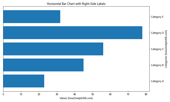
In this example, we create a horizontal bar chart and use Matplotlib.axis.Axis.set_label_position() to move the y-axis label (which represents the categories) to the right side of the plot. This layout can be more intuitive for horizontal bar charts, as it places the category labels closer to the ends of the bars.
Best Practices and Tips for Using Matplotlib.axis.Axis.set_label_position()
When working with the Matplotlib.axis.Axis.set_label_position() function, there are several best practices and tips to keep in mind to create effective and visually appealing plots. Let’s explore some of these:
1. Consistency in Label Positioning
When using Matplotlib.axis.Axis.set_label_position(), it’s important to maintain consistency across your plots, especially if you’re creating multiple plots for a single project or publication. Consistent label positioning helps readers quickly understand and compare different plots. Here’s an example of how to create a consistent style for multiple subplots:
import matplotlib.pyplot as plt
import numpy as np

fig, (ax1, ax2) = plt.subplots(1, 2, figsize=(12, 5))

x = np.linspace(0, 10, 100)

# Plot 1
ax1.plot(x, np.sin(x))
ax1.set_title('Sine Wave')
ax1.xaxis.set_label_position('top')
ax1.yaxis.set_label_position('right')
ax1.set_xlabel('X-axis (how2matplotlib.com)')
ax1.set_ylabel('sin(x) (how2matplotlib.com)')

# Plot 2
ax2.plot(x, np.cos(x))
ax2.set_title('Cosine Wave')
ax2.xaxis.set_label_position('top')
ax2.yaxis.set_label_position('right')
ax2.set_xlabel('X-axis (how2matplotlib.com)')
ax2.set_ylabel('cos(x) (how2matplotlib.com)')

plt.tight_layout()
plt.show()
Output:
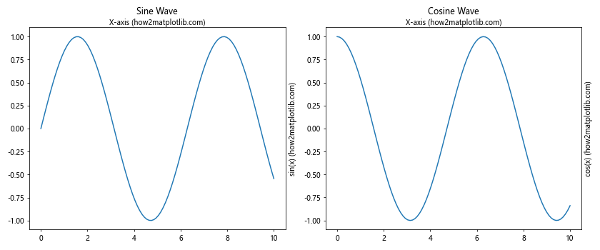
In this example, we create two subplots with consistent label positioning using Matplotlib.axis.Axis.set_label_position(). Both plots have their x-axis labels at the top and y-axis labels on the right, creating a uniform look across the figure.
2. Combining with Other Customization Functions
Matplotlib.axis.Axis.set_label_position() works well in combination with other Matplotlib customization functions. For example, you can use it alongside tick_params() to create a fully customized axis appearance:
import matplotlib.pyplot as plt
import numpy as np

fig, ax = plt.subplots(figsize=(8, 6))

x = np.linspace(0, 10, 100)
y = np.sin(x)

ax.plot(x, y)

# Customize x-axis
ax.xaxis.set_label_position('top')
ax.set_xlabel('X-axis (how2matplotlib.com)')
ax.tick_params(axis='x', which='both', top=True, bottom=False, labeltop=True, labelbottom=False)

# Customize y-axis
ax.yaxis.set_label_position('right')
ax.set_ylabel('Y-axis (how2matplotlib.com)')
ax.tick_params(axis='y', which='both', left=False, right=True, labelleft=False, labelright=True)

ax.set_title('Fully Customized Axis Appearance')

plt.show()
Output:
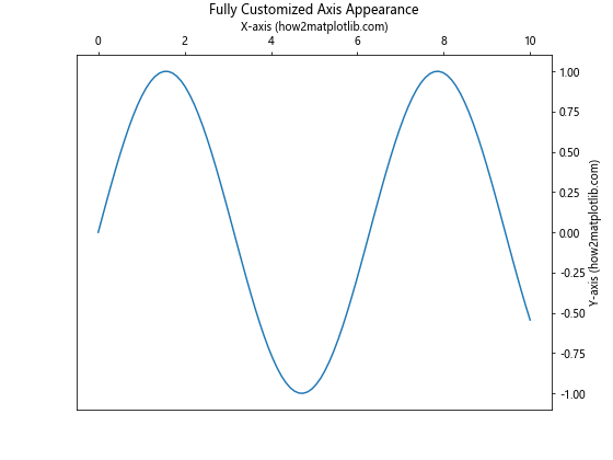
This example demonstrates how to use Matplotlib.axis.Axis.set_label_position() in conjunction with tick_params() to create a plot with both labels and tick marks on the top and right sides.
3. Considering Data Visualization Best Practices
While Matplotlib.axis.Axis.set_label_position() gives you the flexibility to position labels as you wish, it’s important to consider data visualization best practices. In most cases, the default positioning (x-axis label at the bottom, y-axis label on the left) is the most familiar and easiest to read for most audiences. Use custom positioning when it truly enhances the readability or serves a specific purpose in your visualization.
4. Adjusting for Readability
When changing label positions, make sure to check that the labels don’t overlap with other elements of your plot. You may need to adjust the plot’s layout or size to accommodate the new label positions. Here’s an example of how to handle potential overlapping:
import matplotlib.pyplot as plt
import numpy as np

fig, ax = plt.subplots(figsize=(8, 6))

x = np.linspace(0, 10, 100)
y = np.sin(x)

ax.plot(x, y)

ax.xaxis.set_label_position('top')
ax.set_xlabel('X-axis (how2matplotlib.com)')

ax.yaxis.set_label_position('right')
ax.set_ylabel('Y-axis (how2matplotlib.com)')

# Adjust layout to prevent overlapping
plt.tight_layout()

# Add extra space at the top for the x-axis label
plt.subplots_adjust(top=0.85)

ax.set_title('Adjusted Layout for Better Readability')

plt.show()
Output:
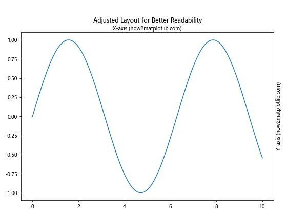
In this example, we use plt.tight_layout() and plt.subplots_adjust() to ensure that the repositioned labels don’t overlap with the plot title or other elements.
Common Pitfalls and How to Avoid Them
When using the Matplotlib.axis.Axis.set_label_position() function, there are some common pitfalls that you should be aware of. Let’s discuss these and how to avoid them:
1. Forgetting to Move Tick Labels
One common mistake is moving the axis label without moving the corresponding tick labels. This can result in a confusing plot where the main label and tick labels are on opposite sides. To avoid this, always remember to adjust the tick parameters when you change the label position:
import matplotlib.pyplot as plt
import numpy as np

fig, (ax1, ax2) = plt.subplots(1, 2, figsize=(12, 5))

x = np.linspace(0, 10, 100)
y = np.sin(x)

# Incorrect: Label moved but ticks remain
ax1.plot(x, y)
ax1.yaxis.set_label_position('right')
ax1.set_ylabel('Incorrect (how2matplotlib.com)')
ax1.set_title('Label Moved, Ticks Unchanged')

# Correct: Label and ticks moved
ax2.plot(x, y)
ax2.yaxis.set_label_position('right')
ax2.set_ylabel('Correct (how2matplotlib.com)')
ax2.tick_params(axis='y', which='both', left=False, right=True, labelleft=False, labelright=True)
ax2.set_title('Label and Ticks Moved')

plt.tight_layout()
plt.show()
Output:
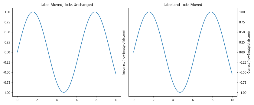
This example shows the difference between moving only the label (incorrect) and moving both the label and tick labels (correct) using Matplotlib.axis.Axis.set_label_position().
2. Overlapping Labels in Multi-Axis Plots
When creating plots with multiple axes, such as with twinx(), be careful not to create overlapping labels. Here’s an example of how to avoid this:
import matplotlib.pyplot as plt
import numpy as np

fig, ax1 = plt.subplots(figsize=(10, 6))

x = np.linspace(0, 10, 100)
y1 = np.sin(x)
y2 = np.cos(x)

# Plot on primary y-axis
ax1.plot(x, y1, 'b-', label='sin(x)')
ax1.set_xlabel('X-axis (how2matplotlib.com)')
ax1.set_ylabel('sin(x) (how2matplotlib.com)', color='b')
ax1.tick_params(axis='y', labelcolor='b')

# Create secondary y-axis
ax2 = ax1.twinx()
ax2.plot(x, y2, 'r-', label='cos(x)')
ax2.set_ylabel('cos(x) (how2matplotlib.com)', color='r')
ax2.tick_params(axis='y', labelcolor='r')

# Avoid overlap by setting label positions
ax1.yaxis.set_label_position('left')
ax2.yaxis.set_label_position('right')

plt.title('Multi-Axis Plot with Non-Overlapping Labels')
plt.tight_layout()
plt.show()
Output:
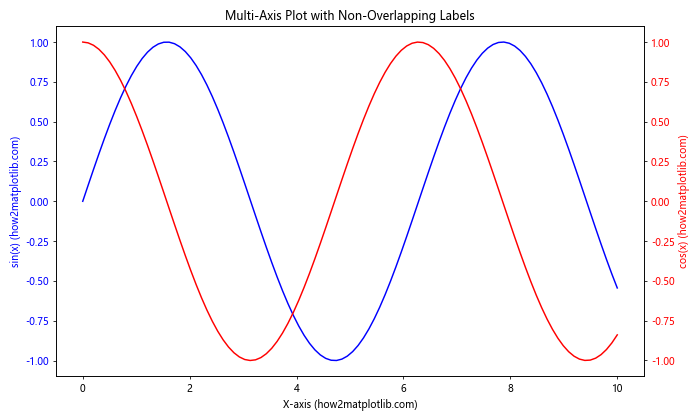
In this example, we use Matplotlib.axis.Axis.set_label_position() to ensure that the labels for the two y-axes are on opposite sides of the plot, preventing overlap.
3. Inconsistent Label Positioning Across Subplots
When creating multiple subplots, it’s important to maintain consistent label positioning. Inconsistent positioning can confuse readers. Here’s an example of how to maintain consistency:
import matplotlib.pyplot as plt
import numpy as np

fig, axs = plt.subplots(2, 2, figsize=(12, 10))

x = np.linspace(0, 10, 100)

for ax in axs.flat:
    ax.plot(x, np.sin(x))
    ax.xaxis.set_label_position('top')
    ax.yaxis.set_label_position('right')
    ax.set_xlabel('X-axis (how2matplotlib.com)')
    ax.set_ylabel('Y-axis (how2matplotlib.com)')
    ax.tick_params(axis='x', which='both', top=True, bottom=False, labeltop=True, labelbottom=False)
    ax.tick_params(axis='y', which='both', left=False, right=True, labelleft=False, labelright=True)

plt.tight_layout()
plt.show()
Output:
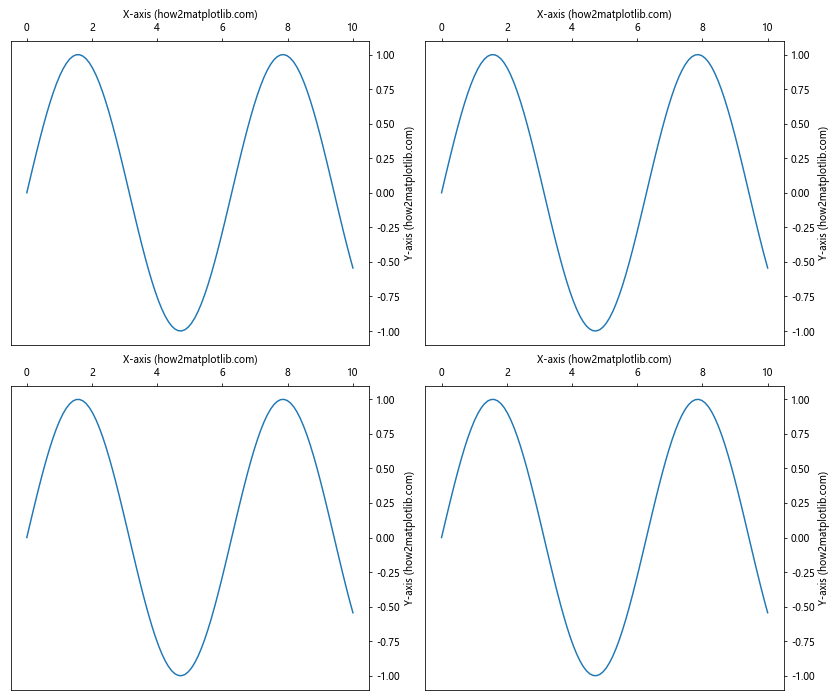
In this example, we use a loop to apply consistent label positioning using Matplotlib.axis.Axis.set_label_position() across all subplots, ensuring a uniform appearance.
Conclusion
The Matplotlib.axis.Axis.set_label_position() function is a powerful tool for customizing the appearance of your plots in Python. By allowing you to precisely control the position of axis labels, it enables you to create clear, professional-looking visualizations that effectively communicate your data.
Throughout this guide, we’ve explored the basic usage of Matplotlib.axis.Axis.set_label_position(), its parameters, advanced techniques, practical applications, best practices, and common pitfalls to avoid. We’ve seen how this function can be used in conjunction with other Matplotlib features to create a wide variety of customized plots, from simple line graphs to complex multi-axis visualizations.