How to Create Bigger Dots and Customize Line Styles in Matplotlib: A Comprehensive Guide
Matplotlib linestyle bigger dots are essential elements in data visualization that can significantly enhance the readability and aesthetics of your plots. This comprehensive guide will explore various techniques to create bigger dots and customize line styles using Matplotlib, one of the most popular plotting libraries in Python. We’ll cover everything from basic concepts to advanced techniques, providing you with the knowledge and tools to create stunning visualizations with matplotlib linestyle bigger dots.
Understanding Matplotlib Line Styles and Marker Sizes
Before diving into the specifics of creating matplotlib linestyle bigger dots, it’s crucial to understand the fundamental concepts of line styles and marker sizes in Matplotlib. Line styles define the appearance of lines in your plots, while marker sizes determine the dimensions of data points or dots.
Line Styles in Matplotlib
Matplotlib offers a wide range of line styles that you can use to customize your plots. These styles include solid lines, dashed lines, dotted lines, and various combinations. By adjusting the line style, you can create visually appealing and informative plots that effectively communicate your data.
Here’s a simple example demonstrating different line styles:
import matplotlib.pyplot as plt
import numpy as np

x = np.linspace(0, 10, 100)
y = np.sin(x)

plt.figure(figsize=(10, 6))
plt.plot(x, y, label='Solid Line (default)', linewidth=2)
plt.plot(x, np.cos(x), linestyle='--', label='Dashed Line', linewidth=2)
plt.plot(x, np.tan(x), linestyle=':', label='Dotted Line', linewidth=2)
plt.plot(x, np.sin(x) + 2, linestyle='-.', label='Dash-Dot Line', linewidth=2)

plt.title('Different Line Styles in Matplotlib - how2matplotlib.com')
plt.xlabel('X-axis')
plt.ylabel('Y-axis')
plt.legend()
plt.grid(True)
plt.show()
Output:
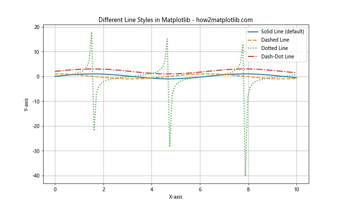
In this example, we create four different lines with various styles: solid, dashed, dotted, and dash-dot. The linestyle parameter is used to specify the desired style for each line. This demonstrates how matplotlib linestyle bigger dots can be achieved through different line styles.
Marker Sizes in Matplotlib
Marker sizes determine the dimensions of data points or dots in your plots. By adjusting the marker size, you can create matplotlib linestyle bigger dots that stand out and effectively highlight important data points.
Here’s an example showcasing different marker sizes:
import matplotlib.pyplot as plt
import numpy as np

x = np.linspace(0, 10, 10)
y = np.random.rand(10)

plt.figure(figsize=(10, 6))
plt.plot(x, y, 'o', label='Default Size', markersize=6)
plt.plot(x, y + 0.5, 'o', label='Bigger Dots', markersize=12)
plt.plot(x, y + 1, 'o', label='Even Bigger Dots', markersize=18)

plt.title('Different Marker Sizes in Matplotlib - how2matplotlib.com')
plt.xlabel('X-axis')
plt.ylabel('Y-axis')
plt.legend()
plt.grid(True)
plt.show()
Output:
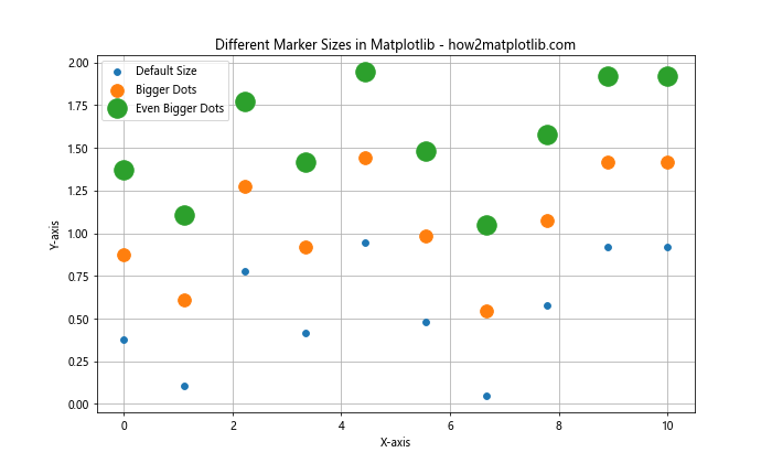
In this example, we create three sets of data points with increasing marker sizes. The markersize parameter is used to specify the size of the markers, allowing us to create matplotlib linestyle bigger dots.
Creating Bigger Dots in Matplotlib
Now that we understand the basics of line styles and marker sizes, let’s focus on creating matplotlib linestyle bigger dots. There are several techniques you can use to achieve this effect, each with its own advantages and use cases.
Using the markersize Parameter
The simplest way to create matplotlib linestyle bigger dots is by using the markersize parameter. This parameter allows you to directly control the size of markers in your plot.
Here’s an example demonstrating how to create bigger dots using the markersize parameter:
import matplotlib.pyplot as plt
import numpy as np

x = np.linspace(0, 10, 20)
y = np.sin(x)

plt.figure(figsize=(10, 6))
plt.plot(x, y, 'o-', label='Default Size', markersize=6)
plt.plot(x, y + 0.5, 'o-', label='Bigger Dots', markersize=12)
plt.plot(x, y + 1, 'o-', label='Even Bigger Dots', markersize=18)

plt.title('Creating Bigger Dots with markersize - how2matplotlib.com')
plt.xlabel('X-axis')
plt.ylabel('Y-axis')
plt.legend()
plt.grid(True)
plt.show()
Output:
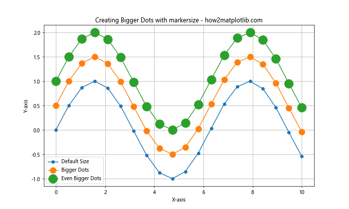
In this example, we create three lines with progressively larger dots using the markersize parameter. This technique is straightforward and effective for creating matplotlib linestyle bigger dots.
Using scatter() for More Control
While the plot() function with the markersize parameter works well for simple cases, the scatter() function offers more control over individual marker properties, including size.
Here’s an example using scatter() to create bigger dots with varying sizes:
import matplotlib.pyplot as plt
import numpy as np

x = np.linspace(0, 10, 20)
y = np.sin(x)
sizes = np.linspace(20, 200, 20)

plt.figure(figsize=(10, 6))
plt.scatter(x, y, s=sizes, c=y, cmap='viridis', label='Varying Dot Sizes')
plt.colorbar(label='Y-value')

plt.title('Creating Bigger Dots with scatter() - how2matplotlib.com')
plt.xlabel('X-axis')
plt.ylabel('Y-axis')
plt.legend()
plt.grid(True)
plt.show()
Output:
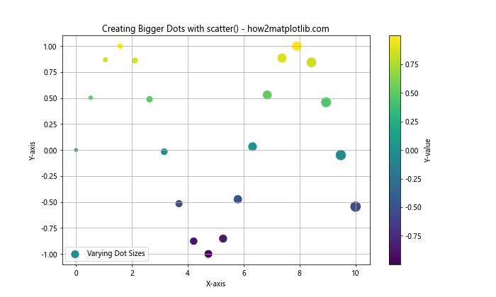
In this example, we use scatter() to create dots with varying sizes based on their position in the sequence. The s parameter controls the size of each marker, allowing for more dynamic visualizations with matplotlib linestyle bigger dots.
Combining Line Styles and Bigger Dots
To create truly eye-catching visualizations, you can combine custom line styles with bigger dots. This technique allows you to highlight both the overall trend and individual data points effectively.
Here’s an example that combines different line styles with bigger dots:
import matplotlib.pyplot as plt
import numpy as np

x = np.linspace(0, 10, 20)
y1 = np.sin(x)
y2 = np.cos(x)

plt.figure(figsize=(10, 6))
plt.plot(x, y1, 'o-', label='Sine Wave', markersize=10, linewidth=2)
plt.plot(x, y2, 's--', label='Cosine Wave', markersize=10, linewidth=2)

plt.title('Combining Line Styles and Bigger Dots - how2matplotlib.com')
plt.xlabel('X-axis')
plt.ylabel('Y-axis')
plt.legend()
plt.grid(True)
plt.show()
Output:
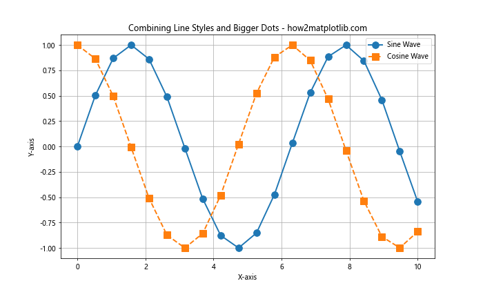
In this example, we create two lines with different styles (solid and dashed) and use bigger dots (markers) to highlight the data points. This combination of matplotlib linestyle bigger dots creates a visually appealing and informative plot.
Advanced Techniques for Customizing Line Styles and Dots
While the basic techniques for creating matplotlib linestyle bigger dots are effective, there are several advanced methods you can use to further customize your plots and create unique visualizations.
Using Custom Markers
Matplotlib provides a wide range of built-in markers, but you can also create custom markers to make your plots stand out. This technique allows you to use any symbol or shape as a marker, giving you unlimited possibilities for creating matplotlib linestyle bigger dots.
Here’s an example demonstrating how to use custom markers:
import matplotlib.pyplot as plt
import numpy as np

x = np.linspace(0, 10, 10)
y = np.random.rand(10)

custom_marker = r'$\clubsuit$'  # Custom card suit marker

plt.figure(figsize=(10, 6))
plt.plot(x, y, marker=custom_marker, markersize=20, linestyle='-', label='Custom Marker')
plt.plot(x, y + 0.2, marker='*', markersize=15, linestyle='--', label='Star Marker')

plt.title('Using Custom Markers - how2matplotlib.com')
plt.xlabel('X-axis')
plt.ylabel('Y-axis')
plt.legend()
plt.grid(True)
plt.show()
Output:
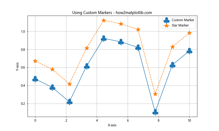
In this example, we use a custom card suit marker (♣) and a built-in star marker to create unique matplotlib linestyle bigger dots. The marker parameter allows you to specify custom markers using LaTeX symbols or other special characters.
Animating Line Styles and Dot Sizes
To create dynamic and engaging visualizations, you can animate your line styles and dot sizes. This technique is particularly useful for showcasing how data changes over time or for emphasizing certain aspects of your data.
Here’s an example of how to create an animated plot with changing line styles and dot sizes:
import matplotlib.pyplot as plt
import numpy as np
from matplotlib.animation import FuncAnimation

fig, ax = plt.subplots(figsize=(10, 6))
x = np.linspace(0, 10, 100)
line, = ax.plot([], [], 'o-', lw=2)

def init():
    ax.set_xlim(0, 10)
    ax.set_ylim(-1.5, 1.5)
    return line,

def update(frame):
    y = np.sin(x - frame / 10)
    line.set_data(x, y)
    line.set_markersize(6 + 4 * np.sin(frame / 10))
    line.set_linestyle(['-', '--', ':', '-.'][frame % 4])
    ax.set_title(f'Animated Plot - Frame {frame} - how2matplotlib.com')
    return line,

ani = FuncAnimation(fig, update, frames=100, init_func=init, blit=True, interval=50)

plt.xlabel('X-axis')
plt.ylabel('Y-axis')
plt.grid(True)
plt.show()
Output:
In this example, we create an animated plot where the line style changes periodically, and the dot size oscillates. This dynamic visualization showcases how matplotlib linestyle bigger dots can be used in animated contexts to create engaging and informative plots.
Best Practices for Using Bigger Dots and Custom Line Styles
When working with matplotlib linestyle bigger dots and custom line styles, it’s important to follow some best practices to ensure your visualizations are effective and easy to interpret.
Choosing Appropriate Dot Sizes
While bigger dots can make your data points more visible, it’s crucial to choose appropriate sizes that don’t overwhelm your plot or obscure important details. Here are some guidelines:
- Consider the density of your data points. For sparse data, larger dots may be appropriate, while dense data may require smaller dots to avoid overlap.
- Ensure that the dot size is proportional to the overall plot size and doesn’t dominate the visualization.
- Use consistent dot sizes within a single plot unless you’re intentionally encoding information through size variation.
Here’s an example demonstrating appropriate dot sizes for different data densities:
import matplotlib.pyplot as plt
import numpy as np

x1 = np.linspace(0, 10, 10)
y1 = np.random.rand(10)

x2 = np.linspace(0, 10, 50)
y2 = np.random.rand(50)

plt.figure(figsize=(12, 5))

plt.subplot(121)
plt.plot(x1, y1, 'o-', markersize=12, label='Sparse Data')
plt.title('Appropriate Dot Size for Sparse Data - how2matplotlib.com')
plt.xlabel('X-axis')
plt.ylabel('Y-axis')
plt.legend()
plt.grid(True)

plt.subplot(122)
plt.plot(x2, y2, 'o-', markersize=6, label='Dense Data')
plt.title('Appropriate Dot Size for Dense Data - how2matplotlib.com')
plt.xlabel('X-axis')
plt.ylabel('Y-axis')
plt.legend()
plt.grid(True)

plt.tight_layout()
plt.show()
Output:
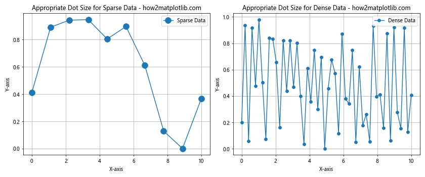
This example shows how to adjust dot sizes based on data density, ensuring that matplotlib linestyle bigger dots are used effectively in different scenarios.
Balancing Line Styles and Dot Sizes
When combining custom line styles with bigger dots, it’s important to strike a balance between the two elements. Here are some tips:
- Use complementary line styles and dot sizes that don’t compete for attention.
- Consider using thicker lines with bigger dots to maintain visual consistency.
- Experiment with different combinations to find the most effective representation for your data.
Here’s an example demonstrating balanced line styles and dot sizes:
import matplotlib.pyplot as plt
import numpy as np

x = np.linspace(0, 10, 20)
y1 = np.sin(x)
y2 = np.cos(x)

plt.figure(figsize=(10, 6))
plt.plot(x, y1, 'o-', label='Sine Wave', markersize=10, linewidth=2)
plt.plot(x, y2, 's--', label='Cosine Wave', markersize=10, linewidth=2)

plt.title('Balanced Line Styles and Dot Sizes - how2matplotlib.com')
plt.xlabel('X-axis')
plt.ylabel('Y-axis')
plt.legend()
plt.grid(True)
plt.show()
Output:

This example demonstrates how to create a balanced visualization using matplotlib linestyle bigger dots and custom line styles.
Advanced Applications of Matplotlib Line Styles and Bigger Dots
Now that we’ve covered the basics and best practices, let’s explore some advanced applications of matplotlib linestyle bigger dots. These techniques will help you create more sophisticated and informative visualizations.
Creating Error Bars with Custom Styles
Error bars are essential for representing uncertainty in data. By combining custom line styles and bigger dots, you can create visually appealing error bars that effectively communicate both the data points and their associated uncertainties.
Here’s an example of how to create custom error bars with bigger dots:
import matplotlib.pyplot as plt
import numpy as np

x = np.linspace(0, 10, 10)
y = np.sin(x)
yerr = 0.2 * np.random.rand(10)

plt.figure(figsize=(10, 6))
plt.errorbar(x, y, yerr=yerr, fmt='o', markersize=10, capsize=5, capthick=2, ecolor='red', label='Data with Error Bars')

plt.title('Custom Error Bars with Bigger Dots - how2matplotlib.com')
plt.xlabel('X-axis')
plt.ylabel('Y-axis')
plt.legend()
plt.grid(True)
plt.show()
Output:
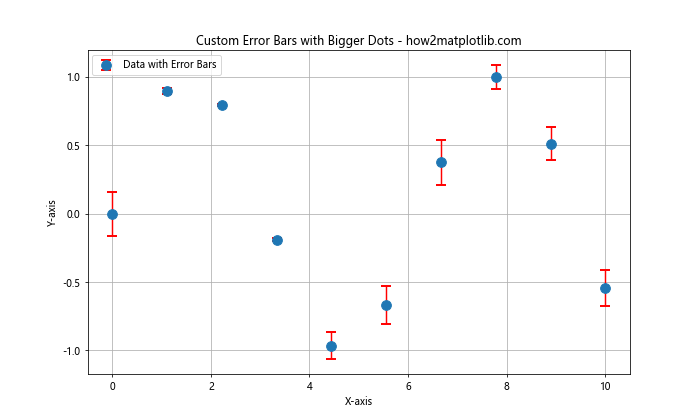
In this example, we create error bars with custom styles, including bigger dots for the data points. The fmt parameter specifies the marker style, while markersize controls the size of the dots. This technique allows you to create informative visualizations that highlight both the data and its uncertainty using matplotlib linestyle bigger dots.
Creating Bubble Charts
Bubble charts are an excellent way to visualize three-dimensional data on a two-dimensional plot. By using matplotlib linestyle bigger dots with varying sizes, you can create effective bubble charts that represent multiple variables simultaneously.
Here’s an example of how to create a bubble chart:
import matplotlib.pyplot as plt
import numpy as np

x = np.random.rand(20)
y = np.random.rand(20)
sizes = np.random.rand(20) * 1000
colors = np.random.rand(20)

plt.figure(figsize=(10, 6))
plt.scatter(x, y, s=sizes, c=colors, alpha=0.5, cmap='viridis')

plt.title('Bubble Chart with Varying Dot Sizes - how2matplotlib.com')
plt.xlabel('X-axis')
plt.ylabel('Y-axis')
plt.colorbar(label='Color Value')
plt.grid(True)
plt.show()
Output:
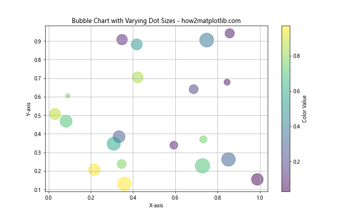
In this example, we create a bubble chart where the x and y coordinates represent two variables, the size of the dots represents a third variable, and the color represents a fourth variable. This technique leverages matplotlib linestyle bigger dots to create a rich, multi-dimensional visualization.
Creating Custom Legends with Line Styles and Dot Sizes
When working with complex plots that use various line styles and dot sizes, it’s crucial to create clear and informative legends. Matplotlib allows you to customize your legends to accurately represent the different elements in your plot.
Here’s an example of how to create a custom legend with different line styles and dot sizes:
import matplotlib.pyplot as plt
import numpy as np

x = np.linspace(0, 10, 100)
y1 = np.sin(x)
y2 = np.cos(x)
y3 = np.tan(x)

plt.figure(figsize=(12, 6))

# Plot the data
plt.plot(x, y1, 'o-', label='Sine Wave', markersize=8, linewidth=2)
plt.plot(x, y2, 's--', label='Cosine Wave', markersize=8, linewidth=2)
plt.plot(x, y3, '^:', label='Tangent Wave', markersize=8, linewidth=2)

# Create custom legend elements
from matplotlib.lines import Line2D
custom_lines = [Line2D([0], [0], color='C0', lw=2, marker='o', markersize=8),
                Line2D([0], [0], color='C1', lw=2, marker='s', markersize=8, linestyle='--'),
                Line2D([0], [0], color='C2', lw=2, marker='^', markersize=8, linestyle=':')]

# Add the custom legend
plt.legend(custom_lines, ['Sine Wave', 'Cosine Wave', 'Tangent Wave'], loc='upper left', bbox_to_anchor=(1.05, 1), borderaxespad=0.)

plt.title('Custom Legend with Different Line Styles and Dot Sizes - how2matplotlib.com')
plt.xlabel('X-axis')
plt.ylabel('Y-axis')
plt.grid(True)
plt.tight_layout()
plt.show()
Output:
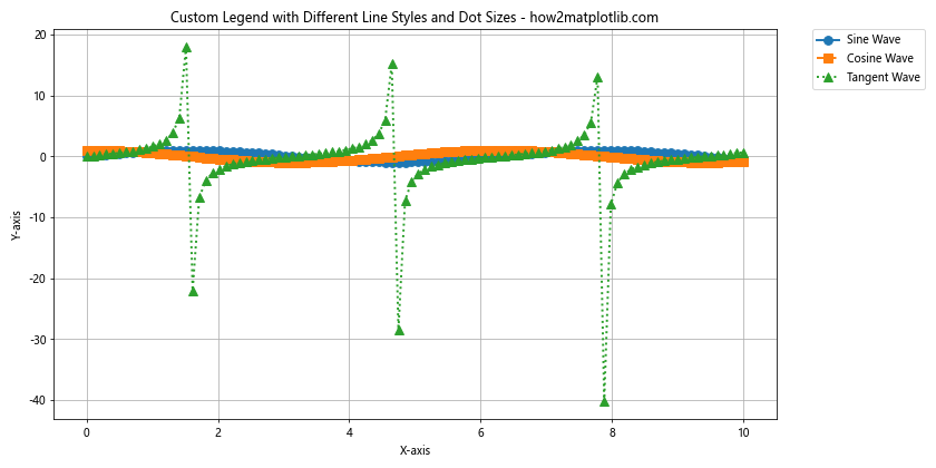
In this example, we create a custom legend that accurately represents the different line styles and dot sizes used in the plot. This technique ensures that your legend effectively communicates the meaning of each element in your visualization, including matplotlib linestyle bigger dots.
Troubleshooting Common Issues with Line Styles and Dot Sizes
When working with matplotlib linestyle bigger dots and custom line styles, you may encounter some common issues. Here are some problems you might face and how to solve them:
Overlapping Dots in Dense Data Sets
When working with dense data sets, bigger dots may overlap, making it difficult to distinguish individual data points. To address this issue, you can:
- Reduce the dot size for dense regions of your plot.
- Use transparency to make overlapping dots visible.
- Consider using a different type of plot, such as a hexbin plot or a 2D histogram.
Here’s an example demonstrating how to handle overlapping dots:
import matplotlib.pyplot as plt
import numpy as np

x = np.random.rand(1000)
y = np.random.rand(1000)

plt.figure(figsize=(12, 5))

plt.subplot(121)
plt.scatter(x, y, s=50, label='Overlapping Dots')
plt.title('Overlapping Dots - how2matplotlib.com')
plt.xlabel('X-axis')
plt.ylabel('Y-axis')
plt.legend()

plt.subplot(122)
plt.scatter(x, y, s=50, alpha=0.5, label='Transparent Dots')
plt.title('Transparent Dots - how2matplotlib.com')
plt.xlabel('X-axis')
plt.ylabel('Y-axis')
plt.legend()

plt.tight_layout()
plt.show()
Output:
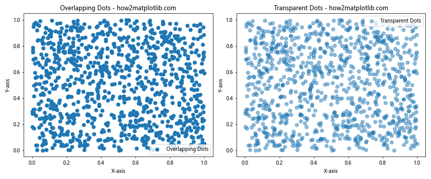
This example shows how using transparency can help visualize overlapping dots in dense data sets while still maintaining the benefits of matplotlib linestyle bigger dots.
Inconsistent Line Styles Across Different Plot Types
Sometimes, you may notice that line styles appear inconsistent when using different plot types or when combining multiple plots. To ensure consistency:
- Explicitly set the line style for each plot element.
- Use the same line style parameters across different plot functions.
- Consider creating a custom style sheet to maintain consistency across your visualizations.
Here’s an example demonstrating how to maintain consistent line styles:
import matplotlib.pyplot as plt
import numpy as np

x = np.linspace(0, 10, 100)
y1 = np.sin(x)
y2 = np.cos(x)

plt.figure(figsize=(10, 6))

# Plot using different functions with consistent styles
plt.plot(x, y1, linestyle='--', linewidth=2, color='blue', label='Sine Wave')
plt.scatter(x[::10], y2[::10], marker='o', s=50, color='red', label='Cosine Points')
plt.step(x, y1 + 2, where='mid', linestyle=':', linewidth=2, color='green', label='Stepped Sine Wave')

plt.title('Consistent Line Styles Across Different Plot Types - how2matplotlib.com')
plt.xlabel('X-axis')
plt.ylabel('Y-axis')
plt.legend()
plt.grid(True)
plt.show()
Output:
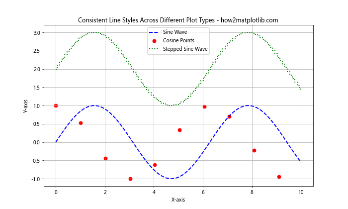
This example demonstrates how to maintain consistent line styles and marker sizes across different plot types, ensuring a cohesive look for your matplotlib linestyle bigger dots visualizations.
Matplotlib linestyle bigger dots Conclusion
In this comprehensive guide, we’ve explored the world of matplotlib linestyle bigger dots and custom line styles. We’ve covered everything from basic concepts to advanced techniques, providing you with the knowledge and tools to create stunning and informative visualizations.
By mastering the art of creating bigger dots and customizing line styles, you can significantly enhance the readability and aesthetics of your plots. Remember to consider the context of your data, balance visual elements, and follow best practices to create effective visualizations.