Matplotlib Histogram Color
Matplotlib is a very popular library for creating visualizations in Python. It provides various types of plots, including histograms, which are commonly used to represent the distribution of a dataset. When creating a histogram with Matplotlib, you can customize its appearance in many ways, including changing the color.
In this article, we will explore different ways to control the color of a histogram using Matplotlib. We will provide code examples along with the execution results for each example.
Default Histogram Color in Matplotlib
By default, Matplotlib uses a blue color for histograms. Let’s start by creating a basic histogram with some sample data to see its default color.
import matplotlib.pyplot as plt
import numpy as np

# Generate random data
data = np.random.normal(0, 1, 1000)

# Create a histogram
plt.hist(data, bins=30)

# Display the plot
plt.show()
Execution Result:
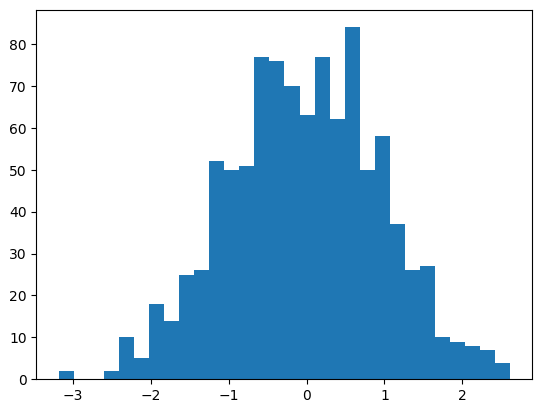
As you can see, the default color for the histogram is blue. But what if you want to change it to a different color or customize it further? Matplotlib provides several options to achieve that.
Changing the Histogram Color in Matplotlib
One way to change the color of a histogram is by using the color parameter. This parameter takes a wide range of inputs, including named colors, hexadecimal color codes, and RGB tuples.
Here’s an example that demonstrates how to change the color of a histogram to red using the color parameter:
# Create a red histogram
plt.hist(data, bins=30, color='red')

# Display the plot
plt.show()
Execution Result:
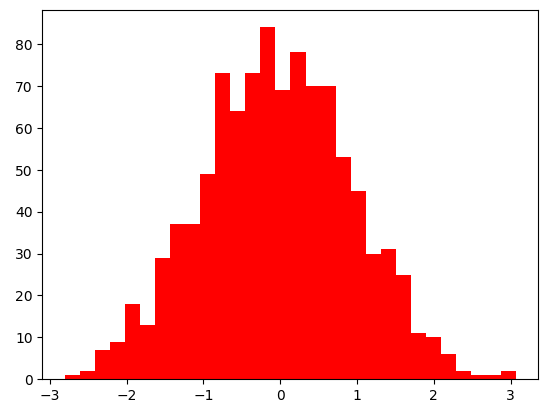
As you can see, the color of the histogram is now red. You can experiment with different named colors or provide hexadecimal color codes to customize the histogram color further.
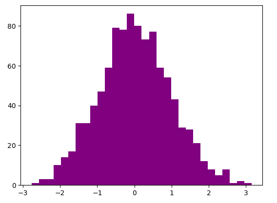
# Create a purple histogram using a hexadecimal color code
plt.hist(data, bins=30, color='#800080')

# Display the plot
plt.show()
Execution Result:
Changing the Edge Color in Matplotlib
In addition to changing the fill color of the bars in a histogram, you can also modify the color of their edges. The edge color represents the outline of the bars, and it can be customized separately from the fill color.
To change the edge color, you can use the edgecolor parameter. Like the color parameter, it accepts named colors, hexadecimal codes, or RGB tuples.
Here’s an example that demonstrates how to change the edge color to green:
# Create a histogram with green edges
plt.hist(data, bins=30, edgecolor='green')

# Display the plot
plt.show()
Execution Result:
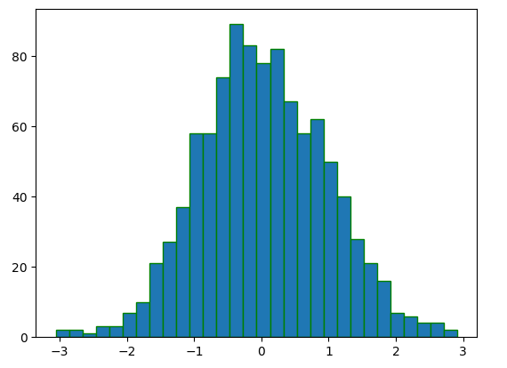
As you can see, the edges of the bars in the histogram are now green.
Changing the Fill and Edge Colors Separately in Matplotlib
Sometimes, you may want to have different colors for the fill and edge of the bars in a histogram. Matplotlib allows you to specify both the fill color and the edge color separately.
Here’s an example that demonstrates how to set a different fill and edge color for the histogram:
# Create a histogram with yellow fill and blue edges
plt.hist(data, bins=30, color='yellow', edgecolor='blue')

# Display the plot
plt.show()
Execution Result:
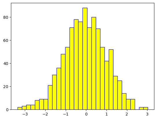
As you can see, the fill color of the bars is yellow, while the edges are blue.
Setting the Transparency (Alpha) Value in Matplotlib
In addition to changing the colors, you can also control the transparency of the histogram bars using the alpha parameter. The alpha parameter accepts values between 0 and 1, where 0 means completely transparent and 1 means completely opaque.
Here’s an example that demonstrates how to set the transparency of the histogram bars to 0.5 (50%):
# Create a histogram with translucent bars
plt.hist(data, bins=30, alpha=0.5)

# Display the plot
plt.show()
Execution Result:
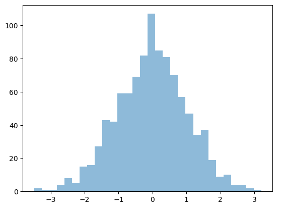
As you can see, the bars in the histogram are now translucent, allowing the background or other plotted elements to show through.
Creating a Multi-Colored Histogram in Matplotlib
Matplotlib also provides a way to create a histogram with bars of different colors. This can be useful when you want to highlight specific ranges of the dataset.
To create a multi-colored histogram, you need to provide a list of colors to the color parameter. Each bar in the histogram will be assigned a color from the list sequentially.
Here’s an example that demonstrates how to create a multi-colored histogram with three colors:
# Define three colors
colors = ['red', 'blue', 'green']

# Create a multi-colored histogram
plt.hist(data, bins=30, color=colors)

# Display the plot
plt.show()
As you can see, the bars in the histogram are now colored using the specified list of colors. The colors are assigned sequentially, so the first bar is red, the second is blue, and the third is green.
Customizing the Colors for Each Bin in Matplotlib
In addition to creating a multi-colored histogram with a predefined list of colors, you can also customize the colors for each individual bar based on the values in a particular dataset.
To achieve this, you need to provide an array-like weights parameter to the hist() function. The values in the weights array determine the colors of the bars.
Here’s an example that demonstrates how to create a histogram with custom colors based on the values in another array:
# Generate the weights array
weights = np.random.rand(len(data))

# Create a histogram with custom colors
plt.hist(data, bins=30, weights=weights)

# Display the plot
plt.show()
Execution Result:
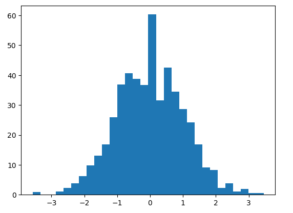
As you can see, the colors of the bars are now determined by the weights array. Higher weight values correspond to darker colors, while lower weight values result in lighter colors.
Using Colormaps in Matplotlib
Matplotlib provides a wide range of colormaps that can be used to assign colors to the bars in a histogram. Colormaps are useful when you want to represent some values on a continuous scale.
To use a colormap, you can set the color parameter to a string representing the desired colormap name.
Here’s an example that demonstrates how to create a histogram using the “cool” colormap:
# Create a histogram with the "cool" colormap
plt.hist(data, bins=30, color='cool')

# Display the plot
plt.show()
As you can see, the bars in the histogram are now colored using the “cool” colormap. The color varies from light blue to dark blue, representing the distribution of the data.
Reversed Colormaps in Matplotlib
In some cases, you may want to reverse a colormap to have a different color mapping order. Matplotlib allows you to reverse a colormap by appending _r to its name.
Here’s an example that demonstrates how to create a histogram using the reversed “jet” colormap:
# Create a histogram with the reversed "jet" colormap
plt.hist(data, bins=30, color='jet_r')

# Display the plot
plt.show()
As you can see, the bars in the histogram are now colored using the reversed “jet” colormap, which starts with dark blue and ends with light yellow.
Matplotlib Histogram Color Summary
In this article, we have explored various ways to control the color of a histogram using Matplotlib. We have seen how to change the fill color, the edge color, and set them separately. We have also learned how to set the transparency of the histogram bars, create multi-colored histograms, customize colors for each bin, and use colormaps.
By customizing the colors, you can enhance the visual appeal of your histograms and make them more informative. Experiment with different color combinations to find the best representation for your data.