Matplotlib Color by Column
In data visualization using Matplotlib, it is important to have the ability to color data points or lines based on a specific column in a dataset. This allows for better understanding and interpretation of the data by adding a visual dimension. In this article, we will explore how to color data points or lines by a specific column in Matplotlib.
1. Scatter Plot
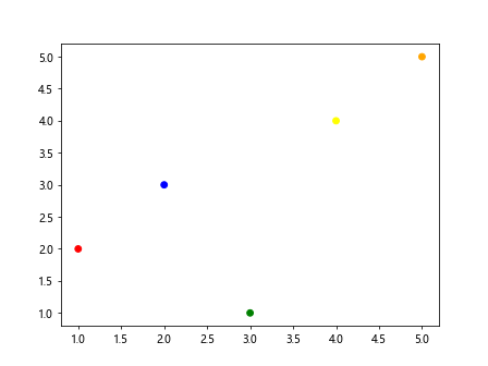
Scatter plots are a great way to visualize the relationship between two numeric columns in a dataset. By coloring the data points based on another column, we can add more context to the plot. Here is an example of how to create a scatter plot with colored data points:
import matplotlib.pyplot as plt
import pandas as pd

# Generate sample data
data = pd.DataFrame({
    'x': [1, 2, 3, 4, 5],
    'y': [2, 3, 1, 4, 5],
    'color': ['red', 'blue', 'green', 'yellow', 'orange']
})

plt.scatter(data['x'], data['y'], c=data['color'])
plt.show()
Output:
2. Line Plot
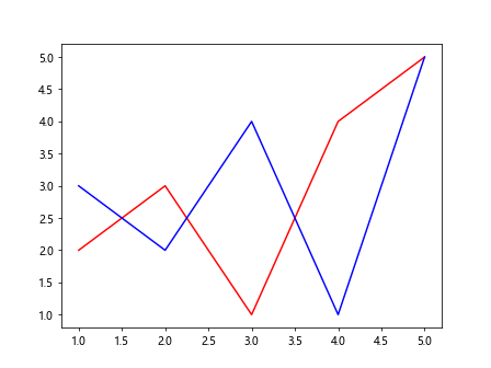
Line plots are commonly used to visualize trends over time or any other continuous variable. Coloring the lines based on a specific column can highlight different categories or groups within the data. Here is an example of how to create a line plot with colored lines:
import matplotlib.pyplot as plt
import pandas as pd

# Generate sample data
data = pd.DataFrame({
    'x': [1, 2, 3, 4, 5],
    'y1': [2, 3, 1, 4, 5],
    'y2': [3, 2, 4, 1, 5],
    'color': ['red', 'blue', 'green', 'yellow', 'orange']
})

plt.plot(data['x'], data['y1'], c=data['color'][0])
plt.plot(data['x'], data['y2'], c=data['color'][1])
plt.show()
Output:
3. Bar Plot
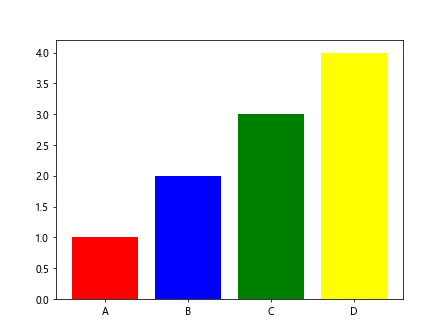
Bar plots are useful for comparing categorical data. By coloring the bars based on a specific column, we can easily distinguish between different categories. Here is an example of how to create a bar plot with colored bars:
import matplotlib.pyplot as plt
import pandas as pd

# Generate sample data
data = pd.DataFrame({
    'category': ['A', 'B', 'C', 'D'],
    'value': [1, 2, 3, 4],
    'color': ['red', 'blue', 'green', 'yellow']
})

plt.bar(data['category'], data['value'], color=data['color'])
plt.show()
Output:
4. Box Plot
Box plots are used to show the distribution of a dataset. By coloring the boxes based on a specific column, we can highlight different groups or categories within the data. Here is an example of how to create a box plot with colored boxes:
import matplotlib.pyplot as plt
import pandas as pd
import numpy as np

# Generate sample data
data = pd.DataFrame({
    'group': np.random.choice(['A', 'B', 'C'], 100),
    'value': np.random.normal(size=100)
})

colors = {'A': 'red', 'B': 'blue', 'C': 'green'}
plt.boxplot([data[data['group']=='A']['value'], data[data['group']=='B']['value'], data[data['group']=='C']['value']],
            patch_artist=True, boxprops=dict(facecolor=[colors['A'], colors['B'], colors['C']]))
plt.show()
5. Histogram
Histograms are used to visualize the distribution of a single variable. By coloring the bars based on another column, we can add another layer of information to the plot. Here is an example of how to create a histogram with colored bars:
import matplotlib.pyplot as plt
import pandas as pd

# Generate sample data
data = pd.DataFrame({
    'value': np.random.normal(size=100),
    'color': ['red', 'blue', 'green', 'yellow'] * 25
})

plt.hist(data['value'], color=data['color'])
plt.show()
6. Heatmap
Heatmaps are often used to represent the correlation between variables in a dataset. By coloring the cells based on a specific column, we can highlight relationships between different groups or categories. Here is an example of how to create a heatmap with colored cells:
import matplotlib.pyplot as plt
import seaborn as sns

# Generate sample data
data = pd.DataFrame({
    'A': [1, 2, 3],
    'B': [4, 5, 6],
    'C': [7, 8, 9],
    'color': ['red', 'blue', 'green']
})

sns.heatmap(data[['A', 'B', 'C']], cmap='coolwarm', annot=True)
plt.show()
7. Scatter Plot with Size and Color Mapping
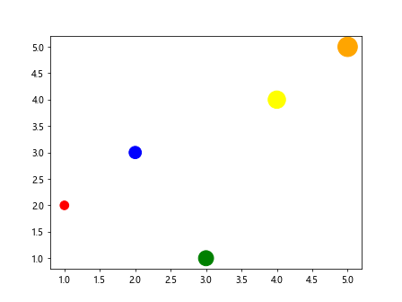
In some cases, we may want to map both the size and color of data points to different columns in the dataset. This can provide even more insights into the data. Here is an example of how to create a scatter plot with size and color mapping:
import matplotlib.pyplot as plt
import pandas as pd

# Generate sample data
data = pd.DataFrame({
    'x': [1, 2, 3, 4, 5],
    'y': [2, 3, 1, 4, 5],
    'size': [100, 200, 300, 400, 500],
    'color': ['red', 'blue', 'green', 'yellow', 'orange']
})

plt.scatter(data['x'], data['y'], s=data['size'], c=data['color'])
plt.show()
Output:
8. Custom Colormap
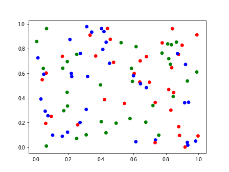
Matplotlib provides a variety of colormaps that can be used to color data points or lines. However, we can also create custom colormaps to fit our specific needs. Here is an example of how to create a custom colormap and use it in a plot:
import matplotlib.pyplot as plt
import numpy as np
from matplotlib.colors import ListedColormap

# Create custom colormap
colors = ['red', 'blue', 'green']
cmap = ListedColormap(colors)

# Generate sample data
x = np.random.rand(100)
y = np.random.rand(100)
c = np.random.choice([0, 1, 2], 100)

plt.scatter(x, y, c=c, cmap=cmap)
plt.show()
Output:
9. Legend Based on Color
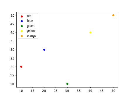
When coloring data points or lines by a specific column, it is important to provide a legend to explain the color mapping. Here is an example of how to create a legend based on the colors used in a plot:
import matplotlib.pyplot as plt
import pandas as pd

# Generate sample data
data = pd.DataFrame({
    'x': [1, 2, 3, 4, 5],
    'y': [2, 3, 1, 4, 5],
    'color': ['red', 'blue', 'green', 'yellow', 'orange']
})

for index, row in data.iterrows():
    plt.scatter(row['x'], row['y'], c=row['color'], label=row['color'])

plt.legend()
plt.show()
Output:
10. 3D Scatter Plot
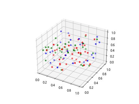
In some cases, we may want to create a 3D scatter plot to visualize data points in three dimensions. By coloring the data points based on a specific column, we can add more information to the plot. Here is an example of how to create a 3D scatter plot with colored data points:
import matplotlib.pyplot as plt
import numpy as np

# Generate sample data
x = np.random.rand(100)
y = np.random.rand(100)
z = np.random.rand(100)
color = np.random.choice(['red', 'blue', 'green'], 100)

fig = plt.figure()
ax = fig.add_subplot(111, projection='3d')
ax.scatter(x, y, z, c=color)
plt.show()
Output:
11. Pie Chart
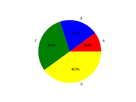
Pie charts are commonly used to show the composition of a dataset. By coloring the slices based on a specific column, we can emphasize different categories or groups within the data. Here is an example of how to create a pie chart with colored slices:
import matplotlib.pyplot as plt
import pandas as pd

# Generate sample data
data = pd.DataFrame({
    'category': ['A', 'B', 'C', 'D'],
    'value': [10, 20, 30, 40],
    'color': ['red', 'blue', 'green', 'yellow']
})

plt.pie(data['value'], labels=data['category'], colors=data['color'], autopct='%1.1f%%')
plt.show()
Output:
12. Area Plot
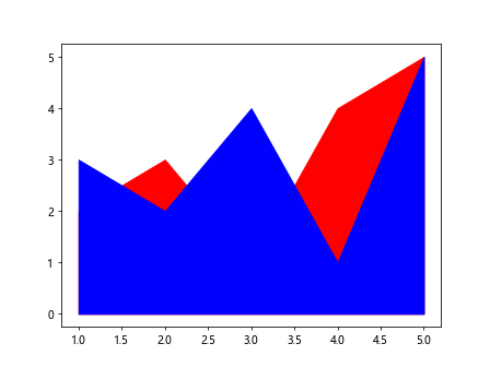
Area plots are used to visualize the cumulative total of a dataset. By coloring the areas based on a specific column, we can differentiate between different categories or groups. Here is an example of how to create an area plot with colored areas:
import matplotlib.pyplot as plt
import pandas as pd

# Generate sample data
data = pd.DataFrame({
    'x': [1, 2, 3, 4, 5],
    'y1': [2, 3, 1, 4, 5],
    'y2': [3, 2, 4, 1, 5],
    'color': ['red', 'blue', 'green', 'yellow', 'orange']
})

plt.fill_between(data['x'], data['y1'], color=data['color'][0])
plt.fill_between(data['x'], data['y2'], color=data['color'][1])
plt.show()
Output:
13. Stacked Bar Plot
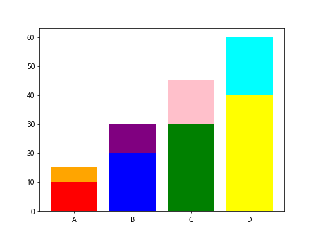
Stacked bar plots are useful for comparing the total and individual values of categorical data. By coloring the bars based on different columns, we can represent multiple categories in a single plot. Here is an example of how to create a stacked bar plot with colored bars:
import matplotlib.pyplot as plt
import pandas as pd

# Generate sample data
data = pd.DataFrame({
    'category': ['A', 'B', 'C', 'D'],
    'value1': [10, 20, 30, 40],
    'value2': [5, 10, 15, 20],
    'color1': ['red', 'blue', 'green', 'yellow'],
    'color2': ['orange', 'purple', 'pink', 'cyan']
})

plt.bar(data['category'], data['value1'], color=data['color1'])
plt.bar(data['category'], data['value2'], bottom=data['value1'], color=data['color2'])
plt.show()
Output:
14. Bubble Chart
Bubble charts are similar to scatter plots but use a third variable to determine the size of the data points. By coloring the bubbles based on a specific column, we can add another dimension to the plot. Here is an example of how to create a bubble chart with colored bubbles:
import matplotlib.pyplot as plt
import pandas as pd

# Generate sample data
data = pd.DataFrame({
    'x': [1, 2, 3, 4, 5],
    'y': [2, 3, 1, 4, 5],
    'size': [100, 200, 300, 400, 500],
    'color': ['red', 'blue', 'green', 'yellow', 'orange']
})

plt.scatter(data['x'], data['y'], s=data['size'], c=data['color'])
plt.show()
Output:

15. Contour Plot
Contour plots are used to show the density or distribution of data points in a two-dimensional space. By coloring the contours based on a specific column, we can highlight different areas within the plot. Here is an example of how to create a contour plot with colored contours:
import matplotlib.pyplot as plt
import numpy as np

# Generate sample data
x = np.random.randn(100)
y = np.random.randn(100)
z = np.random.rand(100)
color = np.random.choice(['red', 'blue', 'green'], 100)

plt.contourf(x, y, z, colors=color)
plt.show()
16. Violin Plot
Violin plots are used to visualize the distribution of data across different categories. By coloring the violins based on a specific column, we can compare the distributions of different groups. Here is an example of how to create a violin plot with colored violins:
import matplotlib.pyplot as plt
import seaborn as sns
import pandas as pd

# Generate sample data
data = pd.DataFrame({
    'group': np.random.choice(['A', 'B', 'C'], 100),
    'value': np.random.normal(size=100),
    'color': np.random.choice(['red', 'blue', 'green'], 100)
})

sns.violinplot(x=data['group'], y=data['value'], hue=data['color'], split=True)
plt.show()
17. Scatter Plot Matrix
A scatter plot matrix is used to visualize relationships between multiple variables in a dataset. By coloring the scatter plots based on a specific column, we can highlight different groups or categories. Here is an example of how to create a scatter plot matrix with colored scatter plots:
import matplotlib.pyplot as plt
import pandas as pd
import seaborn as sns

# Generate sample data
data = pd.DataFrame({
    'x': np.random.rand(100),
    'y': np.random.rand(100),
    'z': np.random.choice(['A', 'B', 'C'], 100),
    'color': np.random.choice(['red', 'blue', 'green'], 100)
})

sns.pairplot(data, hue='z', palette=data['color'])
plt.show()
18. Treemap
Treemaps are used to display hierarchical data as a set of nested rectangles. By coloring the rectangles based on a specific column, we can emphasize different categories within the hierarchy. Here is an example of how to create a treemap with colored rectangles:
import matplotlib.pyplot as plt
import squarify

# Generate sample data
sizes = [50, 30, 20]
colors = ['red', 'blue', 'green']

squarify.plot(sizes=sizes, color=colors, label=['A', 'B', 'C'])
plt.axis('off')
plt.show()
19. Polar Plot
Polar plots are used to display data in a circular format. By coloring the data points based on a specific column, we can add more context to the plot. Here is an example of how to create a polar plot with colored data points:
import matplotlib.pyplot as plt
import numpy as np

# Generate sample data
theta = np.linspace(0, 2*np.pi, 100)
r = np.abs(np.random.randn(100))
color = np.random.choice(['red', 'blue', 'green'], 100)

plt.polar(theta, r, c=color)
plt.show()
20. Wordcloud
Wordclouds are used to visualize text data by representing words in different sizes based on their frequency. By coloring the words based on a specific column, we can add a visual distinction between different categories. Here is an example of how to create a wordcloud with colored words:
from wordcloud import WordCloud
import matplotlib.pyplot as plt

# Generate sample text data
text = 'how2matplotlib how2matplotlib how2matplotlib how2matplotlib how2matplotlib how2matplotlib'

wordcloud = WordCloud(collocations=False, width=800, height=400).generate(text)

plt.imshow(wordcloud.recolor(color_func=lambda *args, **kwargs: 'red'))
plt.axis('off')
plt.show()
In conclusion, coloring data points or lines by a specific column in Matplotlib can greatly enhance the visual representation of datasets and provide valuable insights. By using the techniques and examples provided in this article, you can create more engaging and informative visualizations.