How to Draw Contours on an Unstructured Triangular Grid in Python Using Matplotlib
Draw contours on an unstructured triangular grid in Python using Matplotlib is a powerful technique for visualizing data on irregular meshes. This article will explore various aspects of this process, providing detailed explanations and code examples to help you master this visualization method.
Understanding Unstructured Triangular Grids
Before we dive into drawing contours, it’s essential to understand what an unstructured triangular grid is. Unlike structured grids, which have a regular pattern, unstructured triangular grids consist of irregularly spaced points connected by triangles. These grids are particularly useful for representing complex geometries or data with varying resolution.
To work with unstructured triangular grids in Matplotlib, we often use the Triangulation class. Let’s start with a simple example to create and visualize a basic unstructured triangular grid:
import matplotlib.pyplot as plt
import numpy as np
from matplotlib.tri import Triangulation

# Create sample data
x = np.random.rand(20)
y = np.random.rand(20)
triangles = Triangulation(x, y)

# Plot the triangulation
plt.figure(figsize=(8, 6))
plt.triplot(triangles, 'bo-')
plt.title('Unstructured Triangular Grid - how2matplotlib.com')
plt.xlabel('X')
plt.ylabel('Y')
plt.show()
Output:
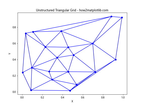
In this example, we create random x and y coordinates and use Matplotlib’s Triangulation class to generate a triangular mesh. The triplot function is then used to visualize the grid.
Preparing Data for Contour Drawing
To draw contours on an unstructured triangular grid, we need three main components:
- x-coordinates
- y-coordinates
- z-values (the data to be contoured)
Let’s create a more realistic dataset for our contour plotting:
import matplotlib.pyplot as plt
import numpy as np
from matplotlib.tri import Triangulation

# Create sample data
x = np.random.rand(500) * 10
y = np.random.rand(500) * 10
z = np.sin(x) * np.cos(y)

# Create triangulation
triang = Triangulation(x, y)

# Plot the data points
plt.figure(figsize=(10, 8))
plt.scatter(x, y, c=z, cmap='viridis')
plt.colorbar(label='Z values')
plt.title('Data Points for Contour Plot - how2matplotlib.com')
plt.xlabel('X')
plt.ylabel('Y')
plt.show()
Output:
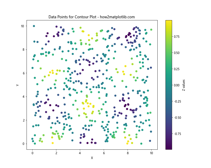
This code generates 500 random points with x and y coordinates between 0 and 10. The z-values are calculated using a simple function: sin(x) * cos(y). We then create a Triangulation object and visualize the data points using a scatter plot.
Drawing Basic Contours
Now that we have our data prepared, let’s draw basic contours on our unstructured triangular grid:
import matplotlib.pyplot as plt
import numpy as np
from matplotlib.tri import Triangulation

# Create sample data
x = np.random.rand(500) * 10
y = np.random.rand(500) * 10
z = np.sin(x) * np.cos(y)

# Create triangulation
triang = Triangulation(x, y)

# Plot contours
plt.figure(figsize=(10, 8))
plt.tricontour(triang, z, cmap='viridis')
plt.colorbar(label='Z values')
plt.title('Basic Contours on Unstructured Grid - how2matplotlib.com')
plt.xlabel('X')
plt.ylabel('Y')
plt.show()
Output:
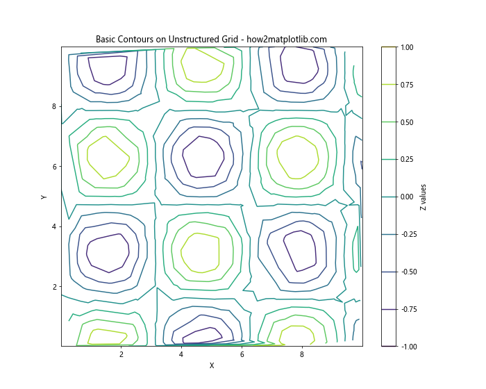
In this example, we use the tricontour function to draw contours on our unstructured grid. The function automatically determines appropriate contour levels based on the range of z-values.
Customizing Contour Appearance
Matplotlib offers various options to customize the appearance of contours. Let’s explore some of these options:
Specifying Contour Levels
You can control the number and values of contour levels:
import matplotlib.pyplot as plt
import numpy as np
from matplotlib.tri import Triangulation

# Create sample data
x = np.random.rand(500) * 10
y = np.random.rand(500) * 10
z = np.sin(x) * np.cos(y)

# Create triangulation
triang = Triangulation(x, y)

# Plot contours with custom levels
plt.figure(figsize=(10, 8))
levels = np.linspace(-1, 1, 15)
plt.tricontour(triang, z, levels=levels, cmap='coolwarm')
plt.colorbar(label='Z values')
plt.title('Contours with Custom Levels - how2matplotlib.com')
plt.xlabel('X')
plt.ylabel('Y')
plt.show()
Output:
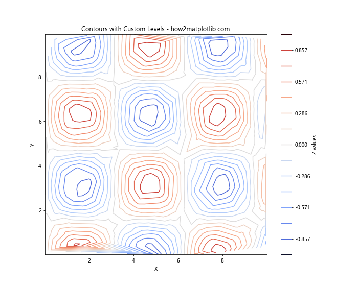
In this example, we use np.linspace to create 15 evenly spaced contour levels between -1 and 1.
Adding Contour Labels
To add labels to contour lines, you can use the clabel function:
import matplotlib.pyplot as plt
import numpy as np
from matplotlib.tri import Triangulation

# Create sample data
x = np.random.rand(500) * 10
y = np.random.rand(500) * 10
z = np.sin(x) * np.cos(y)

# Create triangulation
triang = Triangulation(x, y)

# Plot contours with labels
plt.figure(figsize=(10, 8))
contours = plt.tricontour(triang, z, cmap='viridis')
plt.clabel(contours, inline=True, fontsize=8, fmt='%.2f')
plt.colorbar(label='Z values')
plt.title('Contours with Labels - how2matplotlib.com')
plt.xlabel('X')
plt.ylabel('Y')
plt.show()
Output:
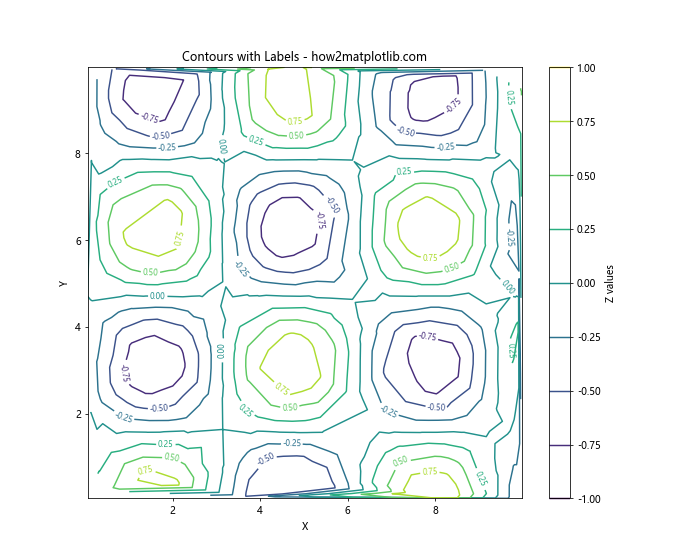
This code adds labels to the contour lines, showing the z-value for each contour.
Filled Contours
In addition to line contours, Matplotlib allows you to create filled contours using the tricontourf function:
import matplotlib.pyplot as plt
import numpy as np
from matplotlib.tri import Triangulation

# Create sample data
x = np.random.rand(500) * 10
y = np.random.rand(500) * 10
z = np.sin(x) * np.cos(y)

# Create triangulation
triang = Triangulation(x, y)

# Plot filled contours
plt.figure(figsize=(10, 8))
plt.tricontourf(triang, z, cmap='viridis')
plt.colorbar(label='Z values')
plt.title('Filled Contours on Unstructured Grid - how2matplotlib.com')
plt.xlabel('X')
plt.ylabel('Y')
plt.show()
Output:
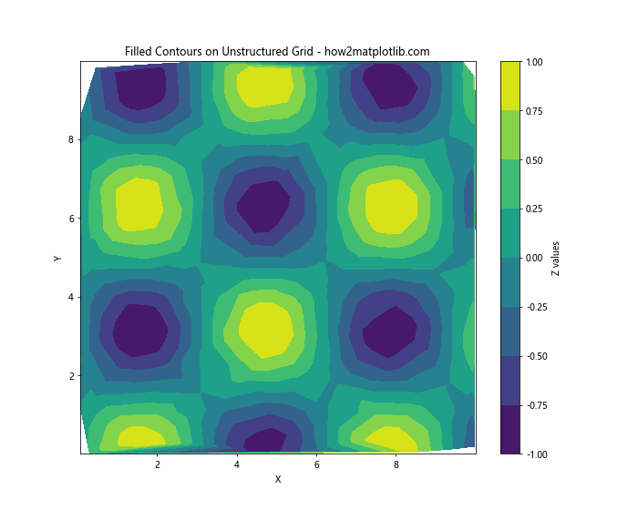
This example creates a filled contour plot, where each region between contour levels is filled with a color corresponding to its z-value.
Combining Line and Filled Contours
For a more informative visualization, you can combine line and filled contours:
import matplotlib.pyplot as plt
import numpy as np
from matplotlib.tri import Triangulation

# Create sample data
x = np.random.rand(500) * 10
y = np.random.rand(500) * 10
z = np.sin(x) * np.cos(y)

# Create triangulation
triang = Triangulation(x, y)

# Plot combined contours
plt.figure(figsize=(10, 8))
plt.tricontourf(triang, z, cmap='viridis', alpha=0.7)
contours = plt.tricontour(triang, z, colors='k', linewidths=0.5)
plt.clabel(contours, inline=True, fontsize=8, fmt='%.2f')
plt.colorbar(label='Z values')
plt.title('Combined Filled and Line Contours - how2matplotlib.com')
plt.xlabel('X')
plt.ylabel('Y')
plt.show()
Output:
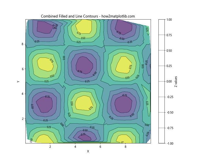
This example overlays black contour lines on top of filled contours, providing both a continuous color representation and discrete level information.
Handling Masked Data
In some cases, you may want to exclude certain regions from your contour plot. Matplotlib allows you to mask data points:
import matplotlib.pyplot as plt
import numpy as np
from matplotlib.tri import Triangulation

# Create sample data
x = np.random.rand(500) * 10
y = np.random.rand(500) * 10
z = np.sin(x) * np.cos(y)

# Create triangulation
triang = Triangulation(x, y)

# Create a mask
mask = np.hypot(x - 5, y - 5) < 3

# Apply the mask to the triangulation
triang.set_mask(mask)

# Plot contours with masked data
plt.figure(figsize=(10, 8))
plt.tricontourf(triang, z, cmap='viridis')
plt.colorbar(label='Z values')
plt.title('Contours with Masked Data - how2matplotlib.com')
plt.xlabel('X')
plt.ylabel('Y')
plt.show()
In this example, we create a circular mask centered at (5, 5) with a radius of 3. The masked region will be excluded from the contour plot.
Interpolation on Unstructured Grids
Sometimes, you may want to interpolate your data onto a regular grid before plotting contours. Matplotlib provides the LinearTriInterpolator class for this purpose:
import matplotlib.pyplot as plt
import numpy as np
from matplotlib.tri import Triangulation, LinearTriInterpolator

# Create sample data
x = np.random.rand(500) * 10
y = np.random.rand(500) * 10
z = np.sin(x) * np.cos(y)

# Create triangulation
triang = Triangulation(x, y)

# Create interpolator
interp = LinearTriInterpolator(triang, z)

# Create regular grid for interpolation
xi, yi = np.meshgrid(np.linspace(0, 10, 100), np.linspace(0, 10, 100))
zi = interp(xi, yi)

# Plot interpolated contours
plt.figure(figsize=(10, 8))
plt.contourf(xi, yi, zi, cmap='viridis')
plt.colorbar(label='Z values')
plt.title('Interpolated Contours - how2matplotlib.com')
plt.xlabel('X')
plt.ylabel('Y')
plt.show()
Output:
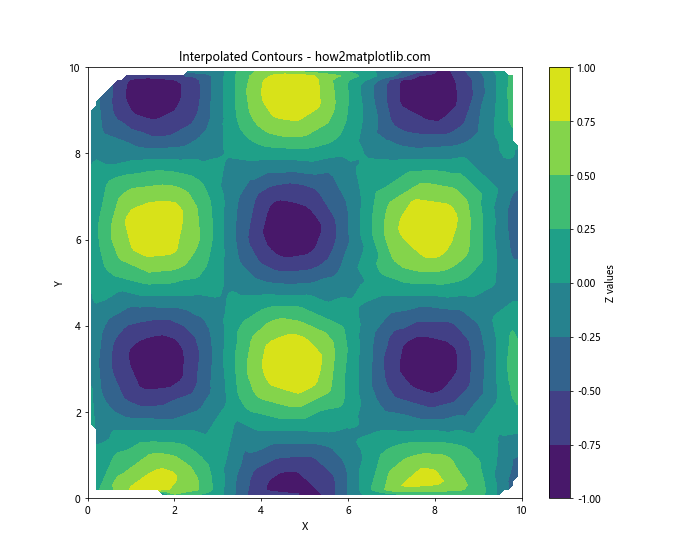
This example interpolates the unstructured data onto a regular grid and then uses the standard contourf function to plot the contours.
Adding a Streamplot to Contours
To visualize both scalar and vector fields simultaneously, you can combine contour plots with streamplots:
import matplotlib.pyplot as plt
import numpy as np
from matplotlib.tri import Triangulation, LinearTriInterpolator

# Create sample data
x = np.random.rand(500) * 10
y = np.random.rand(500) * 10
z = np.sin(x) * np.cos(y)

# Create vector field
u = np.cos(x) * np.sin(y)
v = -np.sin(x) * np.cos(y)

# Create triangulation
triang = Triangulation(x, y)

# Create interpolators
interp_z = LinearTriInterpolator(triang, z)
interp_u = LinearTriInterpolator(triang, u)
interp_v = LinearTriInterpolator(triang, v)

# Create regular grid for interpolation
xi, yi = np.meshgrid(np.linspace(0, 10, 50), np.linspace(0, 10, 50))
zi = interp_z(xi, yi)
ui = interp_u(xi, yi)
vi = interp_v(xi, yi)

# Plot contours and streamplot
plt.figure(figsize=(10, 8))
plt.contourf(xi, yi, zi, cmap='viridis', alpha=0.7)
plt.colorbar(label='Z values')
plt.streamplot(xi, yi, ui, vi, color='k', density=1, linewidth=0.5)
plt.title('Contours with Streamplot - how2matplotlib.com')
plt.xlabel('X')
plt.ylabel('Y')
plt.show()
Output:
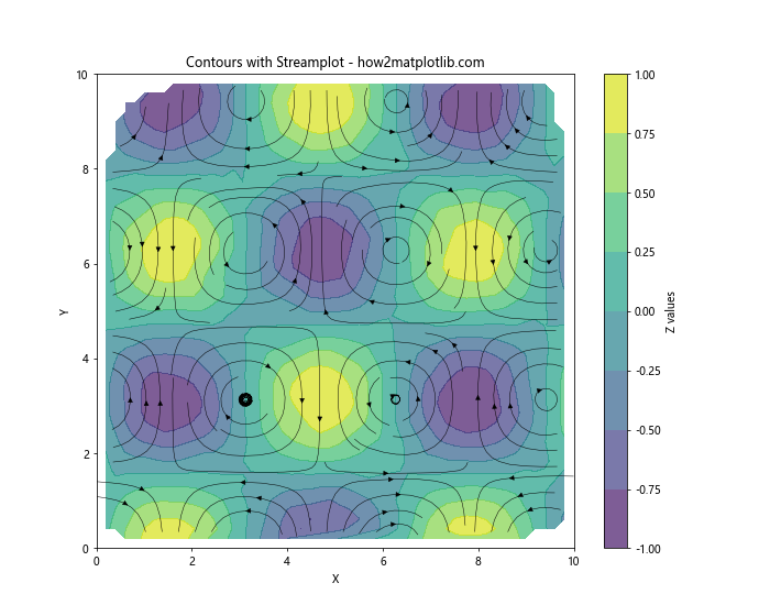
This example combines a contour plot of the scalar field z with a streamplot of the vector field (u, v).
3D Visualization of Contours
While 2D contour plots are useful, sometimes a 3D visualization can provide additional insights. Let's create a 3D surface plot with contours projected onto it:
import matplotlib.pyplot as plt
import numpy as np
from matplotlib.tri import Triangulation
from mpl_toolkits.mplot3d import Axes3D

# Create sample data
x = np.random.rand(500) * 10
y = np.random.rand(500) * 10
z = np.sin(x) * np.cos(y)

# Create triangulation
triang = Triangulation(x, y)

# Create 3D plot
fig = plt.figure(figsize=(12, 9))
ax = fig.add_subplot(111, projection='3d')

# Plot surface
ax.plot_trisurf(triang, z, cmap='viridis', alpha=0.7)

# Plot contours on the x-y plane
ax.tricontour(triang, z, zdir='z', offset=z.min(), cmap='viridis')

ax.set_xlabel('X')
ax.set_ylabel('Y')
ax.set_zlabel('Z')
ax.set_title('3D Surface with Contours - how2matplotlib.com')
plt.show()
Output:
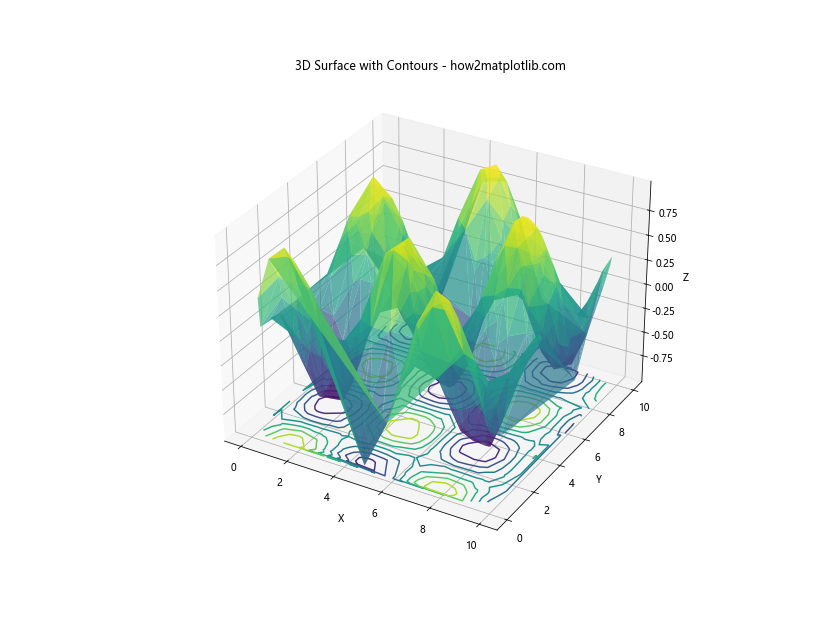
This example creates a 3D surface plot of the data and projects contours onto the x-y plane at the minimum z-value.
Handling Large Datasets
When working with large datasets, plotting contours can become computationally expensive. Here are some strategies to improve performance:
Decimation
Reduce the number of data points by randomly selecting a subset:
import matplotlib.pyplot as plt
import numpy as np
from matplotlib.tri import Triangulation

# Create large sample data
x = np.random.rand(10000) * 10
y = np.random.rand(10000) * 10
z = np.sin(x) * np.cos(y)

# Decimate data
n = len(x)
decimation_factor = 10
indices = np.random.choice(n, n // decimation_factor, replace=False)
x_dec, y_dec, z_dec = x[indices], y[indices], z[indices]

# Create triangulation
triang = Triangulation(x_dec, y_dec)

# Plot contours
plt.figure(figsize=(10, 8))
plt.tricontourf(triang, z_dec, cmap='viridis')
plt.colorbar(label='Z values')
plt.title('Contours with Decimated Data - how2matplotlib.com')
plt.xlabel('X')
plt.ylabel('Y')
plt.show()
Output:
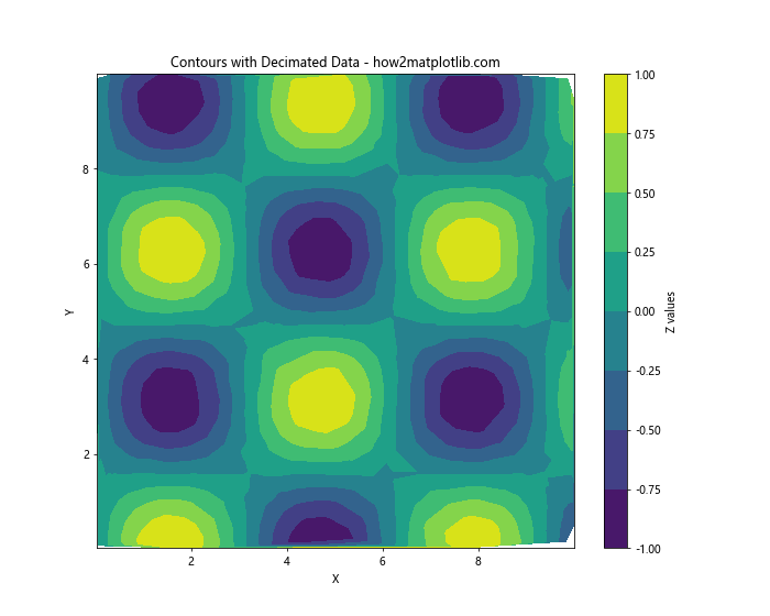
This example reduces the dataset size by a factor of 10 before plotting contours.
Using a Coarser Grid
If you're interpolating onto a regular grid, use a coarser grid to reduce computation time:
import matplotlib.pyplot as plt
import numpy as np
from matplotlib.tri import Triangulation, LinearTriInterpolator

# Create large sample data
x = np.random.rand(10000) * 10
y = np.random.rand(10000) * 10
z = np.sin(x) * np.cos(y)

# Create triangulation
triang = Triangulation(x, y)

# Create interpolator
interp = LinearTriInterpolator(triang, z)

# Create coarse regular grid for interpolation
xi, yi = np.meshgrid(np.linspace(0, 10, 50), np.linspace(0, 10, 50))
zi = interp(xi, yi)

# Plot interpolated contours
plt.figure(figsize=(10, 8))
plt.contourf(xi, yi, zi, cmap='viridis')
plt.colorbar(label='Z values')
plt.title('Contours on Coarse Grid - how2matplotlib.com')
plt.xlabel('X')
plt.ylabel('Y')
plt.show()
Output:
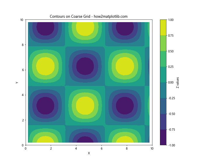
This example uses a 50x50 grid instead of a finer resolution, reducing computation time while still providing a good representation of the data.
Advanced Techniques for Contour Plotting
Let's explore some advanced techniques for enhancing your contour plots on unstructured triangular grids.
Custom Colormaps
Matplotlib offers a wide range of colormaps, but you can also create custom colormaps to suit your specific needs:
import matplotlib.pyplot as plt
import numpy as np
from matplotlib.tri import Triangulation
from matplotlib.colors import LinearSegmentedColormap

# Create sample data
x = np.random.rand(500) * 10
y = np.random.rand(500) * 10
z = np.sin(x) * np.cos(y)

# Create triangulation
triang = Triangulation(x, y)

# Create custom colormap
colors = ['darkblue', 'royalblue', 'lightgreen', 'yellow', 'orange', 'red']
n_bins = 100
cmap = LinearSegmentedColormap.from_list('custom_cmap', colors, N=n_bins)

# Plot contours with custom colormap
plt.figure(figsize=(10, 8))
plt.tricontourf(triang, z, cmap=cmap)
plt.colorbar(label='Z values')
plt.title('Contours with Custom Colormap - how2matplotlib.com')
plt.xlabel('X')
plt.ylabel('Y')
plt.show()
Output:
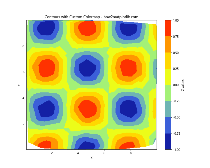
This example creates a custom colormap transitioning from dark blue to red, providing a unique visual representation of the data.
Logarithmic Contours
For data with a large dynamic range, logarithmic contours can be useful:
import matplotlib.pyplot as plt
import numpy as np
from matplotlib.tri import Triangulation

# Create sample data with large dynamic range
x = np.random.rand(500) * 10
y = np.random.rand(500) * 10
z = np.exp(x/2) * np.exp(y/2)

# Create triangulation
triang = Triangulation(x, y)

# Plot logarithmic contours
plt.figure(figsize=(10, 8))
levels = np.logspace(0, 4, 20)
plt.tricontourf(triang, z, levels=levels, cmap='viridis', norm=plt.LogNorm())
plt.colorbar(label='Z values (log scale)')
plt.title('Logarithmic Contours - how2matplotlib.com')
plt.xlabel('X')
plt.ylabel('Y')
plt.show()
This example uses np.logspace to create logarithmically spaced contour levels and plt.LogNorm() to apply a logarithmic color scaling.
Contours with Hatching
You can add hatching patterns to your contour plots to differentiate between regions:
import matplotlib.pyplot as plt
import numpy as np
from matplotlib.tri import Triangulation

# Create sample data
x = np.random.rand(500) * 10
y = np.random.rand(500) * 10
z = np.sin(x) * np.cos(y)

# Create triangulation
triang = Triangulation(x, y)

# Plot contours with hatching
plt.figure(figsize=(10, 8))
levels = [-1, -0.5, 0, 0.5, 1]
cs = plt.tricontourf(triang, z, levels=levels, cmap='RdBu_r', hatches=['///', '\\\\\\', None, '...', '+++'])
plt.colorbar(cs, label='Z values')
plt.title('Contours with Hatching - how2matplotlib.com')
plt.xlabel('X')
plt.ylabel('Y')
plt.show()
Output:
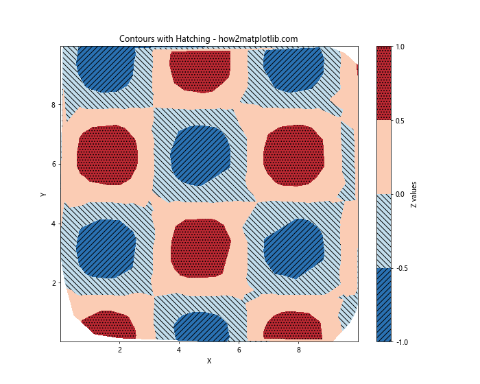
This example adds different hatching patterns to each contour level, providing additional visual cues to differentiate between regions.
Combining Contours with Other Plot Types
Contour plots can be combined with other types of plots to create more informative visualizations.
Contours with Scatter Plot
Overlay a scatter plot on top of contours to show both the original data points and the interpolated contours:
import matplotlib.pyplot as plt
import numpy as np
from matplotlib.tri import Triangulation

# Create sample data
x = np.random.rand(500) * 10
y = np.random.rand(500) * 10
z = np.sin(x) * np.cos(y)

# Create triangulation
triang = Triangulation(x, y)

# Plot contours with scatter plot
plt.figure(figsize=(10, 8))
plt.tricontourf(triang, z, cmap='viridis', alpha=0.7)
plt.scatter(x, y, c=z, cmap='viridis', edgecolors='k', s=20)
plt.colorbar(label='Z values')
plt.title('Contours with Scatter Plot - how2matplotlib.com')
plt.xlabel('X')
plt.ylabel('Y')
plt.show()
Output:
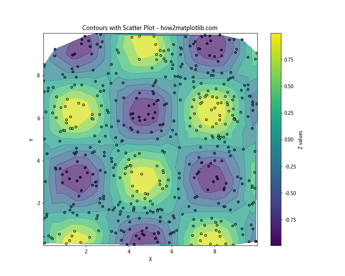
This example overlays the original data points on top of the contour plot, allowing you to see both the raw data and the interpolated surface.
Contours with Quiver Plot
Combine contours with a quiver plot to visualize both scalar and vector fields:
import matplotlib.pyplot as plt
import numpy as np
from matplotlib.tri import Triangulation

# Create sample data
x = np.random.rand(500) * 10
y = np.random.rand(500) * 10
z = np.sin(x) * np.cos(y)

# Create vector field
u = np.cos(x) * np.sin(y)
v = -np.sin(x) * np.cos(y)

# Create triangulation
triang = Triangulation(x, y)

# Plot contours with quiver plot
plt.figure(figsize=(10, 8))
plt.tricontourf(triang, z, cmap='viridis', alpha=0.7)
plt.quiver(x, y, u, v, scale=20, width=0.002)
plt.colorbar(label='Z values')
plt.title('Contours with Quiver Plot - how2matplotlib.com')
plt.xlabel('X')
plt.ylabel('Y')
plt.show()
Output:
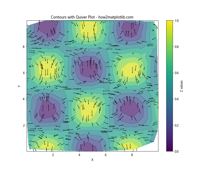
This example adds arrows representing the vector field (u, v) on top of the contour plot of the scalar field z.
Handling Non-Convex Domains
When working with non-convex domains, you may need to mask certain triangles to prevent interpolation across boundaries:
import matplotlib.pyplot as plt
import numpy as np
from matplotlib.tri import Triangulation

# Create sample data for a non-convex domain (e.g., a donut shape)
theta = np.random.uniform(0, 2*np.pi, 1000)
r = np.random.uniform(3, 5, 1000)
x = r * np.cos(theta)
y = r * np.sin(theta)
z = np.sin(x) * np.cos(y)

# Create triangulation
triang = Triangulation(x, y)

# Create mask for the inner circle
xy_center = np.array([0, 0])
distance_from_center = np.sqrt((triang.x[triang.triangles] - xy_center[0])**2 +
                               (triang.y[triang.triangles] - xy_center[1])**2)
mask = np.any(distance_from_center < 2.5, axis=1)
triang.set_mask(mask)

# Plot contours for non-convex domain
plt.figure(figsize=(10, 8))
plt.tricontourf(triang, z, cmap='viridis')
plt.colorbar(label='Z values')
plt.title('Contours on Non-Convex Domain - how2matplotlib.com')
plt.xlabel('X')
plt.ylabel('Y')
plt.axis('equal')
plt.show()
Output:
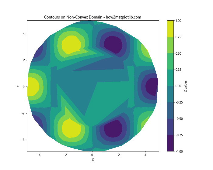
This example creates a donut-shaped domain and masks the inner circle to prevent interpolation across the hole.
Conclusion
Drawing contours on an unstructured triangular grid in Python using Matplotlib is a powerful technique for visualizing complex data. We've covered a wide range of topics, from basic contour plotting to advanced techniques and combinations with other plot types. By mastering these methods, you can create informative and visually appealing representations of your data on irregular meshes.
Remember to experiment with different options and combinations to find the best visualization for your specific dataset. Matplotlib's flexibility allows for countless customizations, so don't hesitate to explore beyond the examples provided here.