How to Decouple Hatch and Edge Color in Matplotlib
Decoupling hatch and edge color in Matplotlib is an essential technique for creating visually appealing and informative plots. This article will explore various methods and best practices for separating hatch and edge colors in Matplotlib, providing you with the tools to enhance your data visualization skills. We’ll cover everything from basic concepts to advanced techniques, ensuring you have a thorough understanding of how to decouple hatch and edge color in Matplotlib.
Understanding Hatch and Edge Color in Matplotlib
Before diving into the specifics of decoupling hatch and edge color in Matplotlib, it’s crucial to understand what these elements are and how they contribute to the overall appearance of a plot. Hatch patterns are used to fill the interior of shapes with repeating patterns, while edge colors define the outline of shapes in a plot. By default, Matplotlib often uses the same color for both hatch and edge, but decoupling these elements can lead to more visually striking and informative visualizations.
Let’s start with a basic example to illustrate the concept of hatch and edge color in Matplotlib:
import matplotlib.pyplot as plt

fig, ax = plt.subplots(figsize=(8, 6))
ax.bar([1, 2, 3], [4, 5, 6], hatch='///', edgecolor='black', facecolor='lightblue')
ax.set_title('Basic Hatch and Edge Color Example - how2matplotlib.com')
plt.show()
Output:

In this example, we create a simple bar plot with a hatch pattern of forward slashes, a black edge color, and a light blue face color. This serves as a starting point for understanding how hatch and edge color work together in Matplotlib.
The Importance of Decoupling Hatch and Edge Color
Decoupling hatch and edge color in Matplotlib offers several advantages:
- Enhanced visual clarity: By separating hatch and edge colors, you can create more distinct visual elements in your plots.
- Improved data representation: Different colors for hatch and edge can help distinguish between various data categories or emphasize specific aspects of your data.
- Greater design flexibility: Decoupling allows for more creative and customized plot designs.
- Better accessibility: Using contrasting colors for hatch and edge can make your plots more accessible to viewers with color vision deficiencies.
Now, let’s explore various techniques for decoupling hatch and edge color in Matplotlib.
Basic Decoupling Techniques
Adjusting Hatch Density and Edge Width
Another way to visually separate hatch and edge is by adjusting their density and width. Here’s how you can do this:
import matplotlib.pyplot as plt

fig, ax = plt.subplots(figsize=(8, 6))
ax.bar([1, 2, 3], [4, 5, 6], hatch='//////', edgecolor='black', facecolor='lightblue', linewidth=2)
ax.set_title('Adjusted Hatch Density and Edge Width - how2matplotlib.com')
plt.show()
Output:
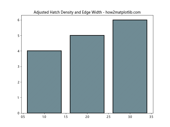
In this example, we’ve increased the hatch density by using more forward slashes and increased the edge width using the linewidth parameter. This creates a visual distinction between the hatch and edge, even when using the same color.
Advanced Decoupling Techniques
Using Alpha Channels
Alpha channels can be used to create semi-transparent hatch patterns, further distinguishing them from the edge color:
import matplotlib.pyplot as plt
import matplotlib.patches as patches

fig, ax = plt.subplots(figsize=(8, 6))
rect = patches.Rectangle((0.1, 0.1), 0.8, 0.8, fill=False, hatch='xxxx', alpha=0.5, edgecolor='black')
ax.add_patch(rect)
ax.set_title('Alpha Channel for Hatch - how2matplotlib.com')
plt.show()
Output:
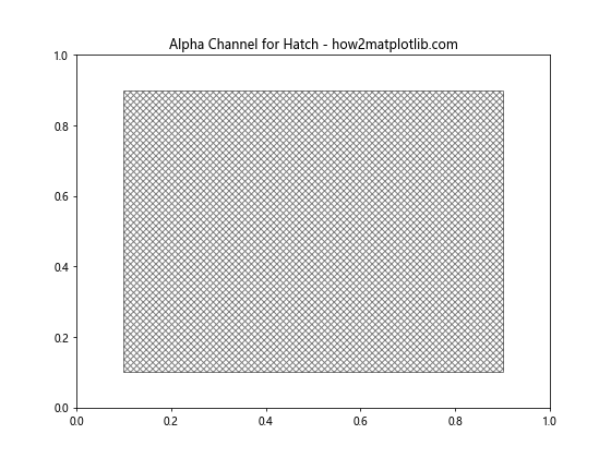
In this example, we’ve created a rectangle with a cross-hatch pattern and set its alpha value to 0.5, making it semi-transparent. This technique can be particularly useful when working with overlapping shapes or complex plots.
Decoupling Hatch and Edge Color in Different Plot Types
Scatter Plots
While scatter plots don’t typically use hatch patterns, we can still apply the concept of decoupling colors to markers and their edges:
import matplotlib.pyplot as plt
import numpy as np

fig, ax = plt.subplots(figsize=(8, 6))
x = np.random.rand(50)
y = np.random.rand(50)
ax.scatter(x, y, c='lightblue', edgecolors='red', s=100)
ax.set_title('Scatter Plot with Decoupled Colors - how2matplotlib.com')
plt.show()
Output:
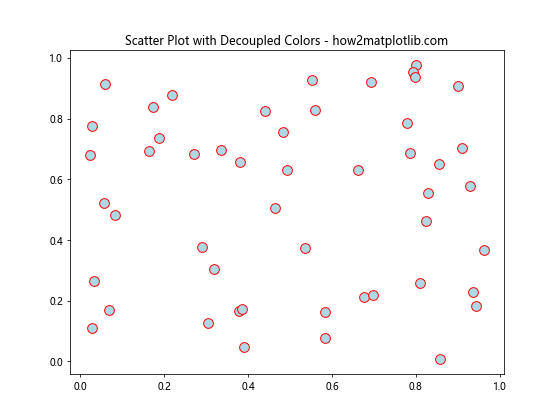
In this example, we’ve created a scatter plot with light blue markers and red edges, effectively decoupling the two colors.
3D Plots
Decoupling hatch and edge color can also be applied to 3D plots for enhanced visual appeal:
import matplotlib.pyplot as plt
import numpy as np
from mpl_toolkits.mplot3d import Axes3D

fig = plt.figure(figsize=(10, 8))
ax = fig.add_subplot(111, projection='3d')

x = np.arange(-5, 5, 0.25)
y = np.arange(-5, 5, 0.25)
X, Y = np.meshgrid(x, y)
Z = np.sin(np.sqrt(X**2 + Y**2))

surf = ax.plot_surface(X, Y, Z, facecolors=plt.cm.viridis(Z), edgecolor='black', linewidth=0.5)
ax.set_title('3D Surface Plot with Decoupled Edge Color - how2matplotlib.com')
plt.show()
Output:
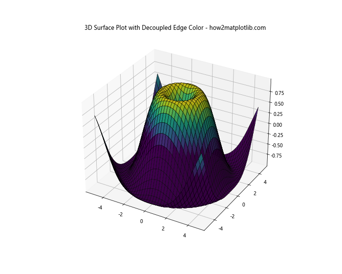
In this 3D surface plot example, we’ve used a colormap for the face colors and set the edge color to black, creating a clear distinction between the surface and its edges.
Handling Color Blindness Considerations
When decoupling hatch and edge color in Matplotlib, it’s important to consider color blindness to ensure your plots are accessible to all viewers:
import matplotlib.pyplot as plt
import matplotlib.colors as mcolors

fig, ax = plt.subplots(figsize=(8, 6))
color_blind_friendly_colors = ['#1f77b4', '#ff7f0e', '#2ca02c', '#d62728']
hatches = ['/', '\\', 'x', 'o']

for i in range(4):
    rect = plt.Rectangle((i, 0), 0.8, 1, facecolor=color_blind_friendly_colors[i],
                         edgecolor='black', hatch=hatches[i])
    ax.add_patch(rect)

ax.set_xlim(0, 4)
ax.set_ylim(0, 1)
ax.set_title('Color Blind Friendly Plot - how2matplotlib.com')
plt.show()
Output:
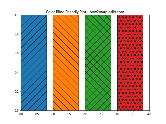
This example uses a color-blind friendly color palette and combines it with different hatch patterns to ensure that the plot is accessible to viewers with various types of color vision deficiencies.
Combining Decoupled Hatch and Edge Color with Other Matplotlib Features
Legends
Incorporating legends can help explain the meaning behind different hatch patterns and colors:
import matplotlib.pyplot as plt
import matplotlib.patches as patches

fig, ax = plt.subplots(figsize=(8, 6))

patterns = ['/', '\\', 'x', 'o']
colors = ['red', 'green', 'blue', 'yellow']

for i in range(4):
    rect = patches.Rectangle((i, 0), 0.8, 1, facecolor=colors[i], edgecolor='black', hatch=patterns[i])
    ax.add_patch(rect)
    ax.legend([rect], [f'Category {i+1}'], loc='upper right')

ax.set_xlim(0, 4)
ax.set_ylim(0, 1)
ax.set_title('Legend with Decoupled Hatch and Edge - how2matplotlib.com')
plt.show()
Output:
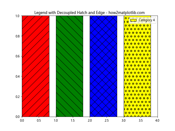
This example creates a plot with different hatch patterns and colors, using a legend to explain what each combination represents.
Conclusion
Decoupling hatch and edge color in Matplotlib is a powerful technique that can significantly enhance the visual appeal and information content of your plots. By separating these elements, you can create more distinct and informative visualizations that effectively communicate your data.
Throughout this article, we’ve explored various methods for decoupling hatch and edge color, from basic techniques to advanced applications across different plot types. We’ve also discussed best practices, troubleshooting common issues, and considerations for accessibility.
Remember that the key to successful decoupling is finding the right balance between visual appeal and clarity. Experiment with different combinations of hatch patterns, colors, and edge styles to find what works best for your specific data and audience.
By mastering the art of decoupling hatch and edge color in Matplotlib, you’ll be able to create more sophisticated and impactful data visualizations that stand out and effectively convey your message. Whether you’re working on scientific publications, business reports, or data journalism, these techniques will help you take your plots to the next level.