How to Rotate X-Axis Tick Label Text in Matplotlib
How to Rotate X-Axis Tick Label Text in Matplotlib is an essential skill for data visualization enthusiasts and professionals alike. Matplotlib, a powerful plotting library for Python, offers various ways to customize your plots, including rotating x-axis tick labels. This article will delve deep into the methods and techniques for rotating x-axis tick label text in Matplotlib, providing you with a comprehensive understanding of this crucial aspect of data visualization.
Understanding the Importance of Rotating X-Axis Tick Labels
Before we dive into the specifics of how to rotate x-axis tick label text in Matplotlib, it’s essential to understand why this technique is so valuable. When working with data that has long or numerous x-axis labels, they can often overlap, making them difficult to read. By rotating the x-axis tick label text, you can improve the readability of your plots and make them more visually appealing.
Let’s start with a simple example to illustrate this point:
import matplotlib.pyplot as plt
import numpy as np

# Create sample data
x = ['How2Matplotlib_' + str(i) for i in range(10)]
y = np.random.rand(10)

# Create the plot
plt.figure(figsize=(10, 5))
plt.bar(x, y)
plt.title('Bar Plot with Unrotated X-Axis Labels')
plt.xlabel('X-Axis')
plt.ylabel('Y-Axis')

# Show the plot
plt.show()
Output:
In this example, we create a simple bar plot with x-axis labels that include “How2Matplotlib” followed by a number. As you can see, the x-axis labels are not rotated, which can lead to overlapping and difficulty in reading when there are many labels or when the labels are long.
Now, let’s explore various methods to rotate x-axis tick label text in Matplotlib.
Method 1: Using plt.xticks() to Rotate X-Axis Tick Label Text
One of the simplest ways to rotate x-axis tick label text in Matplotlib is by using the plt.xticks() function. This method allows you to rotate the labels and adjust their alignment easily.
Here’s an example of how to rotate x-axis tick label text using plt.xticks():
import matplotlib.pyplot as plt
import numpy as np

# Create sample data
x = ['How2Matplotlib_' + str(i) for i in range(10)]
y = np.random.rand(10)

# Create the plot
plt.figure(figsize=(10, 5))
plt.bar(x, y)
plt.title('Bar Plot with Rotated X-Axis Labels')
plt.xlabel('X-Axis')
plt.ylabel('Y-Axis')

# Rotate x-axis labels
plt.xticks(rotation=45, ha='right')

# Show the plot
plt.show()
Output:
In this example, we use plt.xticks(rotation=45, ha='right') to rotate the x-axis tick label text by 45 degrees and align them to the right. The rotation parameter specifies the angle of rotation, while ha (horizontal alignment) determines the alignment of the rotated labels.
Method 2: Using ax.set_xticklabels() to Rotate X-Axis Tick Label Text
Another method to rotate x-axis tick label text in Matplotlib is by using the ax.set_xticklabels() function. This approach is particularly useful when working with Matplotlib’s object-oriented interface.
Here’s an example of how to rotate x-axis tick label text using ax.set_xticklabels():
import matplotlib.pyplot as plt
import numpy as np

# Create sample data
x = ['How2Matplotlib_' + str(i) for i in range(10)]
y = np.random.rand(10)

# Create the plot
fig, ax = plt.subplots(figsize=(10, 5))
ax.bar(x, y)
ax.set_title('Bar Plot with Rotated X-Axis Labels')
ax.set_xlabel('X-Axis')
ax.set_ylabel('Y-Axis')

# Rotate x-axis labels
ax.set_xticklabels(x, rotation=45, ha='right')

# Show the plot
plt.show()
Output:
In this example, we use ax.set_xticklabels(x, rotation=45, ha='right') to rotate the x-axis tick label text. This method allows you to specify the labels explicitly, which can be useful when you want to customize the labels further.
Method 3: Using seaborn to Rotate X-Axis Tick Label Text
Seaborn, a statistical data visualization library built on top of Matplotlib, provides an easy way to rotate x-axis tick label text. While not strictly a Matplotlib method, it’s worth mentioning due to its simplicity and integration with Matplotlib.
Here’s an example of how to rotate x-axis tick label text using seaborn:
import matplotlib.pyplot as plt
import seaborn as sns
import numpy as np

# Create sample data
x = ['How2Matplotlib_' + str(i) for i in range(10)]
y = np.random.rand(10)

# Create the plot
plt.figure(figsize=(10, 5))
sns.barplot(x=x, y=y)
plt.title('Bar Plot with Rotated X-Axis Labels')
plt.xlabel('X-Axis')
plt.ylabel('Y-Axis')

# Rotate x-axis labels
plt.xticks(rotation=45, ha='right')

# Show the plot
plt.show()
Output:
In this example, we use seaborn’s barplot() function to create the plot, and then use plt.xticks() to rotate the x-axis tick label text. Seaborn automatically handles many aspects of plot styling, making it easier to create visually appealing plots.
Advanced Techniques for Rotating X-Axis Tick Label Text
Now that we’ve covered the basic methods for rotating x-axis tick label text in Matplotlib, let’s explore some more advanced techniques that can help you fine-tune your plots.
Adjusting Label Padding
When rotating x-axis tick label text, you may notice that the labels can sometimes overlap with the plot area or other elements. To address this, you can adjust the label padding using the labelpad parameter.
Here’s an example of how to adjust label padding when rotating x-axis tick label text:
import matplotlib.pyplot as plt
import numpy as np

# Create sample data
x = ['How2Matplotlib_' + str(i) for i in range(10)]
y = np.random.rand(10)

# Create the plot
fig, ax = plt.subplots(figsize=(10, 5))
ax.bar(x, y)
ax.set_title('Bar Plot with Rotated X-Axis Labels and Adjusted Padding')
ax.set_xlabel('X-Axis', labelpad=15)
ax.set_ylabel('Y-Axis')

# Rotate x-axis labels and adjust padding
ax.set_xticklabels(x, rotation=45, ha='right')
ax.tick_params(axis='x', which='major', pad=10)

# Show the plot
plt.tight_layout()
plt.show()
Output:
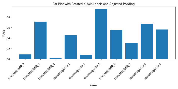
In this example, we use ax.set_xlabel('X-Axis', labelpad=15) to increase the padding between the x-axis label and the tick labels. We also use ax.tick_params(axis='x', which='major', pad=10) to adjust the padding between the tick labels and the plot area.
Using Text Wrapping for Long Labels
When dealing with long x-axis labels, rotating them might not always be the best solution. In such cases, you can use text wrapping to make the labels more readable without rotation.
Here’s an example of how to use text wrapping for x-axis tick label text:
import matplotlib.pyplot as plt
import numpy as np
import textwrap

# Create sample data
x = ['How2Matplotlib Long Label ' + str(i) for i in range(5)]
y = np.random.rand(5)

# Create a function to wrap text
def wrap_labels(labels, max_width=10):
    return [textwrap.fill(label, max_width) for label in labels]

# Create the plot
fig, ax = plt.subplots(figsize=(10, 5))
ax.bar(x, y)
ax.set_title('Bar Plot with Wrapped X-Axis Labels')
ax.set_xlabel('X-Axis')
ax.set_ylabel('Y-Axis')

# Wrap and set x-axis labels
wrapped_labels = wrap_labels(x)
ax.set_xticklabels(wrapped_labels)

# Show the plot
plt.tight_layout()
plt.show()
Output:
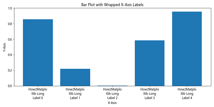
In this example, we define a wrap_labels() function that uses Python’s textwrap module to wrap long labels. We then apply this function to our x-axis labels before setting them using ax.set_xticklabels().
Rotating X-Axis Tick Label Text in Subplots
When working with multiple subplots, you may want to rotate x-axis tick label text consistently across all subplots. Here’s an example of how to achieve this:
import matplotlib.pyplot as plt
import numpy as np

# Create sample data
x = ['How2Matplotlib_' + str(i) for i in range(5)]
y1 = np.random.rand(5)
y2 = np.random.rand(5)

# Create the plot with subplots
fig, (ax1, ax2) = plt.subplots(2, 1, figsize=(10, 10))

# Plot data on the first subplot
ax1.bar(x, y1)
ax1.set_title('Subplot 1')
ax1.set_xlabel('X-Axis')
ax1.set_ylabel('Y-Axis')

# Plot data on the second subplot
ax2.bar(x, y2)
ax2.set_title('Subplot 2')
ax2.set_xlabel('X-Axis')
ax2.set_ylabel('Y-Axis')

# Rotate x-axis labels for both subplots
for ax in (ax1, ax2):
    ax.set_xticklabels(x, rotation=45, ha='right')

# Adjust layout and show the plot
plt.tight_layout()
plt.show()
Output:
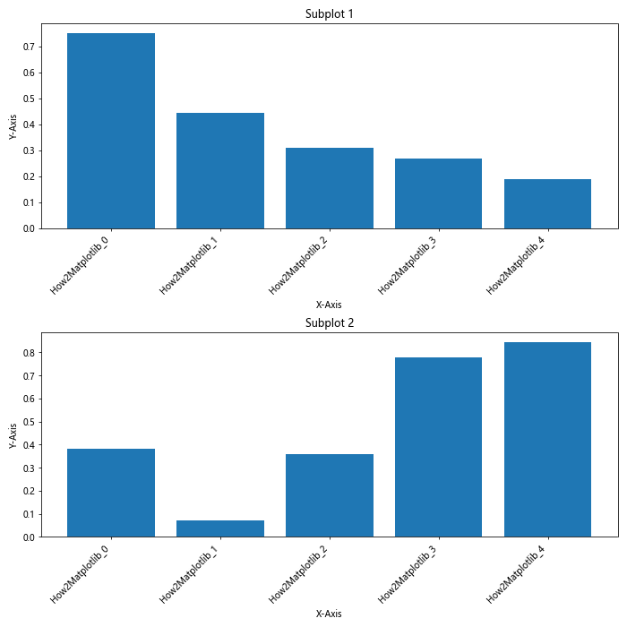
In this example, we create two subplots and use a loop to rotate the x-axis tick label text for both subplots consistently.
Customizing Rotated X-Axis Tick Label Text
Rotating x-axis tick label text is just the beginning. Matplotlib offers numerous ways to customize the appearance of your rotated labels. Let’s explore some of these customization options.
Changing Font Properties
You can change various font properties of the rotated x-axis tick label text, such as font size, weight, and style.
Here’s an example of how to customize font properties for rotated x-axis tick label text:
import matplotlib.pyplot as plt
import numpy as np

# Create sample data
x = ['How2Matplotlib_' + str(i) for i in range(10)]
y = np.random.rand(10)

# Create the plot
fig, ax = plt.subplots(figsize=(10, 5))
ax.bar(x, y)
ax.set_title('Bar Plot with Customized X-Axis Labels')
ax.set_xlabel('X-Axis')
ax.set_ylabel('Y-Axis')

# Rotate and customize x-axis labels
ax.set_xticklabels(x, rotation=45, ha='right', fontsize=12, fontweight='bold', fontstyle='italic')

# Show the plot
plt.tight_layout()
plt.show()
Output:
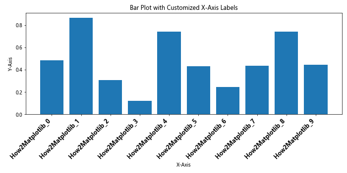
In this example, we use ax.set_xticklabels() with additional parameters to customize the font properties of the rotated x-axis tick label text. We set the font size to 12, make the text bold, and apply an italic style.
Adding Colors to Rotated Labels
Adding colors to your rotated x-axis tick label text can help emphasize certain labels or improve the overall aesthetics of your plot.
Here’s an example of how to add colors to rotated x-axis tick label text:
import matplotlib.pyplot as plt
import numpy as np

# Create sample data
x = ['How2Matplotlib_' + str(i) for i in range(10)]
y = np.random.rand(10)

# Create a color map
colors = plt.cm.get_cmap('Set3')(np.linspace(0, 1, len(x)))

# Create the plot
fig, ax = plt.subplots(figsize=(10, 5))
ax.bar(x, y)
ax.set_title('Bar Plot with Colored X-Axis Labels')
ax.set_xlabel('X-Axis')
ax.set_ylabel('Y-Axis')

# Rotate and color x-axis labels
for i, label in enumerate(ax.get_xticklabels()):
    label.set_rotation(45)
    label.set_ha('right')
    label.set_color(colors[i])

# Show the plot
plt.tight_layout()
plt.show()
Output:
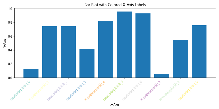
In this example, we create a color map using plt.cm.get_cmap() and apply different colors to each rotated x-axis tick label using a loop.
Handling Overlapping Rotated Labels
When dealing with a large number of x-axis labels or very long labels, even rotating them might not be enough to prevent overlapping. In such cases, you may need to employ additional techniques to ensure readability.
Using Label Thinning
Label thinning involves displaying only a subset of the x-axis tick labels to reduce overcrowding. Here’s an example of how to implement label thinning with rotated x-axis tick label text:
import matplotlib.pyplot as plt
import numpy as np

# Create sample data
x = ['How2Matplotlib_' + str(i) for i in range(50)]
y = np.random.rand(50)

# Create the plot
fig, ax = plt.subplots(figsize=(12, 5))
ax.plot(x, y)
ax.set_title('Line Plot with Thinned X-Axis Labels')
ax.set_xlabel('X-Axis')
ax.set_ylabel('Y-Axis')

# Rotate and thin x-axis labels
ax.set_xticks(ax.get_xticks()[::5])  # Show every 5th label
ax.set_xticklabels(x[::5], rotation=45, ha='right')

# Show the plot
plt.tight_layout()
plt.show()
Output:
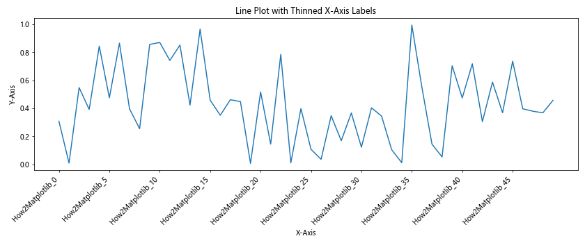
In this example, we use ax.set_xticks() to select every 5th tick, and then use ax.set_xticklabels() to set the corresponding labels with rotation.
Using Staggered Labels
Another approach to handling overlapping labels is to stagger them, alternating between two or more rows. Here’s an example of how to create staggered, rotated x-axis tick label text:
import matplotlib.pyplot as plt
import numpy as np

# Create sample data
x = ['How2Matplotlib_' + str(i) for i in range(20)]
y = np.random.rand(20)

# Create the plot
fig, ax = plt.subplots(figsize=(12, 5))
ax.bar(x, y)
ax.set_title('Bar Plot with Staggered X-Axis Labels')
ax.set_xlabel('X-Axis')
ax.set_ylabel('Y-Axis')

# Rotate and stagger x-axis labels
for i, label in enumerate(ax.get_xticklabels()):
    label.set_rotation(45)
    label.set_ha('right')
    if i % 2:
        label.set_y(label.get_position()[1] - 0.05)

# Show the plot
plt.tight_layout()
plt.show()
Output:
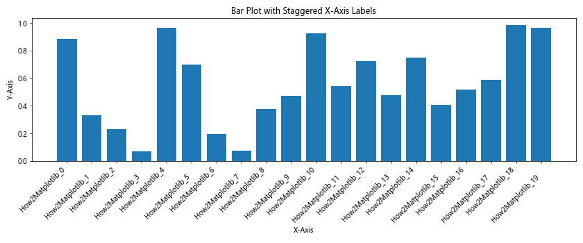
In this example, we use a loop to rotate all labels and then adjust the y-position of every other label to create a staggered effect.
Rotating X-Axis Tick Label Text in Different Plot Types
The techniques for rotating x-axis tick label text can beapplied to various types of plots in Matplotlib. Let’s explore how to rotate x-axis tick label text in different plot types.
Rotating X-Axis Tick Label Text in Line Plots
Line plots are commonly used to show trends over time or other continuous variables. Here’s an example of how to rotate x-axis tick label text in a line plot:
import matplotlib.pyplot as plt
import numpy as np

# Create sample data
x = ['How2Matplotlib_' + str(i) for i in range(20)]
y = np.cumsum(np.random.randn(20))

# Create the plot
fig, ax = plt.subplots(figsize=(12, 5))
ax.plot(x, y, marker='o')
ax.set_title('Line Plot with Rotated X-Axis Labels')
ax.set_xlabel('X-Axis')
ax.set_ylabel('Y-Axis')

# Rotate x-axis labels
ax.set_xticklabels(x, rotation=45, ha='right')

# Show the plot
plt.tight_layout()
plt.show()
Output:
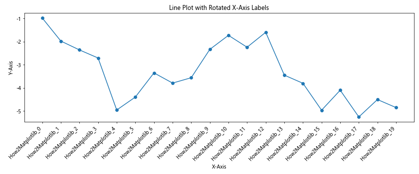
In this example, we create a line plot with markers and rotate the x-axis tick label text using ax.set_xticklabels().
Rotating X-Axis Tick Label Text in Scatter Plots
Scatter plots are useful for showing the relationship between two variables. Here’s how to rotate x-axis tick label text in a scatter plot:
import matplotlib.pyplot as plt
import numpy as np

# Create sample data
x = ['How2Matplotlib_' + str(i) for i in range(15)]
y = np.random.rand(15)
sizes = np.random.rand(15) * 200

# Create the plot
fig, ax = plt.subplots(figsize=(12, 5))
ax.scatter(x, y, s=sizes, alpha=0.6)
ax.set_title('Scatter Plot with Rotated X-Axis Labels')
ax.set_xlabel('X-Axis')
ax.set_ylabel('Y-Axis')

# Rotate x-axis labels
plt.xticks(rotation=45, ha='right')

# Show the plot
plt.tight_layout()
plt.show()
Output:
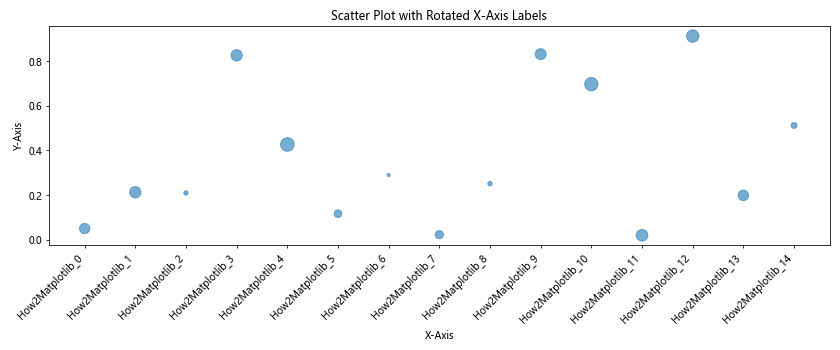
In this example, we create a scatter plot with varying point sizes and use plt.xticks() to rotate the x-axis tick label text.
Rotating X-Axis Tick Label Text in Histograms
Histograms are used to show the distribution of a dataset. Here’s an example of how to rotate x-axis tick label text in a histogram:
import matplotlib.pyplot as plt
import numpy as np

# Create sample data
data = np.random.normal(0, 1, 1000)
bins = ['How2Matplotlib_' + str(i) for i in range(-3, 4)]

# Create the plot
fig, ax = plt.subplots(figsize=(12, 5))
ax.hist(data, bins=7, edgecolor='black')
ax.set_title('Histogram with Rotated X-Axis Labels')
ax.set_xlabel('X-Axis')
ax.set_ylabel('Frequency')

# Set and rotate x-axis labels
ax.set_xticklabels(bins, rotation=45, ha='right')

# Show the plot
plt.tight_layout()
plt.show()
Output:
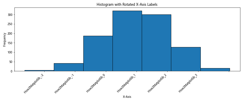
In this example, we create a histogram and use ax.set_xticklabels() to set custom bin labels and rotate them.
Best Practices for Rotating X-Axis Tick Label Text
When rotating x-axis tick label text in Matplotlib, it’s important to follow some best practices to ensure your plots are clear, readable, and visually appealing. Here are some tips to keep in mind:
- Choose the right rotation angle: While 45 degrees is commonly used, experiment with different angles to find the best balance between readability and space efficiency.
Adjust horizontal alignment: Use
ha='right'for positive rotation angles andha='left'for negative rotation angles to align the labels properly.Use
plt.tight_layout(): This function automatically adjusts the plot layout to prevent overlapping elements.Consider label length: For very long labels, consider using text wrapping or abbreviations instead of rotation.
Be consistent: If you’re creating multiple plots, use consistent rotation angles and styles across all of them.
Use readable font sizes: Ensure that the rotated labels are still legible by adjusting the font size as needed.
Adjust tick density: If you have too many x-axis ticks, consider reducing their number to prevent overcrowding.
Let’s implement these best practices in an example: