How to Plot Logarithmic Axes in Matplotlib
How to Plot Logarithmic Axes in Matplotlib is an essential skill for data visualization in Python. Logarithmic axes are particularly useful when dealing with data that spans several orders of magnitude or when you want to emphasize relative changes rather than absolute differences. In this comprehensive guide, we’ll explore various techniques and best practices for creating logarithmic plots using Matplotlib.
Understanding Logarithmic Axes in Matplotlib
Before diving into the specifics of how to plot logarithmic axes in Matplotlib, it’s important to understand what logarithmic scales are and why they’re useful. Logarithmic scales compress large ranges of data into smaller spaces, making it easier to visualize and compare values that differ by orders of magnitude.
In Matplotlib, you can create logarithmic scales for both the x-axis and y-axis. This allows for great flexibility in data representation, especially when dealing with exponential growth or decay, power-law relationships, or data that spans several orders of magnitude.
Let’s start with a simple example of how to plot logarithmic axes in Matplotlib:
import matplotlib.pyplot as plt
import numpy as np

# Generate data
x = np.logspace(0, 5, 100)
y = x**2

# Create the plot
plt.figure(figsize=(10, 6))
plt.loglog(x, y, label='y = x^2')
plt.xlabel('X-axis (log scale)')
plt.ylabel('Y-axis (log scale)')
plt.title('How to Plot Logarithmic Axes in Matplotlib - how2matplotlib.com')
plt.legend()
plt.grid(True)
plt.show()
Output:
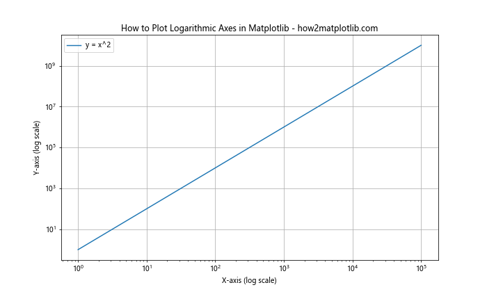
In this example, we use plt.loglog() to create a plot with both x and y axes on a logarithmic scale. The np.logspace() function generates logarithmically spaced numbers, which is ideal for demonstrating how to plot logarithmic axes in Matplotlib.
Creating Logarithmic X-Axis Plots
When you want to focus on how to plot logarithmic axes in Matplotlib for just the x-axis, you can use the semilogx() function. This is particularly useful when your x-axis data spans several orders of magnitude, but your y-axis data is better represented on a linear scale.
Here’s an example of how to create a plot with a logarithmic x-axis:
import matplotlib.pyplot as plt
import numpy as np

# Generate data
x = np.logspace(0, 5, 100)
y = np.sin(x)

# Create the plot
plt.figure(figsize=(10, 6))
plt.semilogx(x, y, label='y = sin(x)')
plt.xlabel('X-axis (log scale)')
plt.ylabel('Y-axis (linear scale)')
plt.title('How to Plot Logarithmic X-Axis in Matplotlib - how2matplotlib.com')
plt.legend()
plt.grid(True)
plt.show()
Output:
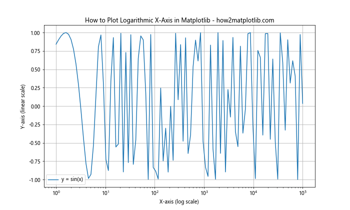
In this example, we use plt.semilogx() to create a plot with a logarithmic x-axis and a linear y-axis. This is useful for visualizing how a periodic function like sine behaves over a wide range of input values.
Creating Logarithmic Y-Axis Plots
Similarly, when you want to learn how to plot logarithmic axes in Matplotlib for just the y-axis, you can use the semilogy() function. This is helpful when your y-axis data spans several orders of magnitude, but your x-axis data is better represented on a linear scale.
Here’s an example of how to create a plot with a logarithmic y-axis:
import matplotlib.pyplot as plt
import numpy as np

# Generate data
x = np.linspace(0, 10, 100)
y = np.exp(x)

# Create the plot
plt.figure(figsize=(10, 6))
plt.semilogy(x, y, label='y = e^x')
plt.xlabel('X-axis (linear scale)')
plt.ylabel('Y-axis (log scale)')
plt.title('How to Plot Logarithmic Y-Axis in Matplotlib - how2matplotlib.com')
plt.legend()
plt.grid(True)
plt.show()
Output:
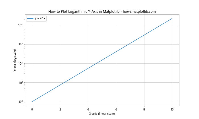
In this example, we use plt.semilogy() to create a plot with a linear x-axis and a logarithmic y-axis. This is particularly useful for visualizing exponential growth, as demonstrated by the exponential function.
Customizing Logarithmic Axes in Matplotlib
When learning how to plot logarithmic axes in Matplotlib, it’s important to know how to customize the appearance of your plots. You can adjust various aspects such as the base of the logarithm, the tick locations, and the tick labels.
Customizing Tick Locations
When learning how to plot logarithmic axes in Matplotlib, you might want to control where the tick marks appear. You can do this using the LogLocator class. Here’s an example:
import matplotlib.pyplot as plt
import numpy as np
from matplotlib.ticker import LogLocator

# Generate data
x = np.logspace(0, 5, 100)
y = x**2

# Create the plot
fig, ax = plt.subplots(figsize=(10, 6))
ax.loglog(x, y, label='y = x^2')
ax.set_xlabel('X-axis (log scale)')
ax.set_ylabel('Y-axis (log scale)')
ax.set_title('How to Plot Logarithmic Axes with Custom Ticks in Matplotlib - how2matplotlib.com')
ax.legend()

# Customize tick locations
ax.xaxis.set_major_locator(LogLocator(base=10, numticks=6))
ax.yaxis.set_major_locator(LogLocator(base=10, numticks=6))

plt.grid(True)
plt.show()
Output:

In this example, we use LogLocator to set the major tick locations on both axes. The numticks parameter controls the approximate number of ticks to display.
Customizing Tick Labels
When working on how to plot logarithmic axes in Matplotlib, you might also want to customize the tick labels. You can do this using the FuncFormatter class. Here’s an example:
import matplotlib.pyplot as plt
import numpy as np
from matplotlib.ticker import FuncFormatter

# Generate data
x = np.logspace(0, 5, 100)
y = x**2

# Create a custom formatter
def log_formatter(x, pos):
    return f'10^{int(np.log10(x))}'

# Create the plot
fig, ax = plt.subplots(figsize=(10, 6))
ax.loglog(x, y, label='y = x^2')
ax.set_xlabel('X-axis (log scale)')
ax.set_ylabel('Y-axis (log scale)')
ax.set_title('How to Plot Logarithmic Axes with Custom Labels in Matplotlib - how2matplotlib.com')
ax.legend()

# Apply the custom formatter
ax.xaxis.set_major_formatter(FuncFormatter(log_formatter))
ax.yaxis.set_major_formatter(FuncFormatter(log_formatter))

plt.grid(True)
plt.show()
Output:
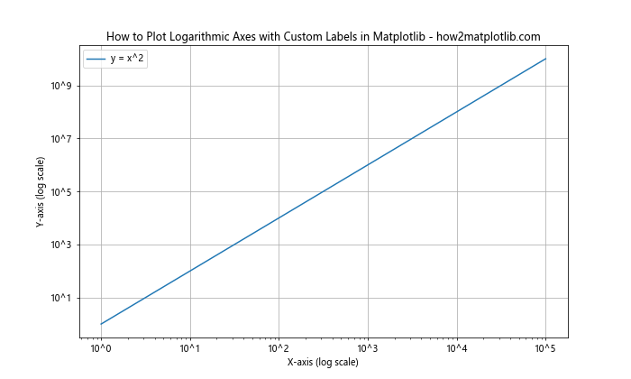
In this example, we define a custom formatter function log_formatter that displays tick labels as powers of 10. We then apply this formatter to both axes using FuncFormatter.
Plotting Multiple Datasets with Logarithmic Axes
When learning how to plot logarithmic axes in Matplotlib, you’ll often need to plot multiple datasets on the same graph. This can be particularly useful for comparing different trends or relationships. Here’s an example of how to do this:
import matplotlib.pyplot as plt
import numpy as np

# Generate data
x = np.logspace(0, 5, 100)
y1 = x**2
y2 = x**1.5
y3 = x

# Create the plot
plt.figure(figsize=(10, 6))
plt.loglog(x, y1, label='y = x^2')
plt.loglog(x, y2, label='y = x^1.5')
plt.loglog(x, y3, label='y = x')
plt.xlabel('X-axis (log scale)')
plt.ylabel('Y-axis (log scale)')
plt.title('How to Plot Multiple Datasets with Logarithmic Axes in Matplotlib - how2matplotlib.com')
plt.legend()
plt.grid(True)
plt.show()
Output:
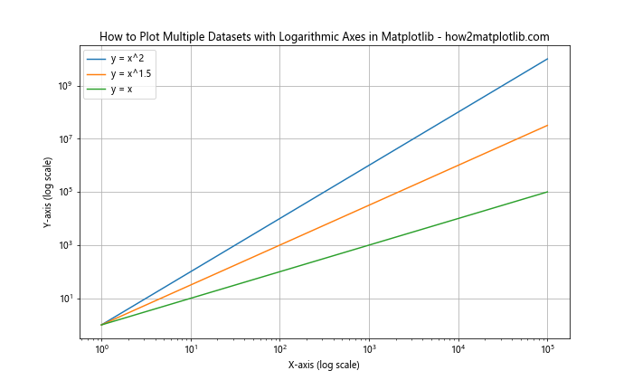
In this example, we plot three different functions on the same logarithmic plot. This allows us to easily compare their growth rates over a wide range of input values.
Handling Zero and Negative Values in Logarithmic Plots
When learning how to plot logarithmic axes in Matplotlib, it’s important to understand how to handle zero and negative values, as logarithms are only defined for positive numbers. Here are a few strategies:
Using a Mask for Non-Positive Values
One approach is to mask out non-positive values:
import matplotlib.pyplot as plt
import numpy as np

# Generate data
x = np.linspace(-10, 10, 100)
y = x**3

# Create a mask for positive values
mask = y > 0

# Create the plot
plt.figure(figsize=(10, 6))
plt.semilogy(x[mask], y[mask], label='y = x^3')
plt.xlabel('X-axis (linear scale)')
plt.ylabel('Y-axis (log scale)')
plt.title('How to Plot Logarithmic Axes with Masked Data in Matplotlib - how2matplotlib.com')
plt.legend()
plt.grid(True)
plt.show()
Output:
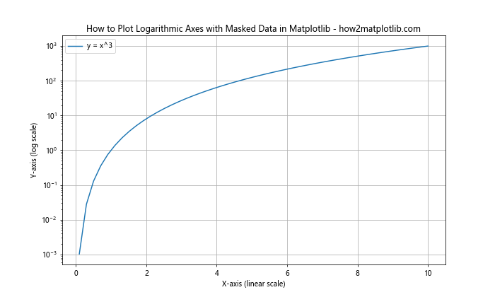
In this example, we create a mask for positive y values and only plot those points.
Using SymLogNorm for Handling Negative Values
Another approach is to use SymLogNorm, which allows for a symmetrical logarithmic scale that can handle both positive and negative values:
import matplotlib.pyplot as plt
import numpy as np
from matplotlib.colors import SymLogNorm

# Generate data
x = np.linspace(-10, 10, 100)
y = x**3

# Create the plot
plt.figure(figsize=(10, 6))
plt.scatter(x, y, c=y, norm=SymLogNorm(linthresh=1), cmap='viridis')
plt.colorbar(label='Y values')
plt.xlabel('X-axis (linear scale)')
plt.ylabel('Y-axis (symlog scale)')
plt.title('How to Plot Logarithmic Axes with SymLogNorm in Matplotlib - how2matplotlib.com')
plt.grid(True)
plt.show()
Output:
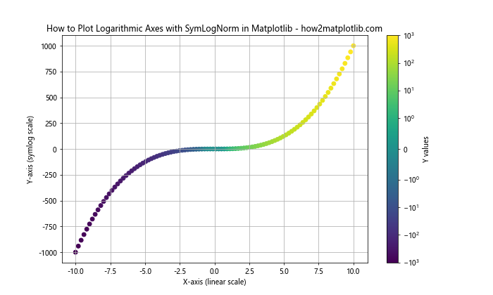
In this example, we use SymLogNorm with a scatter plot to handle both positive and negative values on a logarithmic scale.
Creating Logarithmic Histograms
When exploring how to plot logarithmic axes in Matplotlib, you might want to create histograms with logarithmic scales. This can be particularly useful for visualizing data with a wide range of frequencies. Here’s an example:
import matplotlib.pyplot as plt
import numpy as np

# Generate data
data = np.random.lognormal(0, 1, 1000)

# Create the histogram
plt.figure(figsize=(10, 6))
plt.hist(data, bins=50, log=True)
plt.xlabel('Values')
plt.ylabel('Frequency (log scale)')
plt.title('How to Plot Logarithmic Histogram in Matplotlib - how2matplotlib.com')
plt.grid(True)
plt.show()
Output:
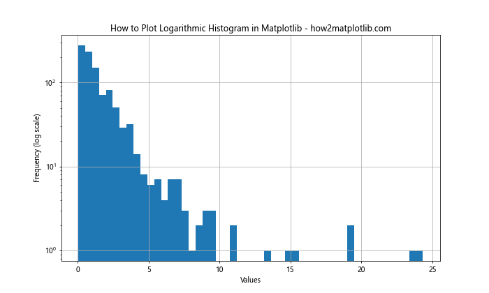
In this example, we use the log=True parameter in plt.hist() to create a histogram with a logarithmic y-axis.
Creating Logarithmic Bar Plots
Bar plots can also benefit from logarithmic scales when dealing with data that spans several orders of magnitude. Here’s an example of how to plot logarithmic axes in Matplotlib for a bar plot:
import matplotlib.pyplot as plt
import numpy as np

# Generate data
categories = ['A', 'B', 'C', 'D', 'E']
values = [10, 100, 1000, 10000, 100000]

# Create the bar plot
plt.figure(figsize=(10, 6))
plt.bar(categories, values)
plt.yscale('log')
plt.xlabel('Categories')
plt.ylabel('Values (log scale)')
plt.title('How to Plot Logarithmic Bar Plot in Matplotlib - how2matplotlib.com')
plt.grid(True, axis='y')
plt.show()
Output:
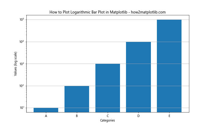
In this example, we use plt.yscale('log') to set the y-axis to a logarithmic scale after creating the bar plot.
Creating Logarithmic Scatter Plots
Scatter plots are another type of visualization that can benefit from logarithmic axes. Here’s an example of how to plot logarithmic axes in Matplotlib for a scatter plot:
import matplotlib.pyplot as plt
import numpy as np

# Generate data
x = np.logspace(0, 5, 100)
y = x**1.5 + np.random.normal(0, x, 100)

# Create the scatter plot
plt.figure(figsize=(10, 6))
plt.scatter(x, y, alpha=0.5)
plt.xscale('log')
plt.yscale('log')
plt.xlabel('X-axis (log scale)')
plt.ylabel('Y-axis (log scale)')
plt.title('How to Plot Logarithmic Scatter Plot in Matplotlib - how2matplotlib.com')
plt.grid(True)plt.show()
Output:
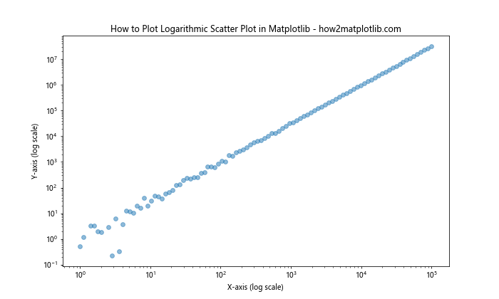
In this example, we use plt.xscale('log') and plt.yscale('log') to set both axes to logarithmic scales after creating the scatter plot.
Combining Linear and Logarithmic Axes
Sometimes, when learning how to plot logarithmic axes in Matplotlib, you might want to combine linear and logarithmic scales on the same plot. This can be achieved using twin axes. Here’s an example:
import matplotlib.pyplot as plt
import numpy as np

# Generate data
x = np.linspace(0, 10, 100)
y1 = np.exp(x)
y2 = x**2

# Create the plot
fig, ax1 = plt.subplots(figsize=(10, 6))

# Plot on logarithmic y-axis
color = 'tab:red'
ax1.semilogy(x, y1, color=color, label='exp(x)')
ax1.set_xlabel('X-axis')
ax1.set_ylabel('Y-axis (log scale)', color=color)
ax1.tick_params(axis='y', labelcolor=color)

# Create twin axis
ax2 = ax1.twinx()

# Plot on linear y-axis
color = 'tab:blue'
ax2.plot(x, y2, color=color, label='x^2')
ax2.set_ylabel('Y-axis (linear scale)', color=color)
ax2.tick_params(axis='y', labelcolor=color)

plt.title('How to Plot Combined Linear and Logarithmic Axes in Matplotlib - how2matplotlib.com')
fig.legend(loc='upper left', bbox_to_anchor=(0.1, 0.9))
plt.grid(True)
plt.show()
Output:
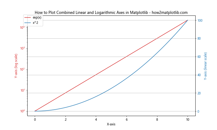
In this example, we create two y-axes: one with a logarithmic scale (left) and one with a linear scale (right). This allows us to compare data with vastly different scales on the same plot.
Creating Logarithmic Contour Plots
Contour plots can also benefit from logarithmic scales when dealing with data that spans several orders of magnitude. Here’s an example of how to plot logarithmic axes in Matplotlib for a contour plot:
import matplotlib.pyplot as plt
import numpy as np

# Generate data
x = np.logspace(0, 2, 100)
y = np.logspace(0, 2, 100)
X, Y = np.meshgrid(x, y)
Z = np.sqrt(X * Y)

# Create the contour plot
plt.figure(figsize=(10, 8))
contour = plt.contourf(X, Y, Z, levels=20, cmap='viridis')
plt.colorbar(contour, label='Z values')
plt.xscale('log')
plt.yscale('log')
plt.xlabel('X-axis (log scale)')
plt.ylabel('Y-axis (log scale)')
plt.title('How to Plot Logarithmic Contour Plot in Matplotlib - how2matplotlib.com')
plt.show()
Output:
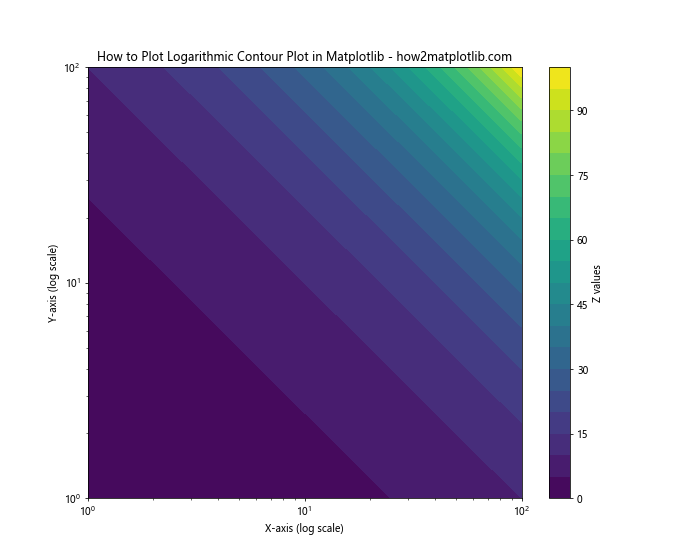
In this example, we use plt.xscale('log') and plt.yscale('log') to set both axes to logarithmic scales after creating the contour plot.
Handling Logarithmic Axes in 3D Plots
When learning how to plot logarithmic axes in Matplotlib, you might also want to create 3D plots with logarithmic scales. Here’s an example:
import matplotlib.pyplot as plt
import numpy as np
from mpl_toolkits.mplot3d import Axes3D

# Generate data
x = np.logspace(0, 2, 30)
y = np.logspace(0, 2, 30)
X, Y = np.meshgrid(x, y)
Z = np.sqrt(X * Y)

# Create the 3D plot
fig = plt.figure(figsize=(12, 9))
ax = fig.add_subplot(111, projection='3d')
surf = ax.plot_surface(X, Y, Z, cmap='viridis')

ax.set_xscale('log')
ax.set_yscale('log')
ax.set_zscale('log')

ax.set_xlabel('X-axis (log scale)')
ax.set_ylabel('Y-axis (log scale)')
ax.set_zlabel('Z-axis (log scale)')
ax.set_title('How to Plot Logarithmic 3D Surface in Matplotlib - how2matplotlib.com')

plt.colorbar(surf, label='Z values')
plt.show()
Output:
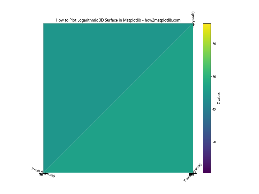
In this example, we use ax.set_xscale('log'), ax.set_yscale('log'), and ax.set_zscale('log') to set all three axes to logarithmic scales in a 3D plot.
Best Practices for Logarithmic Plots
When working on how to plot logarithmic axes in Matplotlib, it’s important to follow some best practices:
- Always clearly label your axes, indicating that they are on a logarithmic scale.
- Choose an appropriate base for your logarithmic scale (10 is common, but 2 can be useful for computer science applications).
- Be mindful of the range of your data – logarithmic scales work best when your data spans several orders of magnitude.
- Consider using a symmetrical logarithmic scale (
SymLogNorm) when dealing with data that includes both positive and negative values. - Use appropriate tick locations and labels to make your plot easy to read and interpret.
- When comparing multiple datasets on a logarithmic plot, make sure to use clear and distinguishable colors or markers.
Conclusion
Learning how to plot logarithmic axes in Matplotlib is a valuable skill for data visualization. It allows you to effectively represent data that spans several orders of magnitude, highlight relative changes, and visualize exponential relationships. By mastering the techniques and best practices outlined in this guide, you’ll be well-equipped to create informative and visually appealing logarithmic plots using Matplotlib.
Remember that the key to effective data visualization is not just knowing how to plot logarithmic axes in Matplotlib, but also understanding when and why to use them. Always consider your data and your audience when choosing between linear and logarithmic scales.