How to Plot List of X Y Coordinates in Matplotlib
How to Plot List of X Y Coordinates in Matplotlib is an essential skill for data visualization in Python. Matplotlib is a powerful library that allows you to create a wide variety of plots, including scatter plots, line plots, and more complex visualizations using lists of X and Y coordinates. In this comprehensive guide, we’ll explore various techniques and best practices for plotting X Y coordinates in Matplotlib, providing you with the knowledge and tools to create stunning visualizations.
Understanding X Y Coordinates in Matplotlib
Before diving into the specifics of how to plot list of X Y coordinates in Matplotlib, it’s crucial to understand what X Y coordinates represent and how they are used in plotting. X Y coordinates are pairs of values that define points in a two-dimensional space. In Matplotlib, these coordinates are used to position data points on a plot.
Let’s start with a simple example to illustrate how to plot list of X Y coordinates in Matplotlib:
import matplotlib.pyplot as plt

x = [1, 2, 3, 4, 5]
y = [2, 4, 6, 8, 10]

plt.plot(x, y)
plt.title("How to Plot List of X Y Coordinates in Matplotlib - how2matplotlib.com")
plt.xlabel("X-axis")
plt.ylabel("Y-axis")
plt.show()
Output:
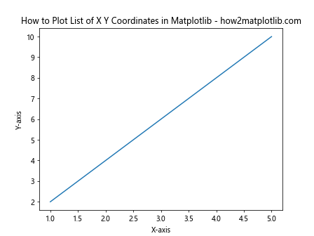
In this example, we have two lists: x and y, representing the X and Y coordinates respectively. The plt.plot() function is used to create a line plot of these coordinates. We’ve also added a title and labels to the axes to make the plot more informative.
Creating Scatter Plots with X Y Coordinates
Scatter plots are an excellent way to visualize the relationship between two variables. When learning how to plot list of X Y coordinates in Matplotlib, scatter plots are often one of the first types of plots you’ll encounter. Here’s an example of how to create a scatter plot:
import matplotlib.pyplot as plt
import numpy as np

x = np.random.rand(50)
y = np.random.rand(50)

plt.scatter(x, y)
plt.title("Scatter Plot of X Y Coordinates - how2matplotlib.com")
plt.xlabel("X-axis")
plt.ylabel("Y-axis")
plt.show()
Output:
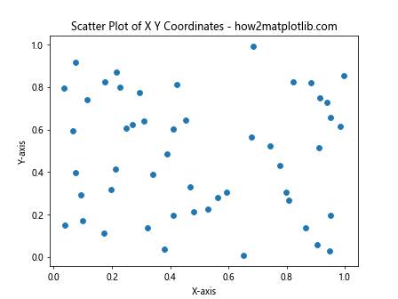
In this example, we use NumPy to generate random X and Y coordinates. The plt.scatter() function is used to create the scatter plot. This is a simple yet effective way to visualize the distribution of points in a two-dimensional space.
Customizing Scatter Plots
When learning how to plot list of X Y coordinates in Matplotlib, it’s important to know how to customize your plots. Matplotlib offers a wide range of customization options. Let’s explore some of these:
import matplotlib.pyplot as plt
import numpy as np

x = np.random.rand(50)
y = np.random.rand(50)
colors = np.random.rand(50)
sizes = 1000 * np.random.rand(50)

plt.scatter(x, y, c=colors, s=sizes, alpha=0.5)
plt.colorbar()
plt.title("Customized Scatter Plot - how2matplotlib.com")
plt.xlabel("X-axis")
plt.ylabel("Y-axis")
plt.show()
Output:
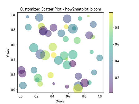
In this example, we’ve added color and size variations to our scatter plot. The c parameter sets the color of each point based on the colors array, while s sets the size of each point based on the sizes array. The alpha parameter controls the transparency of the points.
Creating Line Plots with X Y Coordinates
Line plots are another common way to visualize X Y coordinates, especially when dealing with time series data or when you want to show trends. Here’s how to create a line plot:
import matplotlib.pyplot as plt
import numpy as np

x = np.linspace(0, 10, 100)
y = np.sin(x)

plt.plot(x, y)
plt.title("Line Plot of Sin Function - how2matplotlib.com")
plt.xlabel("X-axis")
plt.ylabel("Y-axis")
plt.grid(True)
plt.show()
Output:
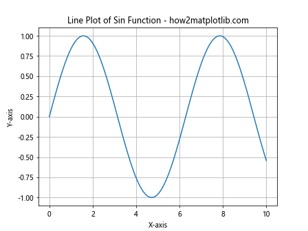
In this example, we use NumPy’s linspace function to create evenly spaced X coordinates, and then calculate the sine of these values for our Y coordinates. The plt.plot() function creates a line plot, and we’ve added a grid for better readability.
Multiple Lines on the Same Plot
Often, when learning how to plot list of X Y coordinates in Matplotlib, you’ll need to plot multiple sets of data on the same axes. Here’s how you can do that:
import matplotlib.pyplot as plt
import numpy as np

x = np.linspace(0, 10, 100)
y1 = np.sin(x)
y2 = np.cos(x)

plt.plot(x, y1, label='sin(x)')
plt.plot(x, y2, label='cos(x)')
plt.title("Multiple Lines Plot - how2matplotlib.com")
plt.xlabel("X-axis")
plt.ylabel("Y-axis")
plt.legend()
plt.grid(True)
plt.show()
Output:
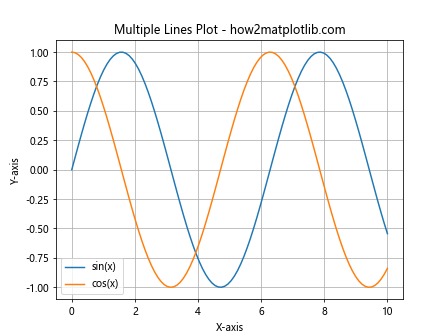
In this example, we plot both sine and cosine functions on the same axes. The label parameter is used to create a legend, which is then displayed using plt.legend().
Customizing Line Plots
Matplotlib offers numerous options for customizing line plots. Let’s explore some of these options:
import matplotlib.pyplot as plt
import numpy as np

x = np.linspace(0, 10, 100)
y = np.sin(x)

plt.plot(x, y, color='red', linestyle='--', linewidth=2, marker='o', markersize=5)
plt.title("Customized Line Plot - how2matplotlib.com")
plt.xlabel("X-axis")
plt.ylabel("Y-axis")
plt.grid(True)
plt.show()
Output:
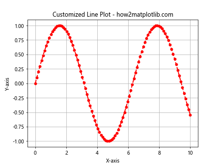
In this example, we’ve customized the line color, style, width, and added markers. These options allow you to create visually appealing and informative plots.
Creating Bar Plots with X Y Coordinates
Bar plots are useful for comparing quantities across different categories. Here’s how to create a bar plot using X Y coordinates:
import matplotlib.pyplot as plt

categories = ['A', 'B', 'C', 'D', 'E']
values = [3, 7, 2, 5, 8]

plt.bar(categories, values)
plt.title("Bar Plot of Categories and Values - how2matplotlib.com")
plt.xlabel("Categories")
plt.ylabel("Values")
plt.show()
Output:
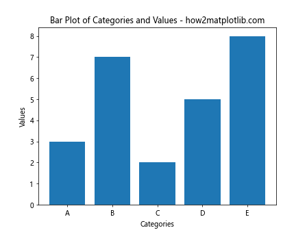
In this example, we use the plt.bar() function to create a bar plot. The categories are used as X coordinates, and the values as Y coordinates.
Horizontal Bar Plots
Sometimes, you might want to create horizontal bar plots. Here’s how to do that:
import matplotlib.pyplot as plt

categories = ['Category A', 'Category B', 'Category C', 'Category D', 'Category E']
values = [3, 7, 2, 5, 8]

plt.barh(categories, values)
plt.title("Horizontal Bar Plot - how2matplotlib.com")
plt.xlabel("Values")
plt.ylabel("Categories")
plt.show()
Output:

The plt.barh() function is used to create horizontal bar plots. This can be particularly useful when you have long category names.
Creating Stacked Bar Plots
Stacked bar plots are useful for showing the composition of each category. Here’s how to create a stacked bar plot:
import matplotlib.pyplot as plt
import numpy as np

categories = ['A', 'B', 'C', 'D']
men_means = [20, 35, 30, 35]
women_means = [25, 32, 34, 20]

x = np.arange(len(categories))
width = 0.35

plt.bar(x, men_means, width, label='Men')
plt.bar(x, women_means, width, bottom=men_means, label='Women')

plt.title("Stacked Bar Plot - how2matplotlib.com")
plt.xlabel("Categories")
plt.ylabel("Scores")
plt.xticks(x, categories)
plt.legend()
plt.show()
Output:
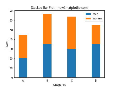
In this example, we create two sets of bars and stack them on top of each other using the bottom parameter in the second plt.bar() call.
Creating Pie Charts with X Y Coordinates
While pie charts don’t directly use X Y coordinates, they can be created from lists of values. Here’s how to create a pie chart:
import matplotlib.pyplot as plt

sizes = [30, 20, 25, 15, 10]
labels = ['A', 'B', 'C', 'D', 'E']
colors = ['gold', 'yellowgreen', 'lightcoral', 'lightskyblue', 'lightgreen']
explode = (0.1, 0, 0, 0, 0)  # explode 1st slice

plt.pie(sizes, explode=explode, labels=labels, colors=colors, autopct='%1.1f%%', startangle=90)
plt.axis('equal')  # Equal aspect ratio ensures that pie is drawn as a circle
plt.title("Pie Chart - how2matplotlib.com")
plt.show()
Output:
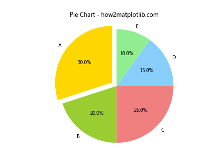
In this example, we use the plt.pie() function to create a pie chart. The sizes list represents the values for each slice of the pie.
Creating 3D Plots with X Y Z Coordinates
While we’ve focused on 2D plots so far, Matplotlib also supports 3D plotting. Here’s an example of how to create a 3D scatter plot:
import matplotlib.pyplot as plt
from mpl_toolkits.mplot3d import Axes3D
import numpy as np

fig = plt.figure()
ax = fig.add_subplot(111, projection='3d')

n = 100
x = np.random.rand(n)
y = np.random.rand(n)
z = np.random.rand(n)

ax.scatter(x, y, z)
ax.set_xlabel('X Label')
ax.set_ylabel('Y Label')
ax.set_zlabel('Z Label')
plt.title("3D Scatter Plot - how2matplotlib.com")
plt.show()
Output:
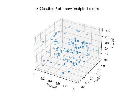
In this example, we create a 3D scatter plot using the Axes3D class from mpl_toolkits.mplot3d. This allows us to visualize data in three dimensions.
Creating Heatmaps with X Y Coordinates
Heatmaps are a great way to visualize 2D data where color represents a third variable. Here’s how to create a heatmap:
import matplotlib.pyplot as plt
import numpy as np

data = np.random.rand(10, 10)
plt.imshow(data, cmap='hot', interpolation='nearest')
plt.colorbar()
plt.title("Heatmap - how2matplotlib.com")
plt.show()
Output:
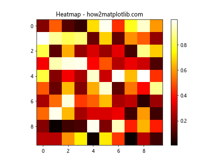
In this example, we use plt.imshow() to create a heatmap from a 2D array of data. The cmap parameter sets the color scheme, and interpolation='nearest' ensures that each cell in the data is represented by a distinct color block.
Creating Contour Plots with X Y Coordinates
Contour plots are useful for visualizing 3D surfaces on a 2D plane. Here’s how to create a contour plot:
import matplotlib.pyplot as plt
import numpy as np

x = np.linspace(-5, 5, 100)
y = np.linspace(-5, 5, 100)
X, Y = np.meshgrid(x, y)
Z = np.sin(np.sqrt(X**2 + Y**2))

plt.contourf(X, Y, Z, cmap='viridis')
plt.colorbar()
plt.title("Contour Plot - how2matplotlib.com")
plt.xlabel("X-axis")
plt.ylabel("Y-axis")
plt.show()
Output:
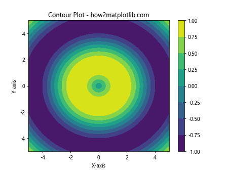
In this example, we use np.meshgrid() to create 2D arrays of X and Y coordinates, and then calculate Z values based on these coordinates. The plt.contourf() function is used to create a filled contour plot.
Customizing Plot Appearance
When learning how to plot list of X Y coordinates in Matplotlib, it’s important to know how to customize the overall appearance of your plots. Here are some techniques:
import matplotlib.pyplot as plt
import numpy as np

x = np.linspace(0, 10, 100)
y = np.sin(x)

plt.figure(figsize=(10, 6))
plt.plot(x, y, 'b-', linewidth=2)
plt.title("Customized Plot Appearance - how2matplotlib.com", fontsize=16)
plt.xlabel("X-axis", fontsize=12)
plt.ylabel("Y-axis", fontsize=12)
plt.grid(True, linestyle='--', alpha=0.7)
plt.tick_params(axis='both', which='major', labelsize=10)
plt.show()
Output:
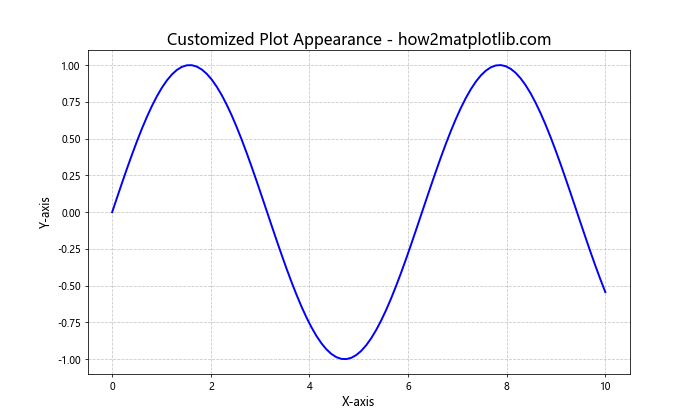
In this example, we’ve customized various aspects of the plot:
figsizesets the overall size of the figurefontsizeparameters control the size of text elementsgridadds a grid with custom style and transparencytick_paramsadjusts the appearance of tick marks and labels
Adding Annotations to Plots
Annotations can greatly enhance the informativeness of your plots. Here’s how to add annotations:
import matplotlib.pyplot as plt
import numpy as np

x = np.linspace(0, 10, 100)
y = np.sin(x)

plt.plot(x, y)
plt.title("Plot with Annotations - how2matplotlib.com")
plt.xlabel("X-axis")
plt.ylabel("Y-axis")

plt.annotate('Maximum', xy=(np.pi/2, 1), xytext=(np.pi/2, 1.2),
             arrowprops=dict(facecolor='black', shrink=0.05))

plt.annotate('Minimum', xy=(3*np.pi/2, -1), xytext=(3*np.pi/2, -1.2),
             arrowprops=dict(facecolor='black', shrink=0.05))

plt.show()
Output:
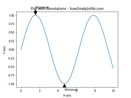
In this example, we use plt.annotate() to add text annotations with arrows pointing to specific points on the plot.
Saving Plots
Once you’ve created your plot, you’ll often want to save it as an image file. Here’s how to do that:
import matplotlib.pyplot as plt
import numpy as np

x = np.linspace(0, 10, 100)
y = np.sin(x)

plt.plot(x, y)
plt.title("Saving Plots Example - how2matplotlib.com")
plt.xlabel("X-axis")
plt.ylabel("Y-axis")

plt.savefig('my_plot.png', dpi=300, bbox_inches='tight')
plt.show()
Output:
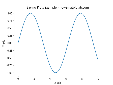
The plt.savefig() function is used to save the plot. The dpi parameter sets the resolution, and bbox_inches='tight' ensures that the entire plot fits within the saved image.
Creating Subplots
Subplots allow you to create multiple plots within a single figure. Here’s how to create subplots:
import matplotlib.pyplot as plt
import numpy as np

x = np.linspace(0, 10, 100)
y1 = np.sin(x)
y2 = np.cos(x)

fig, (ax1, ax2) = plt.subplots(2, 1, figsize=(8, 8))

ax1.plot(x, y1)
ax1.set_title("Subplot 1: Sin Function - how2matplotlib.com")
ax1.set_xlabel("X-axis")
ax1.set_ylabel("Y-axis")

ax2.plot(x, y2)
ax2.set_title("Subplot 2: Cos Function - how2matplotlib.com")
ax2.set_xlabel("X-axis")
ax2.set_ylabel("Y-axis")

plt.tight_layout()
plt.show()
Output:
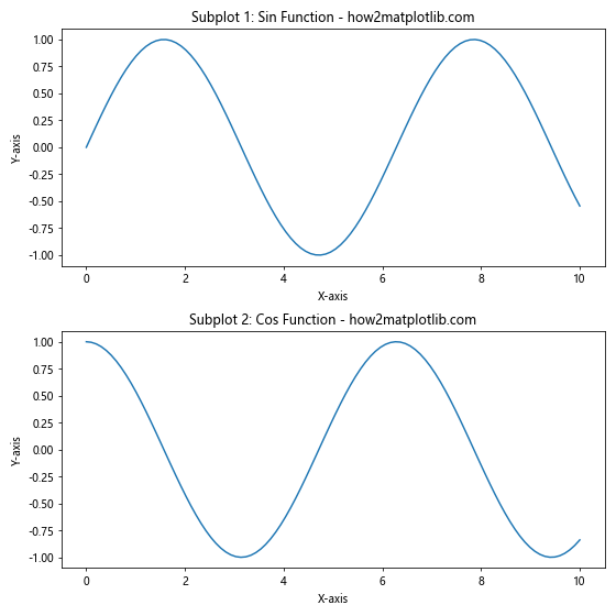
In this example, we create two subplots vertically stacked. The plt.subplots() function returns a figure object and an array of axes objects, which we can then use to plot on each subplot individually.
Customizing Tick Marks and Labels
Customizing tick marks and labels can greatly improve the readability of your plots. Here’s how to do it:
import matplotlib.pyplot as plt
import numpy as np

x = np.linspace(0, 2*np.pi, 100)
y = np.sin(x)

fig, ax = plt.subplots()

ax.plot(x, y)
ax.set_title("Customized Tick Marks and Labels - how2matplotlib.com")
ax.set_xlabel("X-axis")
ax.set_ylabel("Y-axis")

ax.set_xticks([0, np.pi/2, np.pi, 3*np.pi/2, 2*np.pi])
ax.set_xticklabels(['0', 'π/2', 'π', '3π/2', '2π'])
ax.set_yticks([-1, -0.5, 0, 0.5, 1])

plt.show()
Output:
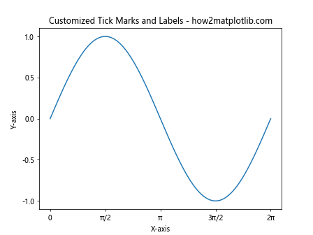
In this example, we use set_xticks() and set_xticklabels() to customize the x-axis tick marks and labels, and set_yticks() to customize the y-axis tick marks.
Adding a Legend to Your Plot
Legends are crucial when you have multiple data series in your plot. Here’s how to add a legend:
import matplotlib.pyplot as plt
import numpy as np

x = np.linspace(0, 2*np.pi, 100)
y1 = np.sin(x)
y2 = np.cos(x)

plt.plot(x, y1, label='sin(x)')
plt.plot(x, y2, label='cos(x)')

plt.title("Plot with Legend - how2matplotlib.com")
plt.xlabel("X-axis")
plt.ylabel("Y-axis")

plt.legend(loc='upper right')
plt.show()
Output:
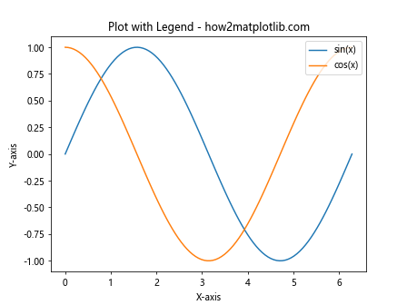
In this example, we use the label parameter when plotting each line, and then call plt.legend() to display the legend. The loc parameter specifies where the legend should be placed on the plot.
Using Different Scales for X and Y Axes
Sometimes, you might need to use different scales for your X and Y axes. Matplotlib allows for logarithmic scales:
import matplotlib.pyplot as plt
import numpy as np

x = np.logspace(0, 5, 100)
y = x**2

plt.loglog(x, y)
plt.title("Log-Log Plot - how2matplotlib.com")
plt.xlabel("X-axis (log scale)")
plt.ylabel("Y-axis (log scale)")
plt.grid(True)
plt.show()
Output:
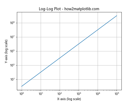
In this example, we use plt.loglog() to create a plot with logarithmic scales on both axes. This is particularly useful when dealing with data that spans several orders of magnitude.
Creating Filled Area Plots
Filled area plots can be useful for showing cumulative distributions or ranges. Here’s how to create one:
import matplotlib.pyplot as plt
import numpy as np

x = np.linspace(0, 10, 100)
y1 = np.sin(x)
y2 = np.cos(x)

plt.fill_between(x, y1, y2, alpha=0.5)
plt.plot(x, y1, 'b', label='sin(x)')
plt.plot(x, y2, 'r', label='cos(x)')

plt.title("Filled Area Plot - how2matplotlib.com")
plt.xlabel("X-axis")
plt.ylabel("Y-axis")
plt.legend()
plt.show()
Output:
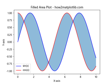
In this example, we use plt.fill_between() to create a filled area between two curves. The alpha parameter controls the transparency of the filled area.
Creating Polar Plots
Polar plots are useful for data that is naturally circular, such as directional or periodic data. Here’s how to create a polar plot:
import matplotlib.pyplot as plt
import numpy as np

r = np.arange(0, 2, 0.01)
theta = 2 * np.pi * r

fig, ax = plt.subplots(subplot_kw=dict(projection='polar'))
ax.plot(theta, r)
ax.set_rticks([0.5, 1, 1.5, 2])
ax.set_rlabel_position(-22.5)
ax.grid(True)

plt.title("Polar Plot - how2matplotlib.com")
plt.show()
Output:
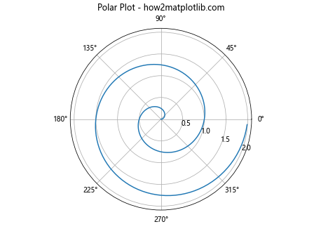
In this example, we create a polar plot using the projection='polar' parameter. The r values represent the radial coordinate, while theta represents the angular coordinate.
Conclusion
Learning how to plot list of X Y coordinates in Matplotlib is a fundamental skill for data visualization in Python. This comprehensive guide has covered a wide range of plot types and customization options, from simple scatter plots to more complex 3D visualizations and polar plots. By mastering these techniques, you’ll be well-equipped to create informative and visually appealing plots for your data analysis projects.