How to Plot Histogram from List of Data in Matplotlib
How to Plot Histogram from List of Data in Matplotlib is an essential skill for data visualization in Python. Histograms are powerful tools for displaying the distribution of numerical data, and Matplotlib provides a robust set of functions to create them. In this comprehensive guide, we’ll explore various techniques and customizations for plotting histograms from lists of data using Matplotlib.
Understanding Histograms and Their Importance
Before diving into the specifics of how to plot histogram from list of data in Matplotlib, it’s crucial to understand what histograms are and why they’re important. A histogram is a graphical representation of the distribution of numerical data. It consists of bars where the height of each bar represents the frequency or count of data points falling within a specific range or bin.
Histograms are particularly useful for:
- Visualizing the shape of data distribution
- Identifying outliers and patterns
- Comparing distributions across different datasets
- Estimating probability density functions
When learning how to plot histogram from list of data in Matplotlib, keep in mind that histograms provide insights into the central tendency, spread, and skewness of your data.
Basic Histogram Plotting in Matplotlib
Let’s start with the basics of how to plot histogram from list of data in Matplotlib. The primary function we’ll use is plt.hist(). Here’s a simple example:
import matplotlib.pyplot as plt
import numpy as np

# Generate sample data
data = np.random.normal(0, 1, 1000)

# Create the histogram
plt.hist(data, bins=30, edgecolor='black')

# Add labels and title
plt.xlabel('Value')
plt.ylabel('Frequency')
plt.title('How to Plot Histogram from List of Data in Matplotlib - how2matplotlib.com')

# Display the plot
plt.show()
Output:
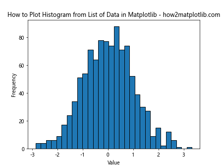
In this example, we generate a list of 1000 random numbers from a normal distribution. The plt.hist() function takes this data and creates a histogram with 30 bins. The edgecolor parameter adds a black outline to each bar for better visibility.
Customizing Histogram Appearance
When learning how to plot histogram from list of data in Matplotlib, it’s important to know how to customize the appearance of your histograms. Let’s explore some options:
Changing Bin Width and Count
The number and width of bins can significantly affect the appearance and interpretation of your histogram. Here’s how to adjust them:
import matplotlib.pyplot as plt
import numpy as np

data = np.random.exponential(scale=2, size=1000)

plt.hist(data, bins=50, range=(0, 10), edgecolor='black')
plt.xlabel('Value')
plt.ylabel('Frequency')
plt.title('How to Plot Histogram with Custom Bins - how2matplotlib.com')
plt.show()
Output:
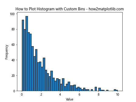
In this example, we set the number of bins to 50 and limit the range of the x-axis from 0 to 10. This can be useful when you want to focus on a specific range of your data.
Changing Histogram Colors
Customizing colors is an important aspect of how to plot histogram from list of data in Matplotlib. Here’s how to change the color of your histogram:
import matplotlib.pyplot as plt
import numpy as np

data = np.random.normal(0, 1, 1000)

plt.hist(data, bins=30, color='skyblue', edgecolor='black')
plt.xlabel('Value')
plt.ylabel('Frequency')
plt.title('How to Plot Histogram with Custom Colors - how2matplotlib.com')
plt.show()
Output:
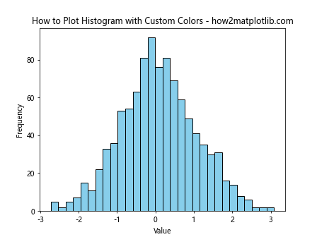
This example uses a light blue color for the bars while maintaining the black edge color for contrast.
Adding Transparency
When learning how to plot histogram from list of data in Matplotlib, you might want to add transparency to your histogram bars, especially when overlaying multiple histograms:
import matplotlib.pyplot as plt
import numpy as np

data1 = np.random.normal(0, 1, 1000)
data2 = np.random.normal(1, 1, 1000)

plt.hist(data1, bins=30, alpha=0.5, label='Dataset 1')
plt.hist(data2, bins=30, alpha=0.5, label='Dataset 2')
plt.xlabel('Value')
plt.ylabel('Frequency')
plt.title('How to Plot Overlapping Histograms - how2matplotlib.com')
plt.legend()
plt.show()
Output:
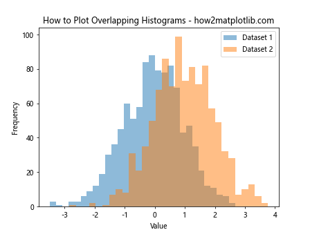
The alpha parameter sets the transparency level of the bars, allowing you to see overlapping distributions clearly.
Normalizing Histogram Data
When comparing datasets of different sizes, it’s often useful to normalize the histogram. Here’s how to plot histogram from list of data in Matplotlib with normalization:
import matplotlib.pyplot as plt
import numpy as np

data1 = np.random.normal(0, 1, 1000)
data2 = np.random.normal(0, 1, 500)

plt.hist(data1, bins=30, density=True, alpha=0.5, label='Dataset 1')
plt.hist(data2, bins=30, density=True, alpha=0.5, label='Dataset 2')
plt.xlabel('Value')
plt.ylabel('Probability Density')
plt.title('How to Plot Normalized Histograms - how2matplotlib.com')
plt.legend()
plt.show()
Output:
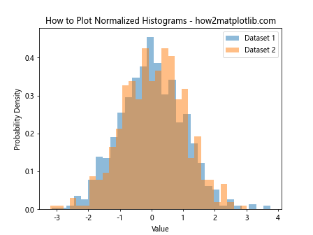
The density=True parameter normalizes the histogram so that the area under the histogram sums to 1, effectively converting it to a probability density function.
Adding Statistical Information
When learning how to plot histogram from list of data in Matplotlib, it’s often helpful to include statistical information directly on the plot. Here’s an example:
import matplotlib.pyplot as plt
import numpy as np

data = np.random.normal(0, 1, 1000)

plt.hist(data, bins=30, edgecolor='black')
plt.xlabel('Value')
plt.ylabel('Frequency')
plt.title('How to Plot Histogram with Statistics - how2matplotlib.com')

# Add mean and standard deviation lines
plt.axvline(np.mean(data), color='red', linestyle='dashed', linewidth=2, label='Mean')
plt.axvline(np.mean(data) + np.std(data), color='green', linestyle='dashed', linewidth=2, label='Mean + 1 Std Dev')
plt.axvline(np.mean(data) - np.std(data), color='green', linestyle='dashed', linewidth=2, label='Mean - 1 Std Dev')

plt.legend()
plt.show()
Output:
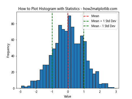
This example adds vertical lines for the mean and one standard deviation above and below the mean, providing a quick visual summary of the data’s central tendency and spread.
Creating Stacked Histograms
Stacked histograms are useful for comparing multiple categories within a dataset. Here’s how to plot histogram from list of data in Matplotlib as a stacked histogram:
import matplotlib.pyplot as plt
import numpy as np

data1 = np.random.normal(0, 1, 1000)
data2 = np.random.normal(1, 1, 1000)
data3 = np.random.normal(2, 1, 1000)

plt.hist([data1, data2, data3], bins=30, stacked=True, label=['Dataset 1', 'Dataset 2', 'Dataset 3'])
plt.xlabel('Value')
plt.ylabel('Frequency')
plt.title('How to Plot Stacked Histogram - how2matplotlib.com')
plt.legend()
plt.show()
Output:
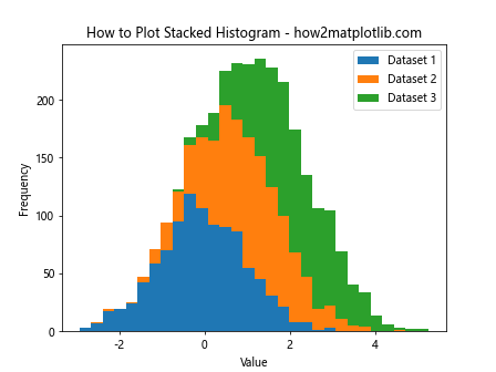
The stacked=True parameter creates a stacked histogram, where each dataset is represented by a different color in the stack.
Creating 2D Histograms
When dealing with two-dimensional data, you can create a 2D histogram. Here’s how to plot histogram from list of data in Matplotlib for 2D data:
import matplotlib.pyplot as plt
import numpy as np

x = np.random.normal(0, 1, 1000)
y = np.random.normal(0, 1, 1000)

plt.hist2d(x, y, bins=30, cmap='viridis')
plt.colorbar(label='Frequency')
plt.xlabel('X Value')
plt.ylabel('Y Value')
plt.title('How to Plot 2D Histogram - how2matplotlib.com')
plt.show()
Output:
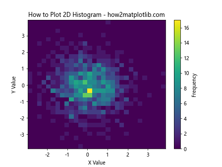
The plt.hist2d() function creates a 2D histogram, where the color intensity represents the frequency of data points in each bin.
Customizing Histogram Edges
When learning how to plot histogram from list of data in Matplotlib, you might want to customize the edges of your histogram bars. Here’s an example:
import matplotlib.pyplot as plt
import numpy as np

data = np.random.normal(0, 1, 1000)

plt.hist(data, bins=30, edgecolor='black', linewidth=1.2, facecolor='lightblue')
plt.xlabel('Value')
plt.ylabel('Frequency')
plt.title('How to Plot Histogram with Custom Edges - how2matplotlib.com')
plt.show()
Output:
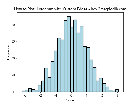
In this example, we set a thicker black edge for each bar and use a light blue color for the bar faces.
Creating Multiple Histograms in Subplots
When comparing multiple datasets, it can be useful to create separate histograms in subplots. Here’s how to plot histogram from list of data in Matplotlib using subplots:
import matplotlib.pyplot as plt
import numpy as np

data1 = np.random.normal(0, 1, 1000)
data2 = np.random.exponential(2, 1000)
data3 = np.random.gamma(2, 2, 1000)

fig, (ax1, ax2, ax3) = plt.subplots(1, 3, figsize=(15, 5))

ax1.hist(data1, bins=30, edgecolor='black')
ax1.set_title('Normal Distribution')
ax1.set_xlabel('Value')
ax1.set_ylabel('Frequency')

ax2.hist(data2, bins=30, edgecolor='black')
ax2.set_title('Exponential Distribution')
ax2.set_xlabel('Value')
ax2.set_ylabel('Frequency')

ax3.hist(data3, bins=30, edgecolor='black')
ax3.set_title('Gamma Distribution')
ax3.set_xlabel('Value')
ax3.set_ylabel('Frequency')

plt.suptitle('How to Plot Multiple Histograms - how2matplotlib.com', fontsize=16)
plt.tight_layout()
plt.show()
Output:
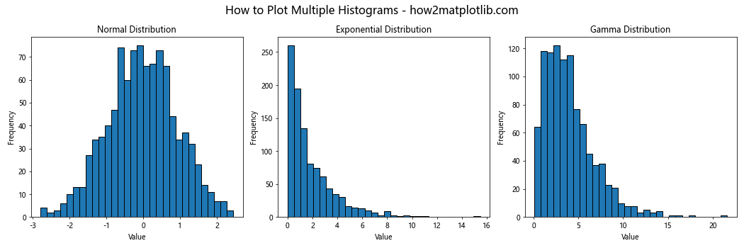
This example creates three subplots, each containing a histogram of a different distribution.
Adding a Kernel Density Estimate
A Kernel Density Estimate (KDE) can provide a smooth estimate of the probability density function. Here’s how to plot histogram from list of data in Matplotlib with a KDE overlay:
import matplotlib.pyplot as plt
import numpy as np
from scipy import stats

data = np.random.normal(0, 1, 1000)

plt.hist(data, bins=30, density=True, alpha=0.7, edgecolor='black')
kde = stats.gaussian_kde(data)
x_range = np.linspace(data.min(), data.max(), 100)
plt.plot(x_range, kde(x_range), 'r-', linewidth=2)
plt.xlabel('Value')
plt.ylabel('Density')
plt.title('How to Plot Histogram with KDE - how2matplotlib.com')
plt.show()
Output:
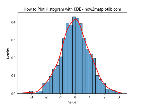
This example adds a red KDE line over the histogram, providing a smooth estimate of the underlying probability density function.
Creating Cumulative Histograms
Cumulative histograms can be useful for understanding the cumulative distribution of your data. Here’s how to plot histogram from list of data in Matplotlib as a cumulative histogram:
import matplotlib.pyplot as plt
import numpy as np

data = np.random.normal(0, 1, 1000)

plt.hist(data, bins=30, cumulative=True, edgecolor='black')
plt.xlabel('Value')
plt.ylabel('Cumulative Frequency')
plt.title('How to Plot Cumulative Histogram - how2matplotlib.com')
plt.show()
Output:
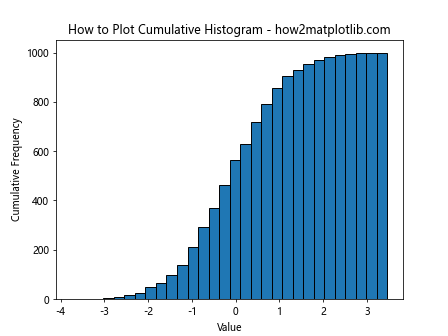
The cumulative=True parameter creates a cumulative histogram, where each bin represents the total count of all data points up to that bin.
Customizing Histogram Orientation
By default, histograms are vertical, but you can create horizontal histograms as well. Here’s how to plot histogram from list of data in Matplotlib horizontally:
import matplotlib.pyplot as plt
import numpy as np

data = np.random.normal(0, 1, 1000)

plt.hist(data, bins=30, orientation='horizontal', edgecolor='black')
plt.ylabel('Value')
plt.xlabel('Frequency')
plt.title('How to Plot Horizontal Histogram - how2matplotlib.com')
plt.show()
Output:

The orientation='horizontal' parameter flips the histogram to a horizontal orientation.
Adding Text Annotations to Histograms
When learning how to plot histogram from list of data in Matplotlib, you might want to add text annotations to highlight specific features. Here’s an example:
import matplotlib.pyplot as plt
import numpy as np

data = np.random.normal(0, 1, 1000)

plt.hist(data, bins=30, edgecolor='black')
plt.xlabel('Value')
plt.ylabel('Frequency')
plt.title('How to Plot Histogram with Annotations - how2matplotlib.com')

# Add annotations
plt.annotate('Peak', xy=(0, 70), xytext=(1, 80),
             arrowprops=dict(facecolor='black', shrink=0.05))
plt.text(-3, 50, 'Left Tail', fontsize=12, color='red')
plt.text(3, 50, 'Right Tail', fontsize=12, color='red')

plt.show()
Output:
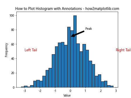
This example adds an arrow pointing to the peak of the distribution and labels for the left and right tails.
Creating Step Histograms
Step histograms can provide a different visual representation of your data. Here’s how to plot histogram from list of data in Matplotlib as a step histogram:
import matplotlib.pyplot as plt
import numpy as np

data = np.random.normal(0, 1, 1000)

plt.hist(data, bins=30, histtype='step', edgecolor='black', linewidth=2)
plt.xlabel('Value')
plt.ylabel('Frequency')
plt.title('How to Plot Step Histogram - how2matplotlib.com')
plt.show()
Output:
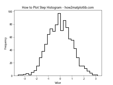
The histtype='step' parameter creates a step histogram, which outlines the shape of the distribution without filling in the bars.
Comparing Multiple Datasets with Histograms
When learning how to plot histogram from list of data in Matplotlib, you might need to compare multiple datasets. Here’s an example using a side-by-side approach:
import matplotlib.pyplot as plt
import numpy as np

data1 = np.random.normal(0, 1, 1000)
data2 = np.random.normal(0.5, 1.2, 1000)

plt.hist([data1, data2], bins=30, label=['Dataset 1', 'Dataset 2'], edgecolor='black')
plt.xlabel('Value')
plt.ylabel('Frequency')
plt.title('How to Plot Multiple Datasets in One Histogram - how2matplotlib.com')
plt.legend()
plt.show()
Output:
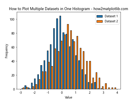
This example plots two datasets side by side in the same histogram, allowing for easy comparison of their distributions.
Creating Logarithmic Scale Histograms
For data with a wide range of values, a logarithmic scale can be useful. Here’s how to plot histogram from list of data in Matplotlib using a logarithmic scale:
import matplotlib.pyplot as plt
import numpy as np

data = np.random.lognormal(0, 1, 1000)

plt.hist(data, bins=30, edgecolor='black')
plt.xscale('log')
plt.xlabel('Value (log scale)')
plt.ylabel('Frequency')
plt.title('How to Plot Histogram with Logarithmic Scale - how2matplotlib.com')
plt.show()
Output:
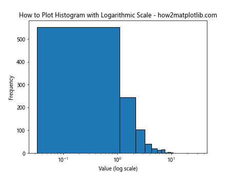
The plt.xscale('log') function sets the x-axis to a logarithmic scale, which can be useful for visualizing data that spans several orders of magnitude.
Adding Error Bars to Histograms
When learning how to plot histogram from list of data in Matplotlib, you might want to include error bars to represent uncertainty. Here’s an example:
import matplotlib.pyplot as plt
import numpy as np

data = np.random.normal(0, 1, 1000)
counts, bins, _ = plt.hist(data, bins=30, edgecolor='black')
bin_centers = 0.5 * (bins[1:] + bins[:-1])
error = np.sqrt(counts)

plt.errorbar(bin_centers, counts, yerr=error, fmt='none', ecolor='red')
plt.xlabel('Value')
plt.ylabel('Frequency')
plt.title('How to Plot Histogram with Error Bars - how2matplotlib.com')
plt.show()
Output:
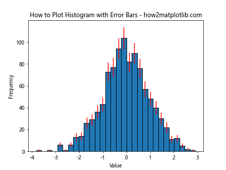
This example adds Poisson error bars to each bin, which can be useful for understanding the statistical uncertainty in your histogram.
Creating Filled Histograms
Filled histograms can provide a different visual style. Here’s how to plot histogram from list of data in Matplotlib with filled bars:
import matplotlib.pyplot as plt
import numpy as np

data = np.random.normal(0, 1, 1000)

plt.hist(data, bins=30, edgecolor='black', facecolor='lightblue', alpha=0.7)
plt.xlabel('Value')
plt.ylabel('Frequency')
plt.title('How to Plot Filled Histogram - how2matplotlib.com')
plt.show()
Output:
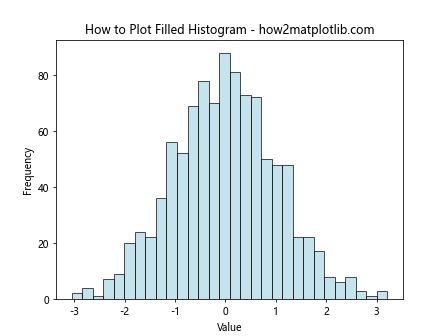
This example uses a light blue color to fill the histogram bars, with some transparency to allow for potential overlays.
Customizing Histogram Tick Labels
When learning how to plot histogram from list of data in Matplotlib, you might want to customize the tick labels. Here’s an example:
import matplotlib.pyplot as plt
import numpy as np

data = np.random.normal(0, 1, 1000)

plt.hist(data, bins=30, edgecolor='black')
plt.xlabel('Value')
plt.ylabel('Frequency')
plt.title('How to Plot Histogram with Custom Tick Labels - how2matplotlib.com')

# Customize x-axis ticks
plt.xticks([-3, -2, -1, 0, 1, 2, 3], ['Very Low', 'Low', 'Below Avg', 'Average', 'Above Avg', 'High', 'Very High'])

plt.show()
Output:
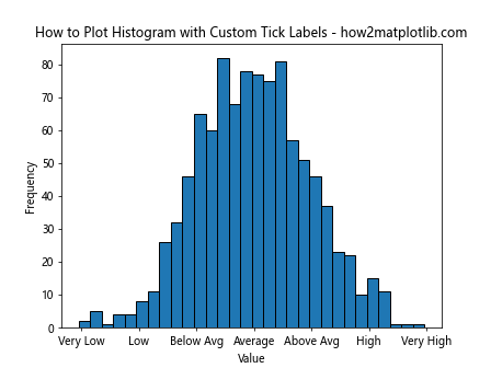
This example replaces the numerical x-axis labels with descriptive text labels.
Creating Histograms with Variable Bin Widths
Sometimes, using variable bin widths can provide a better representation of your data. Here’s how to plot histogram from list of data in Matplotlib with variable bin widths:
import matplotlib.pyplot as plt
import numpy as np

data = np.random.lognormal(0, 1, 1000)

bins = [0, 1, 2, 5, 10, 20, 50, 100]
plt.hist(data, bins=bins, edgecolor='black')
plt.xscale('log')
plt.xlabel('Value (log scale)')
plt.ylabel('Frequency')
plt.title('How to Plot Histogram with Variable Bin Widths - how2matplotlib.com')
plt.show()
Output:
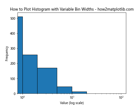
This example uses custom bin edges to create a histogram with variable bin widths, which can be useful for data with a wide range of values.
Conclusion
Learning how to plot histogram from list of data in Matplotlib is an essential skill for data visualization in Python. We’ve covered a wide range of techniques, from basic histogram creation to advanced customizations and variations. By mastering these methods, you’ll be able to create informative and visually appealing histograms that effectively communicate the distribution of your data.
Remember that the key to creating effective histograms is to experiment with different options and find the representation that best suits your data and your audience. Whether you’re working with simple datasets or complex distributions, Matplotlib provides the tools you need to create clear and insightful histograms.